Here’s the new BCR logo, designed by yours truly.
Lives in: Cambridge, Mass.
Does: comics.
Used to live in: Topanga Canyon, California
But grew up in: Cambridge, mostly
Used to do (maybe still?): Screenwriter, journalist, teaches some too
(A diary of the making of this chapter, which begins with the first day’s work at the bottom, and moves up)
March 13: summing up the last 6 months of work.
Yes, six months later, and I am still working on chapter 4. The slow pace partly because of interruptions and creative blocks, but also because this chapter turns out to be the longest so far, and I run into certain problems. And I’m still not finished with it!
So I’ll bring this up to date, starting with page 2, which I completed in late September. Pencils:
Inks (still just inkwashes, the line work remains pencil):
Page 3. I went through several versions of this, over the last couple weeks of October (MICE season. A pencil version that I abandoned. I don’t really remember what I didnt like about this. The placement of the figure, maybe?  
More pencils:
And the ink washes added to that version: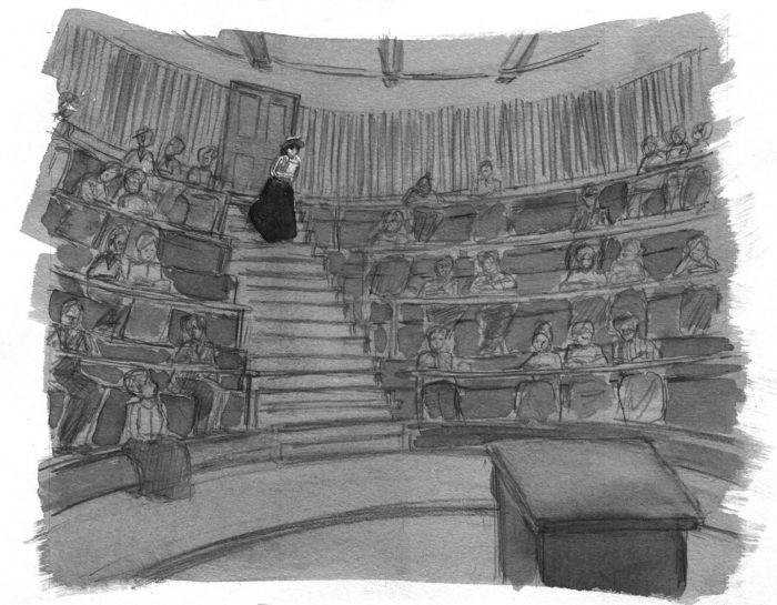
Again, five months later and I’m not sure why I wasn’t satisfied with this. But, apparently, I wasn’t. The shape of the skirt is a little blobby, maybe that was it. Anyway, here’s the final version. Maybe I’ll end up using the previous one, I don’t know. I got options!
Onto page 4, which was pretty simple, just one try (11/2/17):
September 20: Page one, at last!
After the slow process of the last few chapters, I’ve resolved to be more spontaneous, and allow myself fewer “re-do’s.” Here’s the first page, drawn in one try, without any additional rough versions. I changed the composition from the rough I’d done for the mockup, from this: 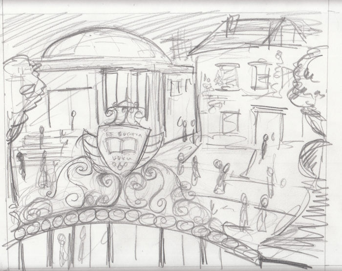
To this, the pencils for the final page:
Before diving straight into the washes, I did a little digital experiment with tones, just to see how it might look, leaving the ground white and darkening the gate in the FG almost to black:
Good enough, so I did the same thing with washes. I made some other changes first. I added the professorial figure with the cane, on the right, to reinforce the academic setting. Then, digitally, I adjusted the lettering on the gate a little, because it felt out of perspective to me (by the way, that’s Latin for “knowledge is power.”) Final page:
Looking at it now, I think I might digitally darken the washes, and erase the pavement lines, to leave the ground a solid white shape with darker figures against it — more like the digital-tone version above. That’s more of the graphic look I’d like for this.

When I was in Barcelona in 2013, I bought two copies (dated 26 November 1908 & 7 December, 1910) of Cu-cut, the Catalan satirical magazine at a flea market. I didn’t realize until much later that the language was Catalan, as I mostly just looked at the cartoons. I won’t pretend to understand the early 20th century Catalan politics, except to conjecture that probably many of the issues linger to this day. For more on the journal: https://en.wikipedia.org/wiki/%C2%A1Cu-Cut!
The journal was published between 1902 and 1912, and featured as a mascot this character, known as “The Catalan” (on the covers his hat, bow-tie and nose are bright red).
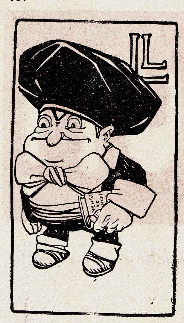
Cu-Cut, which is Catalan for “cuckoo,”  was at the center of civil unrest in December 1905 when, after publishing a cover satirizing the military, its offices were attacked and trashed by some 200 army officers. The incident resulted in curtailment of freedom of the press and had a major impact on Catalan politics and on the power of the military in Spanish civil affairs. Â
Comics scholar Pedro Moura has posted an English-language summary of his 2014 Portuguese review of Comics: a Global History, 1968 to the Present. He describes the book as offering “an English-language map of worldwide comics’ production, and one which presents, as I wrote, ‘a smooth and broad sailing.’ Moura’s recap also includes a link to an interview he did with me and my co-author Alexander Danner.
My first new “Palindrama” in 8 years! Between 2007 and 2009 I did a weekly webcomic, “Palindramas: Palindromes, Cartoonified.” Each week I created a cartoon built around an original palindrome. The entire text of the cartoon might be a palindrome, or just the punchline or caption. Formats varied between strips, panel gags, and full comics-pages (or even multi-page stories), and even a couple of animated GIFs. You can see some of them here. After a while, my brain started to hurt from coming up with these things, so I retired Palindramas. But this year, seeking a submission for the anthology, “One Page Stinkers,” I decided to try my hand at palindrome comics again. I came up with two Palindramas, to fit the theme “heat wave.” You can see it in the latest issue of the anthology… or right here:
(This is a diary of the process of creating chapter 3, updated bottom-to-top. Â So, if you want to follow the whole thing beginning to end, start at the bottom and scroll up)
July 10-13: page 7
For once, this page worked out on the first try. Here are the finished inks, as the kiss commences:
July 5-6 (and peeking ahead to July 23): page 6
This is relatively straightforward compared to what came before, because it’s a “closer-up” view of the couple, meaning less background (phew!). Â The boy leans in for a kiss, puckering up.
My last rough in the mock-up was extremely close, but I decided to move back to a medium view, so as not to lose the body language. Â Started with a couple of sketches/roughs:
Then launch into a final version…
Not happy with this so I abandoned it. Â It felt to me a little like the direction of his “lunge” was wrong, like he was going to miss her. Â Also I had him too close, and I didn’t like the way his nose overlapped with her hair. Â So try again:
I decided also to not make the background shading a uniform gradation (referencing the lamplight from above-right, and getting darker as it moves to the lower right corner), but left light between their faces, so as not to mess up their contours, and let the “light” between them work emotionally.
A 1950s shojo manga I bought online from a Japanese auction site, a relic of the era of kashihon, inexpensive rental libraries through which many manga books were distributed in impoverished, post-war Japan..  “Hoshizora ni uta e ba (If You Sing to the Starry Sky”) by Masai Akiyosha. Here are select pages, and my  non-Japanese-reading commentary/ guesses at what’s going on.  First, the cover and page one of the story.
The cover appears to be by a different artist than the interior.  Perhaps å‹å±±ã²ã‚ã— – KATSUYAMA Hiroshi?

This post will contain all the material that I produce while working on the 2nd chapter of my comic Lunatic: from thumbnails and sketches to finished pages. Lunatic is a wordless story, with one image-per-page.  I’ll add new material to the top of the post as I do it.
April 19-May 5: Crawling to the Finish Line
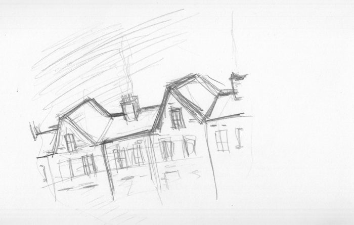
Other nuisances of life interfered, and it took me ages to do the last page I had to do. Â Not actually the last page of the story, but a transition page, to indicate that it’s morning in the last sequence. Â It’s a repeat of an image I’ve drawn twice now, of the exterior of the girl’s house, roof, chimneys etc. Â I’m getting kind of bored of drawing it, so I want to come up with something fun to do with this “morning” version. Â A different angle, to begin with. Â First, a light pencil sketch, just for composition:
Then, 10 DAYS LATER (!) (Really, I had other things to do. Â Or was it the boringness of the page that kept me from getting to it)…. a couple more sketches:Â 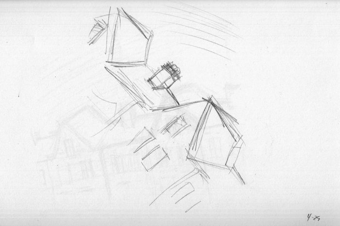
Thinking of ways to make it interesting, I think of using masking fluid to define the clouds, with a light wash for the sky, shading the clouds to show the dramatic light of the sunrise. Â A bunch of wash studies: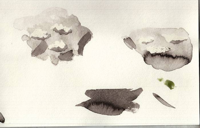
Letting the ink wash pool up at the bottom (on the tilted drawing table) accidentally makes that “burst” effect happen when it dries. Â I decide to try and make use of that for the sunrise itself.
On to the final version. Â The masking fluid is gooey stuff and hard to apply with precision. Â I don’t really want to muck up a brush with it, so I used a pencil eraser to draw the cloud shapes with it:
Brush on the washes, sloppily so that it pools up just above the roofline.
Et voila!
Once this is all dry, I peel off the masking fluid, so that there is a white edge to the clouds, with the darker shading in the middle.
Ilm not sure if the wash effect feels like a sunrise… or is the building on fire?  But I’ll go with it for now.  It doesn’t have the dramatic lighting that I want, though… so I add more gray wash to the front of the building, and some cast shadows on the roof: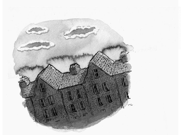
Good morning, right?
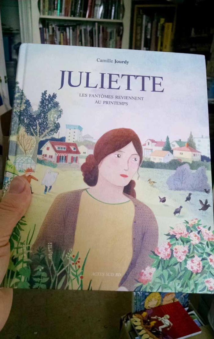 Juliette: les fantômes reviennent au printemps (Juliette: the ghosts return in spring) is a 240-page French graphic novel, published by Actes Sud in 2016. I don’t know much about Camille Jourdy : she’s done a lot of children’s books, and had a previous series of bd albums, Rosalie Blum, which I guess was successful, since it was adapted as a film as well.
As I said, I wasn’t satisfied with the baby’s expression on page 8, so I drew it over. Â I could have just redrawn the face and paste it in on Photoshop, but I really want the pages to be presentable as originals as well.
Anyway, this marks the end of the first chapter of “Lunatic,” in which the main character is an infant. I’ll now move on to Chapter 2, which will start with a lot of thumbnails and studies…