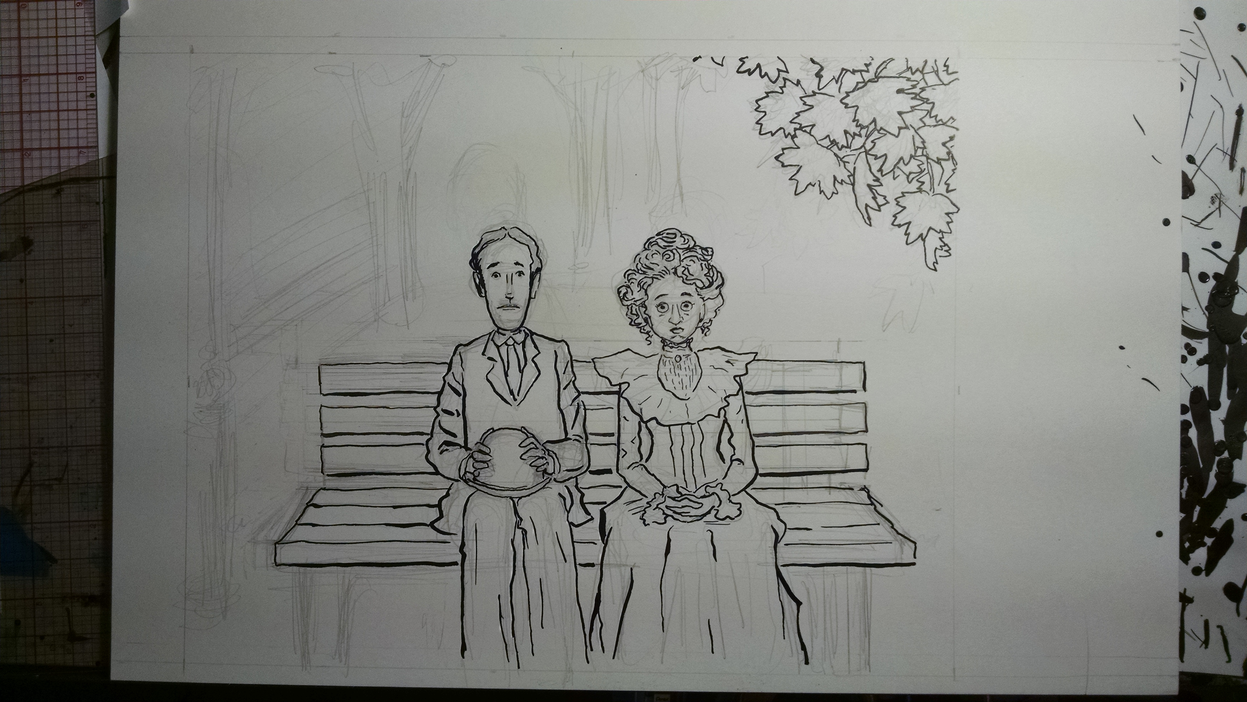
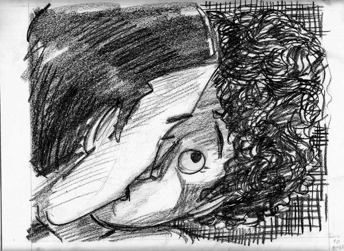
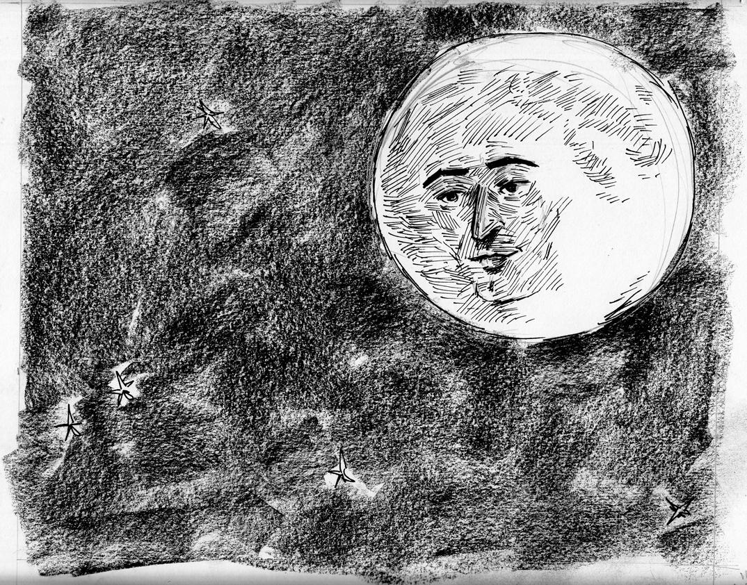
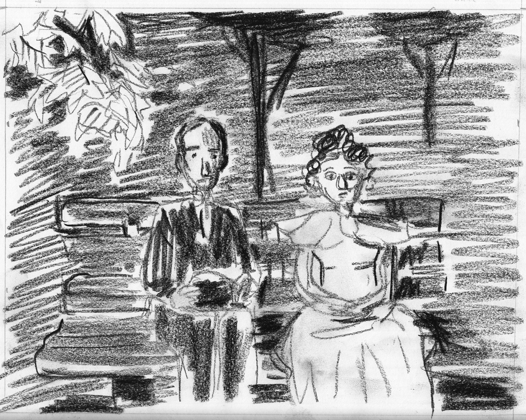
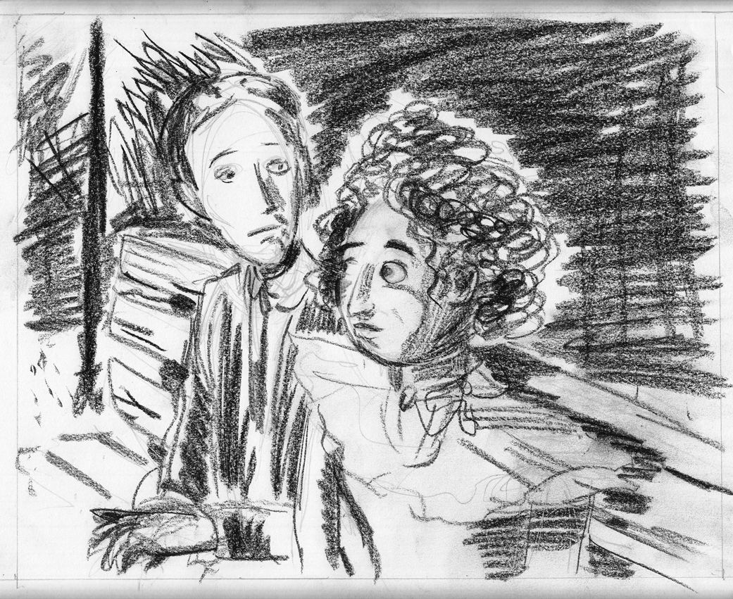
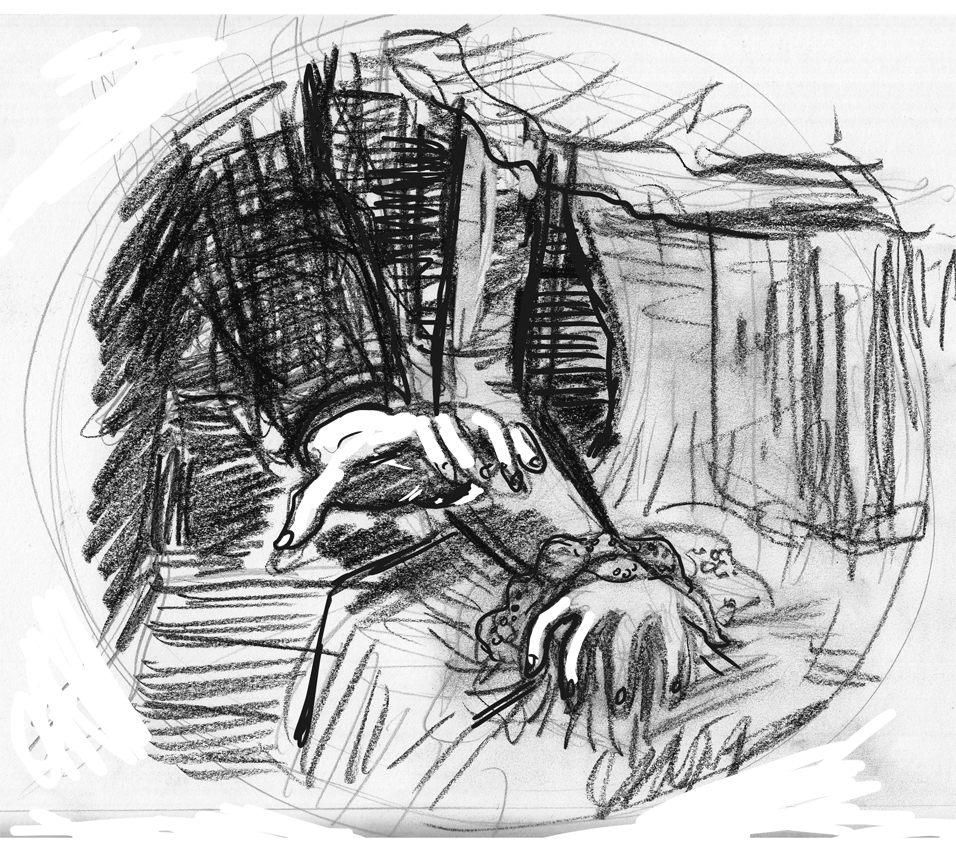
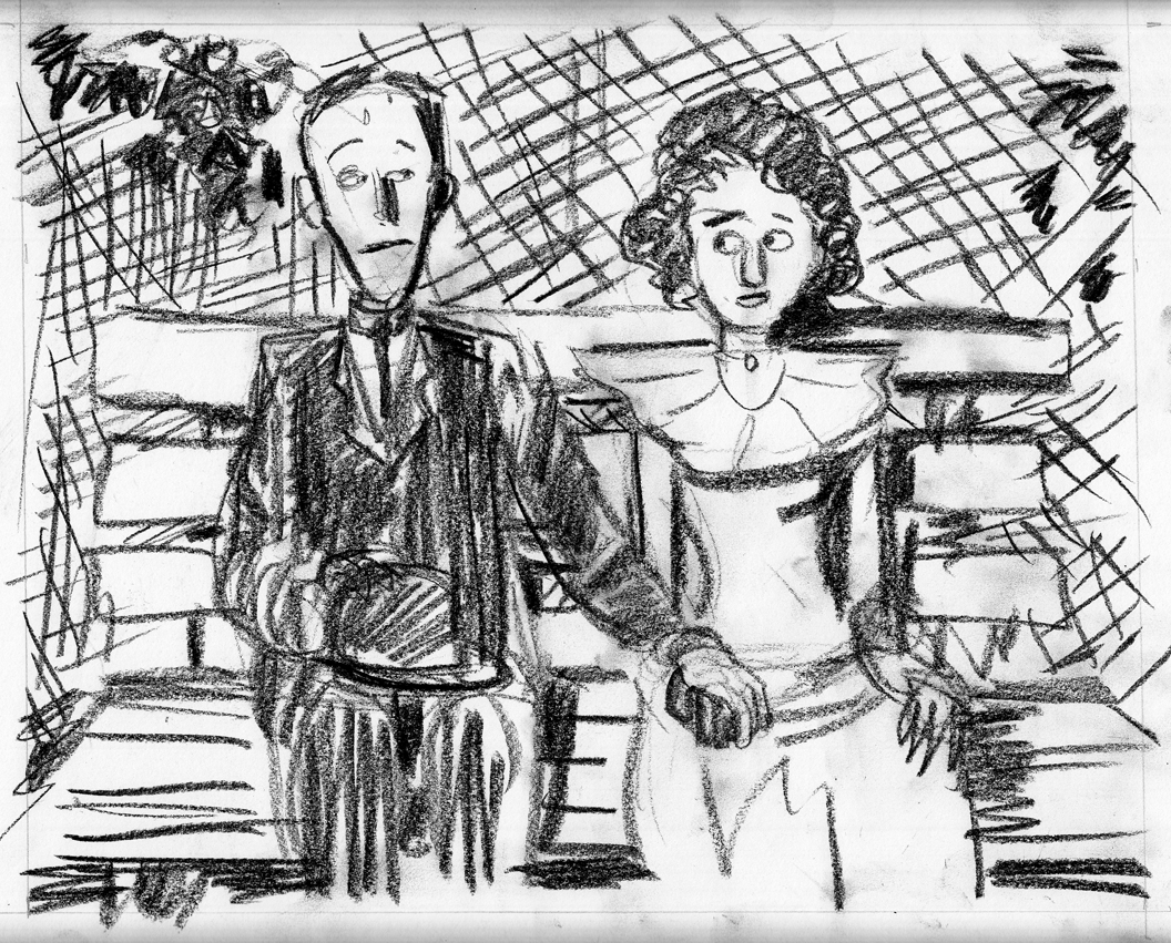
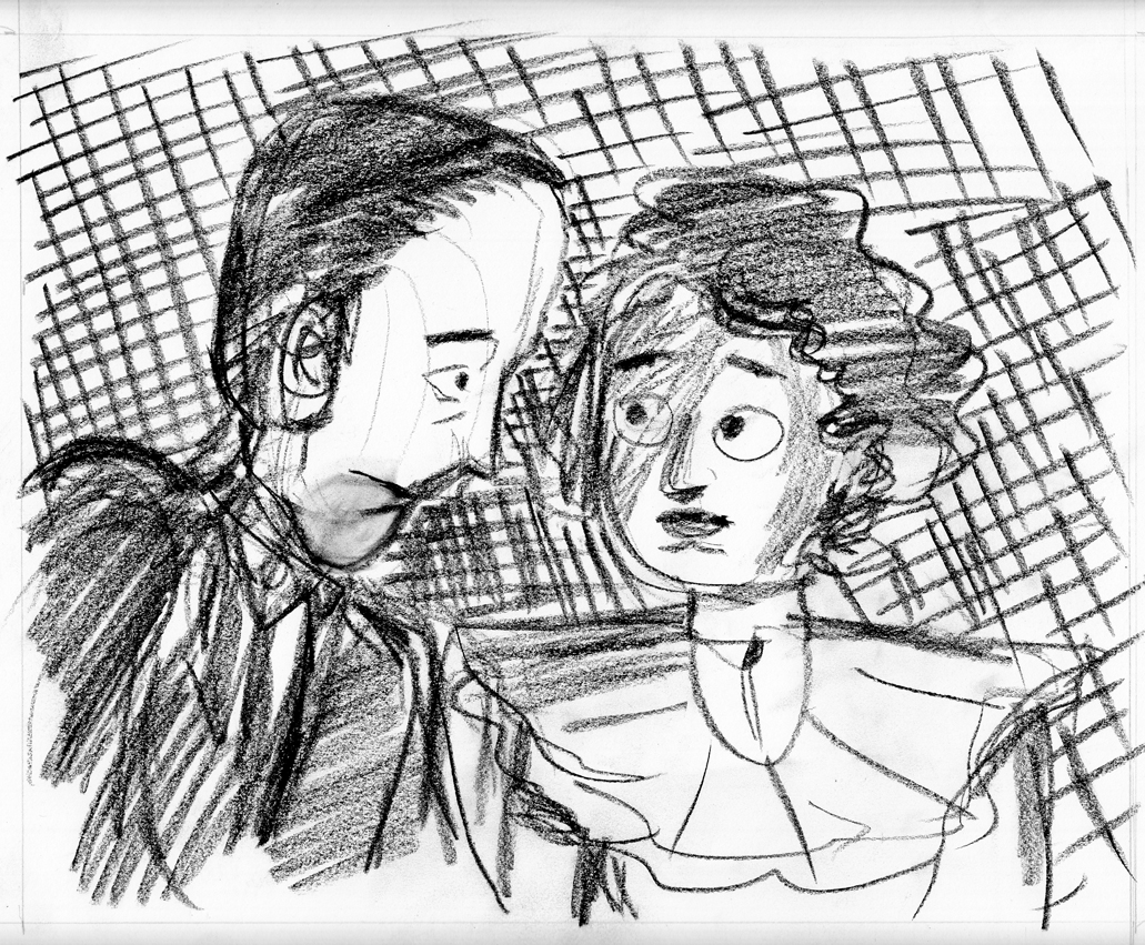
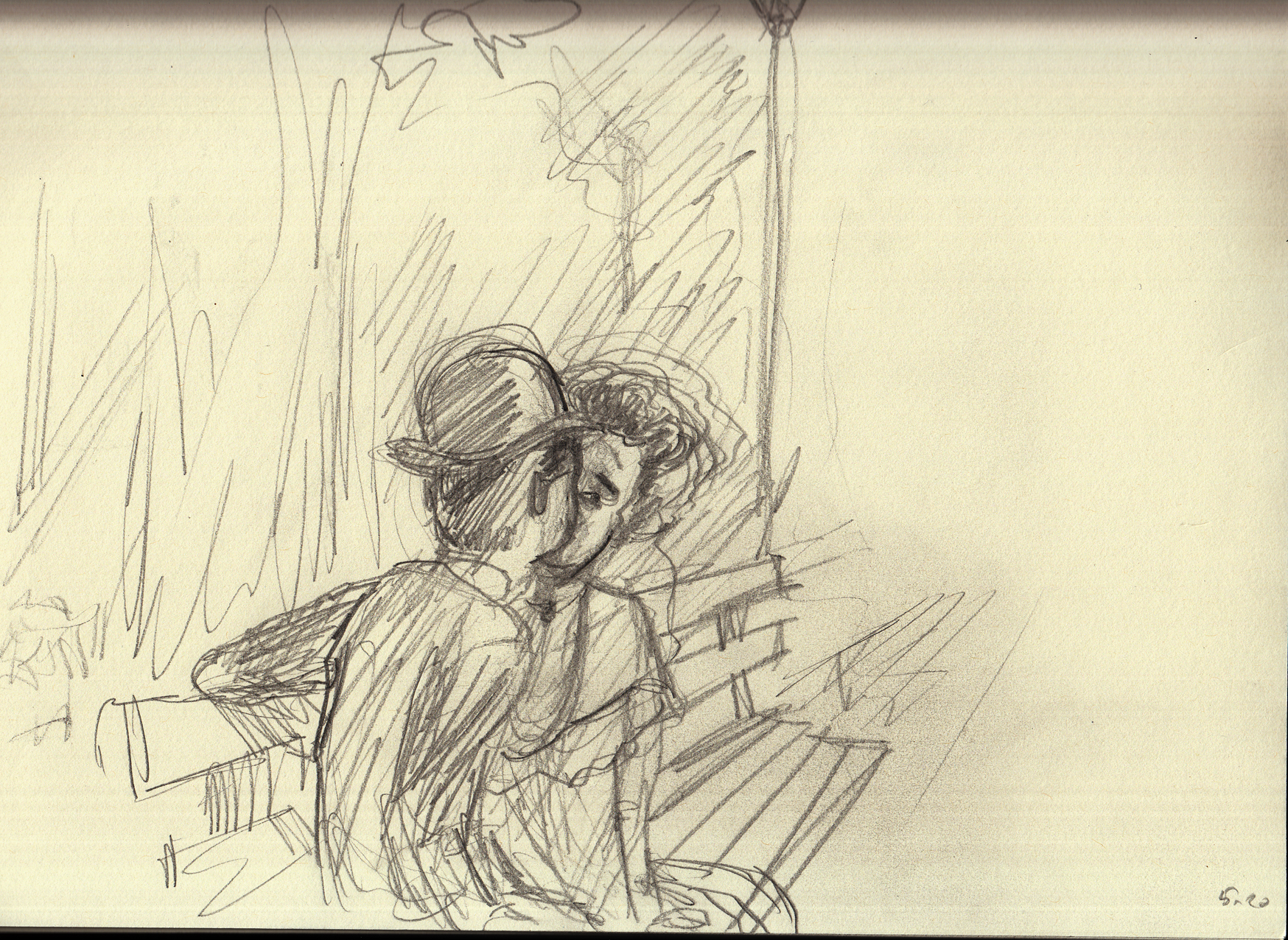
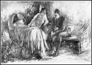
(This is a diary of the process of creating chapter 3, updated bottom-to-top. Â So, if you want to follow the whole thing beginning to end, start at the bottom and scroll up)
July 10-13: page 7
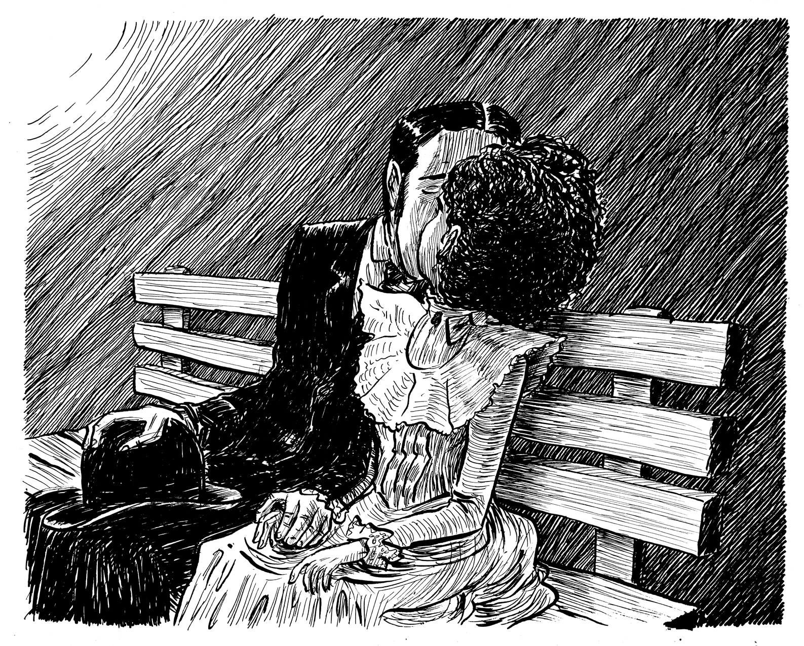
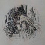
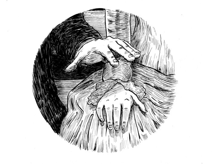
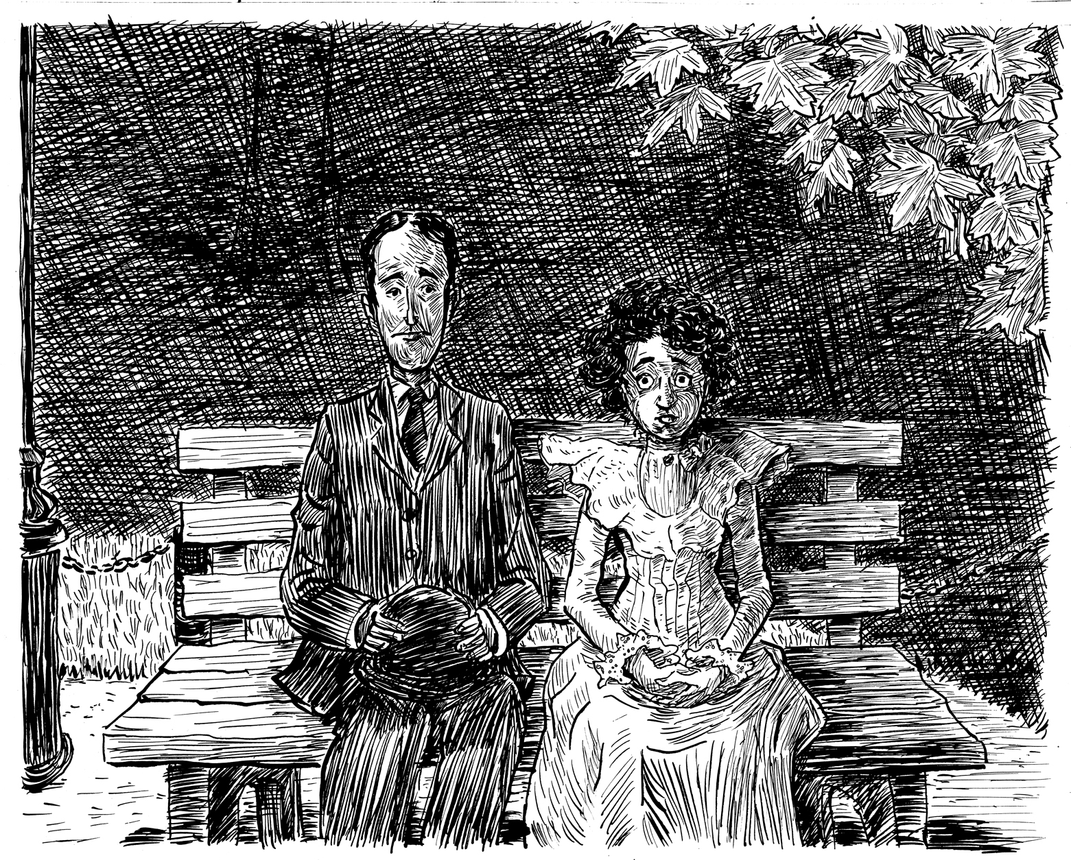
For once, this page worked out on the first try. Here are the finished inks, as the kiss commences:
July 5-6 (and peeking ahead to July 23): page 6
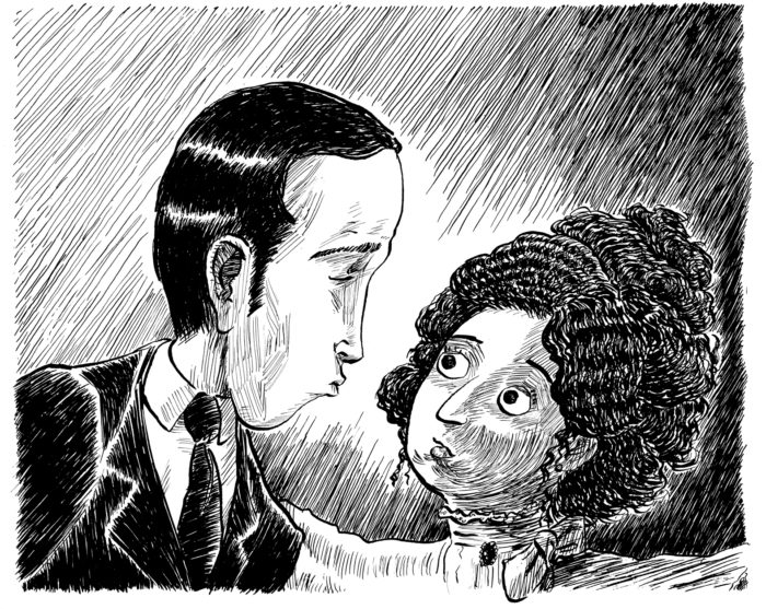
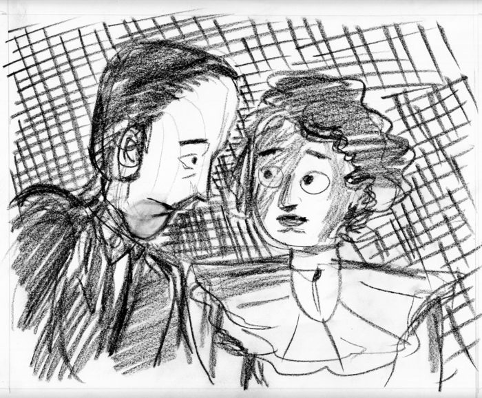
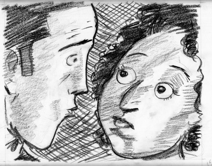
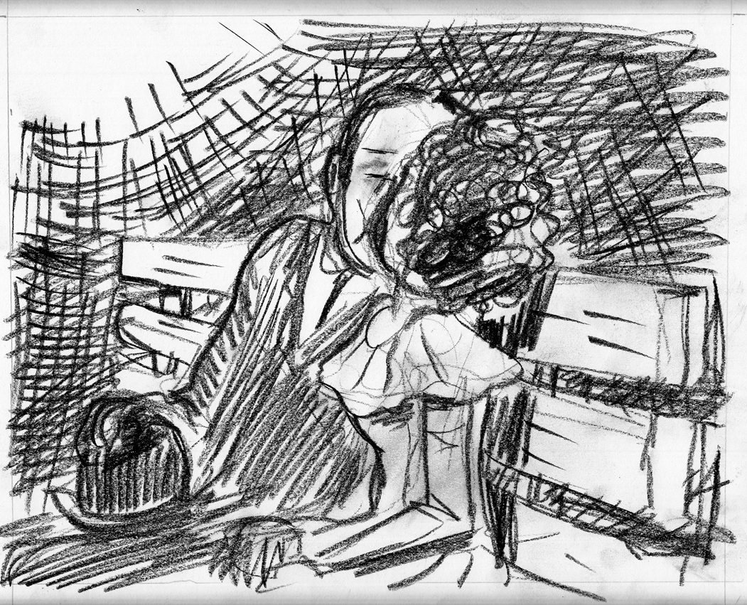
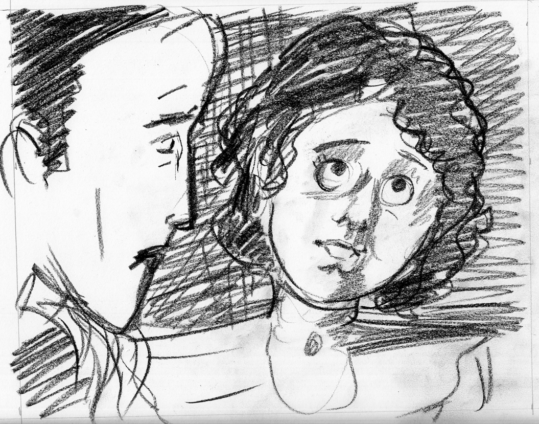
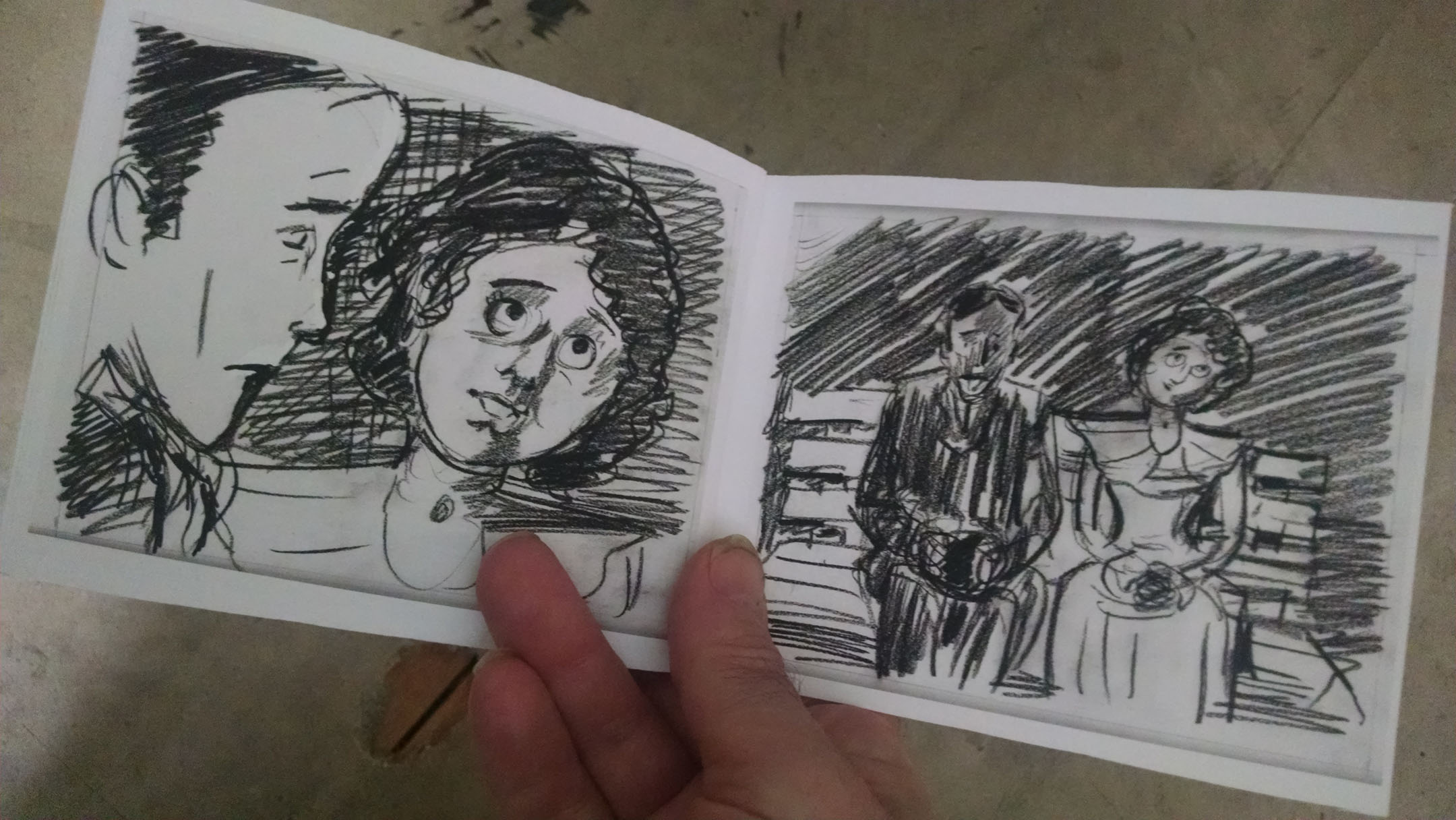
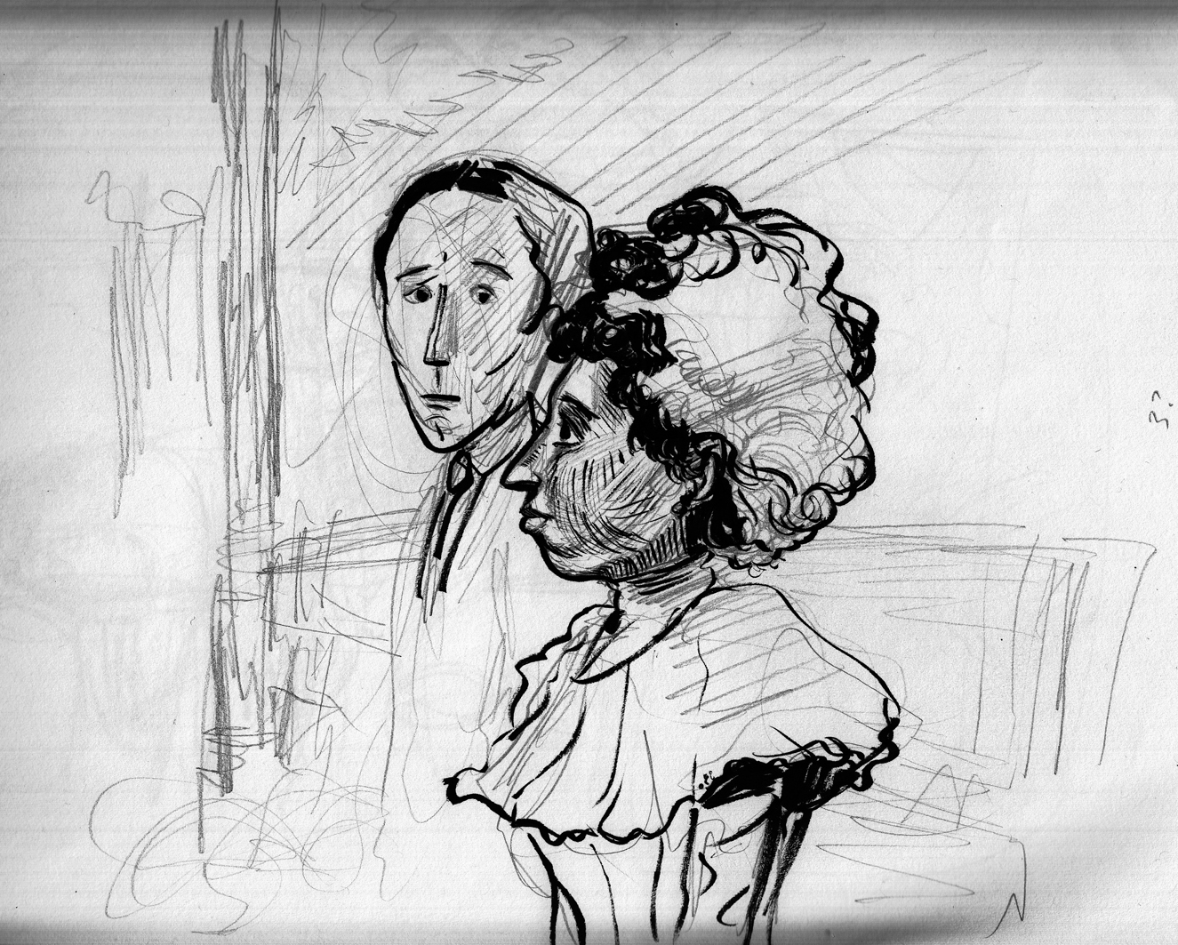
This is relatively straightforward compared to what came before, because it’s a “closer-up” view of the couple, meaning less background (phew!). Â The boy leans in for a kiss, puckering up.
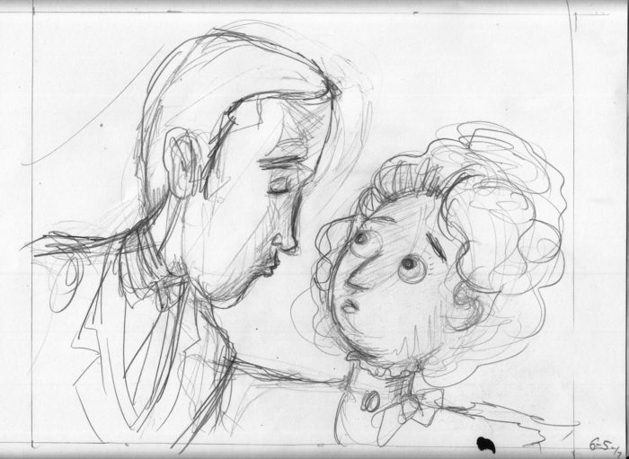
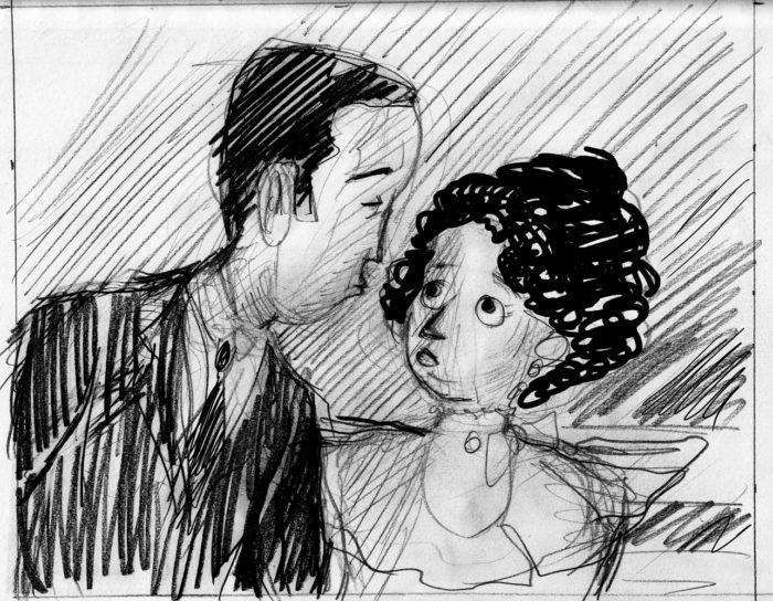
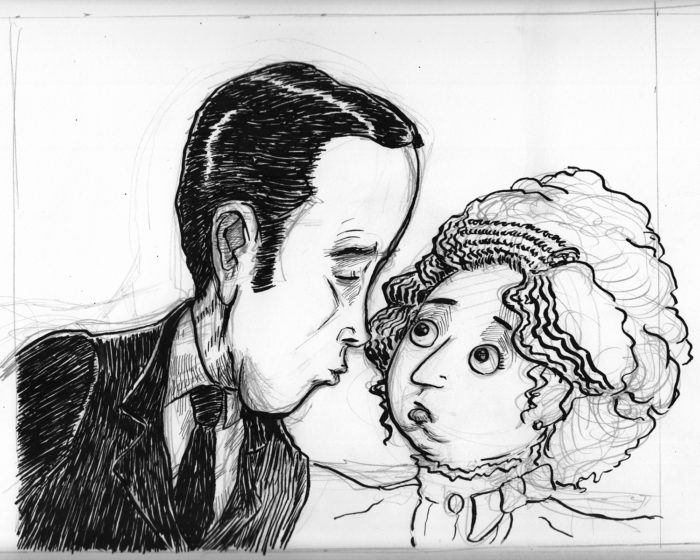
My last rough in the mock-up was extremely close, but I decided to move back to a medium view, so as not to lose the body language. Â Started with a couple of sketches/roughs:
Then launch into a final version…
Not happy with this so I abandoned it. Â It felt to me a little like the direction of his “lunge” was wrong, like he was going to miss her. Â Also I had him too close, and I didn’t like the way his nose overlapped with her hair. Â So try again:
I decided also to not make the background shading a uniform gradation (referencing the lamplight from above-right, and getting darker as it moves to the lower right corner), but left light between their faces, so as not to mess up their contours, and let the “light” between them work emotionally.
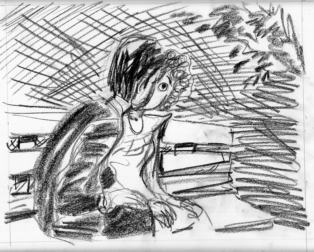
Basically I like this, though I wasn’t completely satisfied with the expressions. Â I like him closing his eyes and puckering up, but she looks more terrified than I had intended. Â I wanted her to be nervous, maybe ambivalent, but not obviously against letting him kiss her. Â For some time I intended to re-draw the face, but then (and this was a couple weeks later on 7/23), I tried the simple fix of just adding eyelids so that she’s not so bug-eyed:
Voila! Â Two tiny lines change the mood completely!
June 28-July 5: tackling the background on pages 2 & 5.
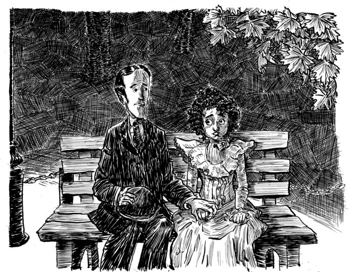
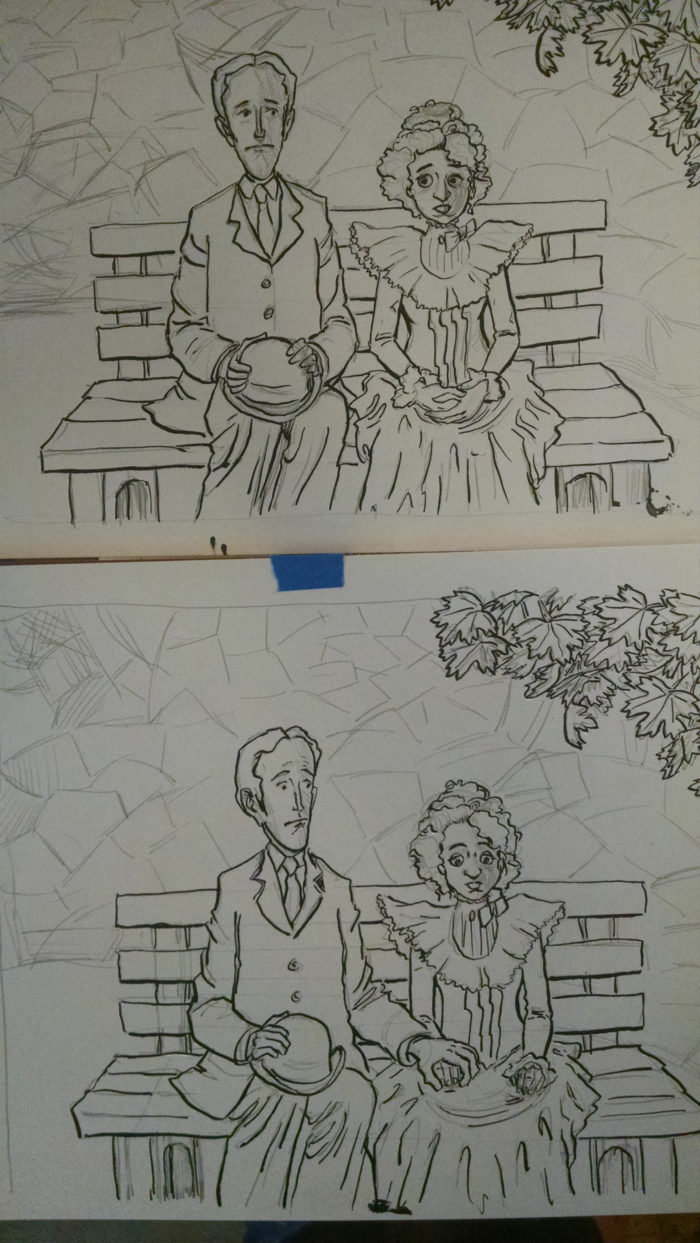
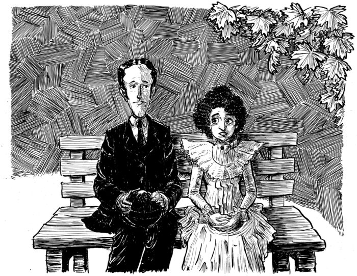
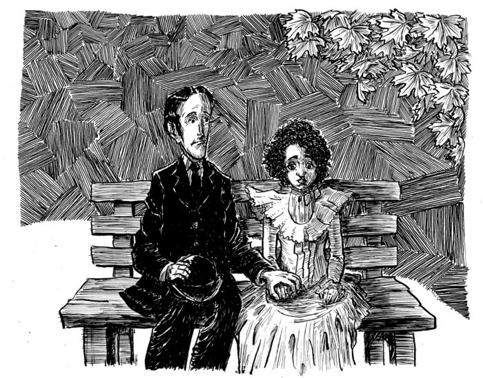
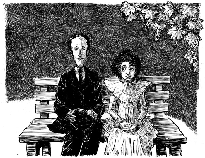
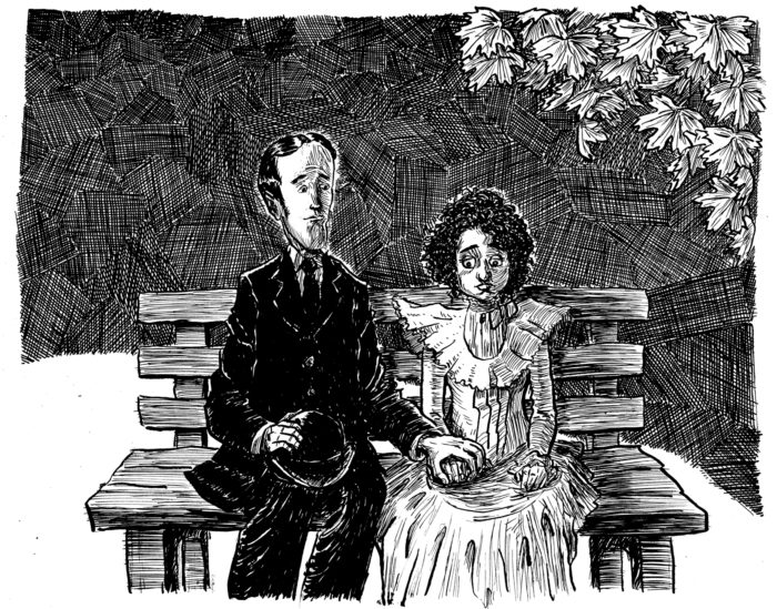
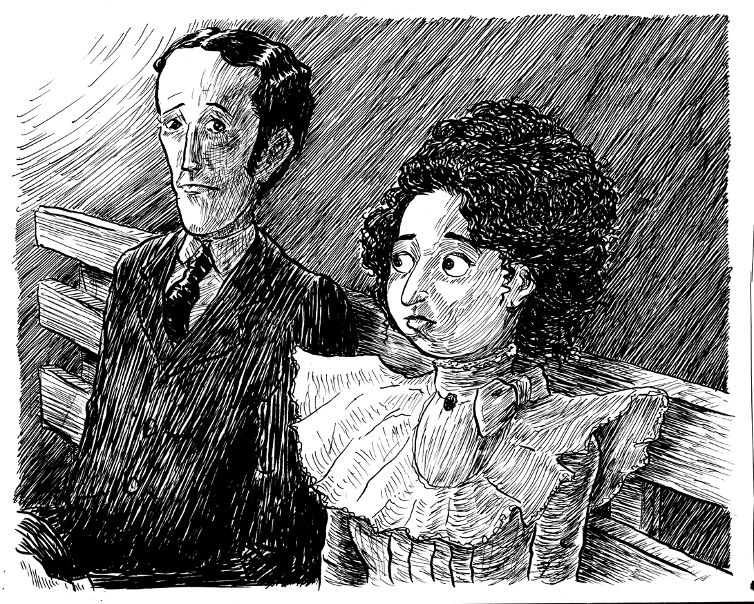
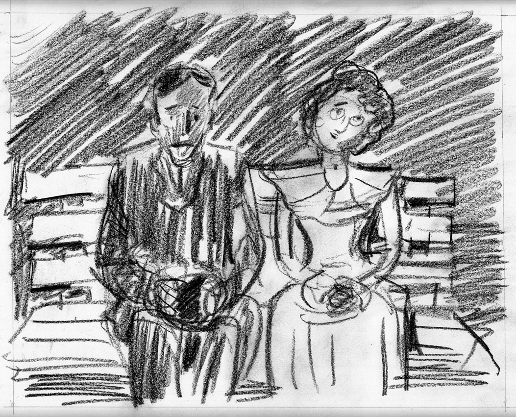
Pages 2 & 5 are the same scene, a frontal, full-shot (I hate using cinematic terms for comics, but it is convenient), of the two on the bench. Â The only difference is that in page 5, he has taken her hand in his. Â There is a fair amount of background space above and around the image, and I struggled with it already in page 2, moving on from it in an unsatisfactory state. Â Now, I’ll try to solve the problem of the background, first by doing a new version of page 2:Â 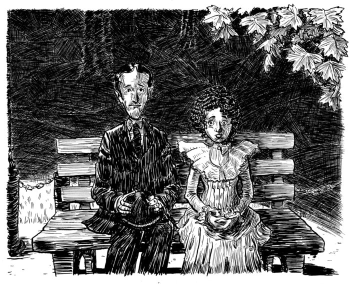
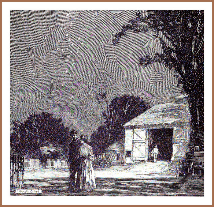
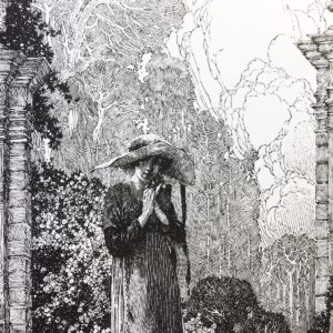
I tried a different approach to the cross-hatching, dividing the background up into irregularly-shaped sections. Â I got the idea from this Franklin Booth illustration:
My version obviously looks very different, not as elegant, cross-hatched instead of just one-directional lines. Â I was also trying to gingerly suggest the receding space with the directionality of the cross-hatched sections, and having them get smaller toward the top of the image.
I then moved to page 5. Â I made the cross-hatched sections a little more neatly.
At this point I decided that there were too many extraneous elements in the picture, the whole “middle plane” behind the bench, but in front of the cross-hatched background, with the truncated view of the light pole, the chain and posts; just clogging up the composition.  I also decided that the vaguely-outlined trees in the background weren’t necessary, and were a tentative “splitting the difference” between a more representational and abstract background. I removed them in Photoshop: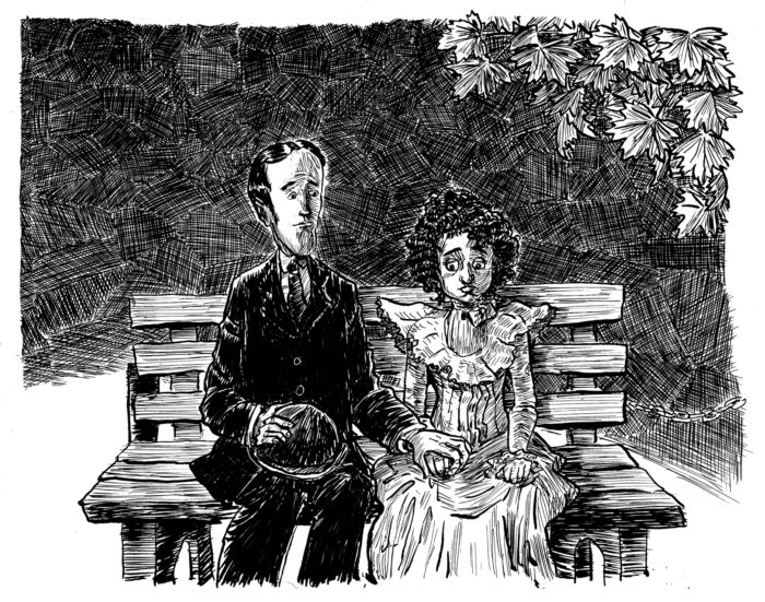
I made some other changes as well, darkening the suit, so that it stands out more from the background, and changing the eyes. moving the pupils so that they are looking more downward, at the awkwardly-held hands. Â I didn’t bother to remove the chain from the right-hand side… because I knew I’d be drawing the whole thing over.
Now, I’ll do a new version of each of the two pages simultaneously and try to finally solve the background problem.
Pencils and line-art:
Foreground shading and blacks: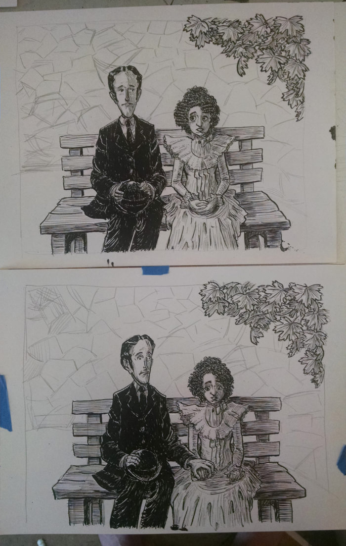
For the backgrounds, I tried a more restrained approach, closer to Franklin Booth’s: not cross-hatched, but one direction of lines in each “tile”:
By this point, I’d kind of lost my ability to judge how well the background effect was working. But I got some feedback saying it looked too much like a “parquet floor.” Â I went back in to page 2 digitally (copied and pasted the background, moving pieces of it around so it created a sort of cross-hatching):
Then added cross-hatching (with real ink) to the background of page 5:
I took the originals in to the Boston Comics Roundtable meeting, looking for more feedback. Â People seemed to like both, and to think it actually worked to keep page 2 with the “parquet floor” look, and page 5 cross-hatched, since the change in background could actually work to reinforced the change in the characters’ emotions after the “hand-hold.” Â Perhaps just out of fatigue, I decided to believe the feedback, and leave them as they were.
Oh, but I wasn’t happy with the faces in the latest version of page 5, so digitally I pasted the faces from the previous versions in. Â I had hoped to have all my “final” pages for this project be complete on paper, but I wasn’t about to re-draw the whole page again in hopes of getting the faces right. Â And so:
And I called it a day on pages 2 and 5!
June 23-24
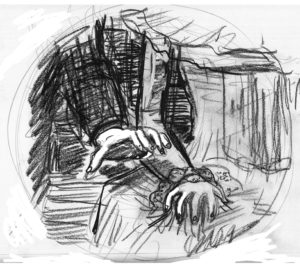
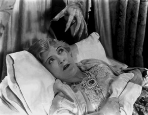
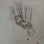
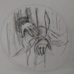
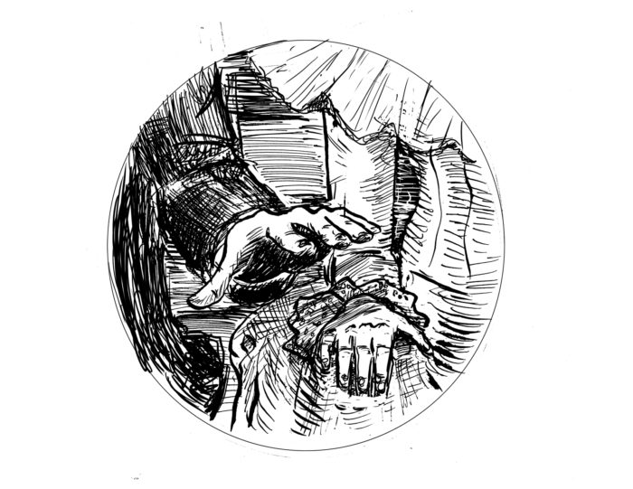
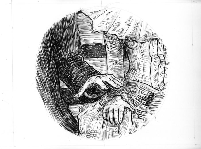
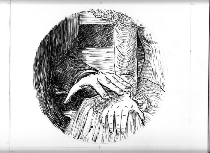
This is a fairly simple page… EXCEPT for getting the hand gesture right. Â The rough version made it look a little too threatening:
It’s supposed to be a hand tentatively but gently moving to take her hand. Â NOT this:
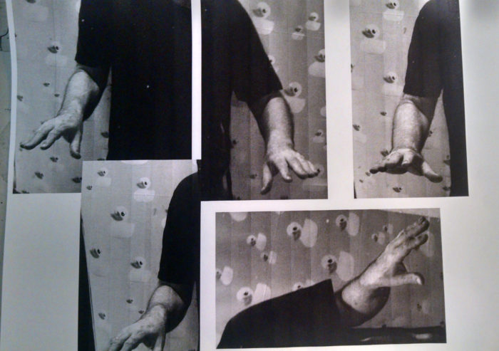
From an early age, I thought I was good at drawing hands. Â As a result I’ve gotten a little lazy over the years as far as learning to draw hands really well. Â Time to remedy that.
Starting with some photos of my own hand in various positions:
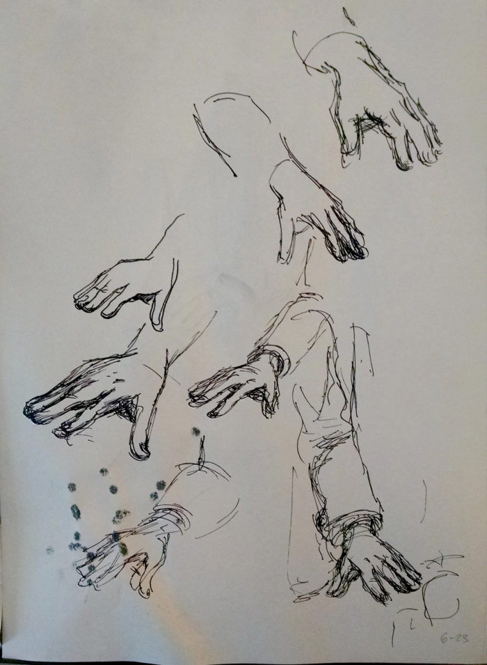
Then, sketches from same:
Then, a lot of sketches of the page, trying to get it just right, with the hand clearly reaching for hers, but the fingers more relaxed, not too claw-like:
I liked the last one, and did some Photoshop touchups on it, for a final rough version:
Moving on to the final version. Â Or what I hope will be the final version:
Not satisfied. Â Composition lacks drama. Â The hands are too small .
Better but not quite good enough. Â The final version, more delicately inked:
June 22: page 3
A different angle on the couple, as they furtively/nervously look at each other without daring to actually turn their heads. Â Pencils, and inks started:
A different approach to the background shading, because I didn’t want to deal with all that cross-hatching. Â This is more abstract (though the light from the upper left places it in space with the lamp above them). Runs the risk of feeling like a gray wall behind them, I guess, but it has the virtue of simplicity.
I think the shading on the boy’s face is a little messy, under his eye and around his cheekbone. I may work on cleaning that up in Photoshop eventually.
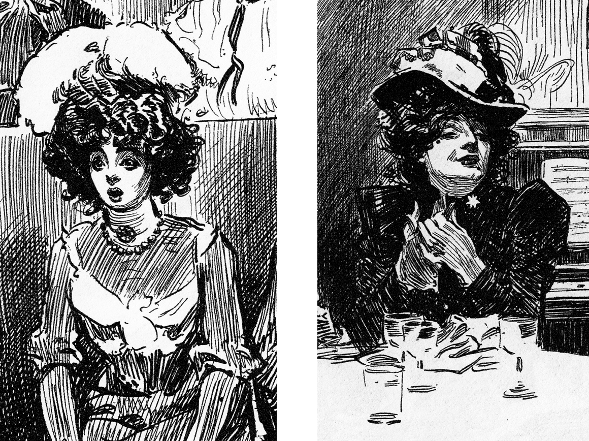
One challenge is visual guidance for drawing a “Gibson Girl” type hairdo for my character, since Gibson hardly ever depicted women with very curly hair.  I guess that since he was presenting usually the ideal, fashionable young lady, and crinkly hair was not in.  The only examples I could find are these two (below), and both of them are Gibson drawing lower-class dames.  And still the hair isn’t as curly as what I want.So I had to develop my own approach to drawing the texture of her hair, as best I could in a “Gibson-esque” style.
Jun 21: page 2
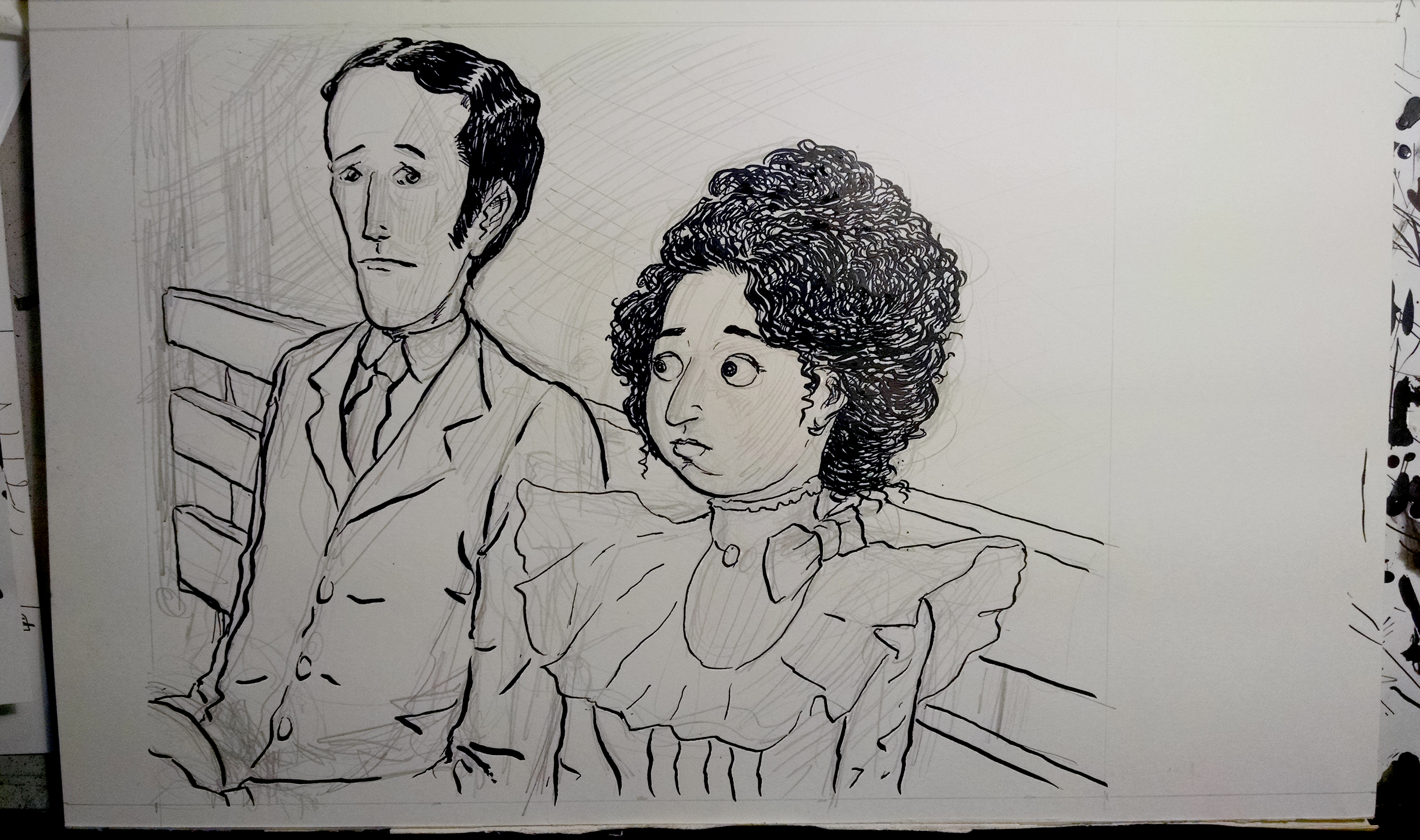
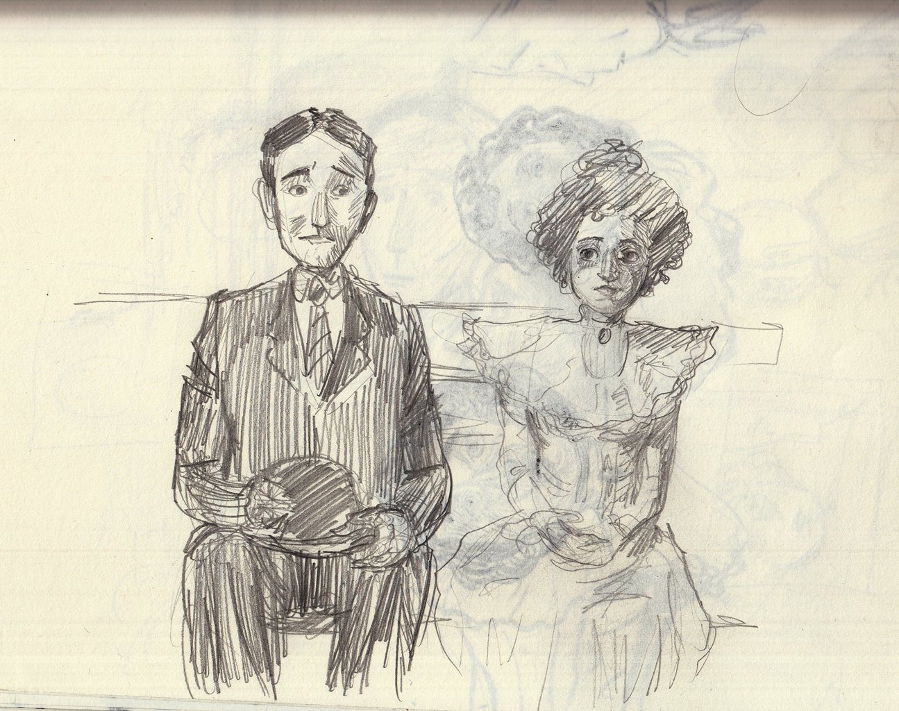
I started in, penciling and beginning to ink this page, which is a closer look at the two characters sitting on the bench in the park at night. Â The idea is that they are very young, on their first “date” unchaperoned, and both of them nervous to the point of near-paralysis.
I was immediately dissatisfied with this, for one reason: the boy is supposed to be way taller than the girl, adding to the awkwardness, and I had drawn them arond the same height! Â So I abandoned this version. Â Here is the next version:
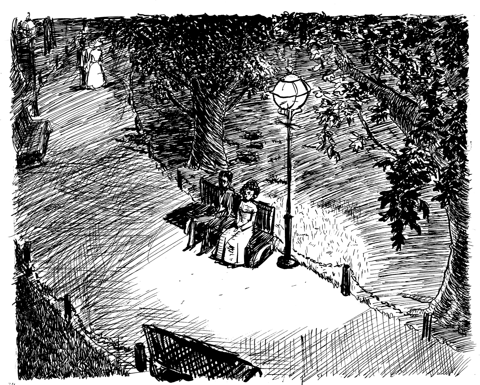
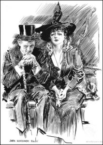
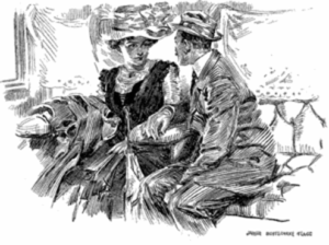
Now the big challenge here, as in most of the pages in this chapter, is how to handle the background. Â I wanted to emulate the loose, thick-lined cross-hatching of James Montgomery Flagg, as seen in the example below. Â But here, I am not sure it works, maybe because it’s not an abstract setting, as in Flagg’s, but meant to denote a darkened space, where you can see the darker shapes of a couple trees through the hatching. Â I know I am not done with this page!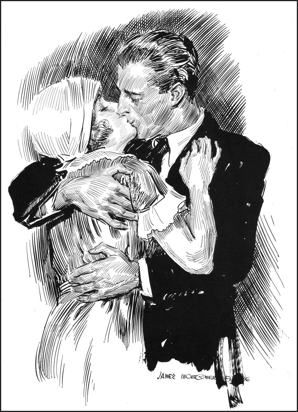
June 20, revisions to the mockup
Much like the normal “thumbnail” stage of a panel-page comic, this is where one can judge the pacing, compositions, etc., and make changes.
First off, I think there needs to be a more dramatic change in composition between pages 5 & 6. Â Both are frontal views of the couple, the second a little closer. Â I think it should be a lot closer, so from this:
…to this:
(also more emphasis on the “puckering up” expression on the boy’s face, to make sure we know a first kiss is imminent).
The other problem I had with the original mockup was that I felt the transition from page 9 to page 10 was a little abrupt, and didn’t make the girl’s obsession with the moon dramatic enough. Â So I decided to add another two pages, basically the same as 8 and 9, but “moving in” closer on the face of the girl, then the face of the moon:
I added these in, re-printed the mockup, and was ready to move on.
June 13: Mockup time
As I did with the earlier chapters, I feel I can’t really get a handle on the flow of the narrative without creating a mockup, so that I can simulate the experience of actually reading this chapter.
Since I’m at an early phase of drawing the pages, I need to do quick, full-size roughs of each page to create the mockup.
I started with a chapter title page, since I think I’ll probably have them in the finished book.
Then, starting with page 2 (I can use the finished page 1 in the mockup):
5:
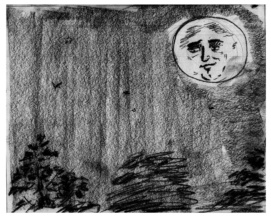
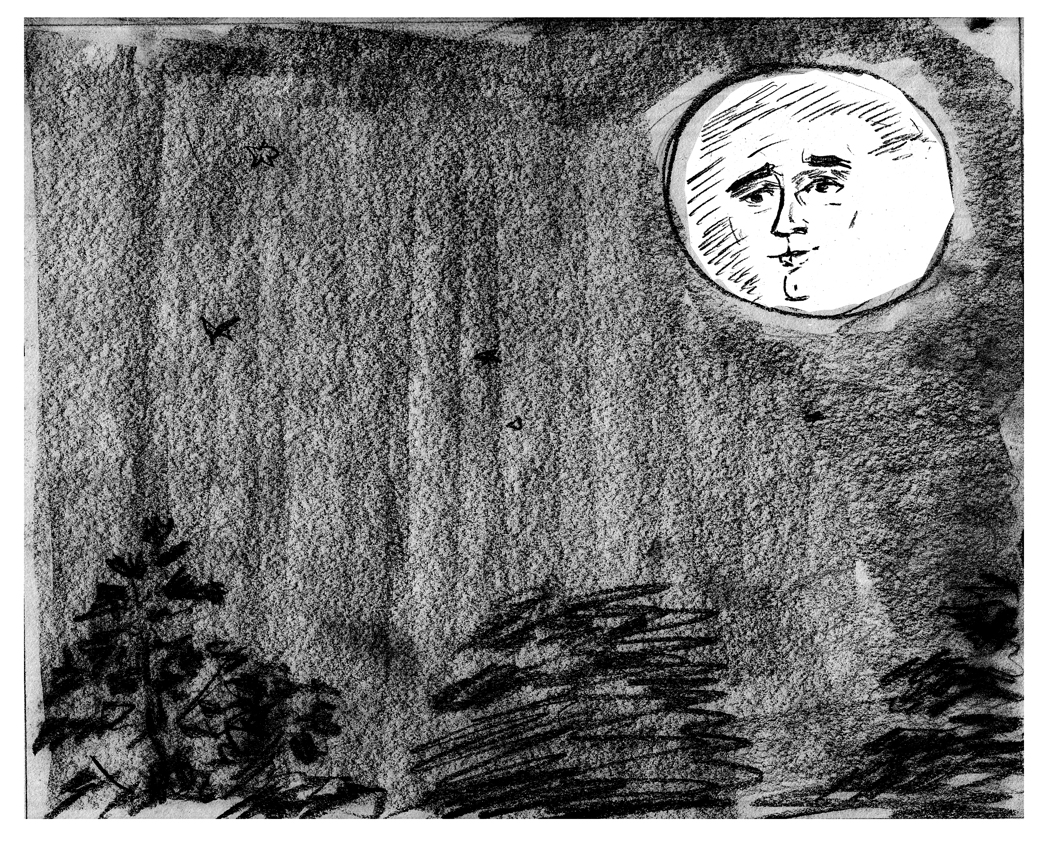
9:
(I didn’t like the moon face in this one, so i re-drew it and pasted it in with Photoshop:)
11:
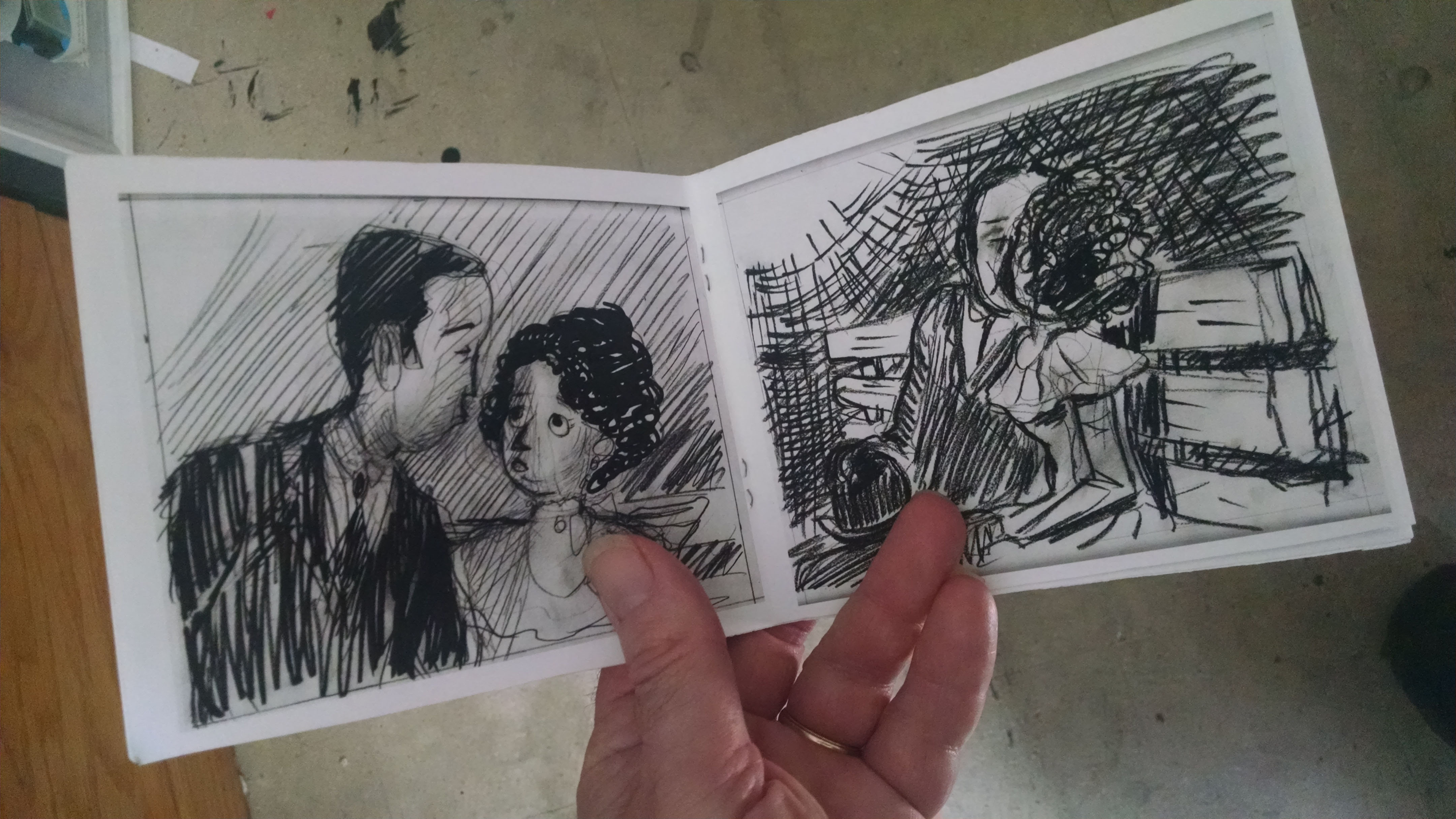
I laid the pages out for a booklet, then printed them out as large as I could (across the length of 11×8.5), flipping the pages over to print again, since I don’t have a duplex printer. Â Then stapled it, and voila:
After looking at this mockup and mulling it over for a few days, I saw some things I definitely wanted to change. Â A very valuable step in the process.
June 1-6: Confronting the characters & planning the rest of the chapter
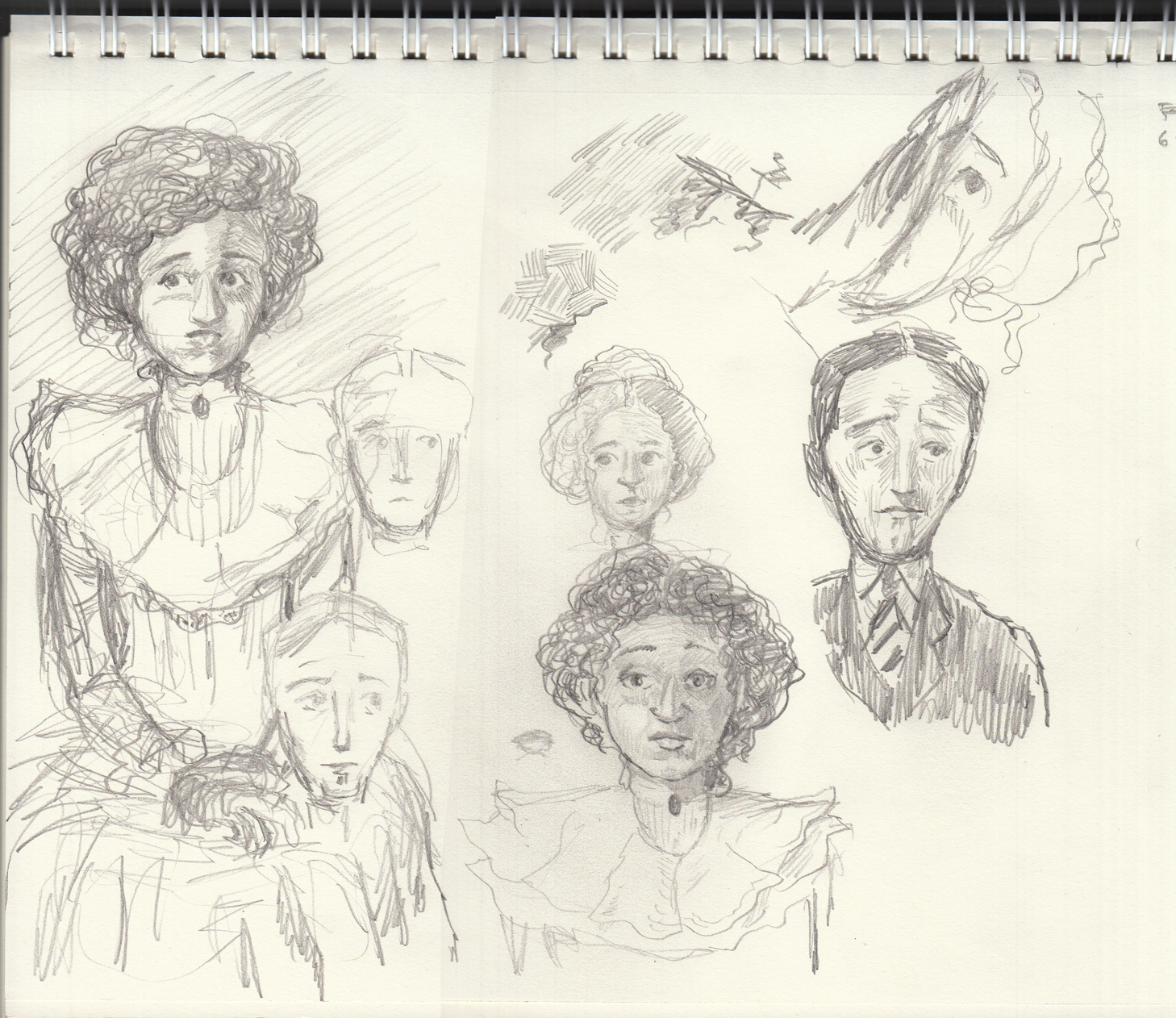
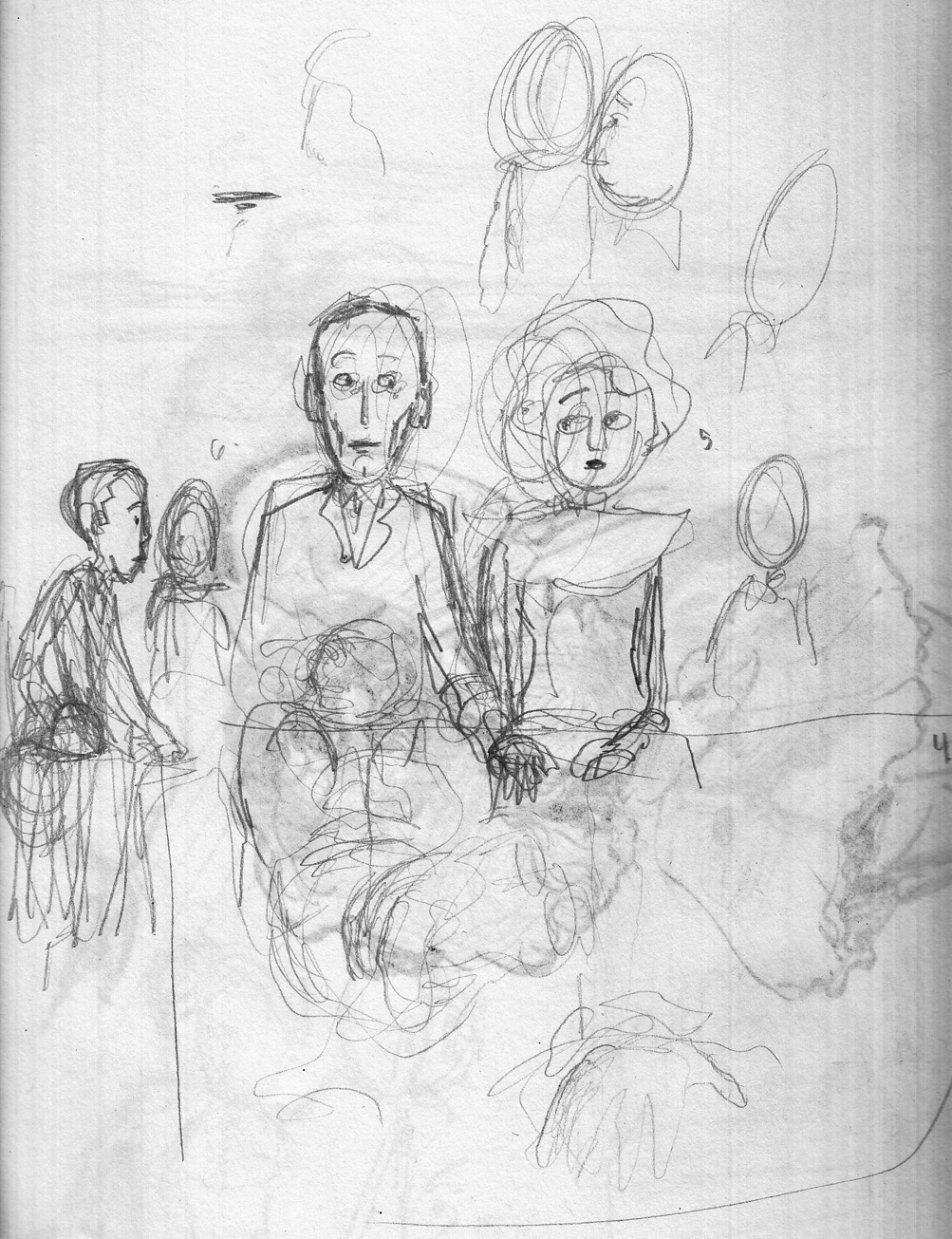
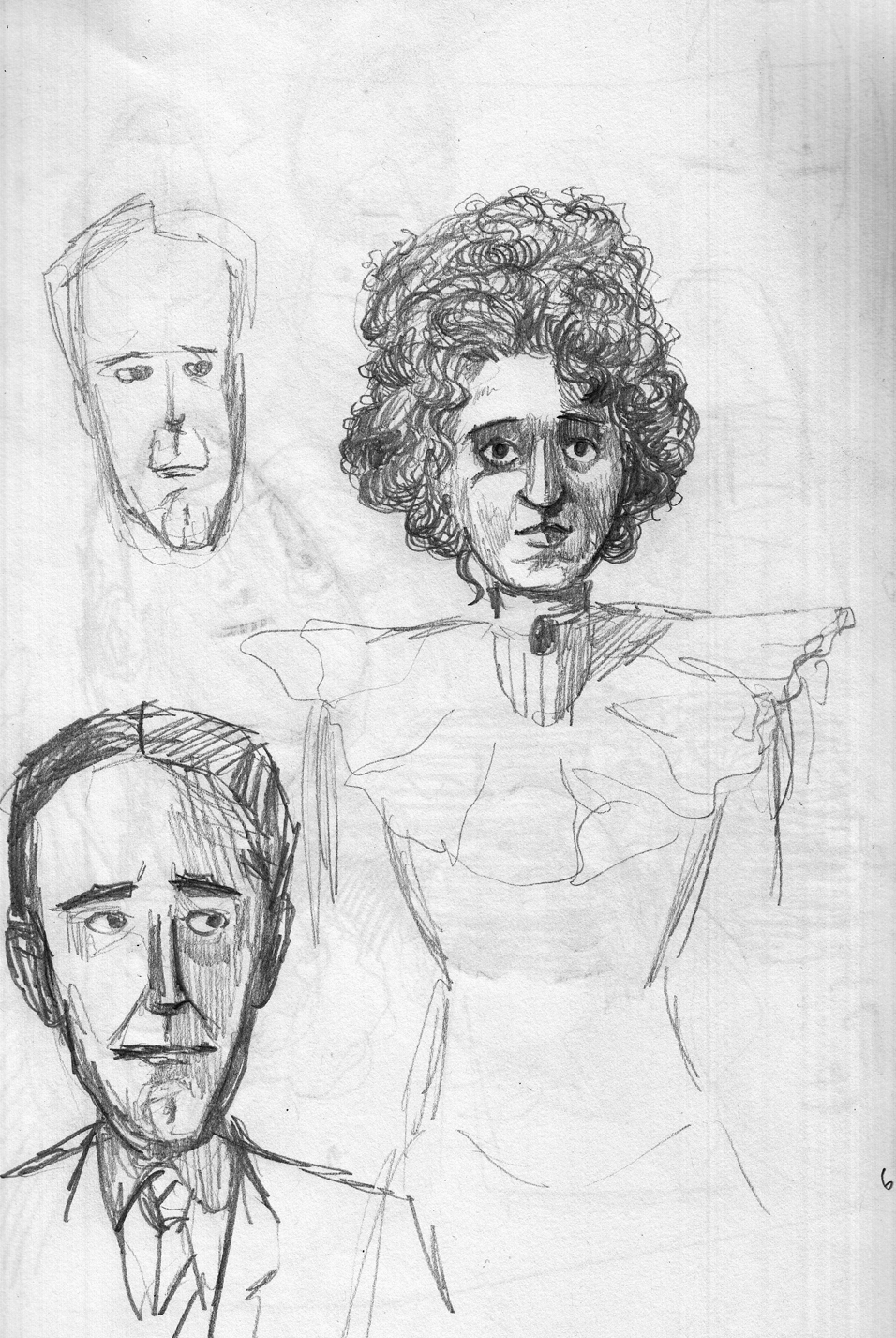
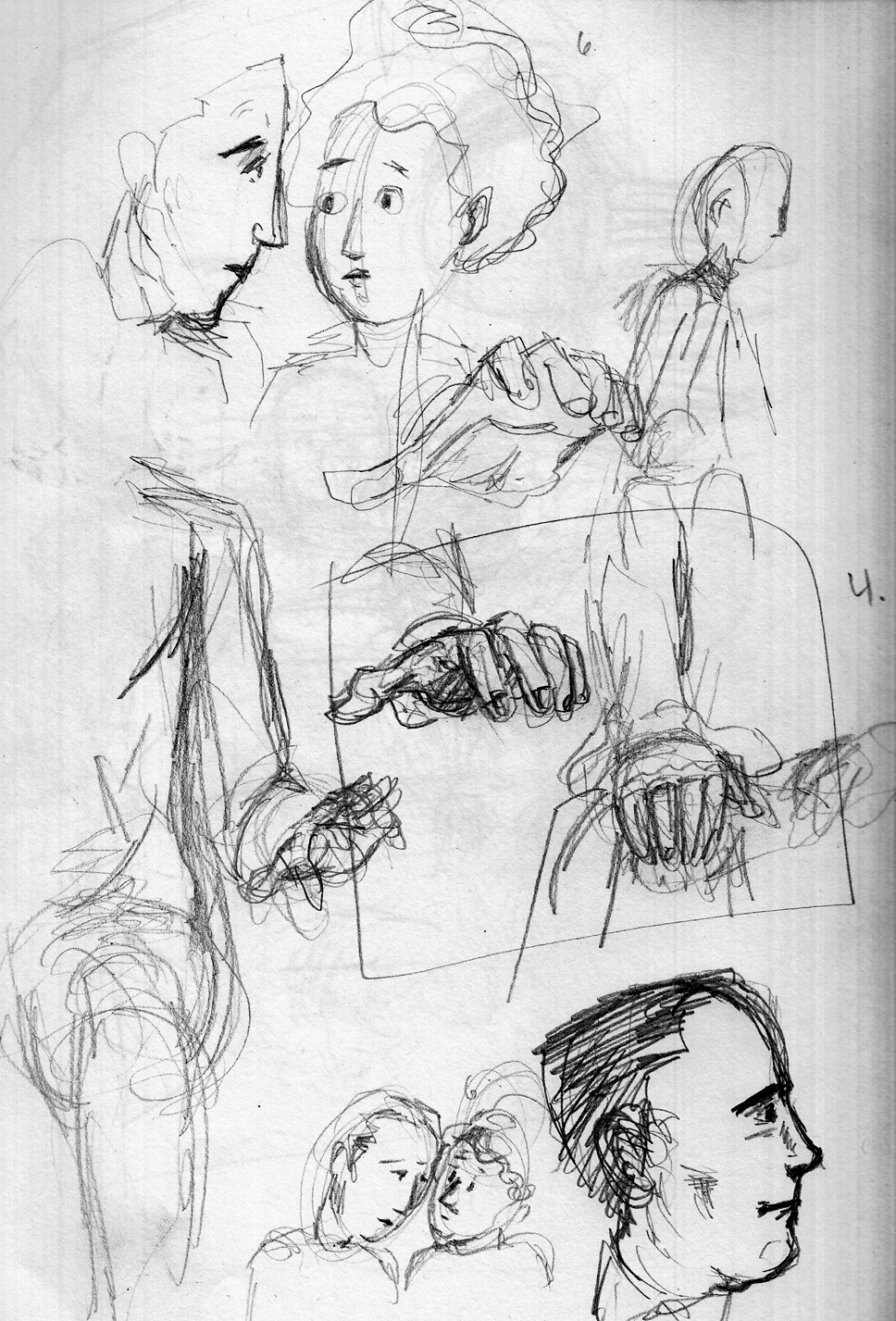
Page 2 of the chapter is a closer angle on the two characters on the bench, so I have to get serious about their physiognomies, costumes, gestures and expressions. Â So, sketches ‘n’ studies time:
Spent a few days away, with only sketch pad and a few pens. Â A good opportunity for intense character studies. Â Trying to capture awkwardness of a “first date,” for a young couple from a Victorian-like culture:
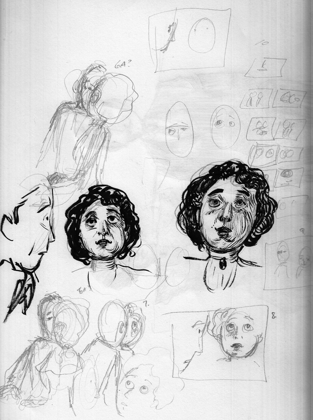
doing a little casual thumbnailing as well so i can anticipate the various gestures and expression. Â Using a brush-pen for hatching practice:
Numbers to remind myself which page each sketch is meant for:
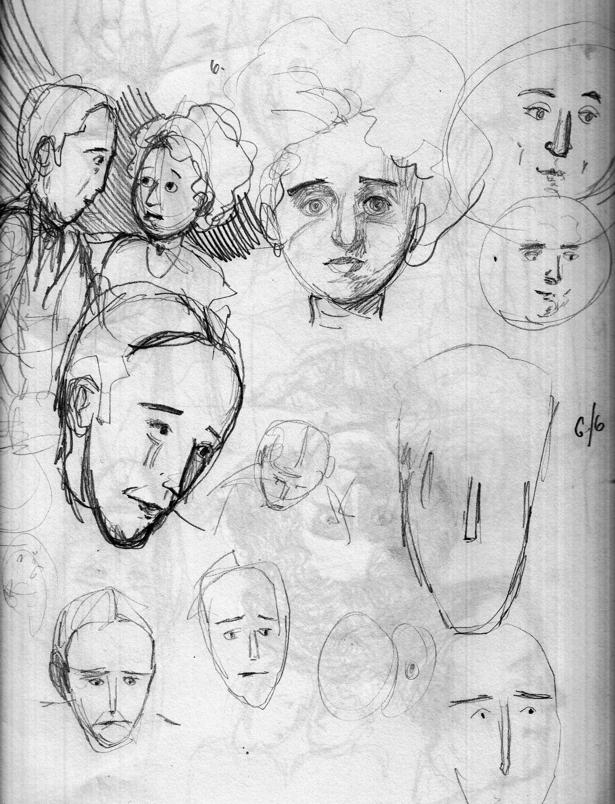
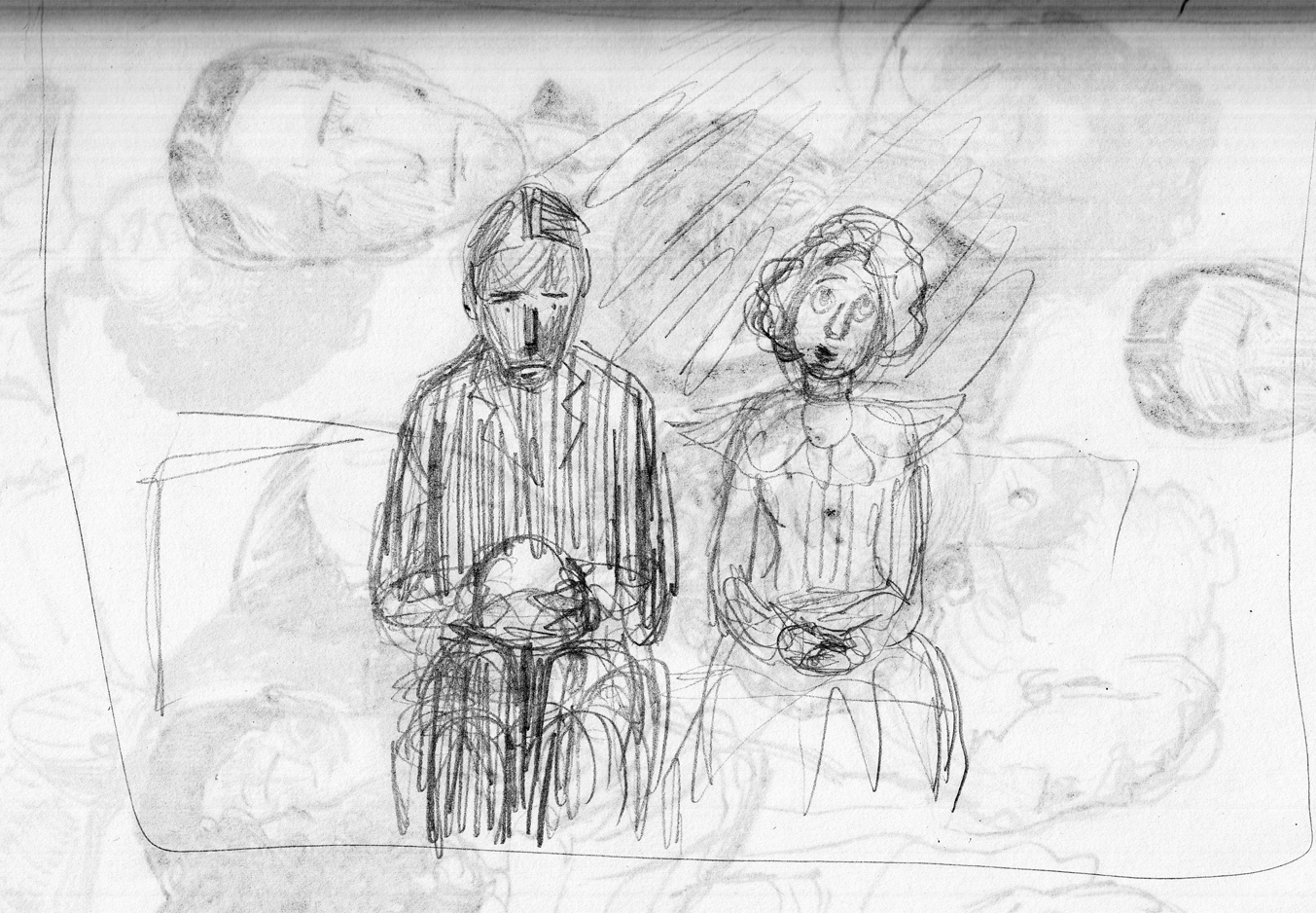
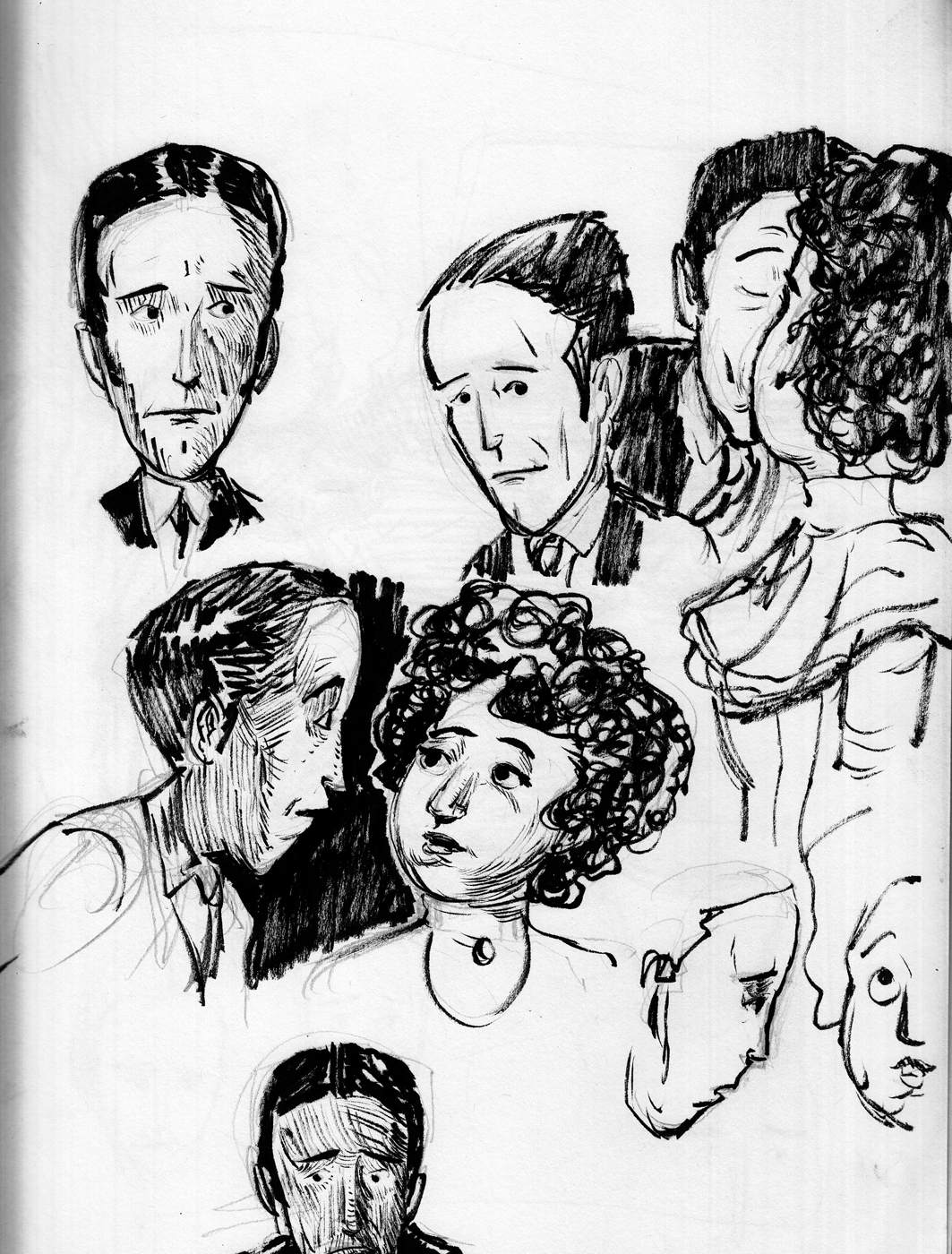
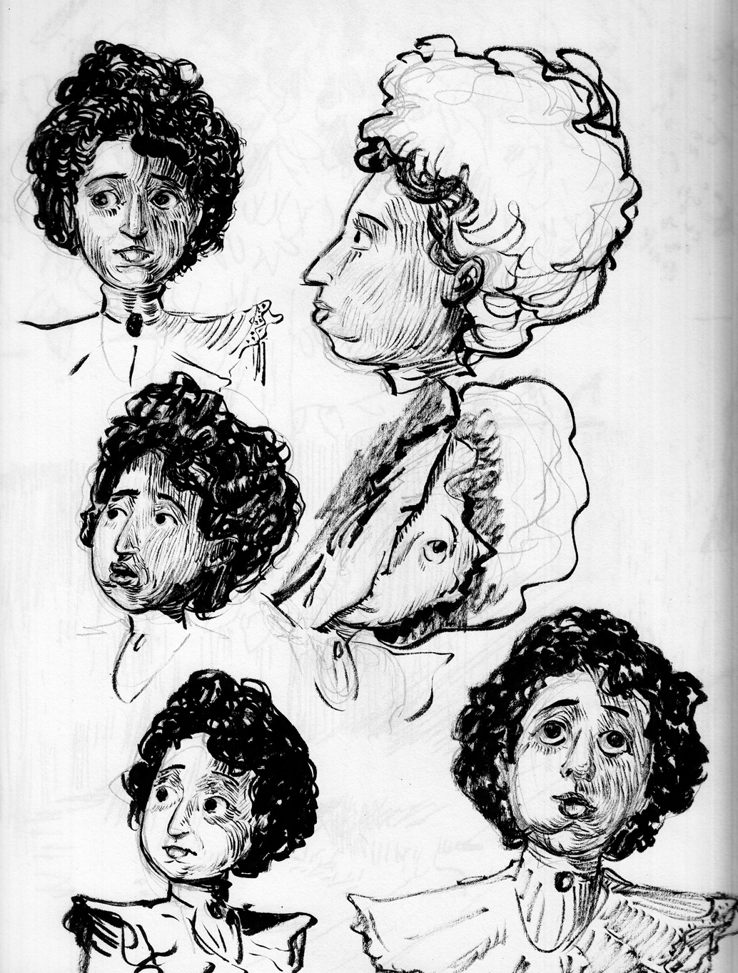 So I returned from a few days at the Cape with a nice set of sketches I can refer to for each page of the rest of the chapter.
May 25-29: Page 1 ink.Â
A real challenge for me in this first page (and for the entire chapter, actually), is that my style models — Gibson, Flagg, Booth, etc. — didn’t draw a lot of night exteriors, or a lot of landscapes with heavy foliage, so I’m on my own as far as what kind of shading and mark-making to use for all this dark foliage and sky backgrounds. Â The exception to this is Franklin Booth, with images like these: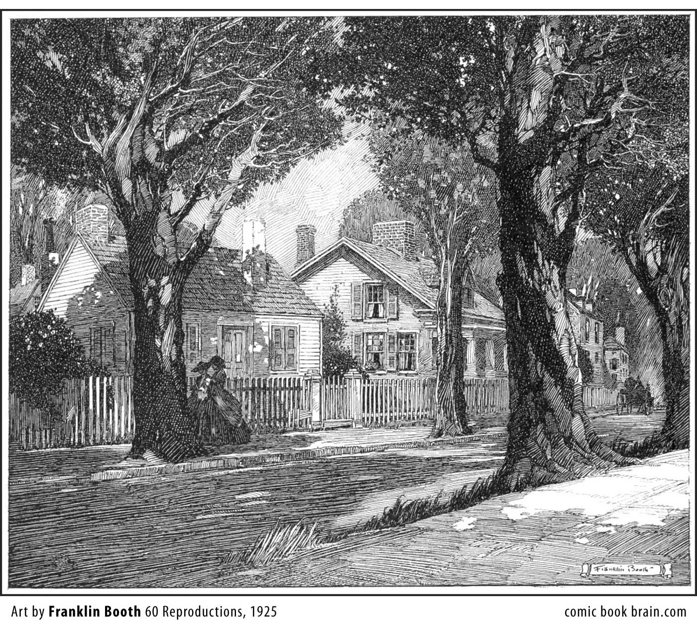
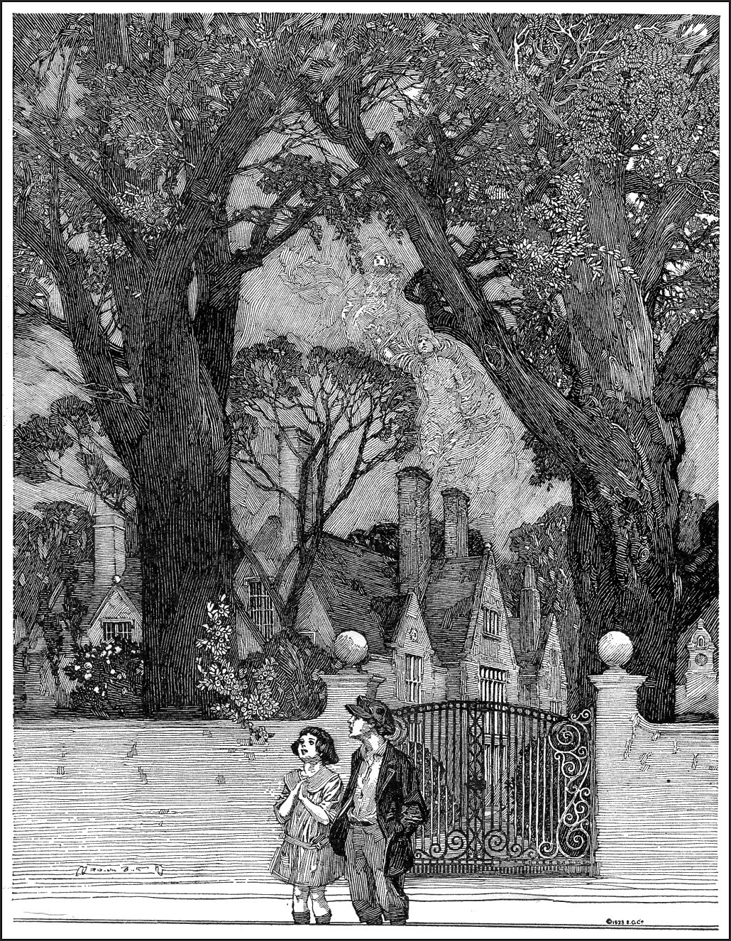
And especially this one:
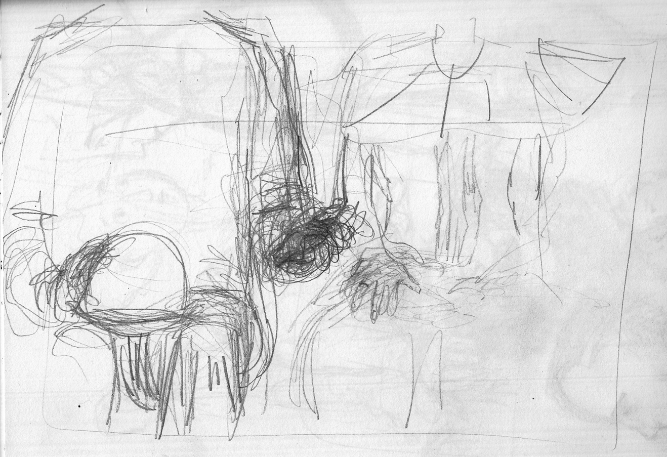
Since the real challenge is going to be how to handle the pen-and-ink shading in this complicated night scene, I start doing studies for the page in ink:
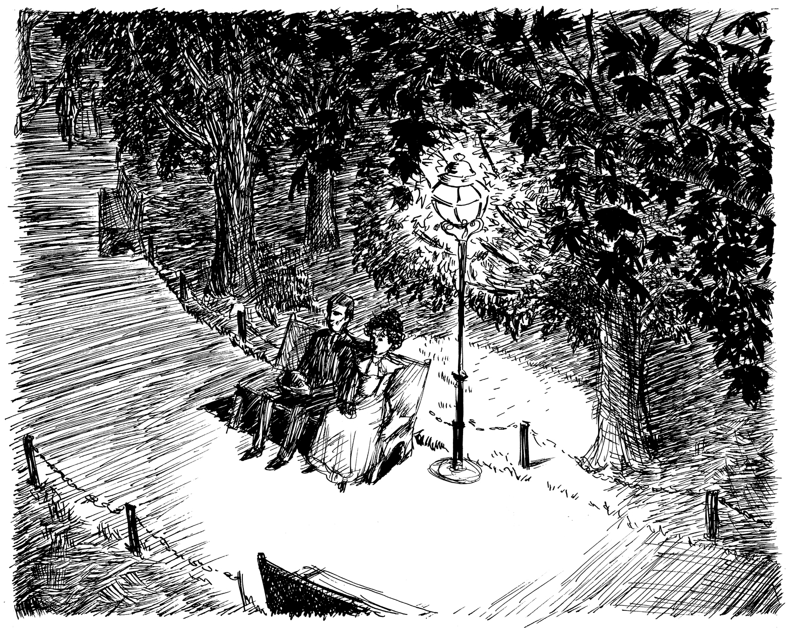
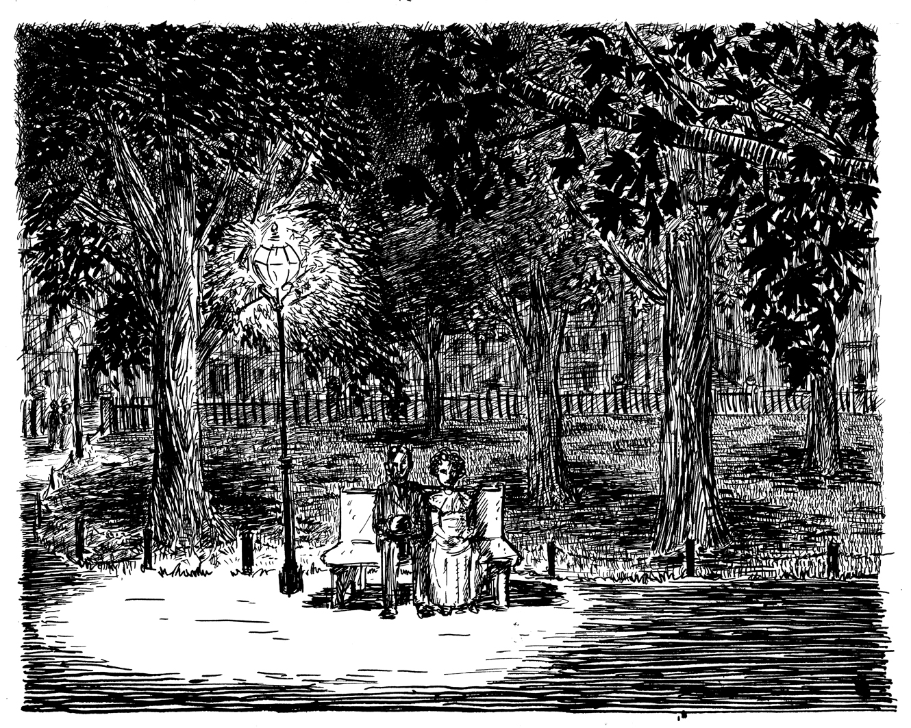
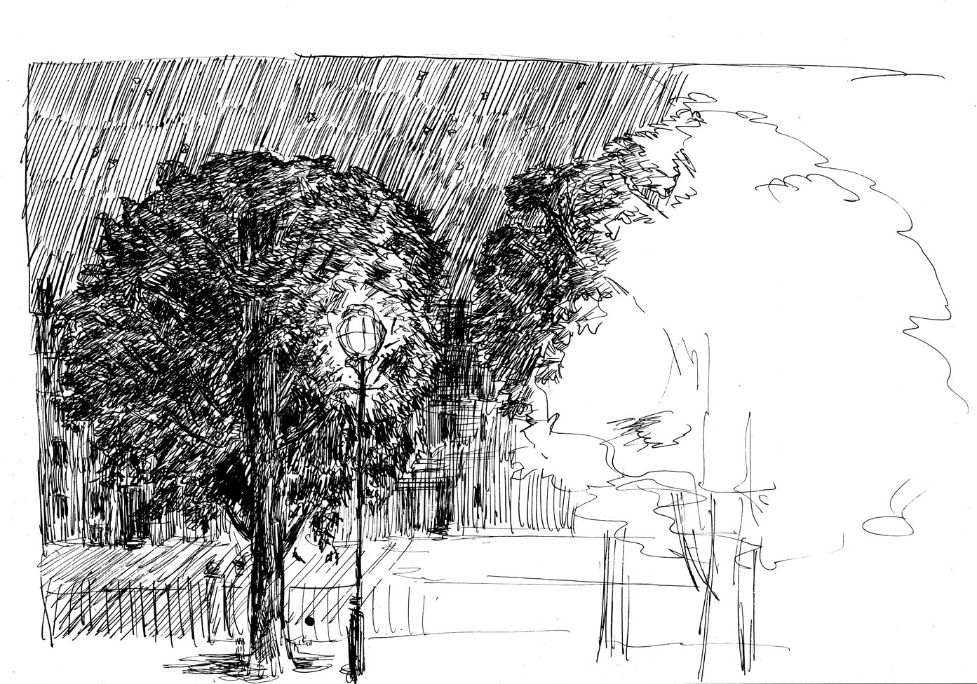
There’s just a lot of different things to shade/describe here using the ink: pavement, grass, leaves, trees… a lot of page to fill. Â Finally I decided to simplify the composition, make it more centered and head-on. Â I want it to be more like that third Franklin Booth, with the couple at eye level, the trees against the night sky. Â It’s not really that much less complicated, but at least, for instance, I’m not drawing grass from above, or trying to contrast the leaves against the grass. Â Everything is sort of on its own plane, which makes it easier to be methodical about assigning different types of marks to different elements. Â This is the final rough:
The horizontal stripes for the ground is a direct swipe from Booth, as is the approach to the tree-trunks. I still have made something of a jumble of the leaves against further-back leaves and an unclear delineation between leaves and night sky. Â But it’s close enough…. One more nervous energy sketch. mostly to figure out how to do the sky:
…and I move on to the final version….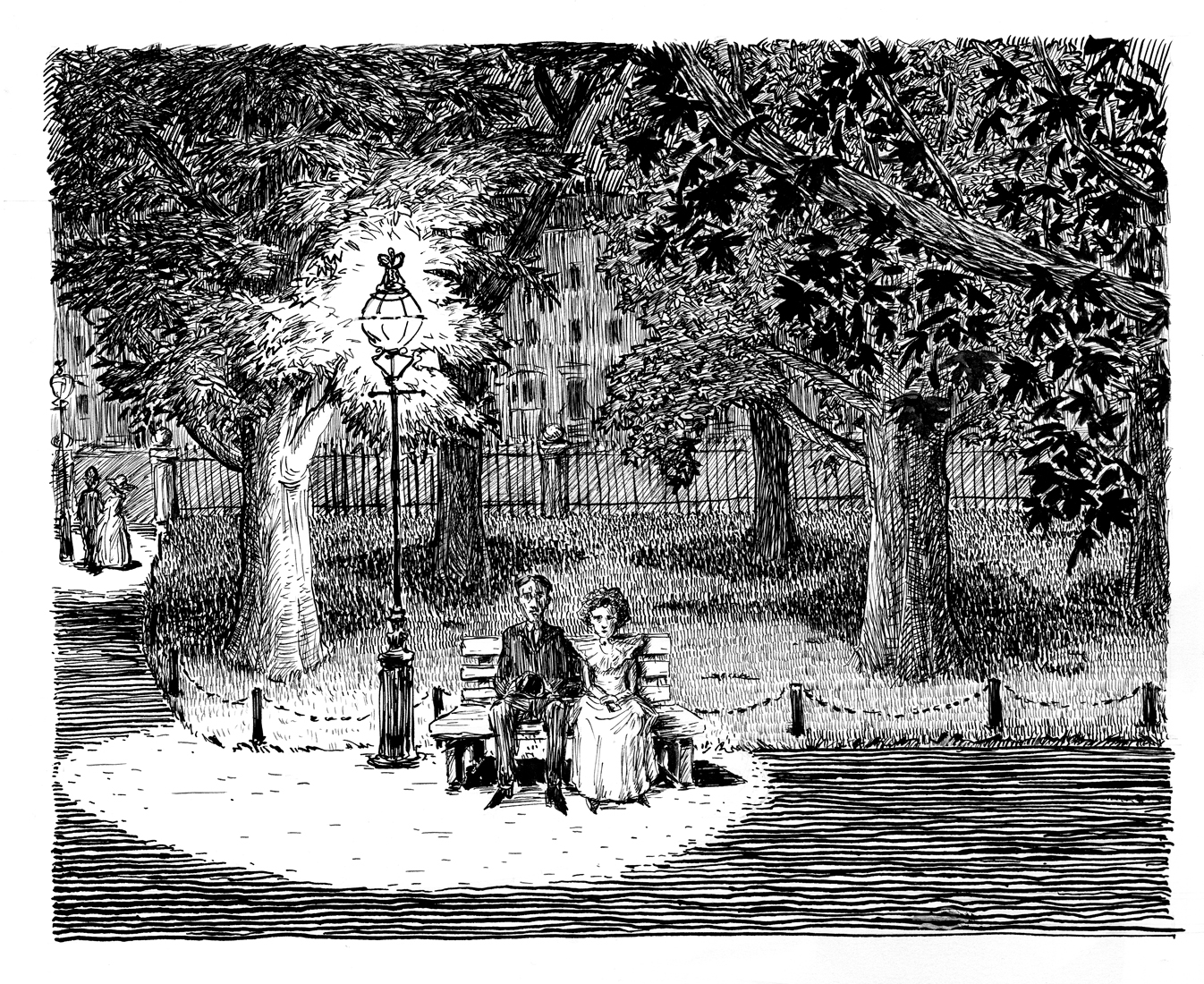
May 25-28 Page 1 pencil sketches
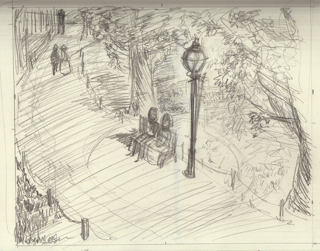
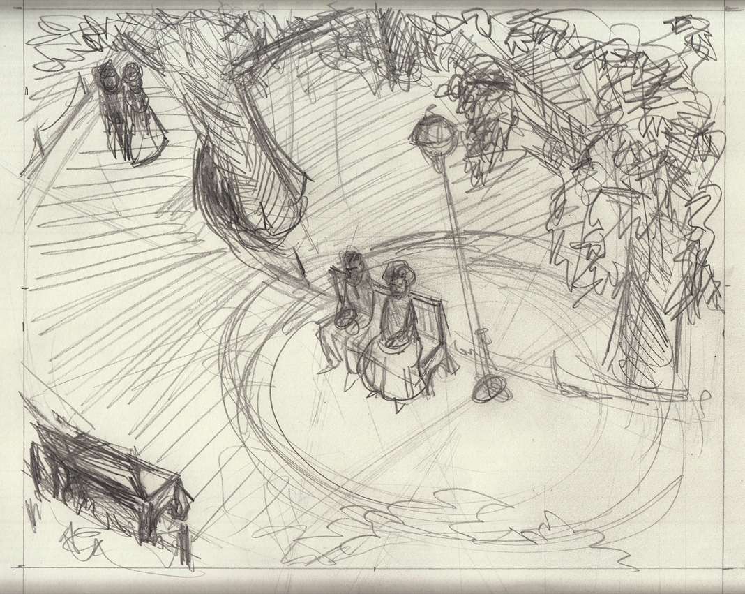
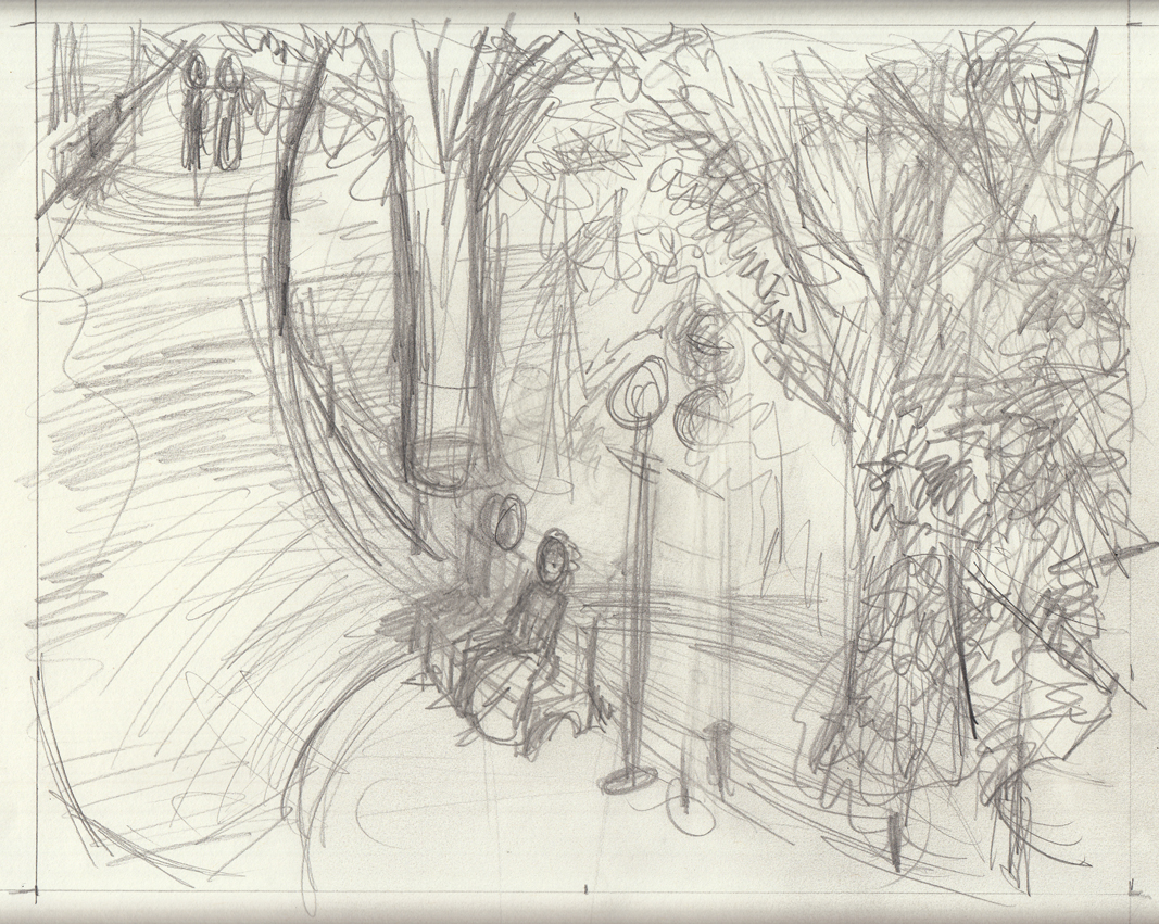
Not actually drawing the final page 1, yet. But at least getting serious about the sketches, and trying to nail the composition:
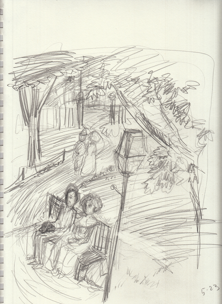
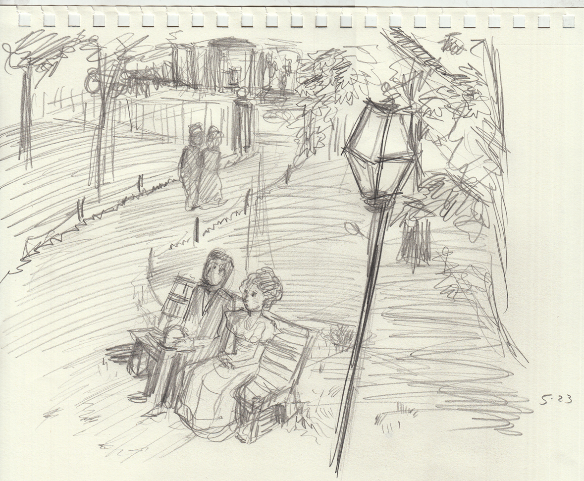
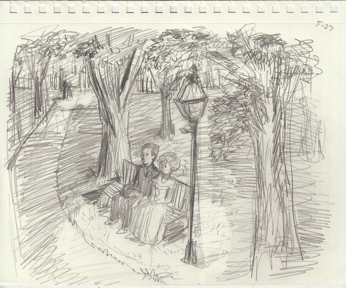

To be honest, I’m posting these studies quite a while after drawing them, and I can’t remember what it was that made me keep going over and over the composition with slight variations. It seems obsessive to me, but I know there was something I was trying to get!
May 23-25: Still sketching!
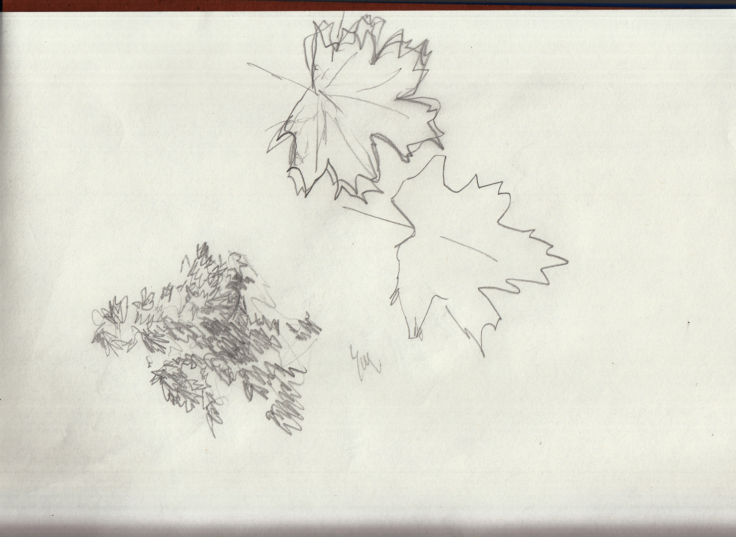
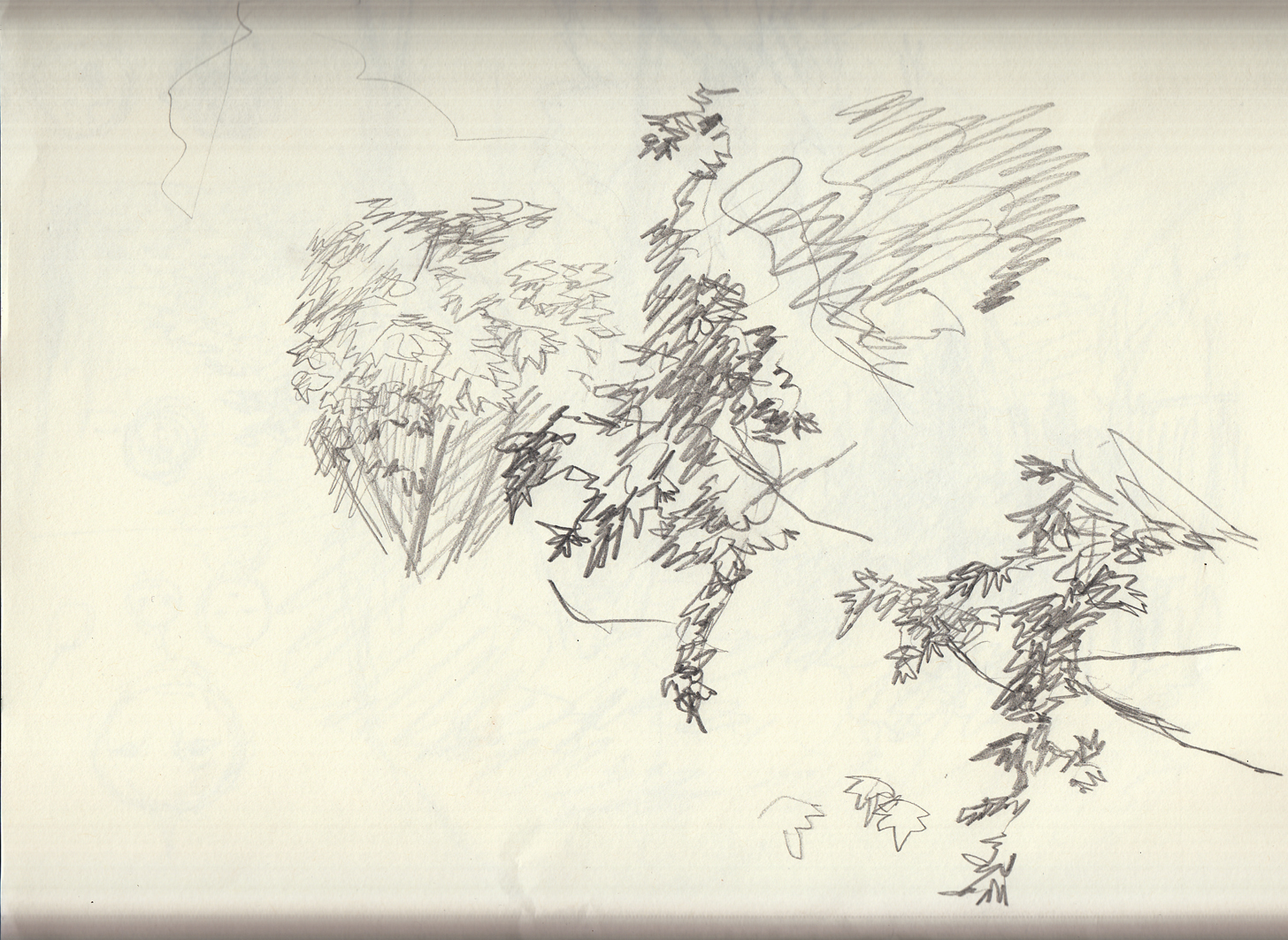
Tree studies (from life), lamp studies (from reference), character studies (from imagination), as I dance around actually starting to draw the first page:
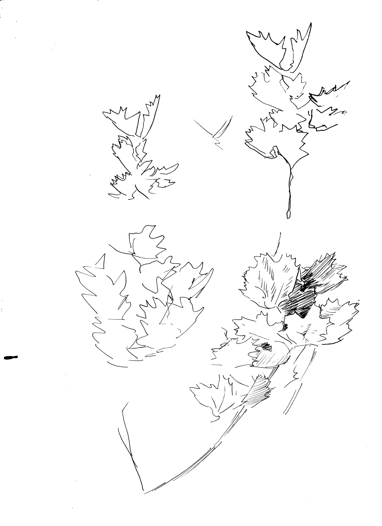
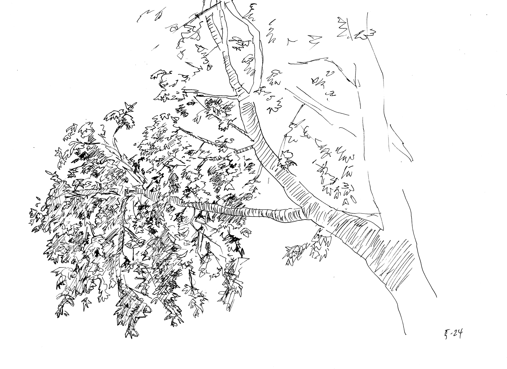
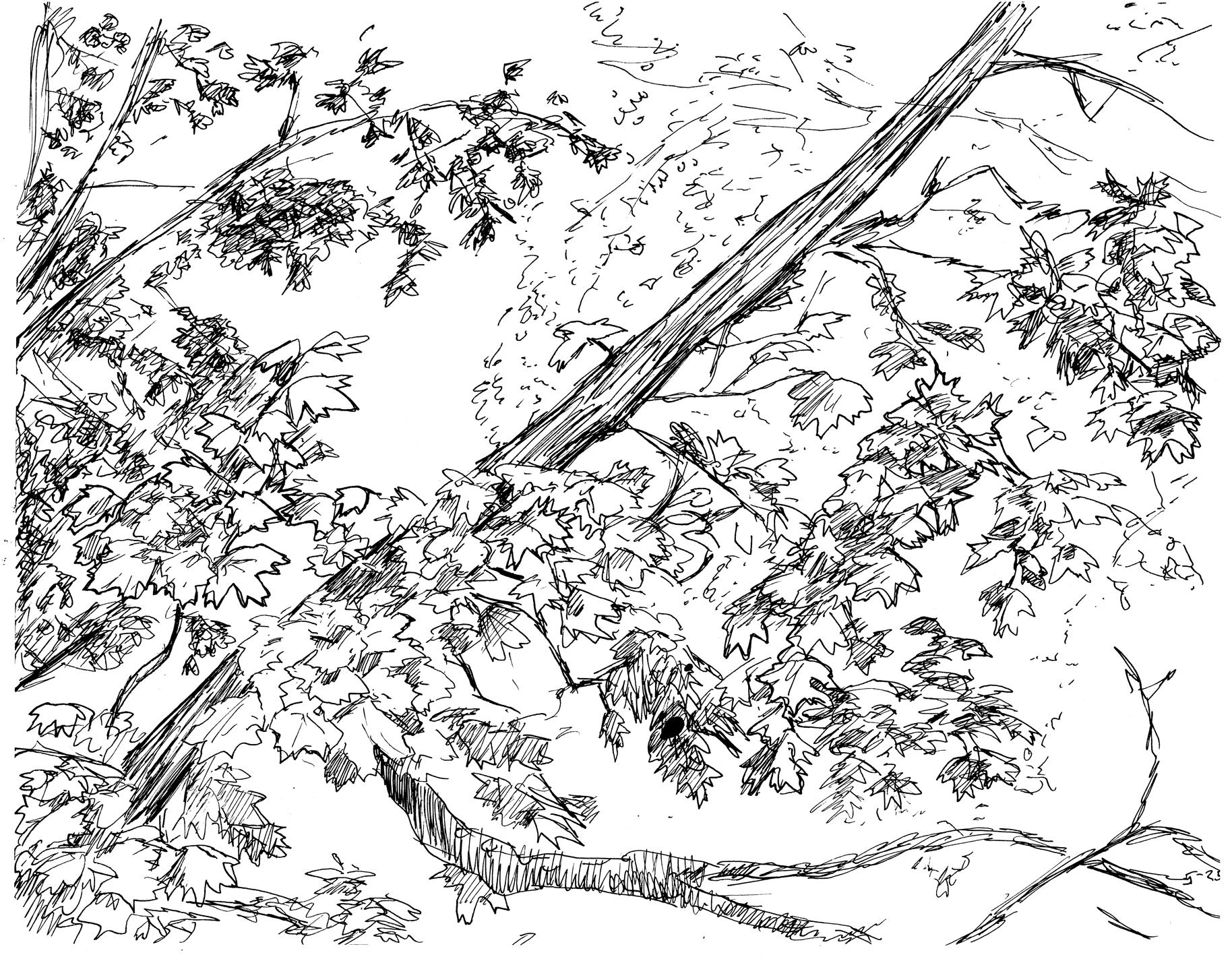
Foliage studies drawn from life with a Rotring art pen (EF tip).
(this last one is from an old photo)
May 17 – 22 Meanwhile….
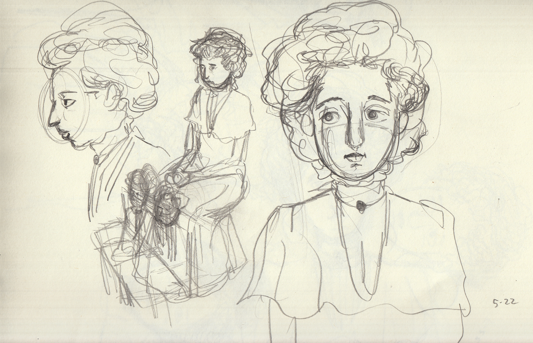
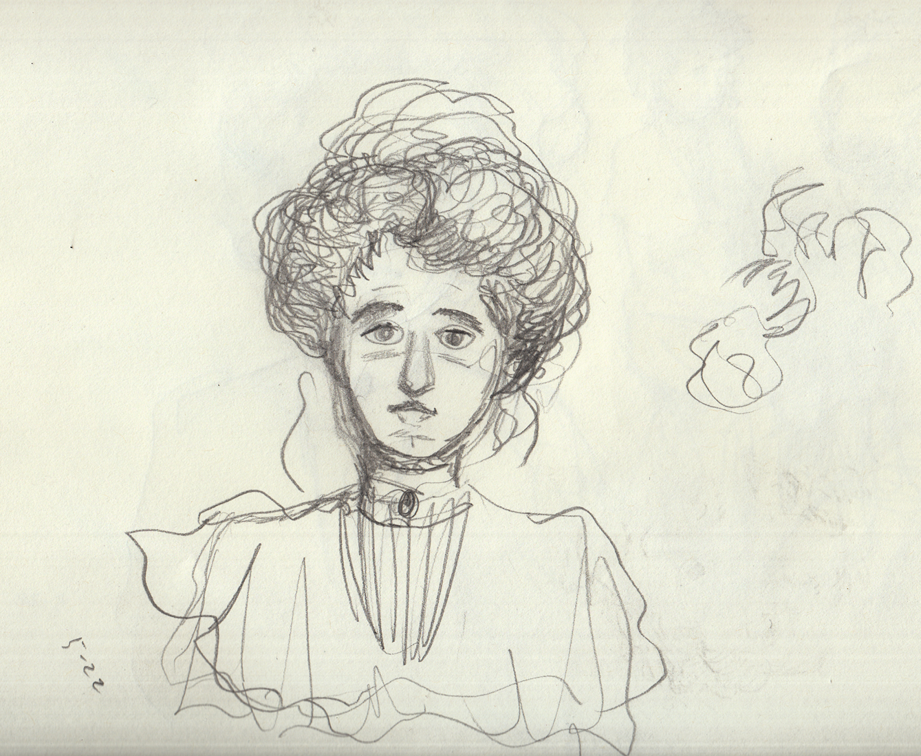
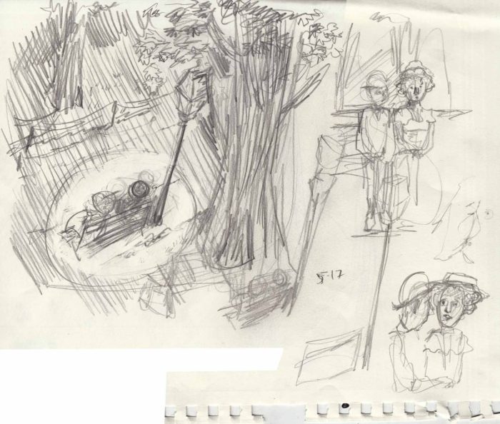
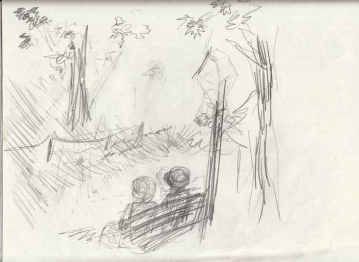
While copying from Gibson and Flagg, and drawing from old photos, I also did a few sketches, getting ready for whenever I actually get started drawing this chapter. Â Character sketches and studies for the first (and most challenging (I think) page). which will be an “establishing shot” of the young couple sitting under a gas lamp in a park at night.
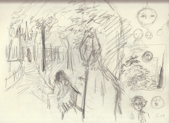
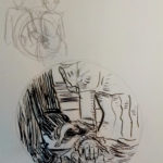
And also a sketch for page 7 (I think it’s going to be page 7), as I nervously or wisely make sure I have a handle on the gestures and actions upcoming. Â I like this sketch! Â Now I just have to worry about capturing it as well in the final version!
May 15-22: Learning from the masters (and trying to apply the lesson).
Now I went through about a week of drawing studies from Charles Dana Gibson, James Montgomery Flagg.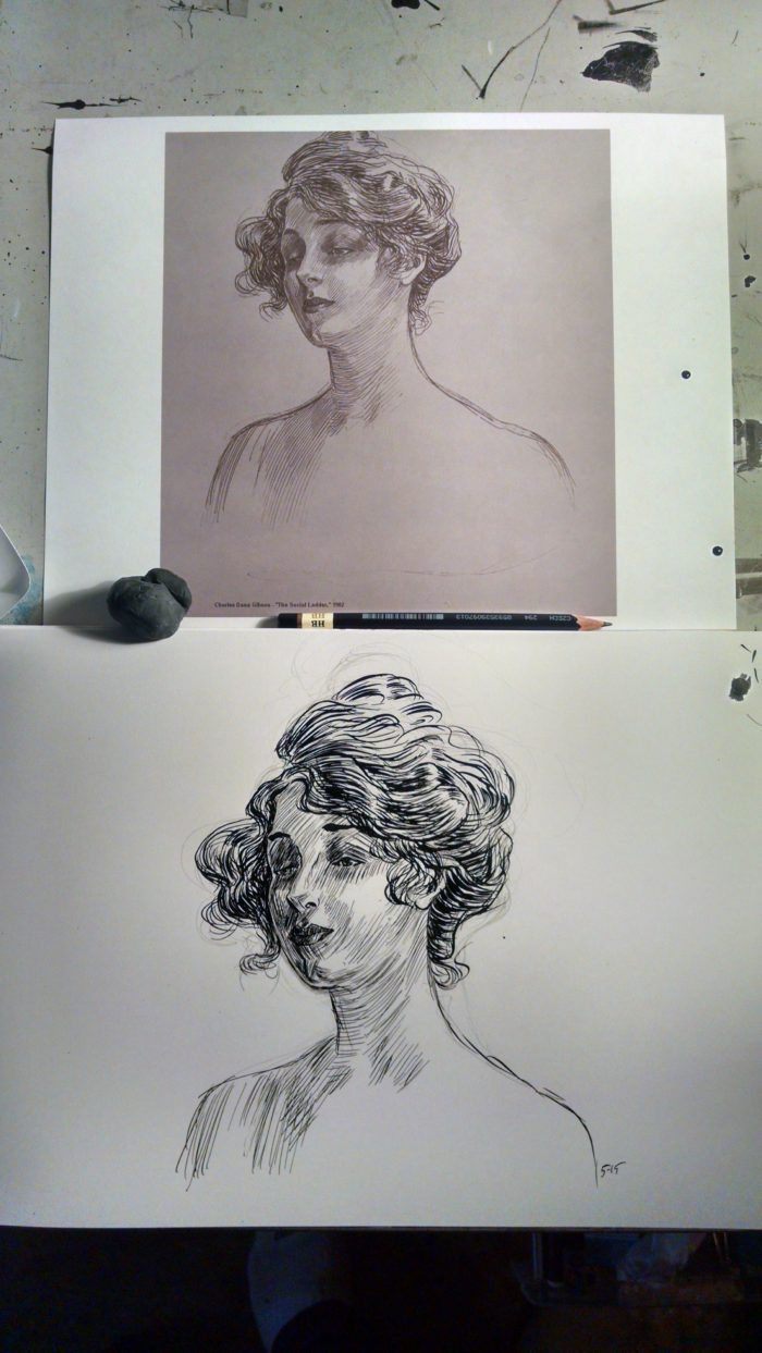
Copying like this, I realized how good they are, especially Gibson. Â The line work in his faces is so delicate and precise, never simply shading, they also describe the curves and planes of the face. Â It’s hard to use that many lines in a face, and not “age” the face, keep it glamorous and pretty.
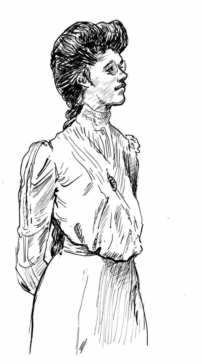
I felt pretty good about the line-work in my copy, but I really wanted to capture that period feel of the Gibson original. Â I didn’t think I had it. Â She looked more like Jane Fonda in the early 70s, than, say Mary Astor, who the orginal looks like to me. Â And so… obsession:Â 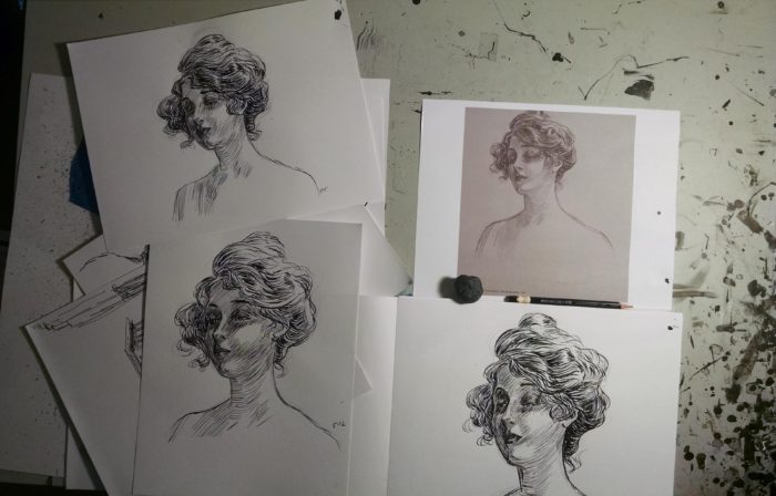
To be honest, I never felt like I really got the “look” of the character in the original. Â But, that’s not REALLY the purpose of this style exercise. Â I moved on to other studies: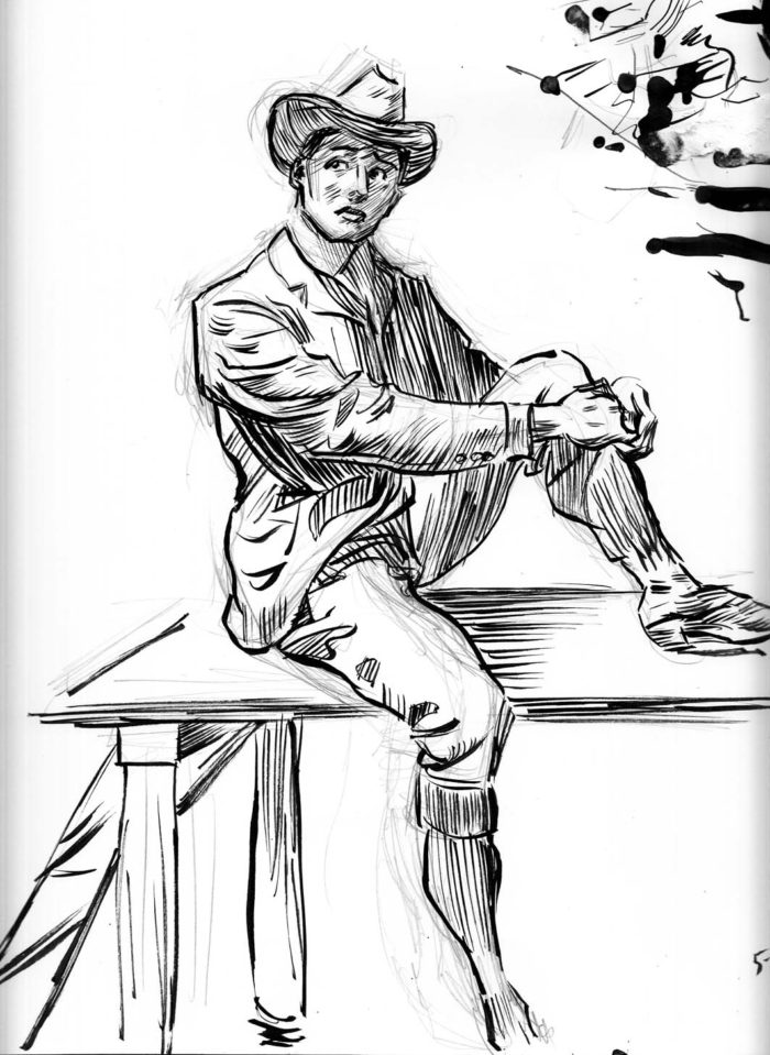
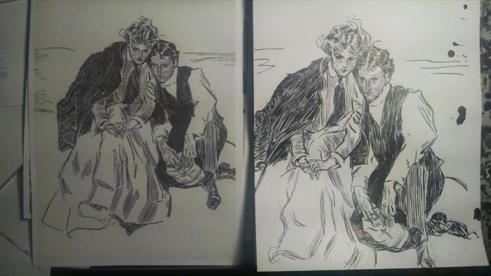
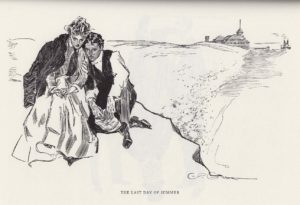
I love this one by Gibson, it’s called, “The Last Day of Summer,” (the original is on the left) and the expressions and poses of the two characters are wonderful. Â I definitely didn’t quite capture it: the haunted look on the faces… the way you can feel them pressing against each other, his cheek on her shoulder, her head leaning on his, as they contemplate the end of their summer tryst. Â But… still… i learned something in the effort.
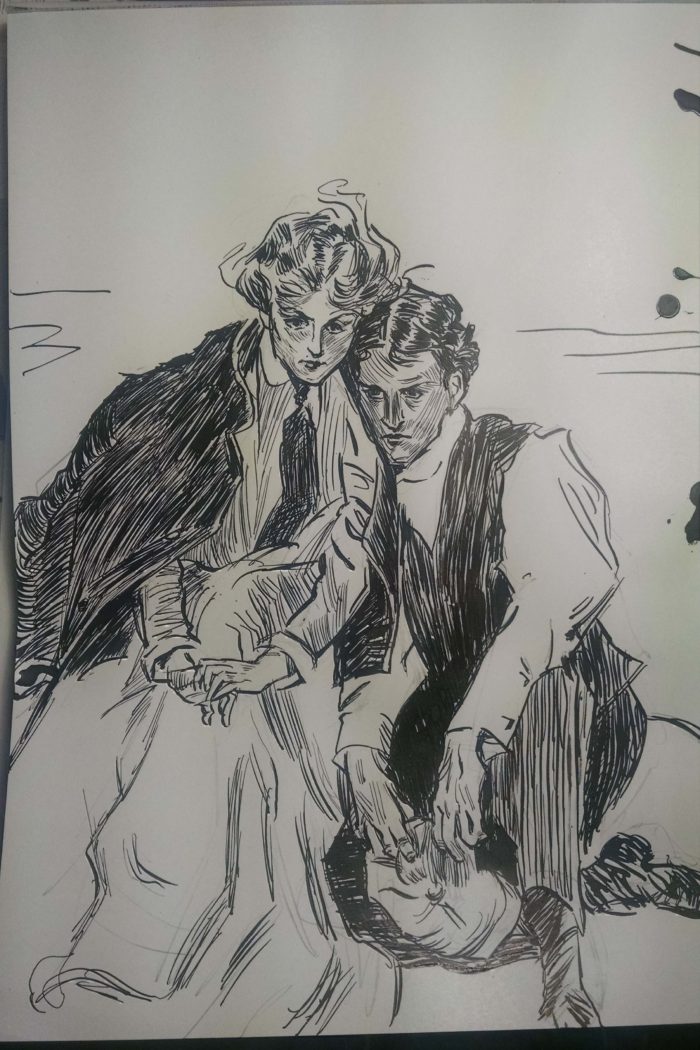
I moved on to another model, this one by James Montgomery Flagg. Â Not quite as exquisite a draughtsman as Gibson, but damned close. Â 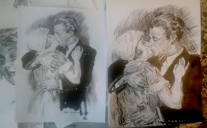
And I was equally obsessed with “getting it right”: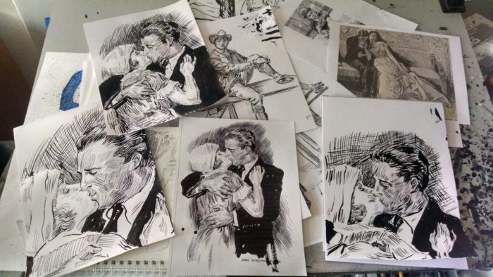
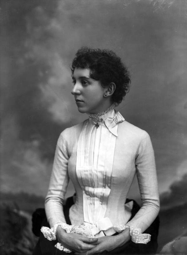
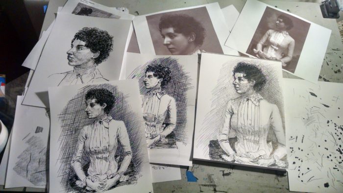
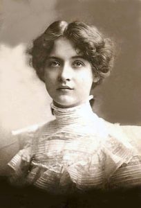
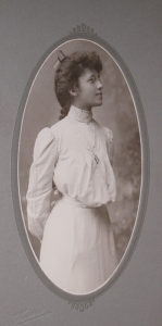
I then decided to apply whatever I had absorbed from Gibson & Flagg, to more work from old photos. Â I chose this one:
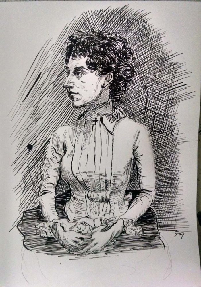
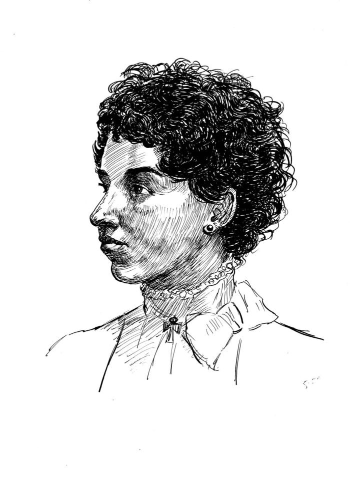
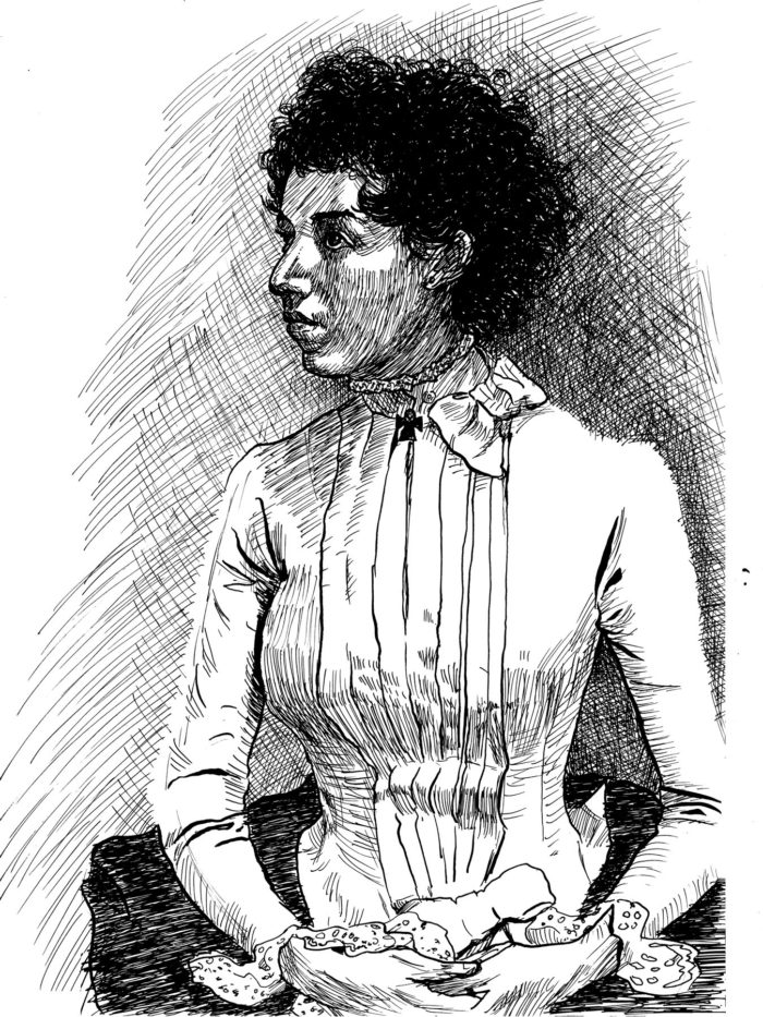
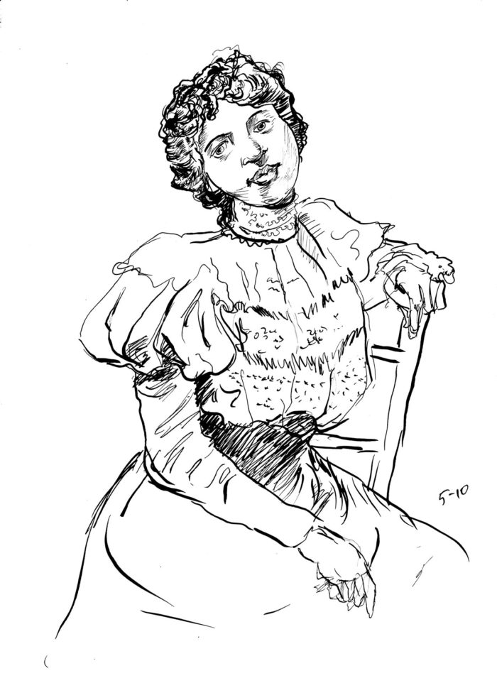
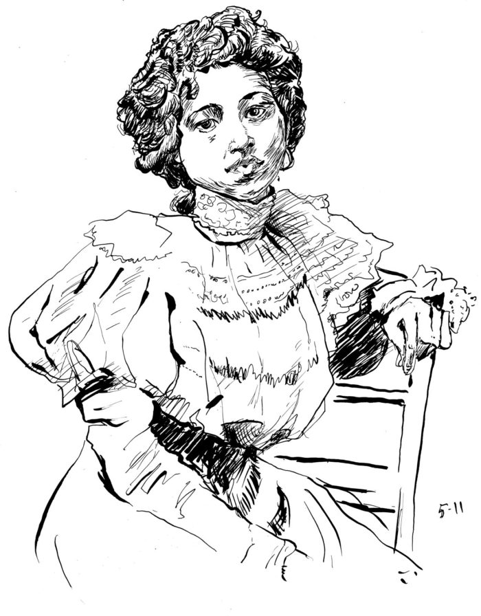
She doesn’t really look like how I picture the character in “Lunatic,” but she has an interesting face, and also curly hair — and short hair, which is pretty unusual for the period. Â Anyway… I spent a long time drawing from this photo, trying over and over again to get a likeness, capture the expression:
Awful.  Head is out of proportion to body and bad likeness.  I’m happy enough with the figure/costume, and the background cross-hatching… but definitely more work needed!
Second try. Â I was making an effort to shade the face with lots of lines, like Gibson/Flagg do. Â Better, but I still don’t like the head/face: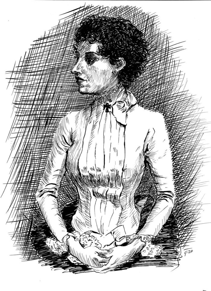
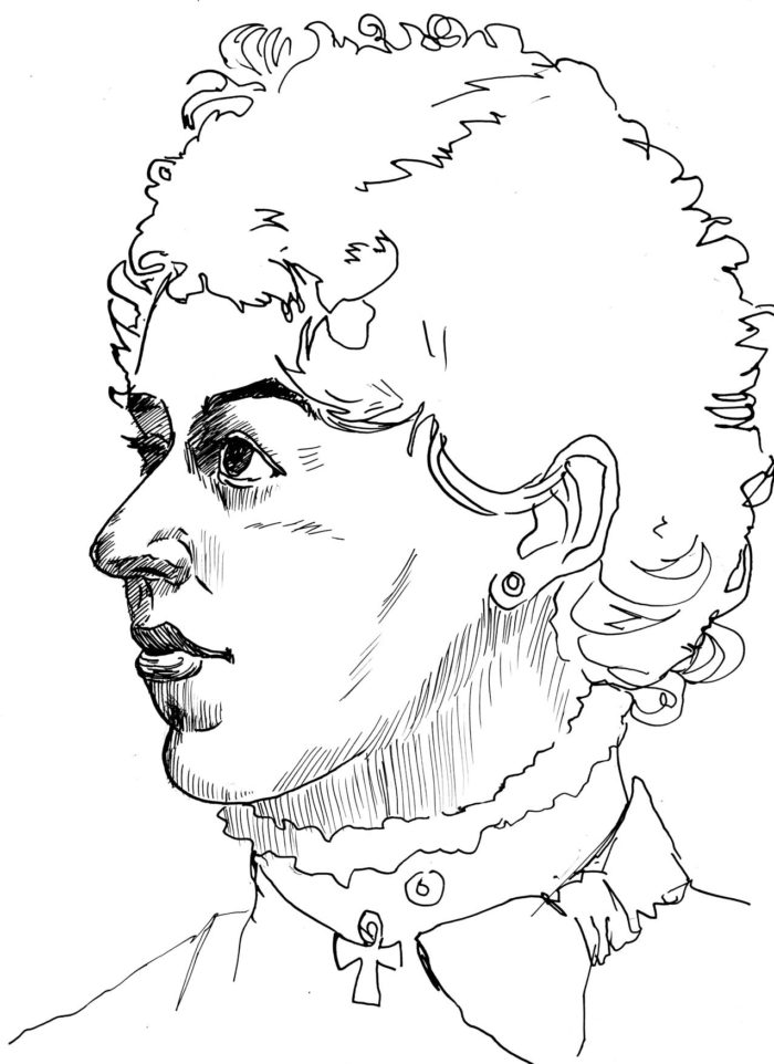
I decided to try a “close-up.” Â First an abortive attempt:
Then one I was finally happy with.
Still not much of a likeness, but my favorite drawing so far in this effort. Â Now, to “put it all together:”
Still not the likeness I had hoped for. Â But I think I’ve probably done enough from this picture.
May 10-12. Â Still warming up, drawings from old photos.
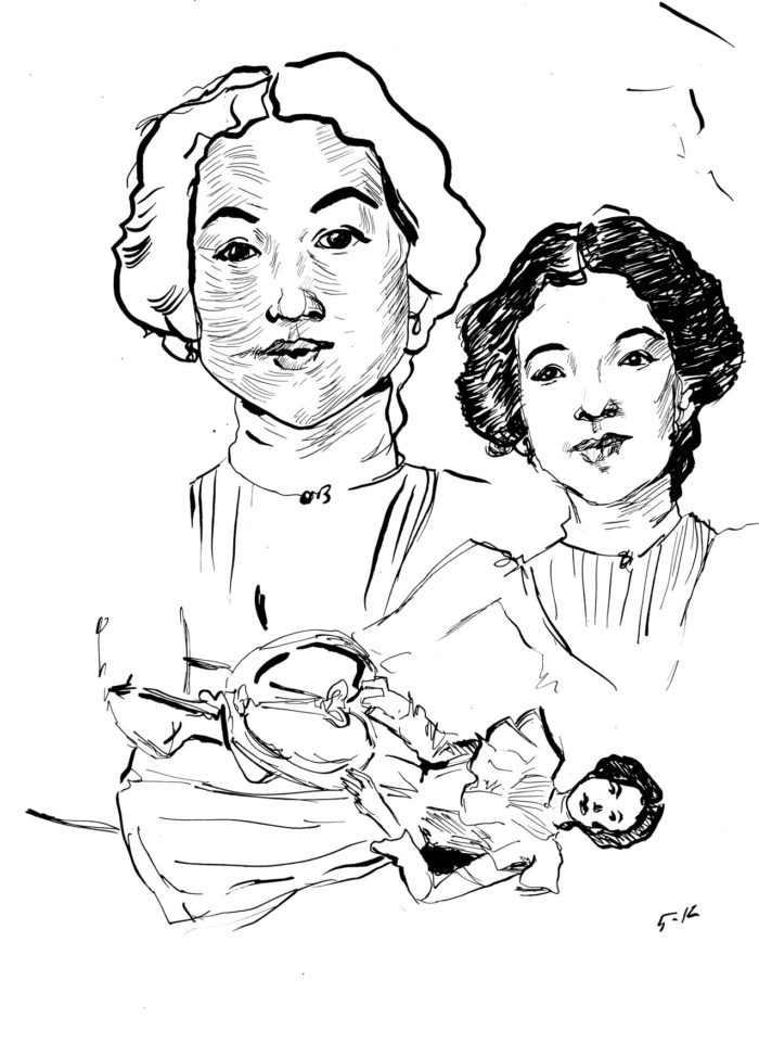
I’m not sure why I was working so slowly (it’s a couple weeks later, now). Â I might have had some good reason, but I was probably just procrastinating.
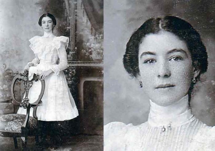
Anyway, I worked from this photo: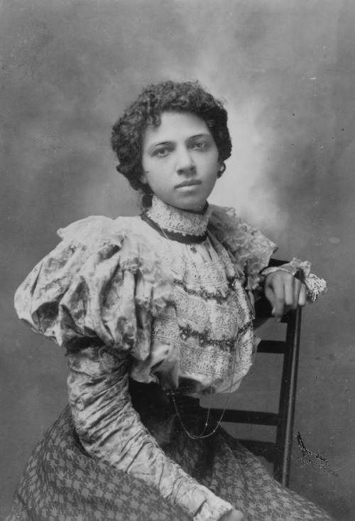
May 8. Getting started: thumbnails and some old photo studies
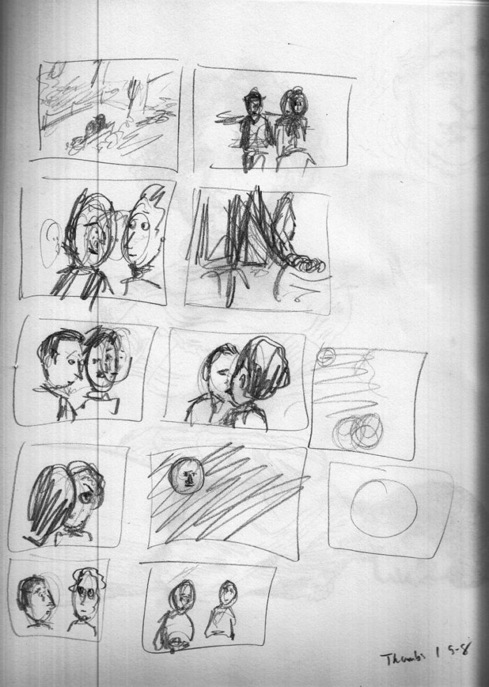
Getting down to work on the actual chapter. Starting with thumbnails. Â This is a shorter chapter, with a quicker pace than the last one. It takes place on a park bench, on a summer’s evening…
Very rough thumbnails, but they will do.
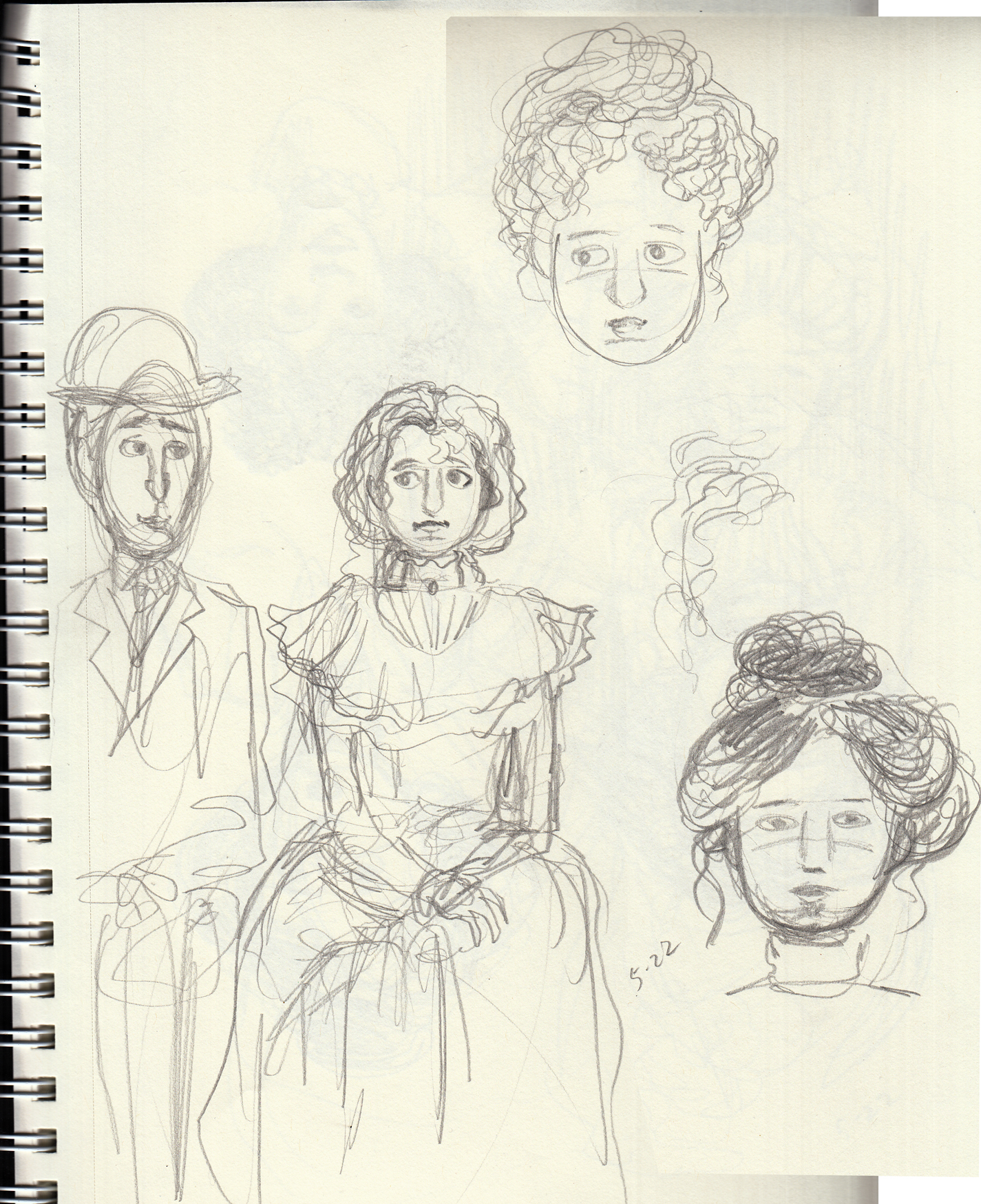
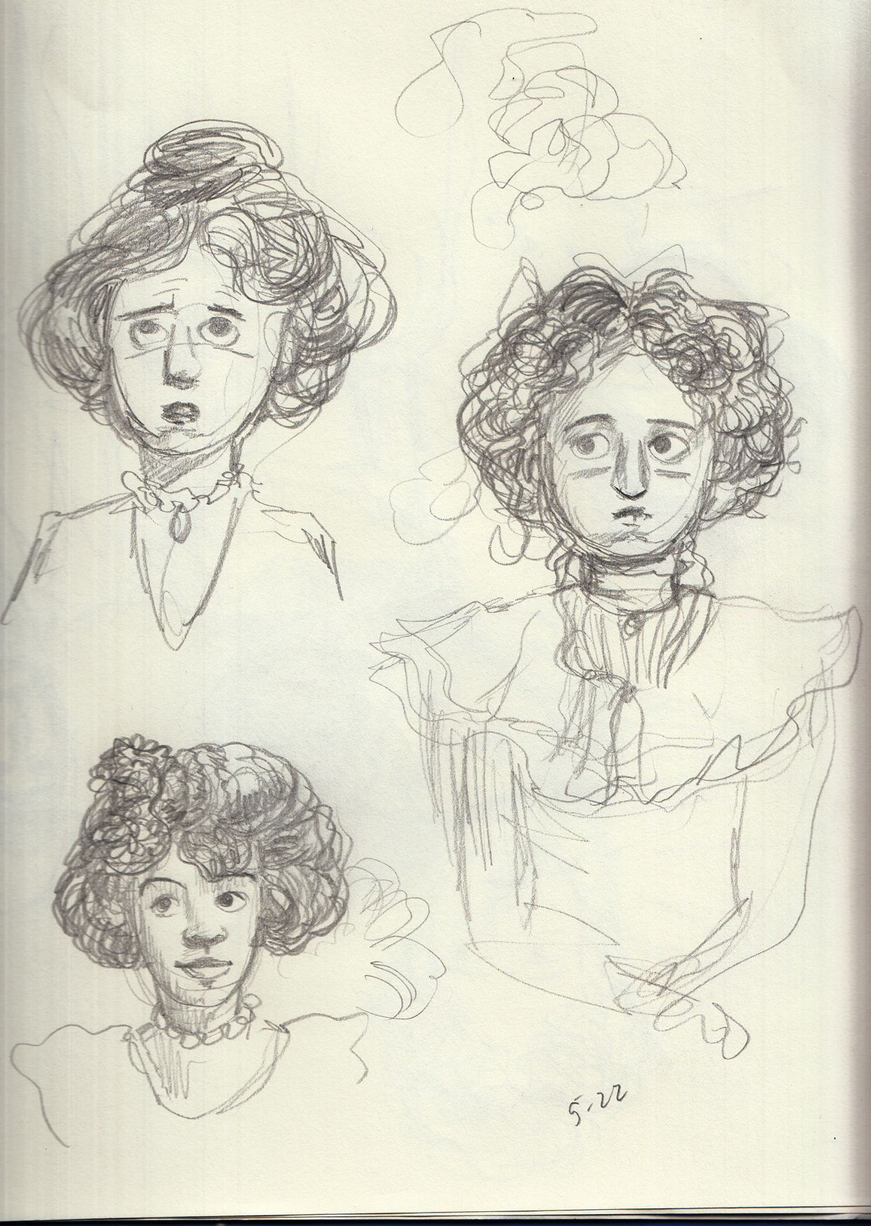
Next, I will grapple with the stylistic challenge of trying to emulate Gibson, Booth, et al. Â And also, start to figure out the character’s appearance as a young woman, hair style and costume, as well as her face. Â To get into this, I start doing some sketches from old photos of Victorian young women. Â Not looking for specific models for her appearance, just general period style and look: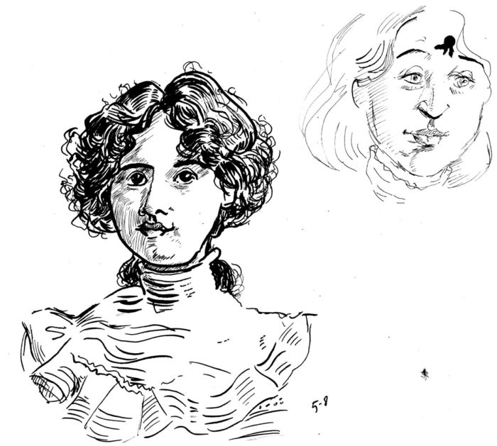
Here are the photos I was working from:
Prelude: inspiration and stylistic research.
I’m changing styles and/or media for each chapter of the book. Each chapter of the book corresponds to a different period in the character’s life, so hopefully the technique and style employed will resonate with the mood I want for that period.
For chapter 3, I decided to switch to pen and ink, and to let inspiration come from the classic illustrators of the turn-of-the-century, or early 20th century, especially Charles Dana Gibson and James Montgomery Flagg. The heroine of the story is a young woman now, probably late teens, and the chapter depicts a romantic encounter, so it seems that Gibson, whose cartoons and illustrations were largely about romantic relations among young couples in that period, would be appropriate. Taking into account that Gibson depicted an idealized version of young late-Victorians, I don’t mind that, because it has an ironic application here.
Of course it’s no easy target to try to emulate Gibson, Flagg and others of that ilk. I don’t intend to copy any style, exactly, but to have the “feel” of the illustrations of the period, as shorthand for the feel of the period itself.
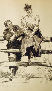
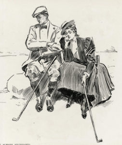
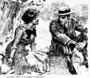
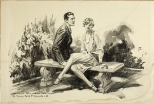
Anyway, I began to collect images from the internet by the artists I wanted to look at. I pulled hundreds of images, here are a few:
Charles Dana Gibson:
James Montgomery Flagg:
Those are the main two, but I collected images from some of the other good illustrators of the period (and a little later).
Franklin Booth:
