Comics I Made, Comics I'm Working On, Comics I Like, etc.
Author:Dan
Lives in: Cambridge, Mass.
Does: comics.
Used to live in: Topanga Canyon, California
But grew up in: Cambridge, mostly
Used to do (maybe still?): Screenwriter, journalist, teaches some too
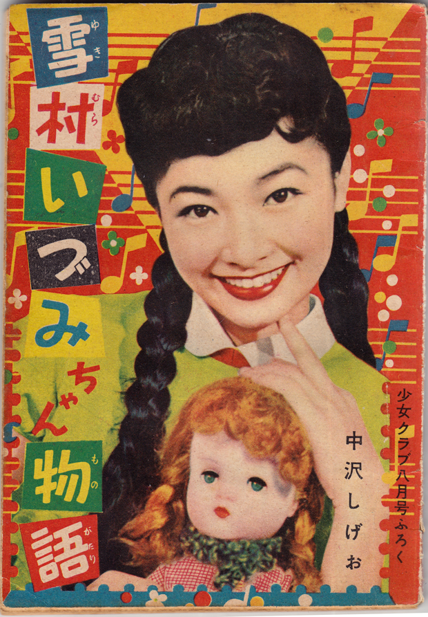
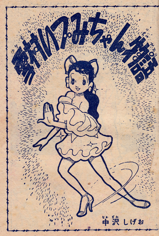
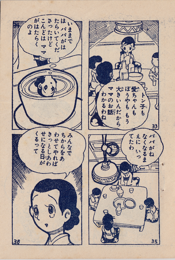
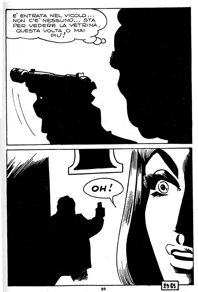
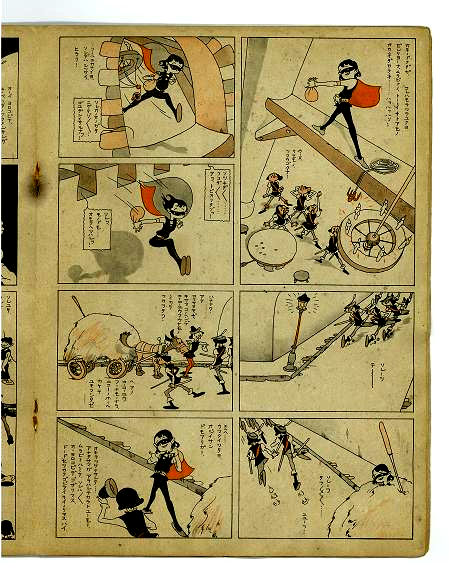
I continue my sporadic exploration of old shoujo manga through obscure (to me, anyway) books obtained through Yahoo Japan auctions.  I got my hands on this ShÅjo Club “supplement” from 1956.  It’s a tiny paperback (4′ by 6″), poorly stapled (I basically had to pull the thing apart to get usable scans, which I hate to do).  That contains a single long story, Yukimura izumi chan monogatari  (Yukimura Izumi’s Story).
The artist is Nakazawa Shigeo (ä¸æ²¢ã—ã’ãŠ).  I assume artist-writer, since there’s only one name credited.  I don’t know anything about him, but there is some quite nice work here, with that introspective shÅjo mood (see my previous post).
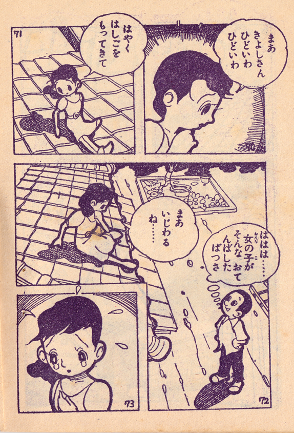
I like the heavy line around the characters, and the nicely detailed settings, with various textures. Â Also, I would say it’s a pretty sophisticated use of “camera angles,” for a kids’ comic from the mid-50s.
Also, notice that they were still numbering the individual panels at this point.
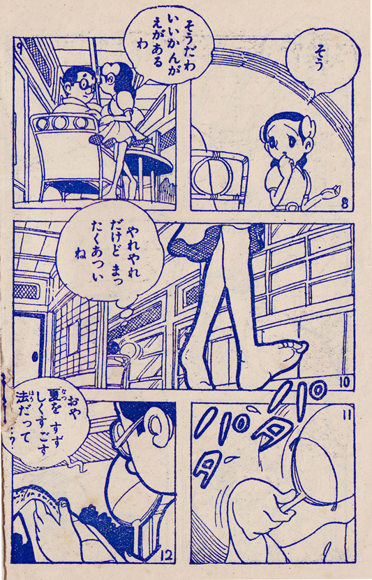
And I love the panel with Izumi’s reflection in the teacup as she’s thinking!
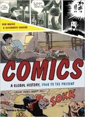
Coming in June from publisher Thames and Hudson, “Comics: A Global History, 1968 to the Present,” written by Alexander Danner and me.   Here are some excerpts and expanded material, including some great images that couldn’t fit in the book.Text in italics is directly from the book.
The decision to start the book in 1968, to define it as a sort of “comics come of age” narrative, sprung from the idea of “watershed” events like the appearance of Zap in the U.S., of Tsuge’s Nejishiki (Screw Style) in Japan, and, in Europe, and the changes seen in the pages of Pilote all taking place in that same year. In all these cases, of course, the breakthroughs of ’68 had been brewing throughout the earlier years of the decade. Â As it says in the introduction…
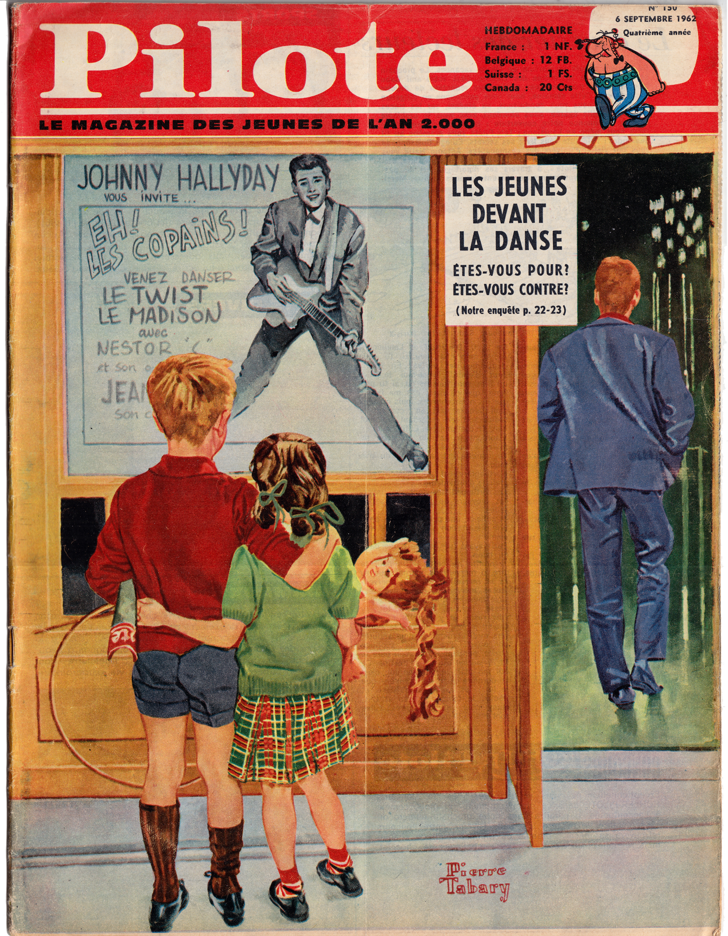
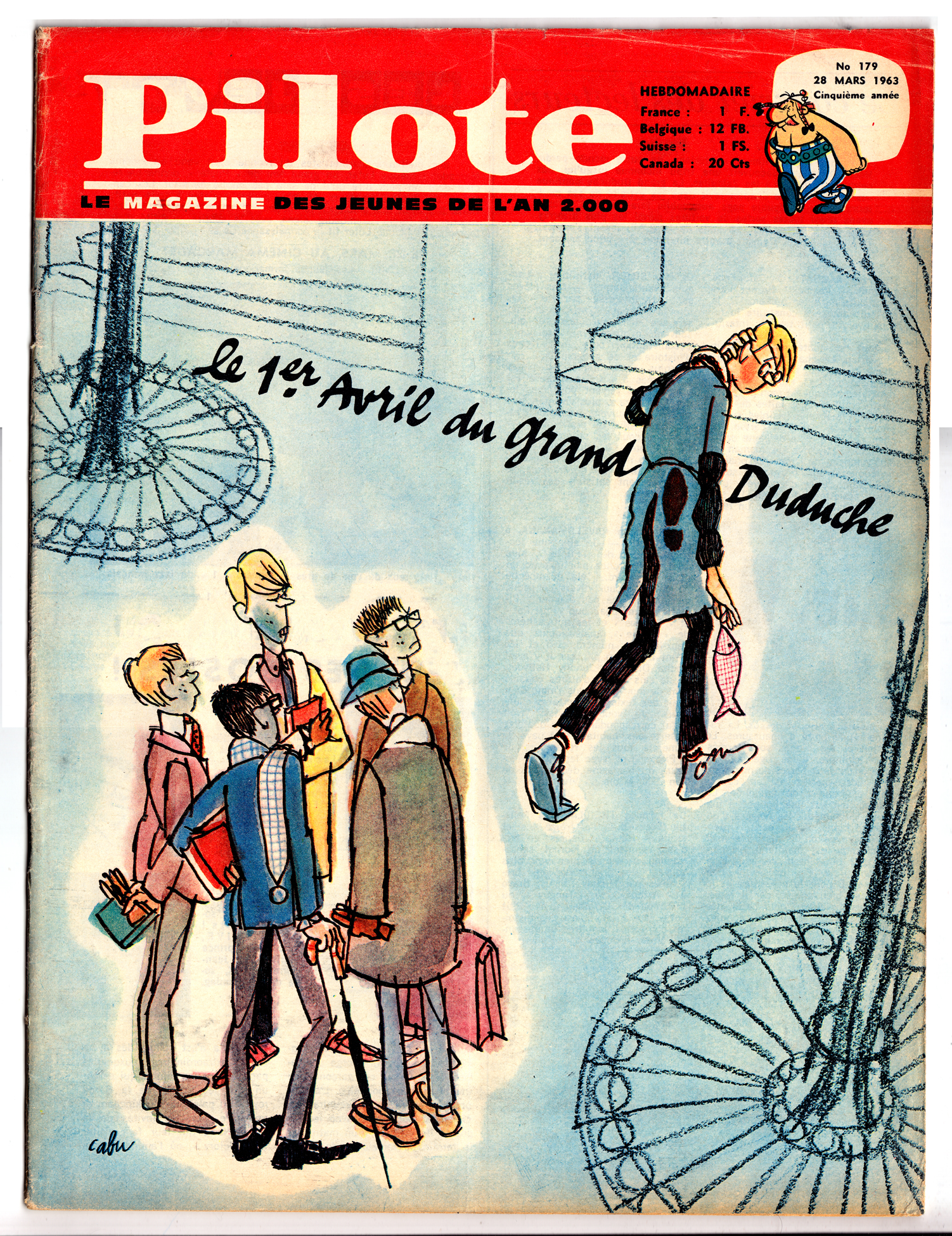
This Norman Rockwell hommage (or is it a parody) encapsulates the position of the early Pilote perfectly: still depicted in a classical mode, young French children gazing at the (mildly) rebellious future as symbolized by French rock star Johnny Hallyday.Cabu – cover, Pilote 179, 1963. Cabu’s insouciant teenage character “Le Grand Duduche,” is another indicator of Pilote’s trajectory toward youth culture and unconventional graphic styles.
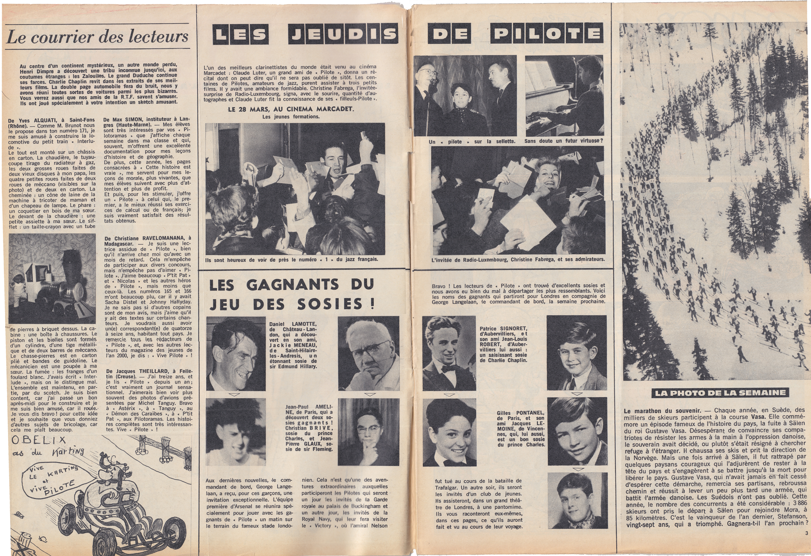
In its first few years, Pilote’s content was only subtly different from that of  Spirou and Tintin.  Though the tone was perhaps a bit breezier, Pilote, like its Belgian elders, featured articles on current events, sports, pop culture and exotic cultures.
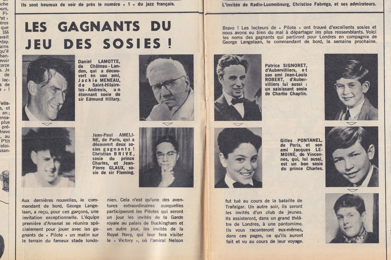
From March 1963, “Les Jeudis de Pilote,” a feature that included letters to the editor, articles on sports and pop music, and a contest for readers to send in photos of friends who were “sosies” (lookalikes) for celebrities like Sir Edmund Hillary, Charlie Chaplin, Ian Fleming or the Prince of Wales (below)
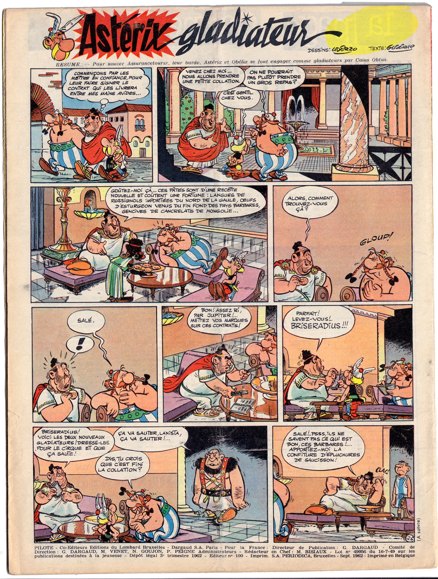
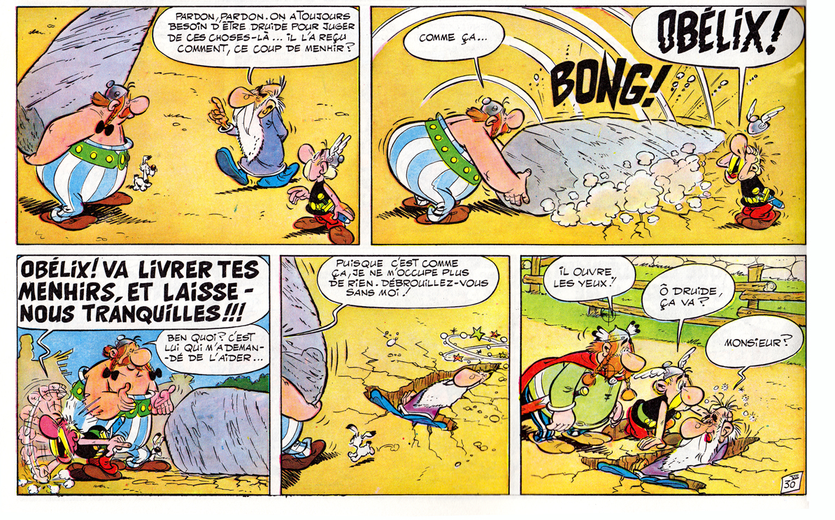
What soon set Pilote apart, and what set it on course to surpass its Belgian rivals, was the strip by founders Goscinny and Uderzo. Â Like any other strip in the journal, Asterix was serialized one page per week:
Goscinny & Uderzo, Asterix, September 1962
Asterix’ combination of slapstick comedy and anachronistic satire were two of the elements that made it a sensation:
Goscinny & Uderzo, Asterix et le combat des chefs, 1964Giscinny & Uderzo – Asterix chez les Bretons, 1965
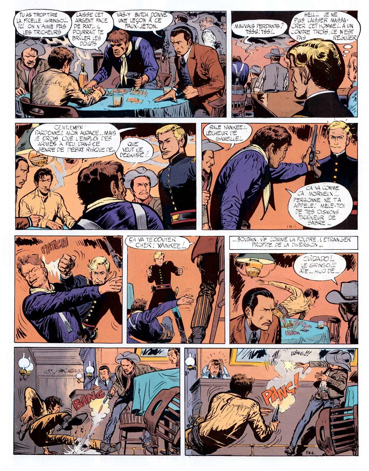
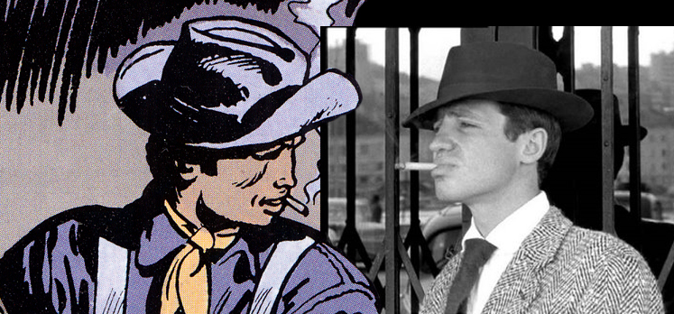
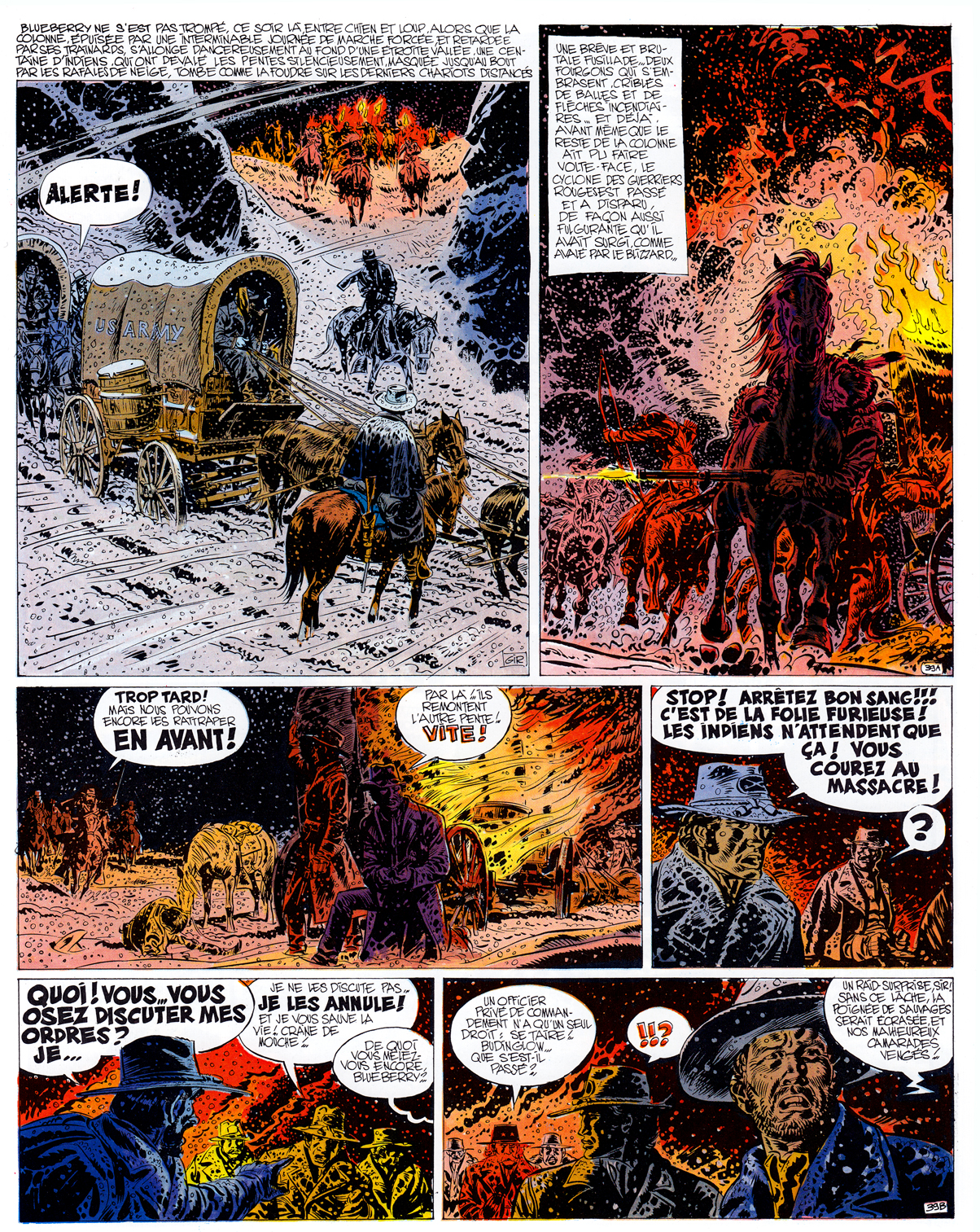
The second pillar of Pilote’s success came in 1965 with Lieutenant Blueberry, written by Charlier and drawn by newcomer Jean Giraud.  In its early years, Giraud’s art for Blueberry was often stiff and undistinguished when compared with other Franco-Belgian westerns:
Giraud & Charlier, Fort Navajo 1965; page four of the first Blueberry story.Fronval , “Jeff Stevens” from Pilote, 1962
From the start however, Charlier and Giraud brought a refreshing, contemporary rebelliousness to the protagonist of their strip, a quality reinforced by Giraud’s depiction of Blueberry as a sosie for New Wave film star Jean-Paul Belmondo.
Within a few years, though, Giraud’s style would progress astonishingly, just one of the many major developments that Pilote would undergo during the eventful late ’60s-early ’70s period.
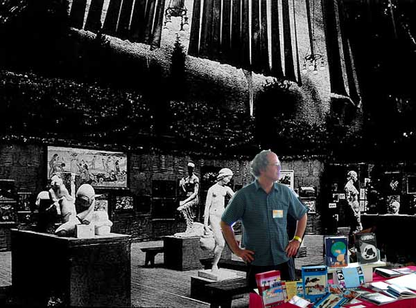
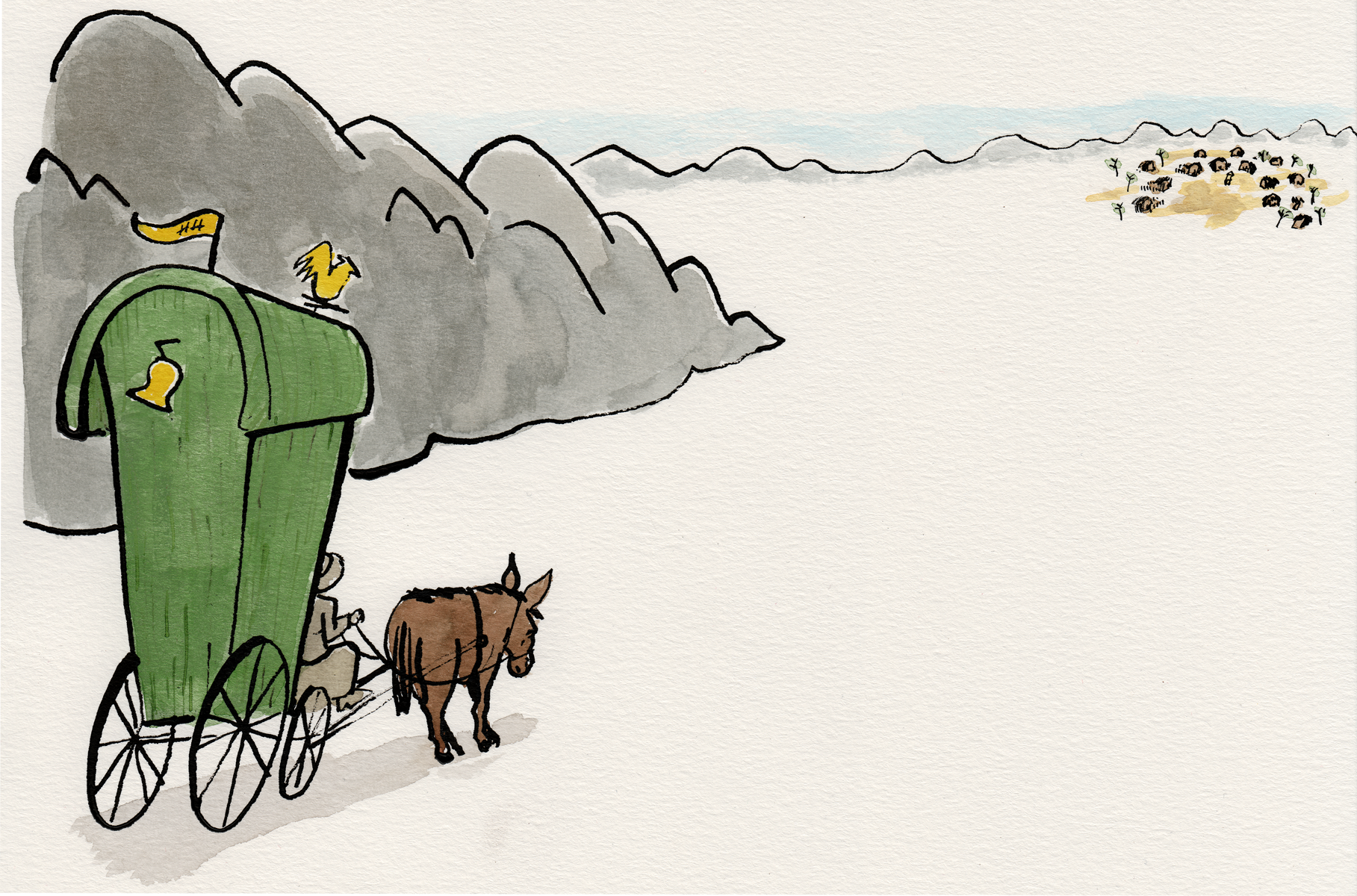
The 1913 Armory Show — take it from me, that was a great show! If you missed us there, we’ll be back for MoCCA 2014!
(For bonus points: how many cartoonists can you name who really exhibited in the 1913 Armory Show? Â There were at least 6!)
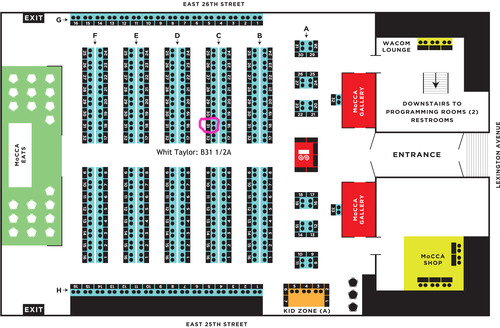
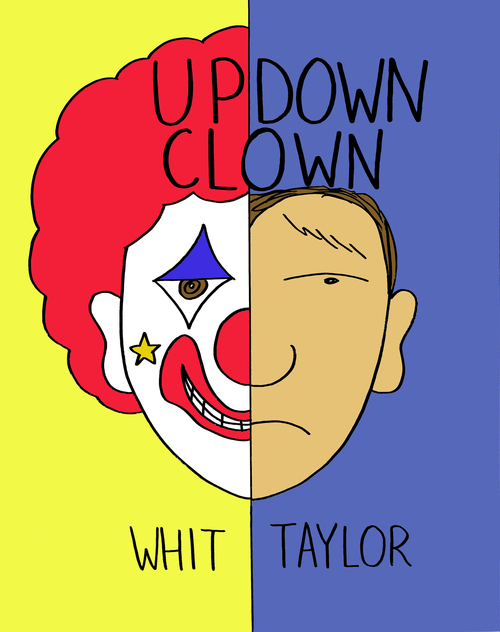
Table chart courtesy of Whit Taylor – Alexander, Doug and I will be right next to her: table B32!
Amongst the exciting items on our tables:
:
Comics: a Global History, 1968-Present. Â We’ll have 2 display copies only, not for sale, but this will be the first time the book has been seen in public! Â There’ll be a postcard for the book as well!
*************************************
Up-Down Clown by Whit Taylor.  A MoCCA debut, Whit’s new graphic novel, a sweet, perceptive and moving, naturalistic fiction about a young professional clown dealing with emotional, relationship and career issues.
*************************************
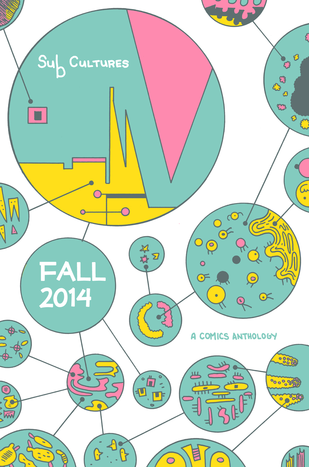
The SubCultures anthology preview postcard!  The book is still a few months off, but MoCCA will witness the world premiere of this glossy, 4×6 postcard, revealing Box Brown’s delectable cover!  Yes, that makes two free postcards at the table!  Suitable for framing or for keeping in the big pile of stuff you got at MoCCA that sits in the corner until sometime next year!
*******************************
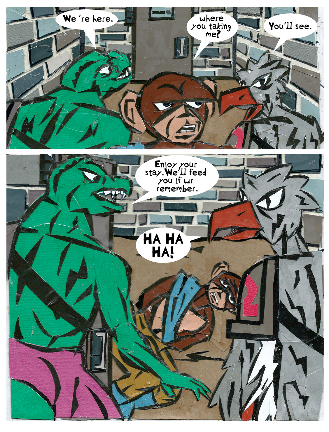
Monarch Monkey and Other Stories by Doug De Rocher: a collection of amazing cut-paper comics:
And of course you will find an assortment of Ninth Art Press excellence, including the anthologies Show and Tell, the Greatest of All Time Comics Anthology, In a Single Bound 1-3, plus Cold Wind and other one-shots. And for those who’ve been following my “Eunice Williams Story” process posts with baited breath, I’ll have the original art from the story! MoCCA is a great show, and you should not miss it!  Stop by and say hi.
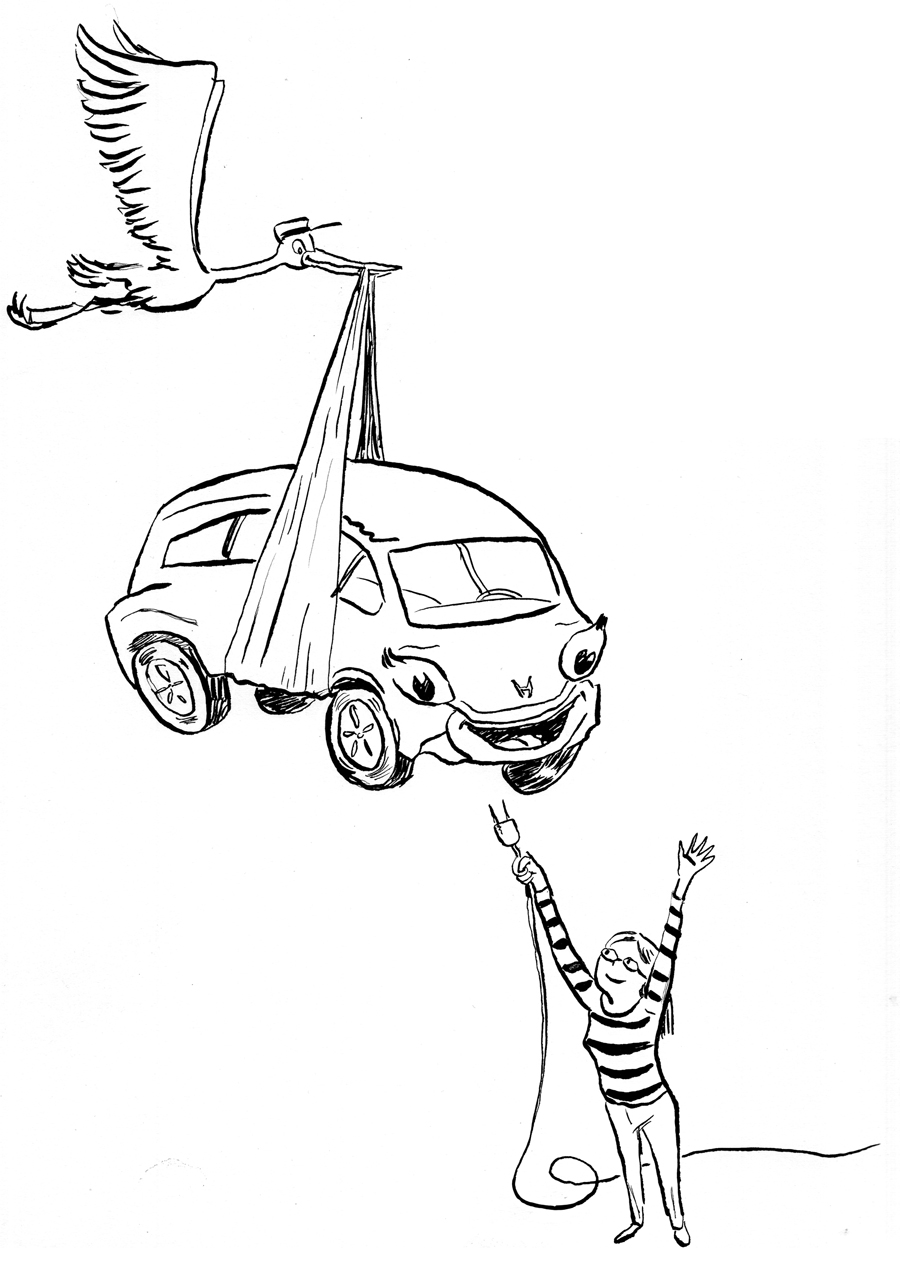
“Allowing my spine to fold forward and my head to hang, I slowly open my eyes and see my feet and calves as though we are meeting for the first time. As I look down, I hear an inner voice say, “These are your feet; these are your legs. They’re small, but they’re strong.†I feel an overwhelming sense of love for my little feet. I like them. They’re pretty. I notice the clear nail polish on my toes and gently touch the hair on my calves. ““On February 27th, I called corporate for an update. A shipment of new cars was being loaded in Japan to set sail that weekend. He would not know until March 10th whether or not my car was on board. I waited some more. On March 10th, I received an email with a VIN, my baby’s numerical name. She was/is on her way into my arms.”
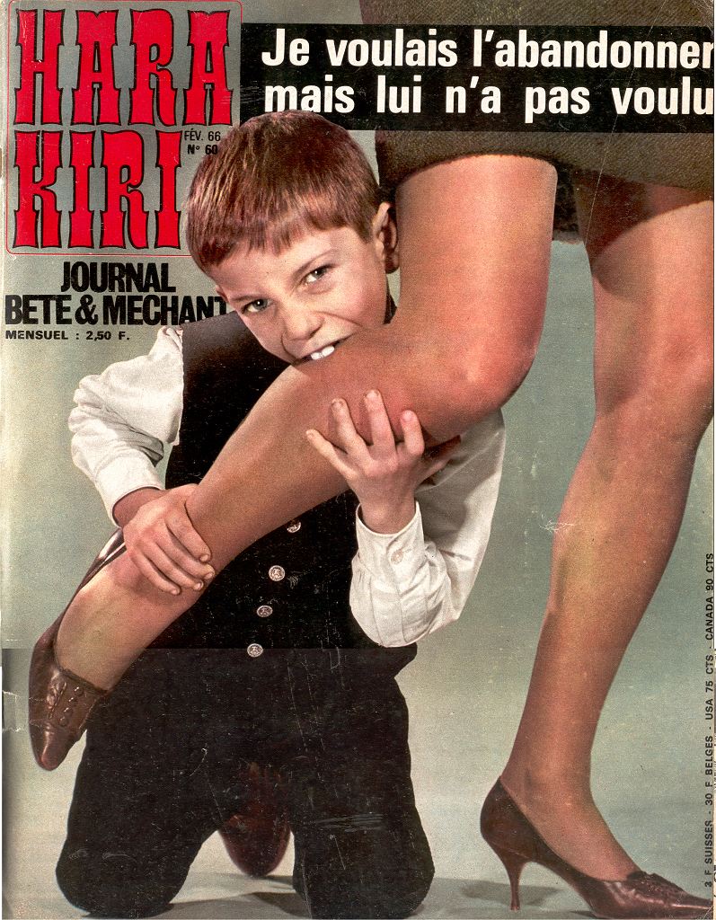
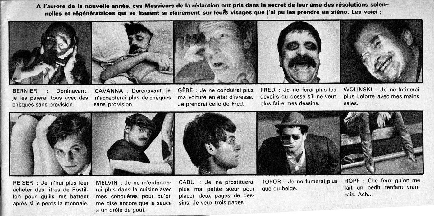
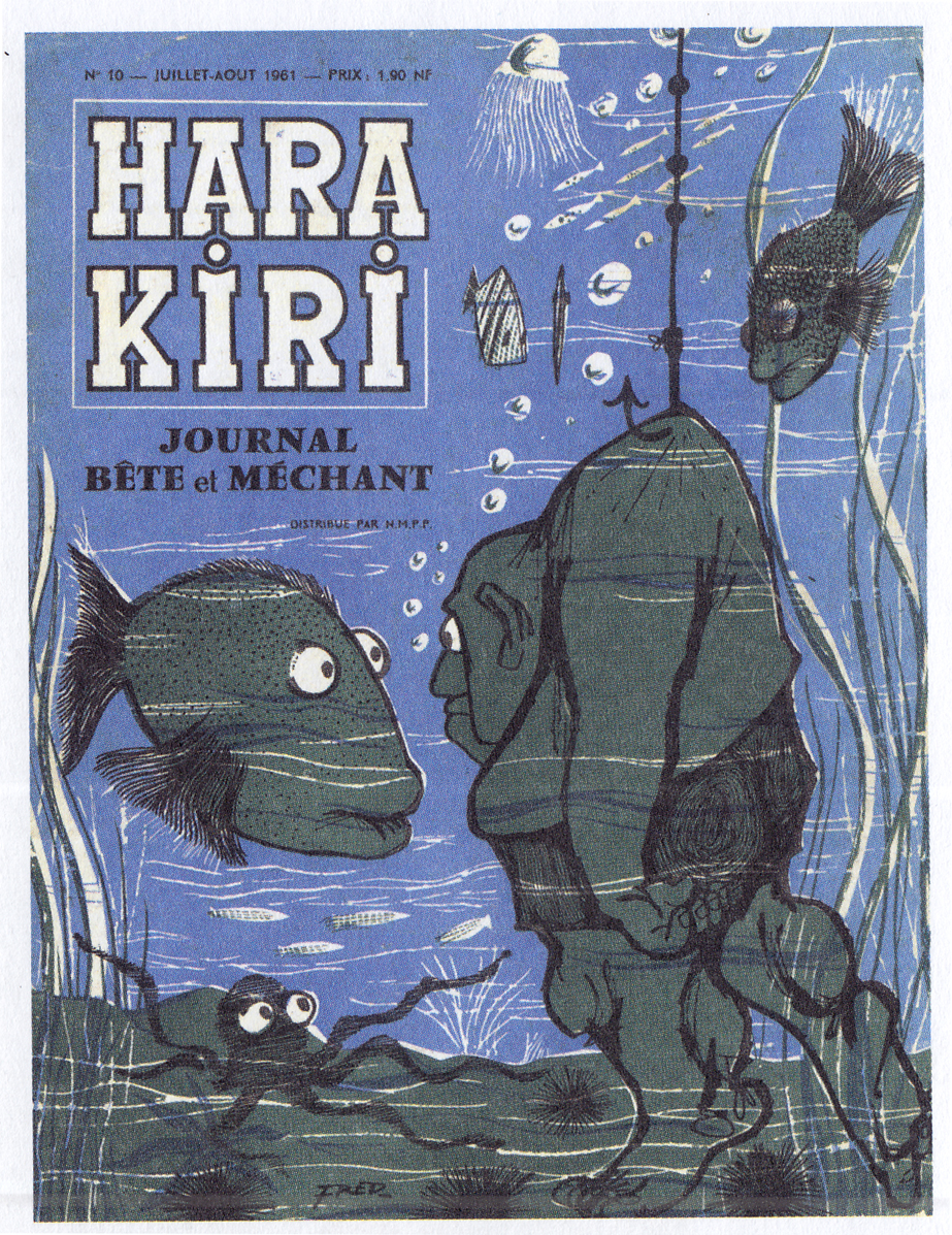
A photo feature on the Hara Kiri staff, from 1966. The satirical self-presentation was a factor in breaking down the “fourth wall” of bande dessinee, establishing a hip, knowing camaraderie between creators and readers.Fred, Hara Kiri #10, cover, 1961
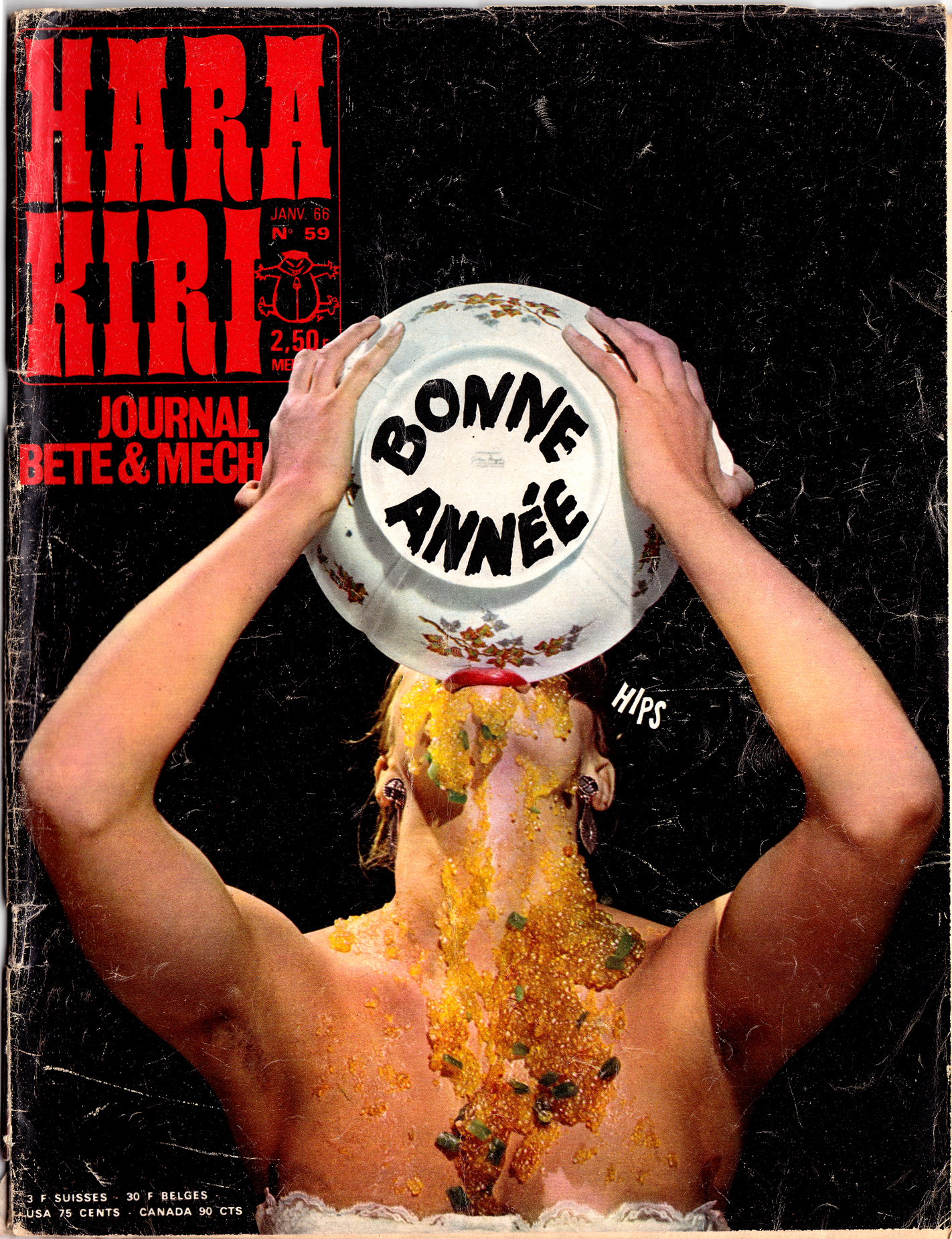
Early covers featured illustrations, but these were soon replaced by infamous staged photographs that demonstrated the magazine’s sensibility: gross-out humor and political/social satire, often completely sexist (you’ll have to google it yourself to see the worst ones).
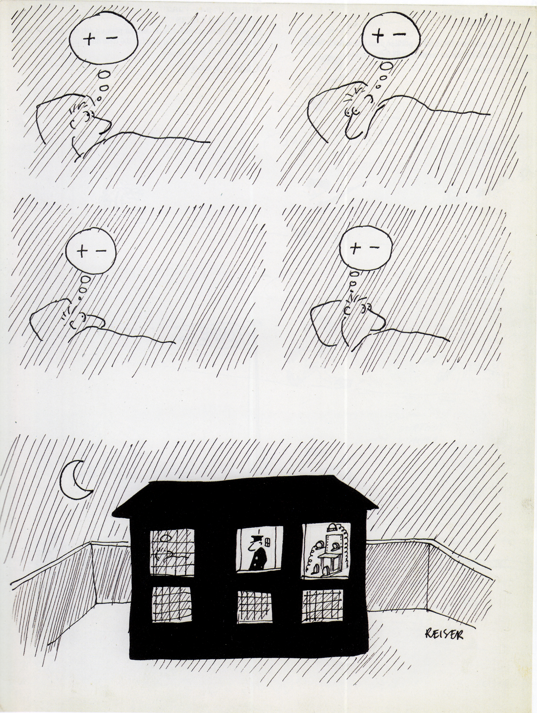
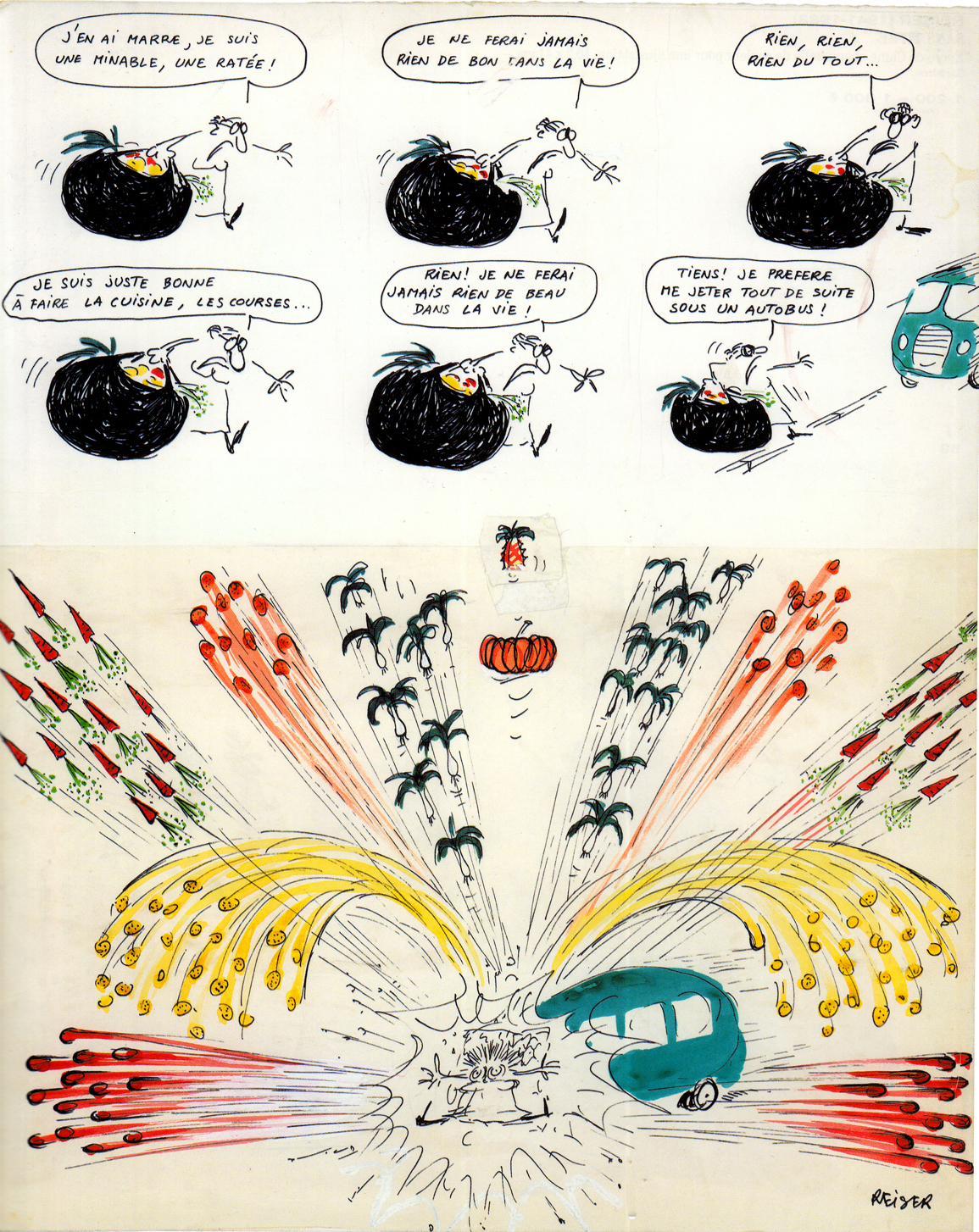
Hara Kiri #59, 1966Resier, Hara Kiri #86, 1968. His style became looser, his jokes wilder and grosser. 1: I’m fed up, I’m a loser, a nothing. 2: I’m not good for anything in this life. 3. Nothing, nothing, nothing at all 4. I’m only good for cooking, buying the groceries… 5. Nothing! I never make anything of beauty in life! 6. Dammit! I’d rather throw myself in front of a bus!
Â
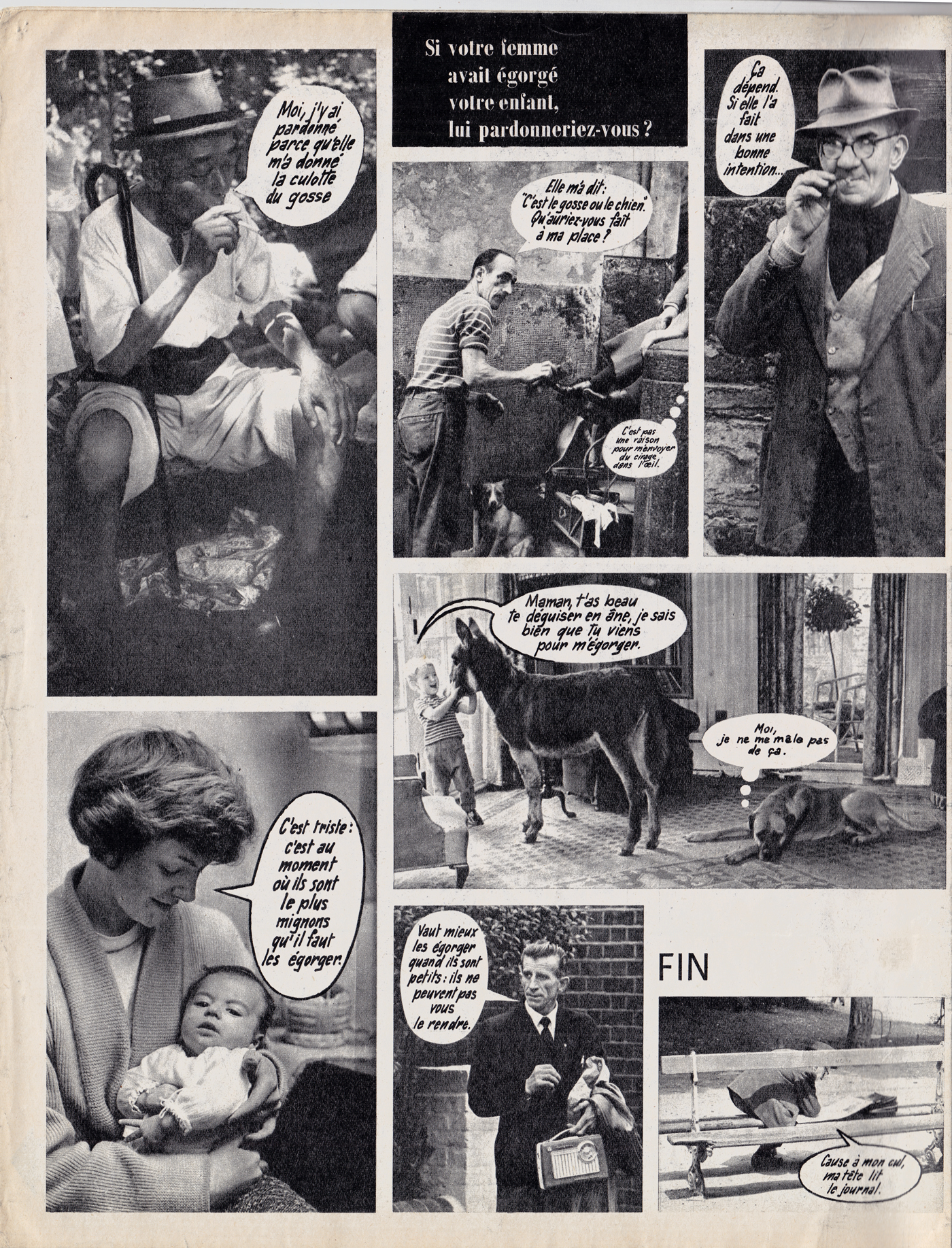
Sick humor in a Hara Kiri photo-funnies feature from 1965, asking the question, “If your wife cut your child’s throat, would you forgive her?” (Based on a real incident from the headlines of the day!)
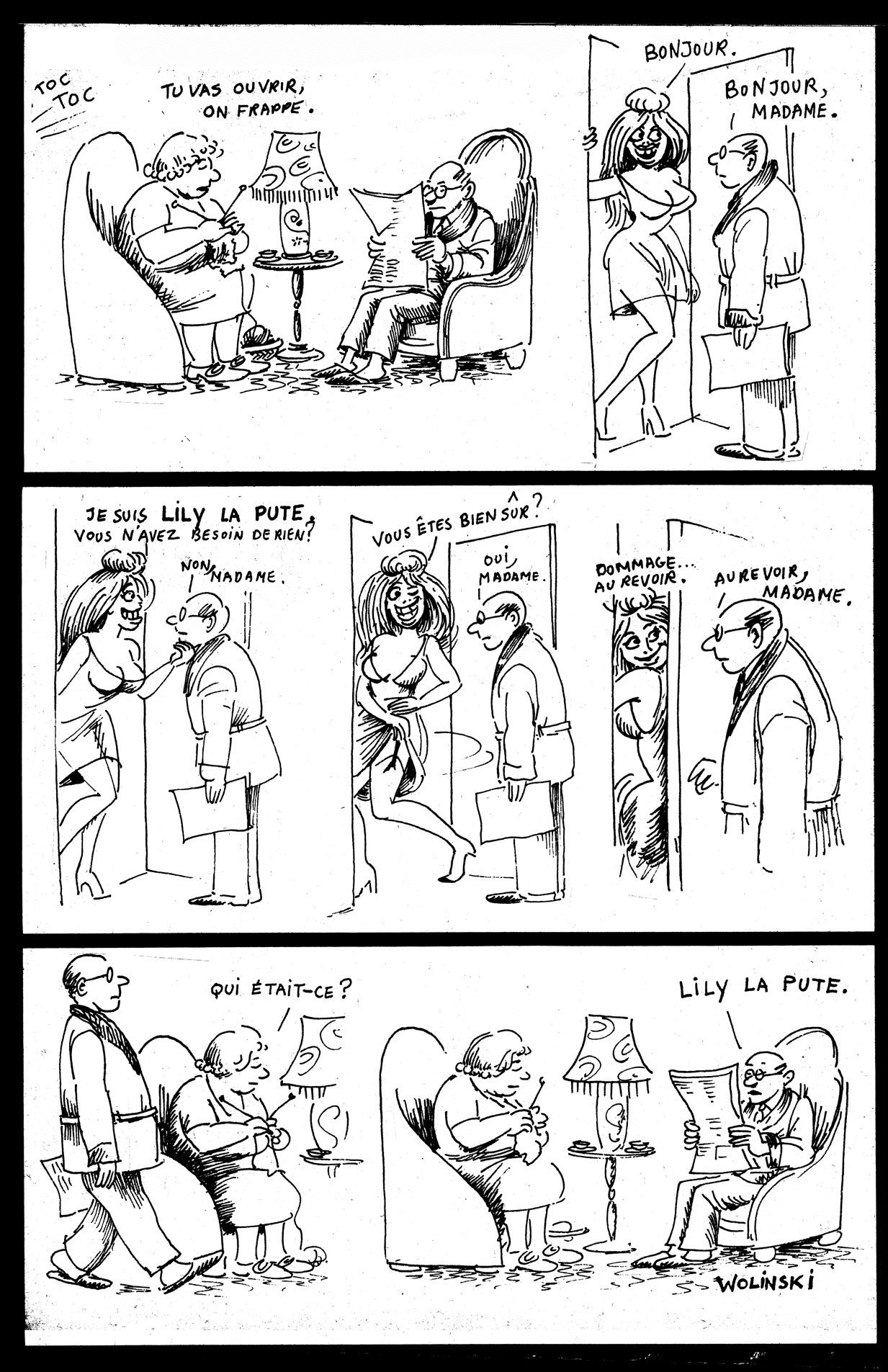
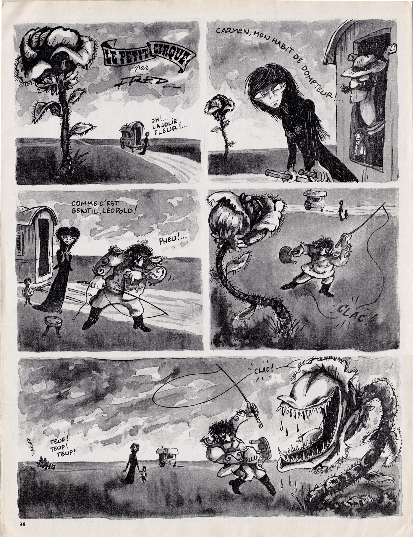
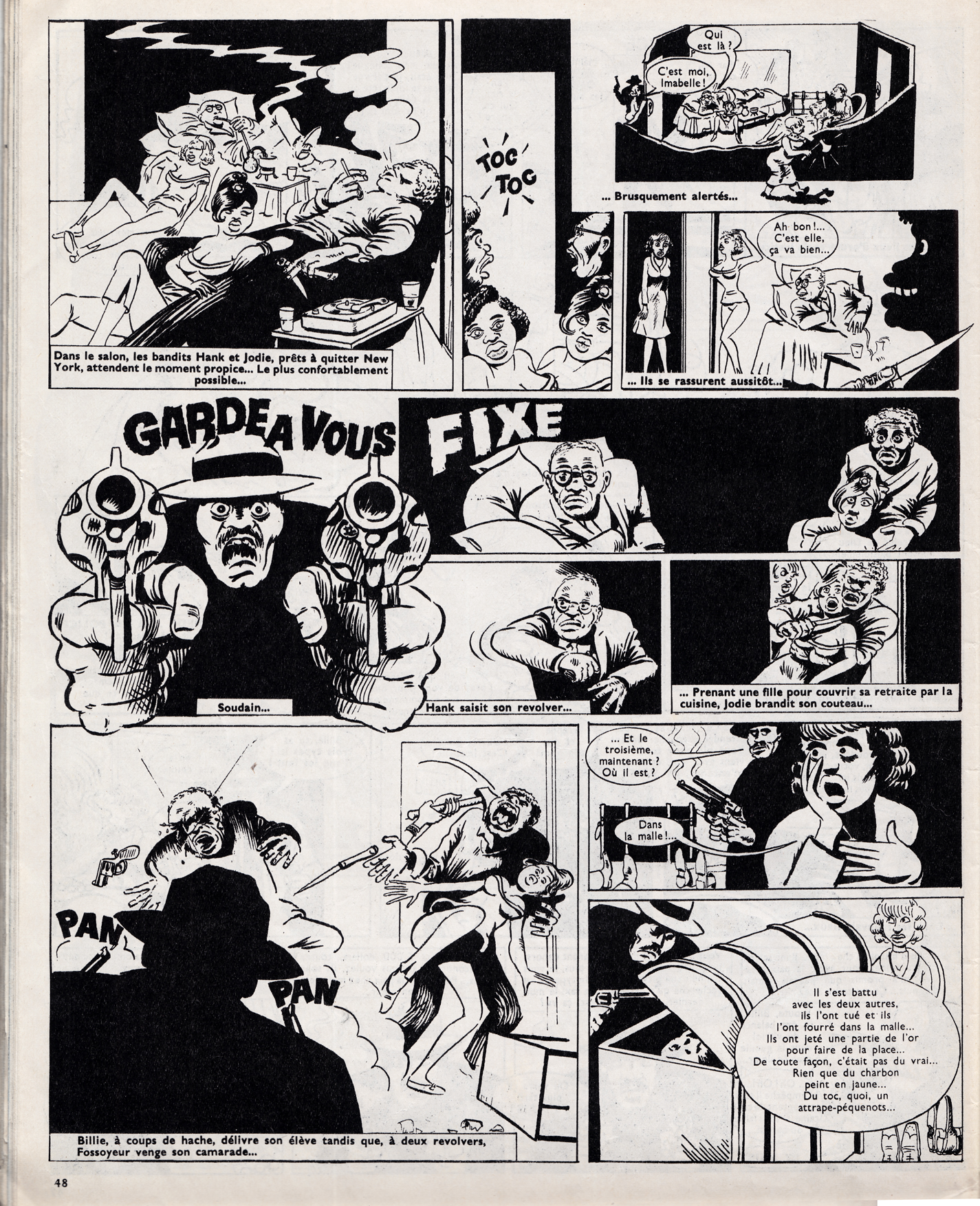
Most of the bd  in Hara Kiri were panel gags and short humor strips, but there were some important longer series as well, such as Fred’s Le Petit Cirque, Guy Peellaert’s Pravda, and a little-known but fascinating collaboration, in which American expatriate writer Melvin Van Peebles collaborated with cartoonist Wolinski to adapt the Chester Himes crime novel, “A Rage in Harlem” (known in French as La Reine des pommes)
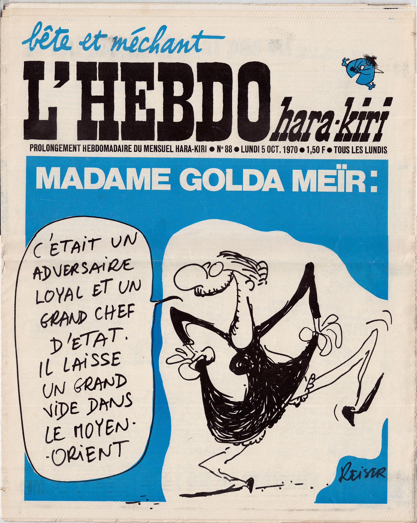
Wolinsk (art) Melvin Van Peebles (writing), La Reine des pommes, adapted from the novel “Rage in Harlem” by Chester Himes. Hara Kiri #51, 1965One tactic employed by Hara Kiri’s publishers to get around the censors who’d banned the magazine, was simply to start a new one, such as “L’Hebdo Hara Kiri” (Hara Kiri Weekly) which appeared in a tabloid format. Here, Reiser’s cover mocks Israeli Prime Minister Golda Meir’s reaction to the death of Egypian leader Nasser (“He was a loyal adversary and a great head of state. He leaves a great emptiness in the middle-east.â€)
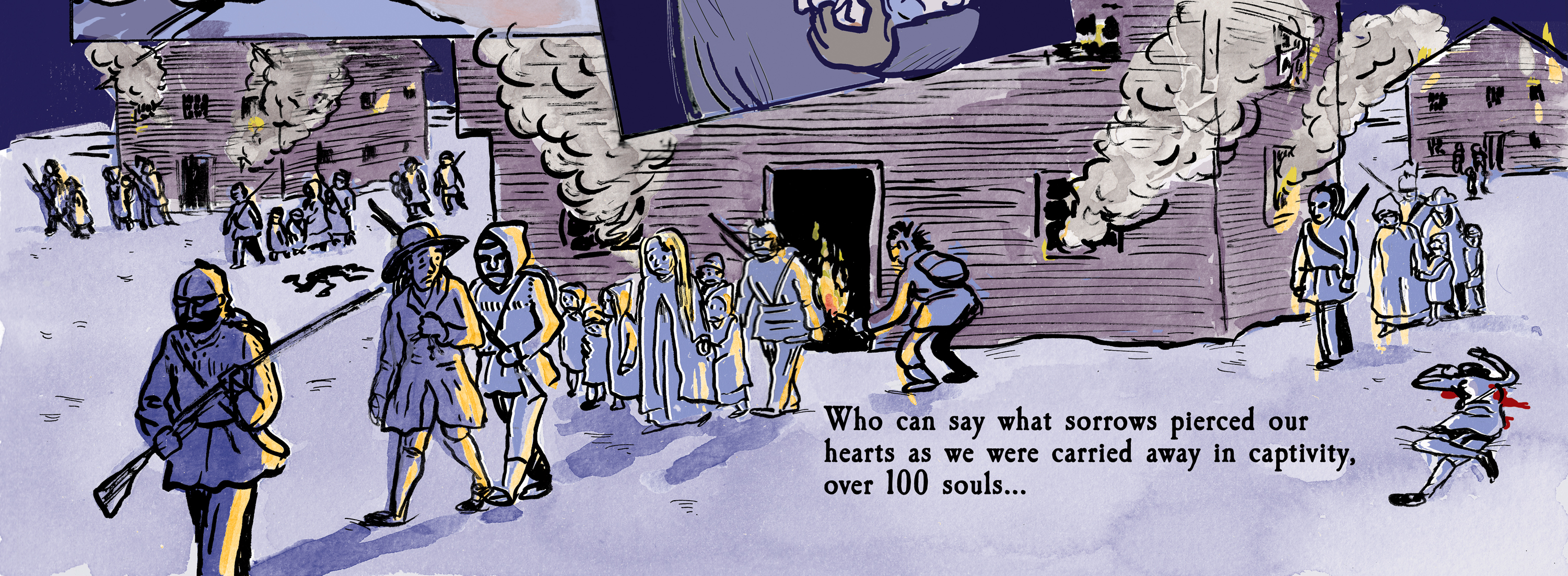
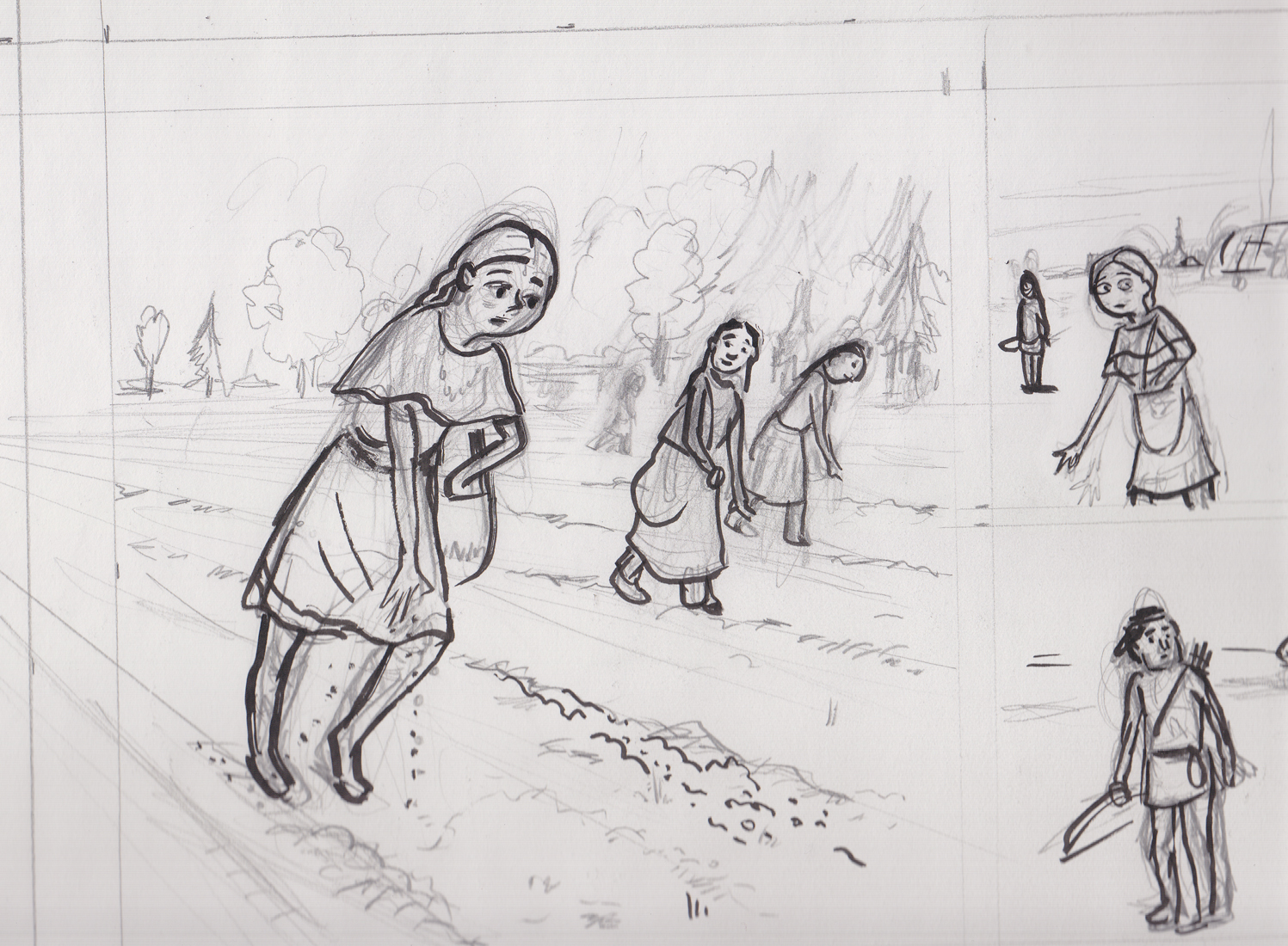
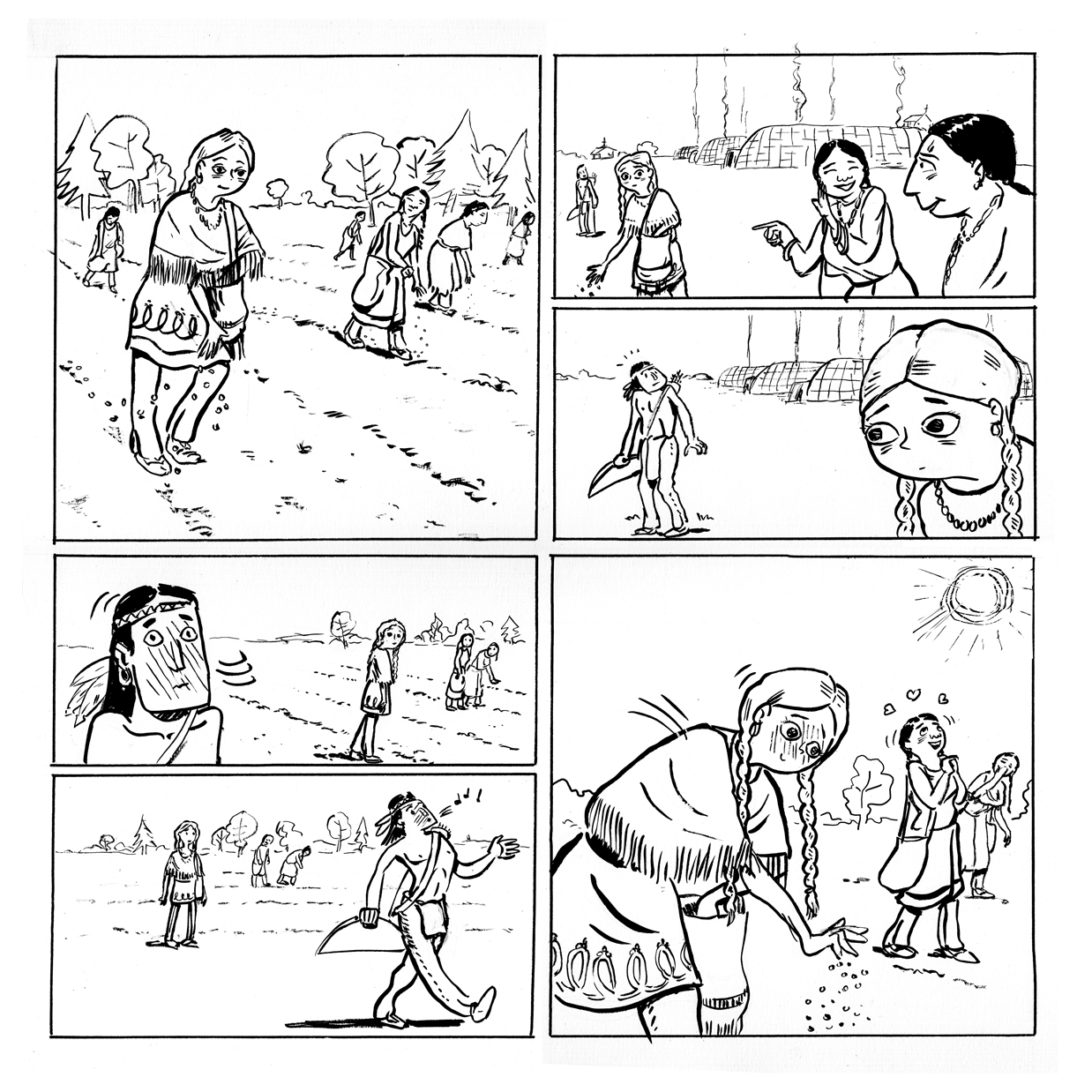
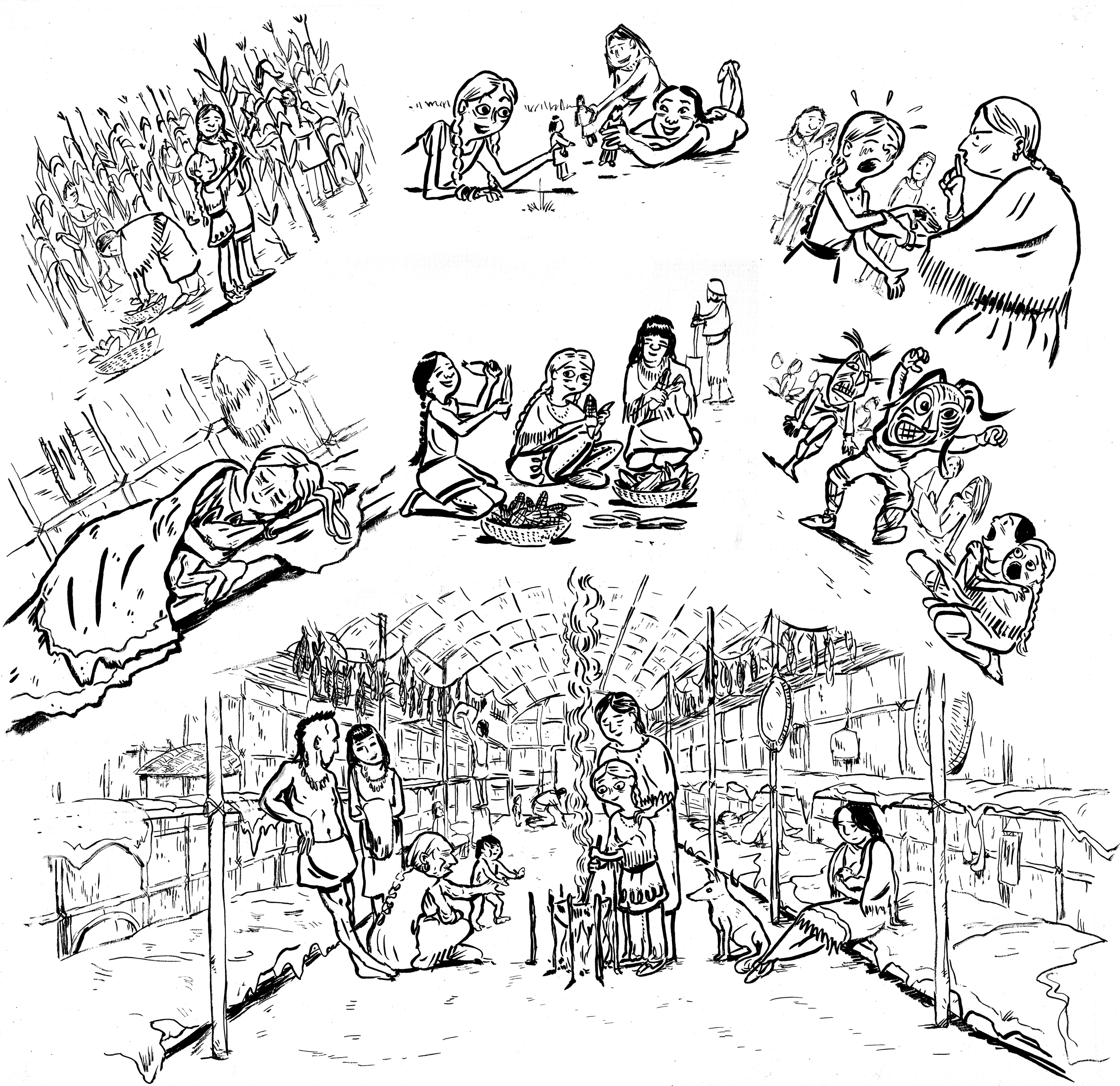
Page eleven of the story I’m working on for Fulcrum Press & Jason Rodriguez’s Colonial Comics anthology. Â Another scene at Kahnawake. Â THIS was all I had for a “script:”
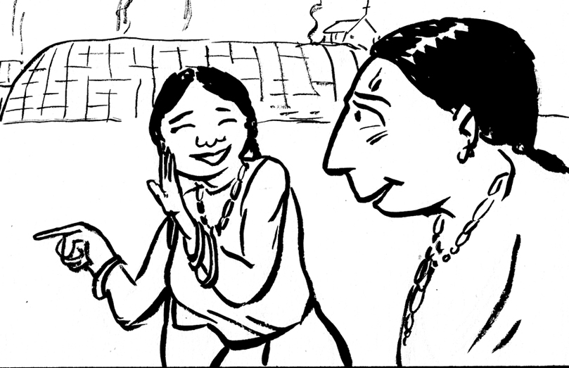
Eunice, about 15 years old, working in the fields, when she sees a handsome young warrior coming back from the hunt. Zing!
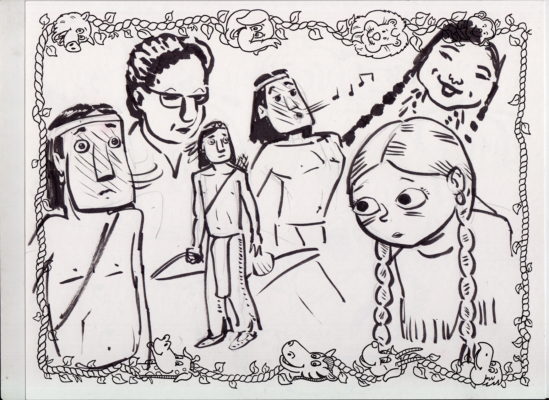
This would be the meeting between Eunice and her future husband. Â Eunice did marry a Mohawk man named Arosen, but how or when they met is pure speculation, so I speculated. Â I did some sketches in between caricatures at an event (ignore the silly childrens caricature border and that woman with the glasses):
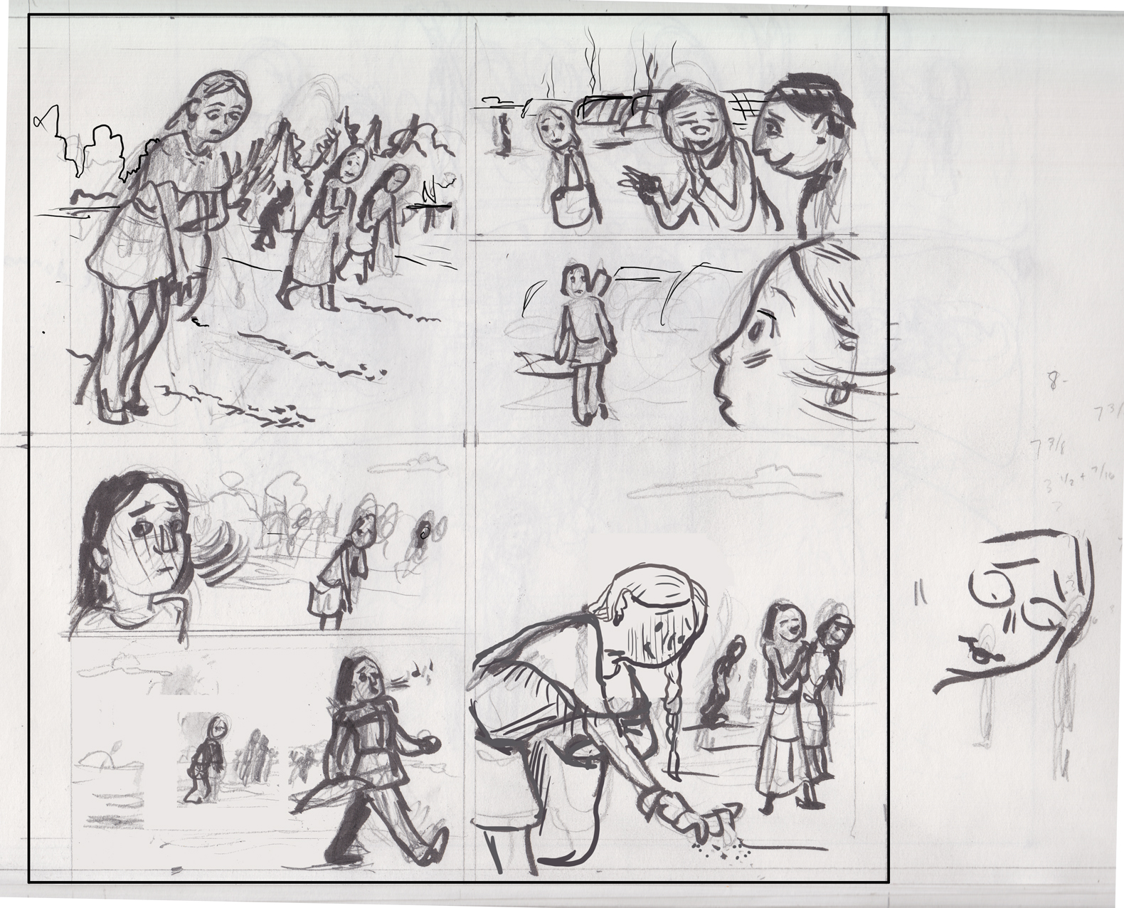
Then the thumbnail (with bonus silly sketch and some numbers in the margin!):
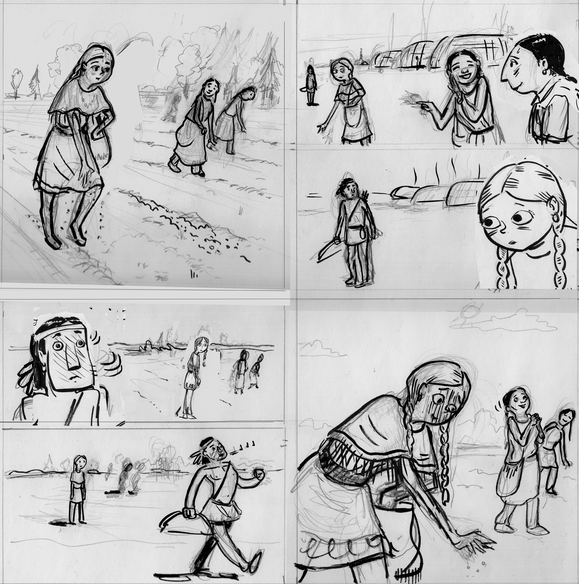
As you can see, I decided to make this page / scene a bookend for the one on page 8. Two key moments in Eunice’s integration into the community/coming-of-age. I used an almost identical panel layout, with the large panels at top-left and lower-right demonstrating the “arc” of the page via Eunice’s change in attitude; and then the story being pushed along by a series of looks and glances in the smaller panels that take up the top-right and lower-left quarters of the page.
Also I had some problems with the way I drew Eunice in the first panel. Â She looked like she was tipping over. Â I just “straightened” her up with photoshop…
…see? Â (here’s the rough pencils/inks:) (with some of those sketches I did on the caricature sheet thrown in because I couldn’t do any better and why not?)
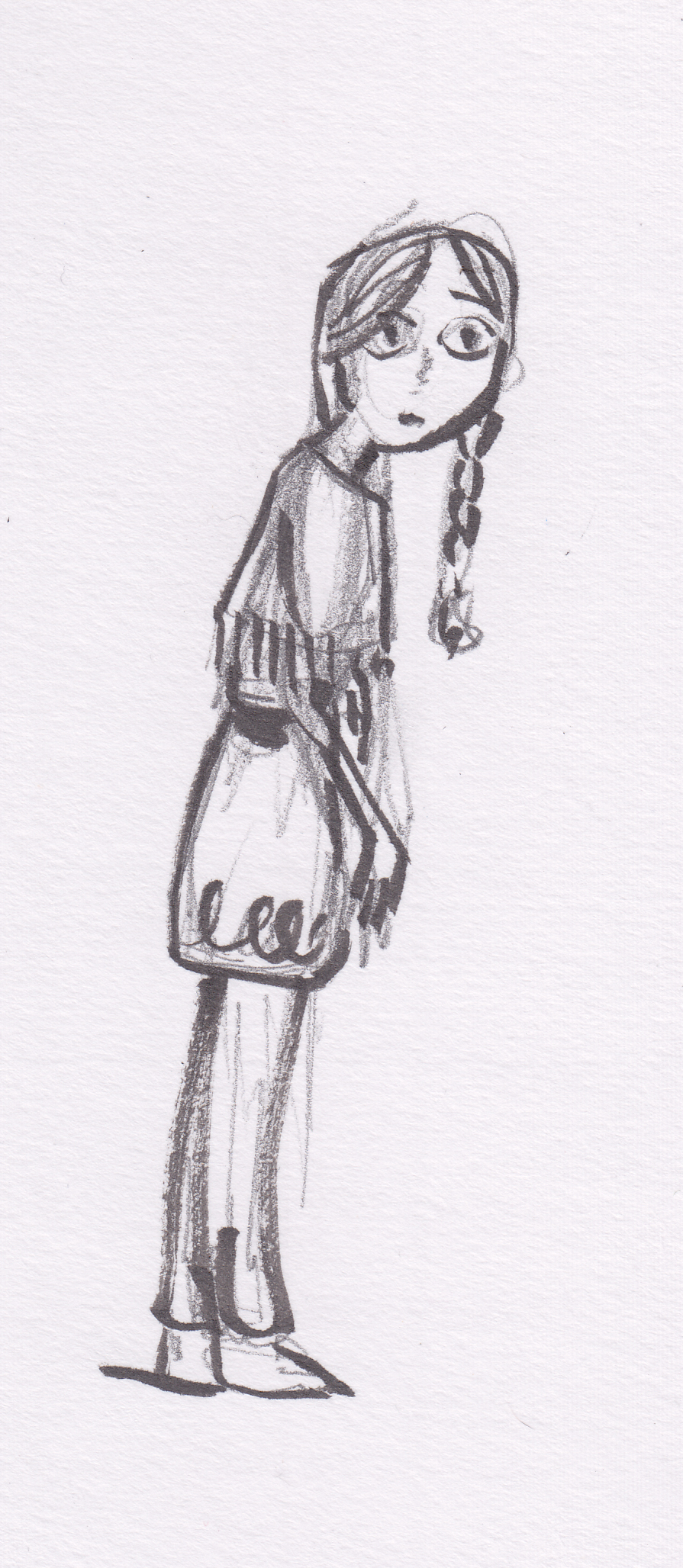
Oh, and I liked this little pencil sketch trying to get Eunice’s attitude in panel 4, so I just stuck it in the rough as well (before printing it out for light-boxing the final art).
Final line-art:
Final? Â Yeah, right! Â Seeing it now, I feel like Eunice’s head is too small in the last panel. Â I’m going to try and fix that digitally before I color it…
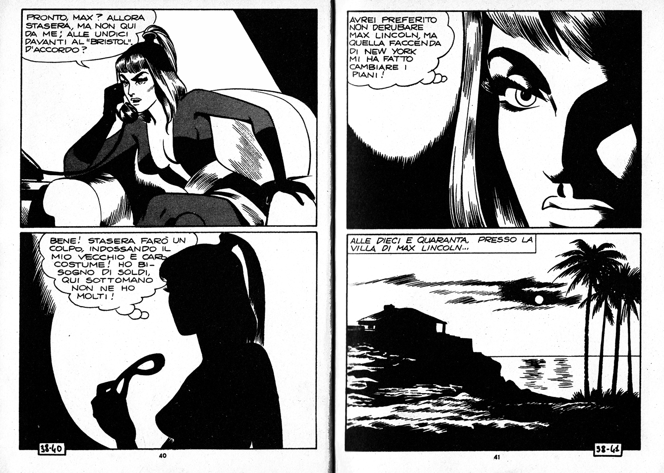
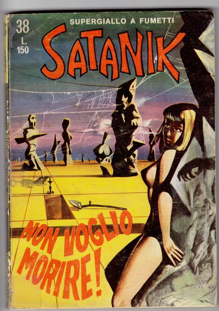
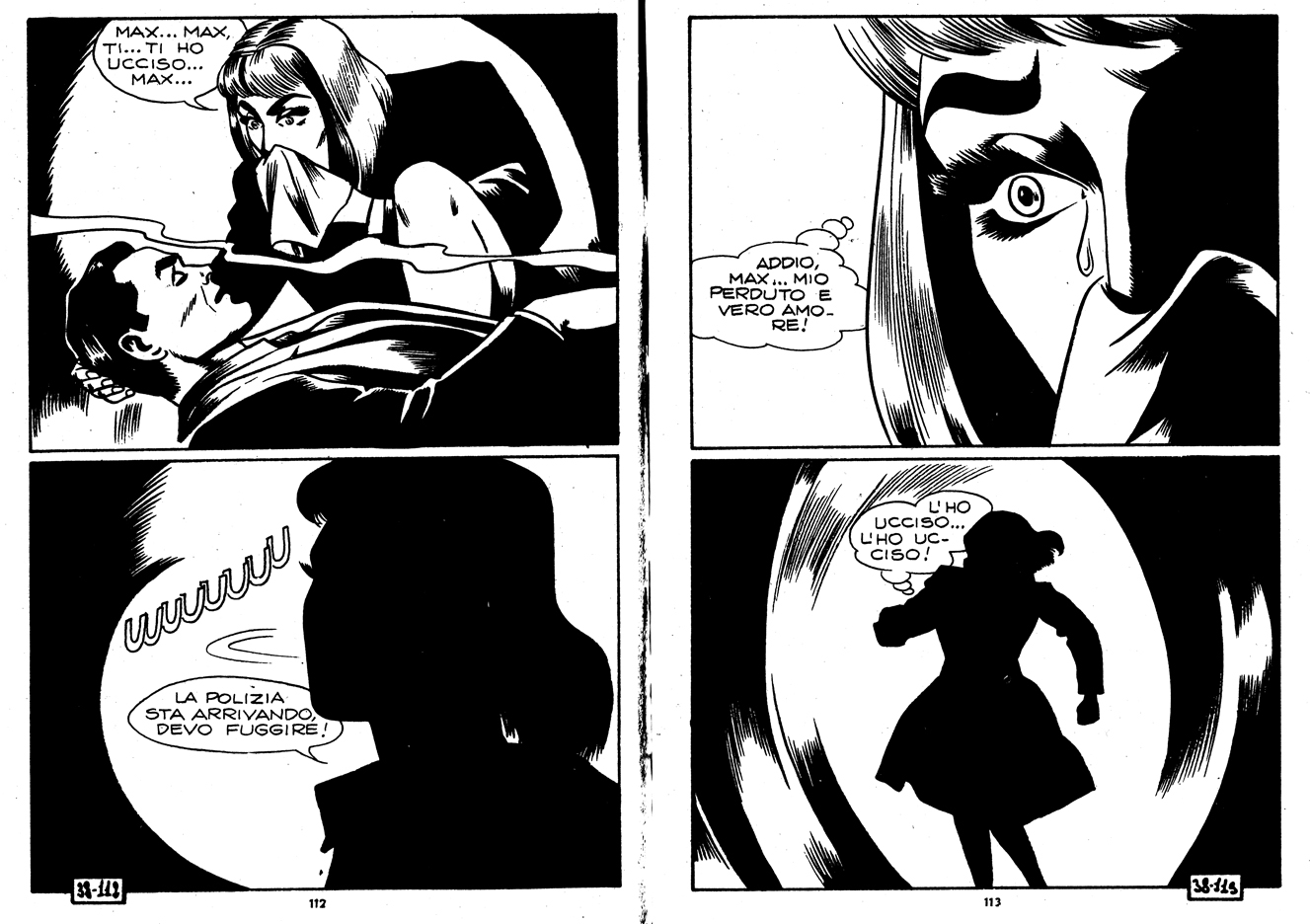
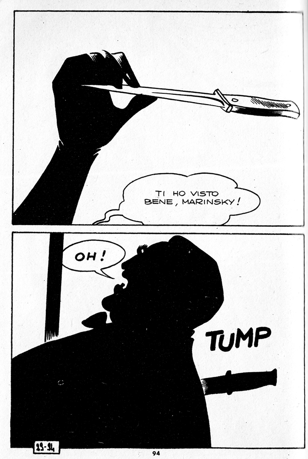
Magnus (Roberto Raviola) (art) Max Bunker (writing) Satanik #38 • 1966 In Italy a new genre of dark, violent and erotic comics in the crime genre, called fumetti neri (“black comicsâ€), reflected the era’s cultural freedoms and the loosening moral grip of the Catholic Church. Another major fumetti neri was sisters Angela and Luciana Giussani’s Diabolik. (From the introduction to Comics: A Global History, 1960 to the Present )
Satanik #38, June 1966
Magnus (art) Max Bunker (writing), Satanik #38, June 1966
Fumetti neri  can certainly be seen in context of  the broader movement toward adult comics in Europe (where they’d been pigeonholed as a children’s medium for even longer than in the U.S.), which also included  Barbarella, The Adventures of Jodelle, the work of Guido Crepax, and journals like the Italian Linus.
Magnus (art) Max Bunker (writing), Satanik #29, Feb 1966
But fumetti neri were more disreputable than those high-toned examples: lurid, sexy, violent… trashy fun, definitely not for all-ages. I’m far from an expert on this stuff.  If you want to read up on Italian comics, I highly recommend Drawn and Dangerous: Italian Comics of the 1970s and 1980s, by Simone Castaldi, one of the best books in English on European comics, with a lot of insight into Italian culture and politics as well.
The most striking work that I’ve seen in this genre is by Magnus (Roberto Raviola), who collaborated with writer Max Bunker (Luciano Secchi) on the titles Kriminal and Satanik (all the work in this post is by them).
Magnus (art) Max Bunker (writing), Satanik #38, June 1966
The rigid 2-panel-per-page format (printed as small, digest-size paperbacks) had the effect of a productive creative restraint on their composition and story-telling. Â Magnus did amazing things with blacks and sillhouettes, creating some very interesting layouts, with amazing use of negative space, and there’s some feathered inking in there that looks like it inspired Charles Burns.
Magnus (art) Max Bunker (writing), Satanik #38, June 1966
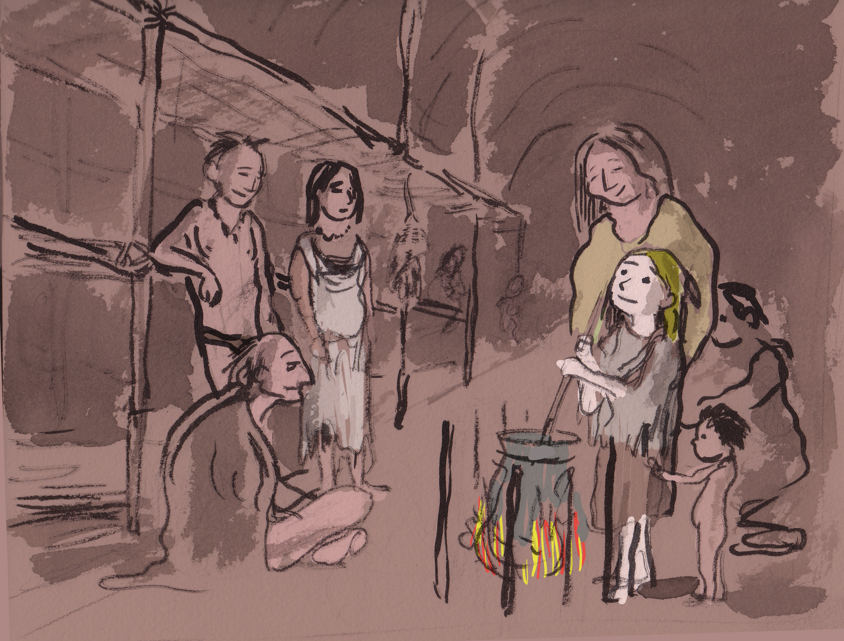
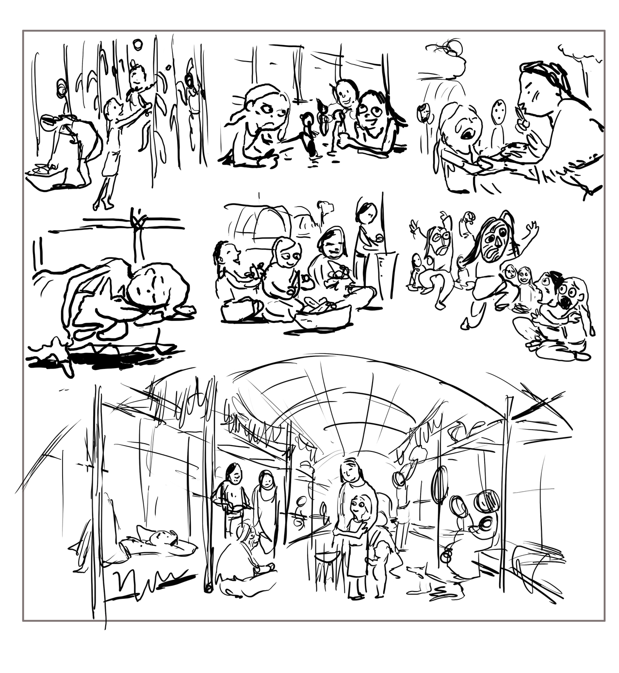
Page 10 of the project I’m working on for Jason Rodriguez’s Colonial Comics anthology from Fulcrum Press.
My outline-y script reads:
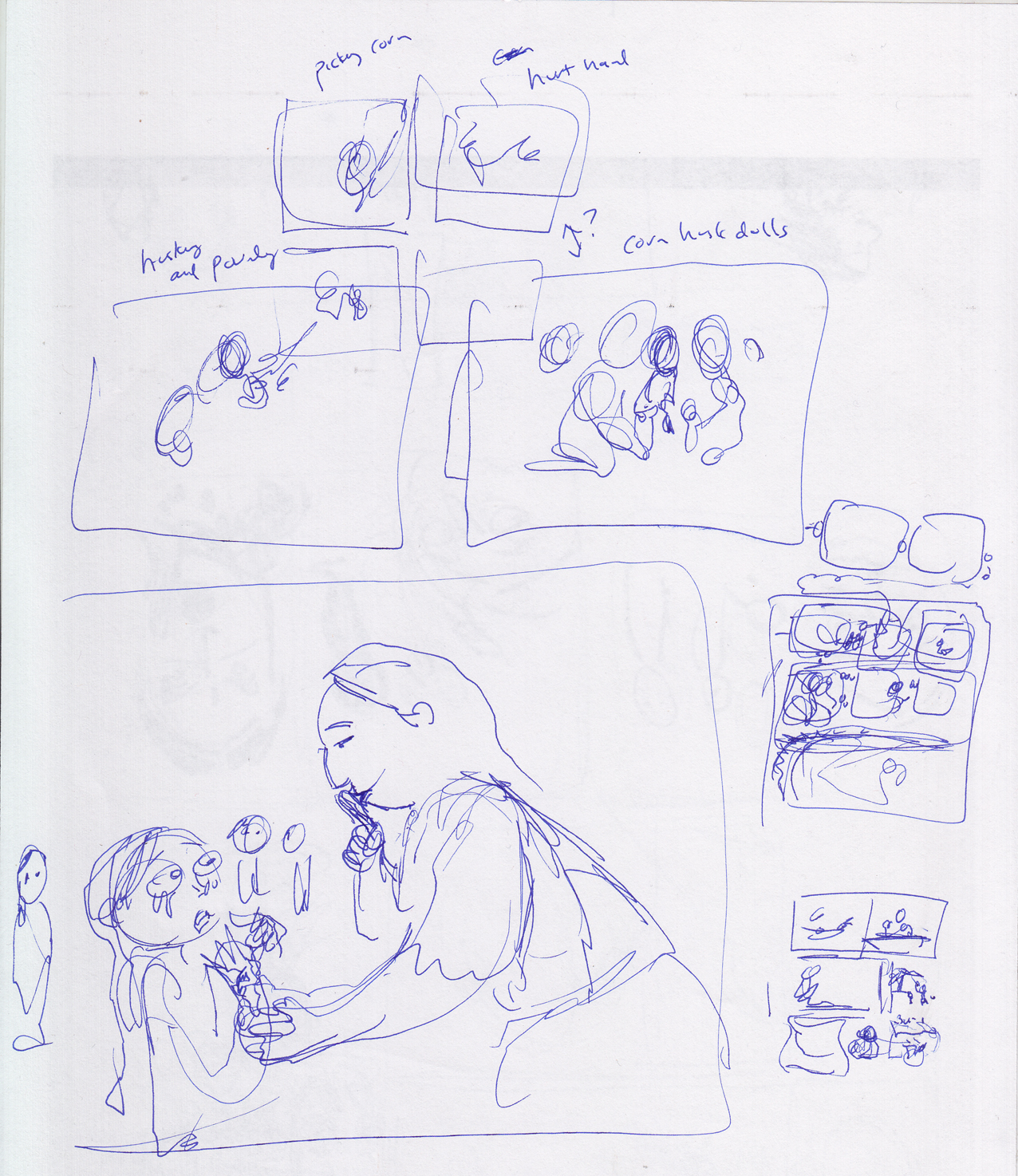
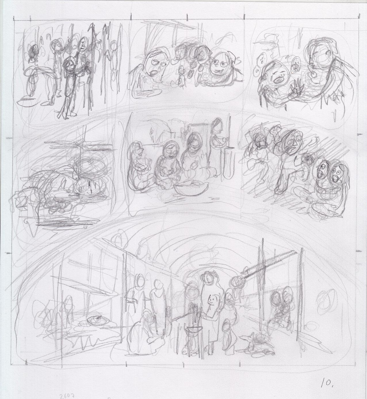
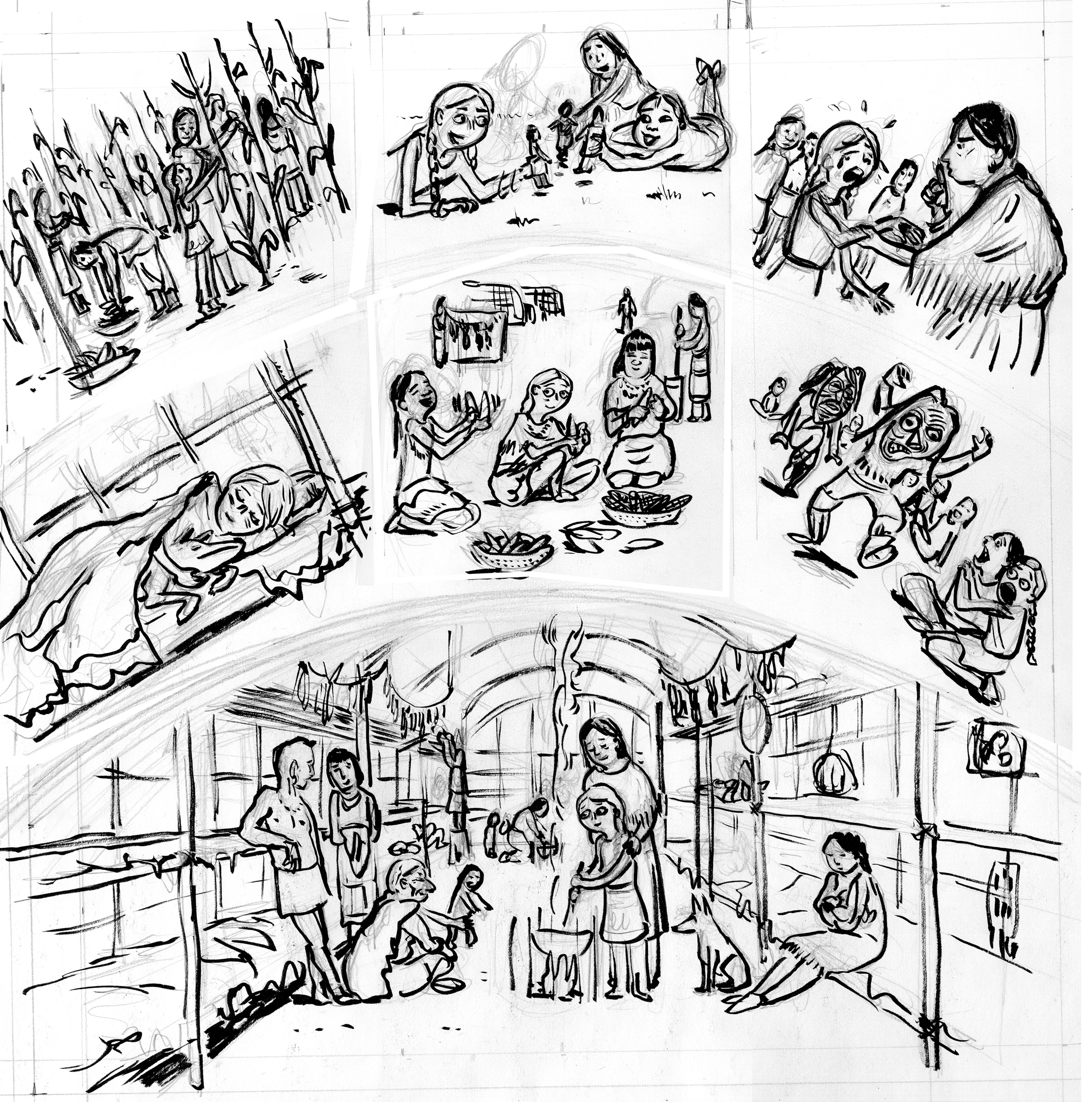
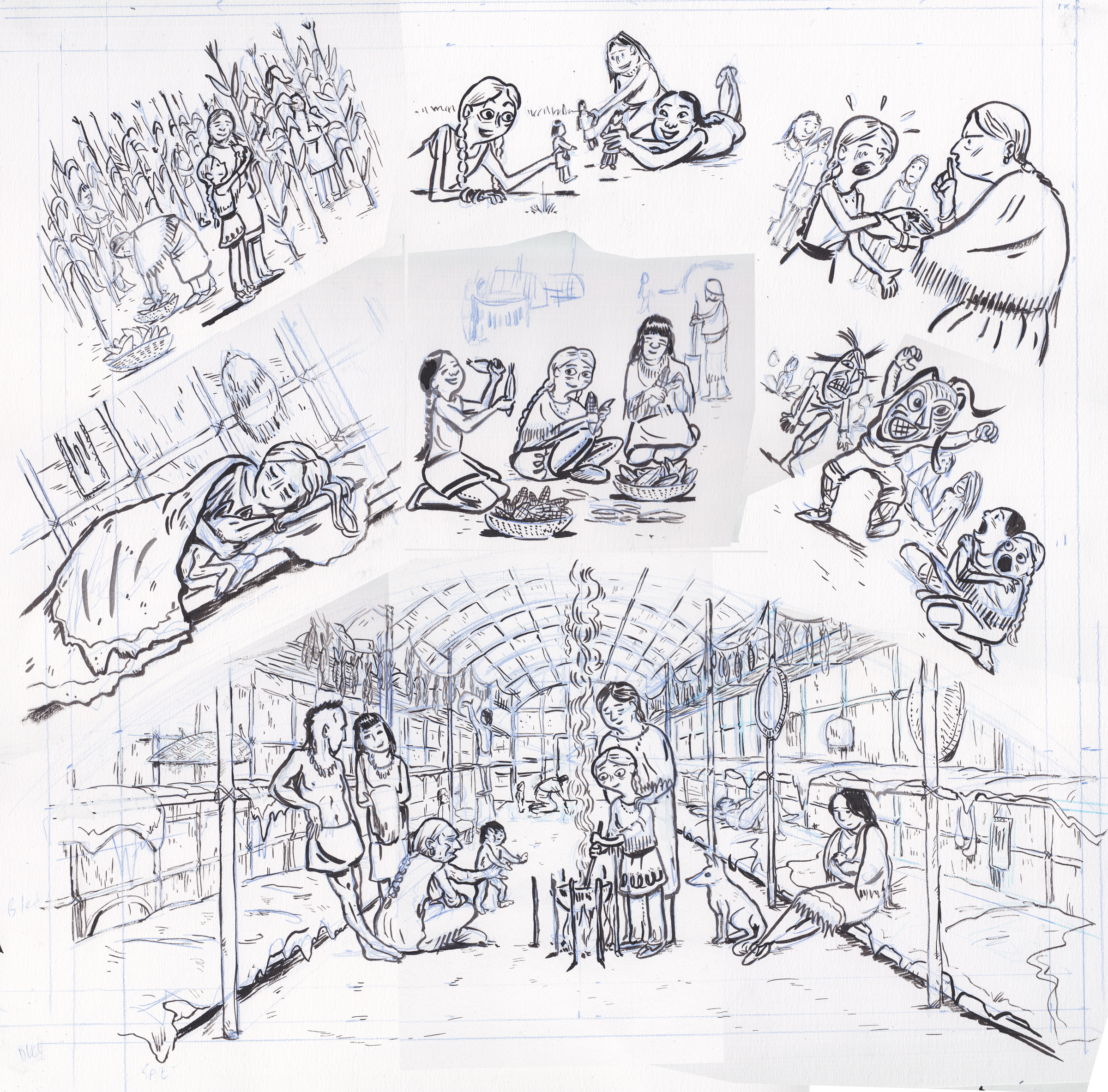
Eunice further assimilated into Kahnwake culture. Daily life centers very much around corn: planting, gathering, drying, grinding, cooking. Being invited with the women to the fields is a big moment.
The home life in the longhouse is warm and communal.
So this is essentially a non-sequential page, but a series of vignettes that add up to Eunice’s generally happy childhood at Kahnawake. Â It’s a matter of putting the anecdotes into an overall page design or architecture that really can be read in any order. Â Since she left no written record of her time there, it’s all made up.
I definitely wanted to make use of the very first sketch I did for the story:
Longhouse interior with Eunice and new family
Then  lot of scribbling to figure how to arrange things:
The thumbnail:
Eunice Williams story, page 10, thumbnail, Dan Mazur
The rough. I decided to curve the drawings in that middle tier around the “archway” of the bottom panel, giving it more of an architectural feel:
The final line art, with blue pencils showing. Â No real reason to show this, I just like the way the blue pencil looks (the scan’s patched together, hence the different coloring):
And the final:
Eunice Williams Story, p 10, Dan Mazur *(line art)
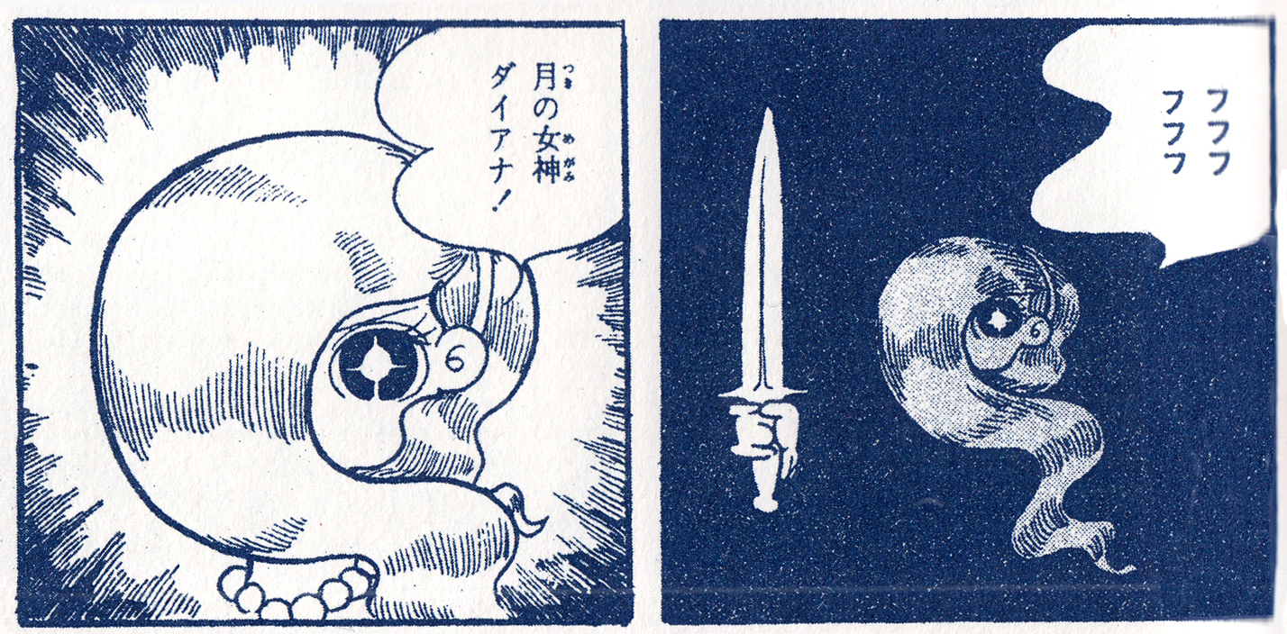
Leiji Matsumoto – Midori no tenshi (Green Angel) 1959, detail
Now available from publisher Thames and Hudson, “Comics: A Global History, 1968 to the Present,” written by Alexander Danner and me.  The book covers the period from, roughly, 1968 to 2010, with an  introduction providing some background on the development of comics around the world (focusing mainly on Europe, Japan and the U.S.) during the post-war era through the mid-60s.  Here are some excerpts and expanded material, including some great images that couldn’t fit in the book. Text in italics is directly from the book.
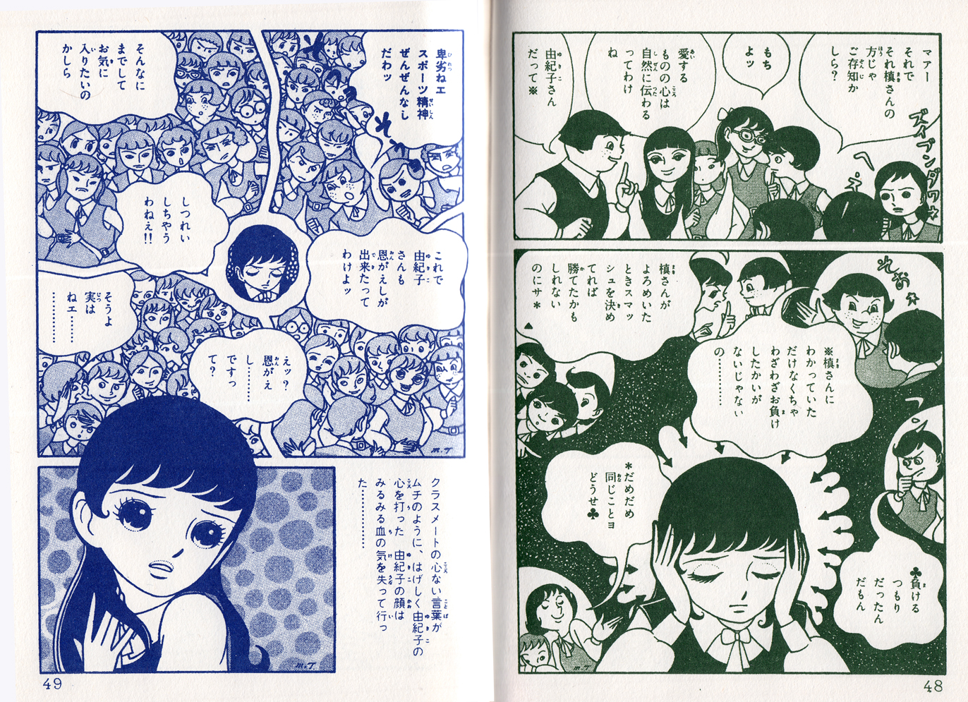
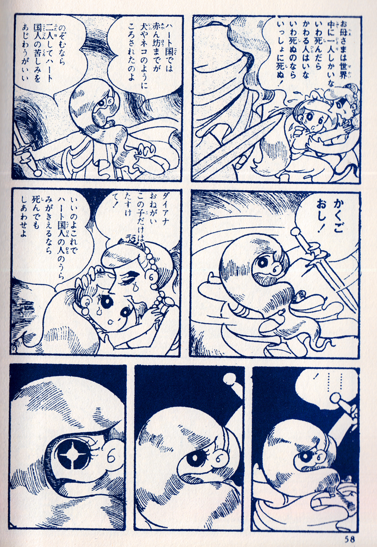
Delving into the history of shÅjo manga was one of the most exciting parts of researching/writing this book.  The revolutionary material produced in the 1970s by the “Year 24 Group” — the first major wave of women mangaka — was a culmination of aesthetic and thematic developments of the previous 50 years.  I don’t think the term “genre,” as we generally use it, fits here; for me, shÅjo manga, as it has evolved, embodies a broad, complex aesthetic category, one that can accomodate many genres — maybe we can call shÅjo a gender of manga (regardless of the biological gender of its creators or readers — see ItÅ, KimiÅ, When a “Male” Reads ShÅjo Manga).
Macoto Takahashi, “Paris-Tokyo” (1959) p 9-8
Shouo represents an example of the power of a marginalized aesthetic, one of those cases in popular culture where a form designed to reinforce a power structure (in this case the gender roles of girls and women in Japan), can expose the conflicts and contradictions within that structure and have a destabilizing effect.
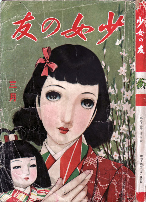
In the pre-Second World War period, when most Japanese comics had been aimed at very young readers, the main vehicles for popular culture designed for adolescent girls had been shÅjo literary magazines and novels. This material reinforced prevailing notions of proper feminine roles and characteristics in Japanese society, which was extremely restrictive. Heterosexual romance was rarely depicted; the literature focused primarily on the all-female world of girls’ schools, and on female friendships, often in a dreamy and flowery literary style (the term shojo carries connotations of cloistered maidenhood, not captured by the usual translation as “girlâ€).
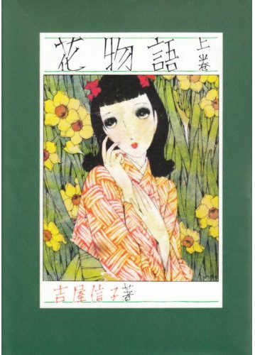
Jun’ichi Nakahara, cover for Hana Monogotari (Flower Stories) by Yoshiya Nobuko
ShÅjo shÅsetsu was, for the most part, “highly formulaic and didactic, inculcating the cardinal virtues of girlhood.”(1)  But this literature, while ostensibly supporting the  proscribed role of girls and women in the broader society, could also express rebellion against it.  One of the most popular writers in the genre was Yoshiya Nobuko (1896-1973), who lived openly in a romantic relationship with another woman for more than 50 years and whose shÅjo writing  reflected her sexual politics.
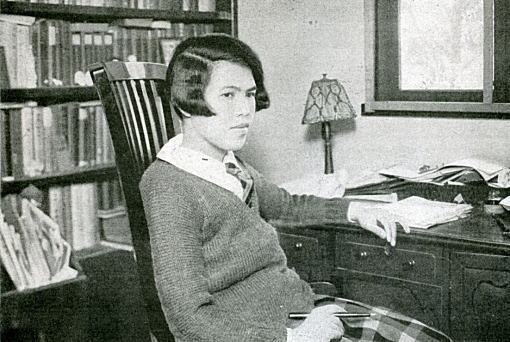
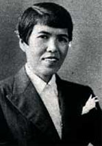
Yoshiya Nobuko
The Japanese girls schools of the day were intended to steer young shÅjos toward “the dream of becoming happy future brides, isolated from the real-life public world outside the family.”(2)  But Nobuko’s work, “defying masculine domination and feminine submission…, constructs two radically opposed universes: on the one hand, the dreamy, fantasizing world of young girls, where they carry out their amorous intrigues, elevated by their purity and erotic beauty. … On the other, the adult world, where young girls become women, torn from their universe of innocence by men and confronted with a painful reality…. Homosexual love, idealized and constructed on a basis of equality between the two lovers, is constantly opposed to heterosexual love, which can only be built on the subjugation of women by men.”(3) The style of illustration that accompanied these stories, known as jojo-ga (å™æƒ…ç”»), “lyrical drawing,†matched the tone of the prose. Lyric painting and illustration depicted women and girls of  slender, ethereal beauty.  The eyes, in particular, were emphasized: the large, liquid eyes suggested deep inner emotions; this treatment of the eyes would become an essential characteristic of shÅjo manga.
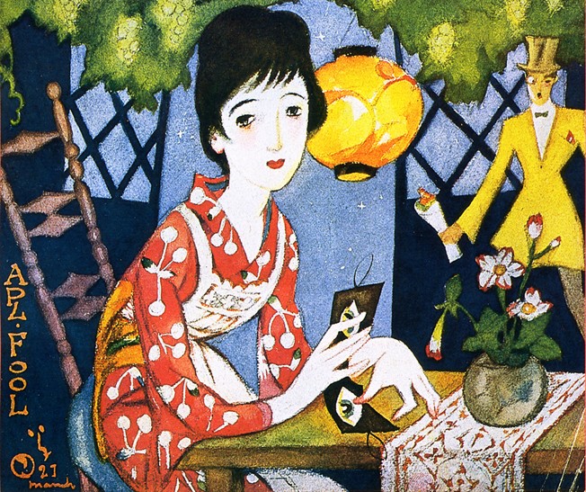
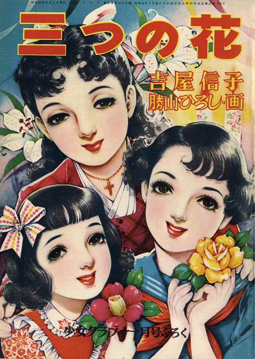
Yumeji Takehisa, painter and illustrator, was one of the key figures in the lyric style that adorned the early shÅjo magazines and novels.Junichi Nakahara, cover for ShÅjo no tomo, 1939 (source: http://showamodern.blog.fc2.com/blog-entry-268.html)Hiroshi Katsuyama, cover for a post-war edition of Nobuko’s “Mitsu no hana.” Â According to manga blogger Matt Thorn: “Katsuyama was hugely popular in the 50s as an illustrator and creator of shojo emonogatari [picture stories – a precursor of story manga]”
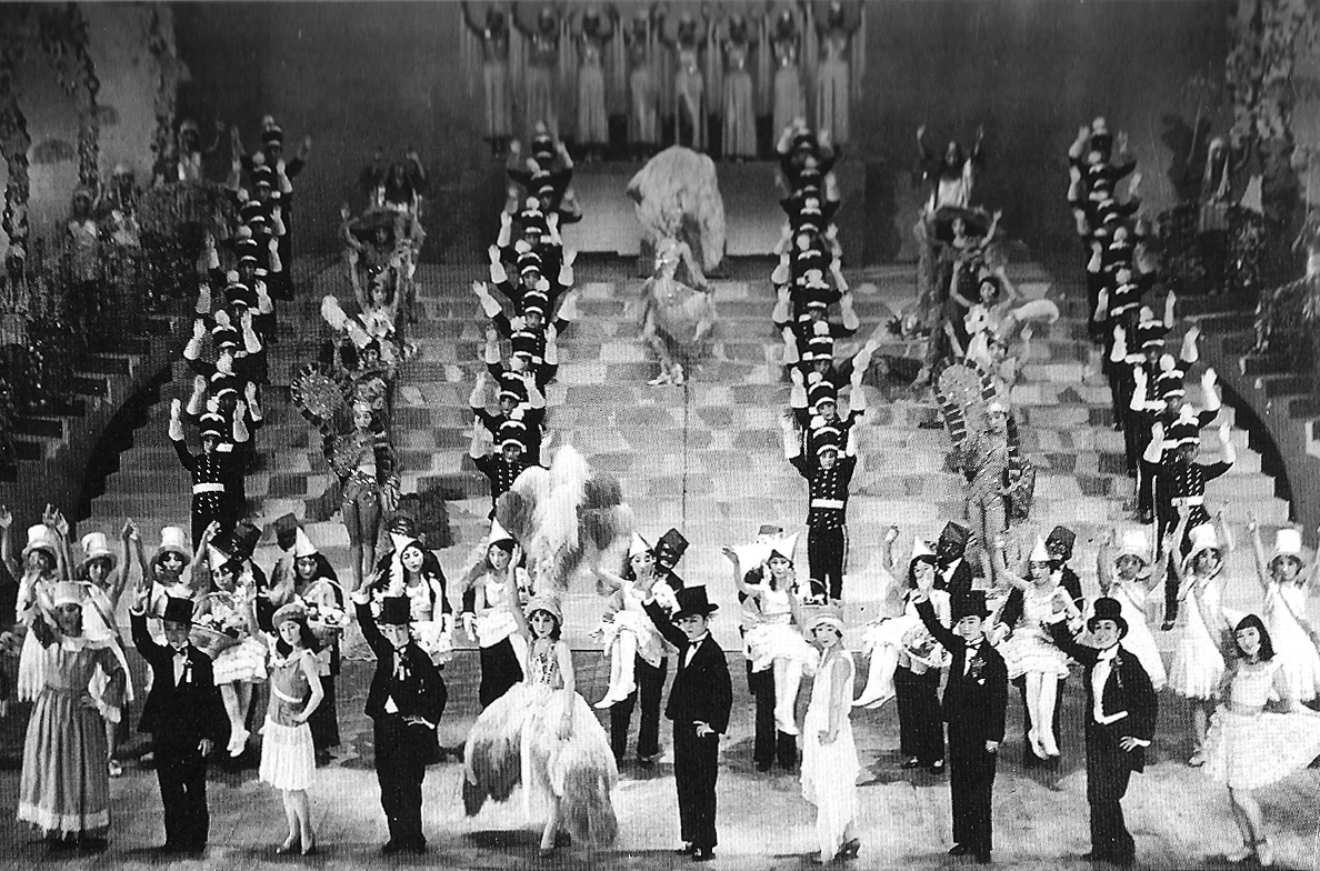
Takarazuka Kagekidan
The other pop-cultural phenomenon that should be noted in the “pre-history” of shÅjo manga is the popular Takarazuka Kagekidan theatre company, founded in 1913. The  company put on lavish musical spectacles full of action and romance, with women playing all the roles, including the “male” heroes. Some members of the company — known as otoko yaku — specialized in playing the male roles, essaying them with macho swagger.  The company was especially popular with female audiences; some women reportedly sent love letters to their favorite otoko yaku performers.
A Takarazuka spectacle from 1930
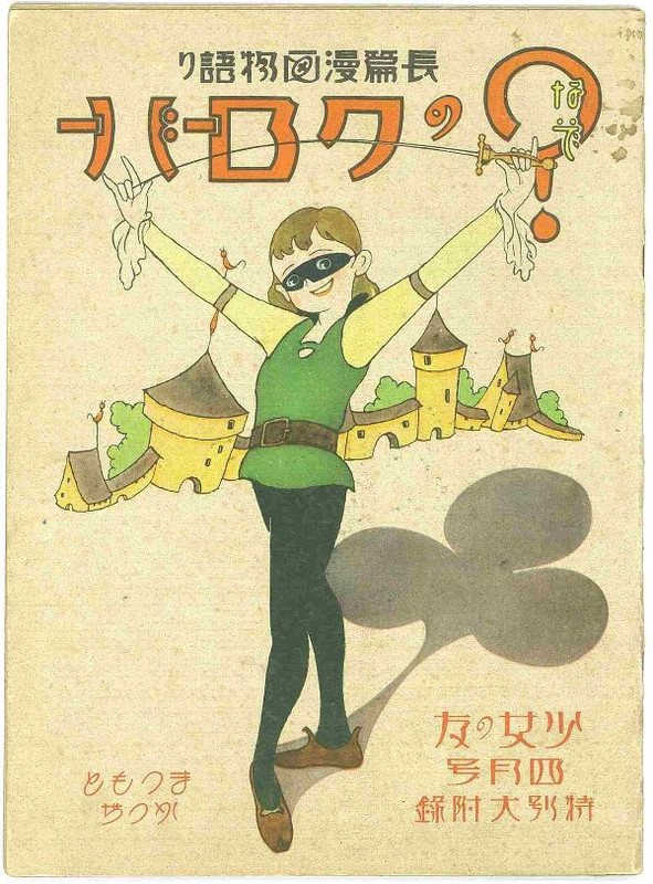
This spirit of spectacle, adventure, and gender masquerade, was perhaps an influence on one of the earliest examples of shÅjo manga — Nazo no Clover (Mysterious Clover) (1934) by Katsuji Matsumoto, in which a young girl dons Scarlet Pimpernel-like disguise to fight wicked nobles. Â
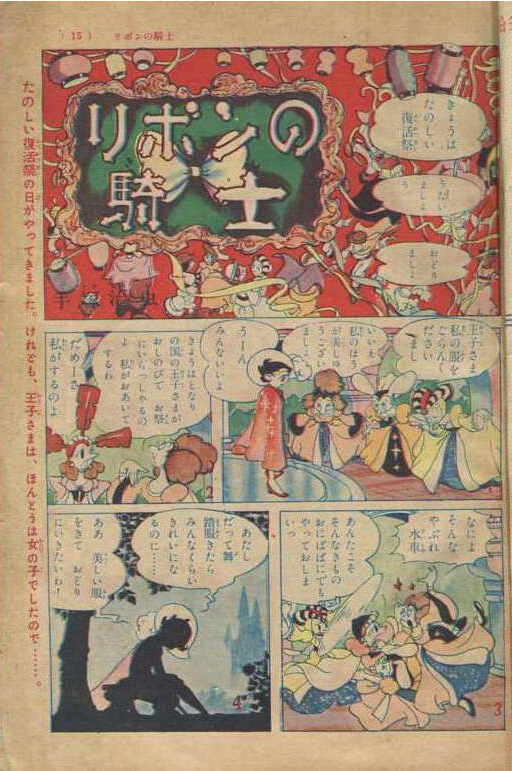
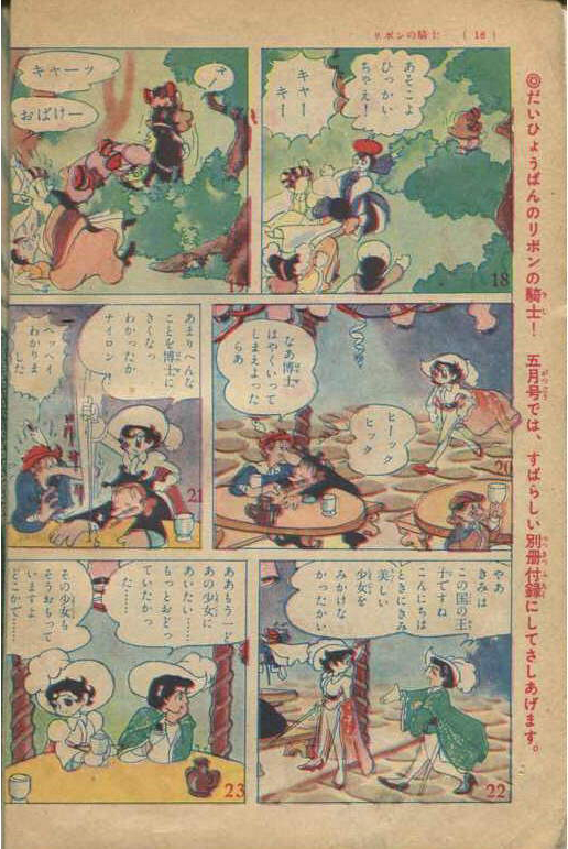
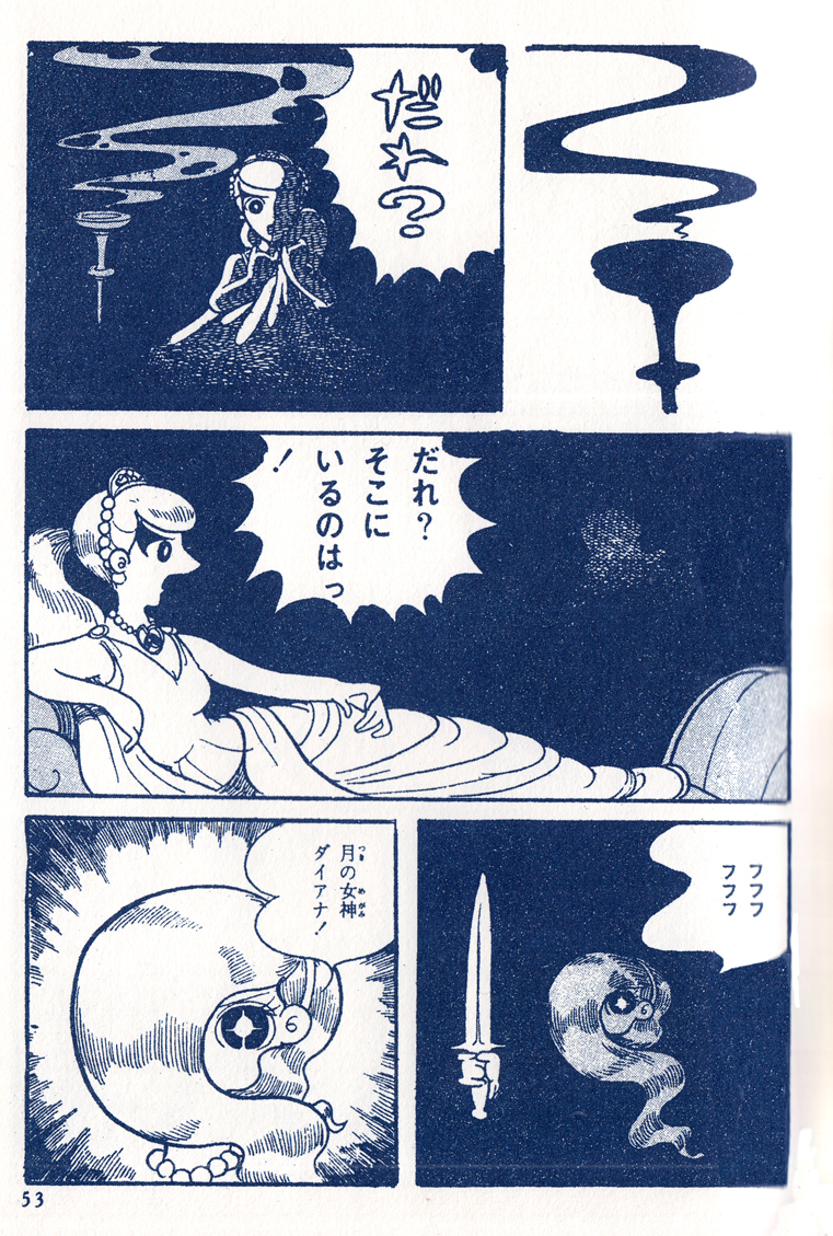
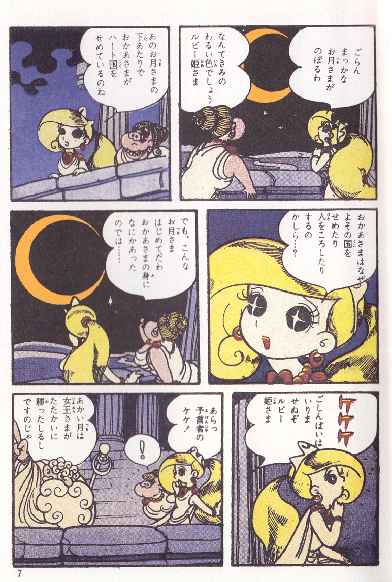
More notably, the Takarazuka revue was a definite influence on Osamu Tezuka, who lived in the city of Takarazuka where it was based, and was a fan of the troupe. Tezuka’s Ribon no kishi (Princess Knight) (1953), an epic tale of a princess who is accidentally given both female and male “hearts” in heaven before birth, represented the most sustained narrative in the shÅjo form and gave shÅjo manga a huge boost in popularity.
Osamu Tezuka, scan from the original printing of the 1953 “Ribon no kishi” (source: http://blogs.yahoo.co.jp/tamatyannanatyan/6865155.html)
With themes and atmospherics deriving from Takarazuka, Ribon no kishi was stylistically in line with the Disney-influenced, dynamically paced manga that Tezuka had been producing in the shonen field for the previous six or seven years, with little relation to the tradition of lyric illustration. The Tezukean style would  be a major current in shÅjo manga for the next several decades, as would the gender-shifting and masquerade themes inspired in part by the Takarazuka revue.
Osamu Tezuka, scan from the original printing of the 1953 “Ribon no kishi” (source: http://blogs.yahoo.co.jp/tamatyannanatyan/6865155.html)
Macoto Takahashi
Macoto Takahashi, Paris-Tokyo, 1959: the dreamy face, existing outside of the panel grid, defining the comics narrative in terms of emotion rather than panel-to-panel sequence, is a typical, early shÅjo manga innovation of Takahashi’s.
The jojoga aesthetic, meanwhile, was carried forward by other shÅjo artists, especially Macoto Takahashi. Though Takahashi’s work appeared in the early gekiga anthology Kage (1956; see previous post), he would be primarily known as a shÅjo manga artist; he brought the dreamy, lyric style of art to the medium, developing comics-specific narrative techniques that grew from the delicate, emotion-driven content of shÅjo literature (such as the “style figure” and  other devices that paved the way for the collage-like page composition that would become characteristic of shÅjo manga in the 1970s).
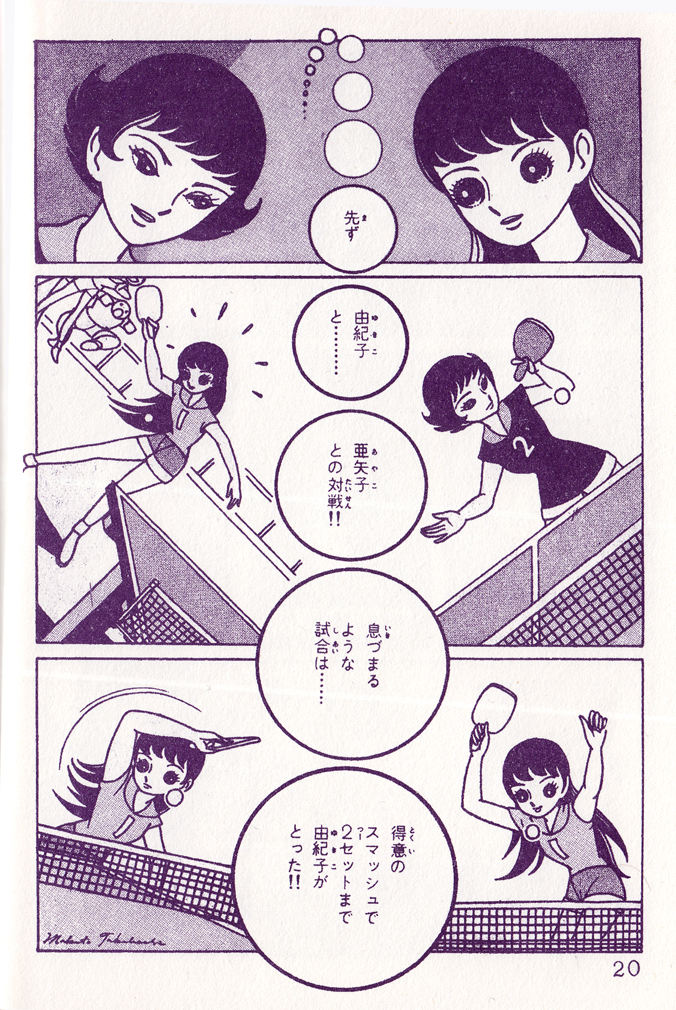
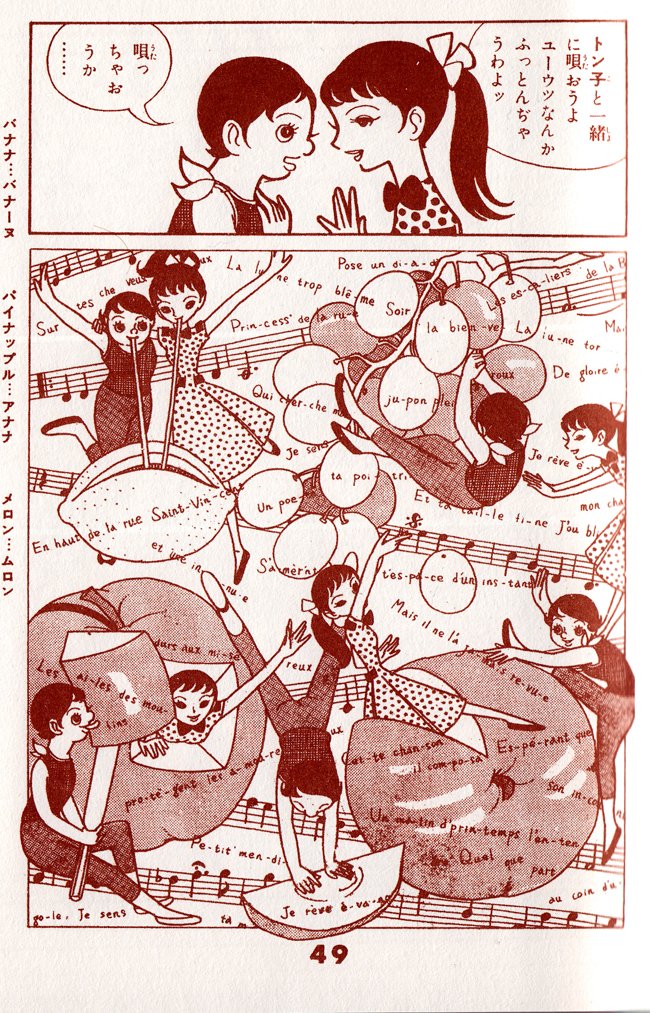
“Sakura namiki” (The Rows of Cherry Trees): Takahashi uses the motif of the round ping-pong ball as a visual narrative element.
Sakura namiki (The Rows of Cherry Trees) (1957) is firmly in the tradition of shÅjo shosetsu, an almost painfully sensitive meditation on friendship, set in a girls school.  Though structured around two excitingly staged ping-pong matches, the manga dwells almost entirely in the realm of emotions and subtle social interaction. The protagonist, Atsuko, after losing in a match to the older girl she loves, suffers the suspicions of her schoolmates that she’s lost on purpose and wonders if she truly understands her own motives. Much emphasis is put on ambiguous glances and shifting emotions; the atmosphere is suffused with beauty and chaste tristesse.
Macoto Takahashi — “Sakura namiki” (The Rows of Cherry Trees) 1957Macoto Takahashi — “Sakura namiki” (The Rows of Cherry Trees) 1957Macoto Takahashi — an innovative “musical” page design from “Paris-Tokyo” (1958)
Miyako Maki
Miyako Maki — “Maki’s Whistle” (1960)
Maki was one of the handful of pioneering women manga creators of the late 1950s and early 1960s. Following Takahashi’s lead, she continued the tradition of the lyric style in shÅjo manga. Â Maki’s Whistle (1960) is voluptuously sentimental, a mother-daughter love story set in the world of ballet and film, with emotions flowing through the large expressive eyes of the characters. Maki was another important artist in the development of the archetypal shÅjo approach to page layout, often emphasizing feelings and atmosphere over forward-driving narrative.
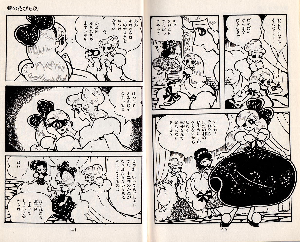
Hideko Mizuno, “Gin no habira” (Silver Petals) 1960Hideko Mizuno, “Gin no habira” (Silver Petals) 1960Hideko Mizuno, “Gin no habira” (Silver Petals) 1960
Though the majority of shÅjo creators of the ’50s and early ’60s were men, there was a considerable and growing number of women as well: Chieko Hokosawa
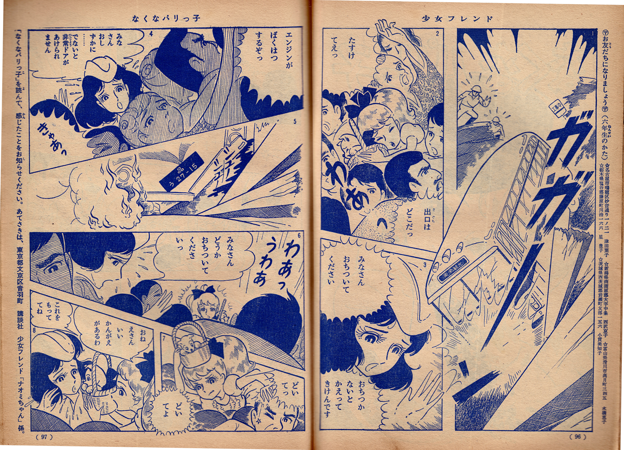
Chieko Hosokawa — “Naku na parikko” 1963
Setsuko Akamatsu
Setsuko Akamatsu — “Apprentice Angel” 1963
These and others (such as Toshiko Ueda, Yoko Imamura, Masako Watanabe, Yoshiko Nishitani) paved the way for the great period of shÅjo manga that would begin with the emergence in the early 1970s of the Year 24 Group, a generation of women artists, born in or around Showa year 24 (1949), who made use of the traditions of lyric illustration, shÅjo shosetsu, Takarazuka and Tezukean manga, in effecting a radical transformation of the entire medium.

 And I love the panel with Izumi’s reflection in the teacup as she’s thinking!
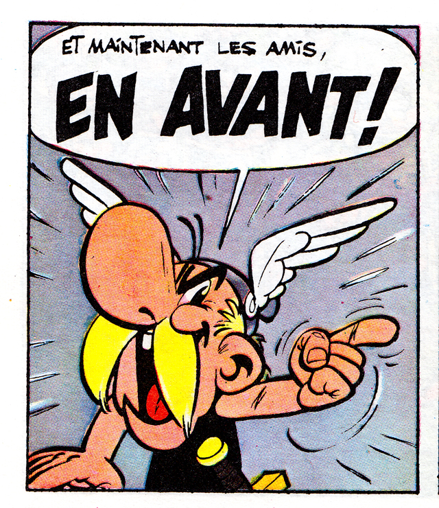


