Portugese comics scholar Pedro Moura did an interview with me and Alexander Danner about Comics: a Global History, for the Comics Alternative website. Â Pedro wrote a review too, for his Portugese blog (Google translate will give you a rough idea of what it says, if you ask nicely!)
Tag: Comics A Global History
Comics, a Global History: Pilote, the Early Years
 Coming in June from publisher Thames and Hudson, “Comics: A Global History, 1968 to the Present,” written by Alexander Danner and me.   Here are some excerpts and expanded material, including some great images that couldn’t fit in the book.Text in italics is directly from the book.
The decision to start the book in 1968, to define it as a sort of “comics come of age” narrative, sprung from the idea of “watershed” events like the appearance of Zap in the U.S., of Tsuge’s Nejishiki (Screw Style) in Japan, and, in Europe, and the changes seen in the pages of Pilote all taking place in that same year. In all these cases, of course, the breakthroughs of ’68 had been brewing throughout the earlier years of the decade. Â As it says in the introduction…
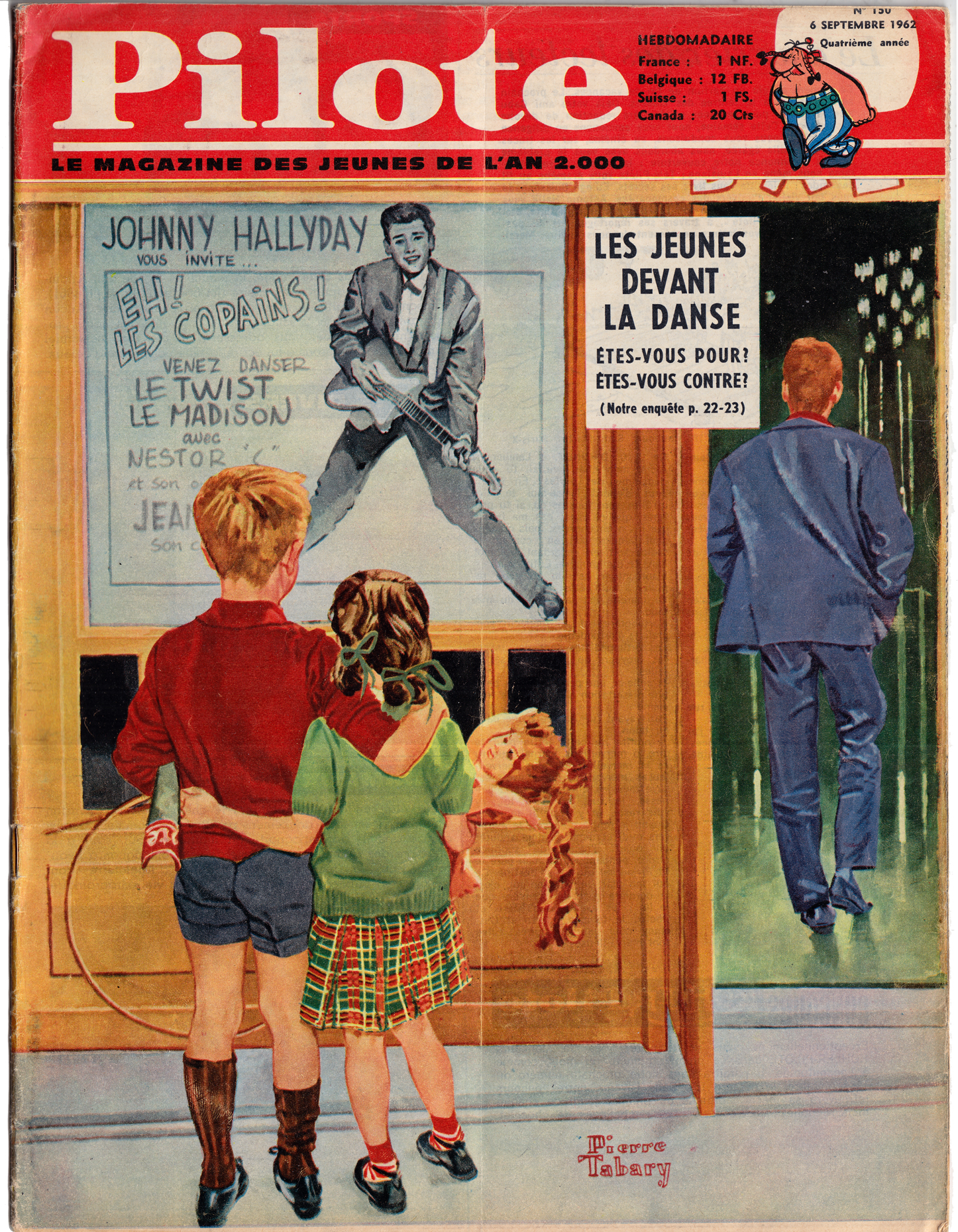
 In Europe, the maturing of the comics audience was accompanied by a rebalancing of the creative center from Belgium toward France. This began with the establishment in 1959 of the Paris-based Pilote magazine by writers René Goscinny and Jean-Michel Charlier, and artist Albert Uderzo. Like Tintin or Spirou, Pilote was initially aimed at schoolboy readers and had a distinctly wholesome and pedagogical tone. But Goscinny, who became editor-in-chief, envisioned a more adult tone for bande dessinée, and Pilote began to move in that direction, helped by the popularity of Uderzo and Goscinny’s Astérix le Gaulois (Astérix the Gaul, 1959) and Charlier and Jean Giraud’s Lieutenant Blueberry (1963). Astérix, which was set in France during the period of Roman occupation, offered sly, anachronistic satire of contemporary culture, while Blueberry was a western with revisionist, antiauthoritarian undertones.
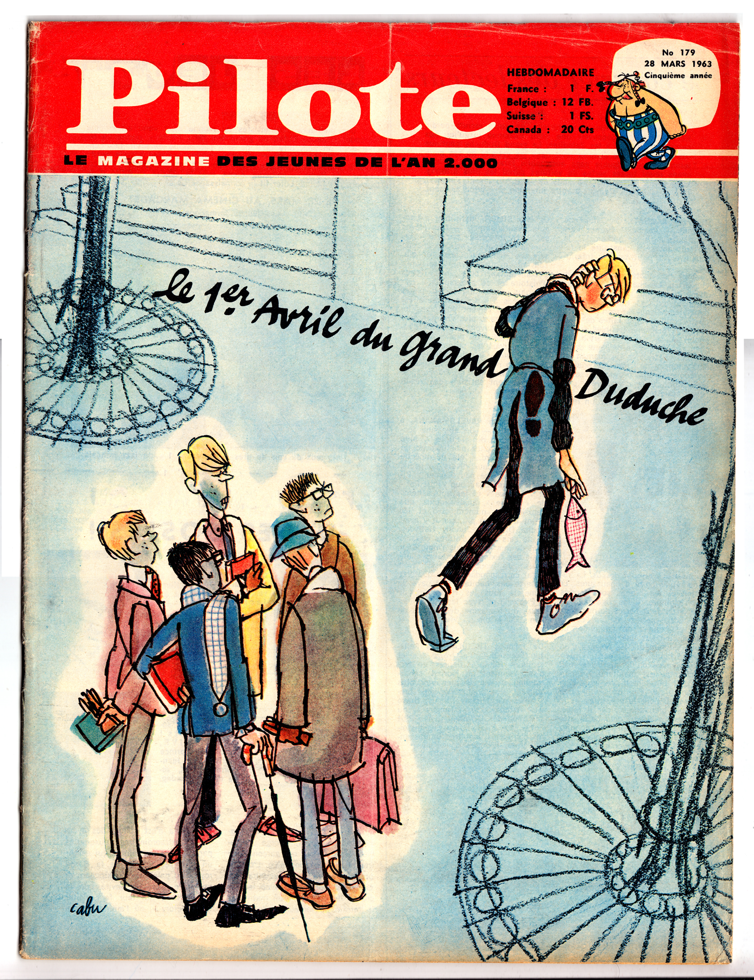
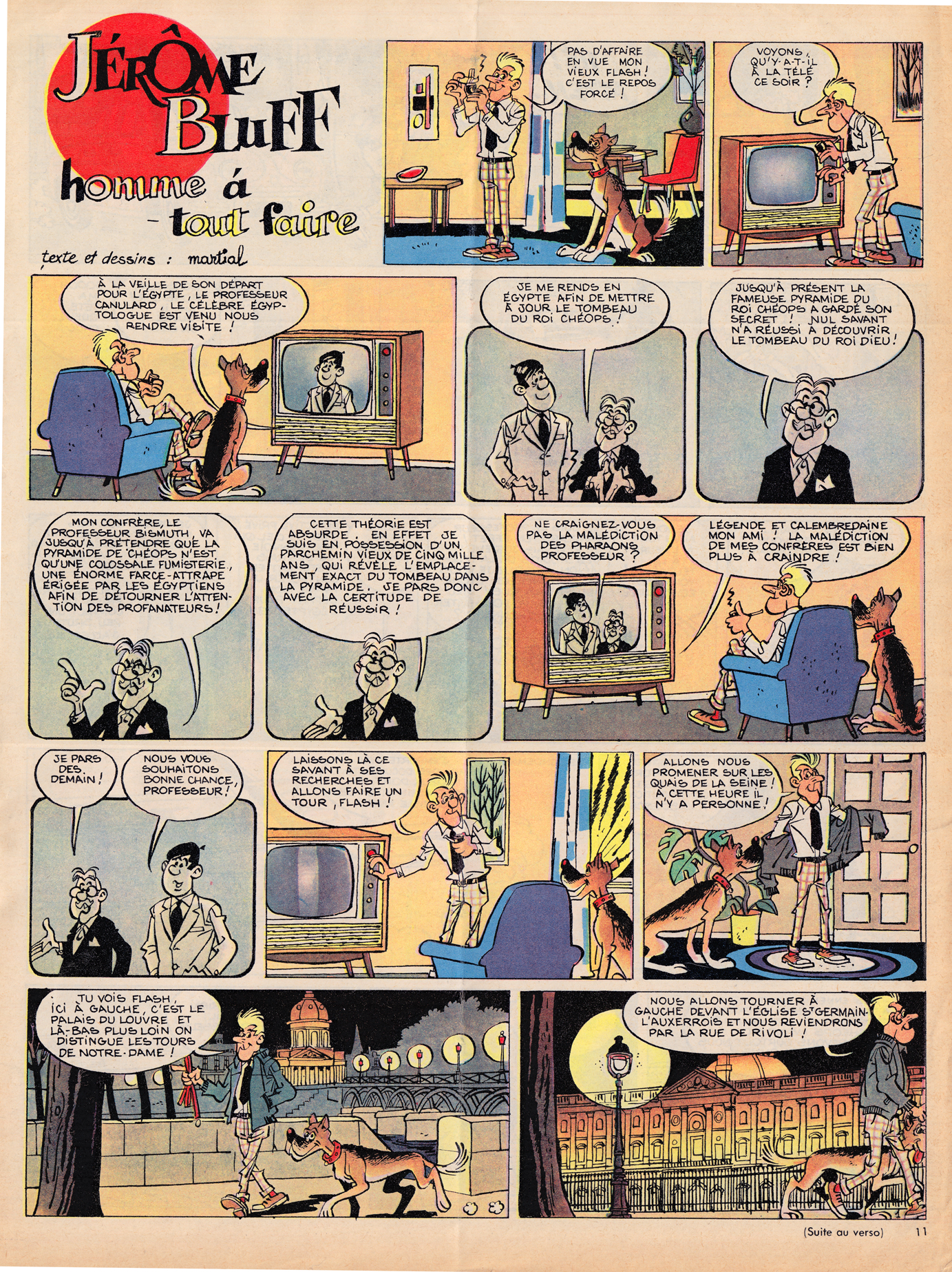
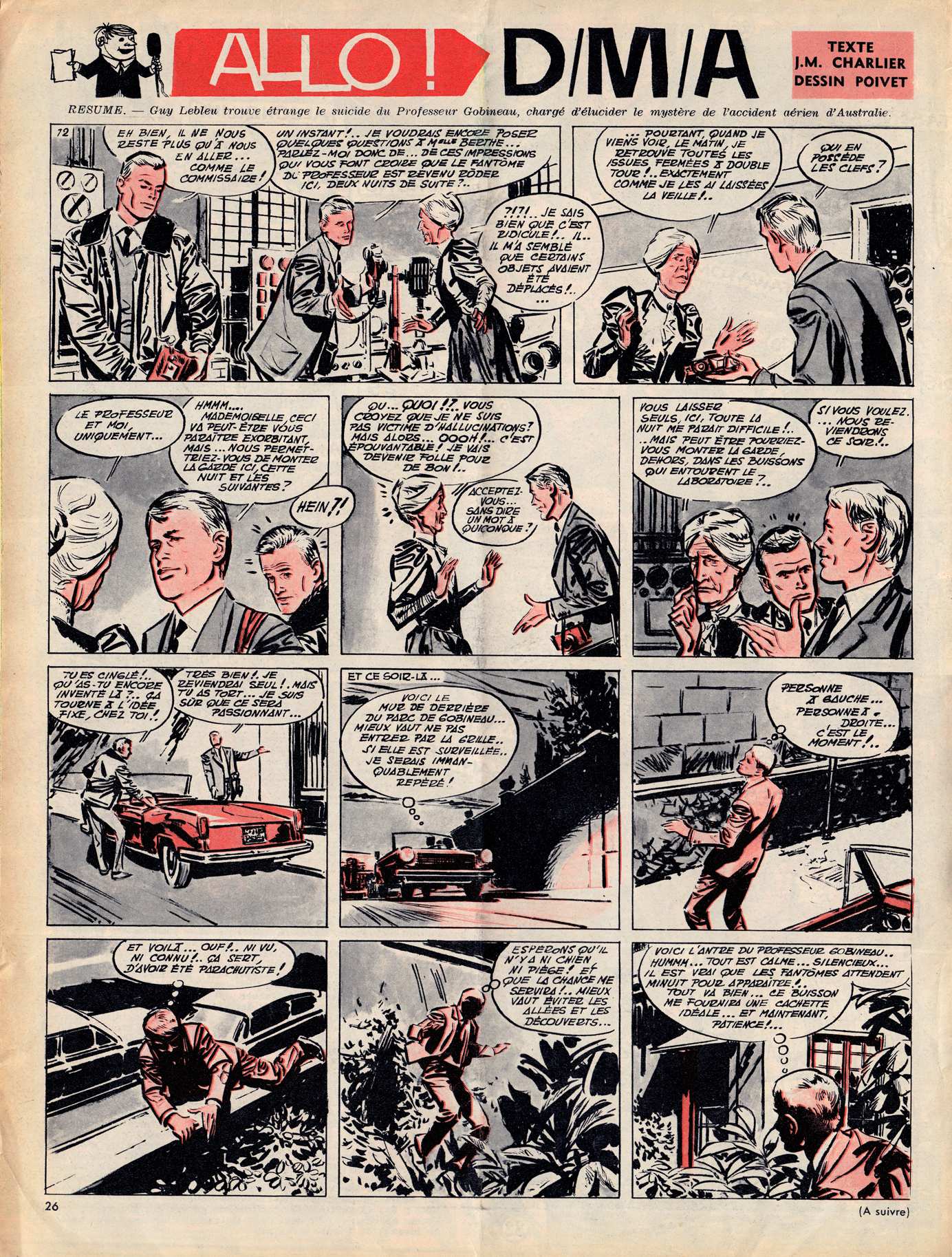
In its first few years, Pilote’s content was only subtly different from that of  Spirou and Tintin.  Though the tone was perhaps a bit breezier, Pilote, like its Belgian elders, featured articles on current events, sports, pop culture and exotic cultures.
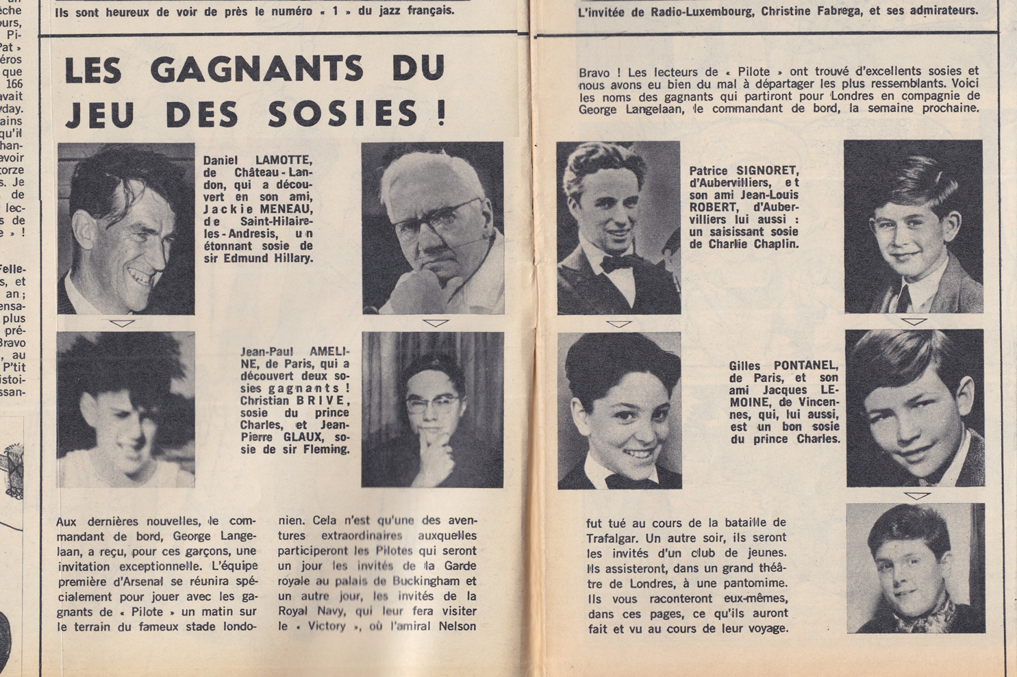
For the most part, the bandes dessinées found in early Pilotes are also in the Spirou/Tintin mold, with a mix of humor and action/drama:
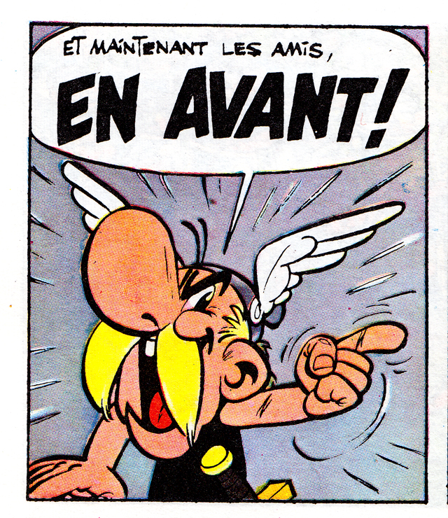
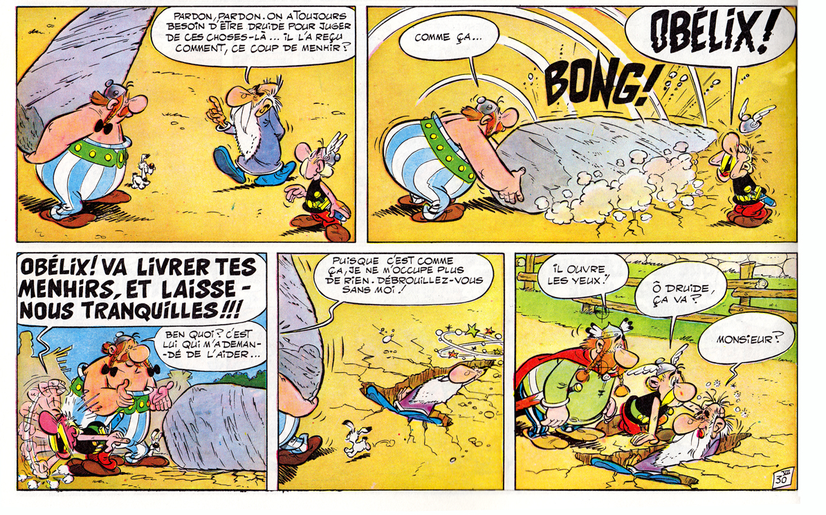
What soon set Pilote apart, and what set it on course to surpass its Belgian rivals, was the strip by founders Goscinny and Uderzo. Â Like any other strip in the journal, Asterix was serialized one page per week:
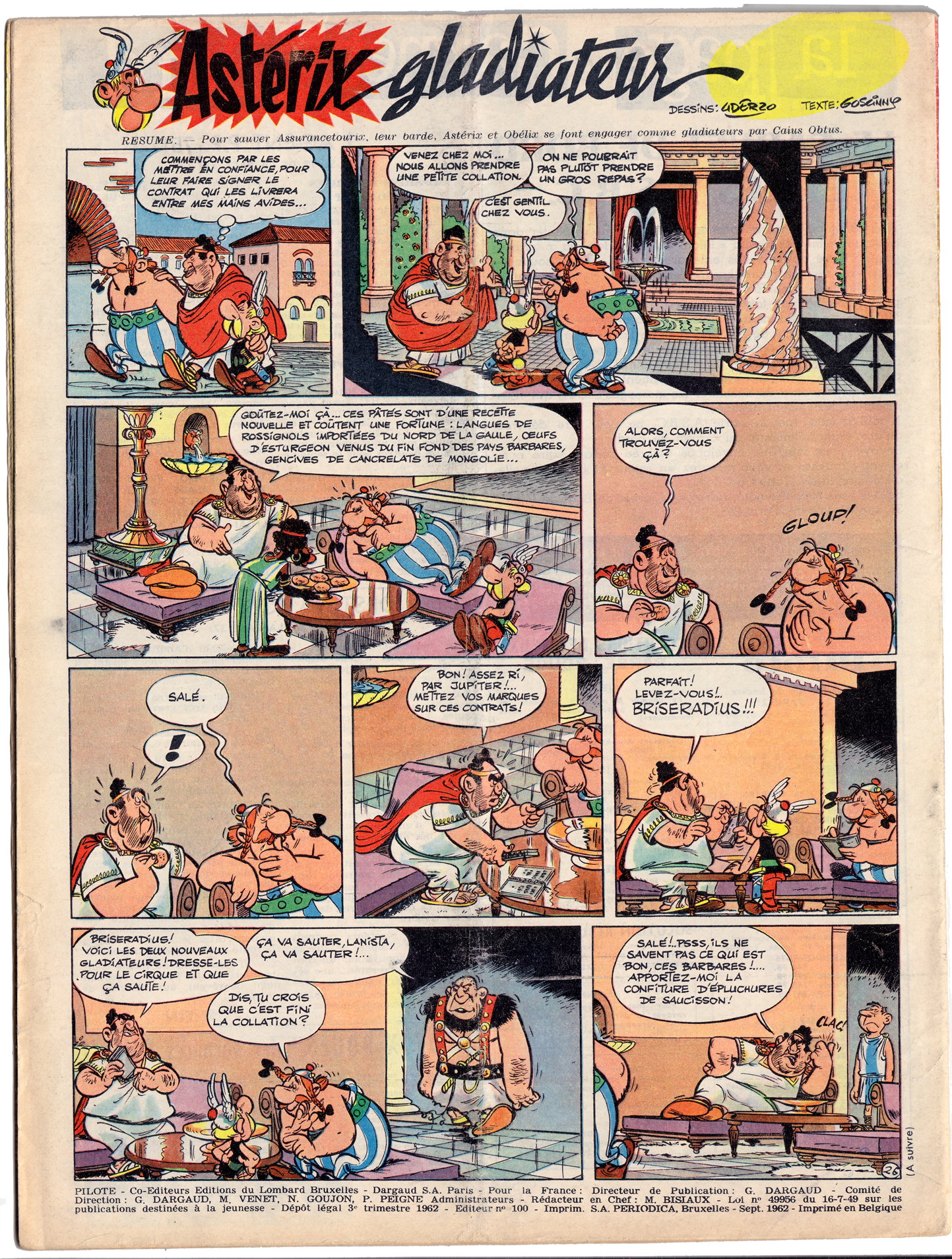
Asterix’ combination of slapstick comedy and anachronistic satire were two of the elements that made it a sensation:
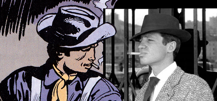
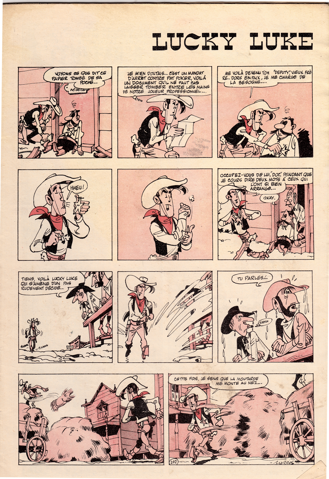
The second pillar of Pilote’s success came in 1965 with Lieutenant Blueberry, written by Charlier and drawn by newcomer Jean Giraud.  In its early years, Giraud’s art for Blueberry was often stiff and undistinguished when compared with other Franco-Belgian westerns:
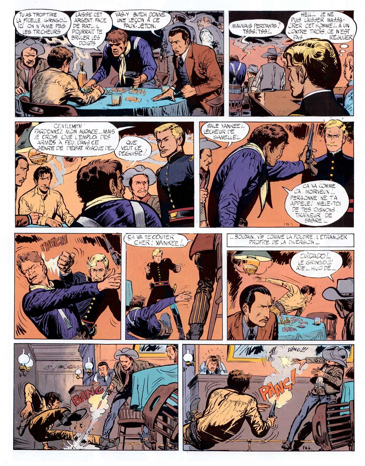
From the start however, Charlier and Giraud brought a refreshing, contemporary rebelliousness to the protagonist of their strip, a quality reinforced by Giraud’s depiction of Blueberry as a sosie for New Wave film star Jean-Paul Belmondo.
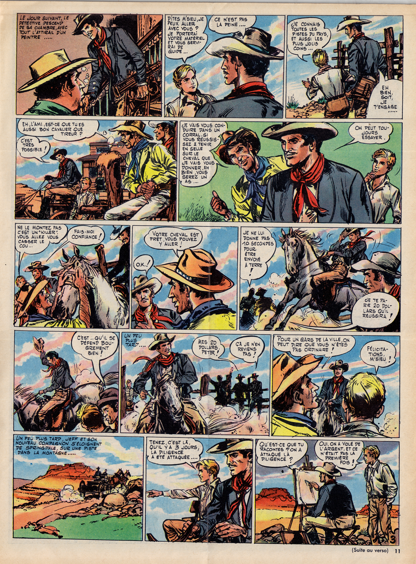
Within a few years, though, Giraud’s style would progress astonishingly, just one of the many major developments that Pilote would undergo during the eventful late ’60s-early ’70s period.
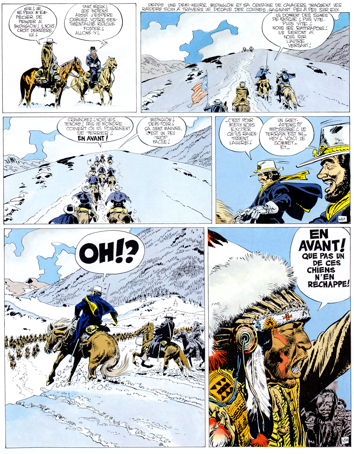
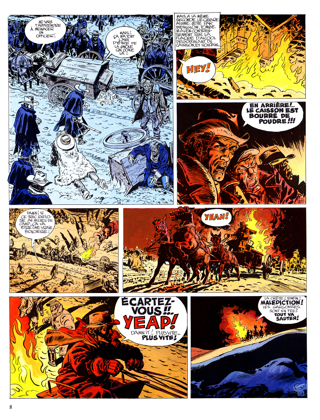
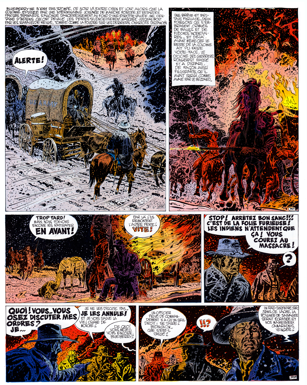
(Above: Giraud & Charlier, 3 pages from Le Général Tête Jaune, 1968)
COMING SOON: “Pilote ’68!”
Comics, a Global History: “Fumetti neri”
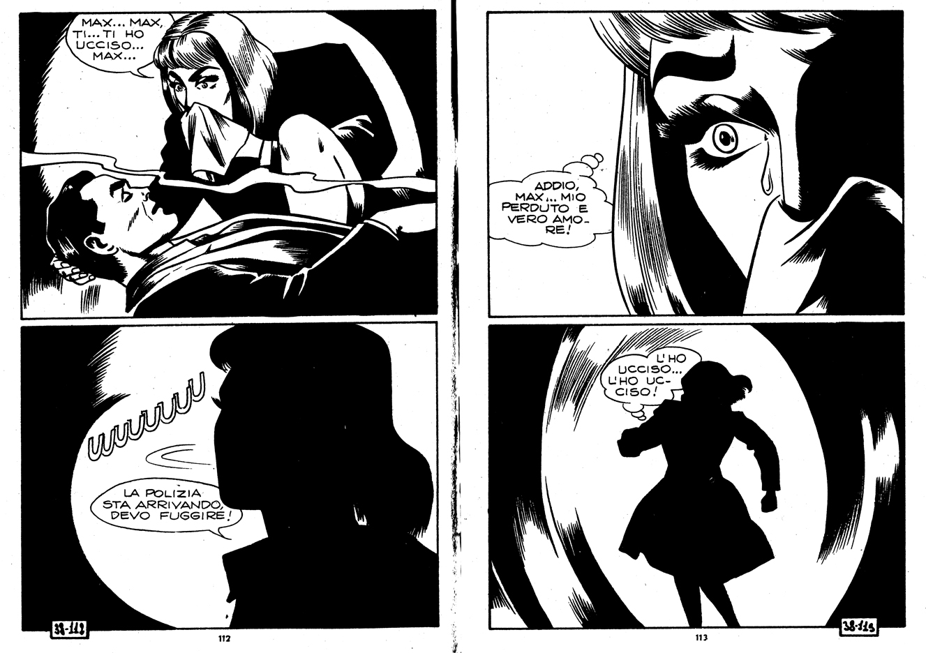
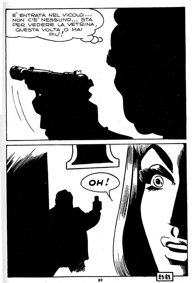
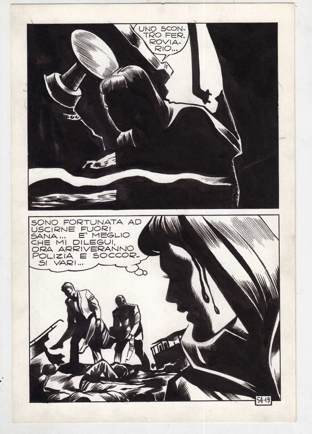
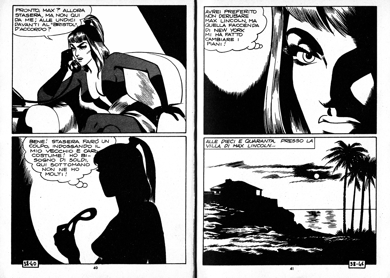 Magnus (Roberto Raviola) (art) Max Bunker (writing) Satanik #38 • 1966 In Italy a new genre of dark, violent and erotic comics in the crime genre, called fumetti neri (“black comicsâ€), reflected the era’s cultural freedoms and the loosening moral grip of the Catholic Church. Another major fumetti neri was sisters Angela and Luciana Giussani’s Diabolik.
(From the introduction to Comics: A Global History, 1960 to the Present )
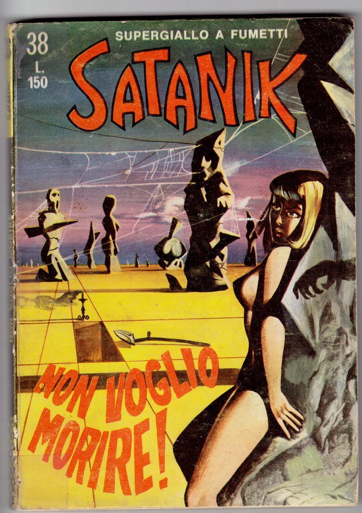
 Magnus (art) Max Bunker (writing), Satanik #38, June 1966
Fumetti neri  can certainly be seen in context of  the broader movement toward adult comics in Europe (where they’d been pigeonholed as a children’s medium for even longer than in the U.S.), which also included  Barbarella, The Adventures of Jodelle, the work of Guido Crepax, and journals like the Italian Linus.

But fumetti neri were more disreputable than those high-toned examples: lurid, sexy, violent… trashy fun, definitely not for all-ages. I’m far from an expert on this stuff.  If you want to read up on Italian comics, I highly recommend Drawn and Dangerous: Italian Comics of the 1970s and 1980s, by Simone Castaldi, one of the best books in English on European comics, with a lot of insight into Italian culture and politics as well.
The most striking work that I’ve seen in this genre is by Magnus (Roberto Raviola), who collaborated with writer Max Bunker (Luciano Secchi) on the titles Kriminal and Satanik (all the work in this post is by them).
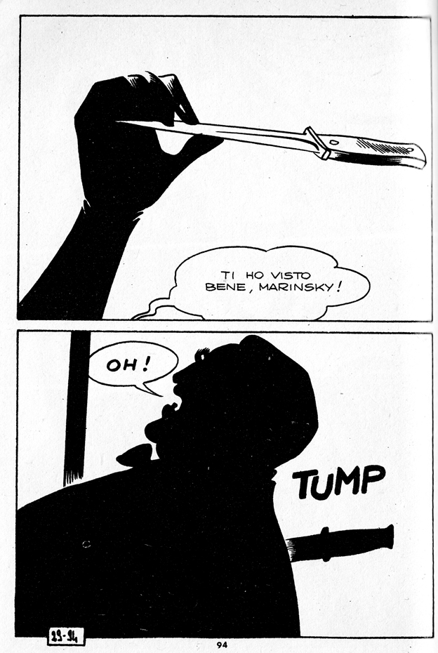
The rigid 2-panel-per-page format (printed as small, digest-size paperbacks) had the effect of a productive creative restraint on their composition and story-telling. Â Magnus did amazing things with blacks and sillhouettes, creating some very interesting layouts, with amazing use of negative space, and there’s some feathered inking in there that looks like it inspired Charles Burns.
Comics a Global History: Post-war Belgian bande dessinée 2: Spirou
Upcoming in June from publisher Thames and Hudson, “Comics: a Global History, 1968-present,” written by Alexander Danner and me.  Here are some excerpts, and additional material including some great comics images  that we couldn’t fit in the book. Â

As the title suggests, the book covers the period from, roughly, 1968 until 2010. The introduction, though, provides some background on the development of comics around the world (focusing mainly on Europe, Japan and the U.S.) during the post-war era through the mid-60s. Â Text in italics is directly from the book.
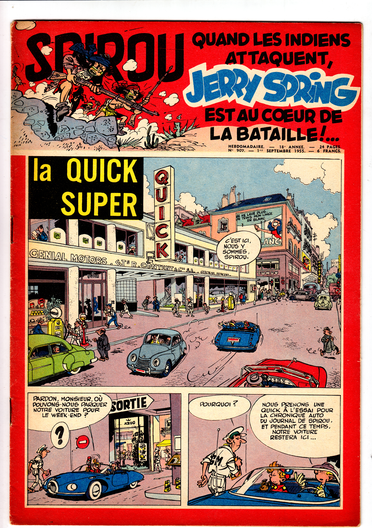
Continuing with the post-war Franco-Belgian comics, and focusing on the two cornerstone comics periodicals of the era, we move from Le Journal de Tintin to:
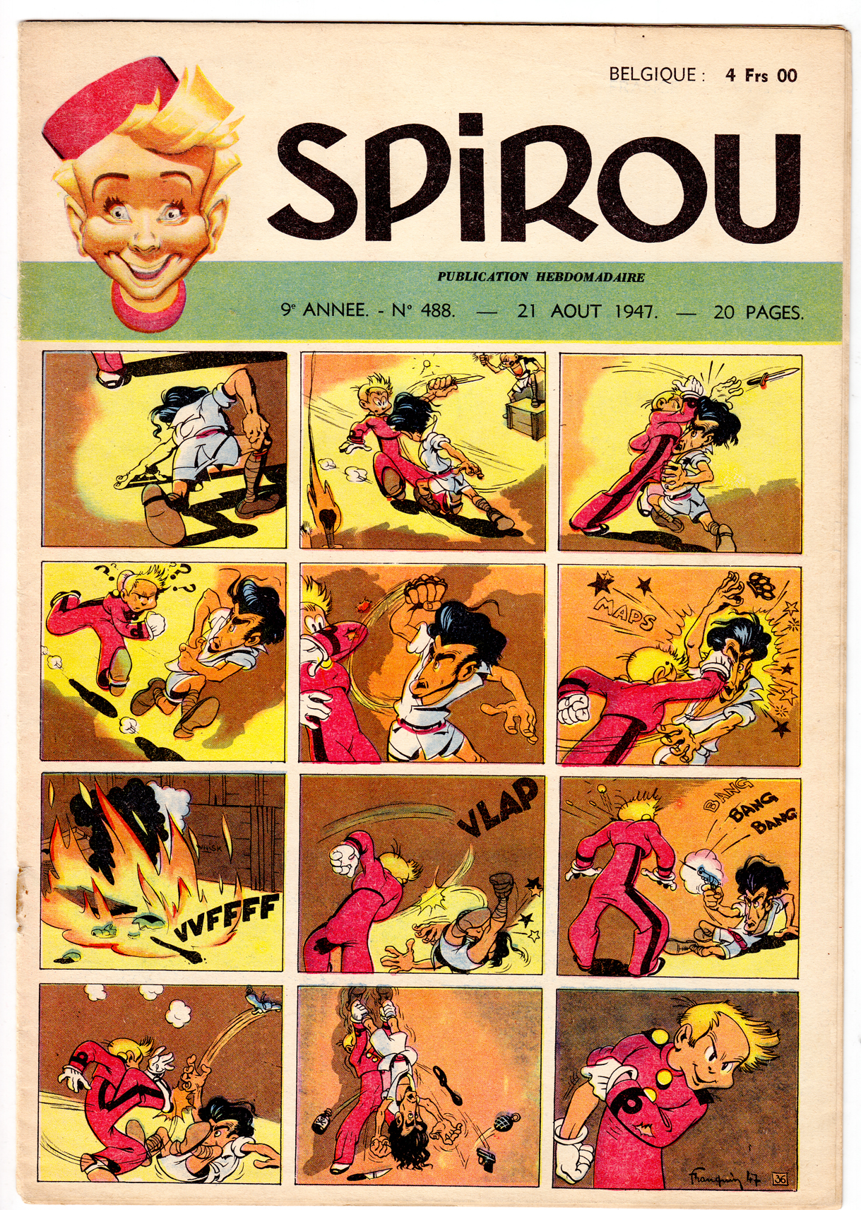
 Spirou cover/strip from 1948, by André Franquin
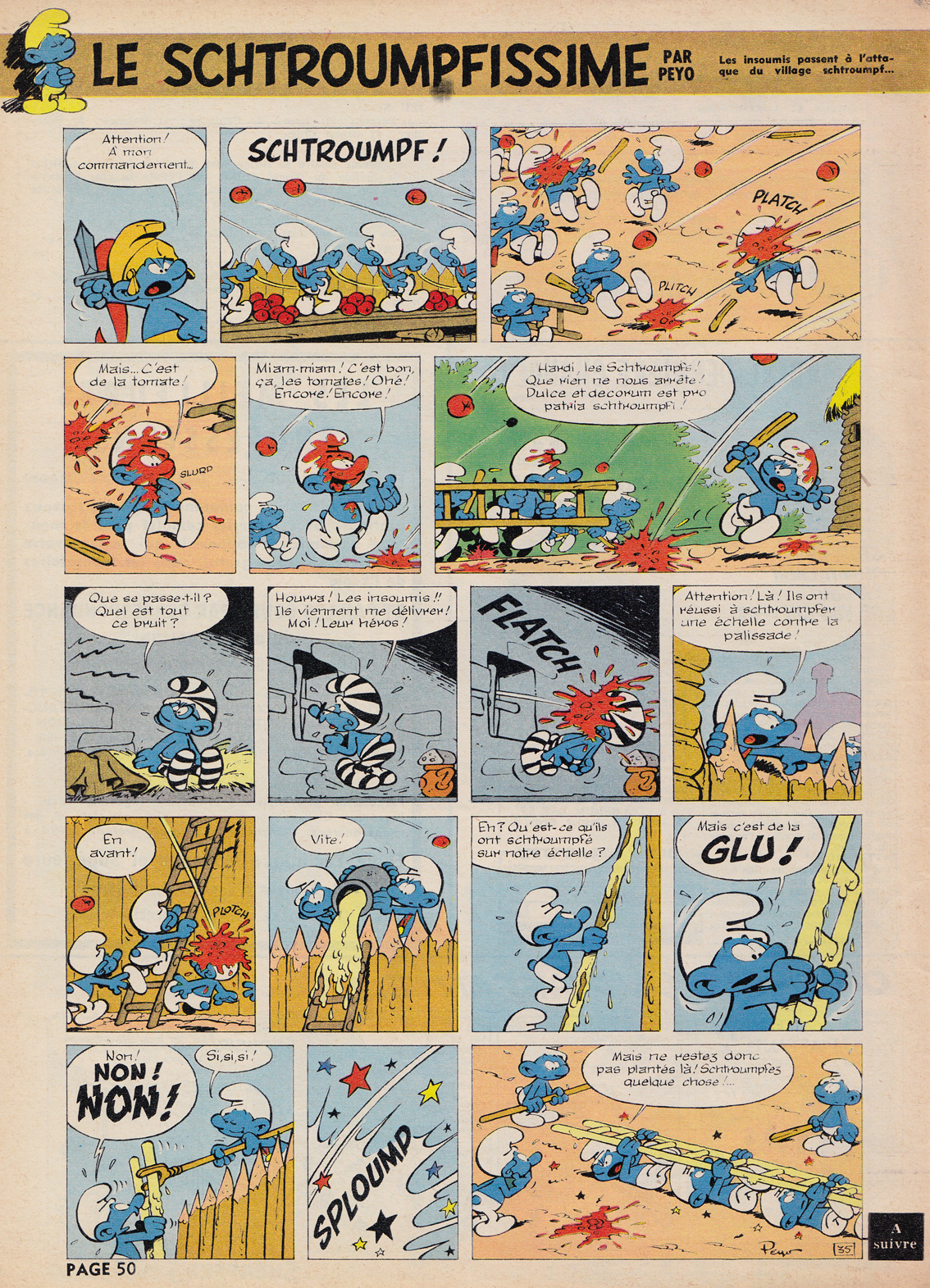
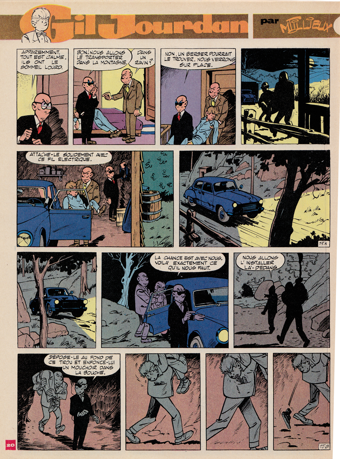
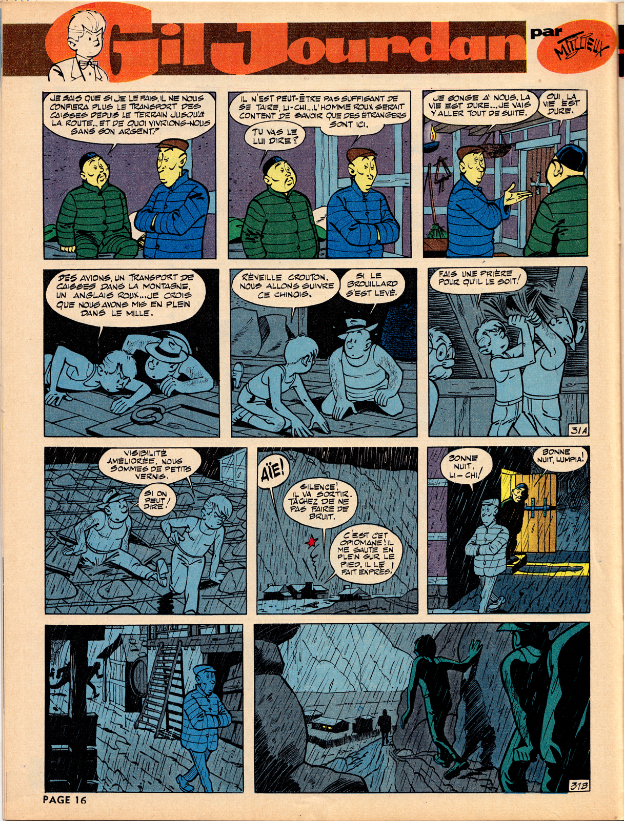
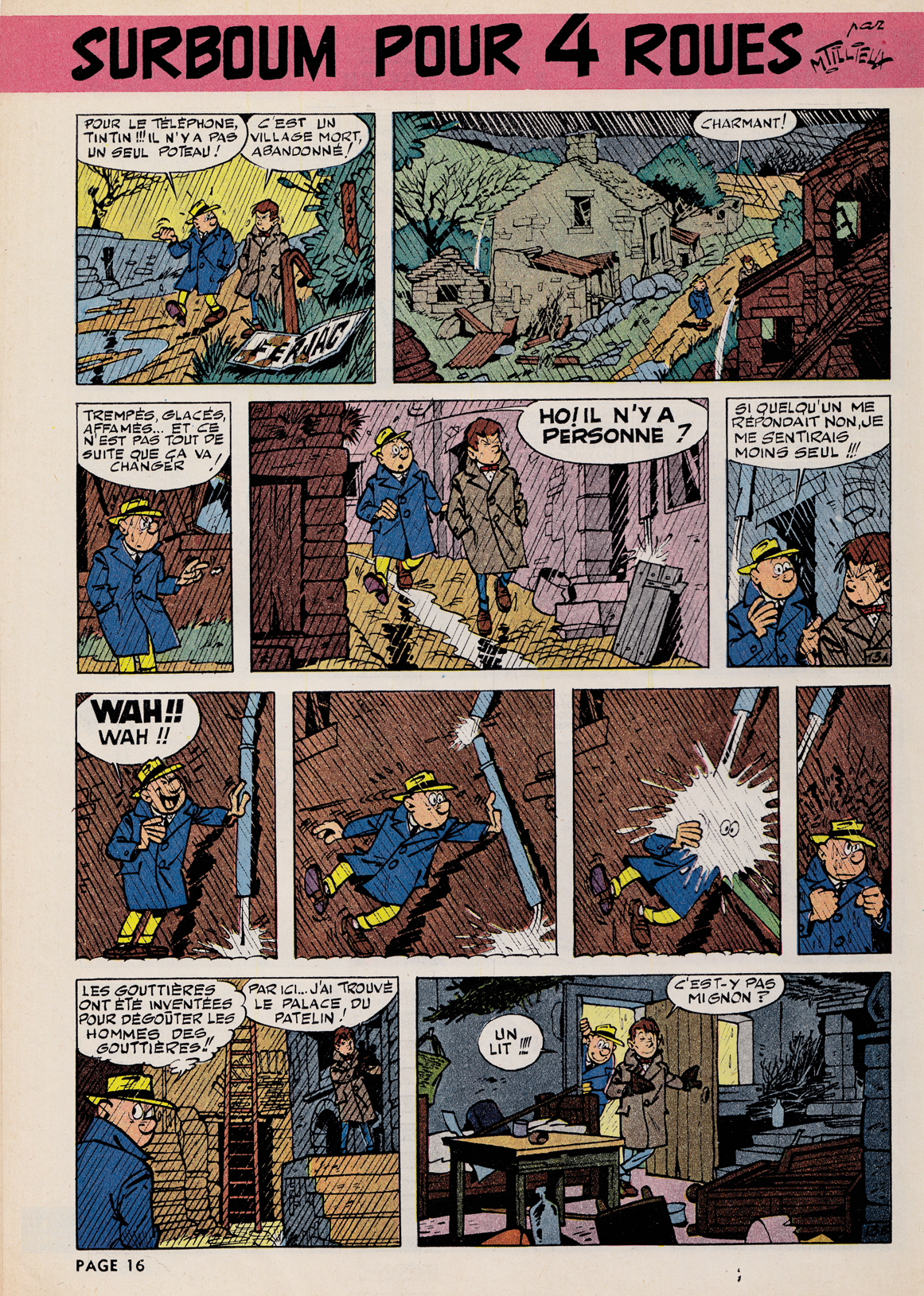
Spirou, first published in 1938, was home to the style known as the École de Charleroi, or École de Marcinelle [for the Brussels neighborhood where Spirou was located], later referred to as the “Atom Style.†In contrast to the precise, cool and orderly approach of the Hergéan Bruxelles style, the Charleroi was more exaggerated and elastic, with a more varied and dynamic quality of line. It was perfected by a strong team of artists, including André Franquin, who took over the title character Spirou and created his beloved sidekick the Marsupilami. Others included Morris (Maurice De Bevere) with Lucky Luke, Peyo (Pierre Culliford) with Les Schtroumpfs (aka   Smurfs), Maurice Tillieux with Gil Jourdan, and Roba, with Boule et Bill.
André Franquin
Franquin ranks with Hergé as the most revered bande dessinée artists of the postwar decades. In the late 40s, Franquin took over the title character of Spirou, and soon created the bellboy’s crazy animal sidekick, the Marsupilami.
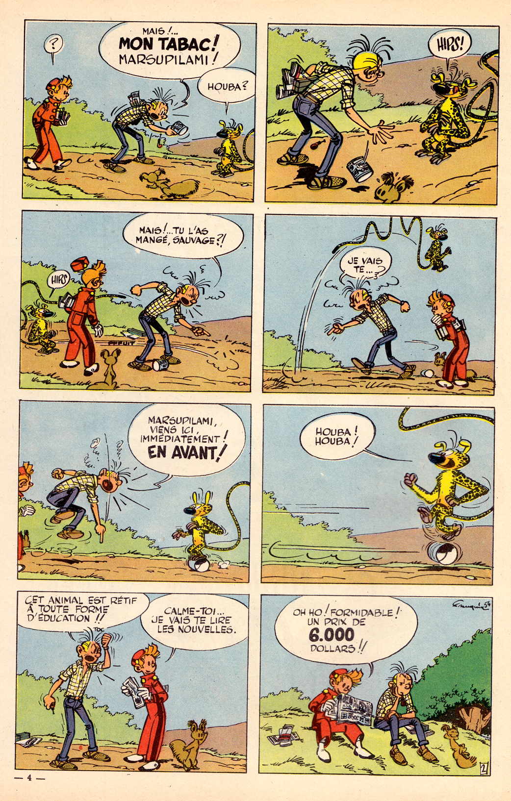
Franquin’s creation Marsupilami, the unspecified-species sidekick of Spirou is one of the most popular characters in Franco-Belgian comics
While there’s much in common between L’Ecoles Bruxelles and Marcinelle (particularly on the level of composition and layout), in Franquin’s work the differences become apparent. Instead of the cool clarity of the ligne claire style, we have here a more energetic approach to line and shading, a rounded cartooning style that owes more to the Disney model, but also a more nervous, even violent “graphism” as the French call it (a great word that means more than simply “graphic style,” I think, implying greater depths of content and meaning in the way an artist composes and draws).
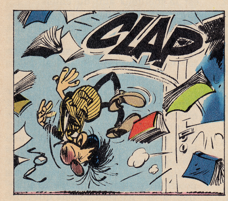
The style bespeaks an undercurrent of anxiety and chaos, as oppose to the comforting stability of the ligne claire, and this is seen also in Franquin’s approach to character.  In the late 50s he created Gaston Lagaffe, a bumbling, lazy office worker, in the words of Matthew Screech, “the first morally ambiguous bande dessinée hero.” (from Screech’s, “Masters of the Ninth Art,” which has the best writing on Franquin in English that I’ve come across, along with great chapters on Hergé, Moebius, Tardi, Goscinny & Uderzo and other topics.)
Maurice Tillieux
 In his private-eye series Gil Jourdan, Tillieux combined the elegance of the ligne claire with the expressive elasticity of L’ecole de Marcinelle, moving easily from comedy to action and drama, with a great sense of atmosphere.  You can see the influence of Tillieux’s  suave but comical style  on Yves Chaland,  one of the best artists in the revival of the Tintin / Spirou styles in the 198os (more on that in later posts).

The Atom Style
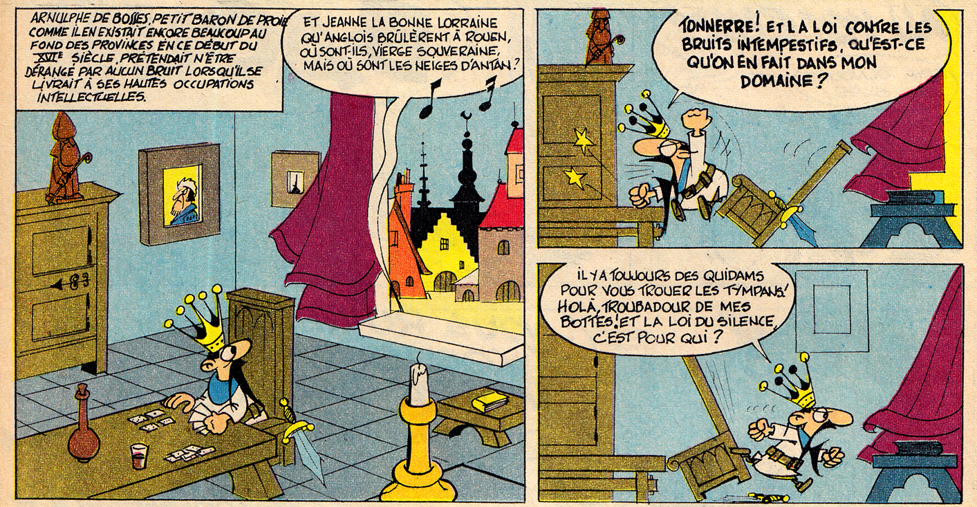
In my opinion, while the Journal de Tintin / ligne claire style reached its peak in the early-mid ’50s., the archetypal Spirou look emerged slightly later, as the cartoonists working in the Charleroi/Marcinelle style fully embraced the aesthetic of 1950s-early 60s Atom-age design.  Joost Swart (another key artist in the 1980s stylistic revival, who also coined the term ligne claire),  later referred to the Spirou sensibility as the “Atom Style,” with reference to this cartoony modernism.
Even a middle-ages-set gag strip can have that “Atom style” look:
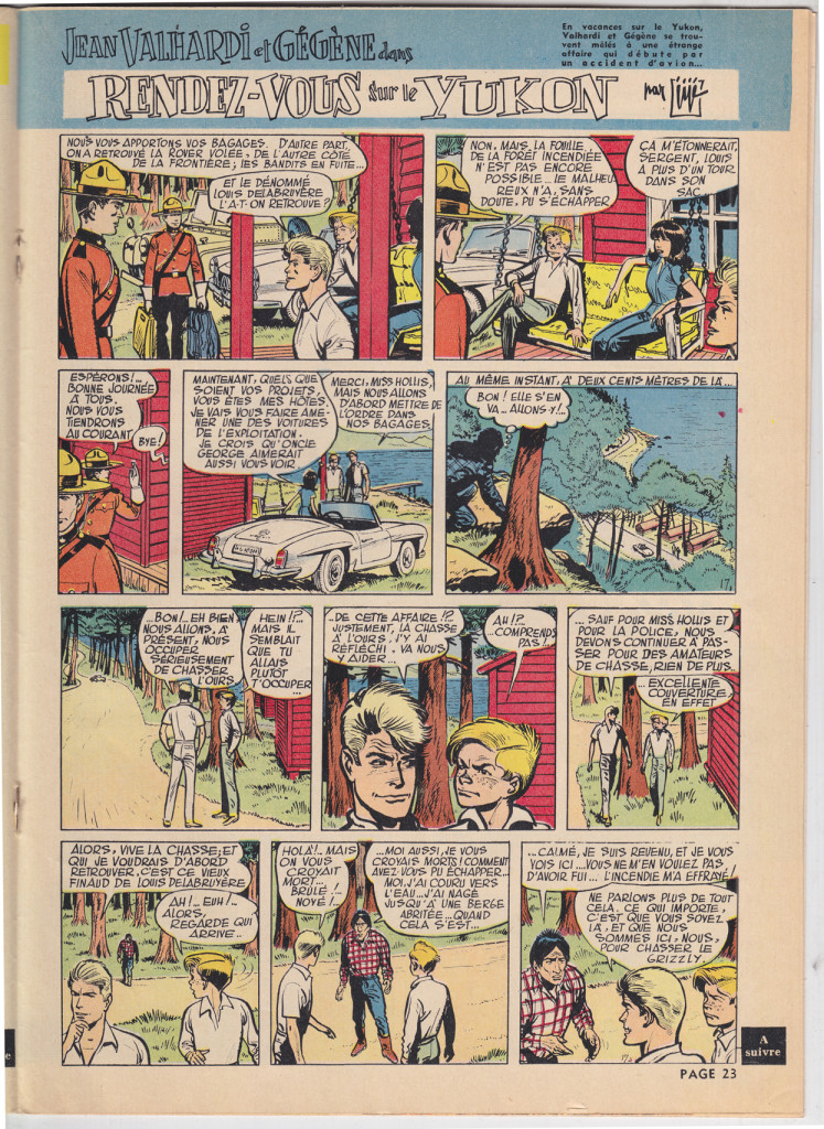
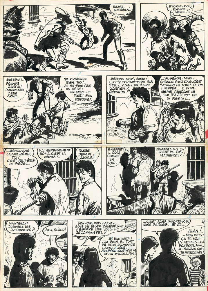
Not all the content of Spirou was comical. Â There was also a large component of muscular action comics, the best featuring the heavy-lined exaggerated styles of Eddie Pappe and Jiji. Two examples, 20 years apart, of the two artists work on the long-running strip Jean Valhardi: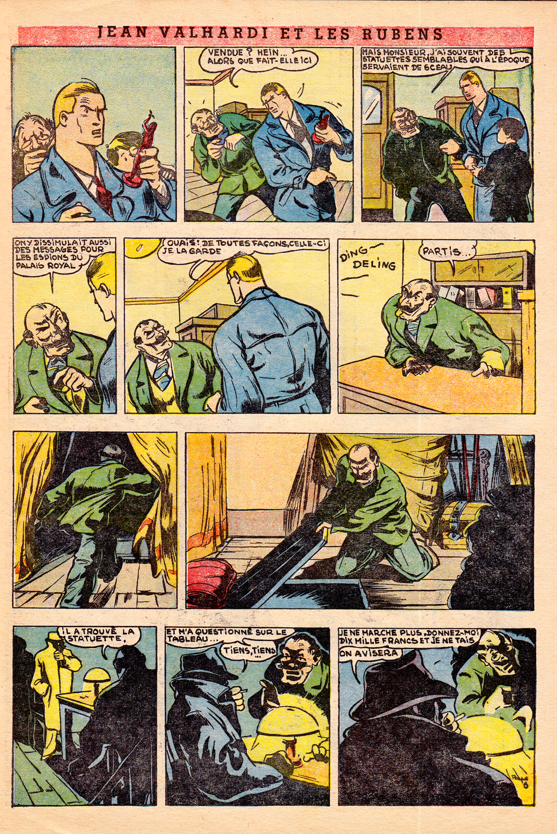
- Eddie Paape – Jean Valhardi – Spirou 436, 1946
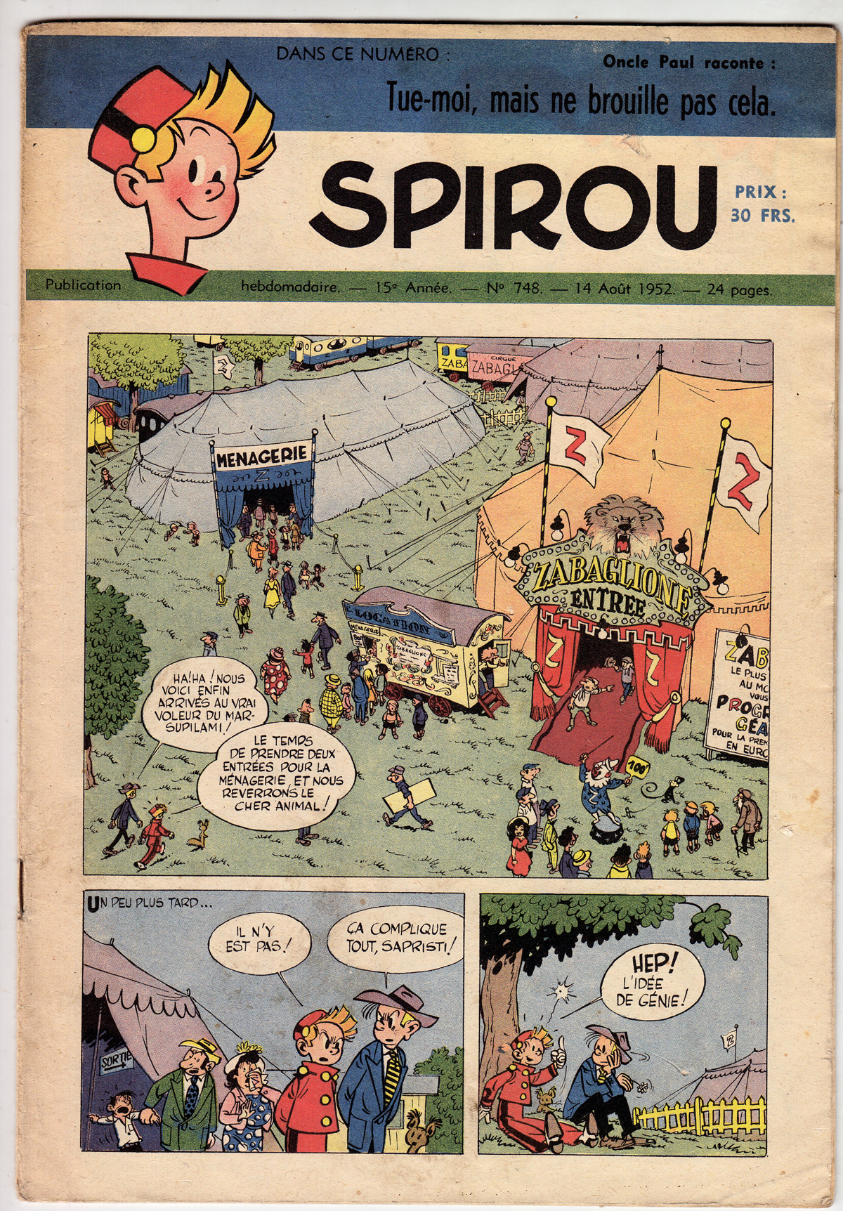
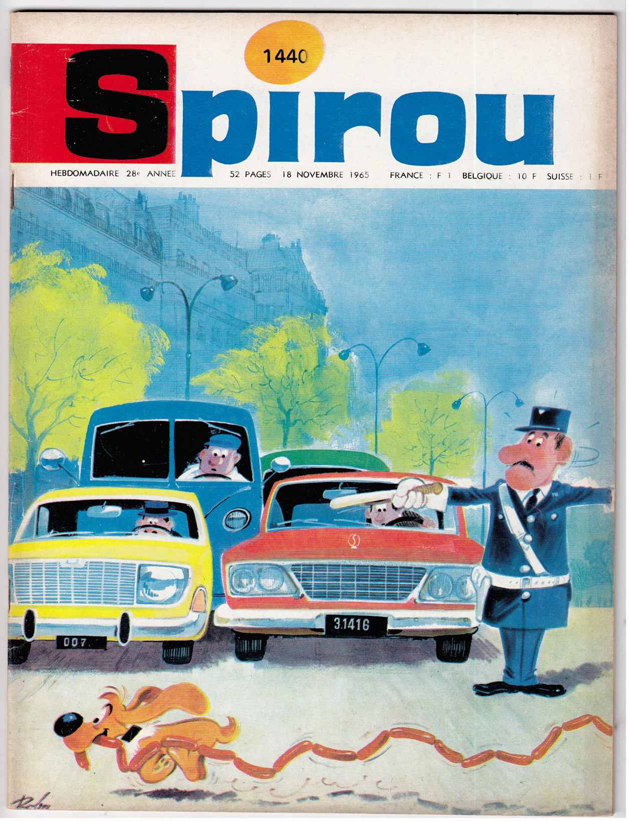
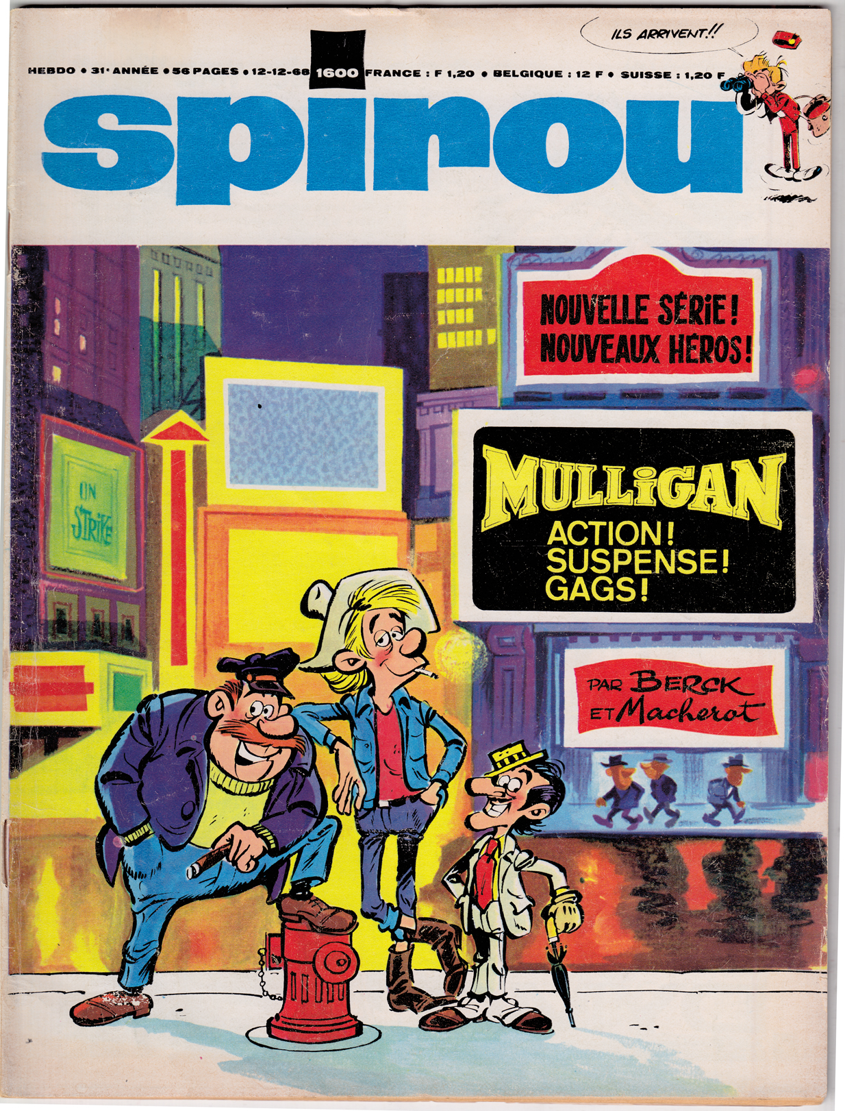
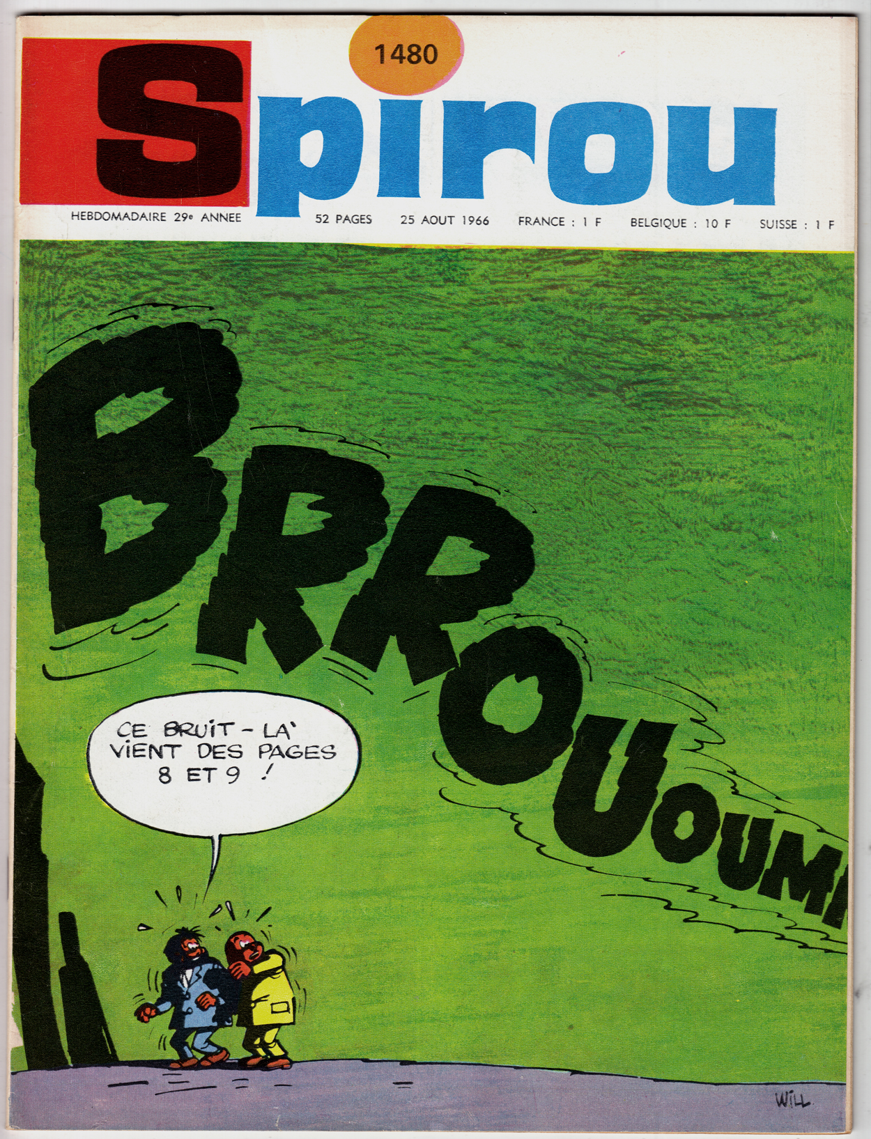
As for covers, since the Spirou approach was generally to run a comic page on the cover, they weren’t as dazzling as in Le Journal de Tintin. Â By the late 60s, though, Spirou shifted to a more conventional approach to cover, with some wonderful results:

Comics A Global History: Post-war Belgian bande dessin̩e РLe Journal de Tintin
Upcoming in June from publisher Thames and Hudson, “Comics: a Global History, 1968-present,” written by Alexander Danner and me.  I want to post some snippets from the book, including some great comics images (from foreign lands and bygone days) that we couldn’t quite fit in the book. Â
As the title suggests, the book covers the period from, roughly, 1968 until 2010. The introduction, though, provides some background on the development of comics around the world (focusing mainly on Europe, Japan and the U.S.) during the post-war era through the mid-60s. Â Text in italics is directly from the book.
Postwar European  Comics

French-language comics created in Belgium rose to international prominence in the postwar years. While most major European countries had their own comic book industries, their comics were generally popular only within their own borders and tended to be derivative of pre-war American newspaper strips. In Belgium, however, bandes dessinées quickly developed a decidedly modern flavor that made them popular throughout the continent.  The most popular Belgian comics periodicals, Tintin and Spirou, represent two influential stylistic branches. Â


Tintin, founded in 1946, was named for the popular reporter hero created in 1929 by Hergé, who was the magazine’s first artistic director. Tintin’s pages showcased the École de Bruxelles, a style later dubbed the ligne claire (“clear lineâ€) style. Pioneered by Hergé, the style was practiced by other artists, such as Edgar P. Jacobs (Blake et Mortimer), Willy Vandersteen  (Suske en Wiske) and Bob De Moor.
Fred Funcken – Le Trone de Gilgit, 1953. Colonialist themes were very prominent in the Francophone comics of the period.
Le Journal de Tintin demonstrated the high level of artistry and imagination comics creators could bring to the form, in the decades when it was primarily a commercial children’s medium. Following the example of Tintin creator Hergé, artists such as Bob De Moor offered European readers the bright, clean, modern style known as l’Ecole de Bruxelles, later dubbed the ligne claire or “clear line†style. Graphically, the hallmarks of the ligne claire are the use of an even, unvarying line to define contours, flat color and avoidance of cross-hatching or other graphic forms of shading. In storytelling as well as graphcs, an inviting clarity and legibility were emphasized.Â
The Ecole d’Herge’s emphasis on lisibilité – legibility – can be seen in an ideological light.  The entire graphic approach: unvarying line, the lack of dramatic lighting effects, consistency of background and foreground; as well as the approach to layout, using only “medium shots” and regular grids, with no close-ups or unusual angles, suggest an objectivity and stability to the universe being depicted.  In a period where France and Belgium were still  Colonial powers, the clearly-defined graphic and narrative quality of the ligne clair was a support for the rationalist, hierarchical world view that benefitted the existing power structure, helping to mold the journal’s youthful readership into good citizens.  As the great French comics critic Bruno Lecigne says, “Toute l’œuvre d’Hergé témoigne d’une doctrine d l’art classique;” (Hergé’s entire Å“uvre demonstrates a doctrine of classical art. “) the ligne claire was the High Classicism of European comics art.

 This classicism also expressed itself in a sort of playfully reassuring cartoon modernism, brimming with optimism about technology and progress.

What I love most about the ’40s and ’50s Tintin are the covers.  Can you  imagine being a French or Belgian kid, running to the newsstand kiosque every week for one of these jewels of color and drama?

Jacques Laudy is a neglected artist from this period. Â He did some breathtaking covers:


More Laudy, from his fanciful, Orientalist series Hassan et Kadour:


Bob De Moor’s style was the closest of all the Journal de Tintin artists to that of Herge.


For French comics critic Lecigne, this stylistic simulacrum is what reveals the essence of the Hergean ligne claire:
“In Barelli [De Moor’s best known series], it’s the fascinating appearance, the opaque surface of the style d’Hergé that’s on display. Hypnotized, I read Barelli without deciphering the text, unable to follow the plot, fascinated by the dramaturgy, the gestures. What I have before me is Hergé emptied of substance, depth and mythology; the signifier without the signified… reading Bob De Moor is an experience that permits me to perceive a language solely from the point of view of the signifier, syllables repeated until meaning disappears, whose existence becomes purely, concretely sonorous.” (Lecigne, Les Heritiers d’Hergé, p 39, translated by me)
Edgar P Jacobs‘ Blake et Mortimer rivaled Hergé’s Tintin in populariy; Jacobs represented the opposite pole of the Ecole de Bruxelles: moodier and more gothic than Herge, the series was an espionage thriller that also blended science fiction and horror.  His detailed, atmospheric London was an influence on young fan Jacques Tardi.


More great TINTIN covers:


<!– extreme_danmazur_c09994d5dcea40e288ef6e0f0b6e9ce8 –>
Comics A Global History: Introduction, part 1 – 1950s gekiga.
Upcoming in June from publisher Thames and Hudson, “Comics: a Global History, 1968-present,” written by Alexander Danner and me. Â I want to post some snippets from the book, including some great comics images (from foreign lands and bygone days) that we couldn’t quite fit in the book. Â
As the title suggests, the book covers the period from, roughly, 1968 until 2010. The introduction, though, provides some background on the development of comics around the world (focusing mainly on Europe, Japan and the U.S.) during the post-war era through the mid-60s.
In the Japanese section, after exploring Osamu Tezuka’s breakthrough work of the late 40s and early 50s, we move on to the 1950s gekiga movement:
By 1956 or so, a small rebellion against Tezukian hegemony was stirring in Osaka,
led by a group of young up-and-comers including Yoshihiro Tatsumi, Takao Saito¯
and Masahiko Matsumoto. Reverent admirers of Tezuka, they nonetheless felt
the need for more bite in their manga, and hence gekiga (meaning “dramatic
pictures†as opposed to manga, “playful pictureâ€) was created to, as Tatsumi
put it, provide “material for those in the transitional period between childhood
and adulthood.†* Distributed through the inexpensive rental library—or
kashihon—market, the early gekiga stories were mostly thrillers and mysteries
for adolescent male readers, with cinematic paneling and lighting effects
inspired by French and American film noir.
- Matsuhiko Matsumoto – Rinshitsu no otoko (The Man Next Door) – 1956 from Kage #1
The young gekiga artists of the 1950s, like Matsumoto, were great fans of Osamu Tezuka, and their cartooning style owed much to his. They pushed his “cinematicâ€Â qualities a little further, with more use of angles and of “aspect-to-aspect†paneling (images of details within a scene, employed to build atmosphere or, in the case of this page, suspense), and in general brought a darker, tougher mood to juvenile thrillers  and mysteries.

This first wave of gekiga** creators collaborated on two anthology periodicals, Kage (“Shadow”) was launched in 1956. The magazine was a success, sparking a boom in crime-themed, short story manga collections for the inexpensive kashihon market. But Kage’s small Osaka publisher, Hinomaru Bunko, was in perpetual financial straits, and when in the following year it appeared that the firm would go under, Matsumoto and Tatsumi accepted an offer from a rival to start a second, noir-ish anthology, Machi (“City”).***  Here are some images scanned from facsimile editions of the first issue of each of those titles:


*Quoted in “God of Comics: Osamu Tezuka and the Creation of Post-World War II Manga” by Natsu Onoda Power
** The term “gekiga” wasn’t yet used during the heyday of Kage and Machi. Â Matsumoto favored the term “Komaga” to differentiate their work, geared for older readers, from manga, which was still thought of as a children’s form. Tatsumi coined the term “gekiga” a few years later.
***As recounted by Matsumoto in his autobiographical “Gekiga Fanatics”