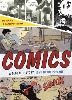
Upcoming in June from publisher Thames and Hudson, “Comics: a Global History, 1968-present,” written by Alexander Danner and me.  I want to post some snippets from the book, including some great comics images (from foreign lands and bygone days) that we couldn’t quite fit in the book. Â
As the title suggests, the book covers the period from, roughly, 1968 until 2010. The introduction, though, provides some background on the development of comics around the world (focusing mainly on Europe, Japan and the U.S.) during the post-war era through the mid-60s. Â Text in italics is directly from the book.
Postwar European  Comics
French-language comics created in Belgium rose to international prominence in the postwar years. While most major European countries had their own comic book industries, their comics were generally popular only within their own borders and tended to be derivative of pre-war American newspaper strips. In Belgium, however, bandes dessinées quickly developed a decidedly modern flavor that made them popular throughout the continent.  The most popular Belgian comics periodicals, Tintin and Spirou, represent two influential stylistic branches. Â
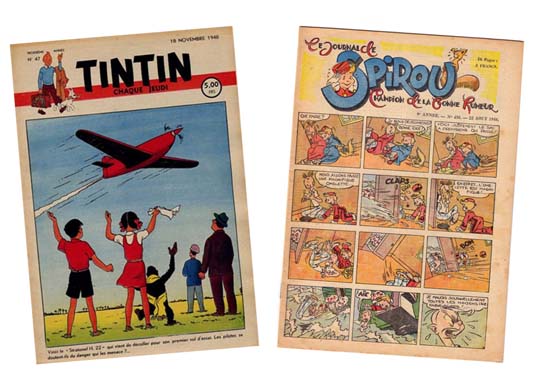
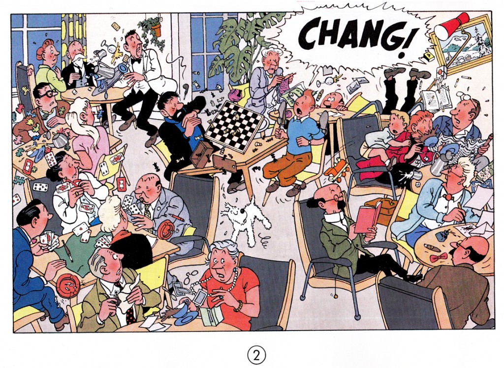
Tintin, founded in 1946, was named for the popular reporter hero created in 1929 by Hergé, who was the magazine’s first artistic director. Tintin’s pages showcased the École de Bruxelles, a style later dubbed the ligne claire (“clear lineâ€) style. Pioneered by Hergé, the style was practiced by other artists, such as Edgar P. Jacobs (Blake et Mortimer), Willy Vandersteen  (Suske en Wiske) and Bob De Moor.
Fred Funcken – Le Trone de Gilgit, 1953. Colonialist themes were very prominent in the Francophone comics of the period.
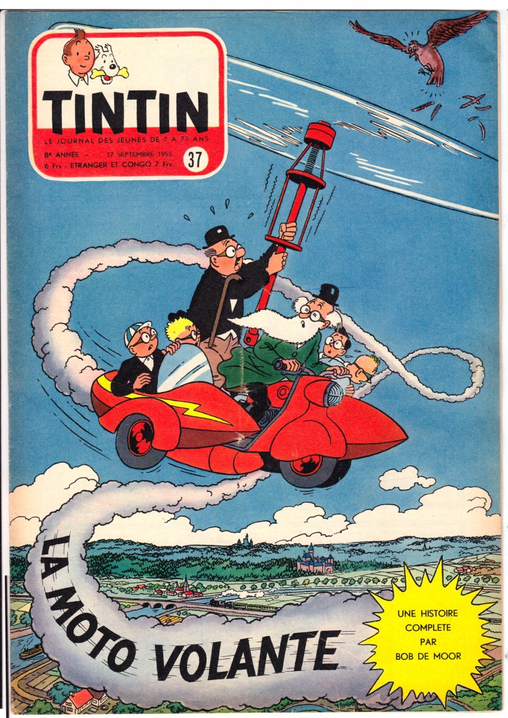
Le Journal de Tintin demonstrated the high level of artistry and imagination comics creators could bring to the form, in the decades when it was primarily a commercial children’s medium. Following the example of Tintin creator Hergé, artists such as Bob De Moor offered European readers the bright, clean, modern style known as l’Ecole de Bruxelles, later dubbed the ligne claire or “clear line†style. Graphically, the hallmarks of the ligne claire are the use of an even, unvarying line to define contours, flat color and avoidance of cross-hatching or other graphic forms of shading. In storytelling as well as graphcs, an inviting clarity and legibility were emphasized.Â
The Ecole d’Herge’s emphasis on lisibilité – legibility – can be seen in an ideological light.  The entire graphic approach: unvarying line, the lack of dramatic lighting effects, consistency of background and foreground; as well as the approach to layout, using only “medium shots” and regular grids, with no close-ups or unusual angles, suggest an objectivity and stability to the universe being depicted.  In a period where France and Belgium were still  Colonial powers, the clearly-defined graphic and narrative quality of the ligne clair was a support for the rationalist, hierarchical world view that benefitted the existing power structure, helping to mold the journal’s youthful readership into good citizens.  As the great French comics critic Bruno Lecigne says, “Toute l’œuvre d’Hergé témoigne d’une doctrine d l’art classique;” (Hergé’s entire Å“uvre demonstrates a doctrine of classical art. “) the ligne claire was the High Classicism of European comics art.
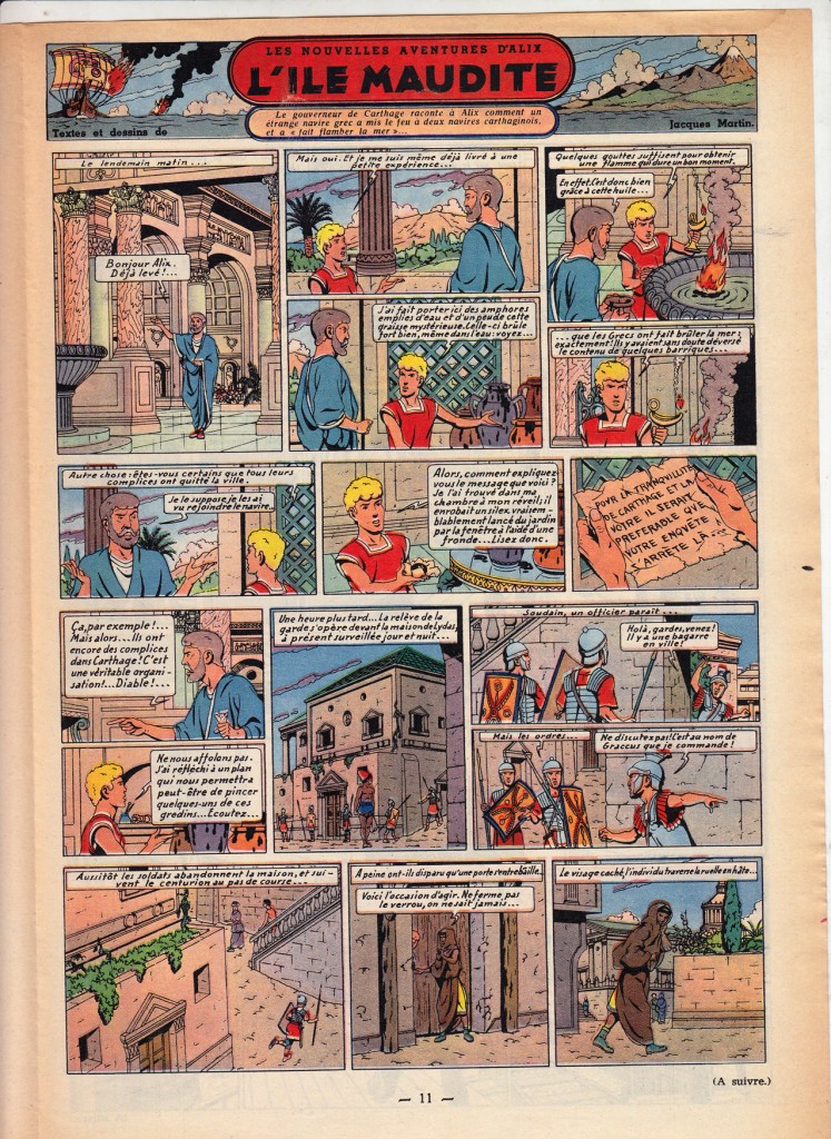
 This classicism also expressed itself in a sort of playfully reassuring cartoon modernism, brimming with optimism about technology and progress.
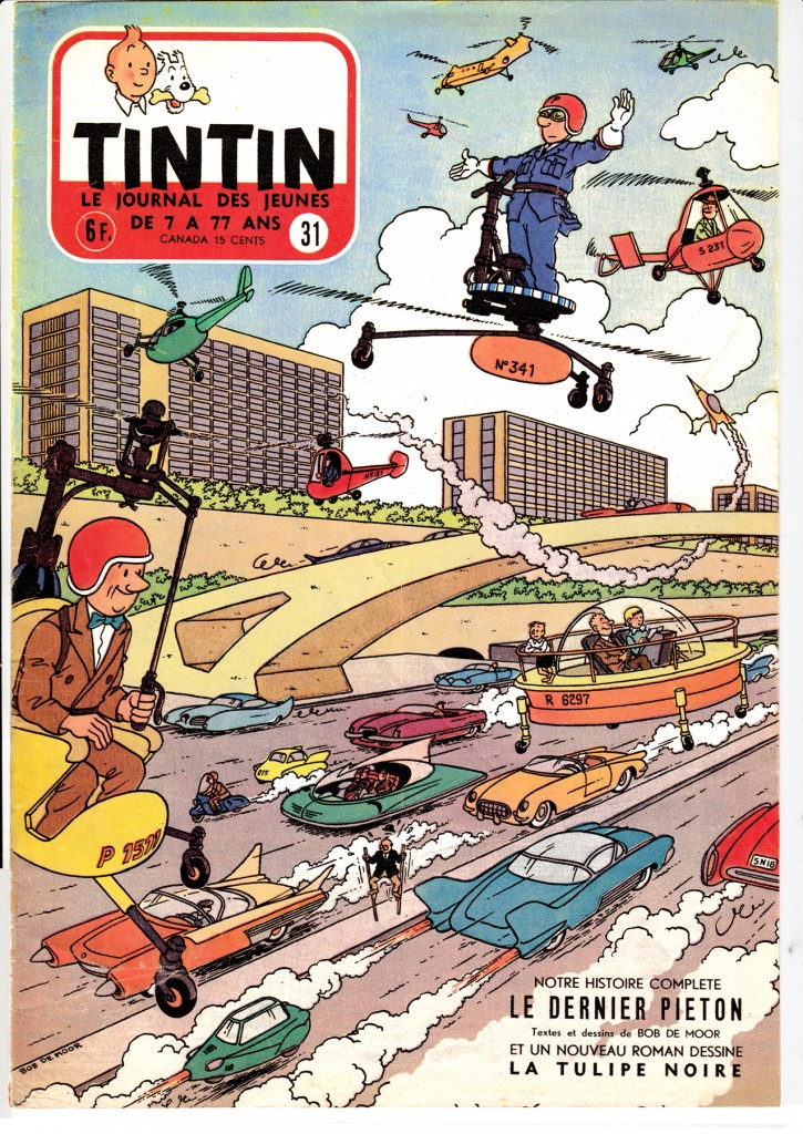
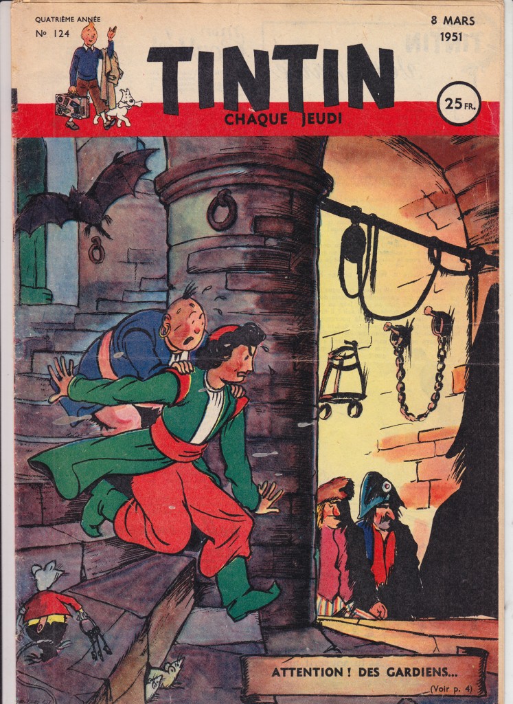
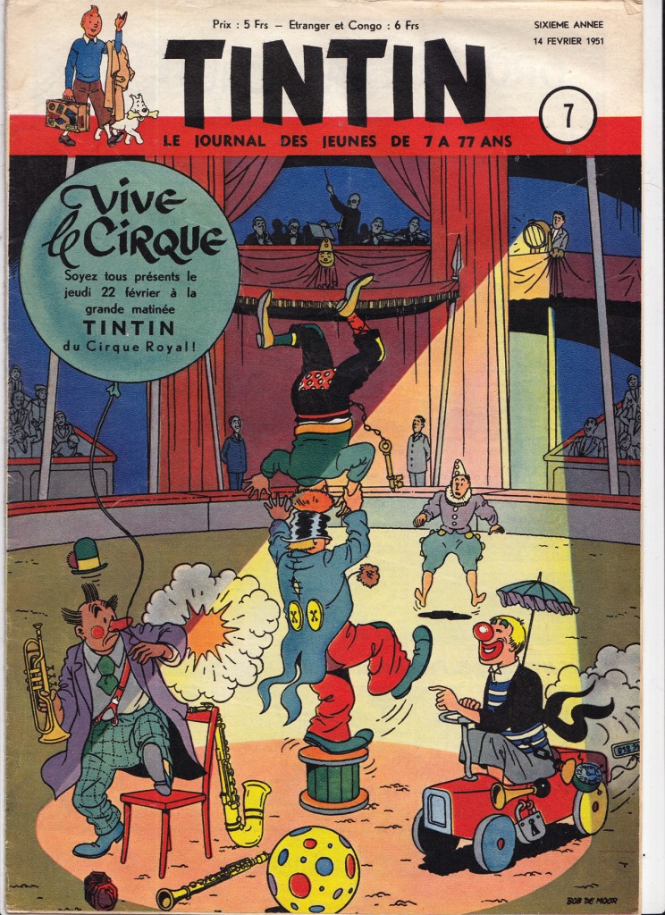
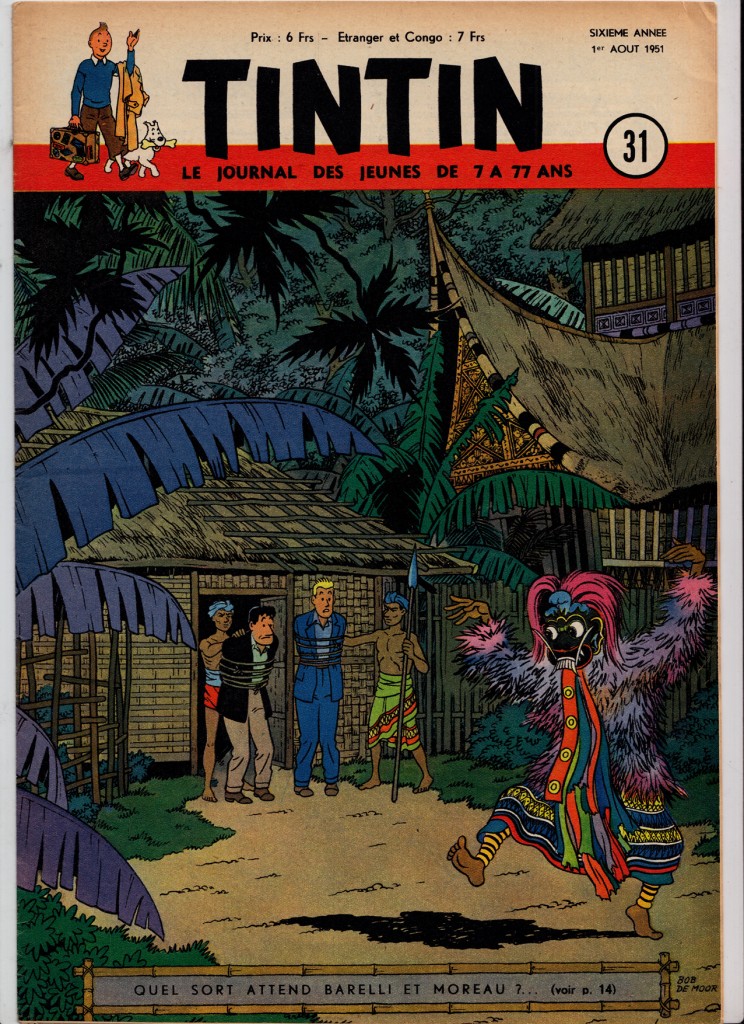
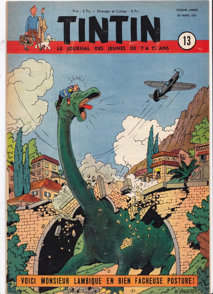
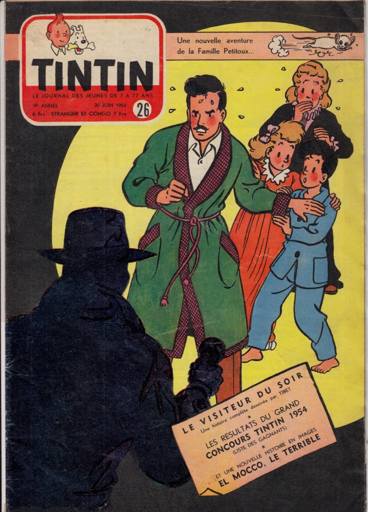
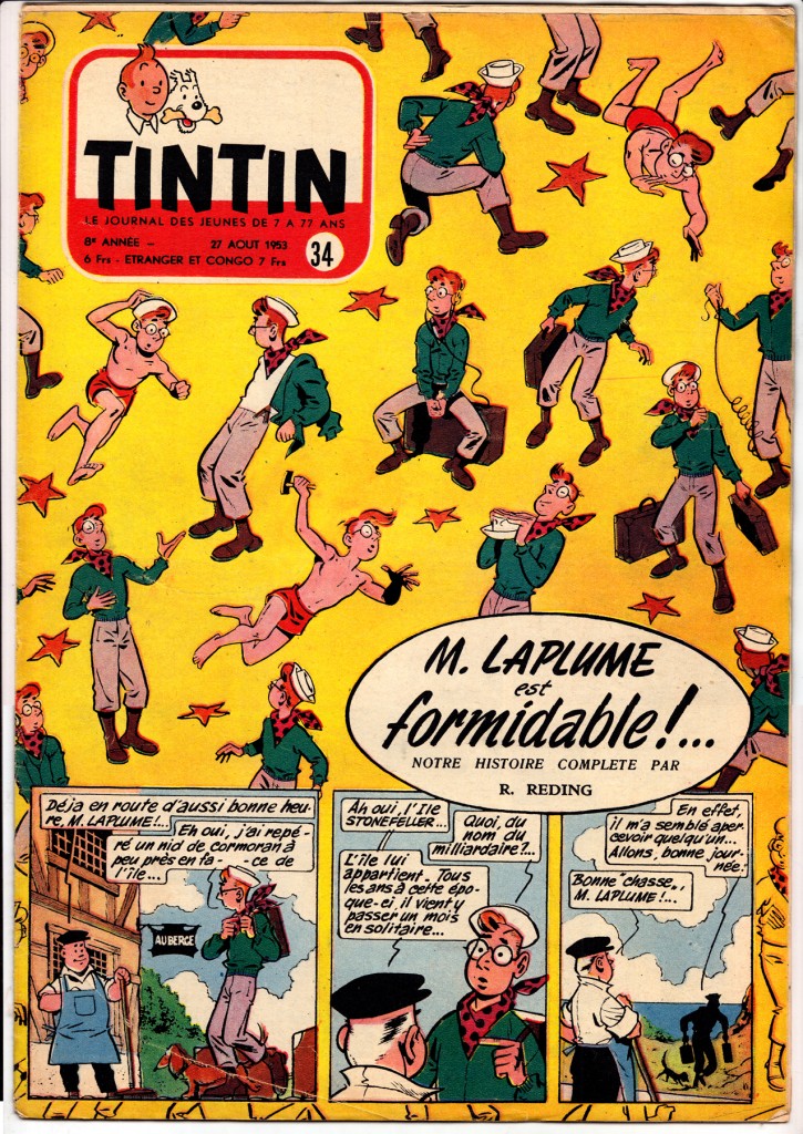
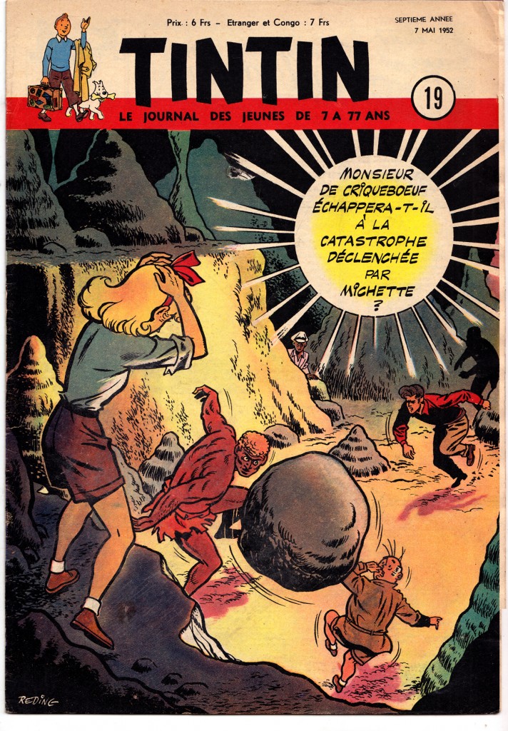
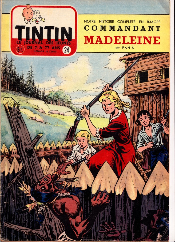
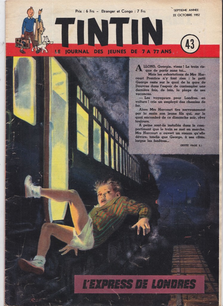
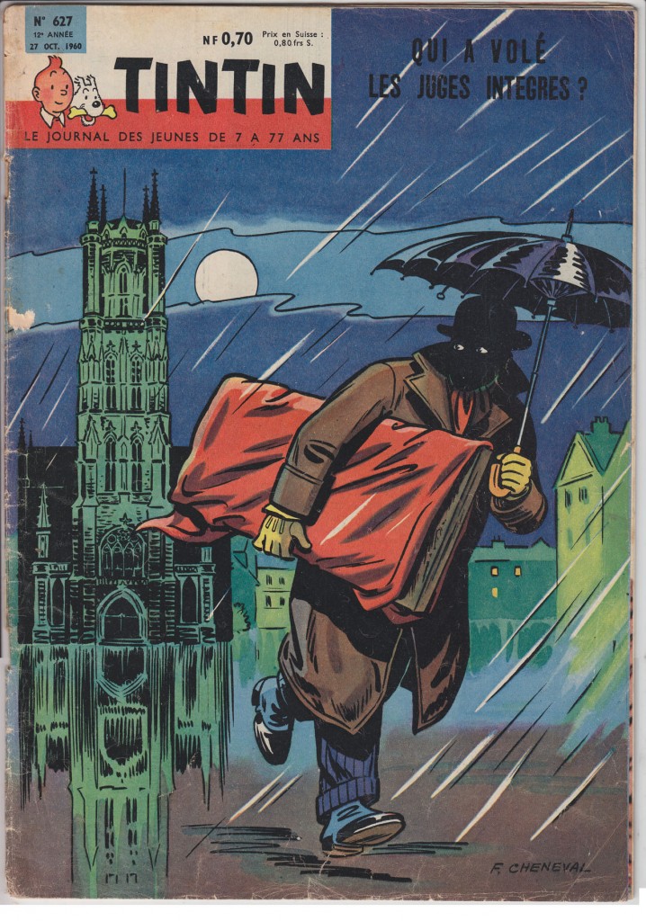
What I love most about the ’40s and ’50s Tintin are the covers.  Can you  imagine being a French or Belgian kid, running to the newsstand kiosque every week for one of these jewels of color and drama?
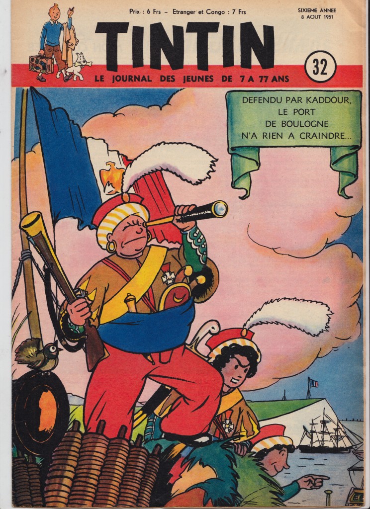
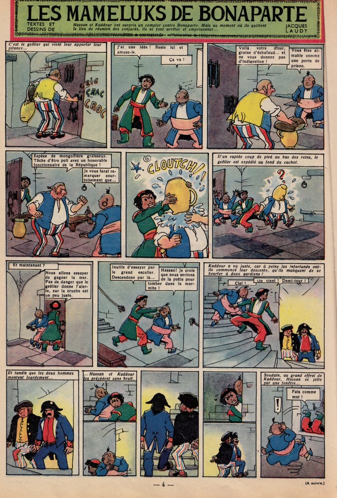
Jacques Laudy is a neglected artist from this period. Â He did some breathtaking covers:
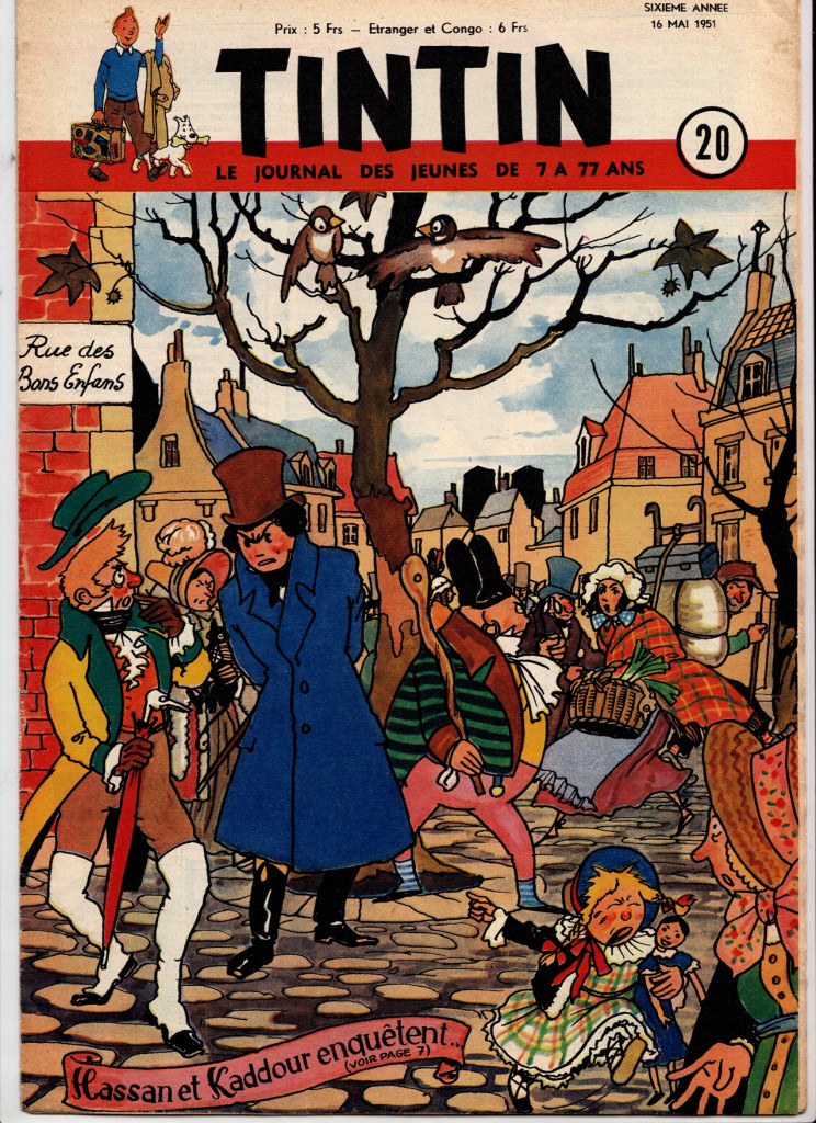
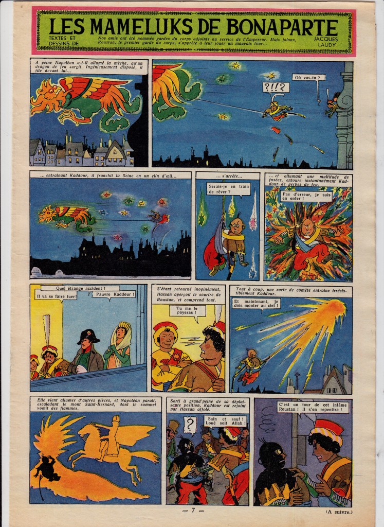
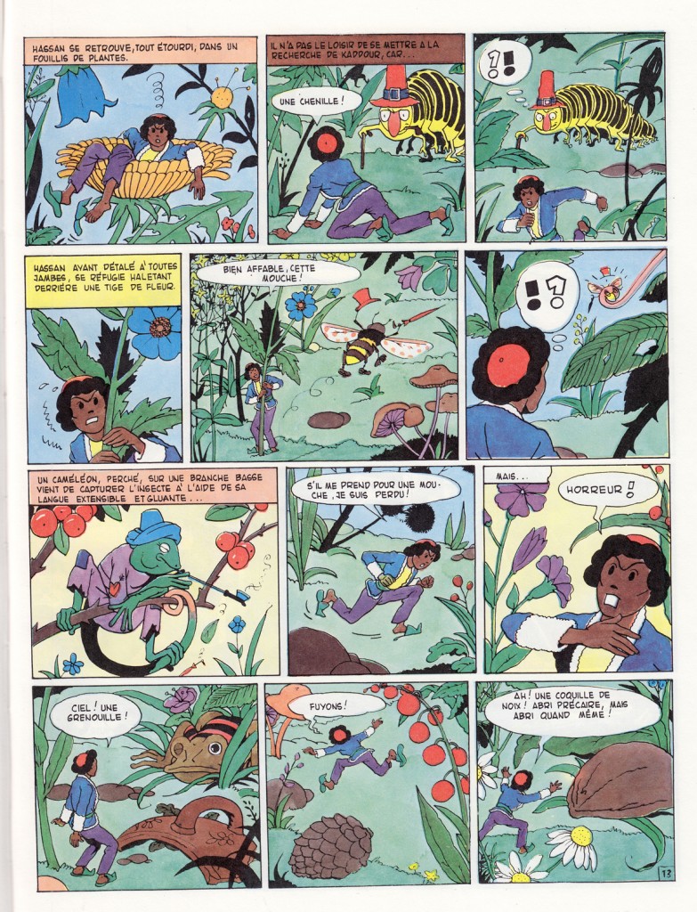
More Laudy, from his fanciful, Orientalist series Hassan et Kadour:
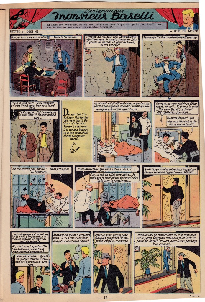
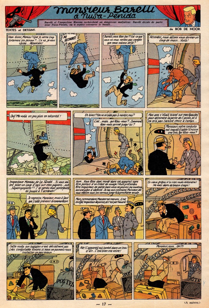
Bob De Moor’s style was the closest of all the Journal de Tintin artists to that of Herge.
For French comics critic Lecigne, this stylistic simulacrum is what reveals the essence of the Hergean ligne claire:
“In Barelli [De Moor’s best known series], it’s the fascinating appearance, the opaque surface of the style d’Hergé that’s on display. Hypnotized, I read Barelli without deciphering the text, unable to follow the plot, fascinated by the dramaturgy, the gestures. What I have before me is Hergé emptied of substance, depth and mythology; the signifier without the signified… reading Bob De Moor is an experience that permits me to perceive a language solely from the point of view of the signifier, syllables repeated until meaning disappears, whose existence becomes purely, concretely sonorous.” (Lecigne, Les Heritiers d’Hergé, p 39, translated by me)
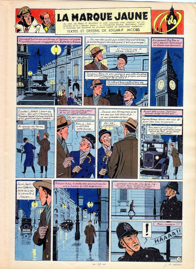
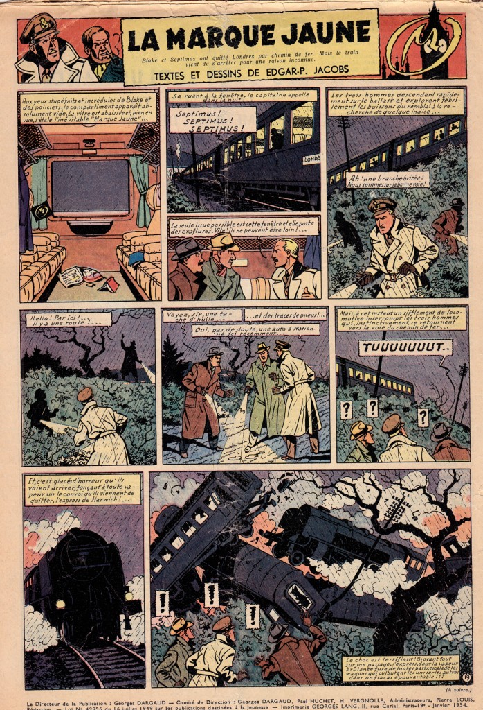
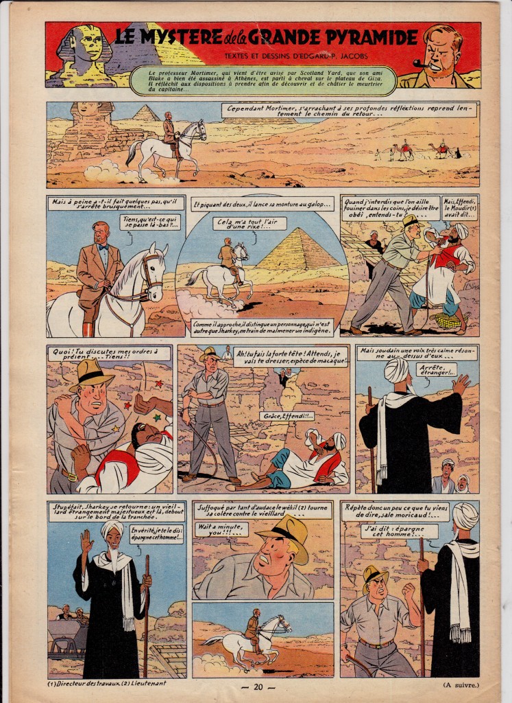
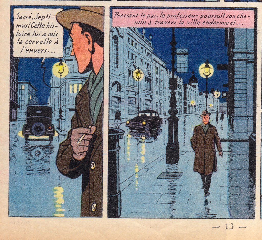
Edgar P Jacobs‘ Blake et Mortimer rivaled Hergé’s Tintin in populariy; Jacobs represented the opposite pole of the Ecole de Bruxelles: moodier and more gothic than Herge, the series was an espionage thriller that also blended science fiction and horror.  His detailed, atmospheric London was an influence on young fan Jacques Tardi.
More great TINTIN covers:
<!– extreme_danmazur_c09994d5dcea40e288ef6e0f0b6e9ce8 –>
