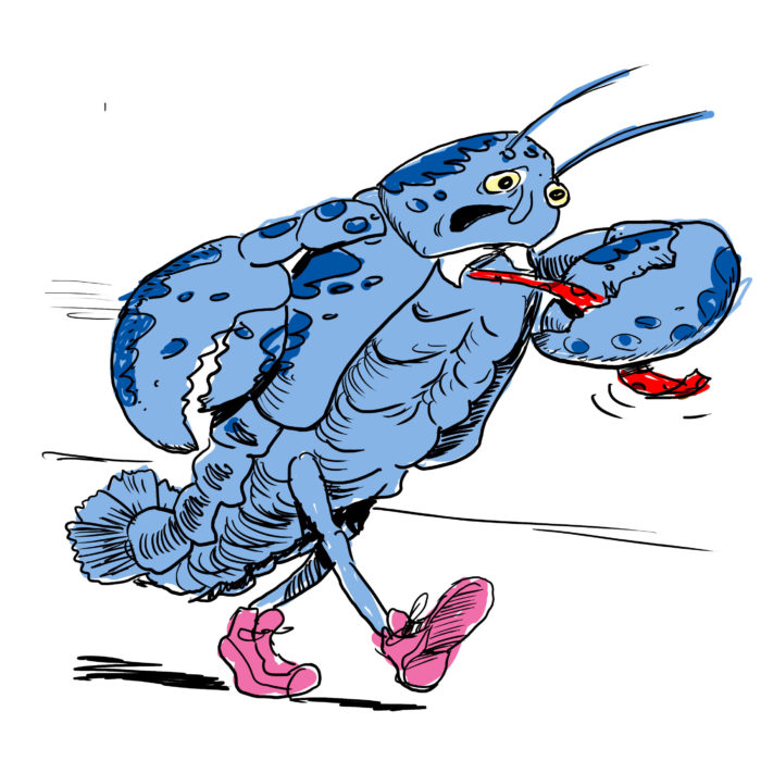
First Live Appearance of the Pandemic!
Here are the first sketches of the new character for my story which will appear later thie year, in the third issue of BOSTON POWERS:
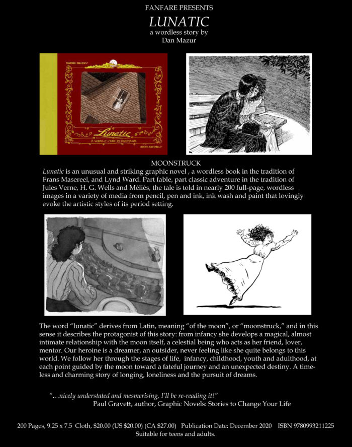
I got my copies of the “official” Fanfare edition of Lunatic, so I now have the book available in 2 sizes: the Fanfare version is 240 by 190 mm (about 8.5 x 7.5 inches). My first version was printed at 12 by 9 inches, so… bigger! I still have a few of those left for sale, the downside being it doesn’t have the 11-page “process” epilogue added for Fanfare. But they’re both $20 (plus $5 for shlepping and handling), so take your pick! Asking your local comics shop or bookstore to order it for you works too!
Order here – please specify which version you want (price is the same $20 = $5 shipping)
My graphic novel/wordless book “Lunatic” will be published by Fanfare Presents and available in stores this winter; I’ll have copies this month, and it can be pre-ordered on Amazon as well.
But RIGHT NOW I have a copies of a Special Limited Edition, printed before Fanfare picked up the book. One feature of this version is that it’s printed at the actual art size (the book is 12″x9″). The regular edition will be slightly smaller (approx 9.5 x 7.5″). It’ll look great at that size too of course.
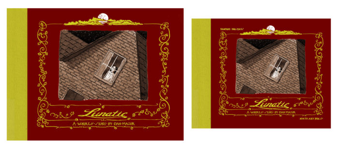
The trade-off is that there will be a 10-page “making of” section included at the end of the book when it comes out from Fanfare, which includes some of the process material found on this blog.
Both editions are hardcover, and both will cost $20, plus shipping & handling ($5 in the U.S., contact me for overseas shipping). I don’t have many of the limited edition ones though!
LUNATIC SPECIAL EDITION (while they last!)
***************
LUNATIC FANFARE EDITION (pre-order, coming soon)
I’ve gone back and added a few pages to the final chapter of Lunatic,… a chance to do more spattering!
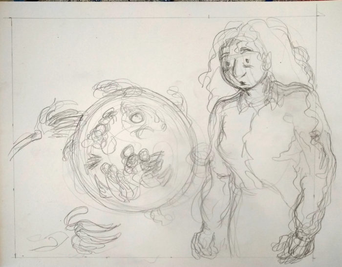
Pencils:
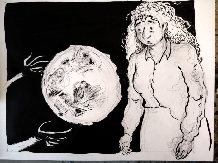
Inks:
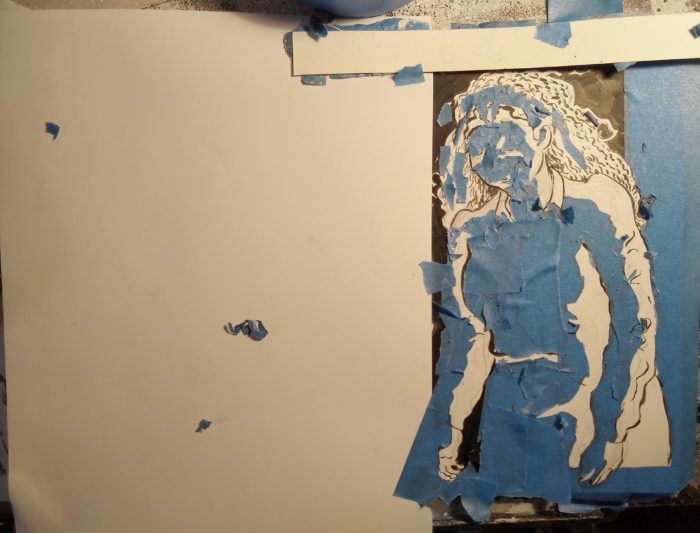
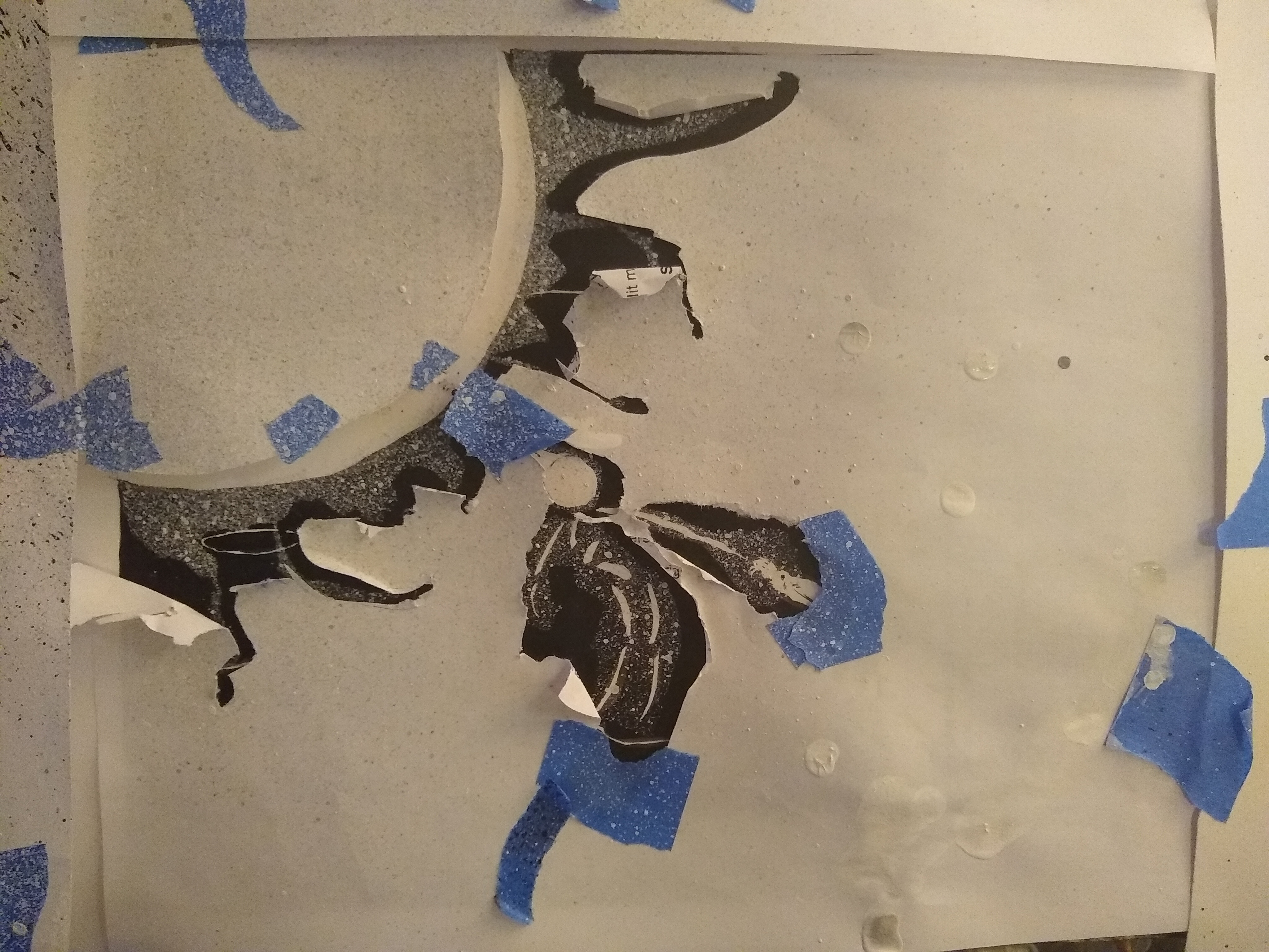
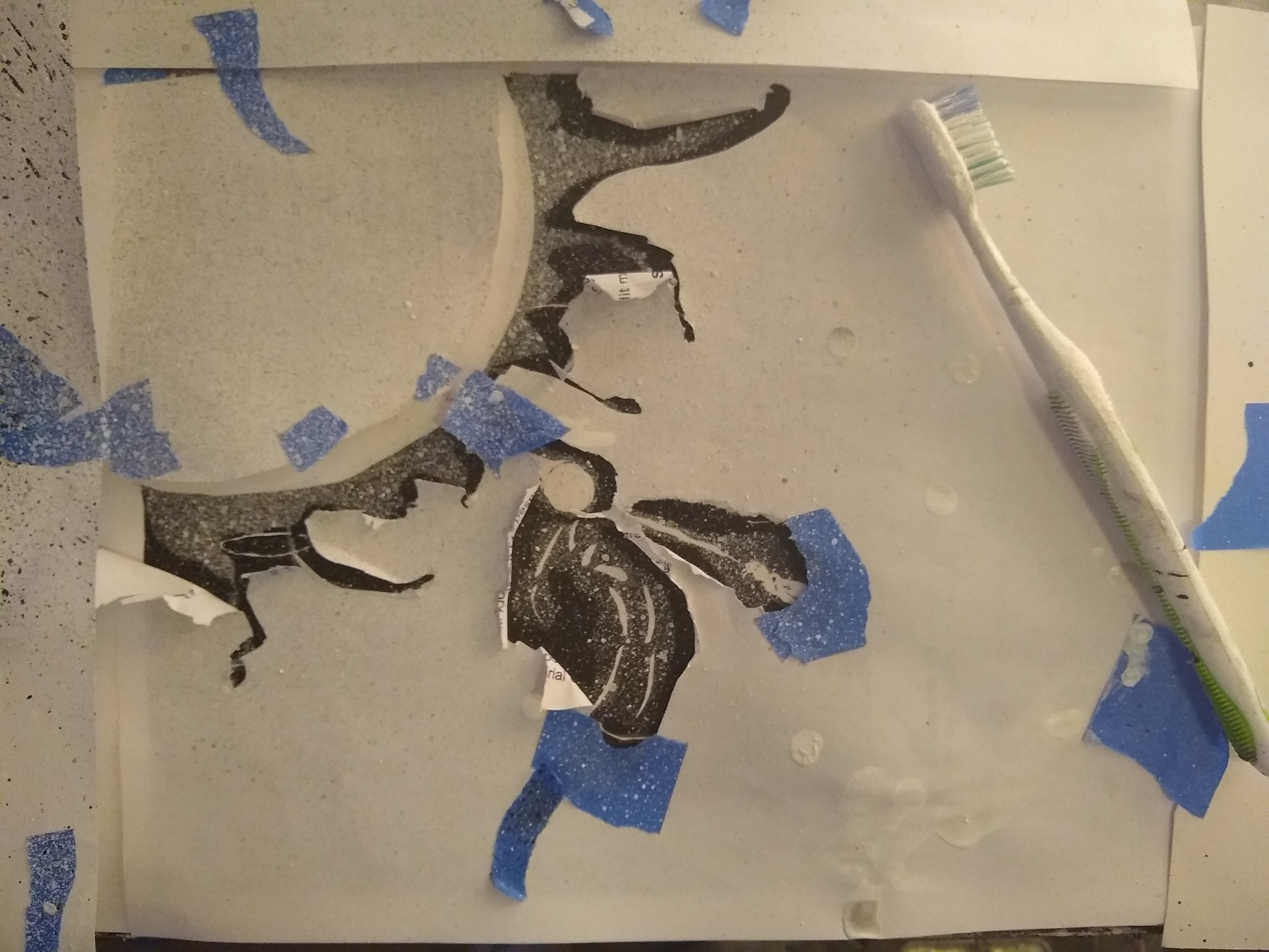
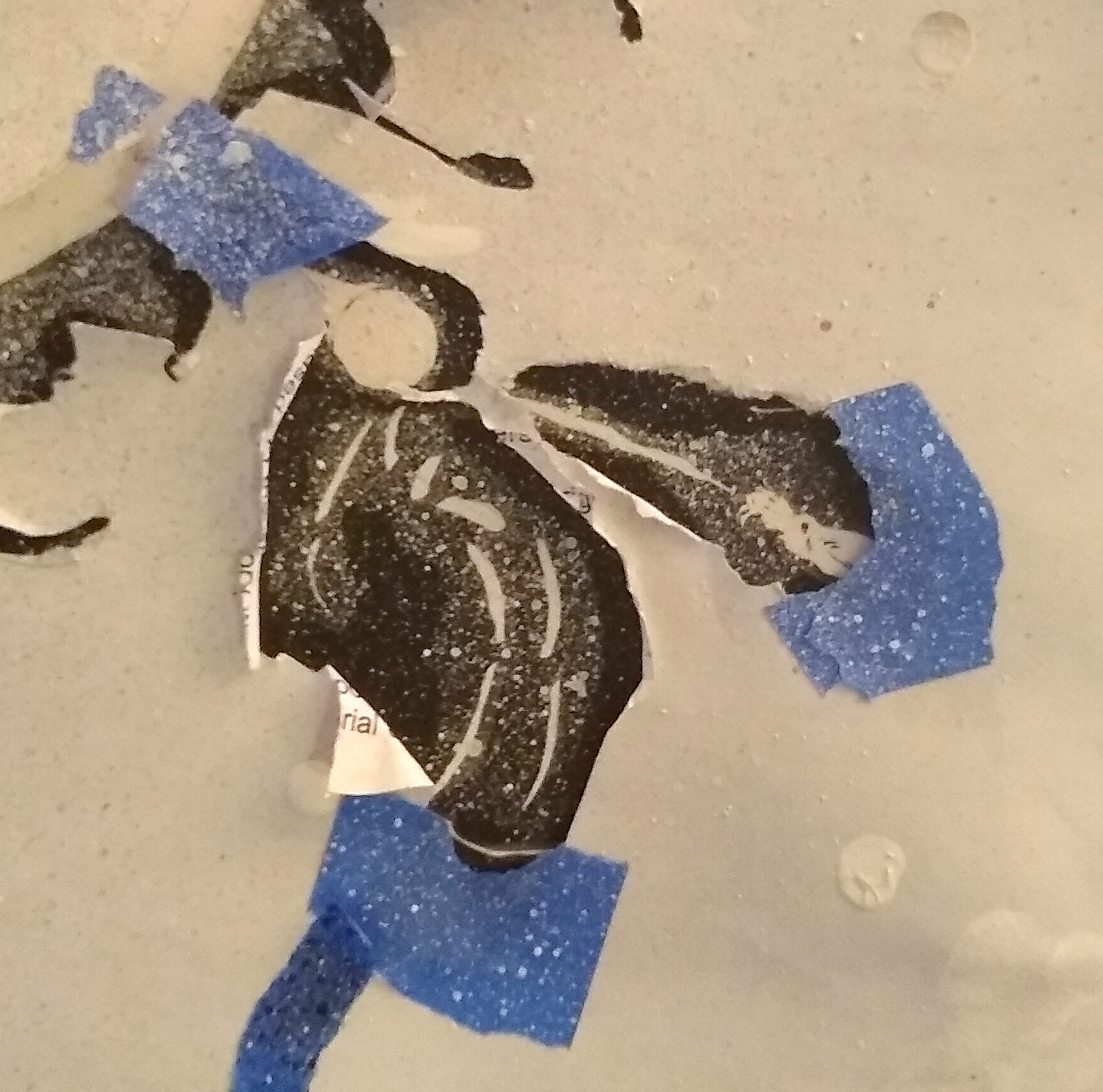
The globe-y thing in the middle is supposed to be casting light, so I want to shade the character’s clothing and face using ink-spatter. I mask off the areas that will NOT be shaded, using lots of little pieces of blue tape (and a piece of paper to block off the rest of the page):
Then pull out the old toothbrush-dipped-in-black ink and flick it at the paper a bunch of times:
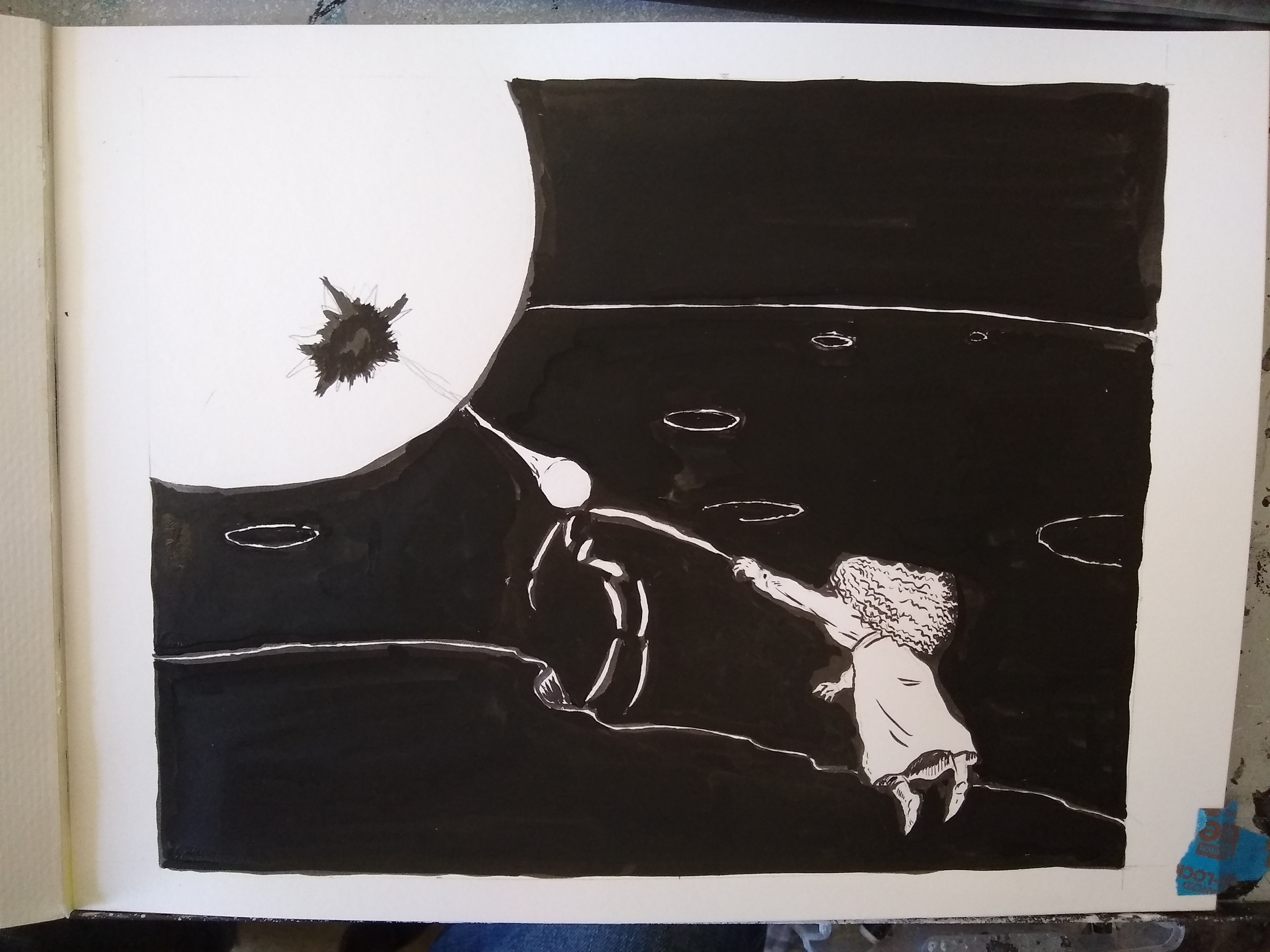
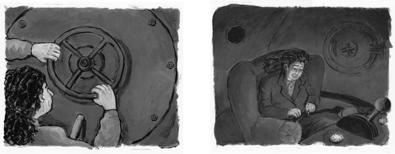
Continue reading “Lunatic Chapter 9 Process: Spatter, part 2”For the last pages of this, the last chapter, I’m doing toothbrush ink spatter effects, for an alien/spacecraft that shows up (spoiler, sorry). Here are some process shots:
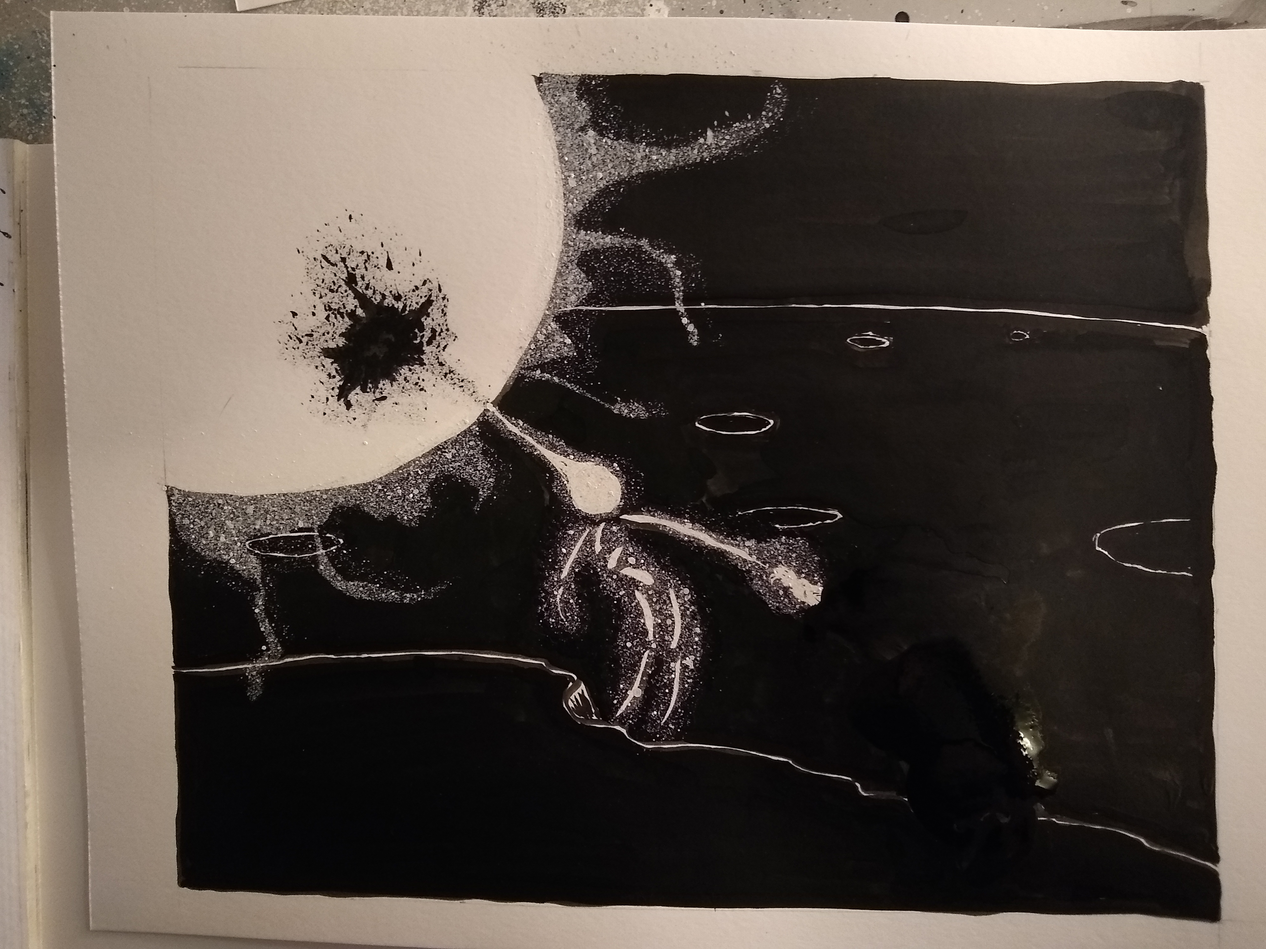
First the basic black ink on bristol. drawing, as the alien pulls the character toward the spacecraft:
Next I cut masks or stencils out of paper, and taped them over the page in the configuration I desired, to get the spatter effect around the alien & craft:
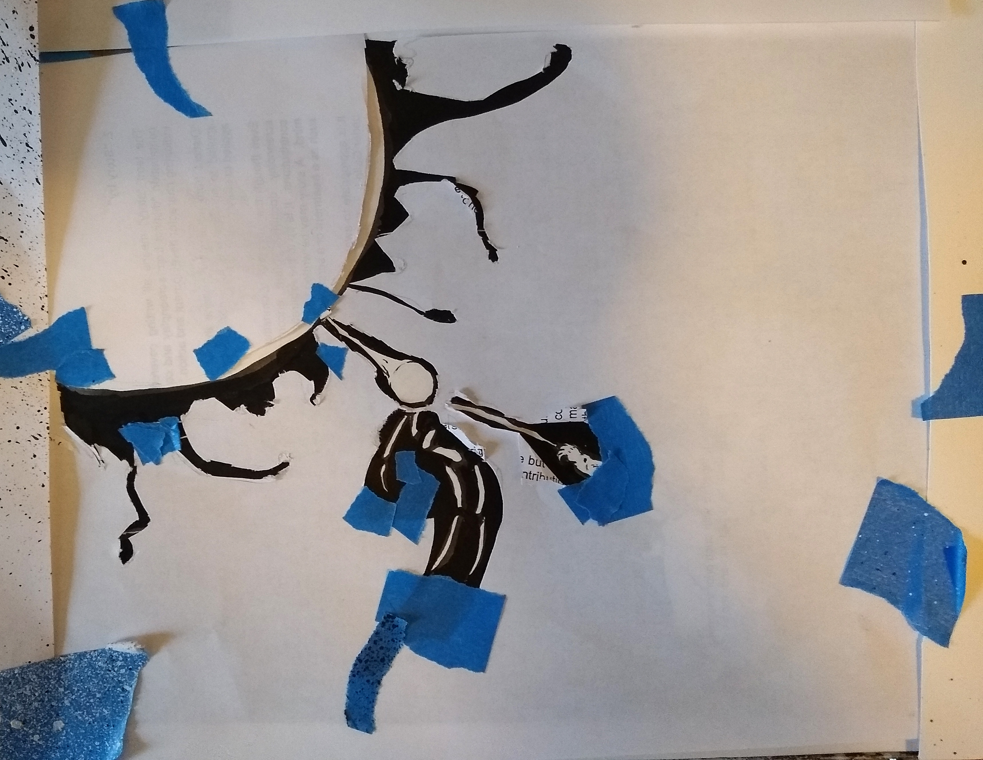
Then I dipped a toothbrush in white Kuratake ink, and (wearing surgical gloves), flick the ink over the paper:
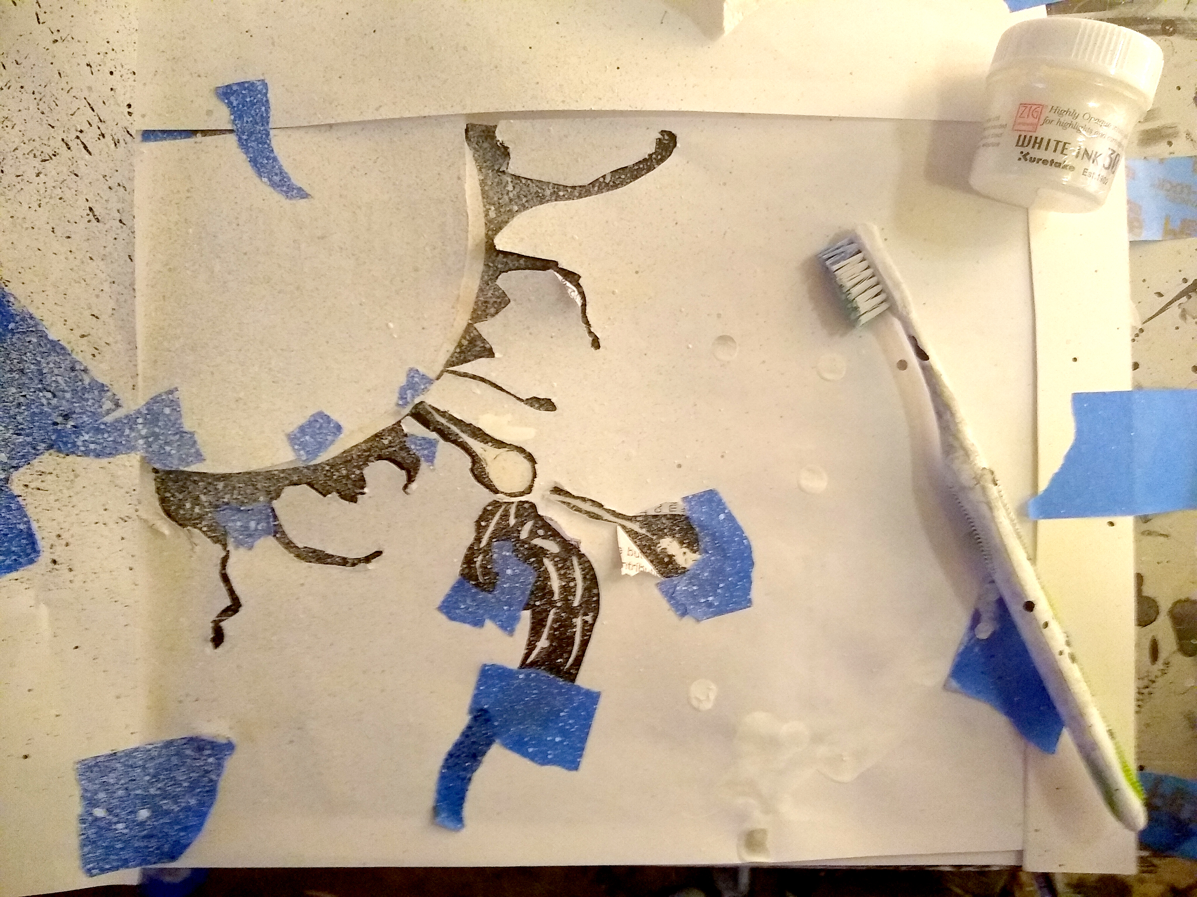
Peel away the paper, and it looks like this:
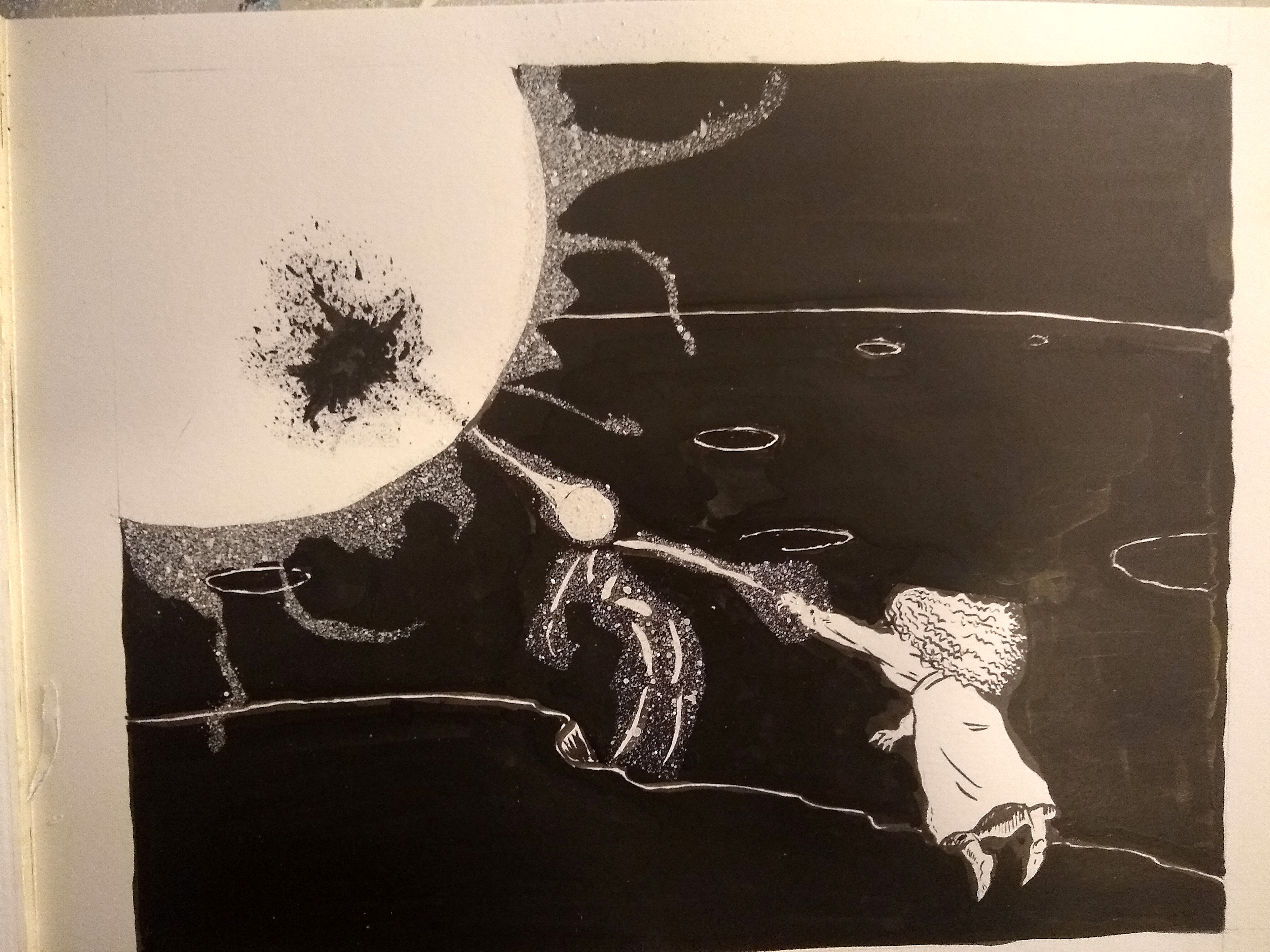
(OH I didn’t document the process of getting that black spatter around the opening in the space-globe-thing, but it was about the same).
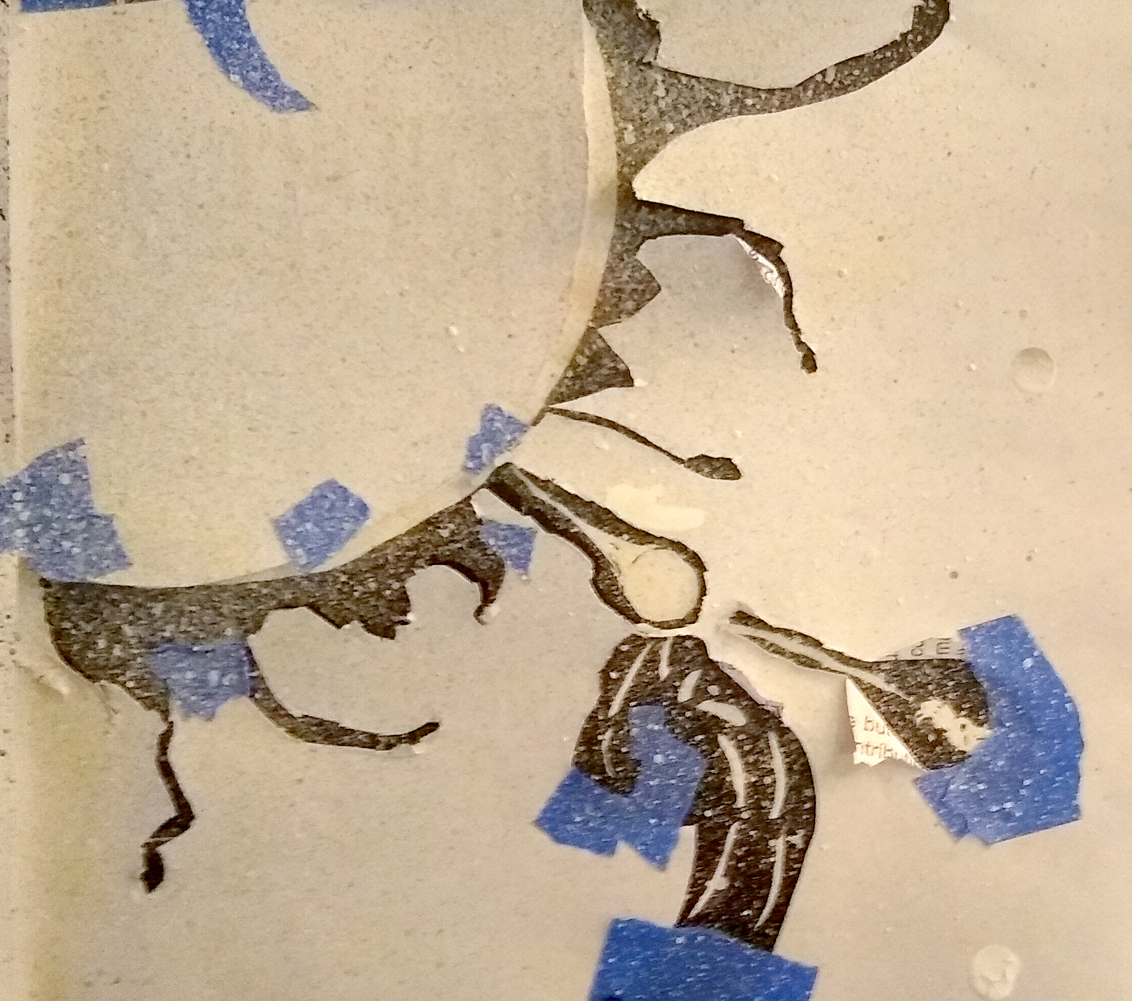
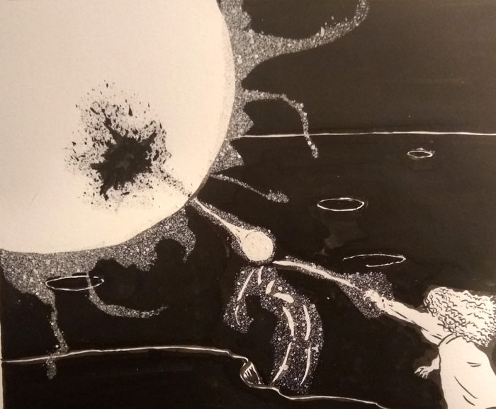
Getting very fussy now: I want to get that white “glow” around those objects, but I also don’t want the edge of the spatter to be too sharp, so I replace the paper mask, but peel back the tape for a slightly larger spatter area…
And repeat, another light dusting of spatter:
See…?
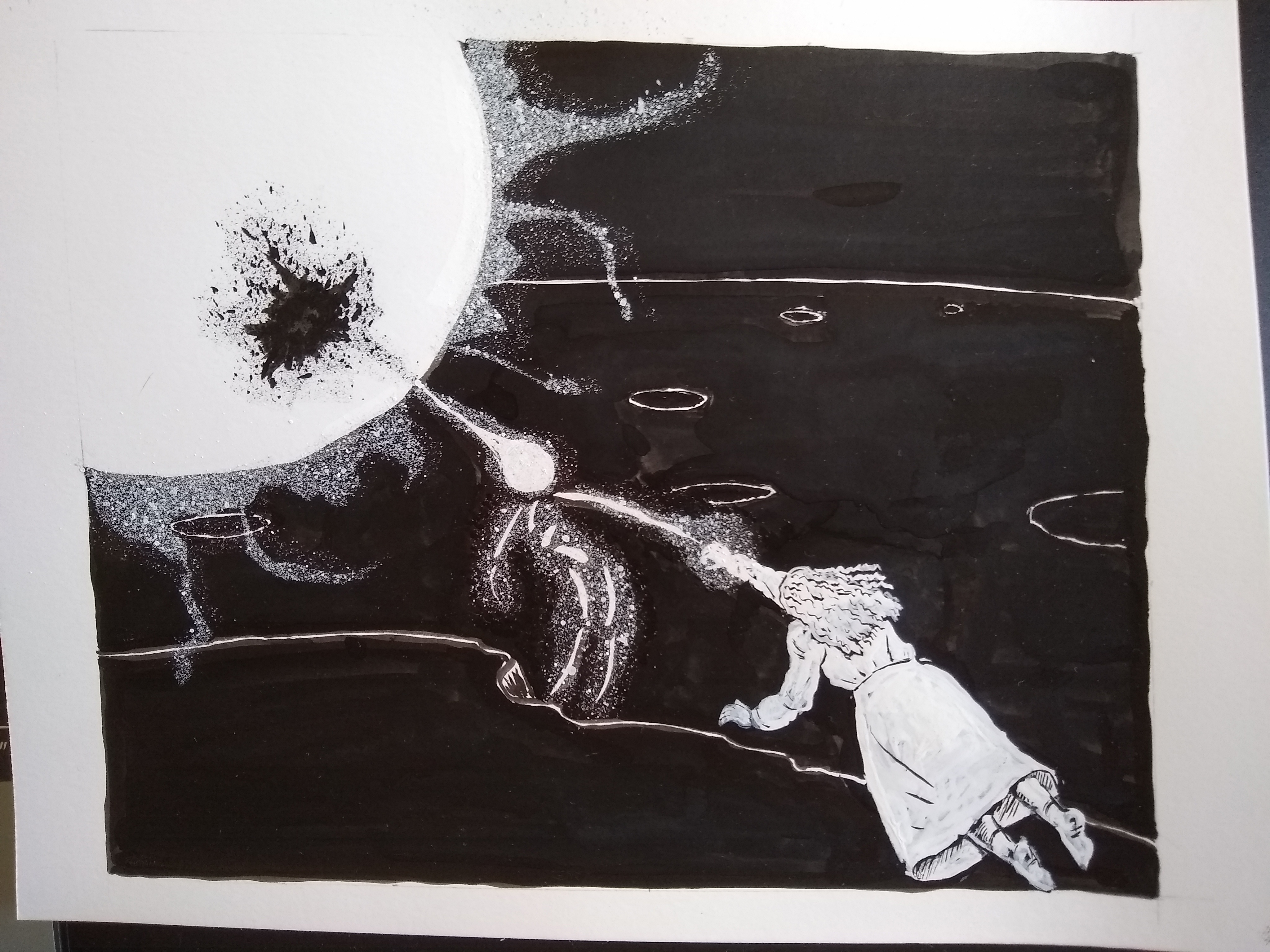
One last thing though. I wasn’t happy with the figure of the character, so I decided to redraw, first brushing black ink over:
Then re-draw it in white ink:
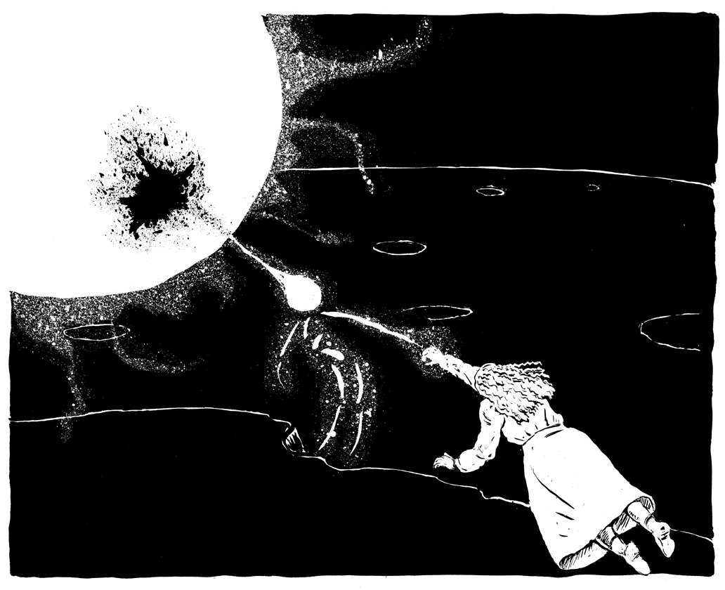
All done! Here’s a proper scan:
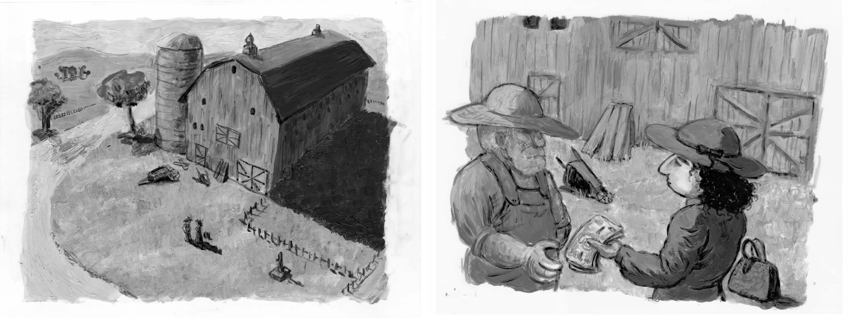
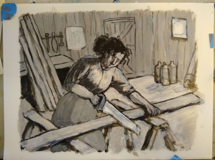
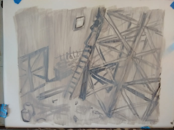
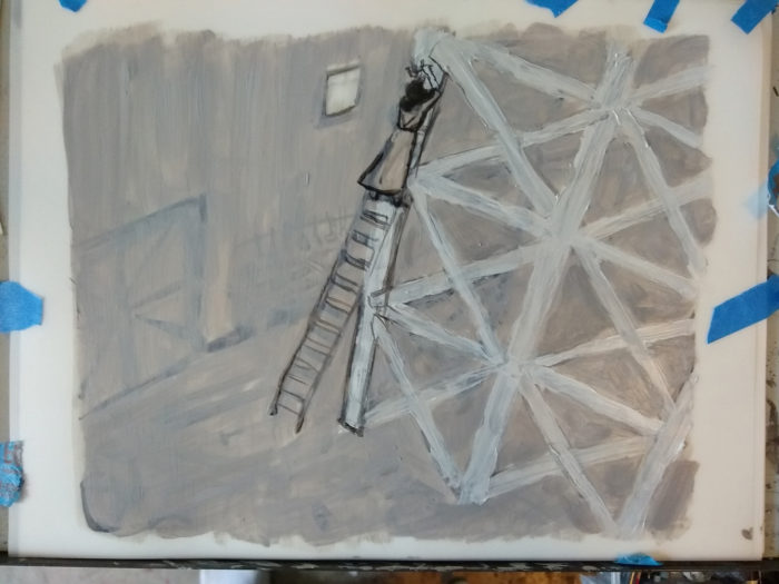
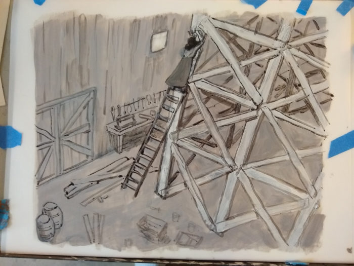
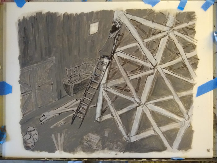
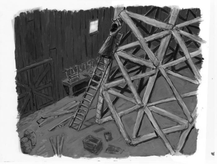
For this chapter, since I’m changing media or style in each chapter, I decided to try black, white and gray acrylic paint. After trying some different kinds of paper I settled on Borden & Riley vellum film as the best support.
Here are some process steps for Chapter 8, page 4
First, a rough sketch with watery, black acrylic. The borders are marked off with blue tape, so I don’t have to have a pencil line in the image.

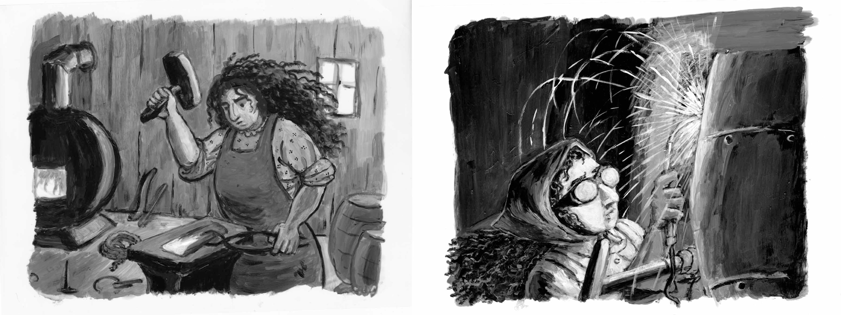
One great feature of working in acrylics is the ability to paint over and make changes. I decided the figure of the woman was too tall in the sketch, making the doorway seem not as large as I wanted. So as I added detail gradually to the overall picture, I was able to paint over the figure in white, and re-draw at a better scale:
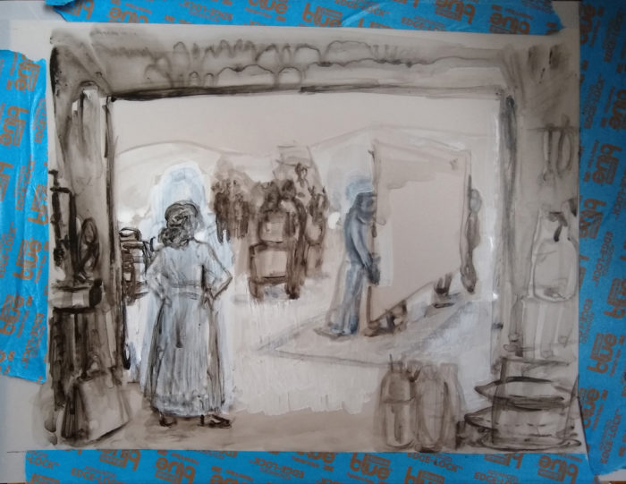
Gradually building up tone and texture:
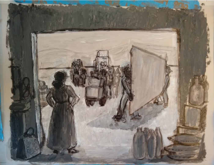
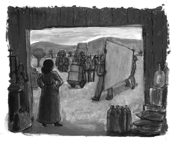
The final image. Lots of little adjustments to tone and texture, and thanks to the flexibility of acrylics I was able to mess around a lot with the positioning of the front figure carrying the piece of sheet metal, until i was happy with it:
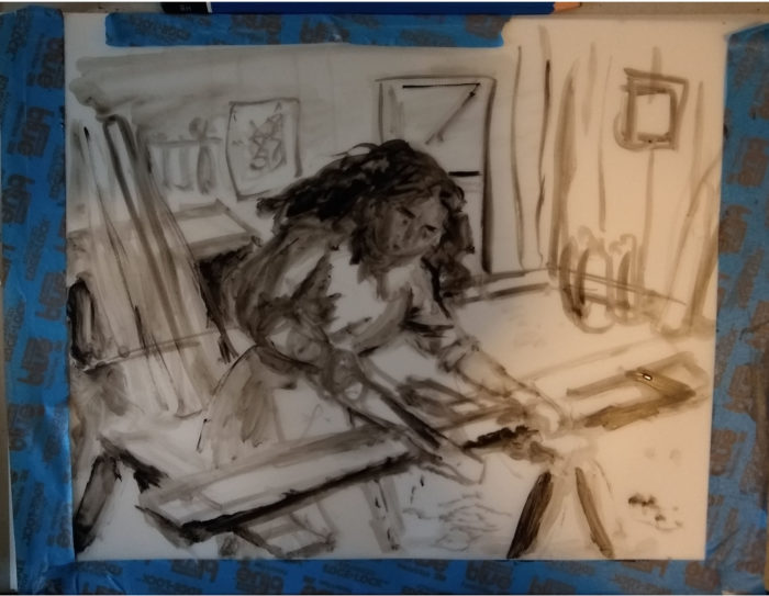
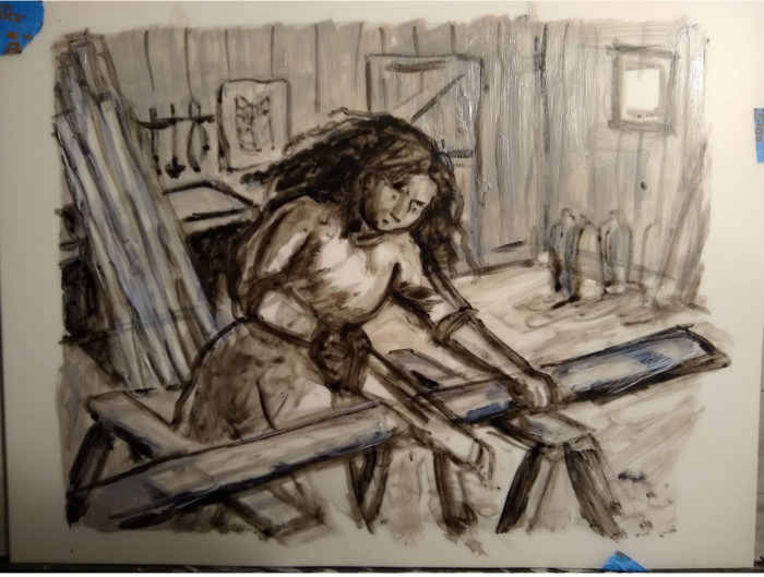
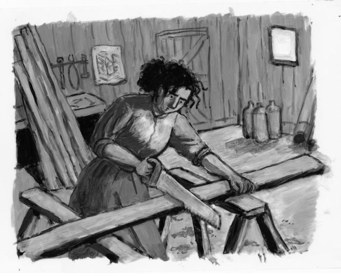
And page 5. She gets to work. I wanted to convey strength, like the WPA murals of Diego Rivera, Thomas Hart Benton, etc.
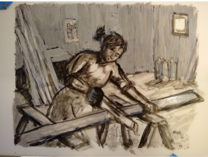
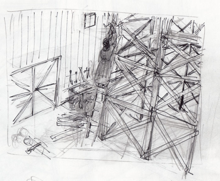
Page 6. The first thumbnail (in acrylics), and a more detailed sketch in pencil and pen (with a revised composition):
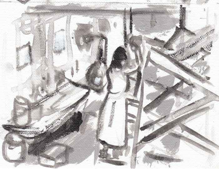
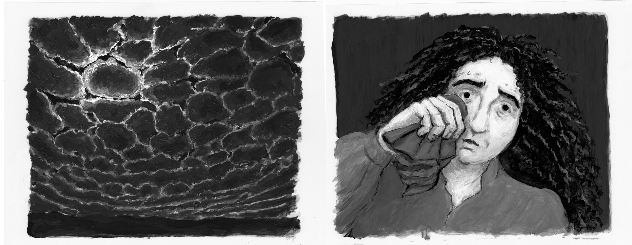
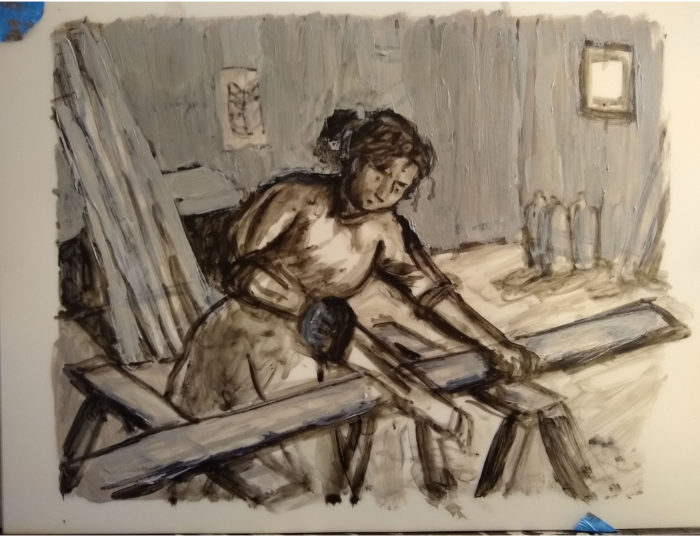
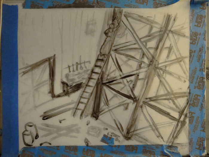
Page 6, final. Starting with a loose sketch and adding layers of paint, pushing and pulling the contrasts until I think it’s right:
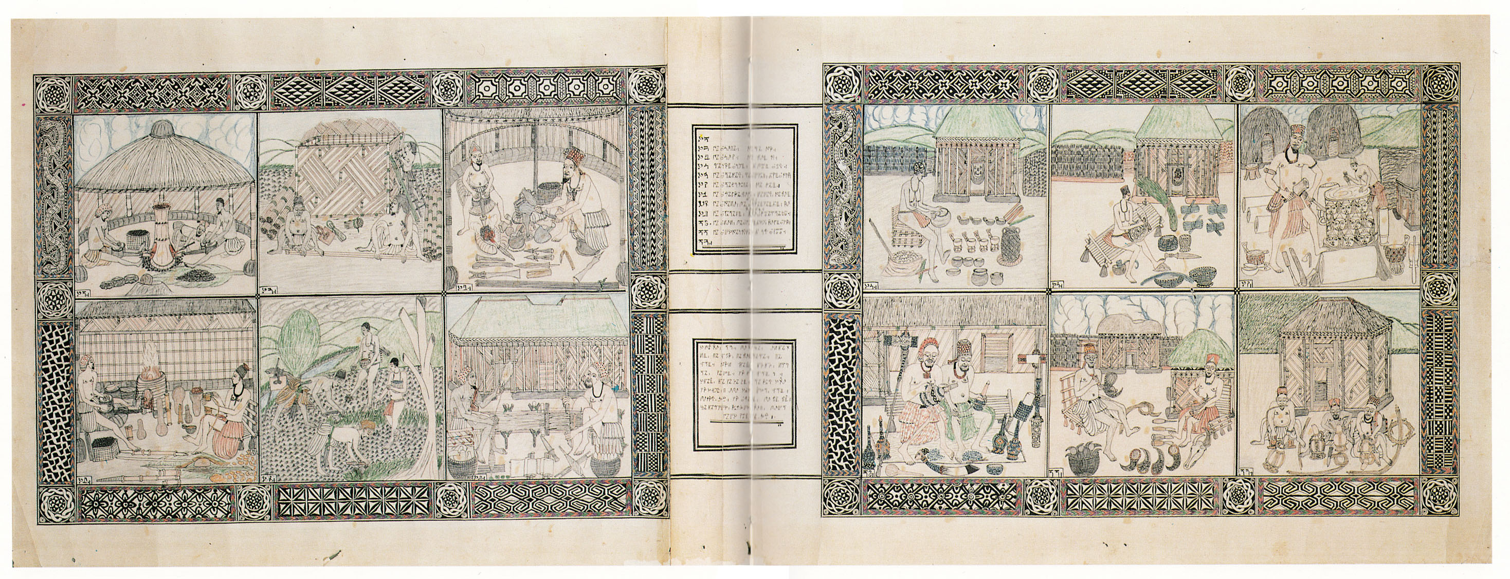
The Comics Journal has published my article on artist Ibrahim Njoya, who lived and worked in Cameroon during the first half of the 20th Century. Historical context, formal analysis, and most of all, images of Njoya’s beautiful work, like this: