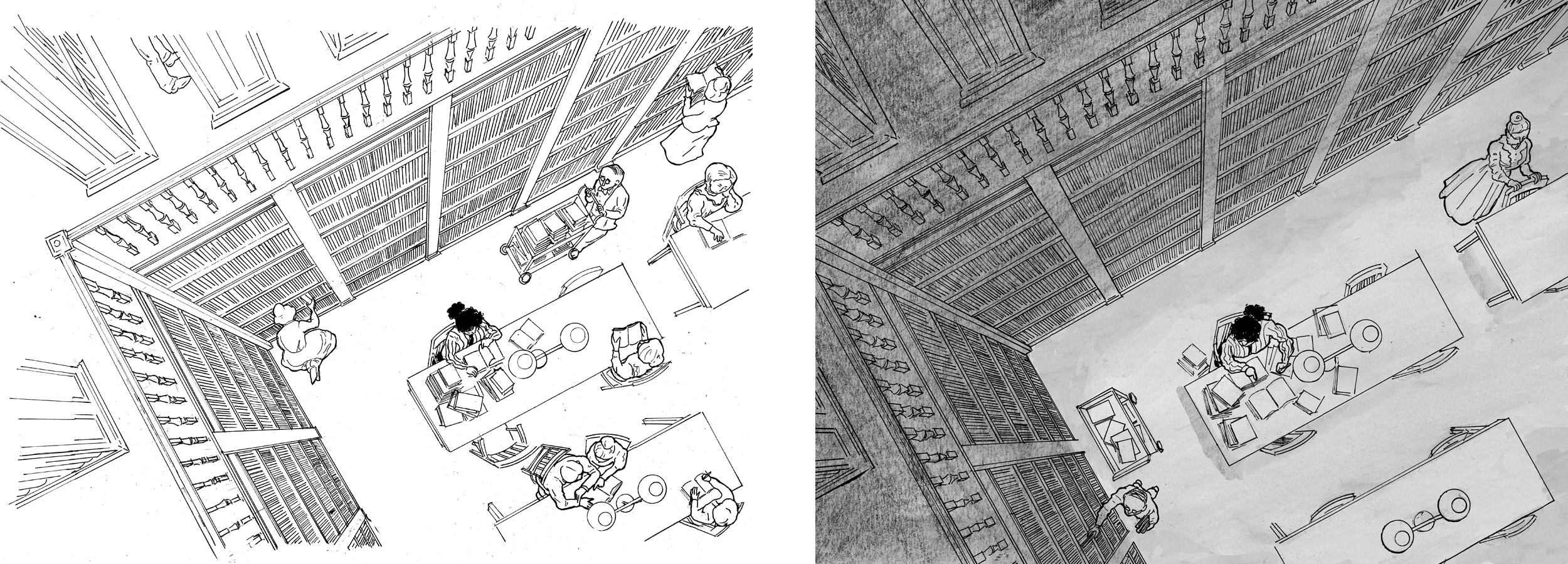
 After the last chapter ballooned to 34 pages, I decided to compress my story-telling for a while. The next section is transitional, showing the character’s college career, as she knuckles down and studies hard. I knew that it would be showing her studying long and hard in the library, and I decided it to do it in only 3 images, a progression taking place over a few hours.  I chose to draw the same scene 3 times, from the same vantage point, a bird’s eye view of the library, with the character far below, close to the center of the image.  The changing positions of the characters, and the changing light, tells the story. I have some ideas how I will add tones/shading, sticking to my principle of changing techniques or materials in each chapter.
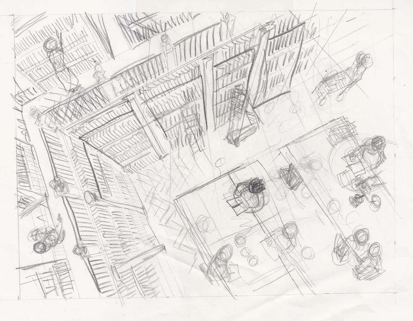
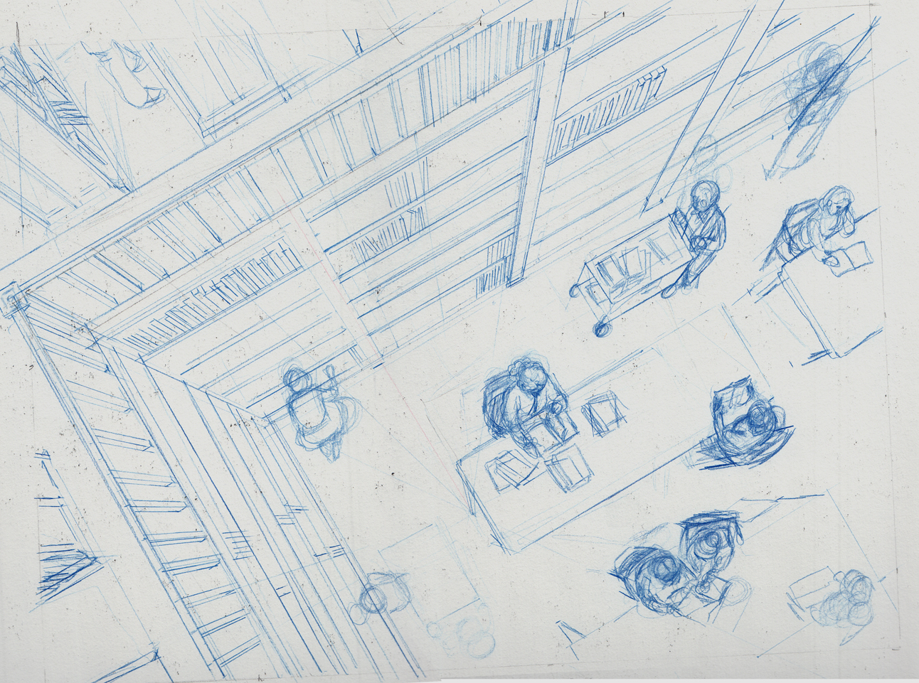
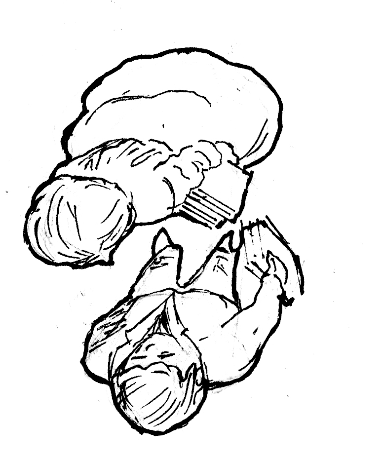
Some pencil sketches:

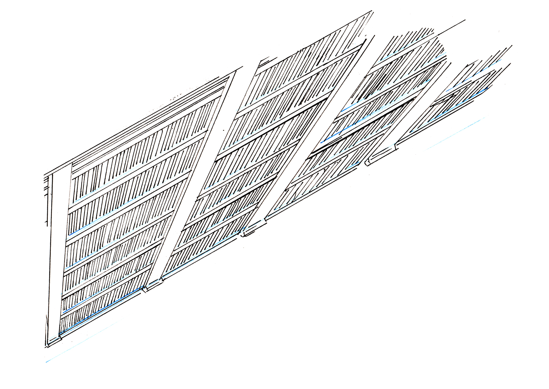
I want the drawing to be precise, the line clean. An ink test: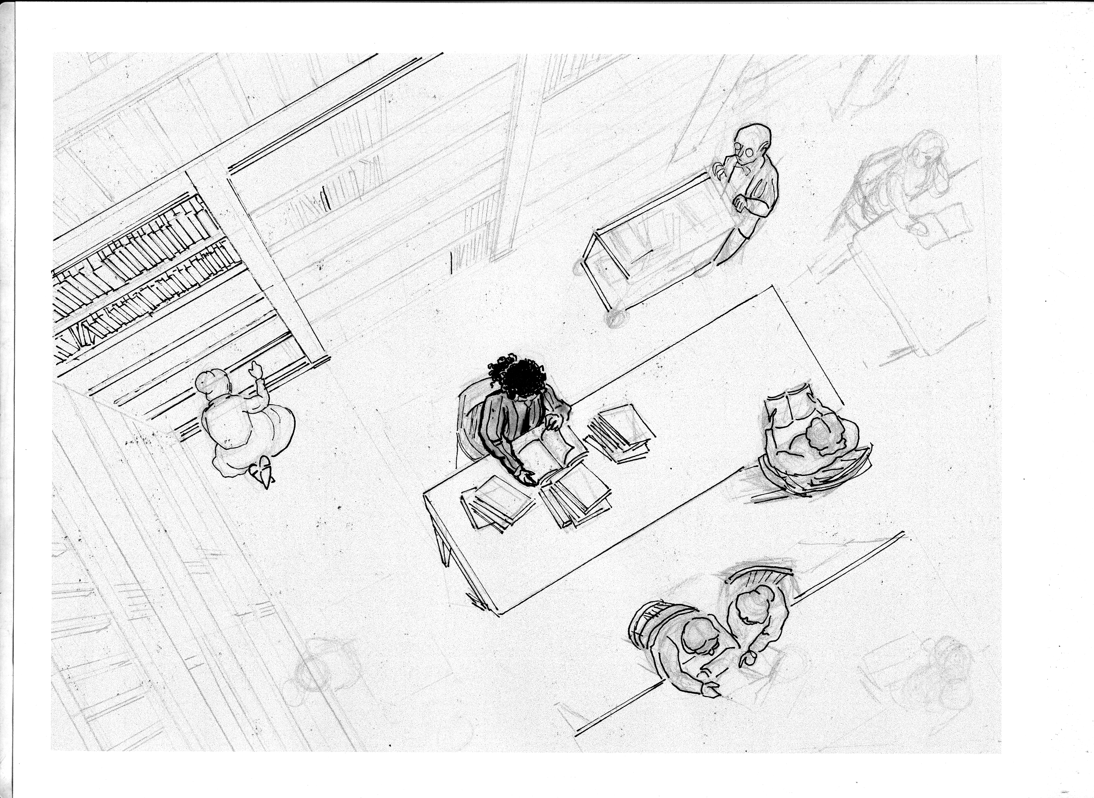
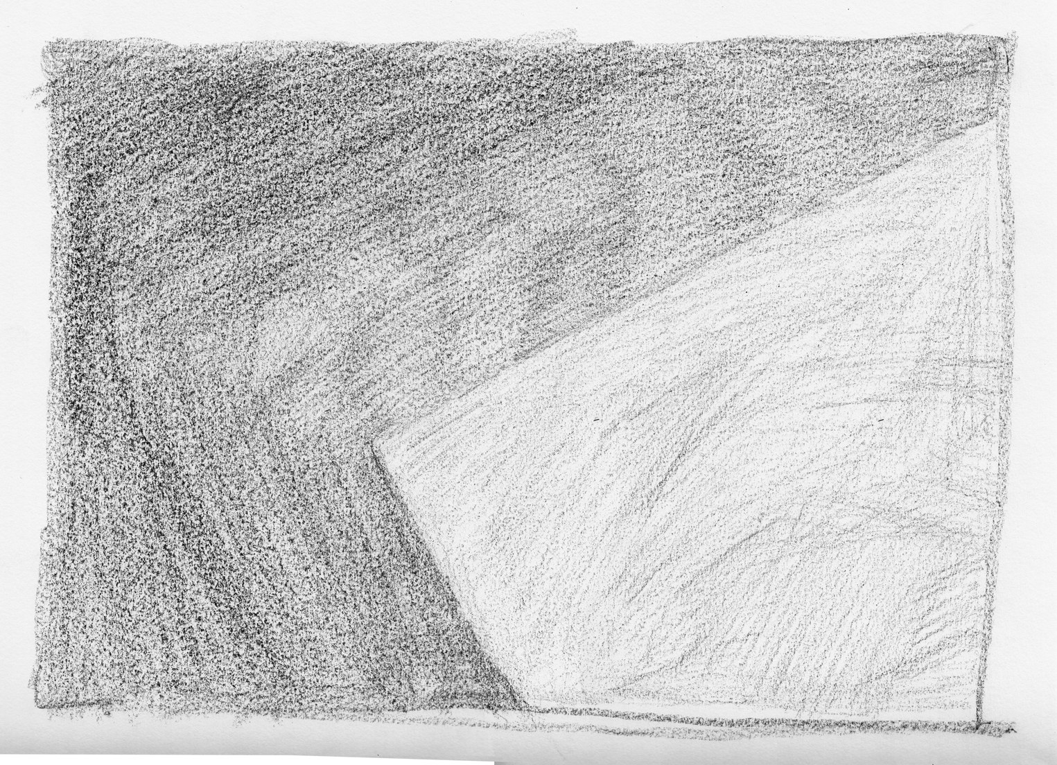
The laborious, one-point perspective this required me to draw, seemed to me to mirror the dull hours of scientific study required for the character to achieve her goal. At least, that’s what I told myself as I found myself burdened with endless ruler-drawing.
Drawing the high-angle “shot” in one-point perspective isn’t really that difficult — just boring takes a lot of patience.
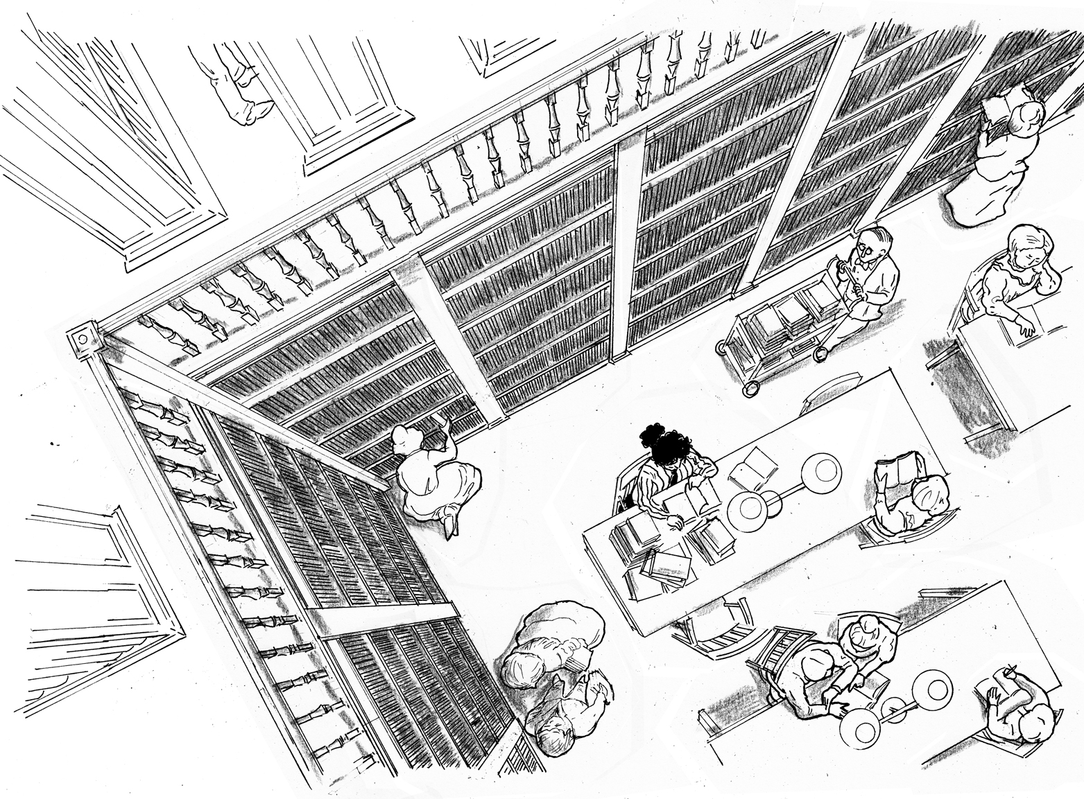
First couple tries at the first page:
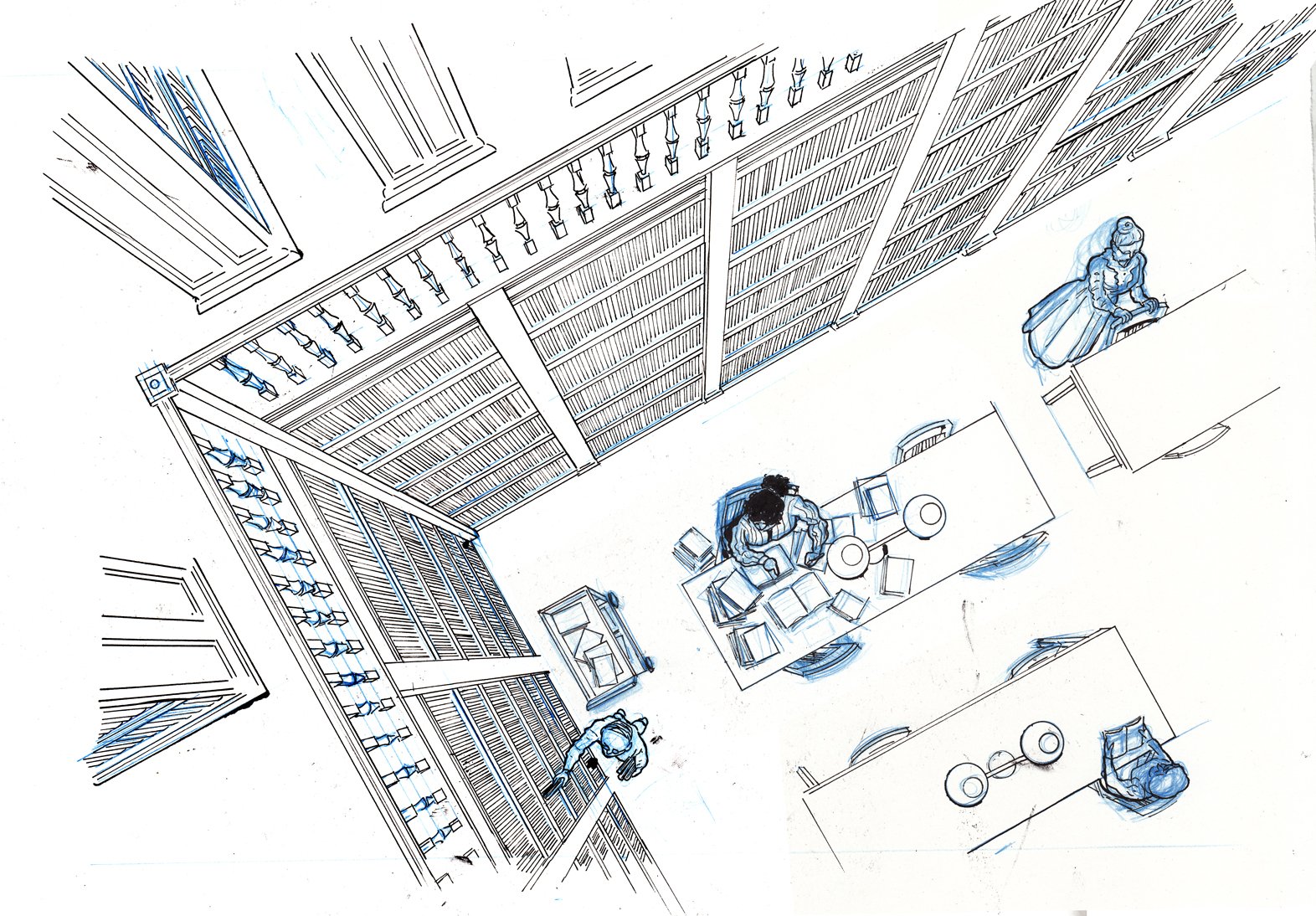
final blue pencils for page 1:
The inking process turned into a battle between me and a succession of pens. I’ve generally avoided using brush pens, fountain pens or technical pens in my comics, in favor of more traditional brushes or nib pens. But because I needed to use a ruler (and nib pens and rulers don’t work well together, the ink OFTEN runs under the ruler edge and blobs up), I decided to use a Rotring art pen, VF point. This worked well at first, but there’s one problem: if I do make a mistake, the non-waterproof ink cannot be corrected with any form of white-out that I know of… they’re all water-based, and the ink just smears. See the column in the lower left of the page:

At this point, I still had a goal of nice clean originals, so rather than just correct in photoshop, I decided to fill Rotring cartridges with my usual, waterproof India ink. I was able to do this, but I quickly found that it’s the thick ink itself that causes the blotching under the rulers — it was no cleaner than using a nib pen. I went back to the Rotring regular cartridge, resigned to correcting blotches (and other errors) in photoshop.
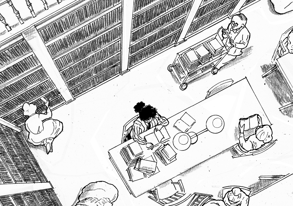
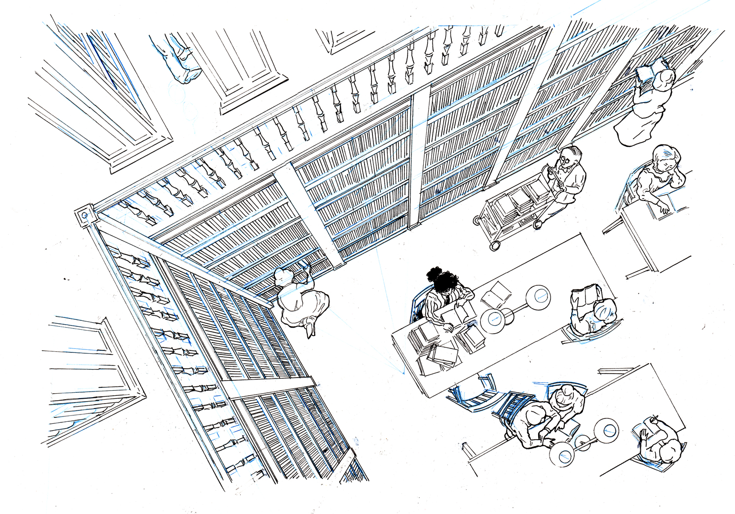
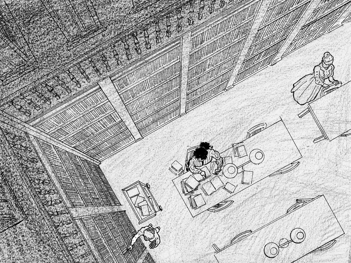
Page 1’s final line-art. It turned out pretty clean anyway:
Moving on to page 2, and things got messy. Maybe it was because the Rotring’s nib had loosened up, but it was bleeding and blotching all over the place:
So I really sold out all my artistic principles and switched to a Micron to finish the page! I cut out a new piece of paper to completely re-draw/paste on, the shelves on the right side of the page:
But I have to say, I really don’t like the line quality of Microns. Plus, the Micron ink is non-waterproof ink still can’t be whited out on the paper. I went to Artist & Craftsman Supply in Central Square and bought a few different technical pens with pigment (ie. permanent, ie. waterproof) ink. I don’t think they had these a few years ago! The one I ended up using was the  (I used the .08 and the .05 tips). Good pen!
Line work for page 3. By this time I knew what I was doing well enough to only need one version:
Now I moved onto the shading. The shading was going to be very important, because it tells of the passage of time, and creates the mood. Since my philosophy (or creative restraint) on the project is to change up the style or methods or materials in each chapter, I didnt want to repeat ink wash shading which I’d used before, and I had an idea of using litho crayon, because I love the look of lithographs, especially old French ones by Lautrec et al, or lithographs by Kathe Kollwitz.
I have to admit, that I think this decision was a little arbitrary: at least in my own mind, each of the change-ups of style/technique in previous chapters seemed motivated by the point of the chapter. Now I feel a little that I am reaching for difference for difference’s sake. This may become a real problem in ensuing chapters, but I’ll cross the bridge when I get there.
Also, lithography crayon is designed for, well, lithography, so using it on Bristol paper might not be the best fit. Anyway, I didn’t have the confidence to start crayoning over the line work, so I decided to do it on separate paper (using a light box with the line work under), and combine it on photoshop, so I drew things like this: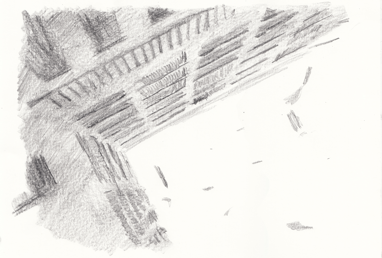
My initial idea was not to shade the first page at all, since it’s set during the daytime. So I started with page 2. Here are some attempts at the traditionally-drawn-but-photoshopped-on shading: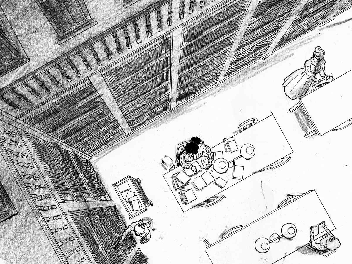
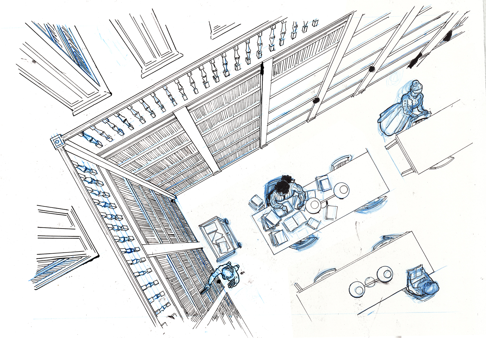
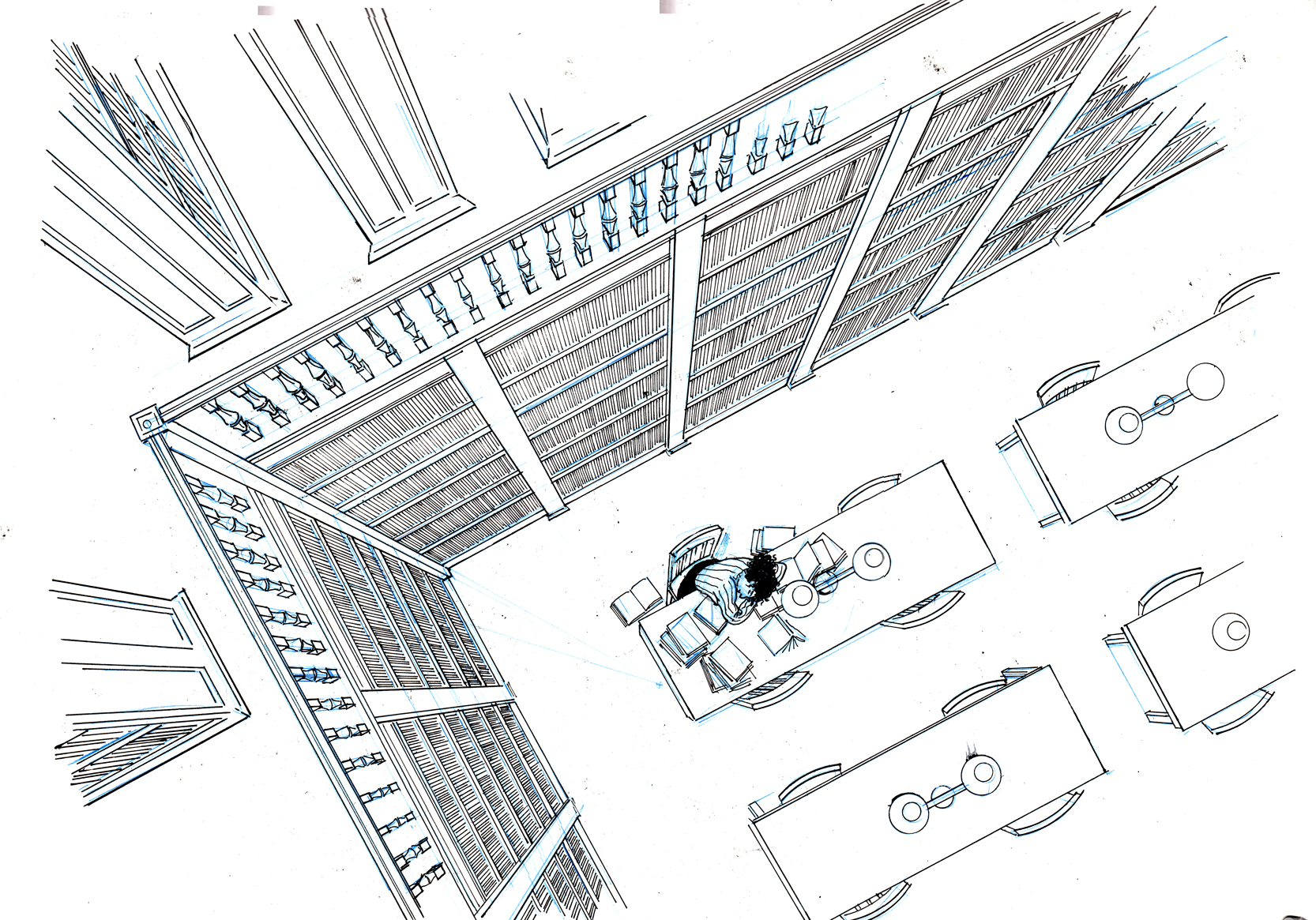
(Here you can see that I had I decided that the effect of the “nearly empty” library was diminished by the character at the other table, so I took her out, digitally).
Not satisfied with the texture of the shading, and uncertain how to handle the light on the floor area. After some input at the BCR meeting, I tried combining wash and litho crayon:
I was now realizing that the shading is actually where the real story-telling takes place, and was at least as challenging as the line-drawing. Even more than the other developments in the drawing (going from crowded library, to nearly-empty library, to empty library and she’s asleep), the shading immediately communicates the progress of time and the changing mood.
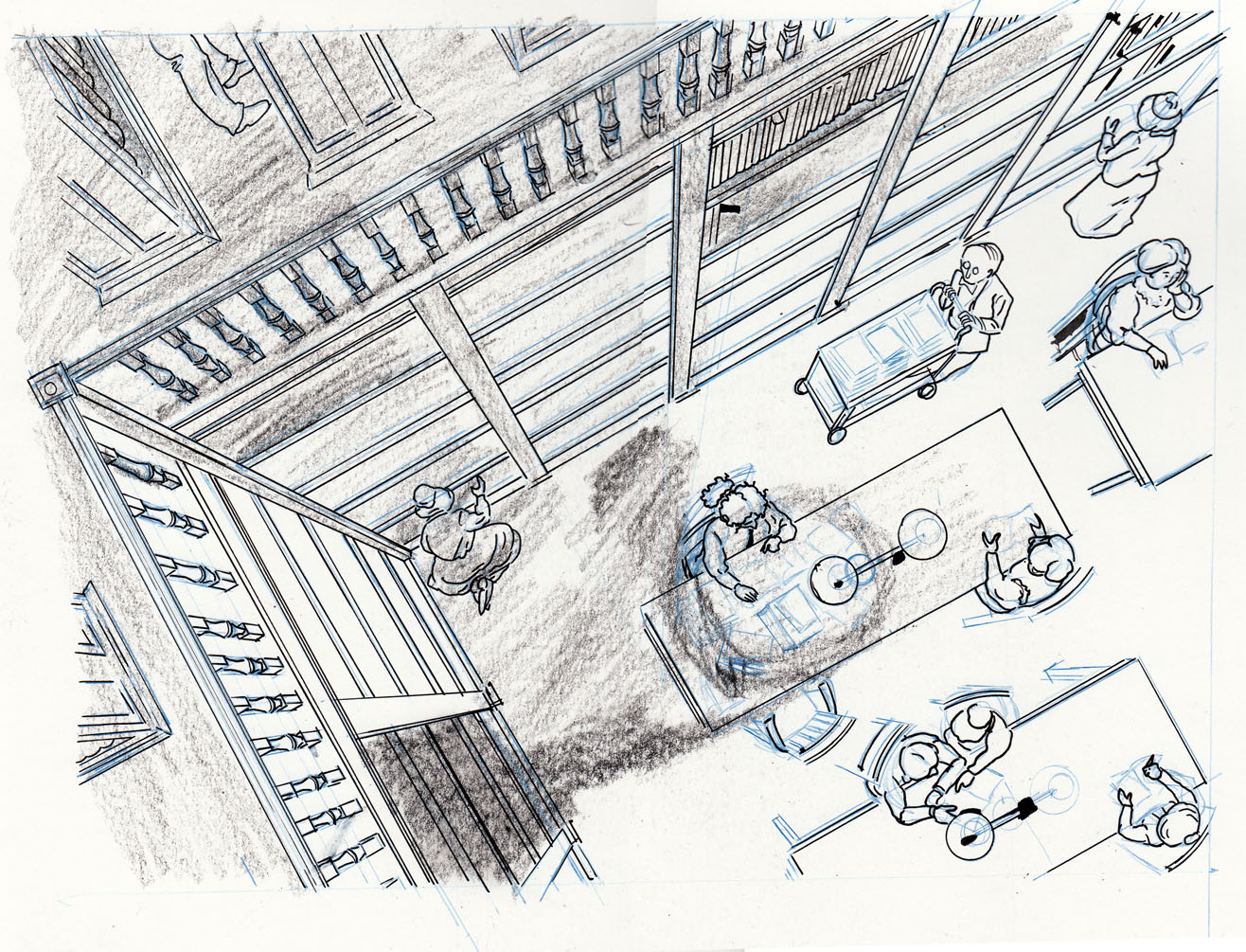
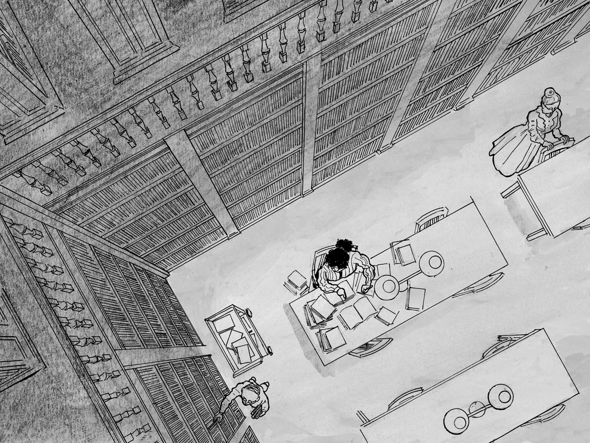
My plan had been to keep page 1 just to the line drawing, no shading at all. But as I looked at the progression of page 1 to page 2, I felt the contrast was too stark:
Also, I wanted to make the room feel as crowded and lively as possible so I added two new figures in the lower left:
Added shadows, especially darkening in the bookshelves, which overall improved the definition and drama of the space, I think.
But my main probems were with page 2. I obsessively kept re-doing the shading, and made other changes as well. I decided the character’s gesture in page 2 wasn’t doing anything for me, and that the figure of the man re-shelving books was detracting from the emptying-out quality of the room.
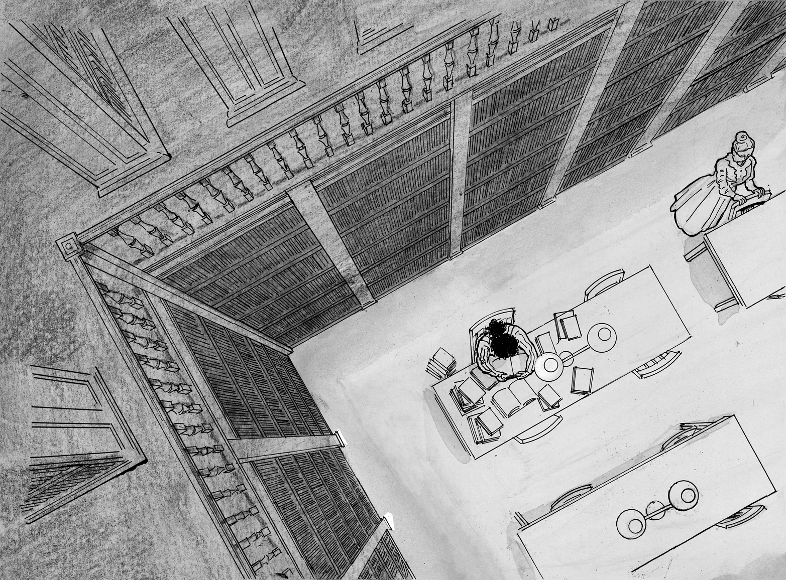

Reaching the stage where I can no longer discern which versions are better. I re-did the wash over the “floor” section of the drawing several times. I had been drawing on bristol. Wash on bristol sucks. My final (I think) version I re-drew just the “floor” section on watercolor paper.
At this point, I started to question whether this was the best way to draw the chapter, repeating the same view each time. I became convinced that, ultimately, it would be better to “zoom in” gradually so that the sleeping character would fill the page on page 3. I felt like I had to go on and finish the original plan though, and try not to feel stupid laboriously drawing the library in perspective over again, despite my suspicion that it wouldn’t work.
Page 3 was actually much simpler, just a dark room with a circle of light where the figure will be, drawn in litho crayon over a light wash:
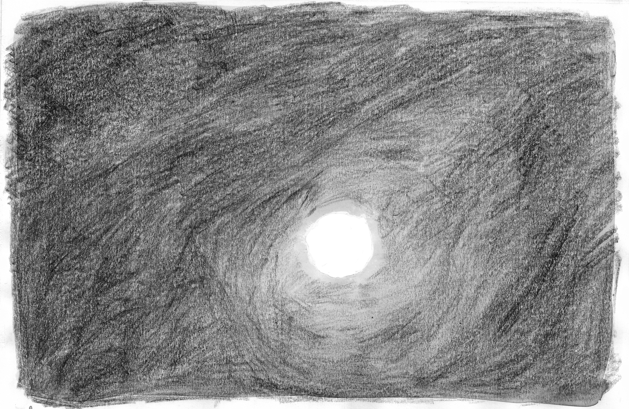
And photo-shopped over the line art:
(NOTE: unlike the earlier chapters, I’m planning to have a bleed on these pages).
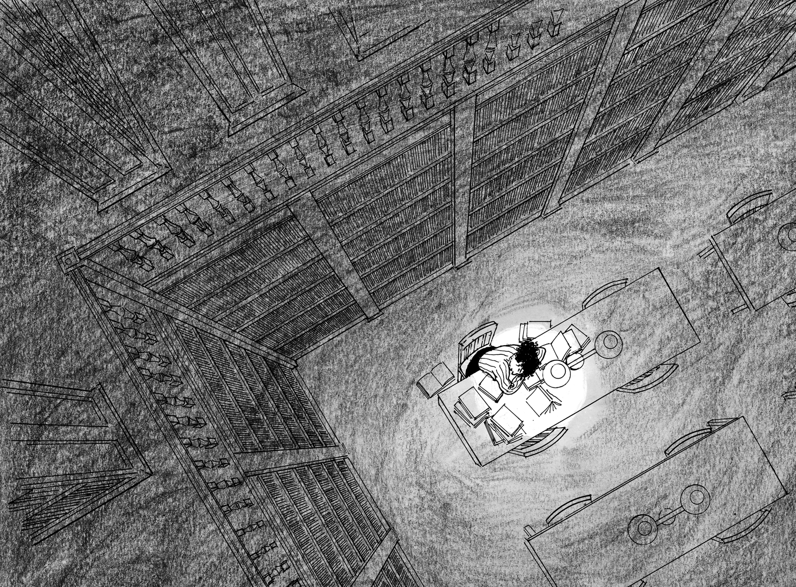
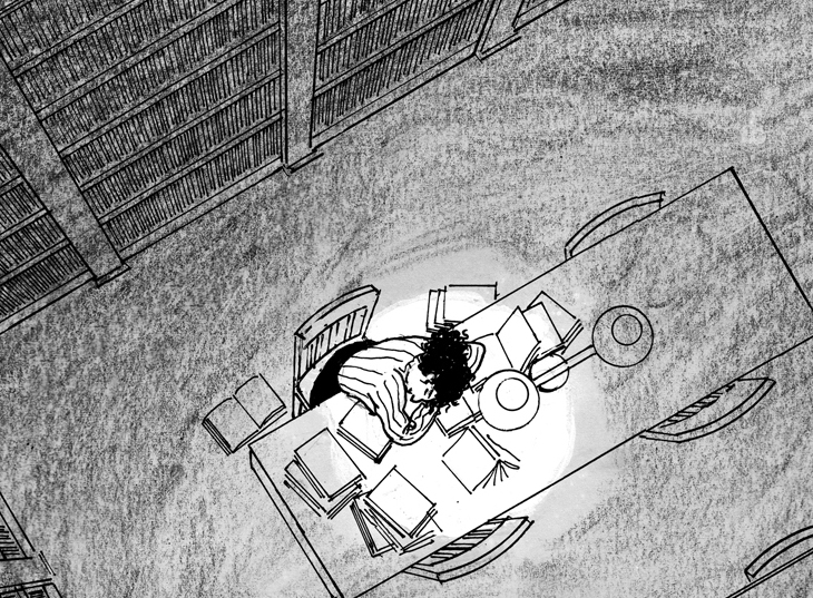
So, the three-page chapter goes something like this. One:
Two:
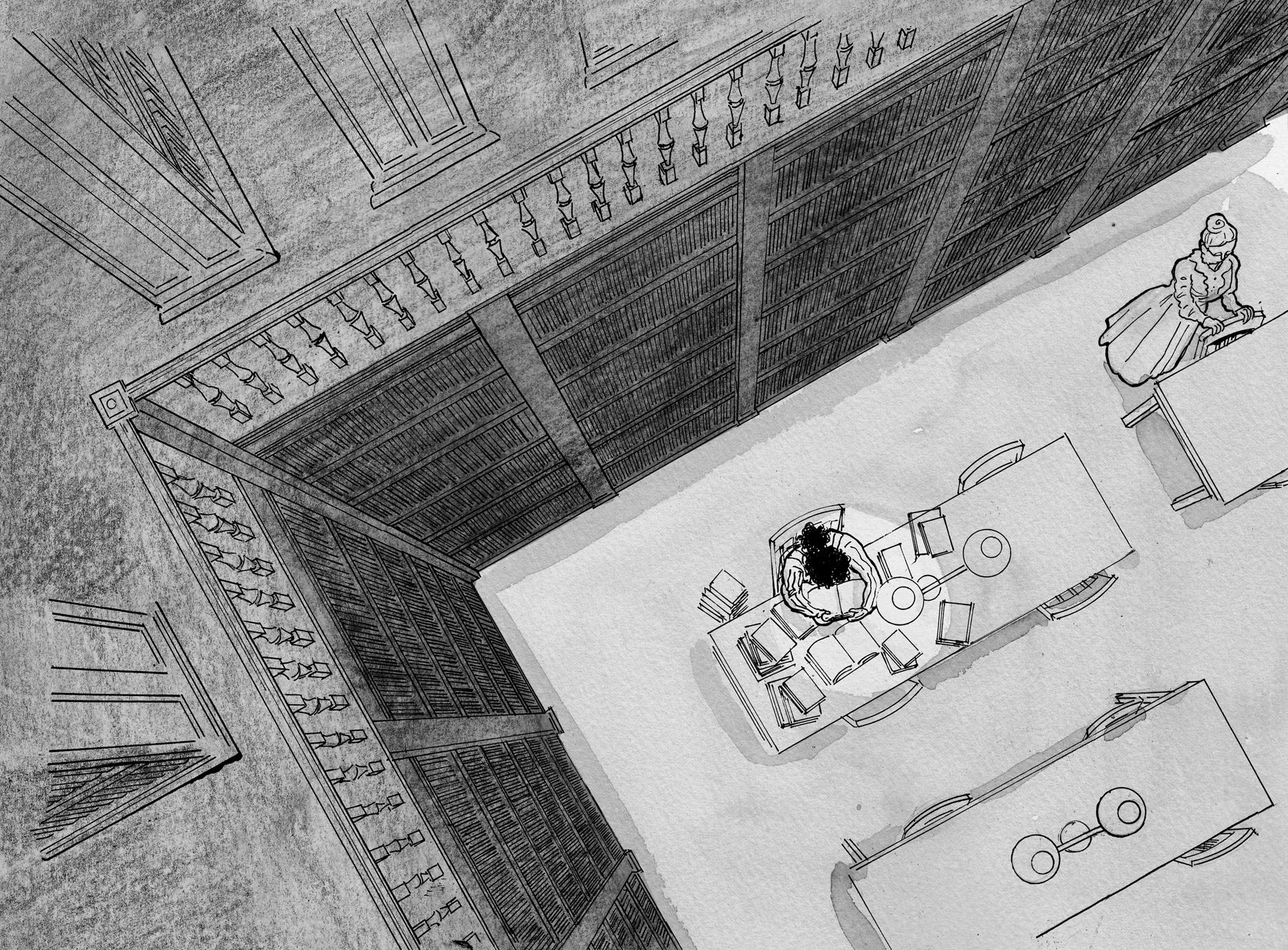
Three:
EPILOGUE
I guess now I no longer think it would be better with the “zoom-in,” but I can try it anyway, digitally:

Nope, I think it works better the original way. What do you think?