
This post will contain all the material that I produce while working on the 2nd chapter of my comic Lunatic: from thumbnails and sketches to finished pages. Lunatic is a wordless story, with one image-per-page.  I’ll add new material to the top of the post as I do it.
April 19-May 5: Crawling to the Finish Line
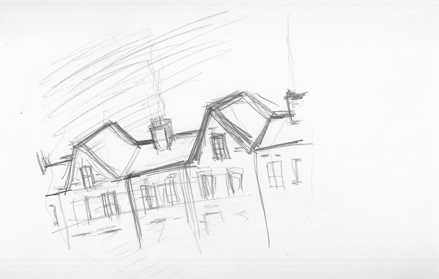
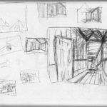
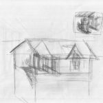
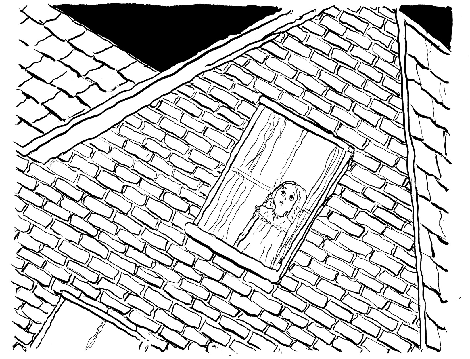
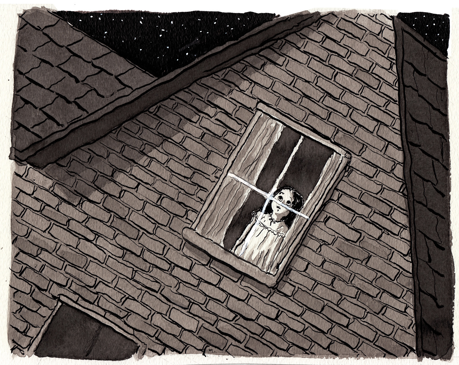
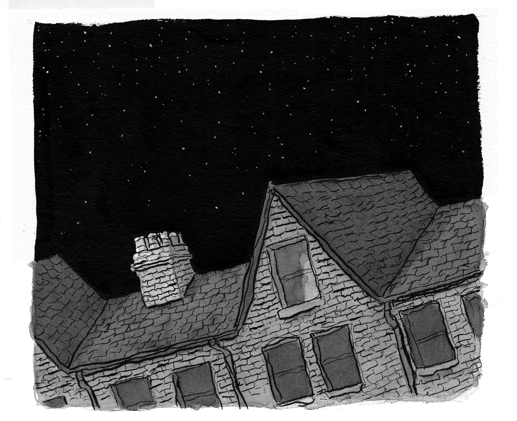
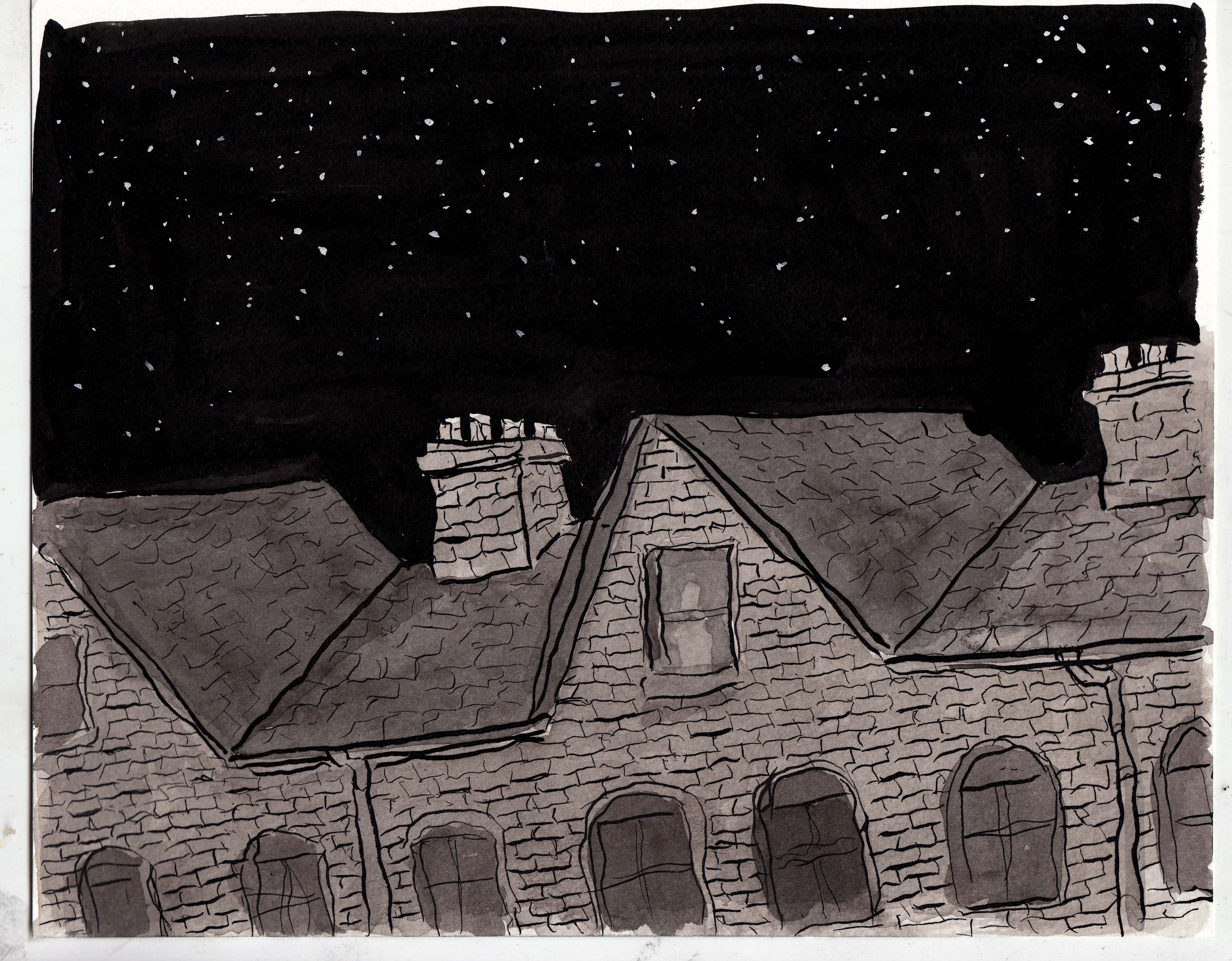
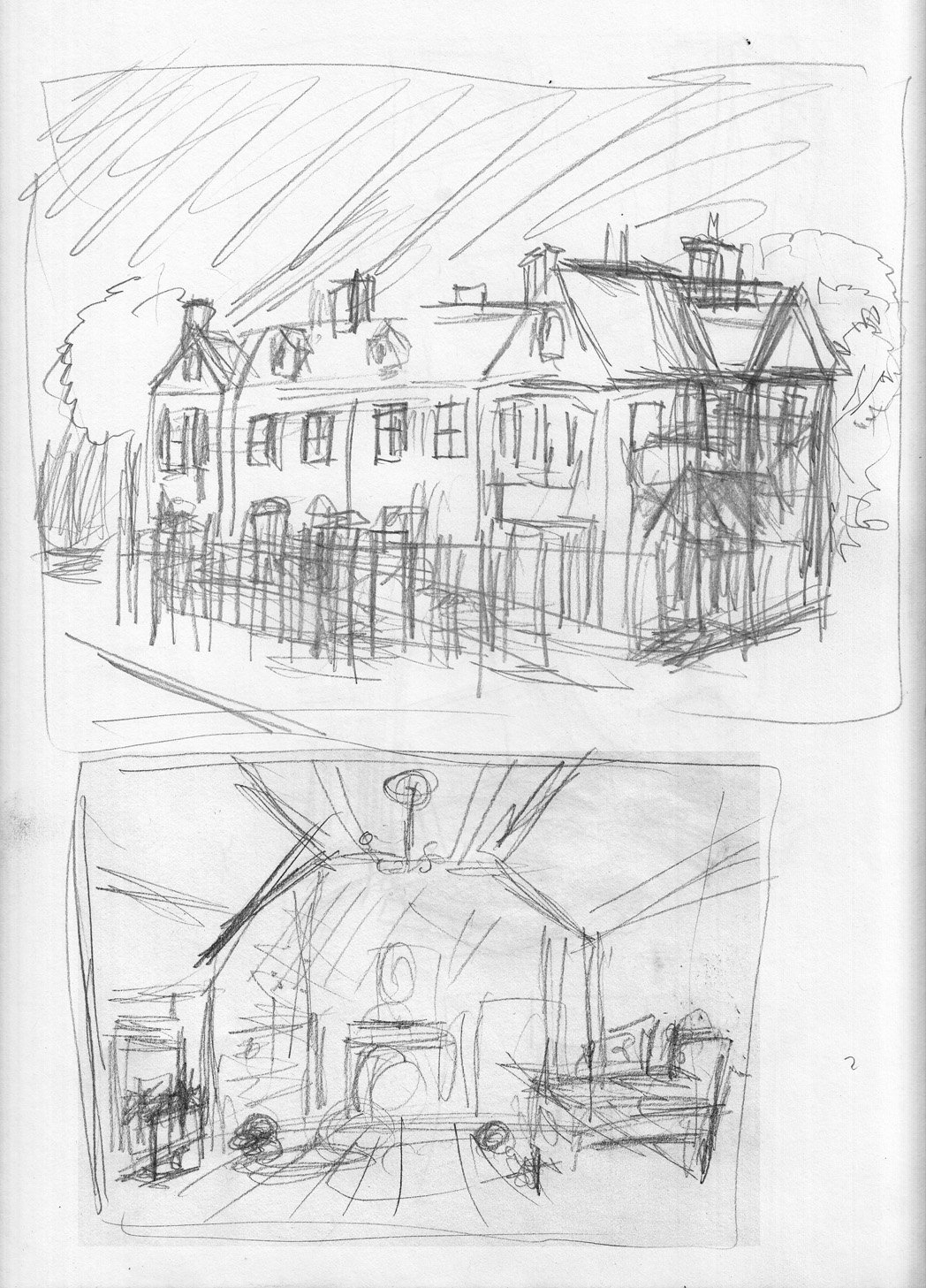
Other nuisances of life interfered, and it took me ages to do the last page I had to do. Â Not actually the last page of the story, but a transition page, to indicate that it’s morning in the last sequence. Â It’s a repeat of an image I’ve drawn twice now, of the exterior of the girl’s house, roof, chimneys etc. Â I’m getting kind of bored of drawing it, so I want to come up with something fun to do with this “morning” version. Â A different angle, to begin with. Â First, a light pencil sketch, just for composition:
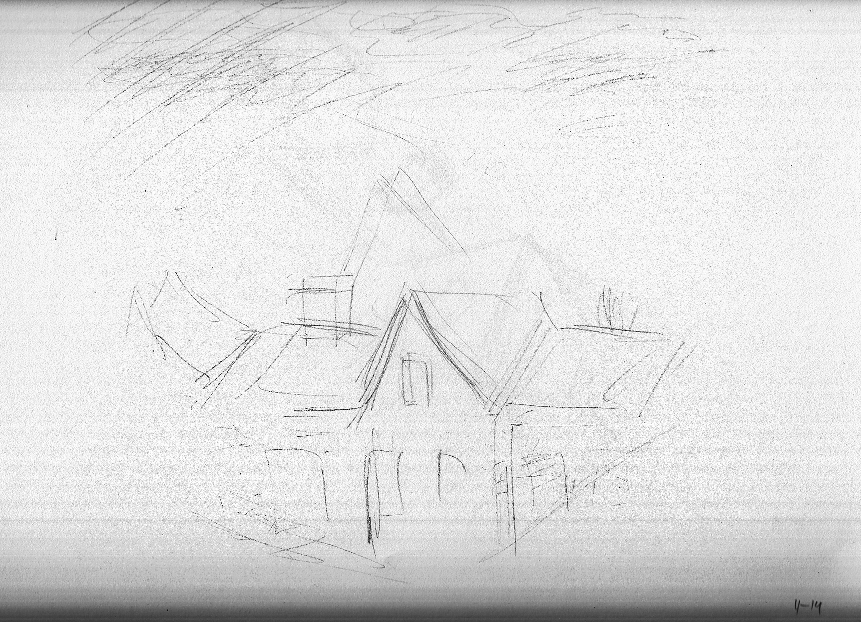
Then, 10 DAYS LATER (!) (Really, I had other things to do. Â Or was it the boringness of the page that kept me from getting to it)…. a couple more sketches:Â 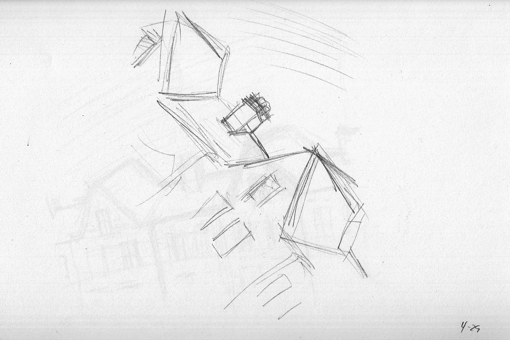
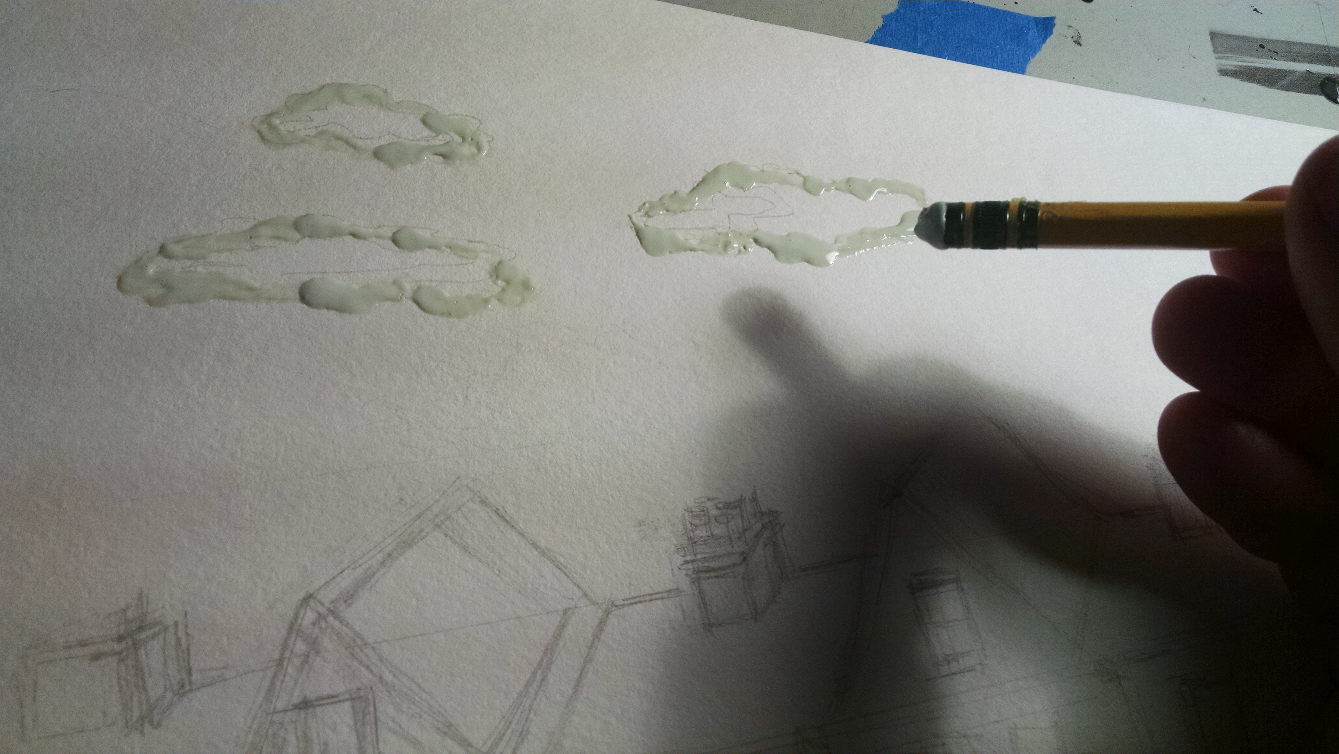
Thinking of ways to make it interesting, I think of using masking fluid to define the clouds, with a light wash for the sky, shading the clouds to show the dramatic light of the sunrise. Â A bunch of wash studies:
Letting the ink wash pool up at the bottom (on the tilted drawing table) accidentally makes that “burst” effect happen when it dries. Â I decide to try and make use of that for the sunrise itself.
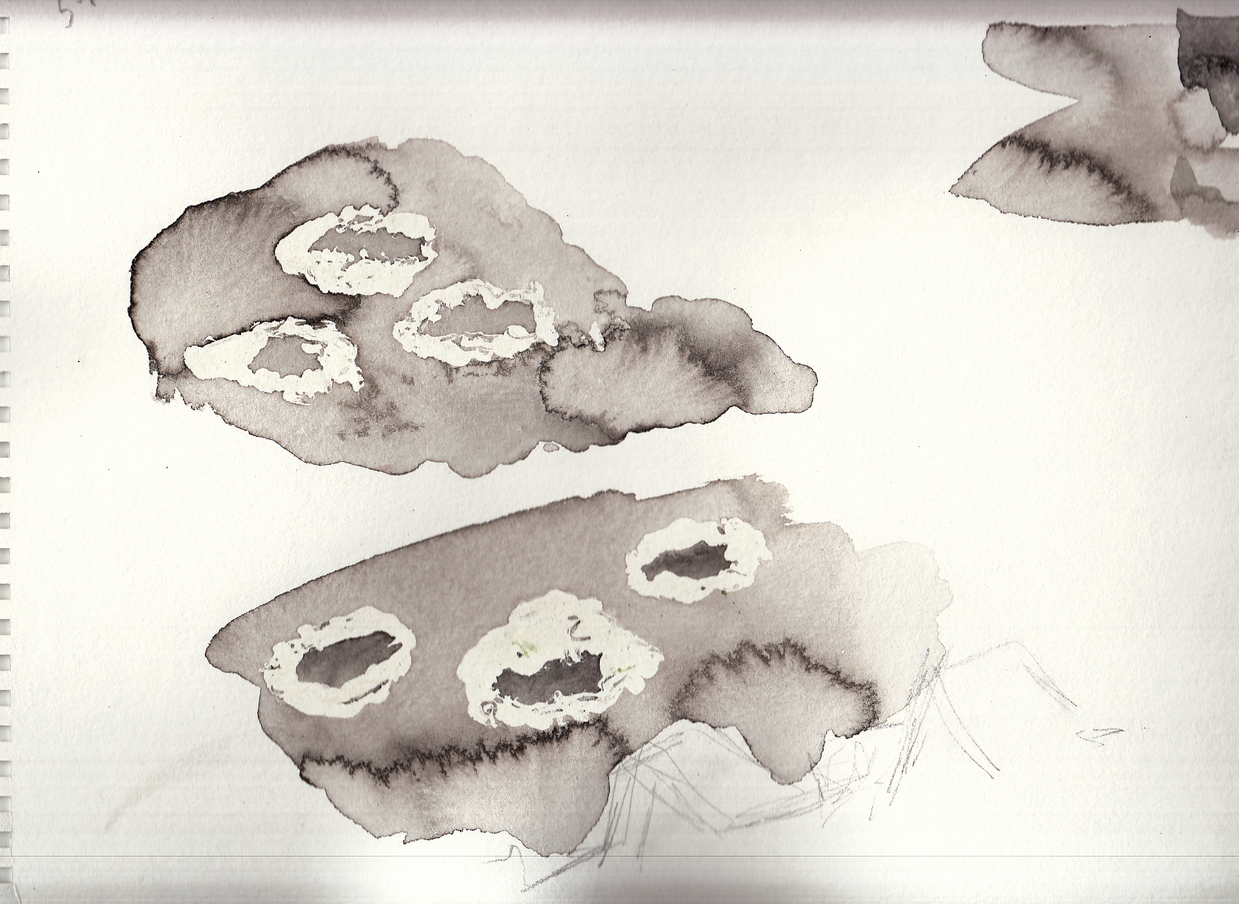
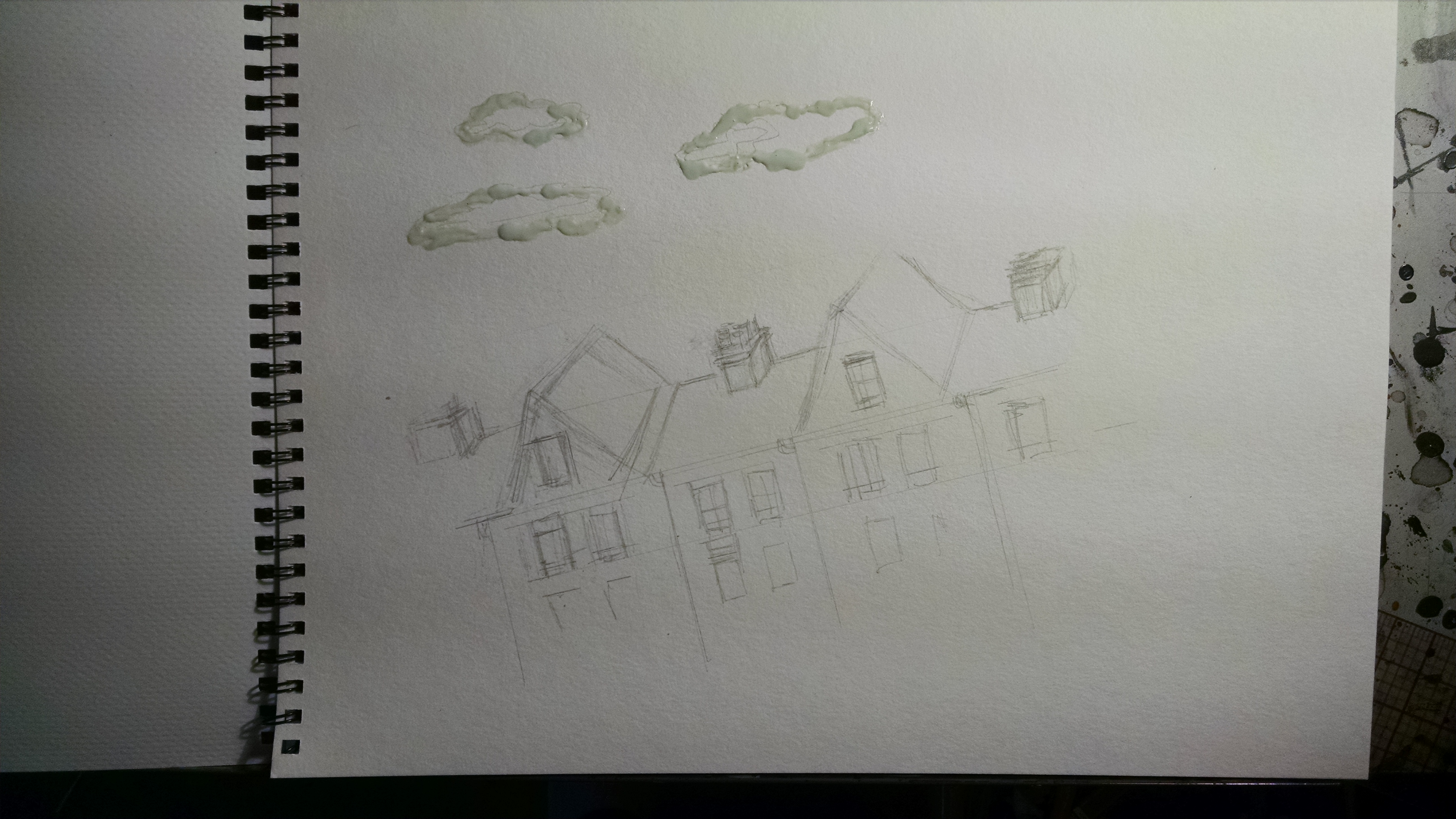
On to the final version. Â The masking fluid is gooey stuff and hard to apply with precision. Â I don’t really want to muck up a brush with it, so I used a pencil eraser to draw the cloud shapes with it:
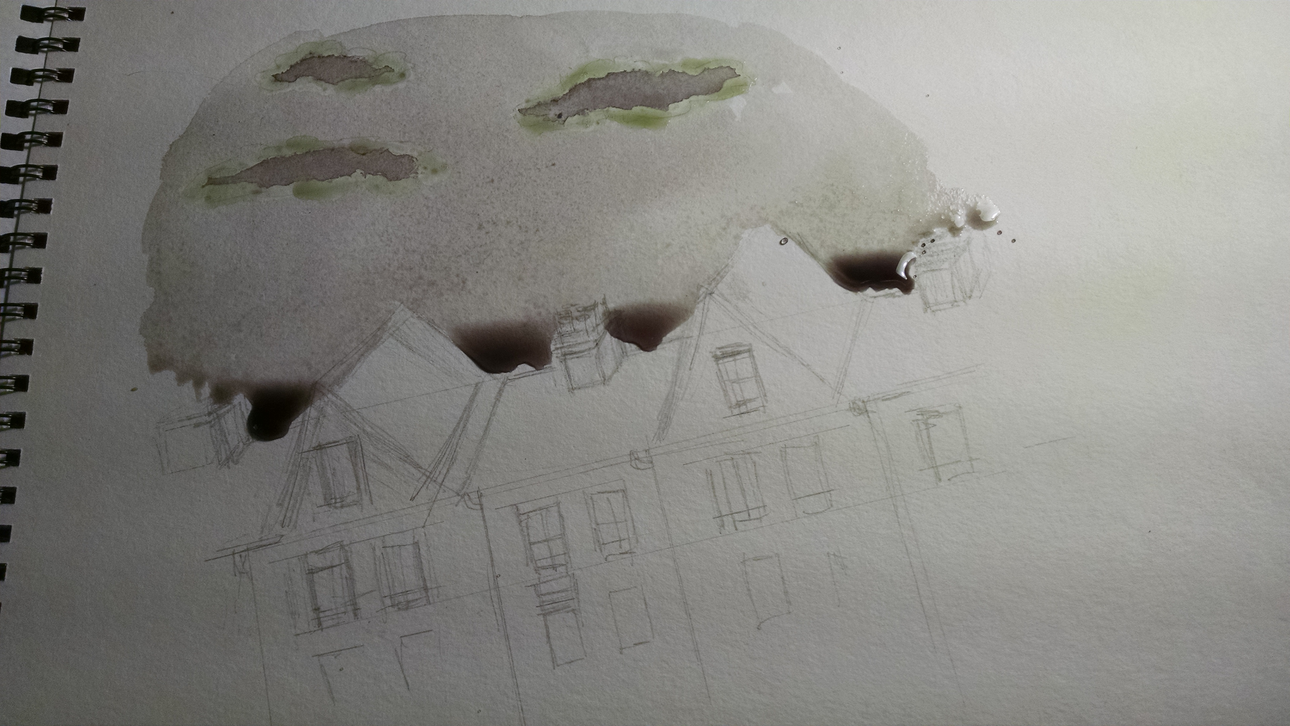
Brush on the washes, sloppily so that it pools up just above the roofline.
Et voila!
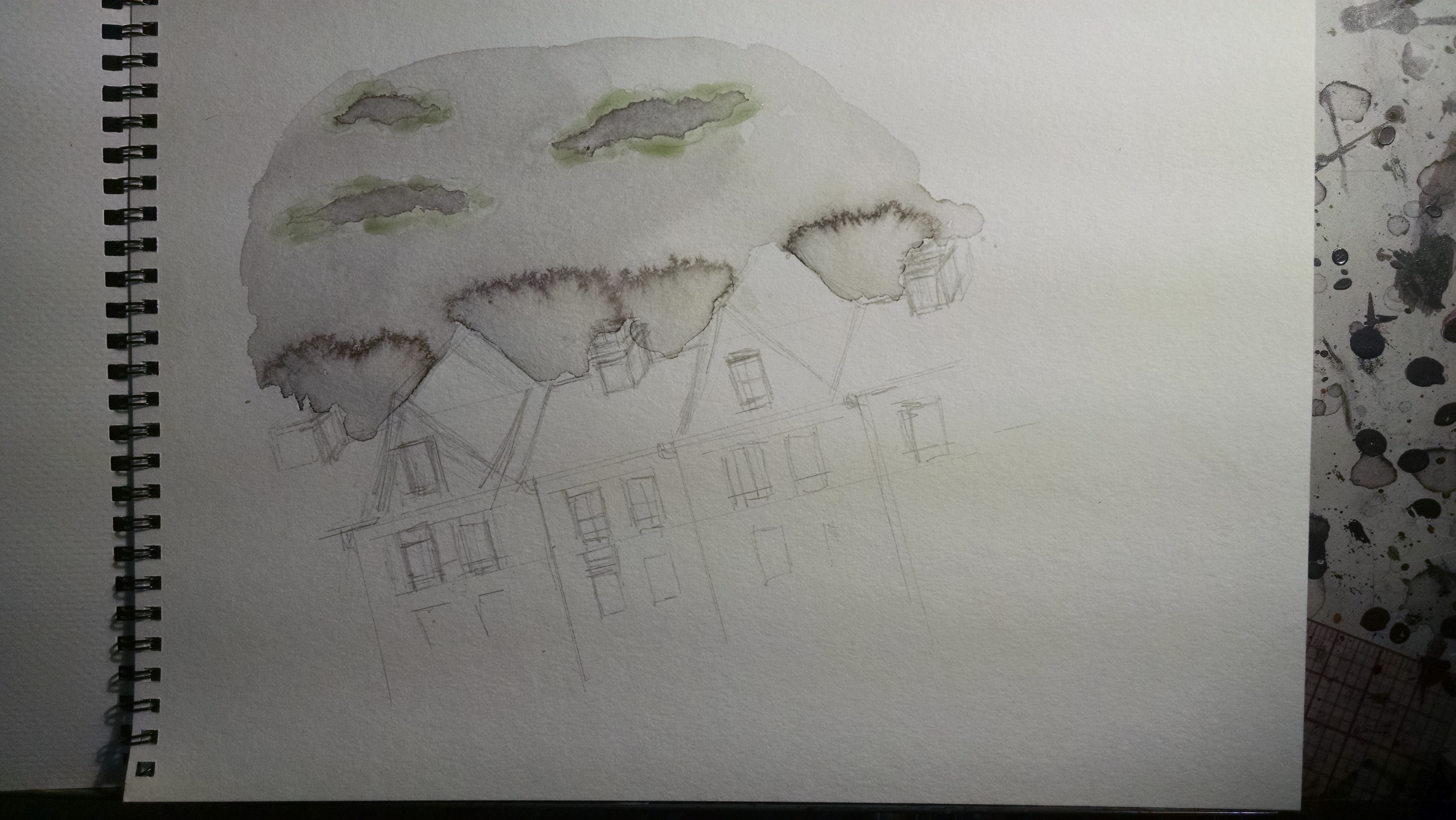
Once this is all dry, I peel off the masking fluid, so that there is a white edge to the clouds, with the darker shading in the middle.
Washes added to the building: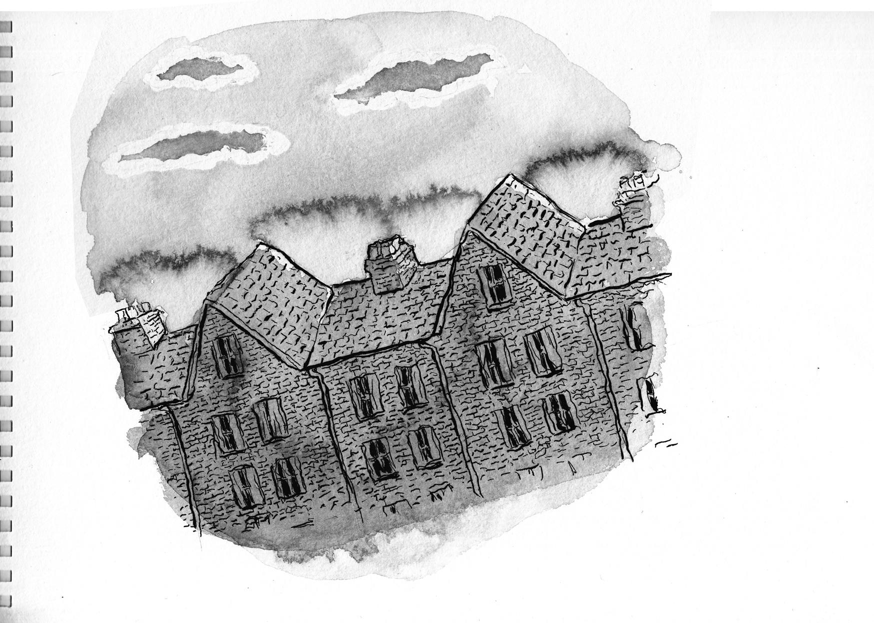
Ilm not sure if the wash effect feels like a sunrise… or is the building on fire?  But I’ll go with it for now.  It doesn’t have the dramatic lighting that I want, though… so I add more gray wash to the front of the building, and some cast shadows on the roof: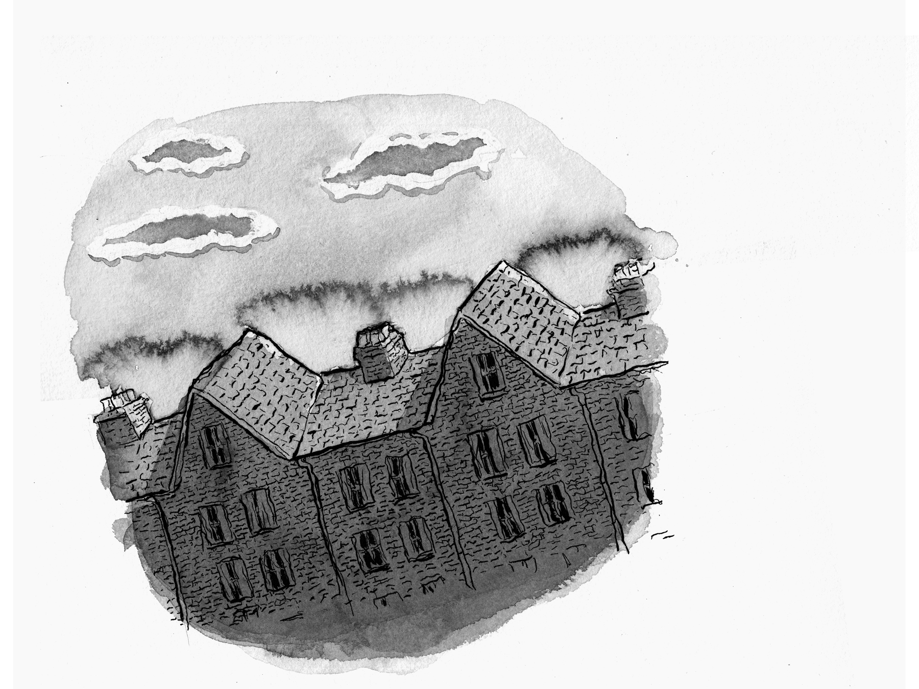
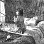
Good morning, right?
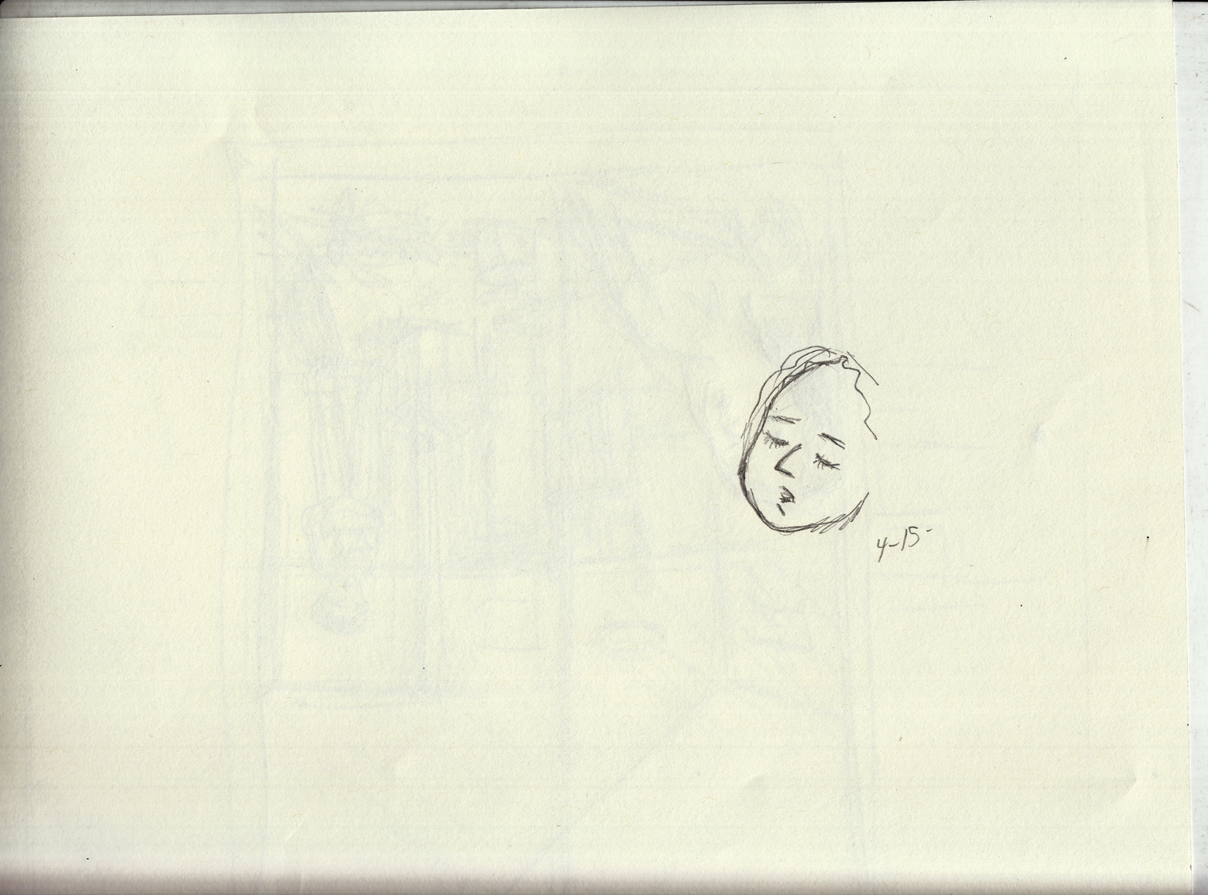
That’s it for chapter 2, but there is one thing that bugs me (there are actually probably lots of things that will bug me, but this one is bugging me now). The face of the girl on page 16.
 Â Looking at it, I realize the problem is that I drew the mouth too far to the left, and it looks funny. Â Though I’m trying to avoid digital corrections as much as possible, I sure don’t want to redraw the whole page, so I just nudge the mouth over in Photoshop. From:
 Looking at it, I realize the problem is that I drew the mouth too far to the left, and it looks funny.  Though I’m trying to avoid digital corrections as much as possible, I sure don’t want to redraw the whole page, so I just nudge the mouth over in Photoshop. From:
To:
I think that’s much nicer. Â Or if I want to really cheat I could try to use the mouth (or the whole face) from the earlier version of the page:
Something tells me there is a lot of fussing yet to come in the future of the “finished” chapter two!!
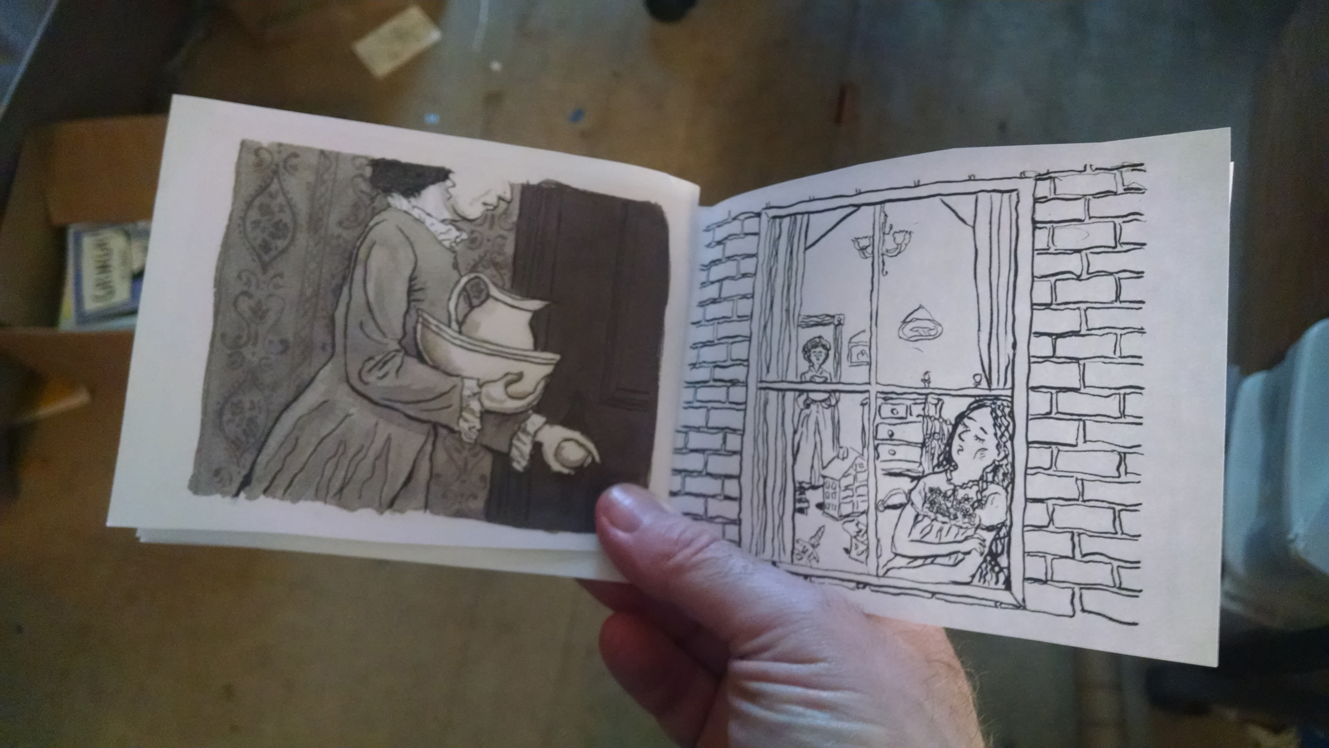
April 14: Mock-up time
As soon as I had linework done on (the first version of) page 16, I wanted to put together a little mockup of the chapter, to see how it flowed. Â As I did with chapter one, I printed them along the 11″ of 8.5 x 11 sheets and folded them. Â The small size is kind of fun, and it’ll be tempting to print it up at this size, though I’ve been planning to print it larger.
Generally, I think it read well. Â I am not sure if framing the moon in the little circles of black on pages 8 & 10 is going to work, but that’s an easy fix.
April 12-20 Slowing down toward the (chapter) finish line
My pace / discipline really starting to sag in April, due to a combination of external and internal factors. Â It happens.
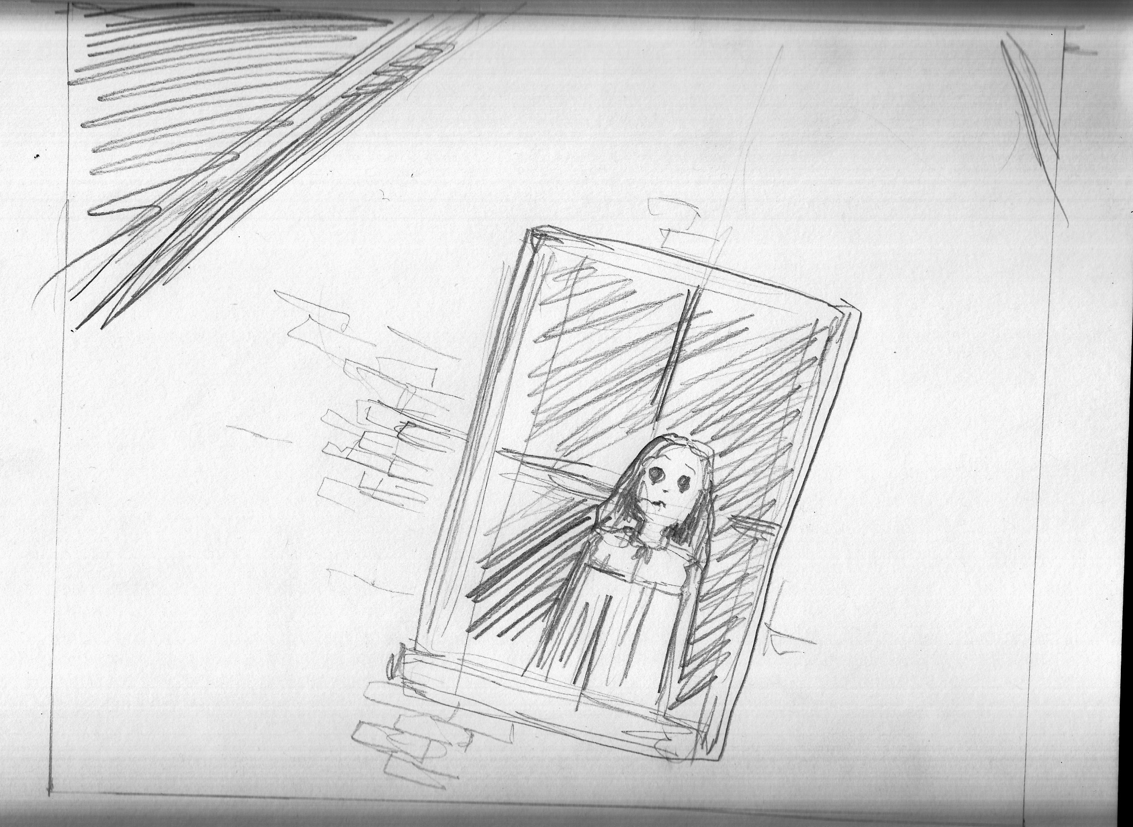
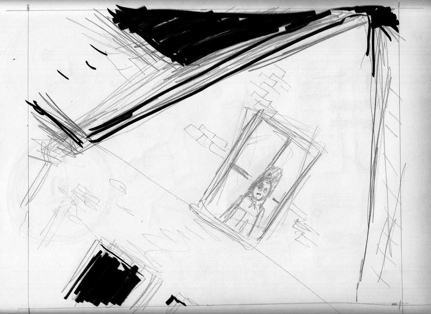
Anyway, I sketch out the last page of the chapter (there were some previous sketches of this, if you scroll down, as well. but this one is more precise as far as composition):

And onto the inked line art (I didnt document the pencils):
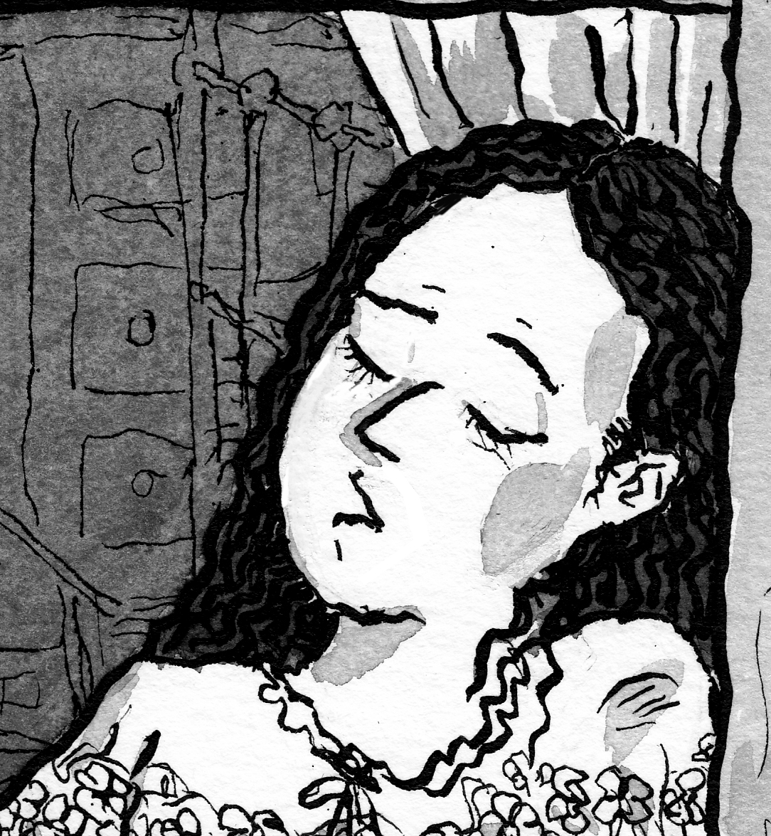
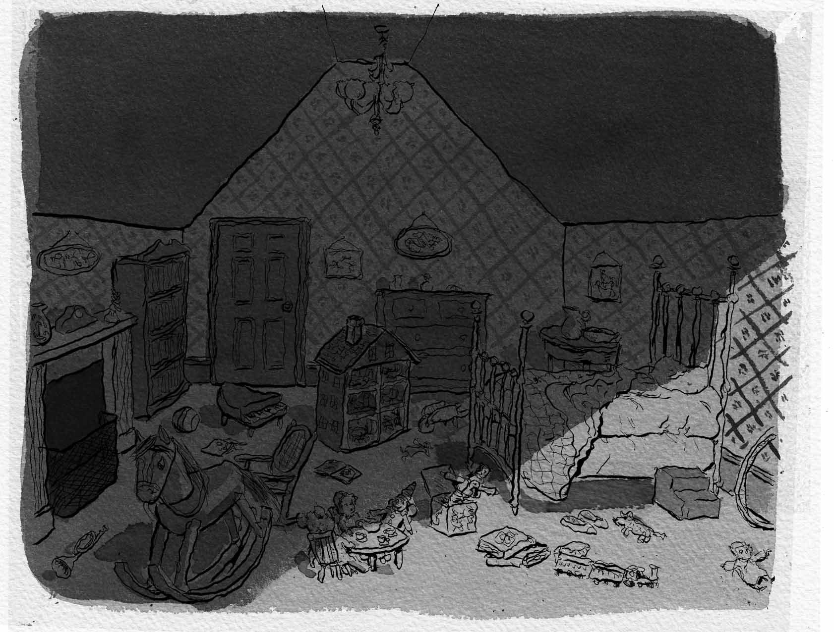
Not thrilled with this, mainly because of the face. Â Also, I didn’t take enough care with the background of furniture, toys etc in the room, and I think it messes up the composition, drawing attention away from the characters.
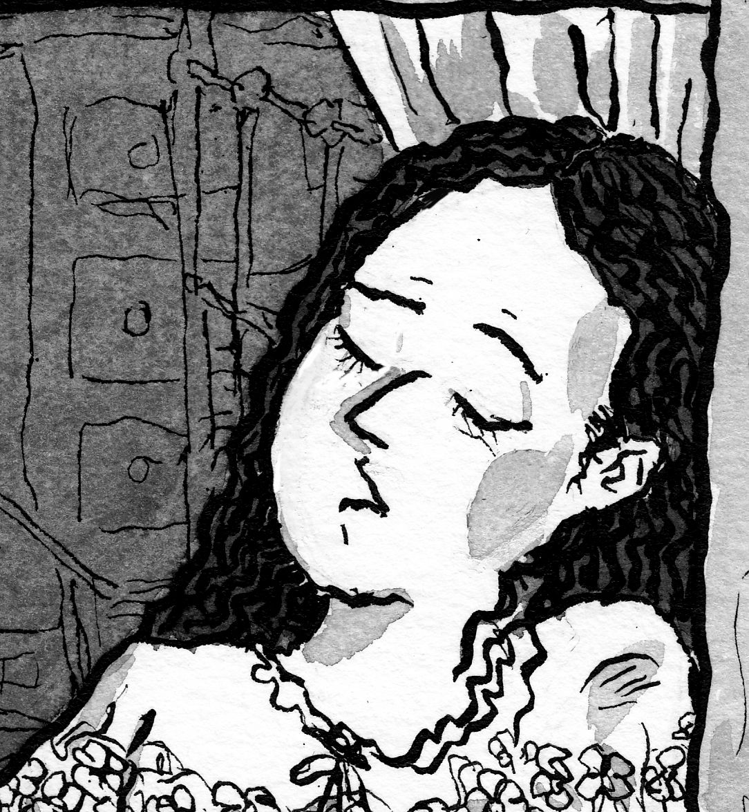
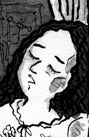
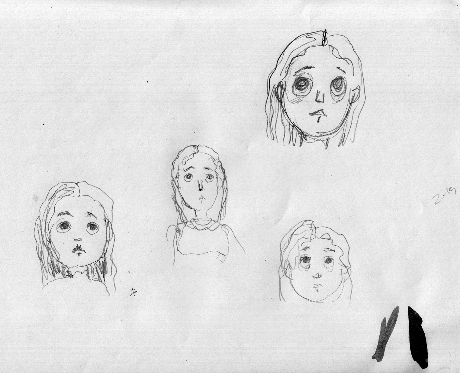
I did one more little sketch, just of her face:
Look closer? Â Okay…

And re-drew the page. Line art:
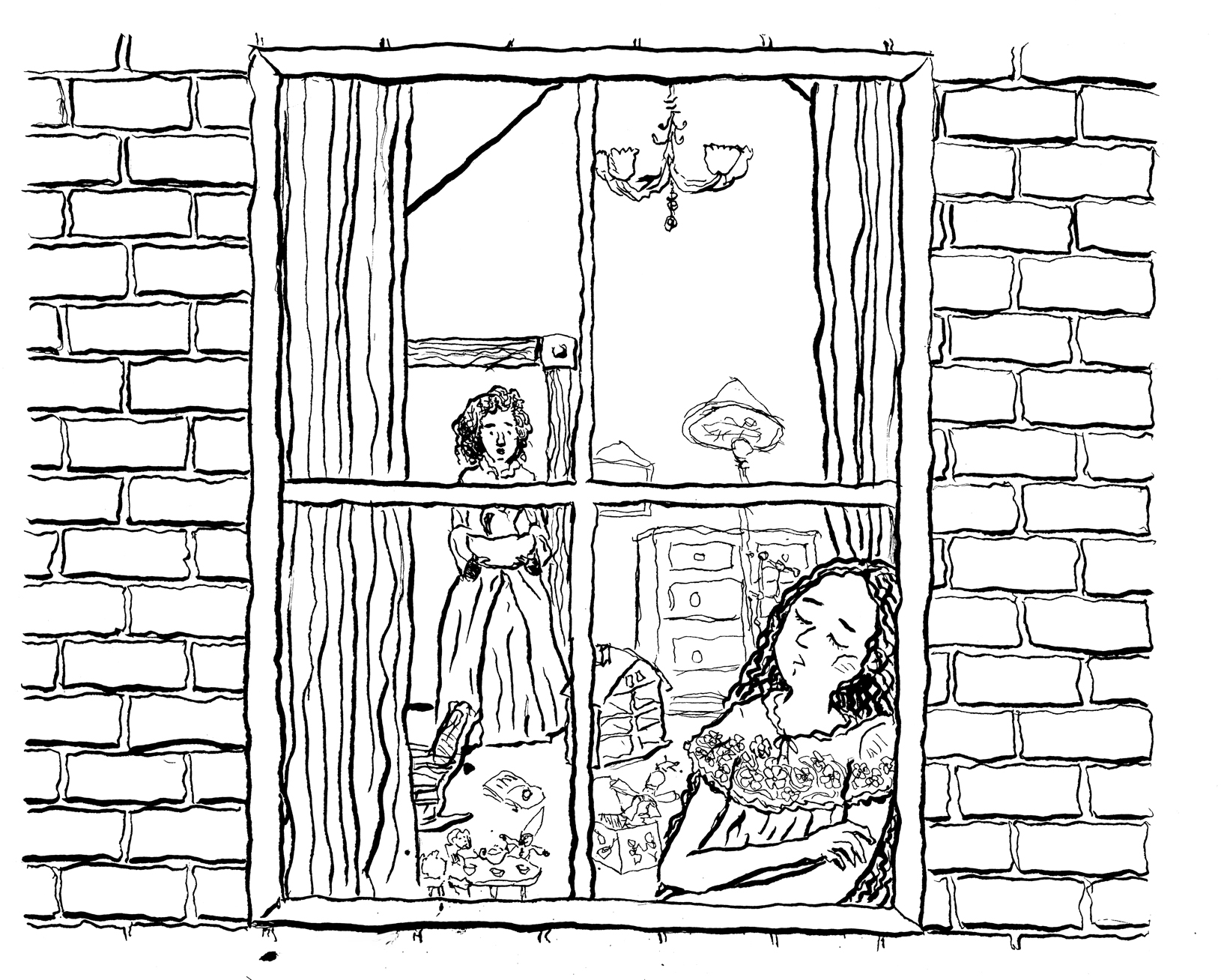
I felt I improved the two problems mentioned above. So I went on to washes: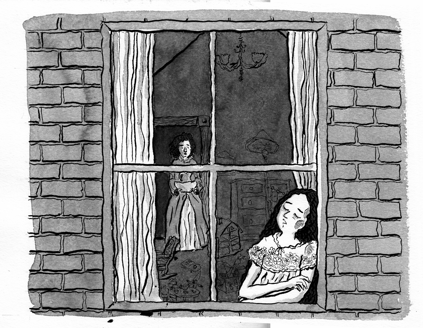
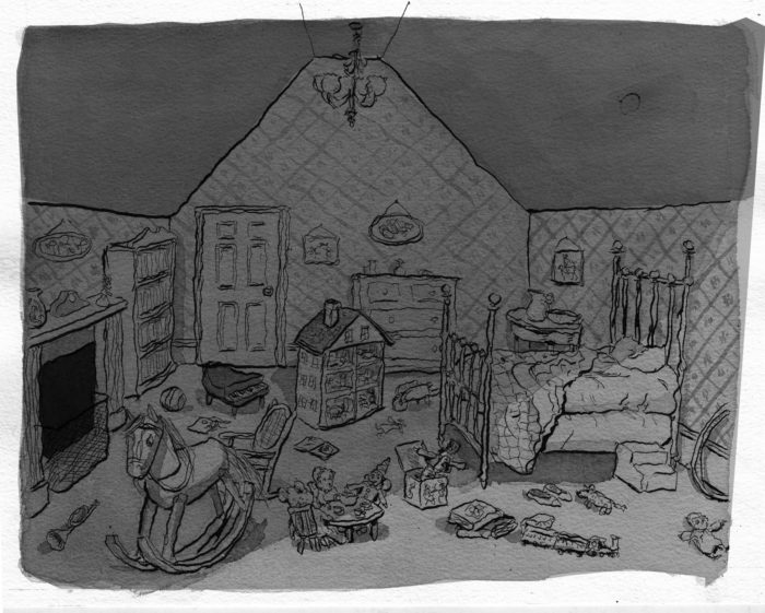
That’s all well and good. Â But as I looked at it, dissatisfaction returned. Not with the drawing, but with the composition. Â The characters are too small in the frame… a lot of wasted space, and it dilutes the impact/”reveal” of the sleeping girl.
To test my hypothesis, I simply cropped the image differently:
Quite a change, no? Â In some circumstances, I might just go with the digital crop. Â But not today… I really want everything to work on paper, not just digitally. And besides, I’d lose the “rough edges: of the lines and washes.
So back to the drawing board, with the new composition. Â Line art:
Washes:
And I have nothing more to add on the topic.
April 2-4: Oy, a new challenge.
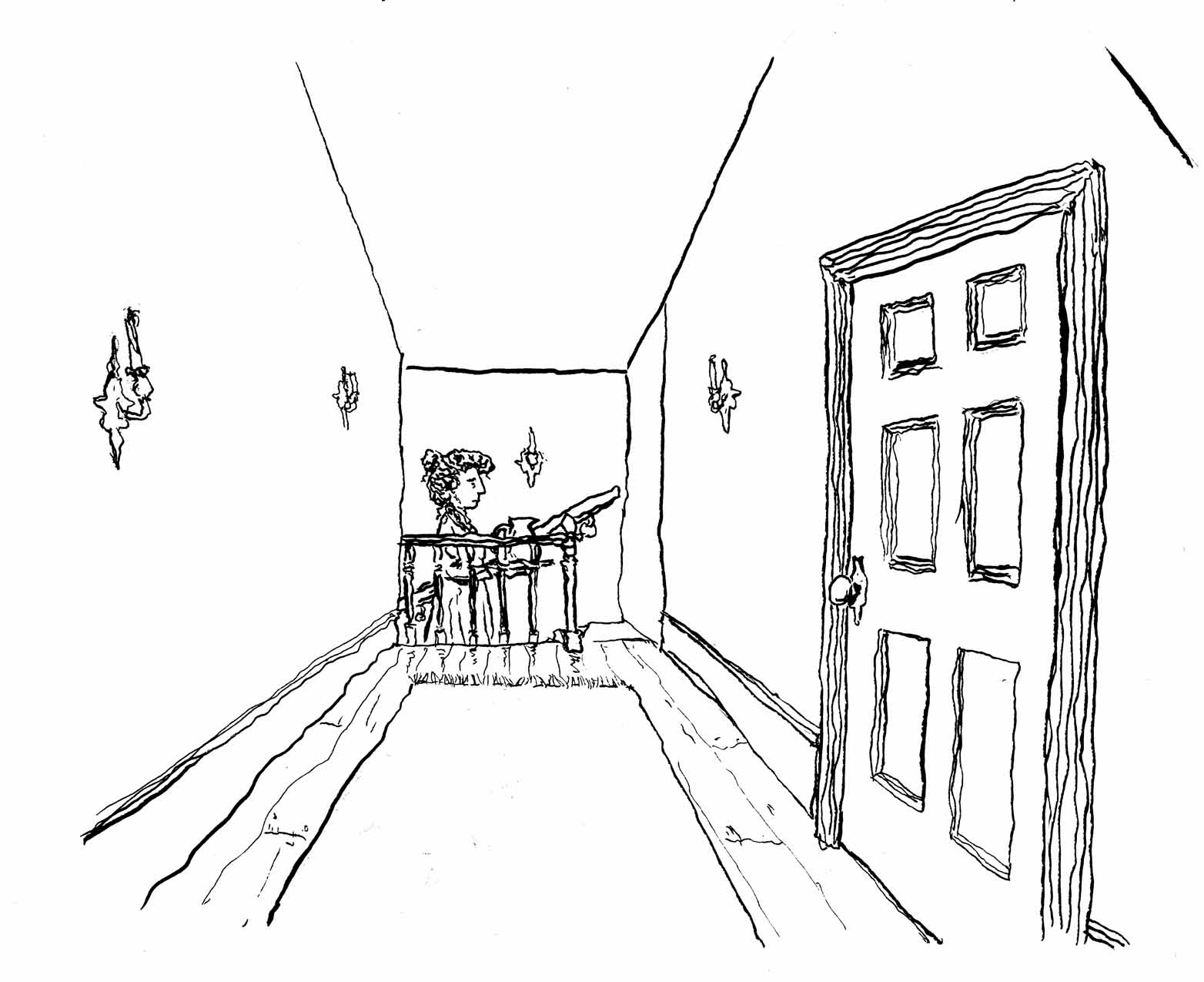
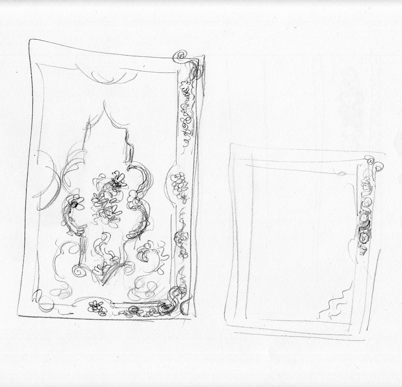
Page 16 switches locations slightly, to the hall outside the bedroom. Â I am forced to reckon with the perhaps nonsensical architecture that I’ve created.
How is the house laid out? Â Where would the stairs be? Â What would the proportions feel like? Â I know, I know… probably best to figure this stuff out before I start drawing the scene, but who can be bothered right? Â So I’m retroactively trying to make sense of it, not my strong suit:
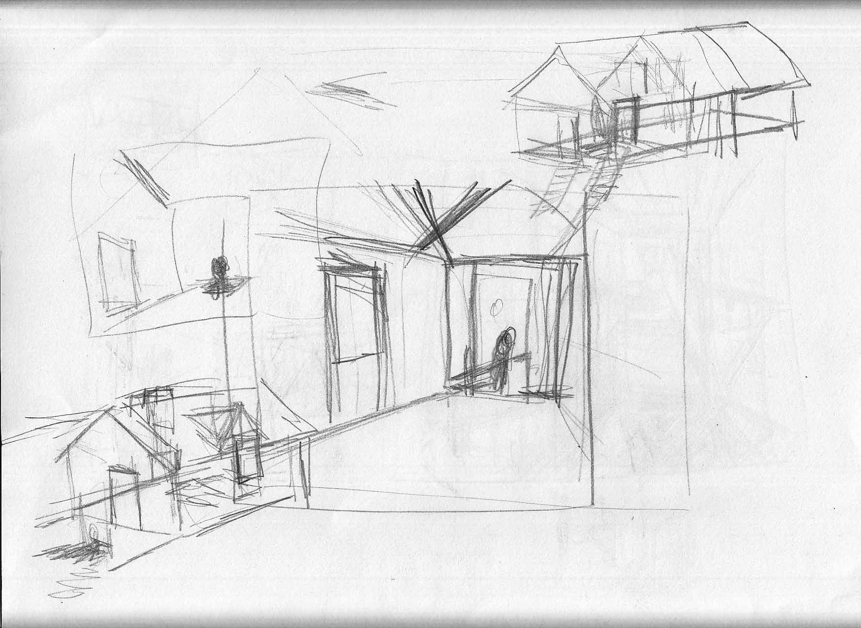
Of course maybe no one will pay attention to such things. Â Or maybe they will… and LAUGH at me!! Â Obsessive now:
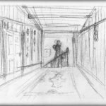
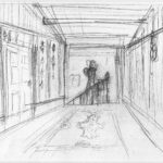


Do I really solve the architectural question? Â I don’t know, maybe I just gave up. Â Anyway, it pretty much ended up looking like my earliest sketch. Here are the final pencils:
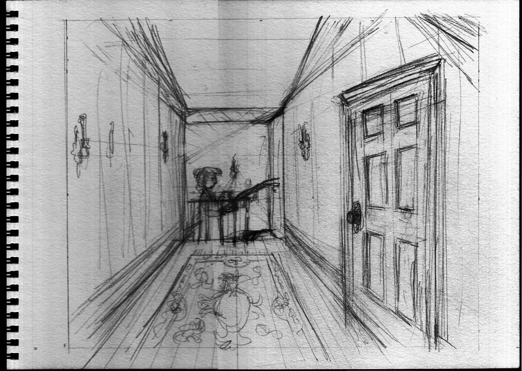
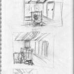
The inked line work:
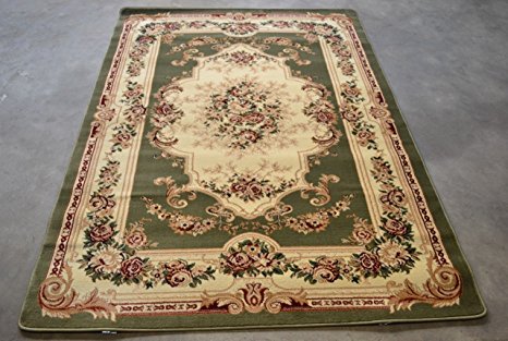
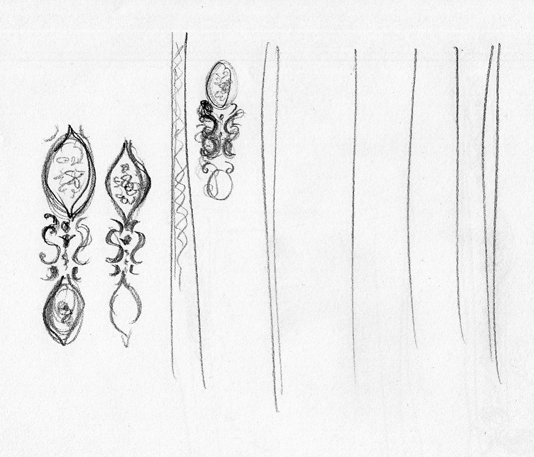
In this case, it’s really all about the washes. Â The rug, the wallpaper. Â A little reference, and some quick studies: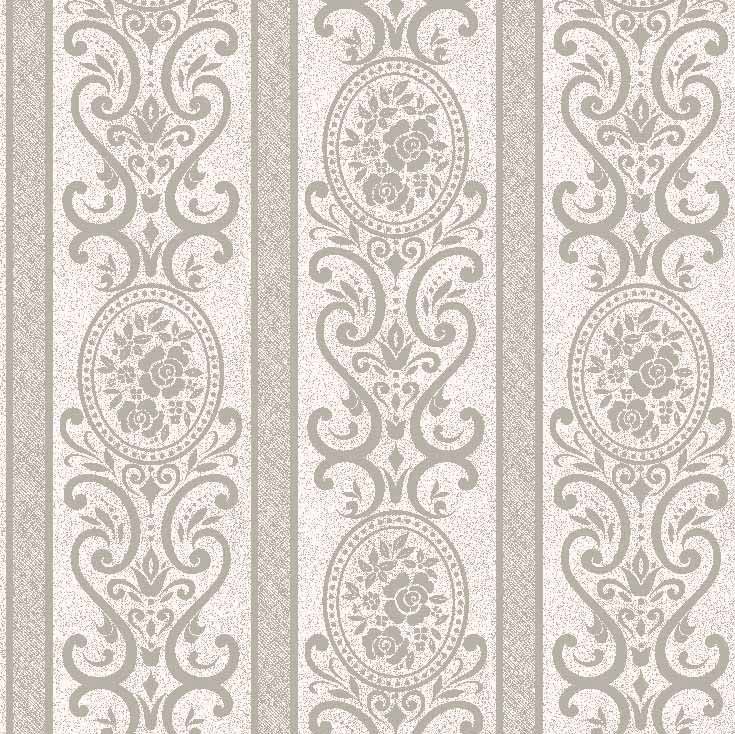
And voila! Â Here it is on the drawing board:
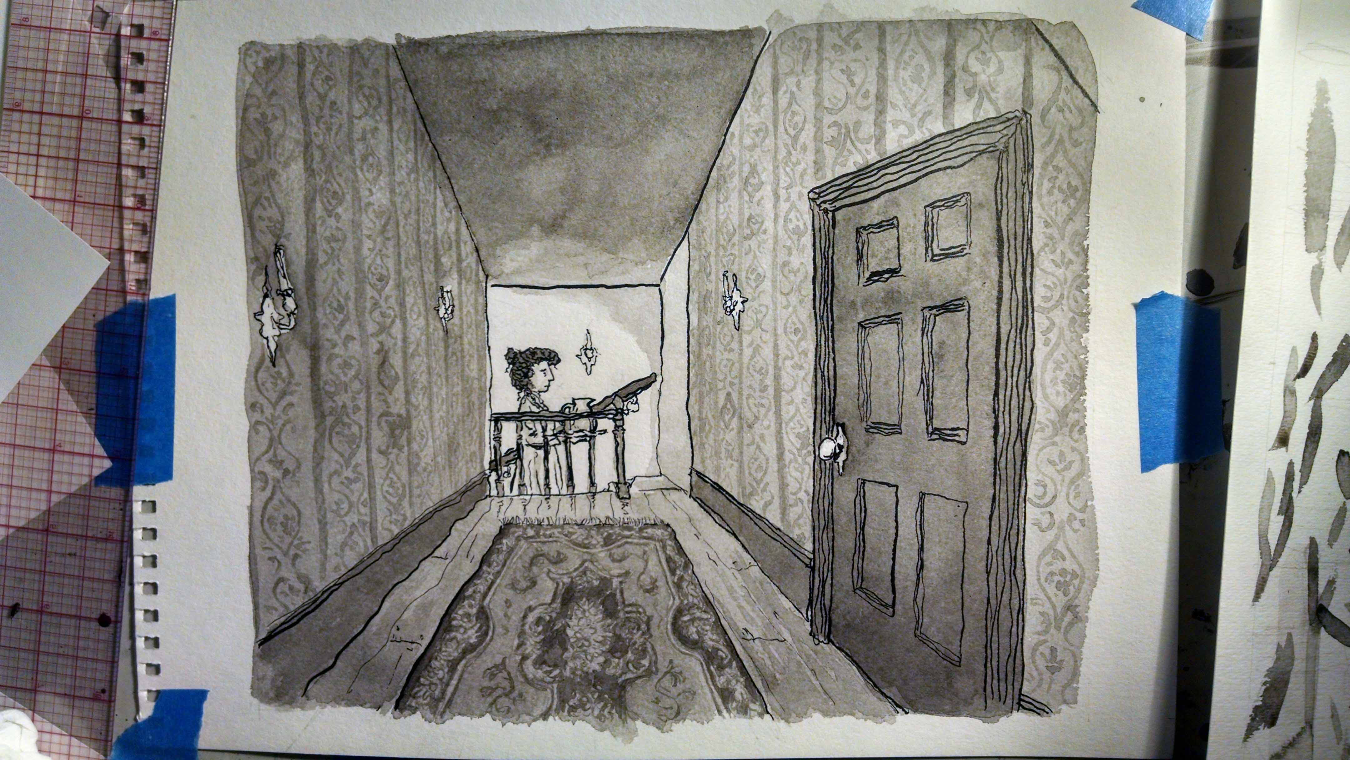
And scanned, with hopefully the levels adjusted well:
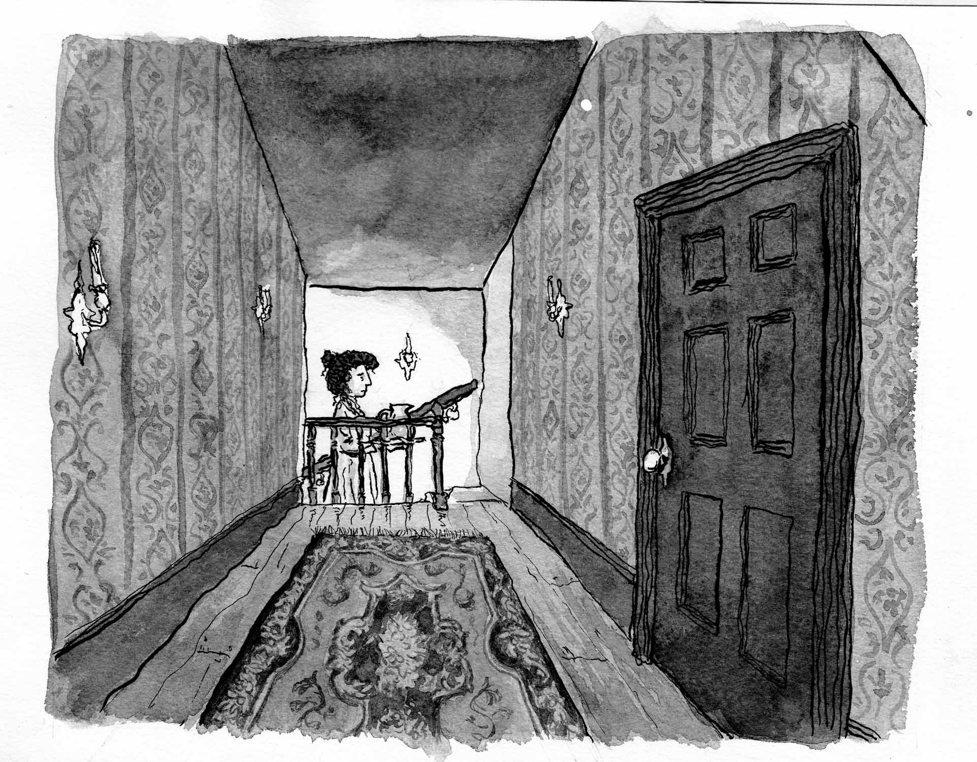
And after all that… My rational brain failed me around the drawing of that rail at the top of the stairs: is there room for a person to get through there? Â Does the sloping-down ceiling of the roof read as perspective, making the figure look way too large?
Y’know what? I think this time I’m going to have to live with it, plus whatever little tweaks I can manage on Photoshop.
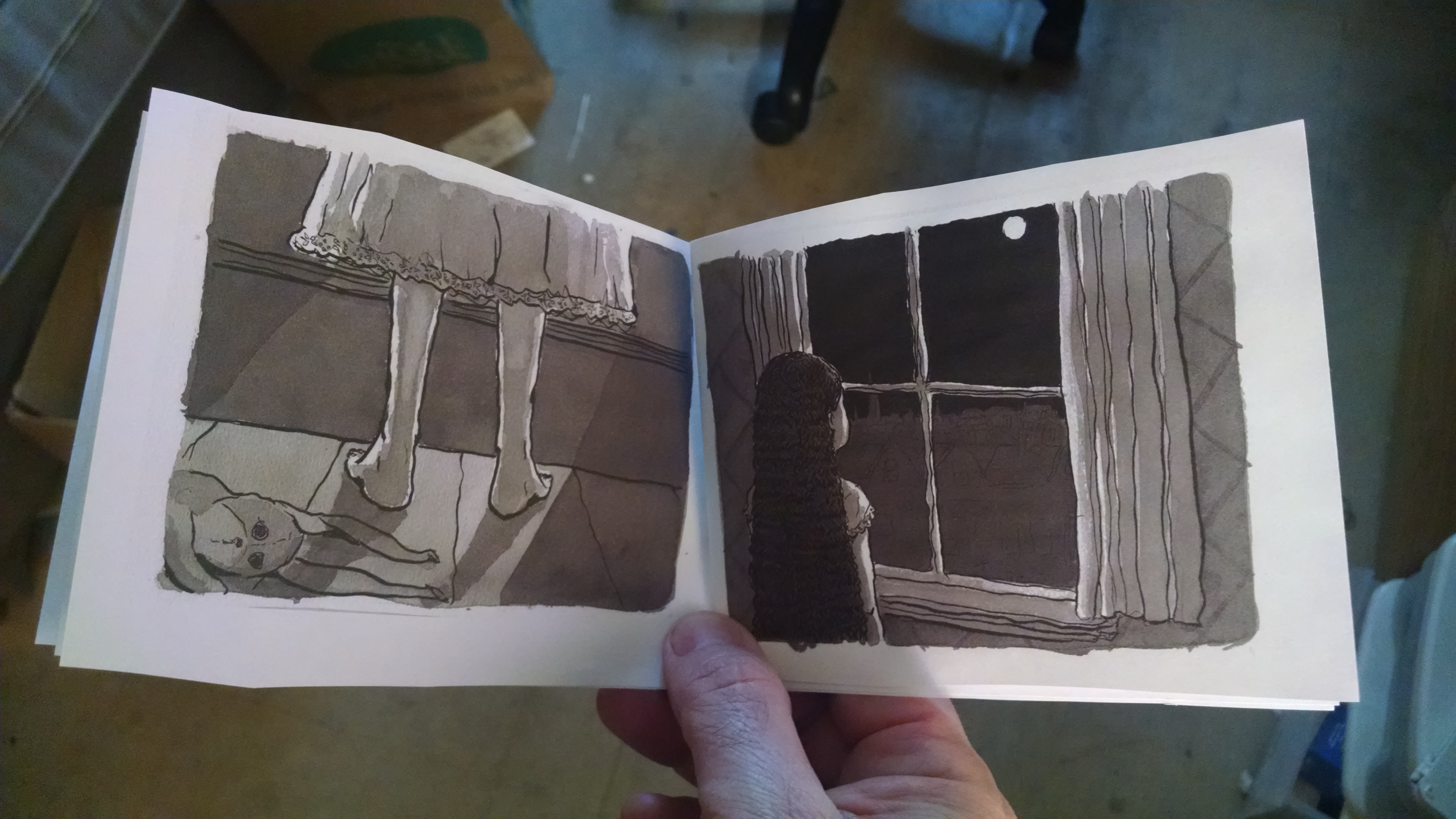
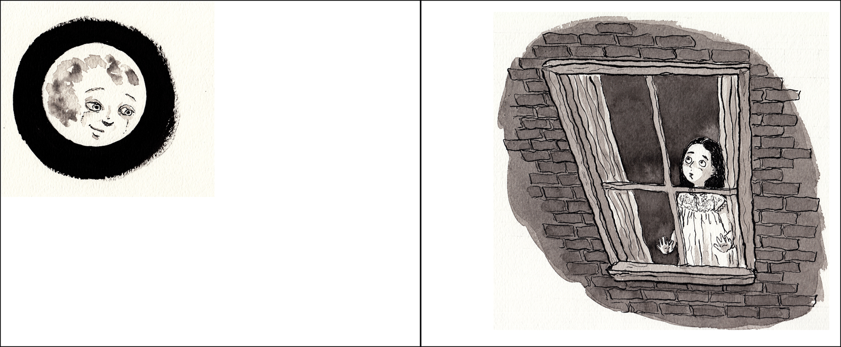
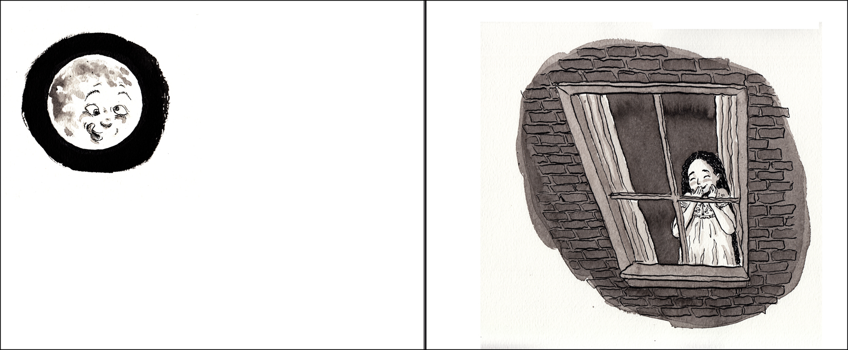
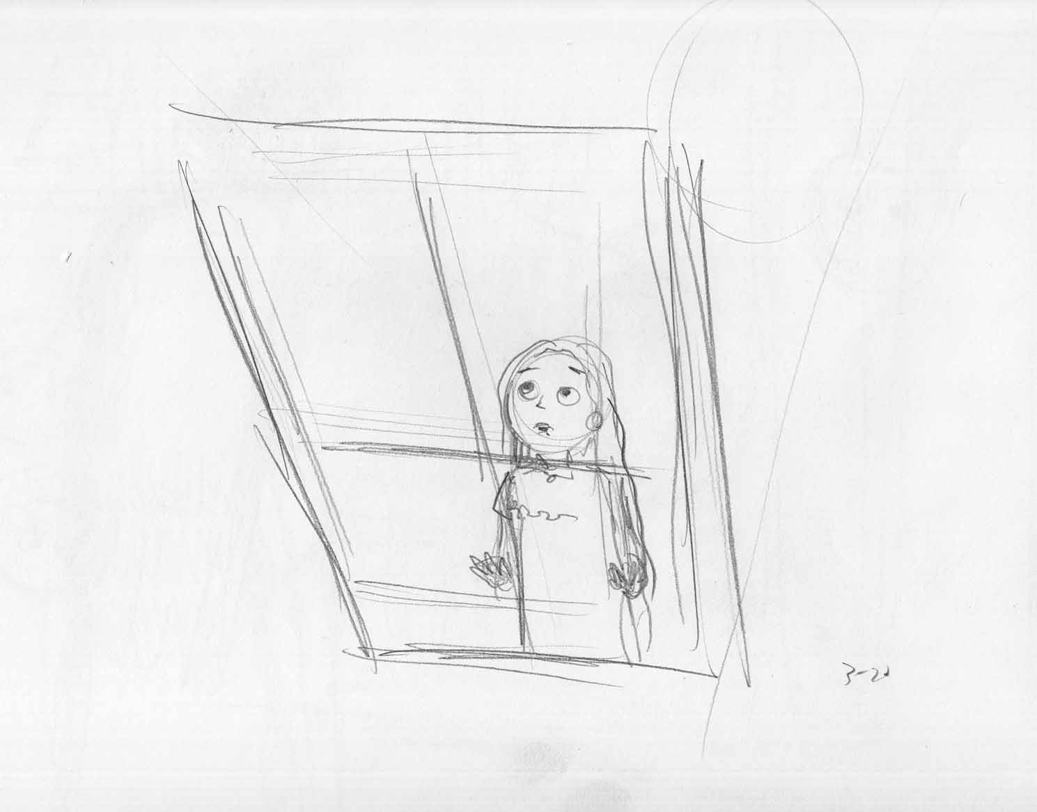
March 29-30: spreads
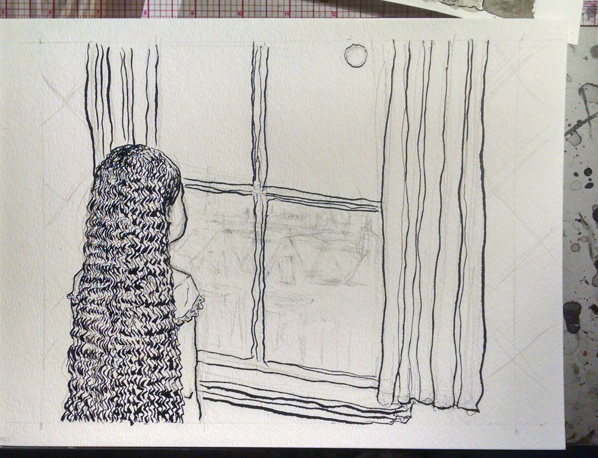
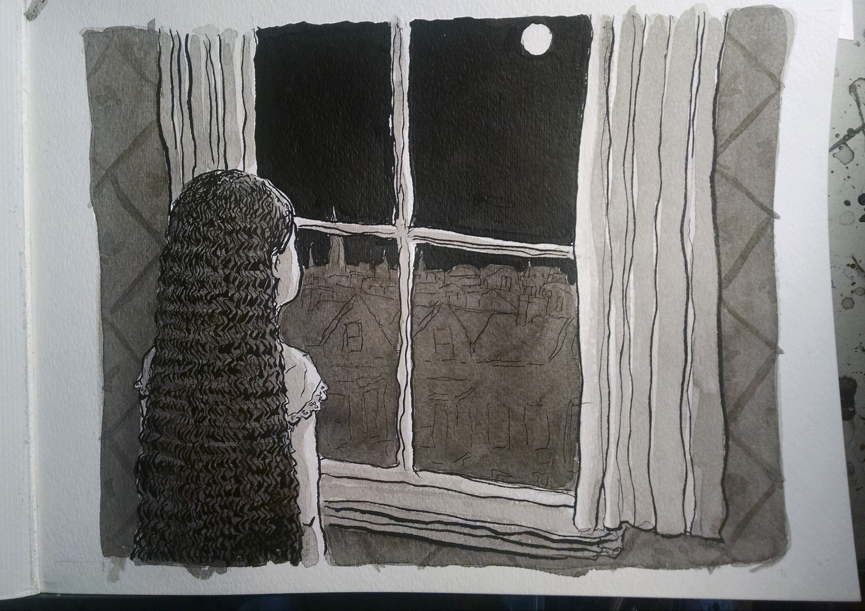
The next four pages are two sets of spreads. In each, the moon is on the left of the fold, girl on the right, looking at/reacting to the moon.
I didn’t grab many process moments along the way, so here are finished inks/washes for these four pages (plus a couple rejected versions):
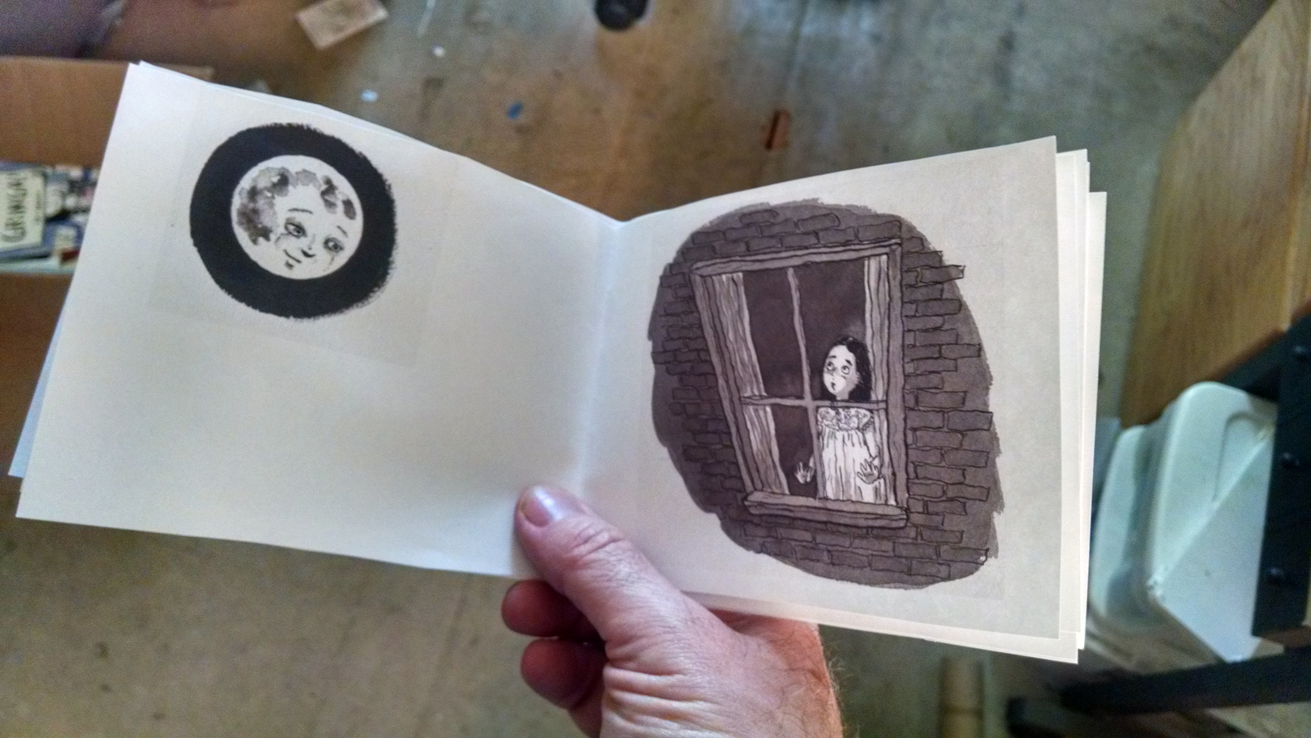
The first moon: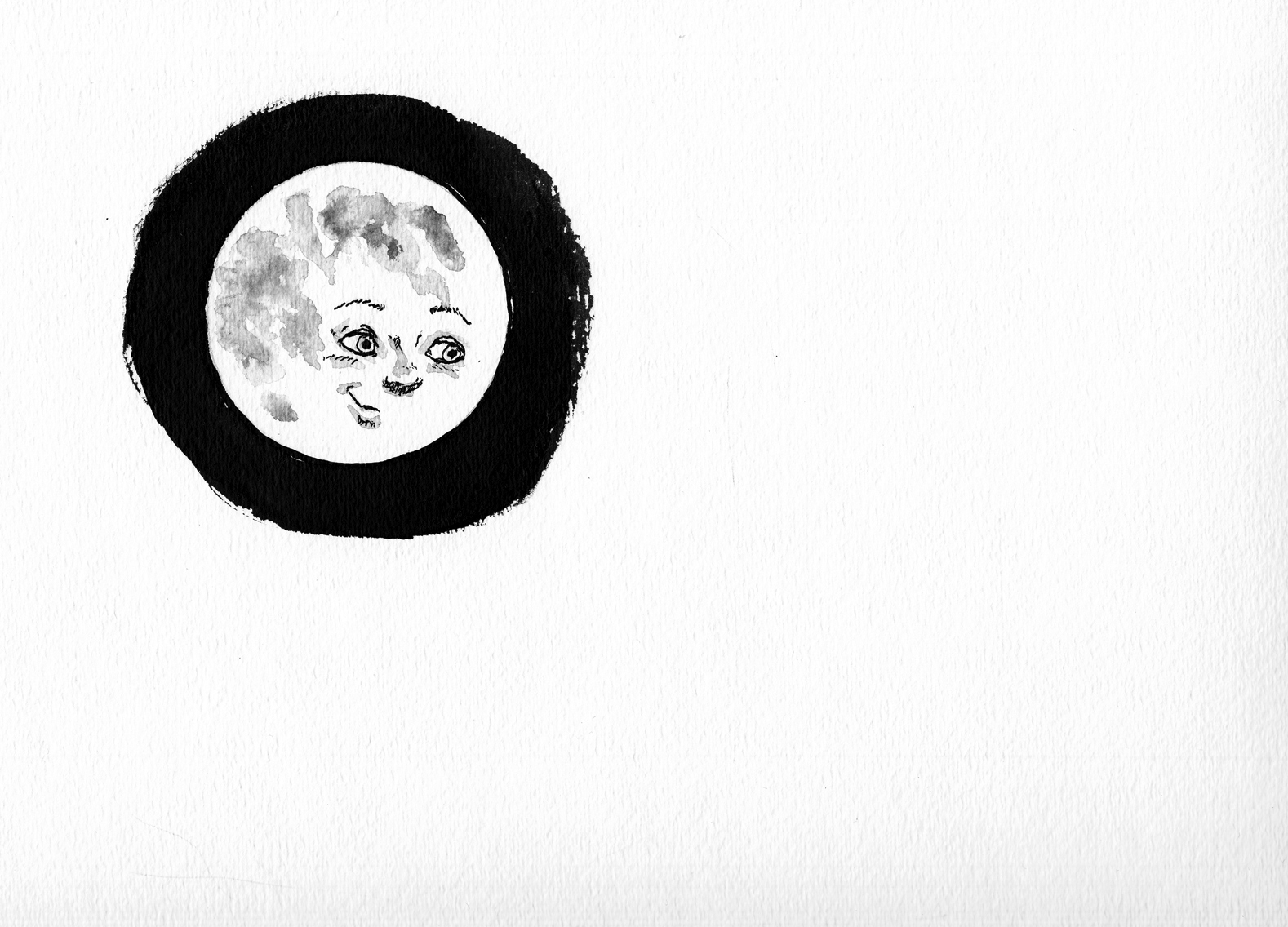
Let’s look a little closer: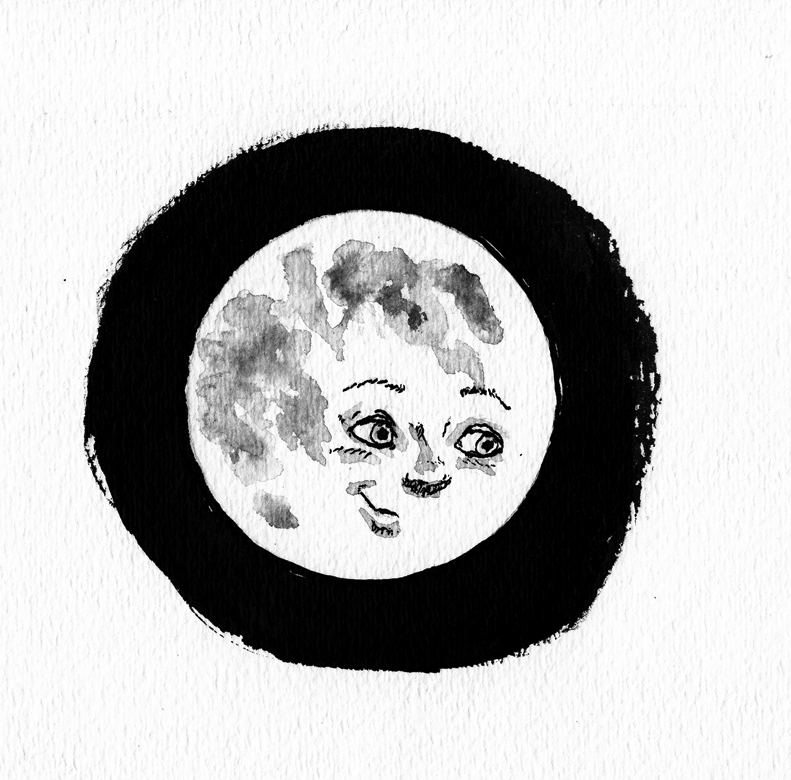
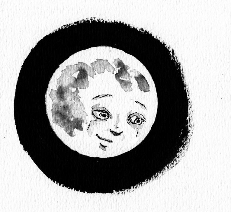
I didn’t like the expression — kind of a banal, friendly look, and I wanted something a little more mysterious: compelling but aloof. Â So, drew it over:
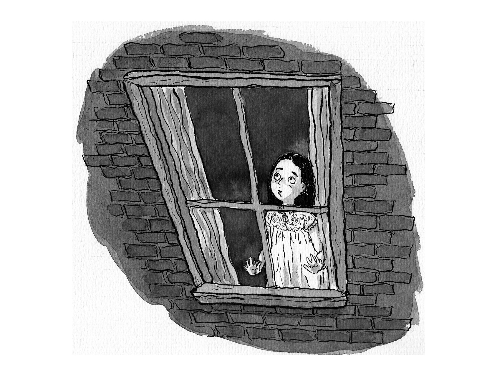
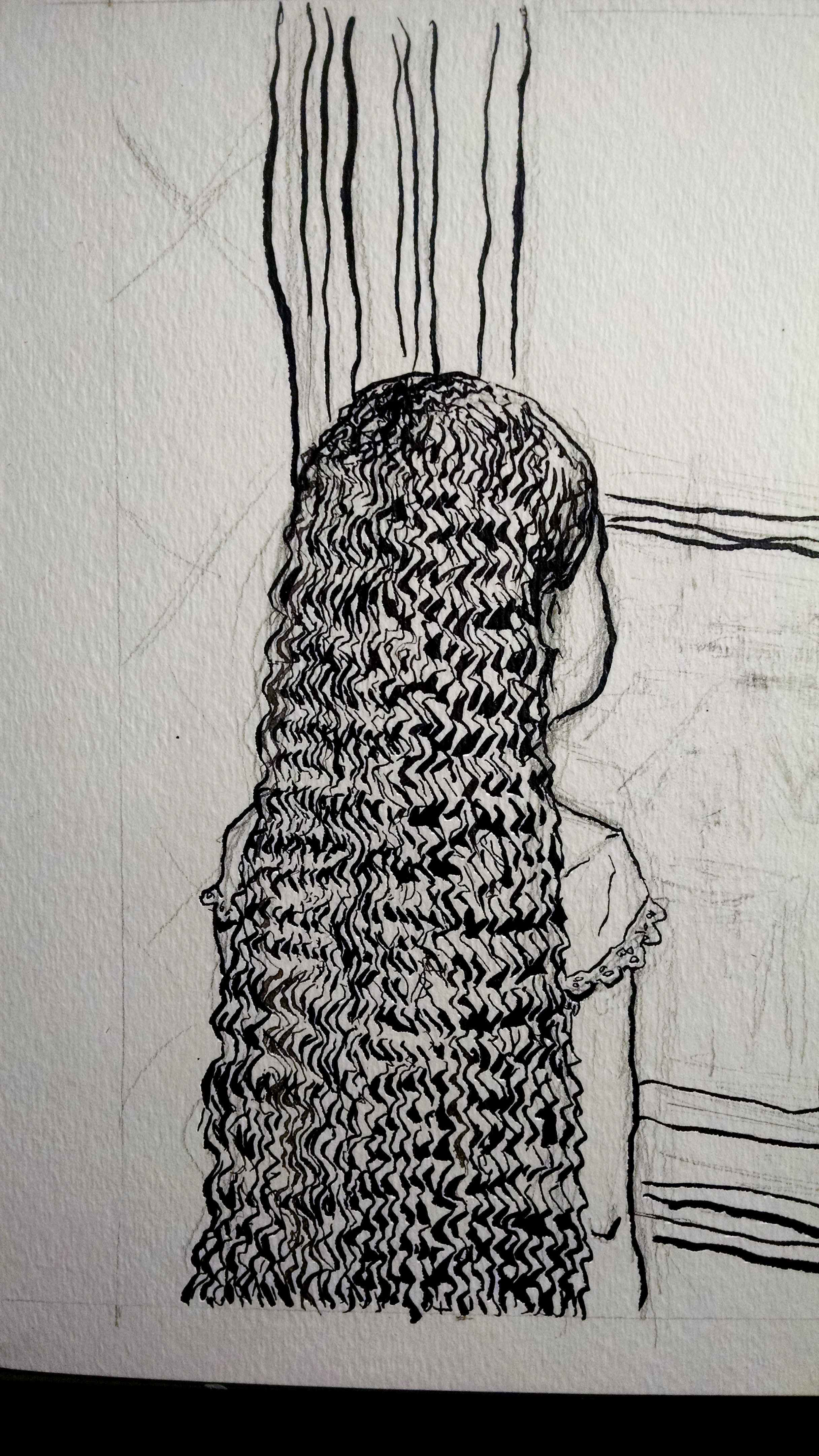
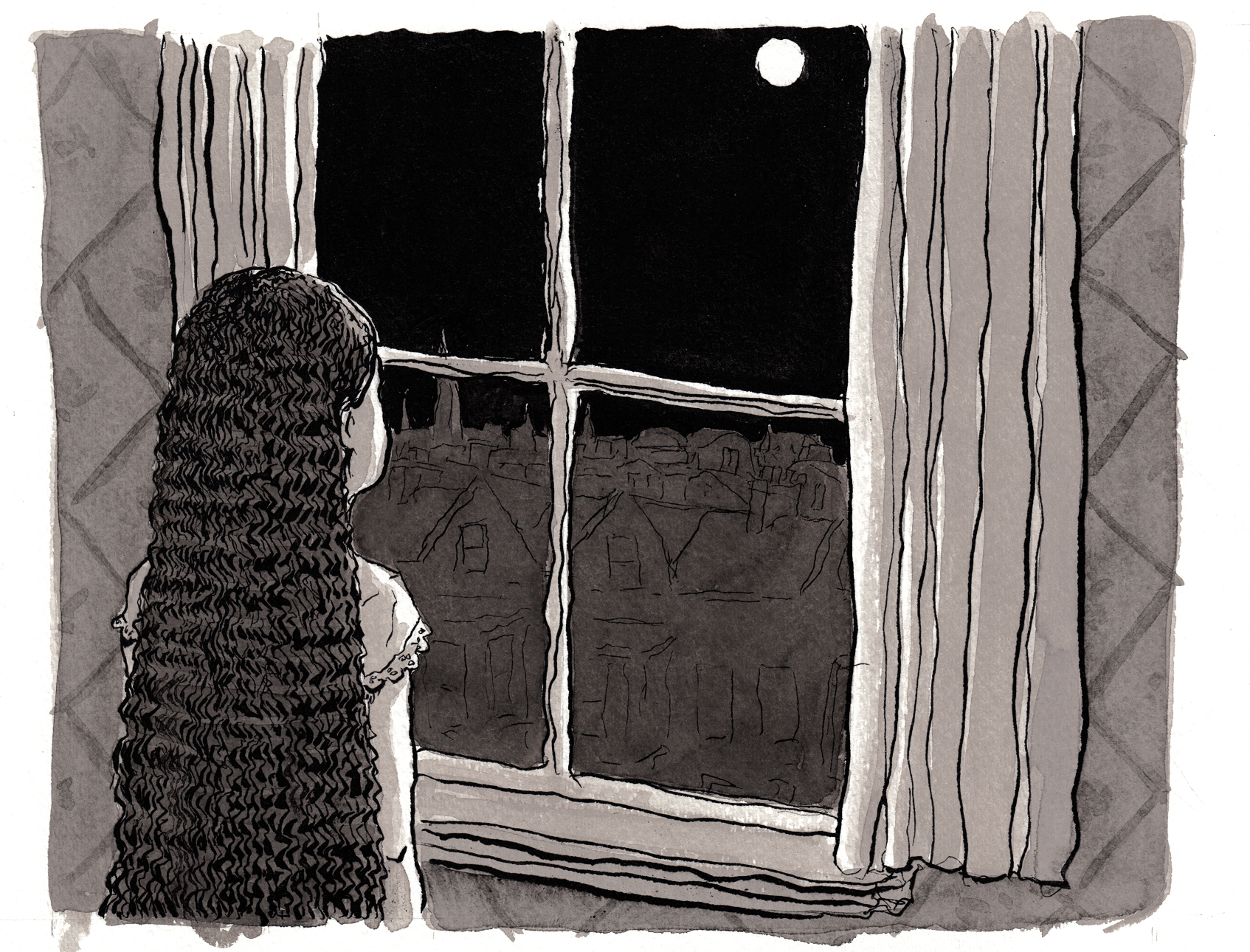
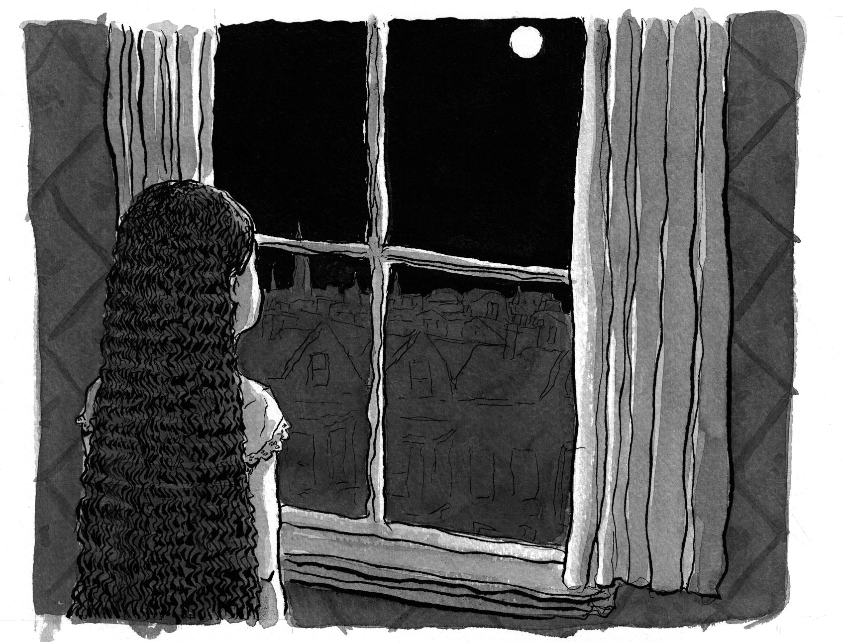
Okay. Â Then, the girl looking up at the moon from her bedroom window:
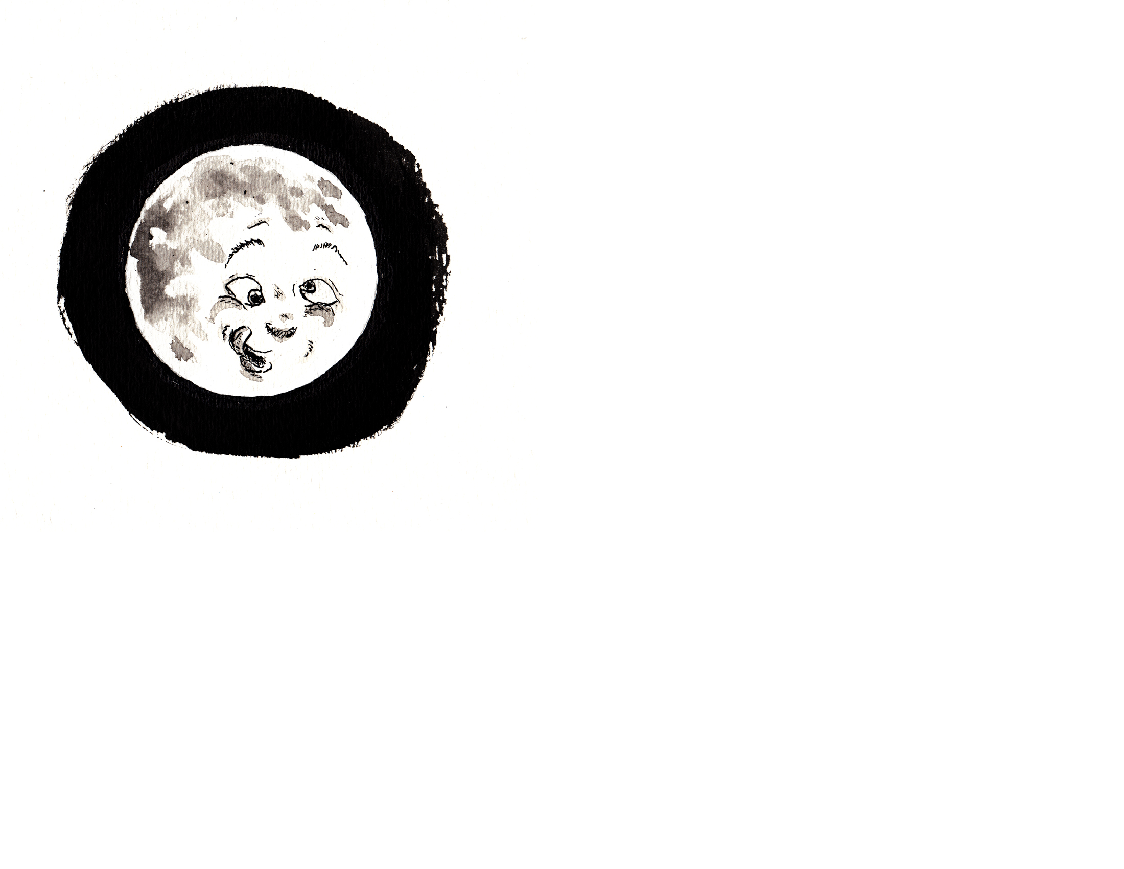
Then the moon does THIS:
And the girl:

I didn’t completely love the expression on HER face this time, so I tried it again:

Better, and good enough!
Here they are as spreads. Â As you can see, my idea is to break up the repetitive rectangle format that the images have followed so far:
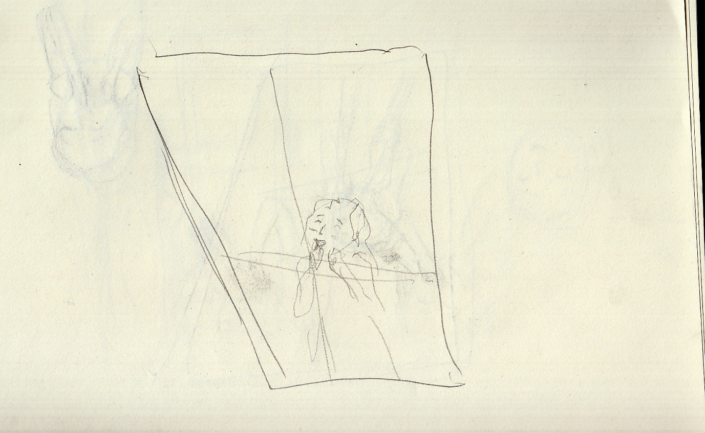
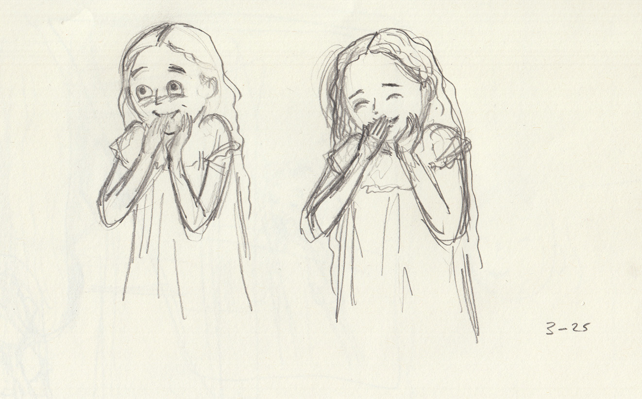
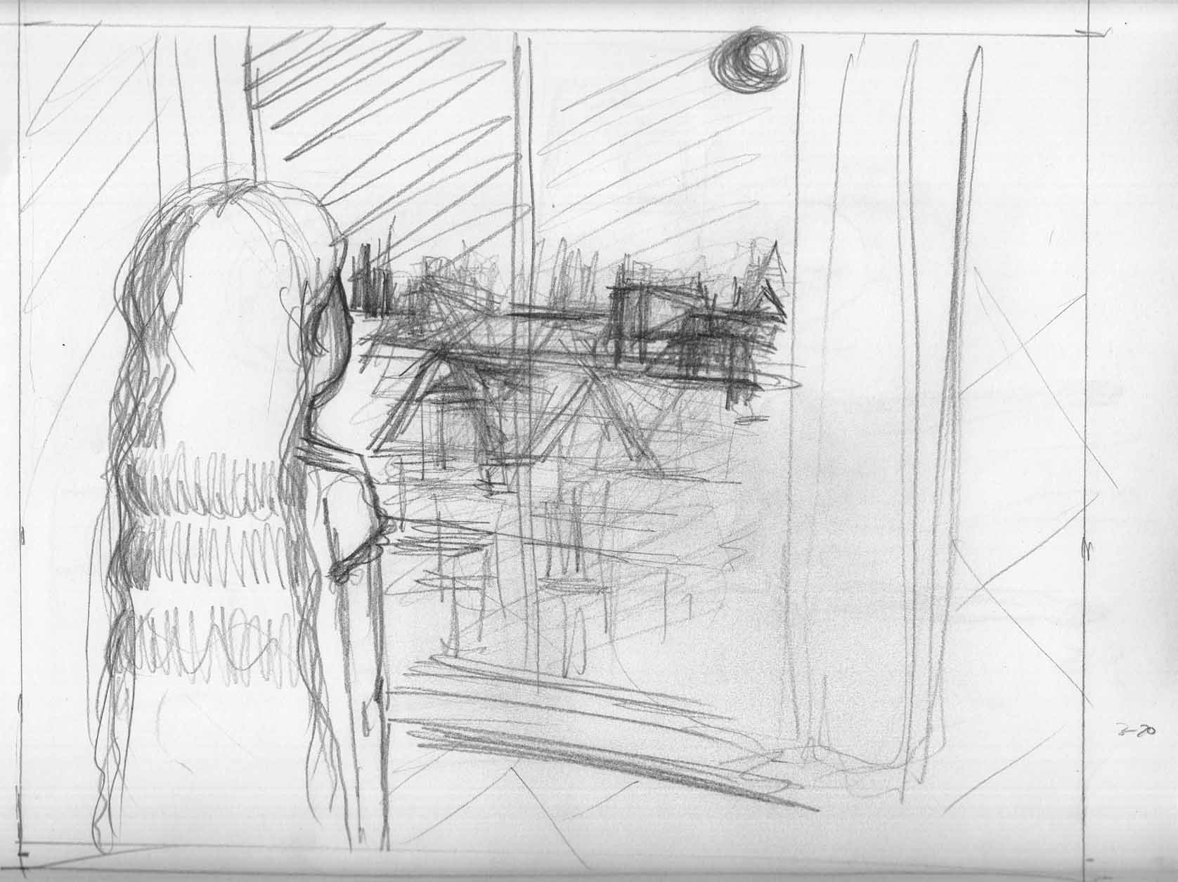
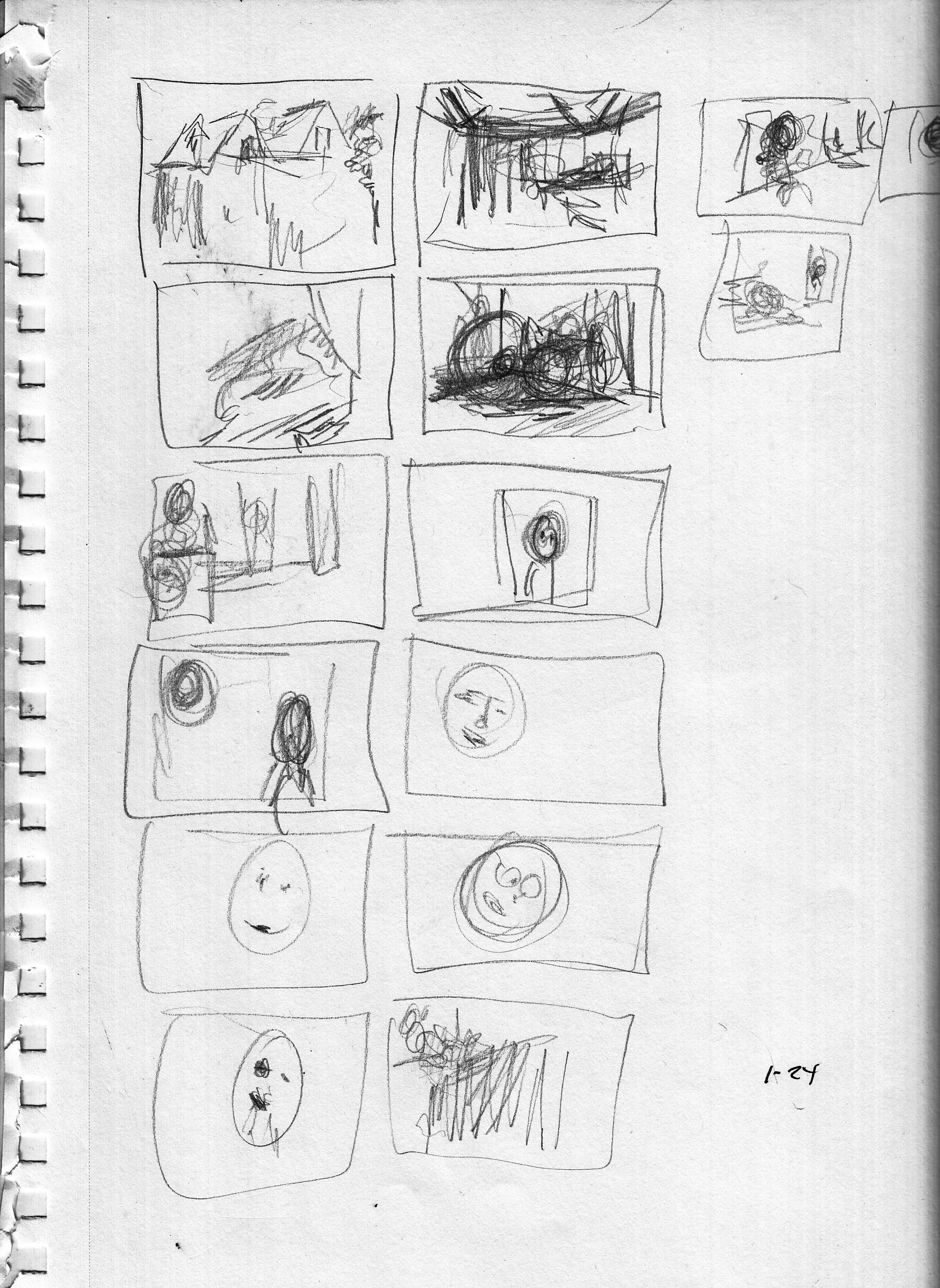
March 24-28, sketches for the rest of the chapter.
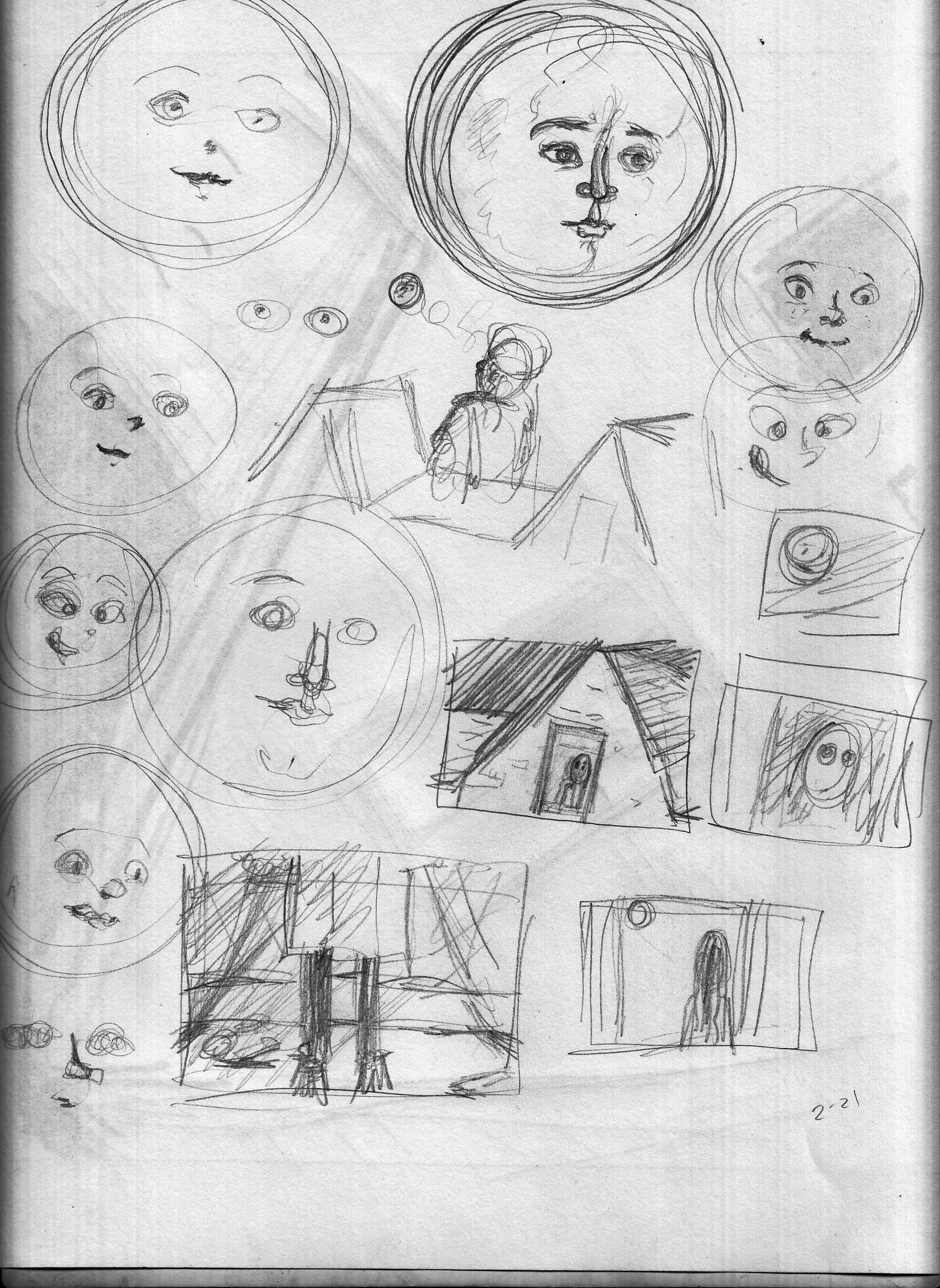
My main concern for the next few pages is facial expressions, as it’s a back-and-forth of reactions between the Moon and the Girl.


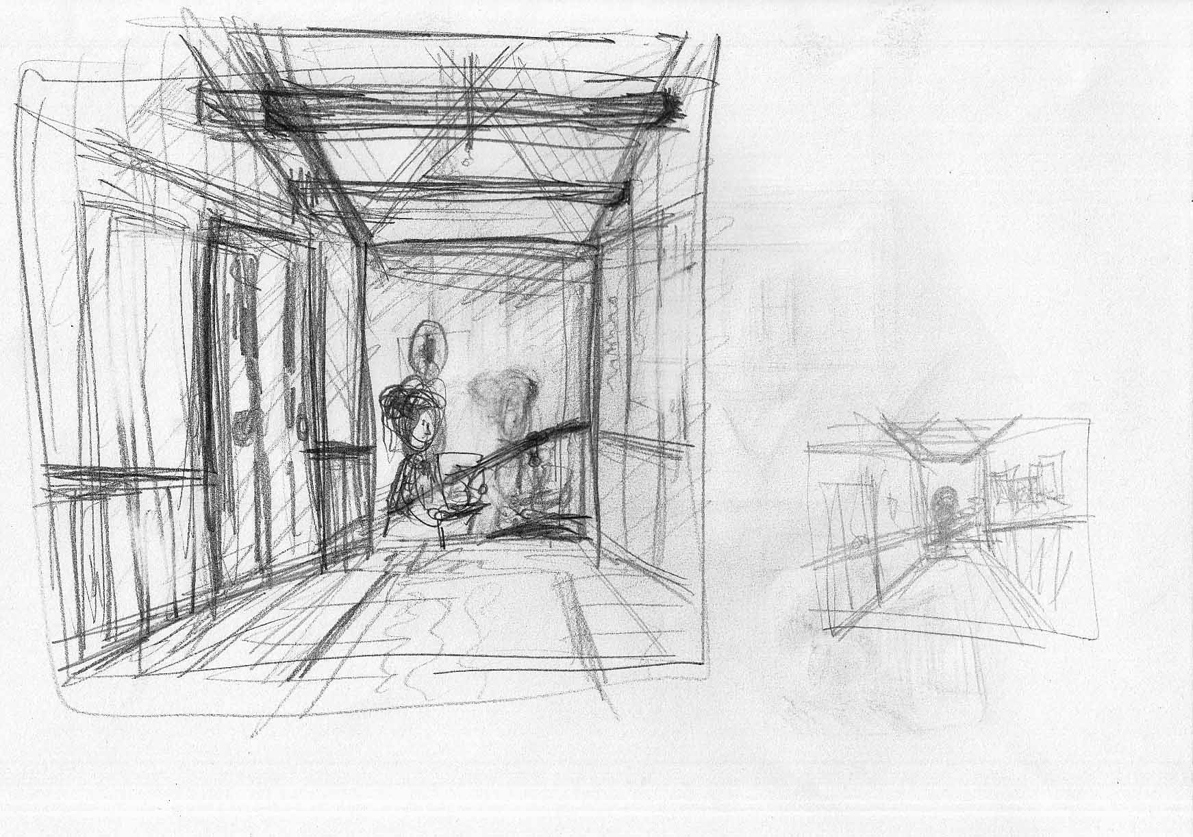
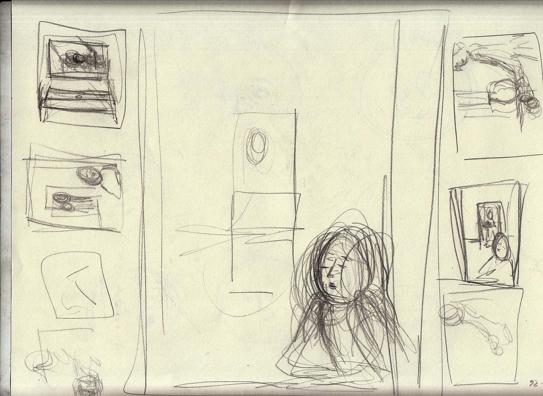
Then, I also started to look past these pages to the next sequence, and sketched some for it. Sketches of the girl’s mother, who will enter the room (which morphed into sketches of the girl, older):
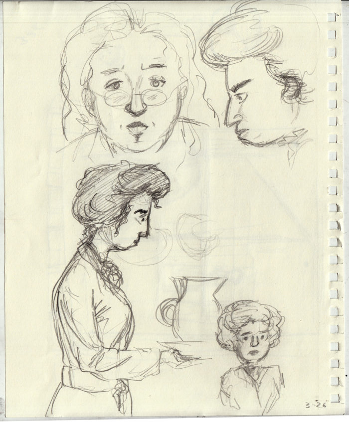
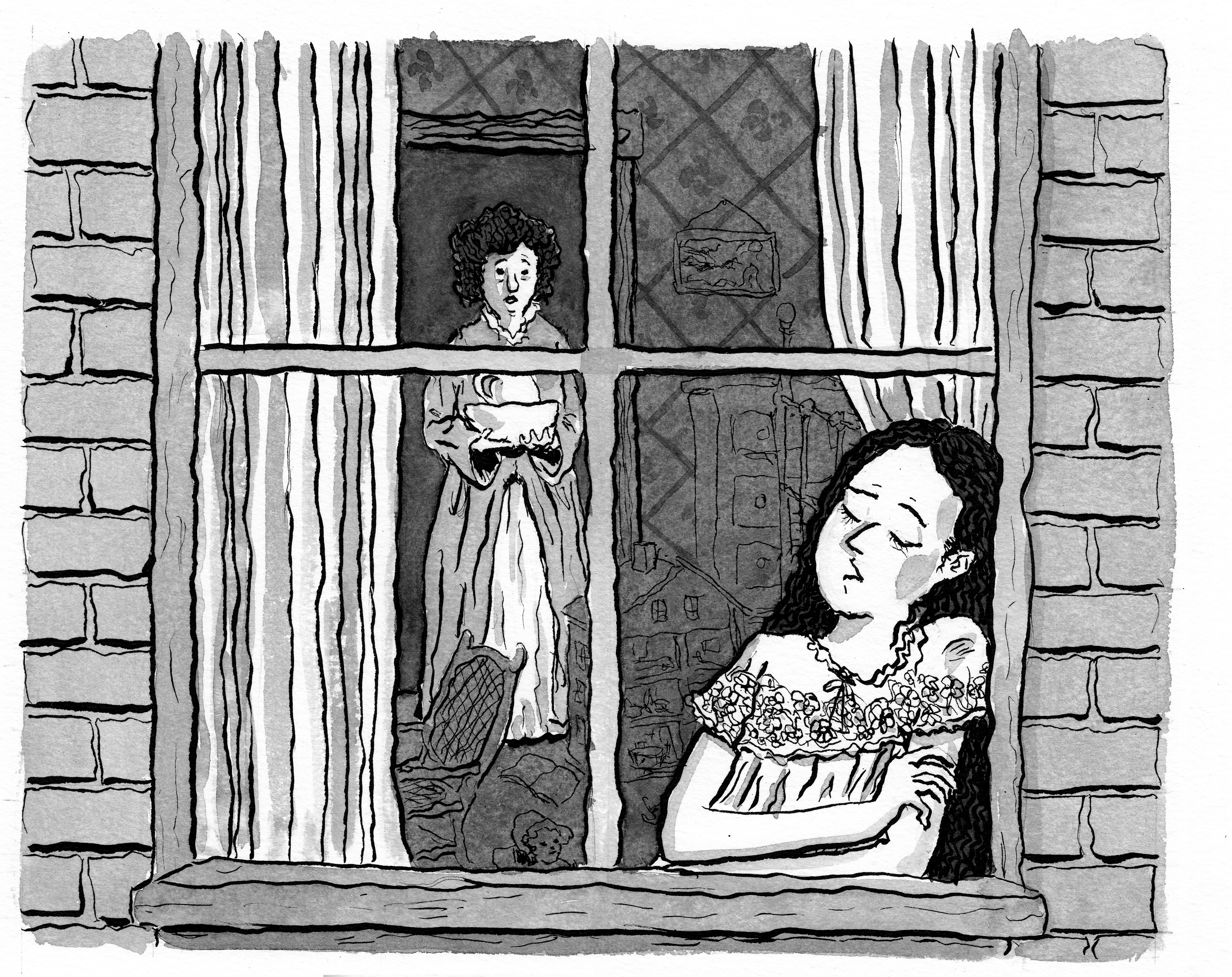
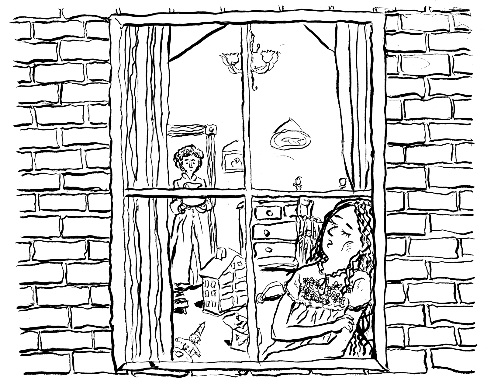
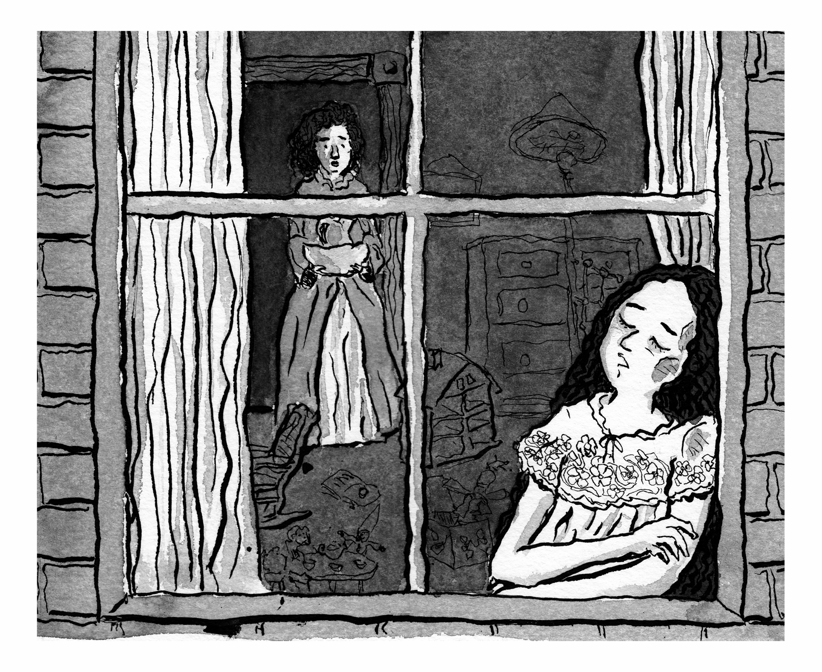
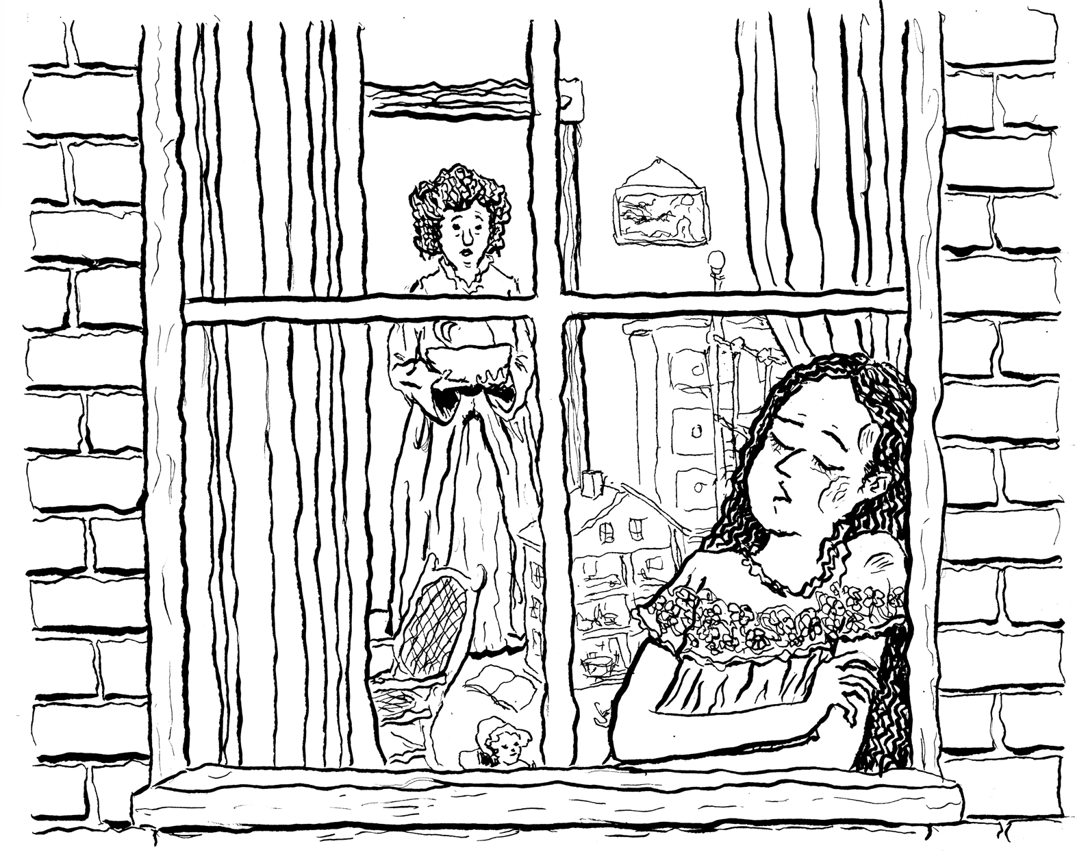
And of the final page, in which the girl has fallen asleep against the window, as her mother enters in the background:
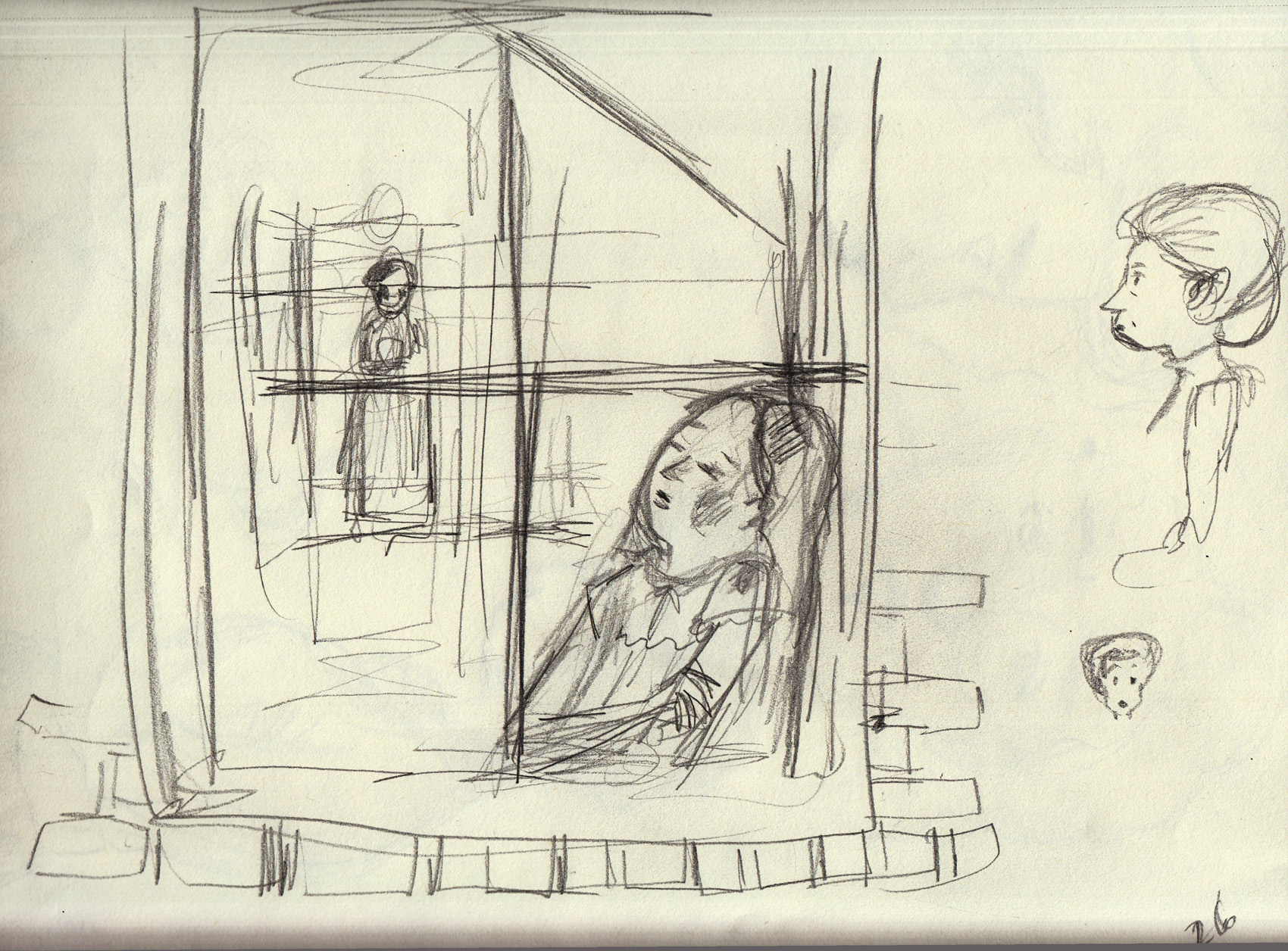
Happy with that last one.
March 21-22, re-drawing page 8.
Line art, ink over pencils:

Adding washes: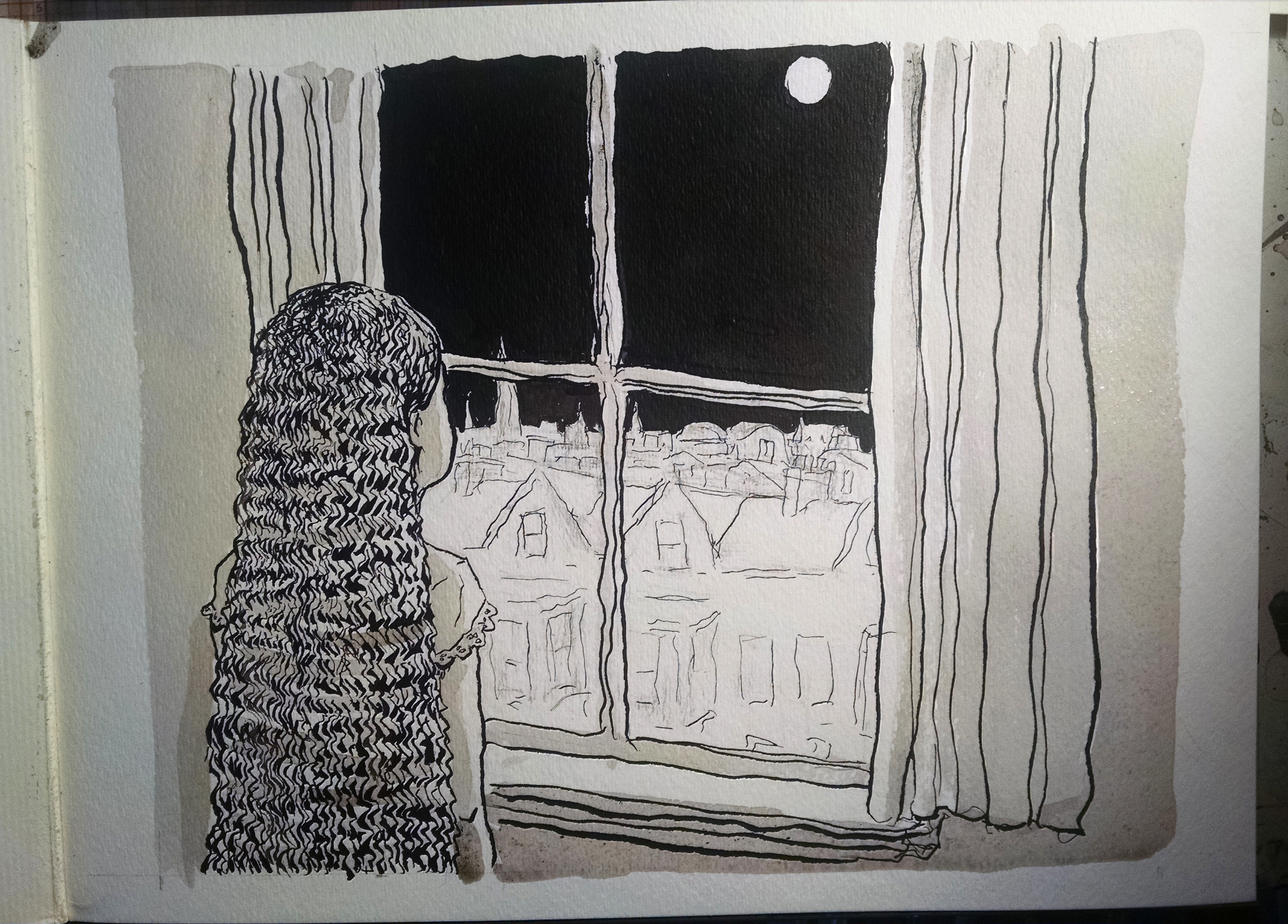
Scanned:
That was a color scan, here it is in grayscale:
The color adds a warmth to it, though, for sure.  Though, as  I said before, not sure I’ll be able to print in color.
March 20, after, a long hiatus:
I took a break from this project for a few weeks, during which I drew a short comic for the upcoming BCR anthology (so I don’t feel guilty about it).
During this time, looking at page 8, I decided it looked a little too squared-off and I wanted to spice up the composition a little, change the angle.
First, I got back into it with a few sketches of upcoming pages. Â Character studies and thumbnails of a new composition for page 8:Â 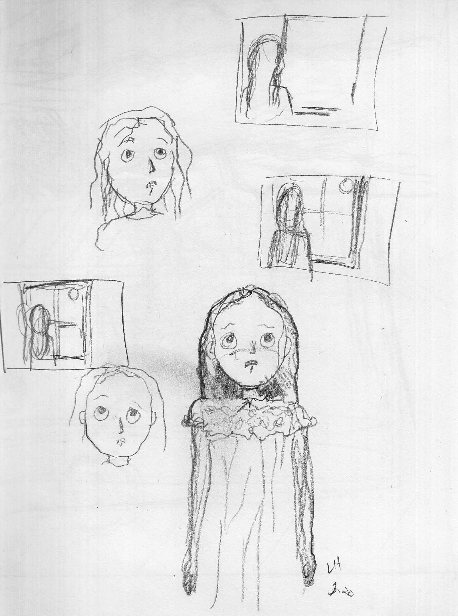
Moon face studies, and thumbnails for page 10:
A sketch for page 10:
A roughed new version of page 8:
February 25-26, page 8:
Basically the “reverse shot” of page 7 (ohhh I hate using cinematic terms, but I don’t know how else to describe it). Â Here is line art:

And, with washes:

February 23, page 7:
Line art:
Washes added, first scan: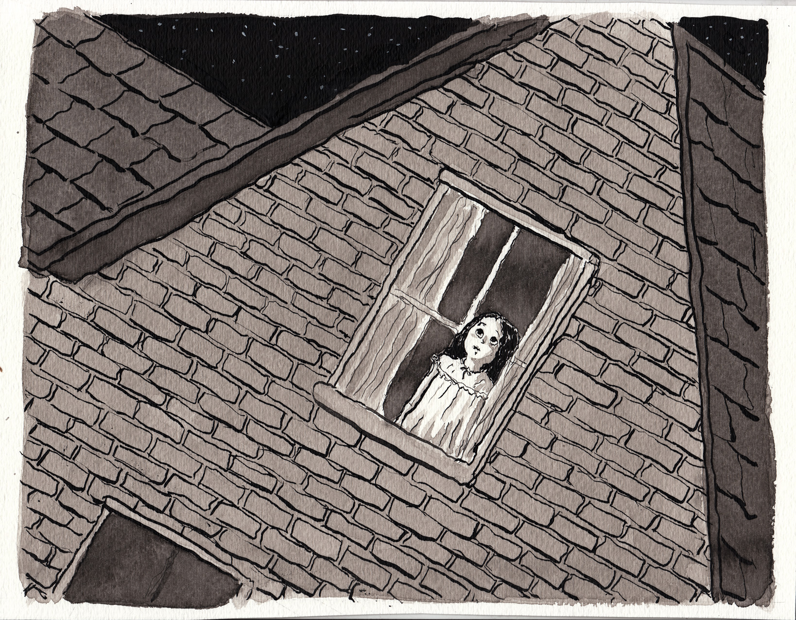
Touchups to the washes, in 2 stages (warning: subtle differences); I used white ink to put in the cross-bars of the window frame. Â I wanted to be able to draw her face as a whole, then obstruct it afterward: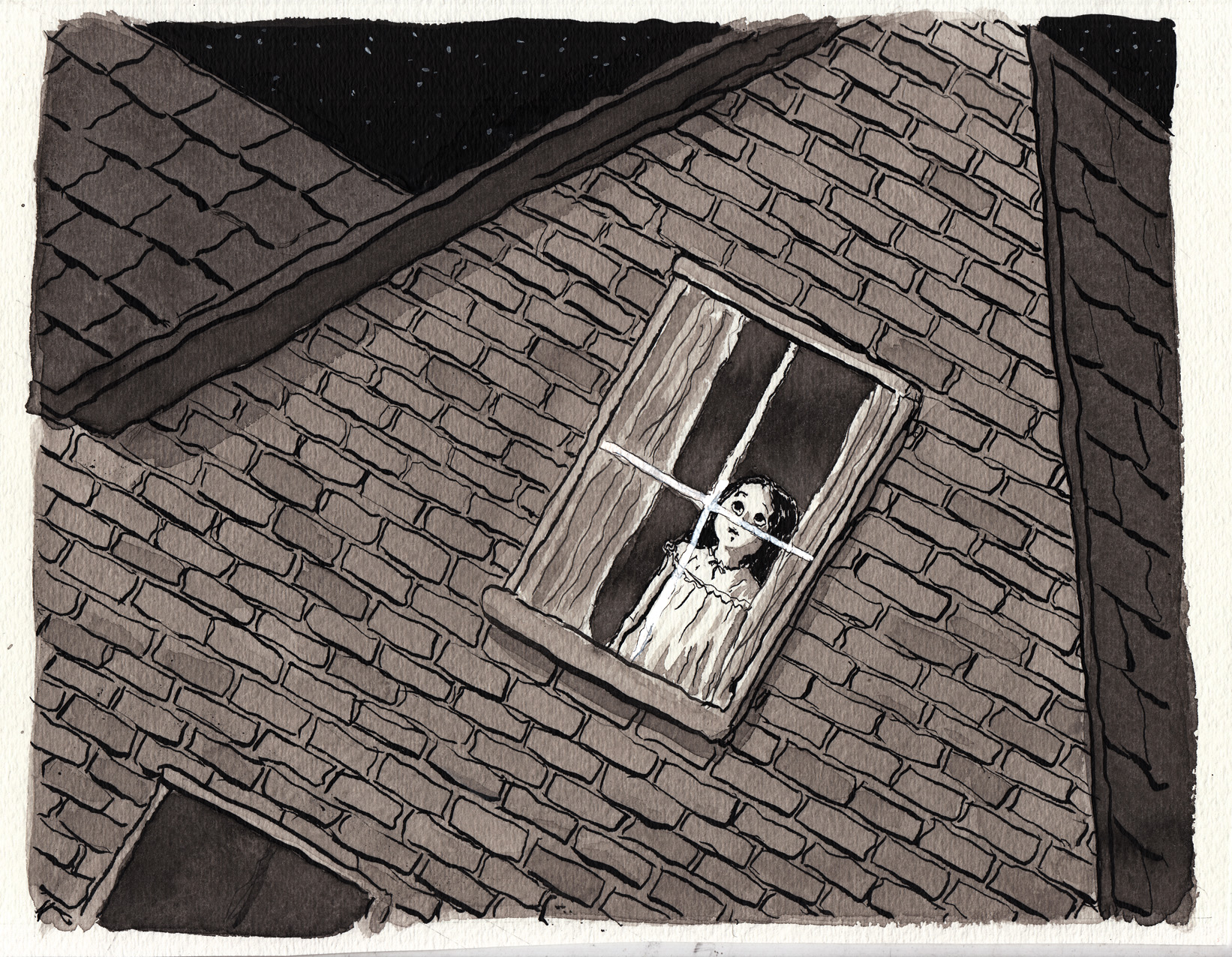
Final (except nothing’s final, ’til the book is printed. Â And even then…?).
February 22-23: page 6
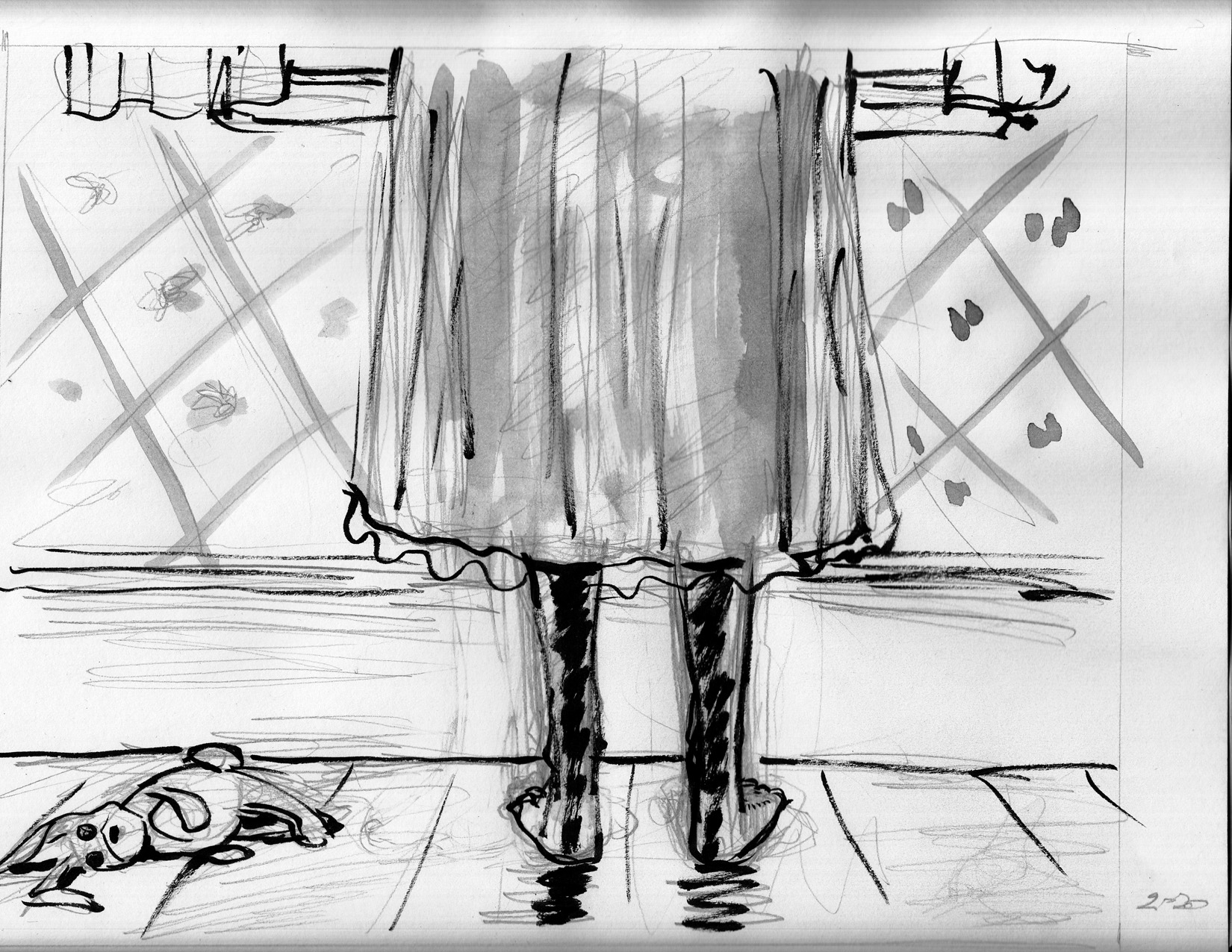
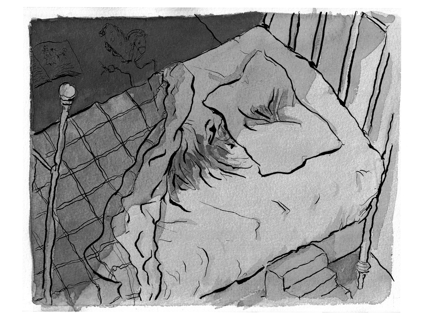
Finally, we meet our heroine as a young girl… sort of. Â Feet only:

This is a black-and-white image of course, but this is a color scan, so it adds a tint. Which I like. Â It makes me think about printing it in color, though that would be very expenseive. Â Anyway, here it is converted to grayscale, as it will probably end up:
I really like this image, but I decided to try it another way, with the feet closer to the picture plane. Â I scanned it once before finishing the shading (“state one”):
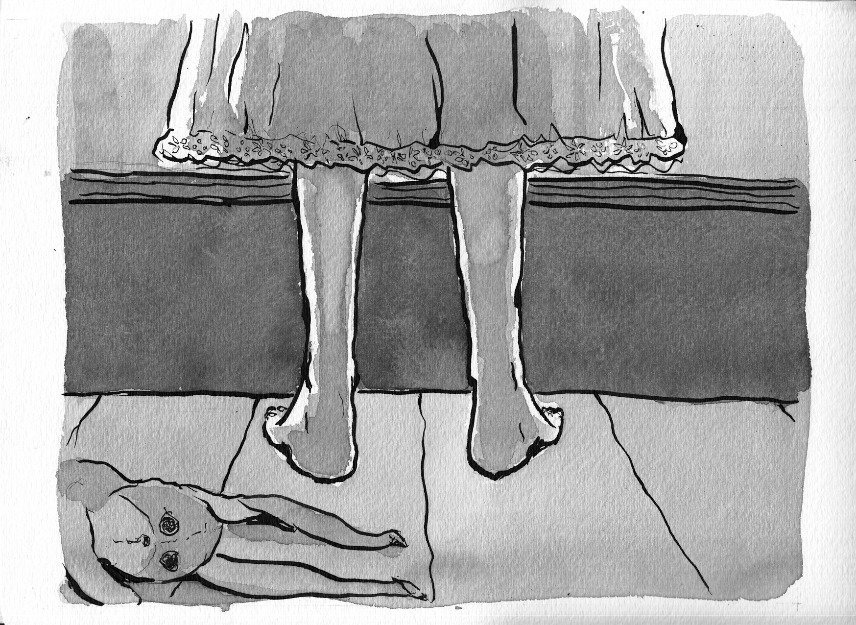
Here’s the color scan of it with added shading, for a more dramatic composition, and to indicate the light from the window above (even though it’s kind of nonsensical, probably, as far as how the light would really go):
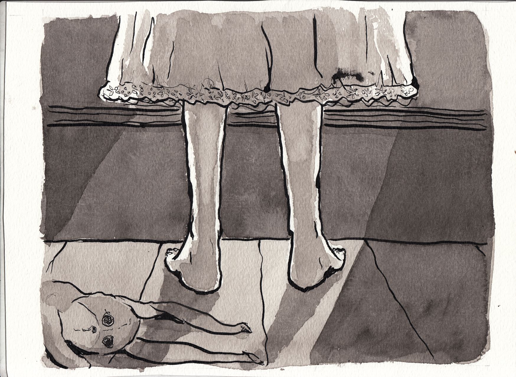
As you can see, between the first scan and the second I smudged ink on the picture (above the hem of the nightgown on the right). Here’s the image with some touchups, and converted to grayscale:
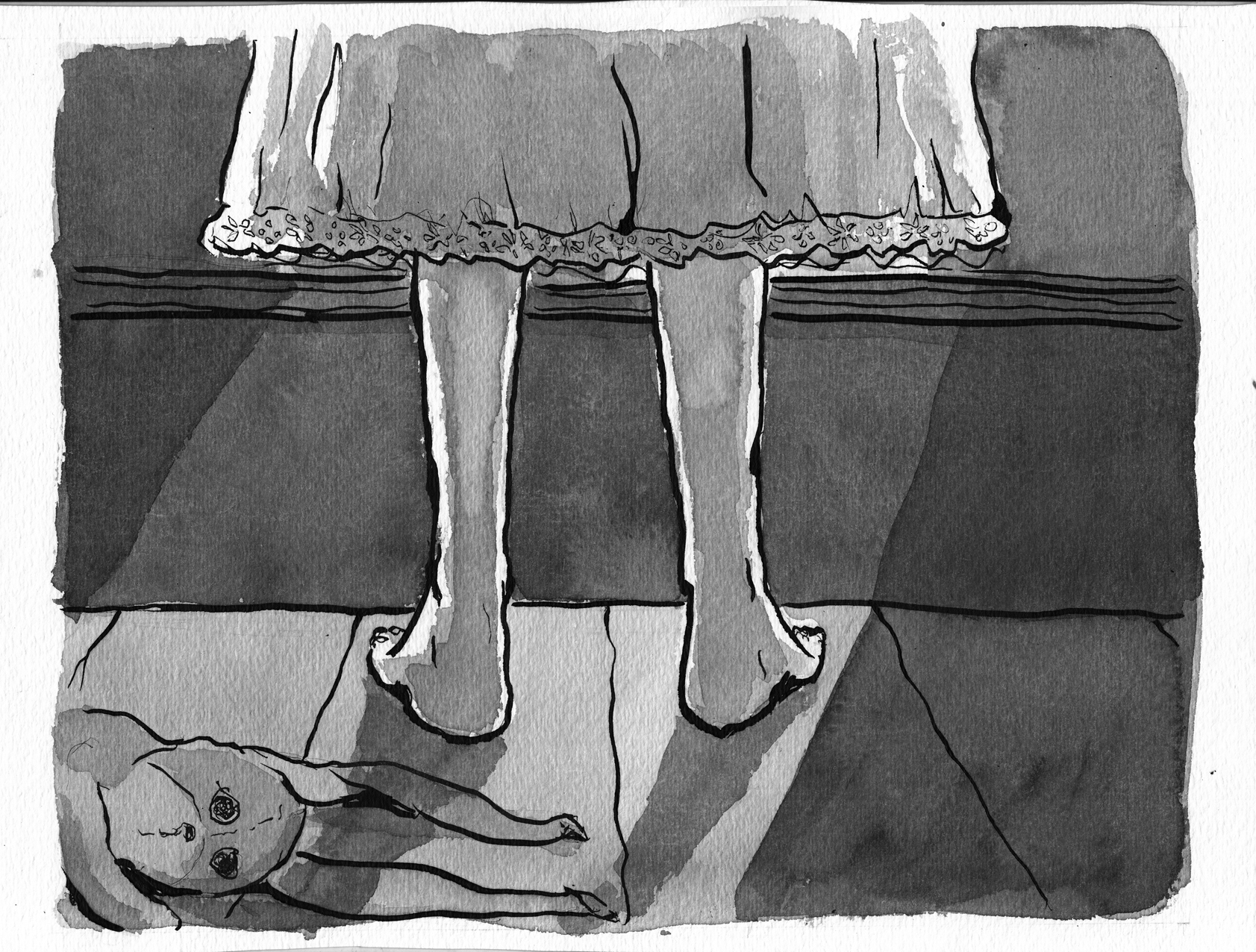
I think this second version of the drawing is more dramatic for being a “close-up.” Â But I don’t have to make a final decision until I’m actually assembling the book.
February 21st
More sketching/studying for the next 2-3 pages:
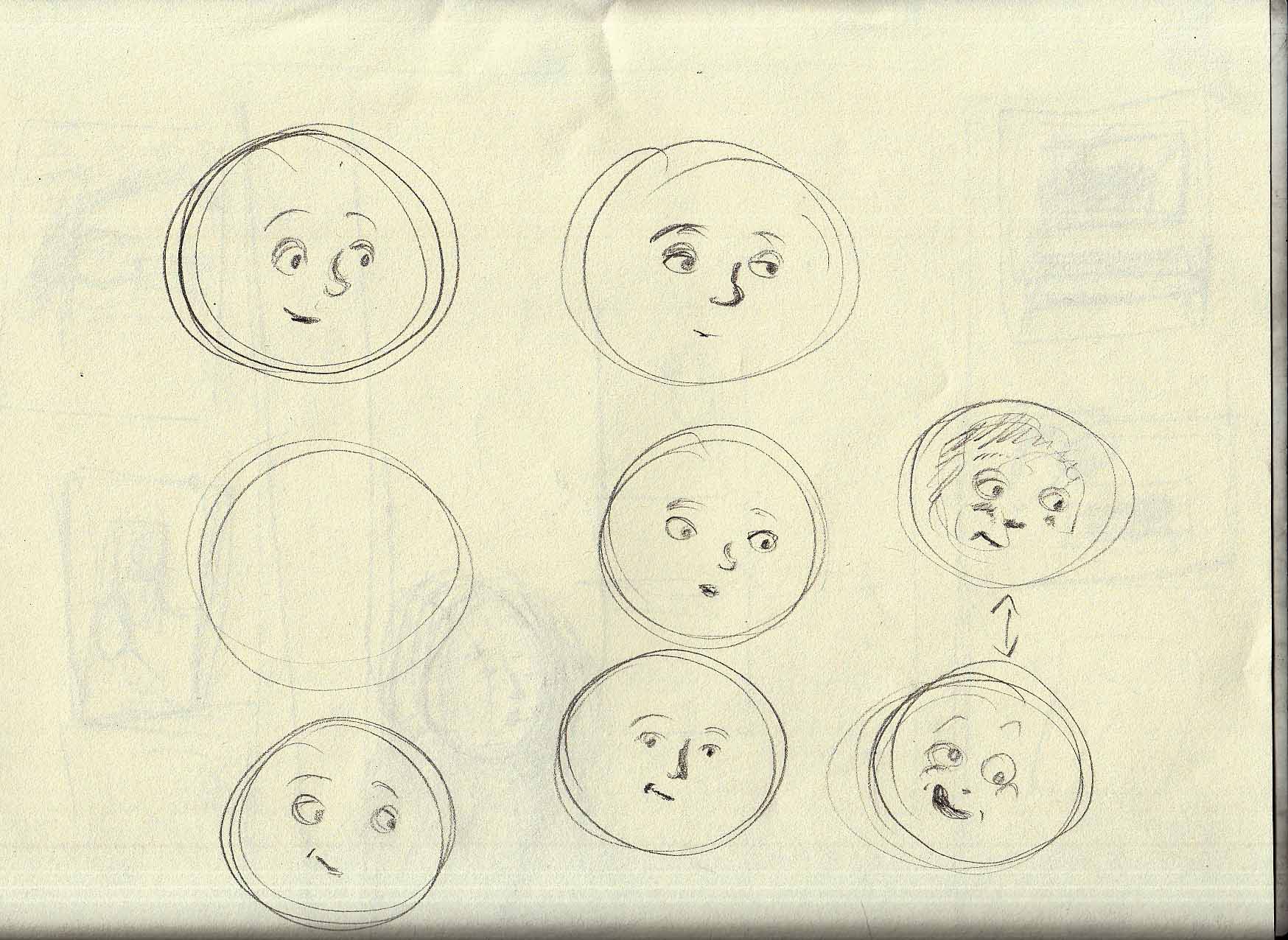
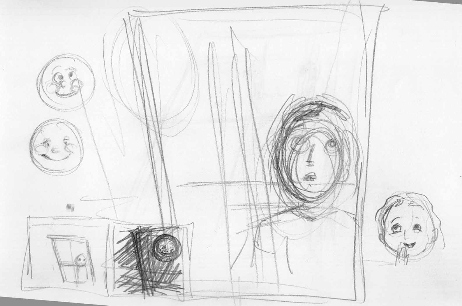
My idea for the moon, is that, as the girl ages, the moon’s face will change to reflect the image that a child of her age would have of a friendly or beautiful or funny face:
February 19-20.
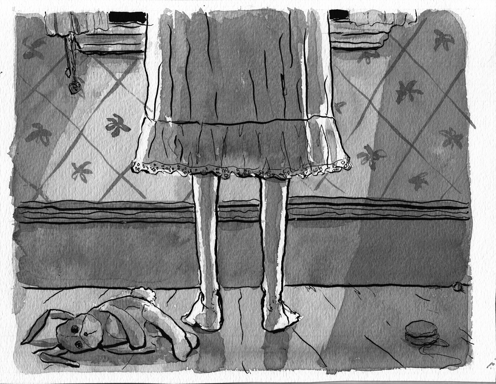
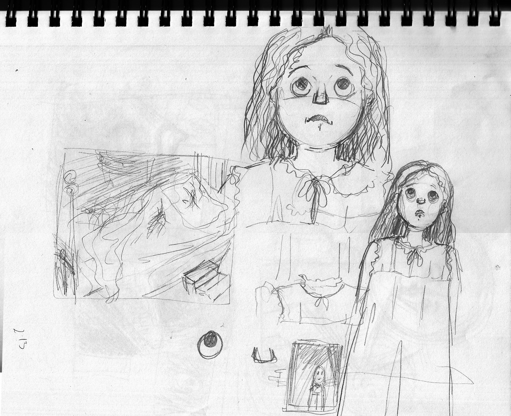
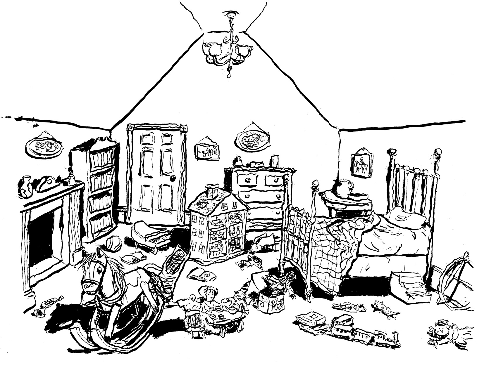
At long last, after moving around the room looking at toys and bedclothes, the next pages will introduce the character (re-introduce, since we met her as a baby in the last chapter). Â Gearing up for this with sketches and studies.
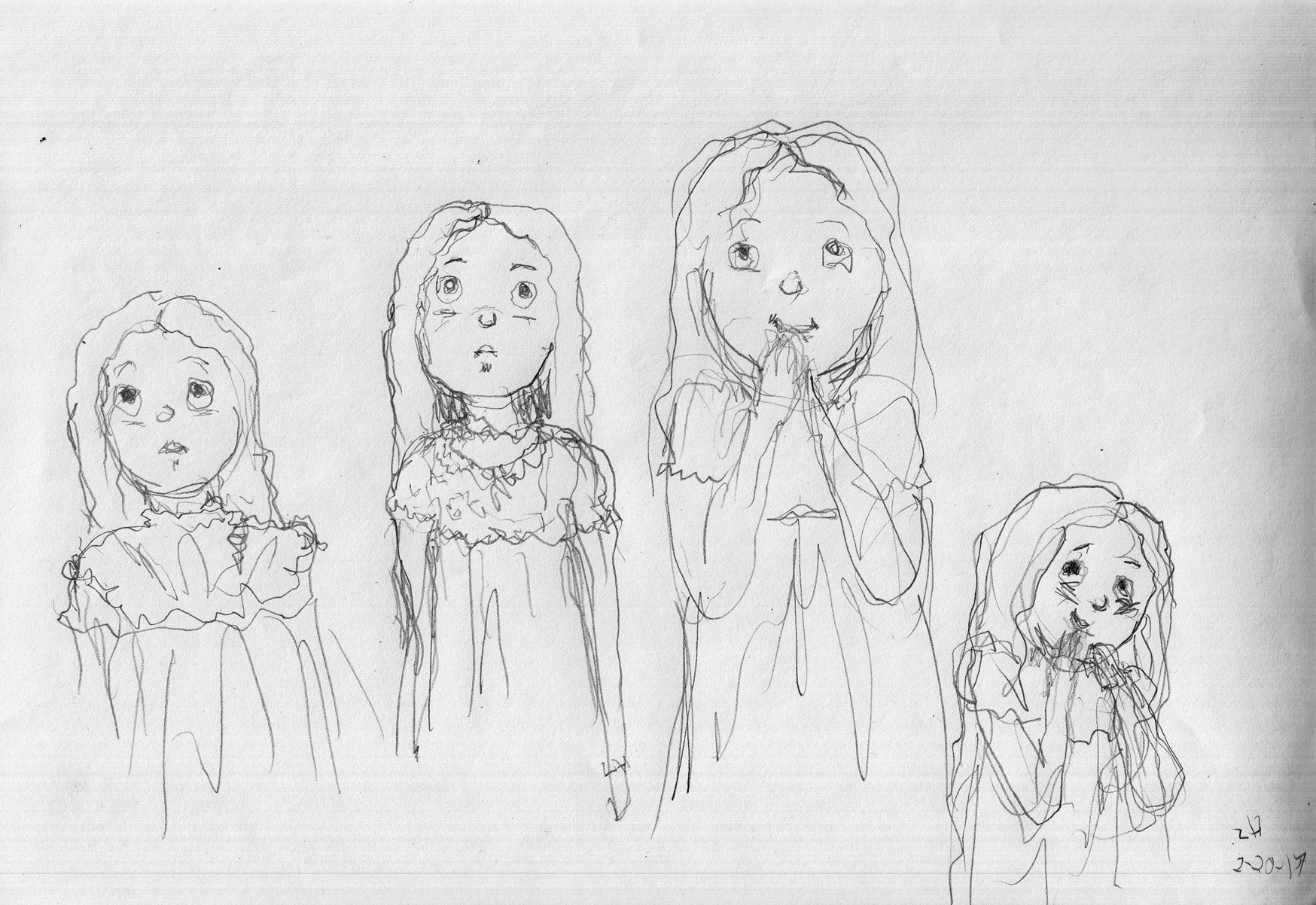
Still trying to find her face as depicted at the age of 8 years old or so. Â Curly hair seems to be winning the day (resisting the easy fallback of a little blonde girl, which would probably be the stereotype Victorian child, I’ll make her hair black and curly, so that her ethnicity is a little more open to interpretation).
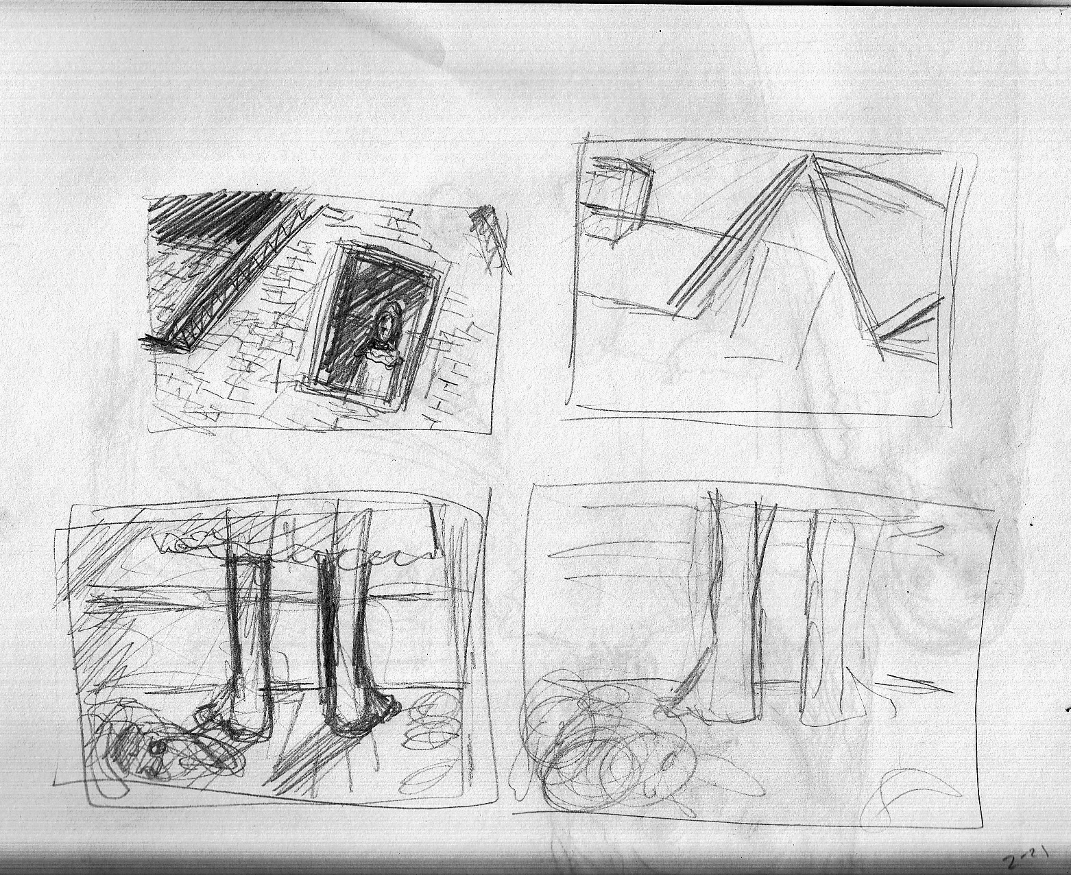
But at first, we don’t even see her face. Â We see:
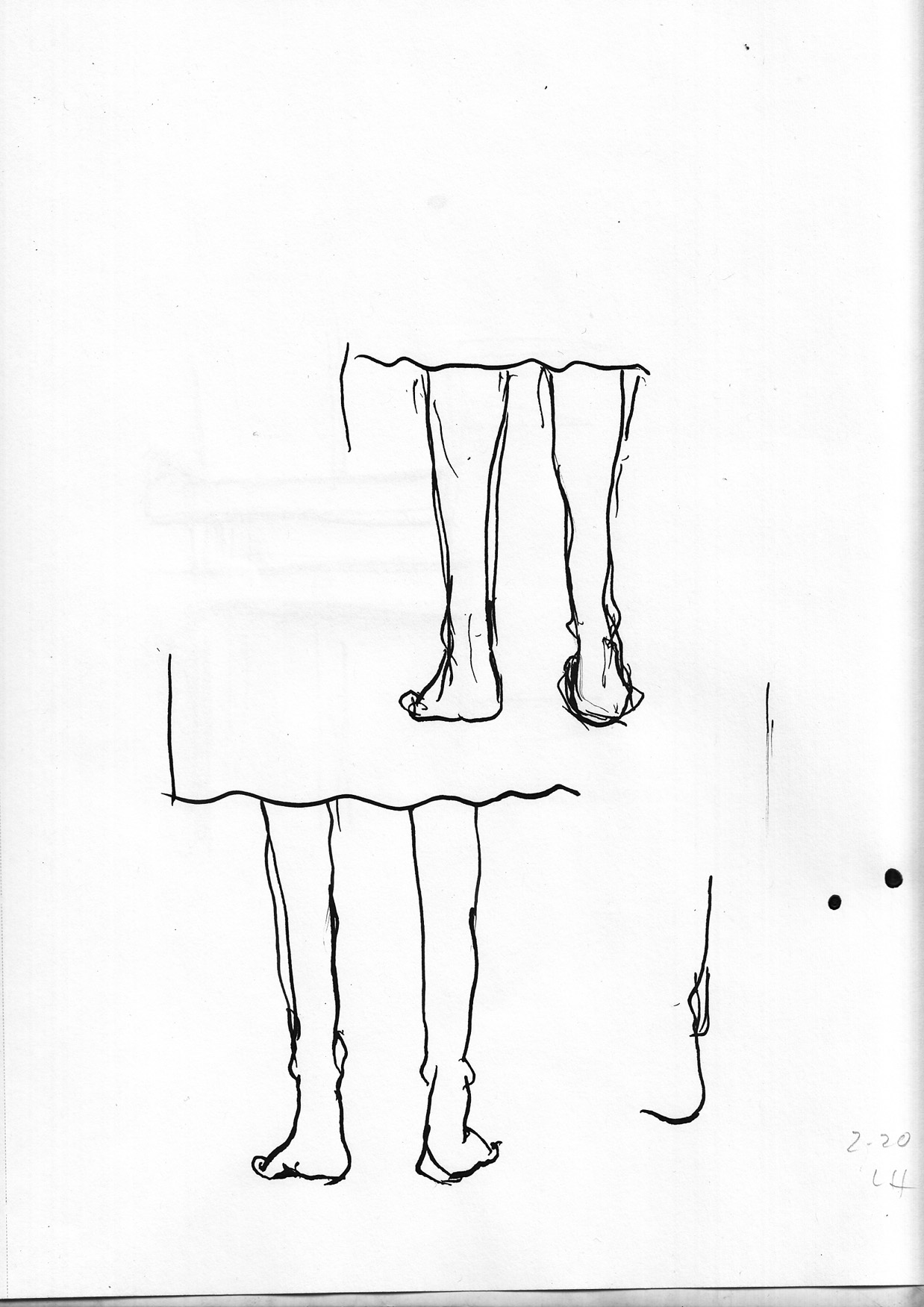
…feet. Â Which ain’t so easy to draw, for me. Â Especially from behind!
So more studies:Â 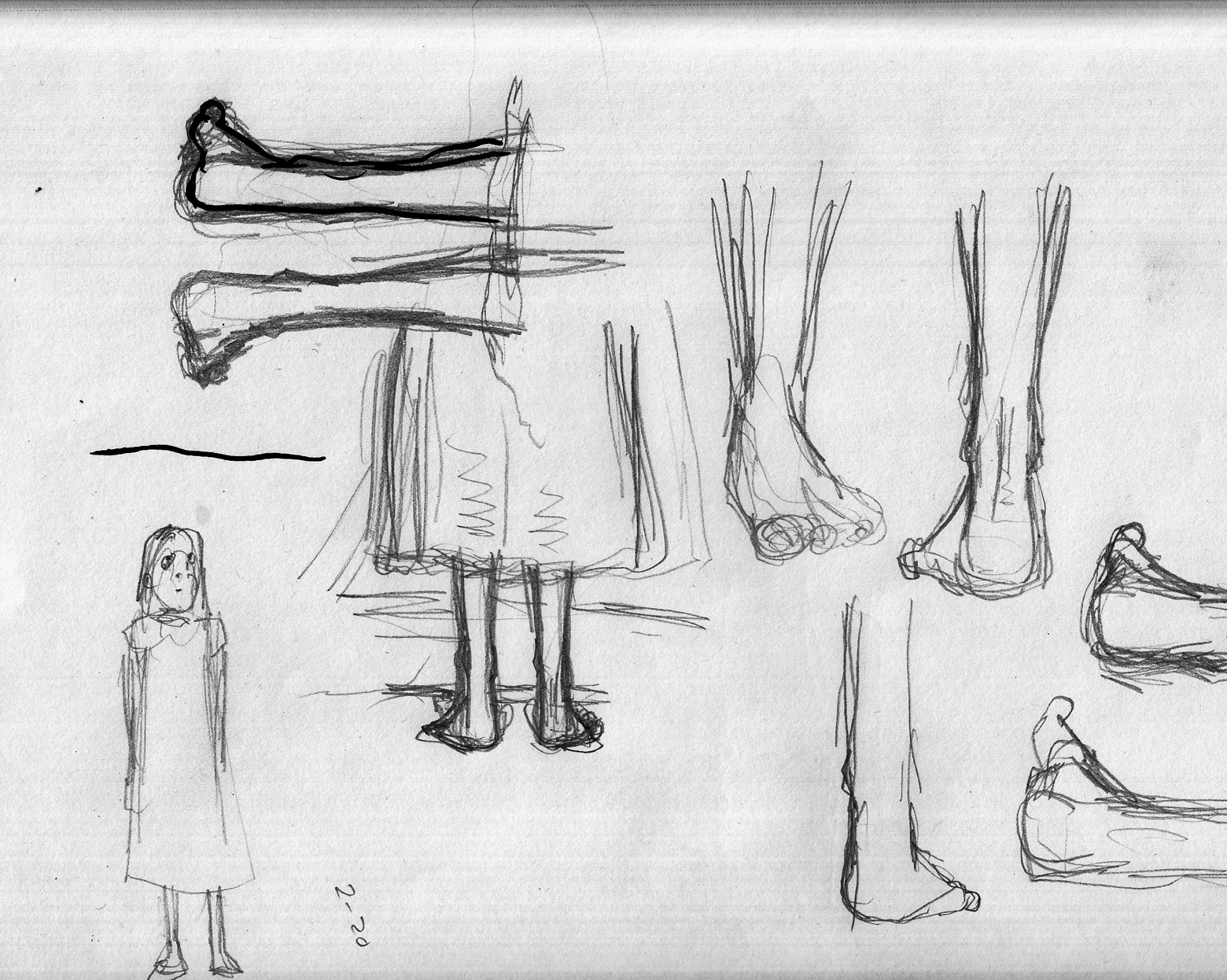
And working toward the actual composition of the page, including a stuffed animal bearing mute witness:
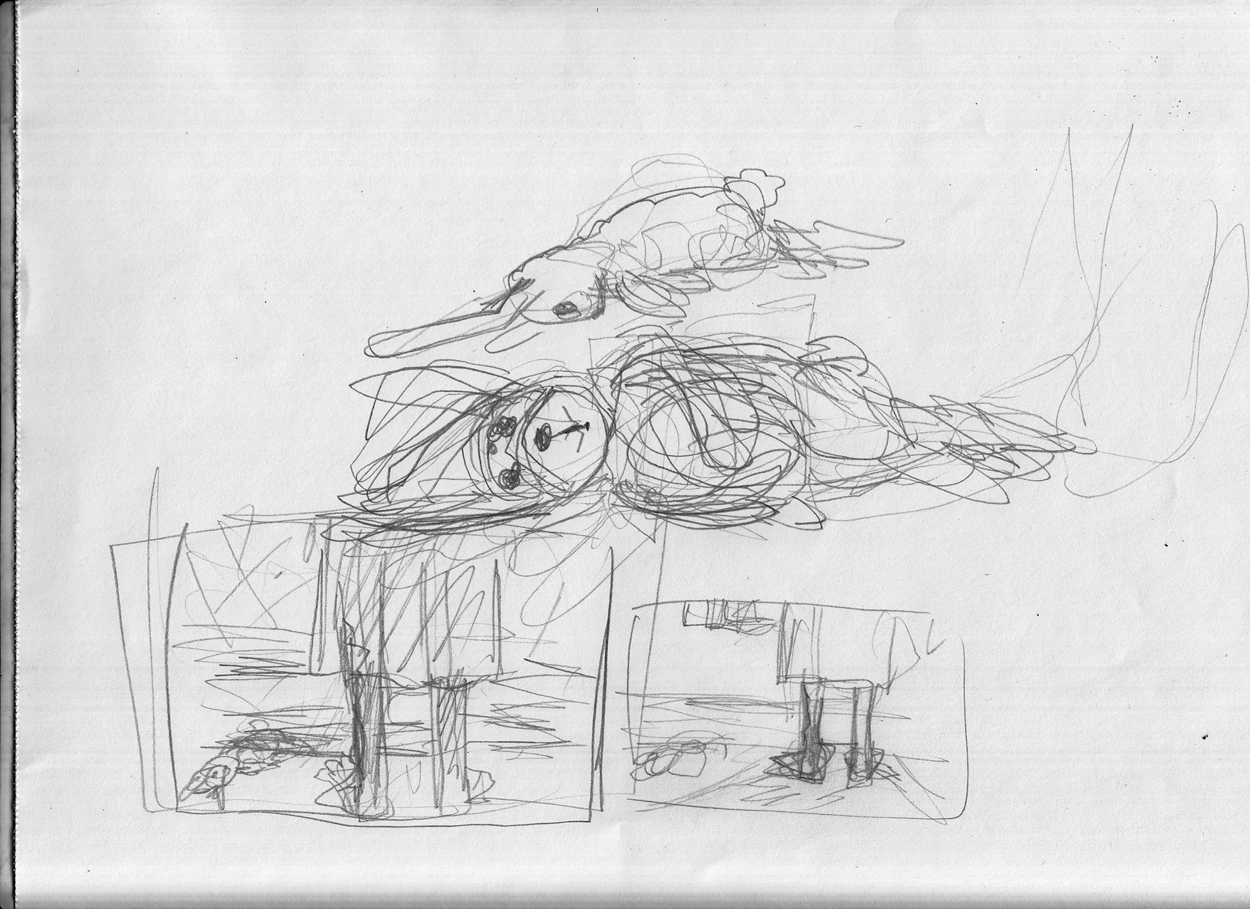
And an actual rough of the page:
February 15-19: Do-overs.
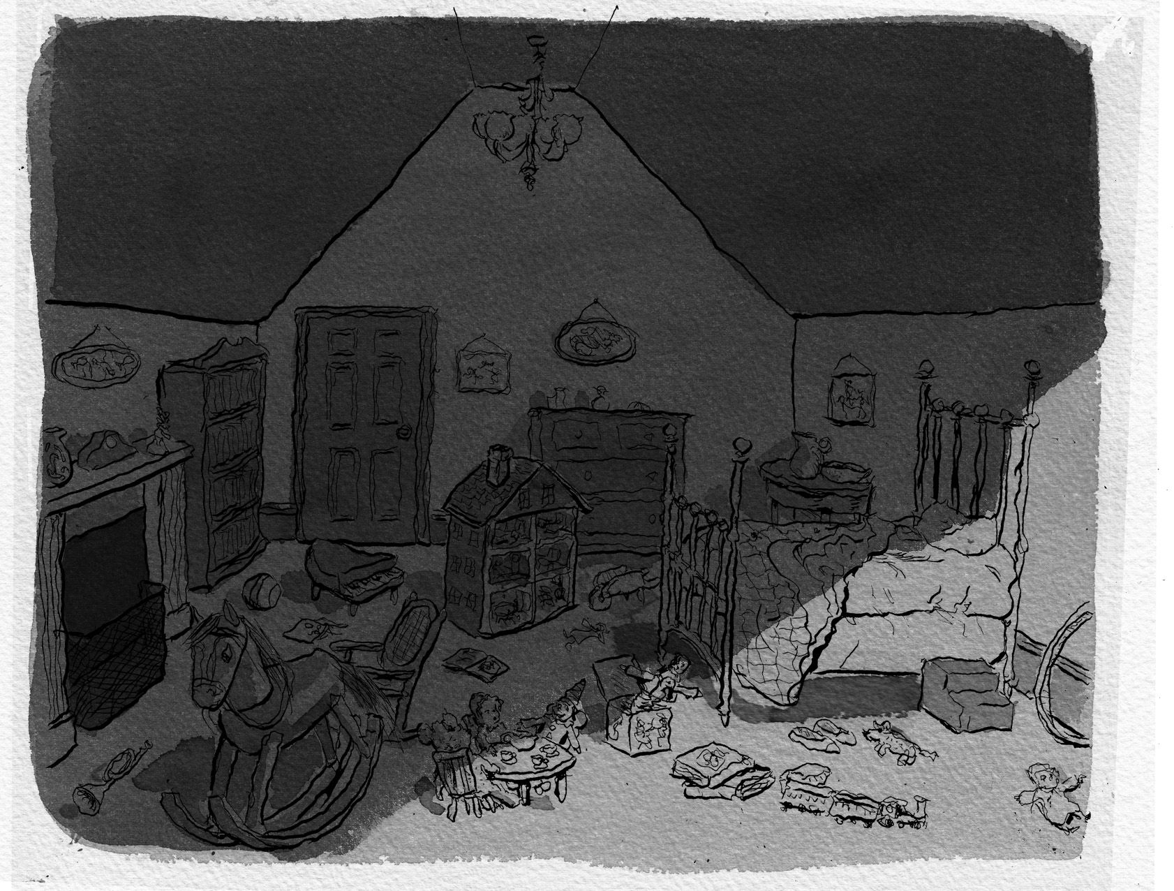
I felt that page 2 (the “wide shot” of the bedroom), didn’t capture the shadowy, night-time feel. Â I wanted to beef up the blacks, and rather than go back into the page with more ink, I bit the bullet, put a print-out of the line art onto the light-table, and re-inked the page, with heavier blacks:
I think it’s stronger than the earlier version. Â I added washes. Â Again, I kept putting more layers of gray wash down to get it as dark as I wanted. Â But I don’t think I really know how to handle this yet: you can damage the paper and lose the ability to control the tone, and I think that’s what happened in that lighter patch above and to the right of the door. Â But… working this way, I’ve got to be willing to live with accidents and imperfections.
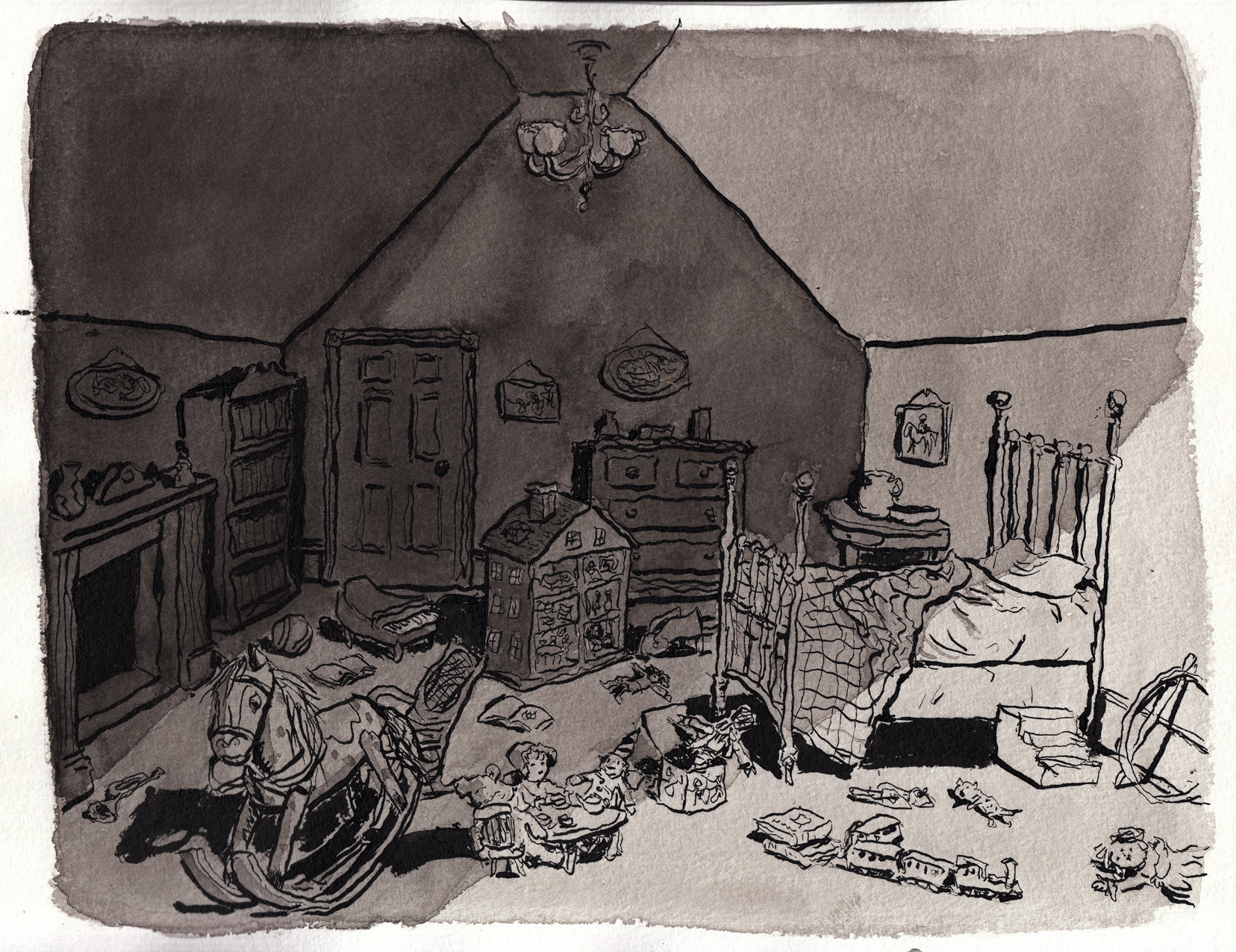
One more step, to add in the wallpaper pattern:
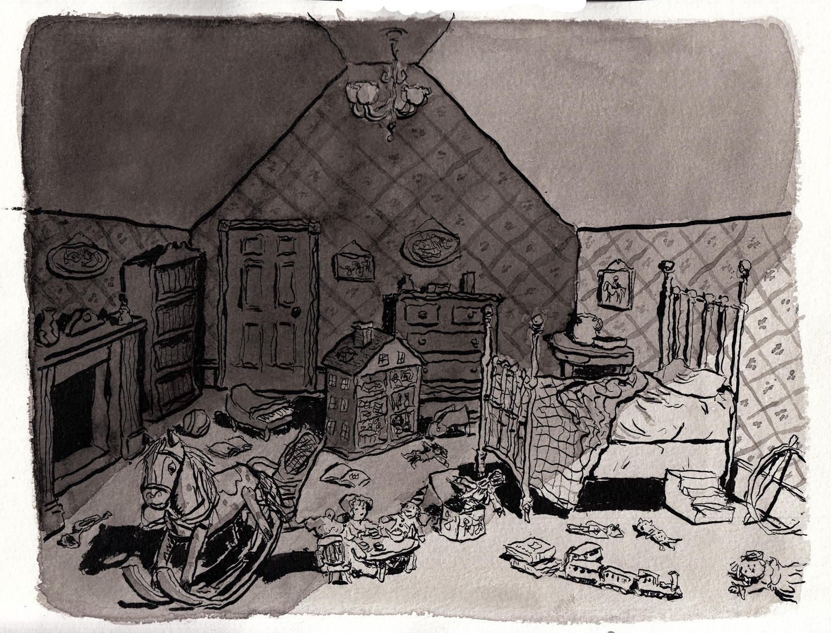
Okay! Â But now that I was into all those heavier blacks, I started to feel disatisfied with some of the other pages in this sequence… so I used the same process and redrew two of them!
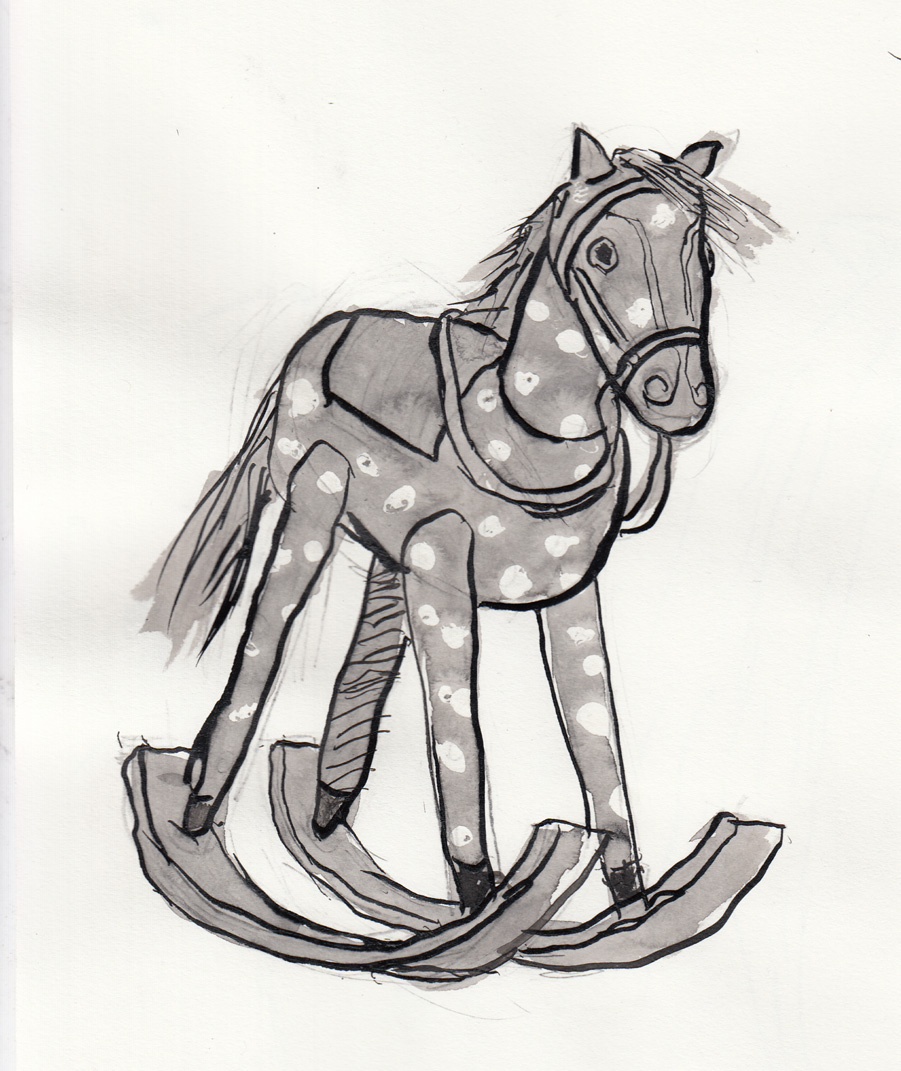
I had a good time being a little more reckless drawing this page, and I like the crazier linework. Â Washes:

Needed a little more tones, to make the horse stand out a little better, etc:
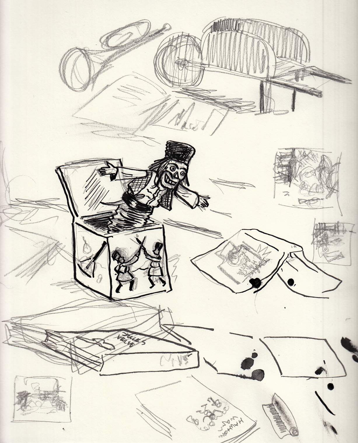
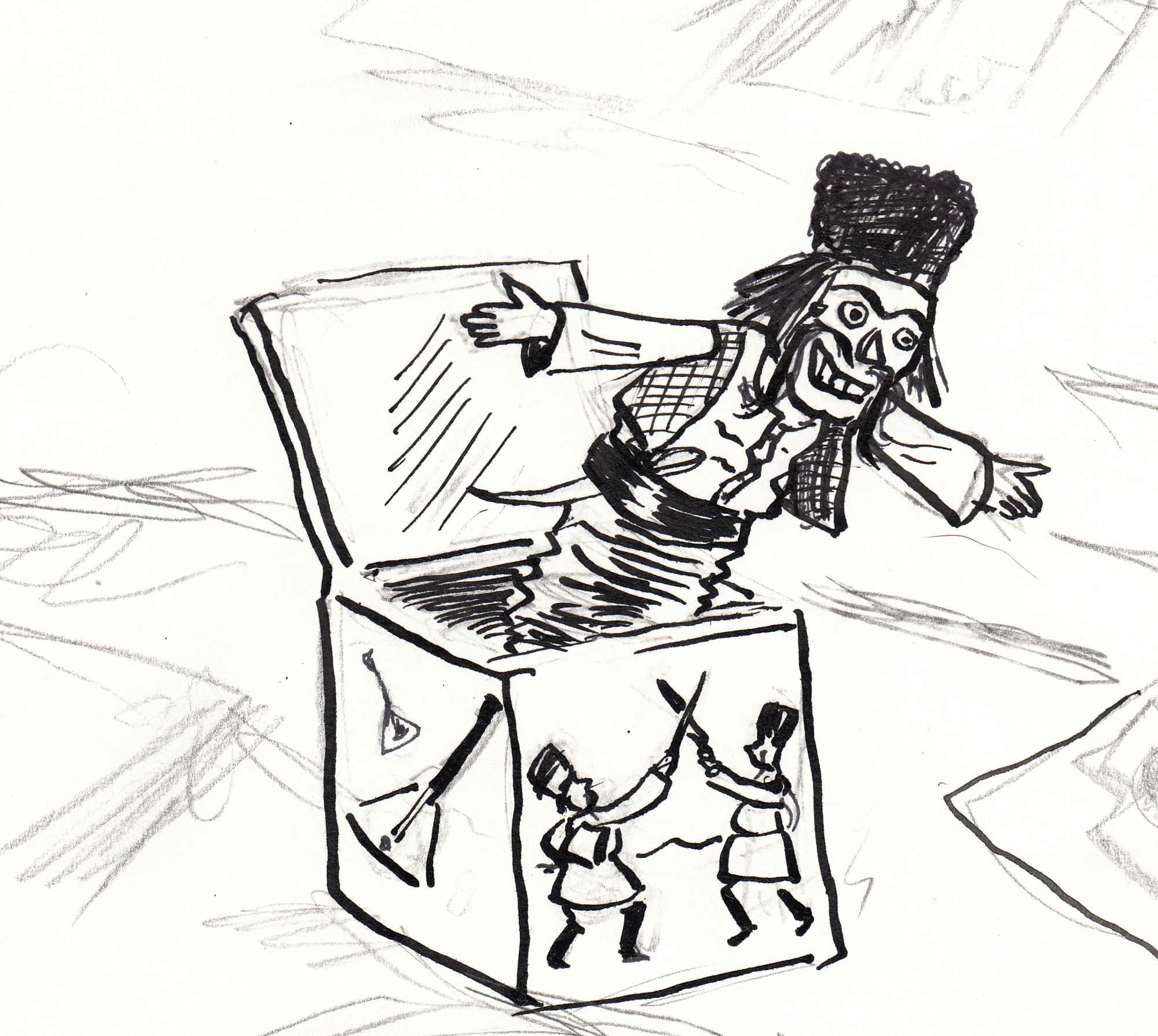
Alright! Â On to the Jack in the Box. Â 
All of this is still being inked lefty, by the way, because I am digging the unrulier line I get with that hand. Washes:
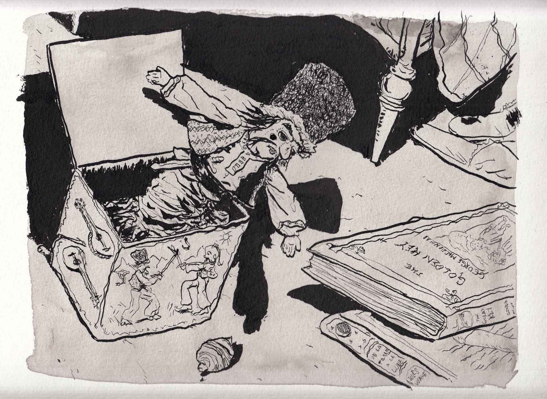
And a little shadier:
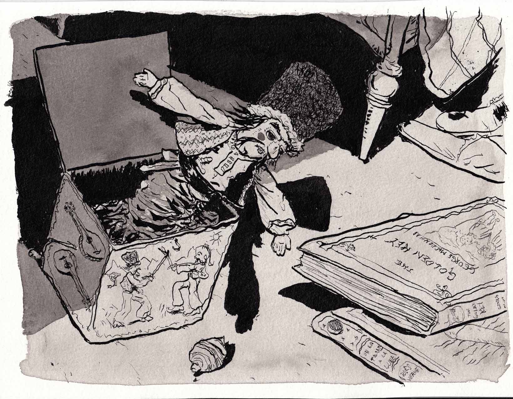
Yeah! Â I didn’t redraw page 5, but added some black: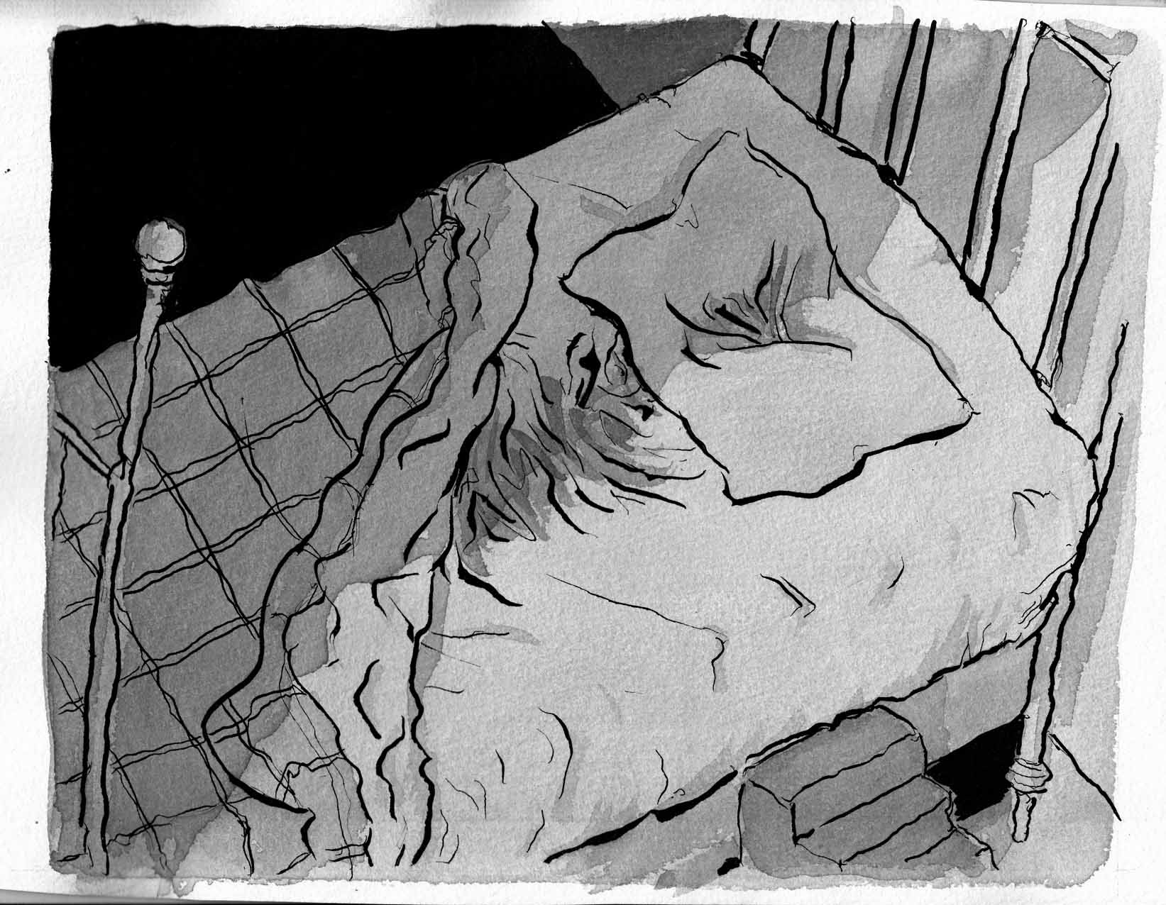
This was all fun to do, and I like the way they turned out.
But then.
It suddenly came back to me that the reason I wanted to use gray ink washes for this sequence was to get a delicate quality, appropriate for a child’s bedroom & toys bathed in moonlight. Â Now, I feel like what I’ve done has added a little bit of the “scary toy” feeling to things. Â Is that just as good? Â I’m not sure. Â Luckily, I’ve got everything scanned (and backed up on another disc and in the cloud) at lots of different stages, so when it comes down to it, I have a lot to choose from. Â That’ll be tough.
February 11-13: pages 4 and 5
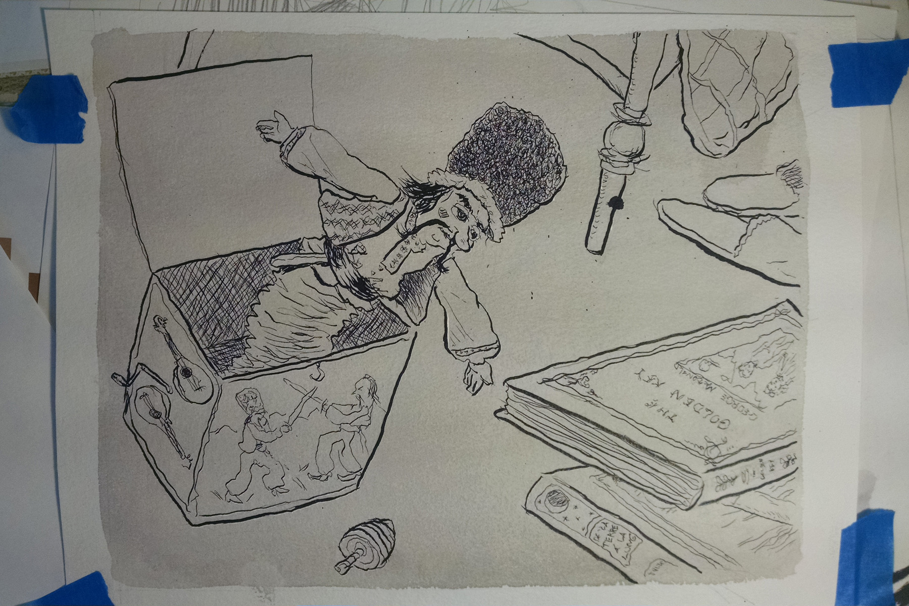
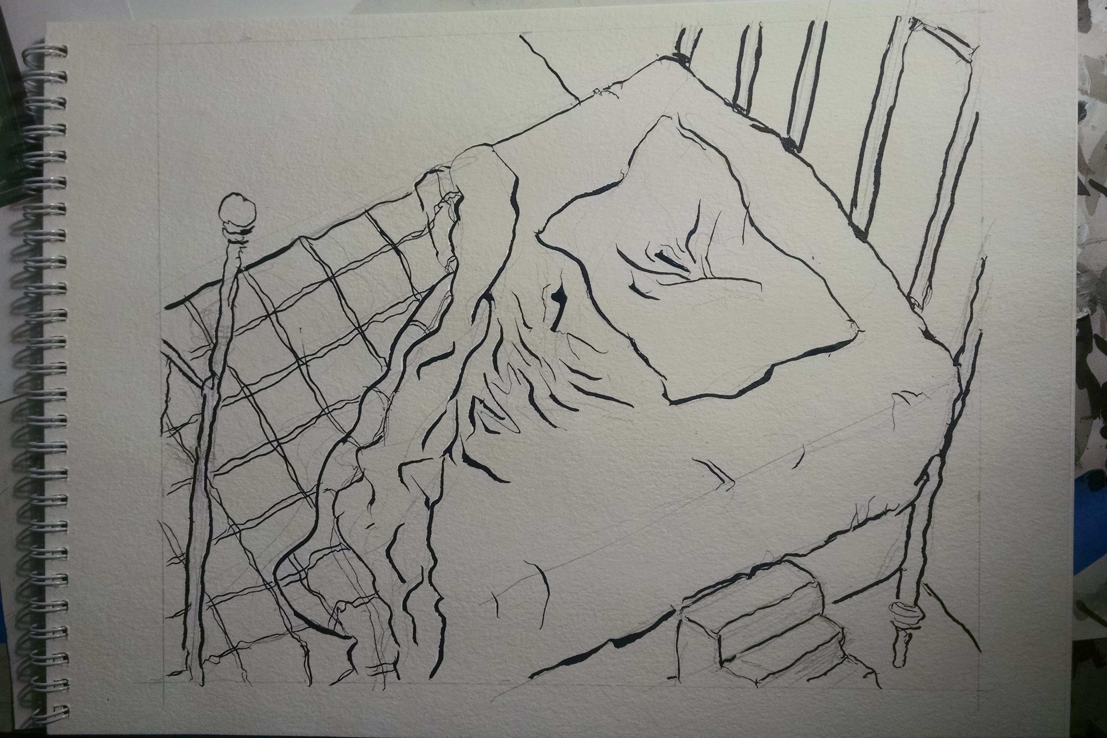
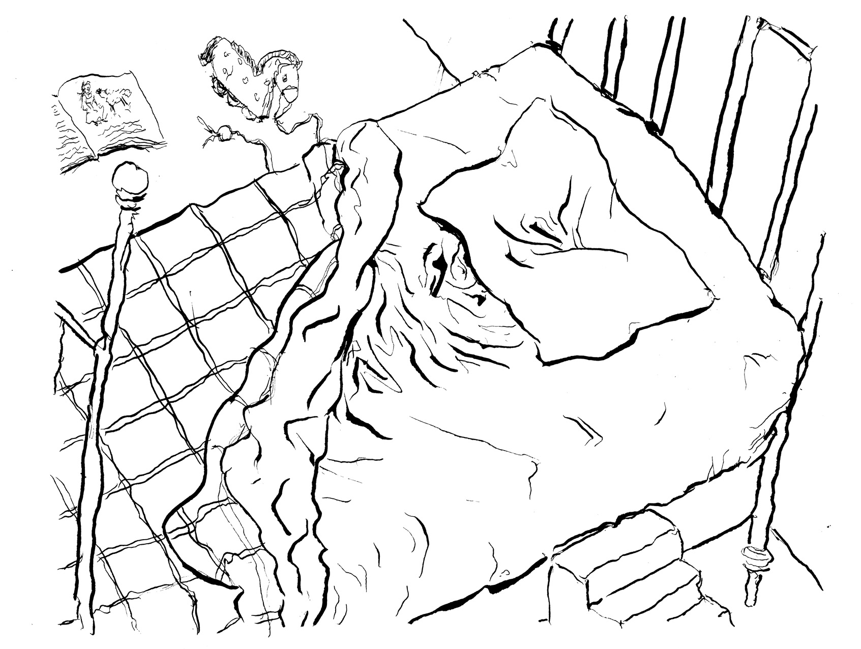
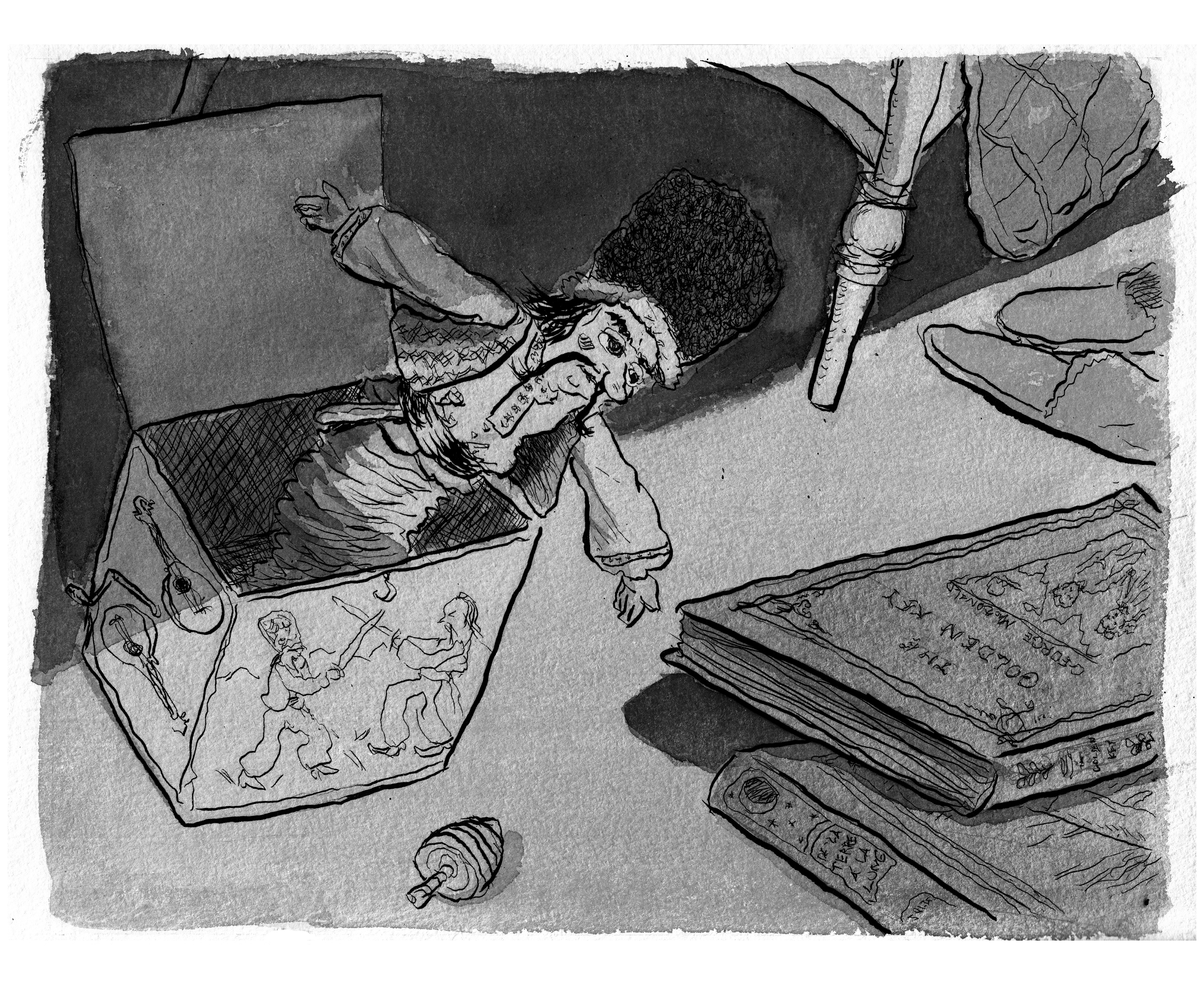
Moving on to page 4, the Jack-in-the-Box detail of the room. Â A rough sketch:
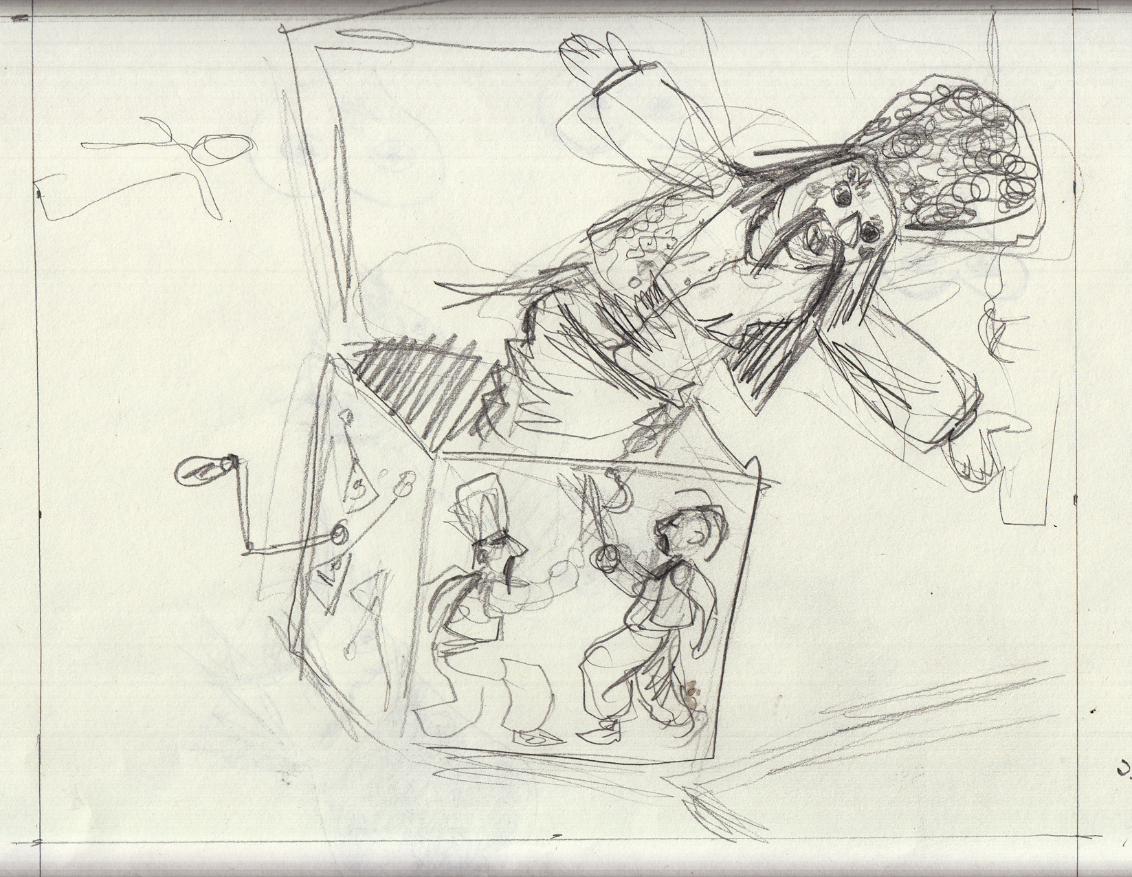
Then another, to adjust the composition, moving the jack-in-the-box left so that the head is closer to the center of the page and you can see more of the books:
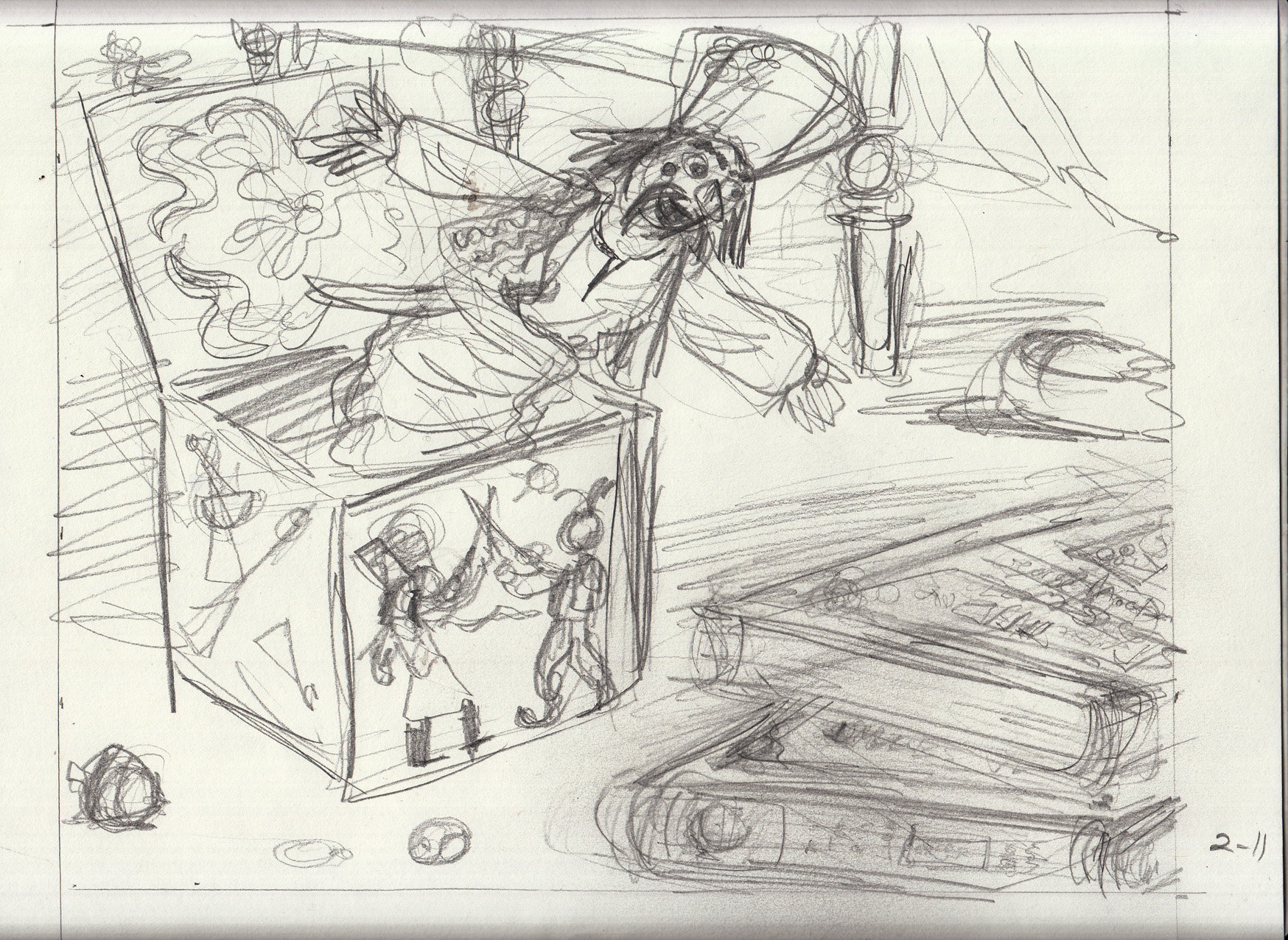
Work in progress on the drawing table, penciled and inked. With one nice ink drop on the bed-post, oh, well.
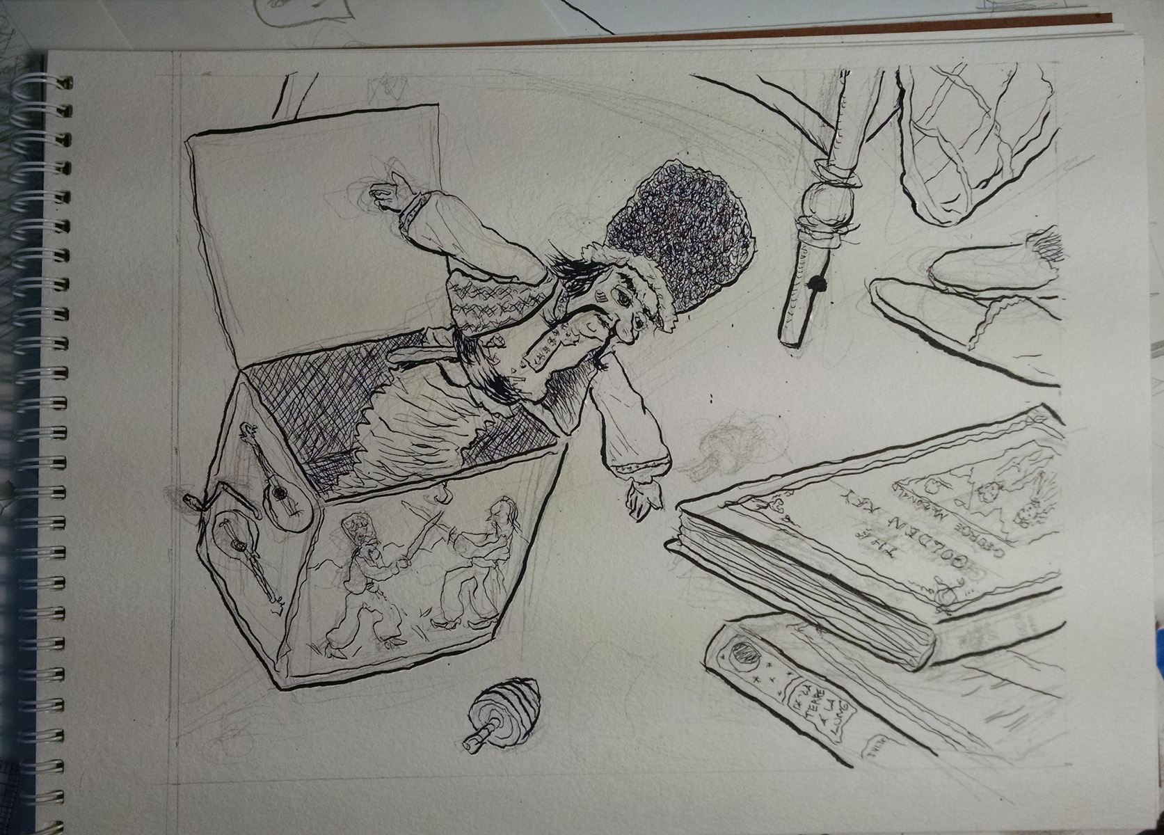
Here is the line-art with pencils erased: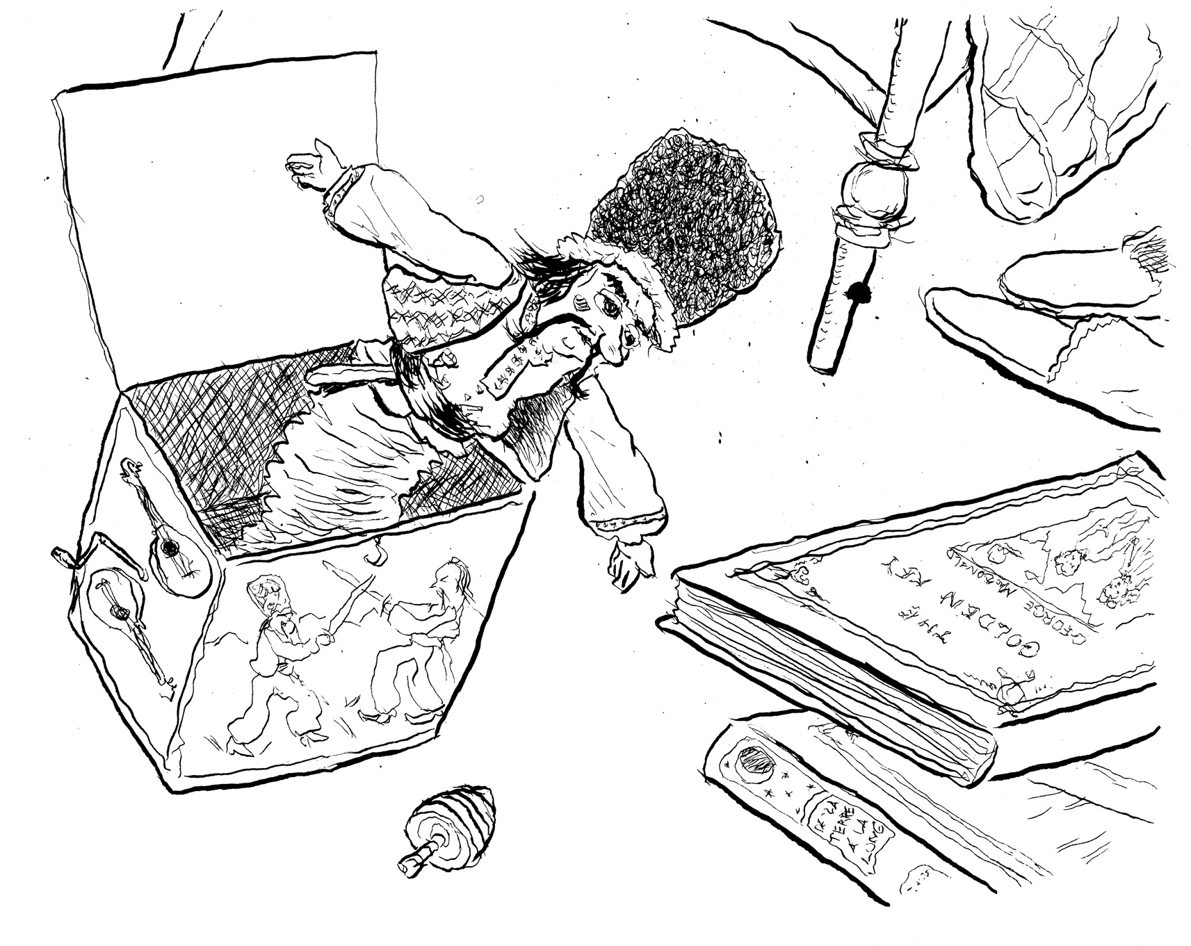
The ink washes go on in layers, from light to dark. Â Here’s the first layer, an overall light gray:
Moving faster now, I didn’t resort to doing ink washes on separate pages via light-box (because I was satisfied with the way they turned out applied directly to the original.) I moved back and forth between pages 4 & 5, as I waited for the layers of ink wash to dry. Â Here’s page 4 on the drawing table:
Page 5 line art scanned:
And here is page 5 with all the ink washes applied:
And pag4 Â with final ink washes:
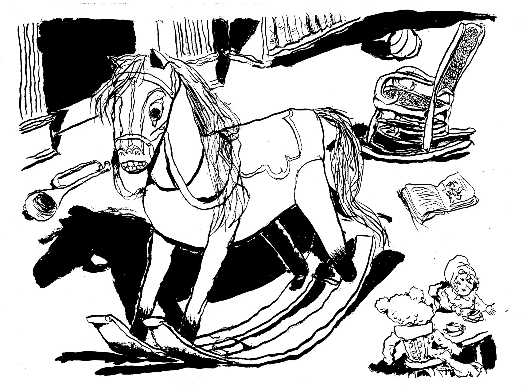
February 10-13: Â Page 3
After the wide shot of the room, three pages of details, moving around the room. Bear with me for all these versions. Â It’s f***ing endless. Â Here’s a photo of the line art, inked, on the drawing table:

Scan of the line art:
Gray wash process. Â First an overall light gray (which will serve as the “white” of the page once other wash layers are applied) (i premixed 3 different tones of ink wash in separate jars):
Next, added another layer to darken in the figure of the horse. Â I also wanted the horse to have spots that are lighter than its overall tone, so I used masking fluid to create those. Â Actually I didn’t particularly care if the spots were lighter, I just liked using the masking fluid:
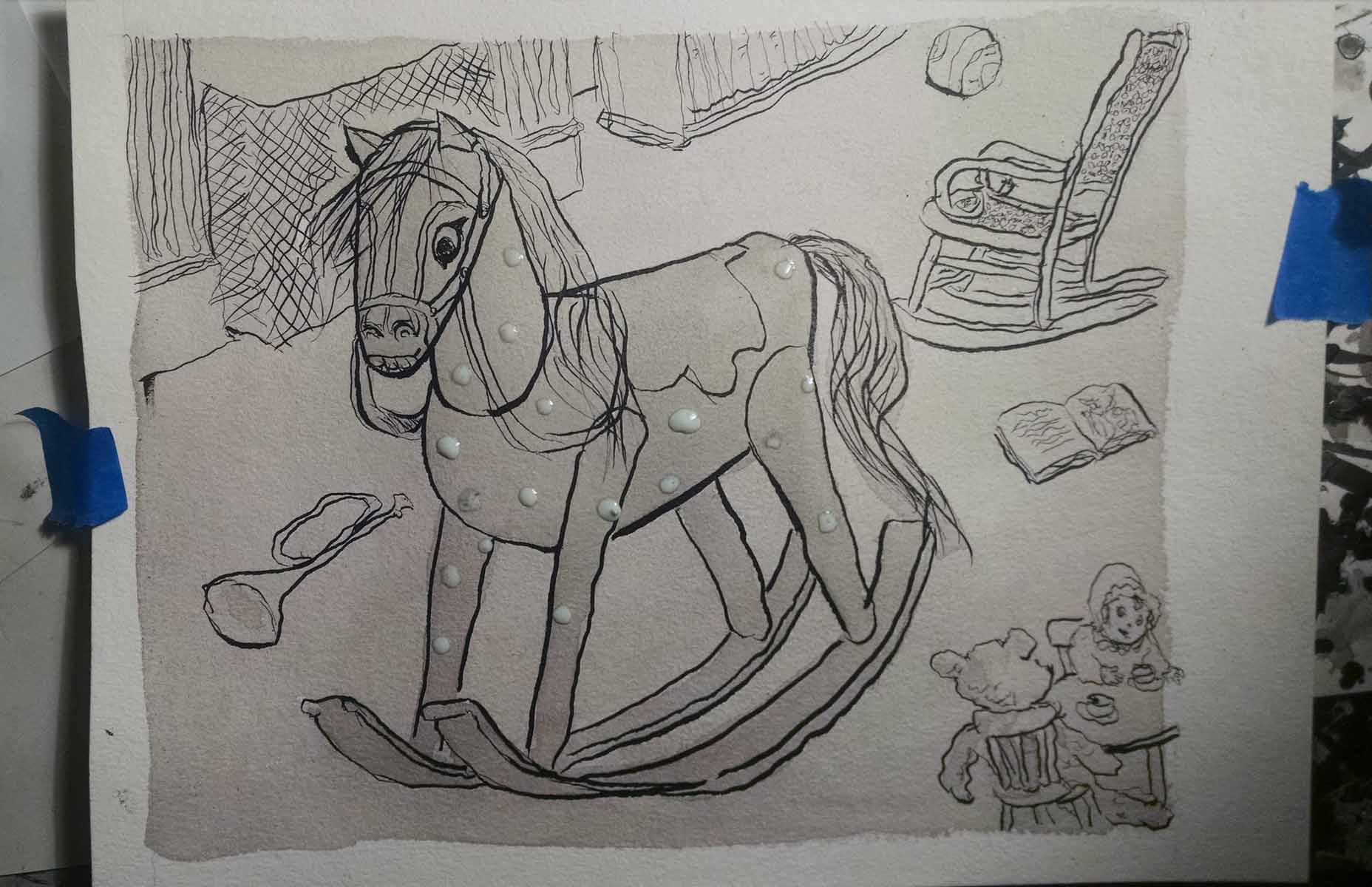
Finally, more wash to darken everything, and peeled off the dried masking fluid:
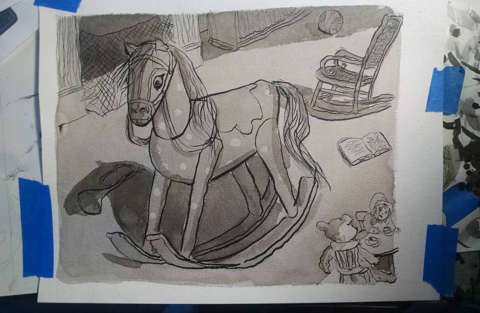
Here it is, scanned:

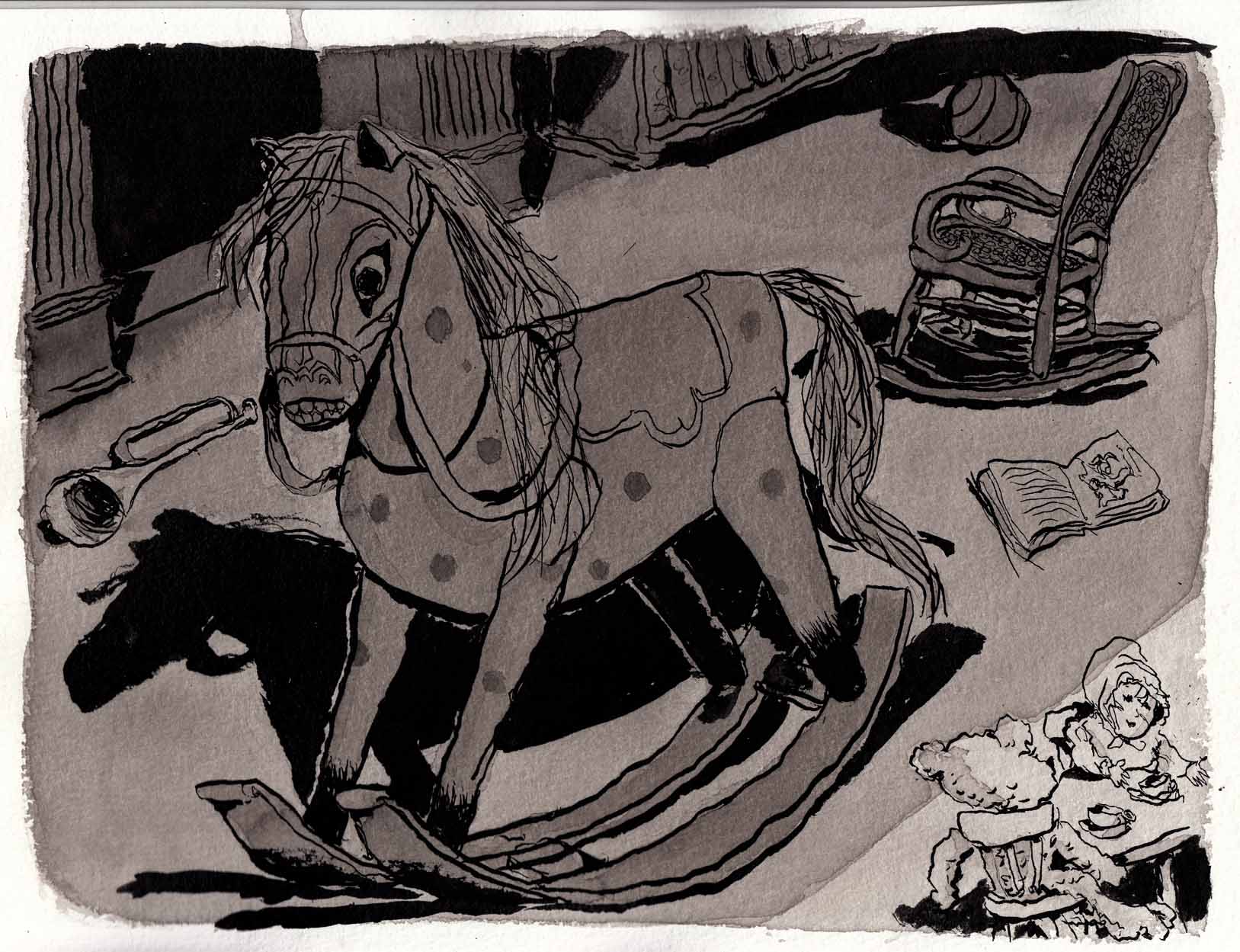
To be honest, I can’t even remember what it was that disatisfied me about the above version. Â Probably again, that it’s a little too pale and doesn’t feel like a dark room at night time. Â At any rate, I went through the same process I did on the previous page, using a light box to create new wash layers on separate pages: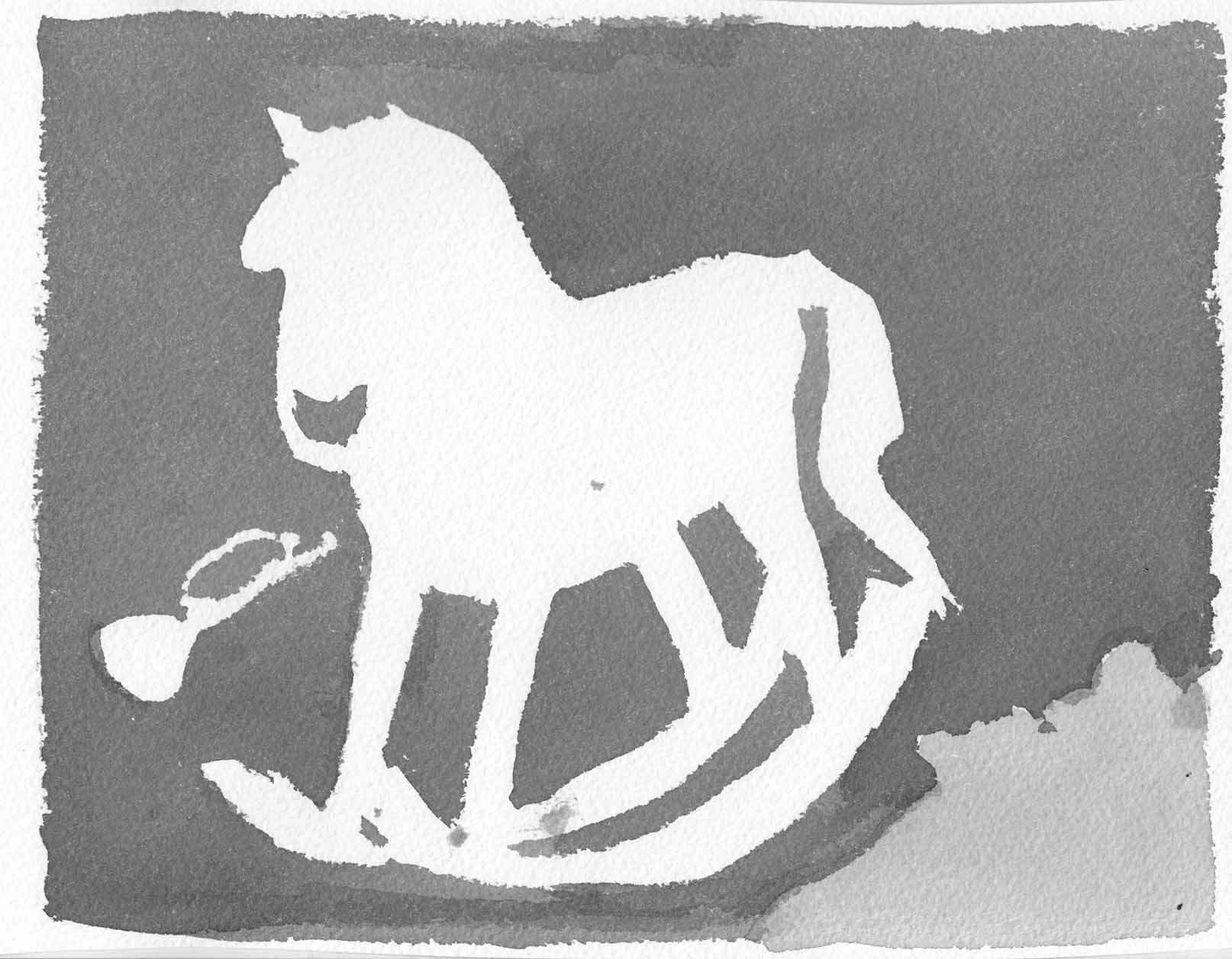

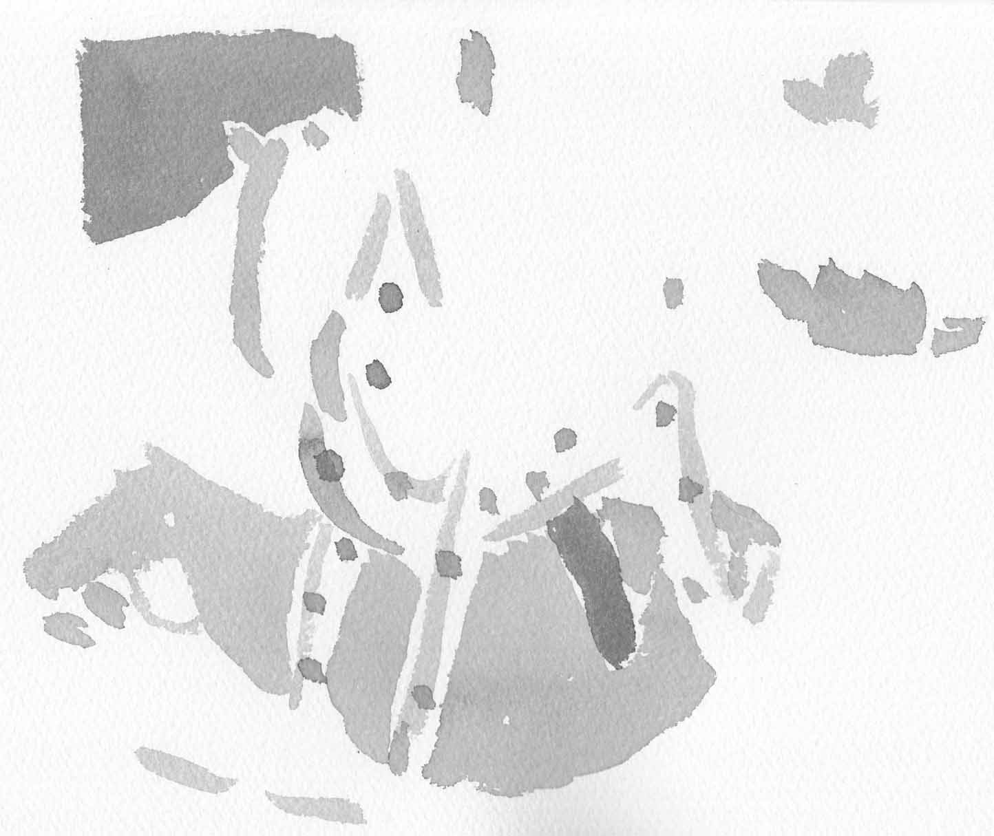
Stack ’em in transparent layers over the scan of the line art, and voila:
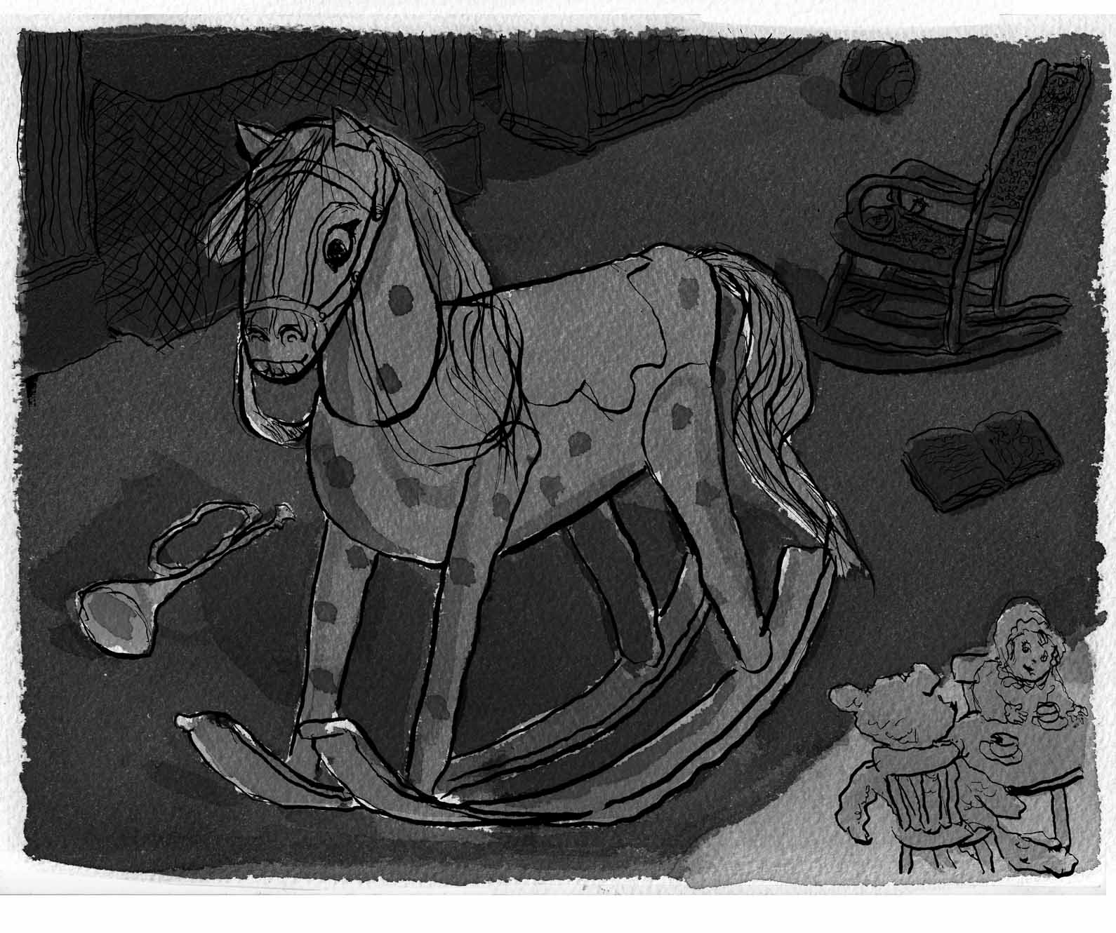
Well, I do find this richer and stronger. Â I even the white gaps in the washes on the horse, resulting from imprecisions in my light-boxed layers. Â So I’m done with the page. Â Or am I? Â Don’t kid yourself.
February 6-9: Page 2, many stages.
Rough pencils:
Final pencils: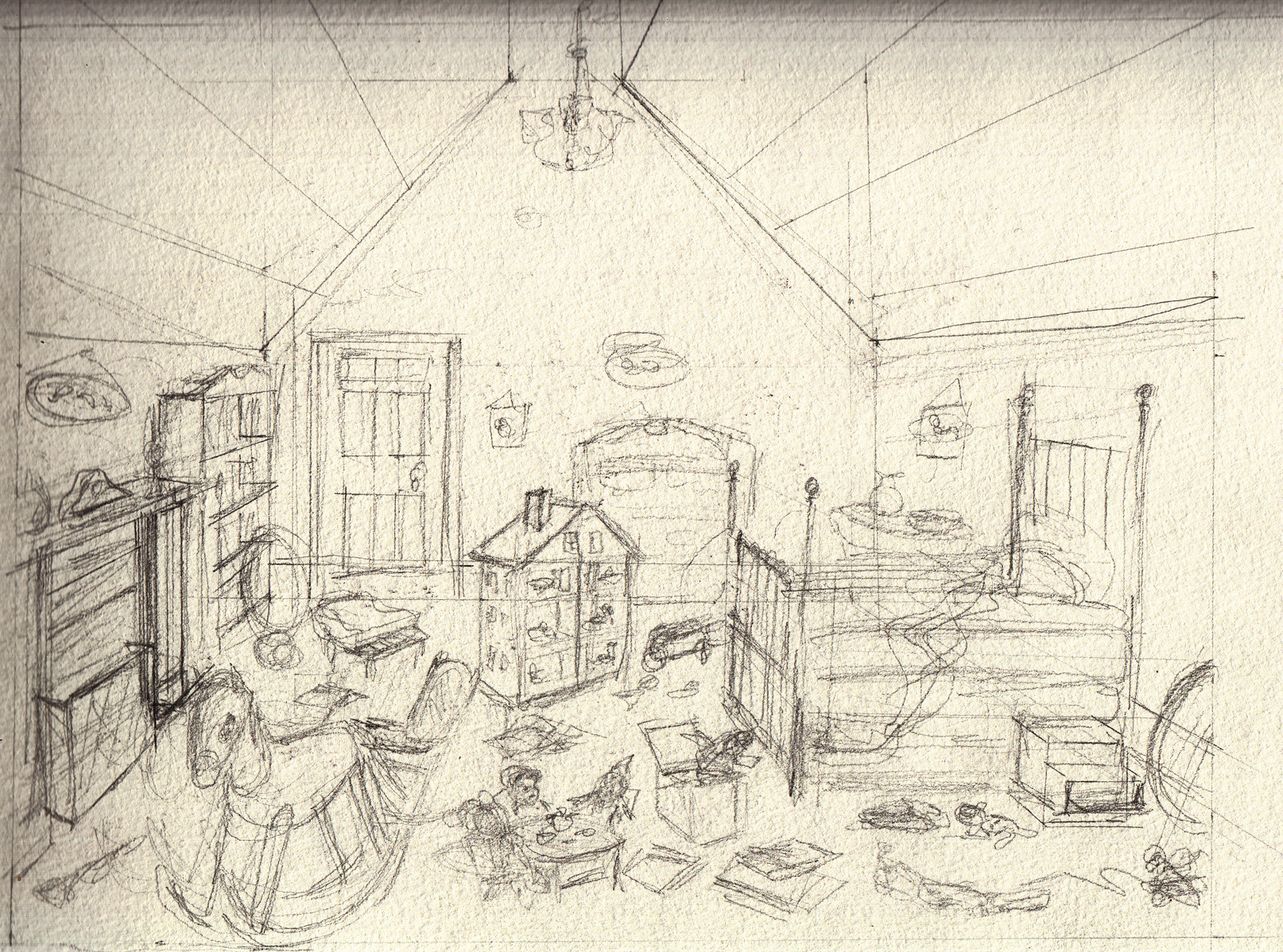
Pencils inked:
Line art inks: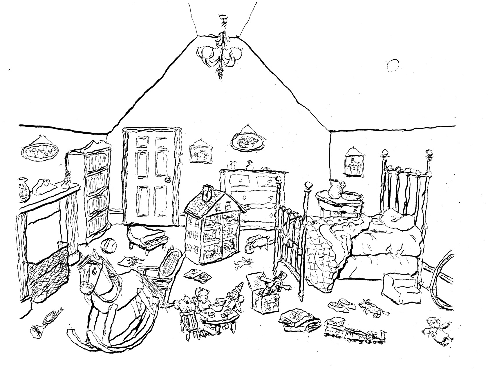
With ink washes (applied directly to page):
(note on above: I wasn’t satisfied with the washes, because I think there’s too much light. This is supposed to be a room at night, dark, with a diagonal section lit by moonlight thru the window).
So I went back in to add more atmosphere with washes:

…but I felt I’d only muddied things up. Â Irretrievably. Â Luckily, I’d scanned the line art, so I tried a different method, applying ink washes to separate pages, using a light table over a print out of the line art.
Here is the ink wash for the overall lighting of the room:
Then, digitally combined with the line art: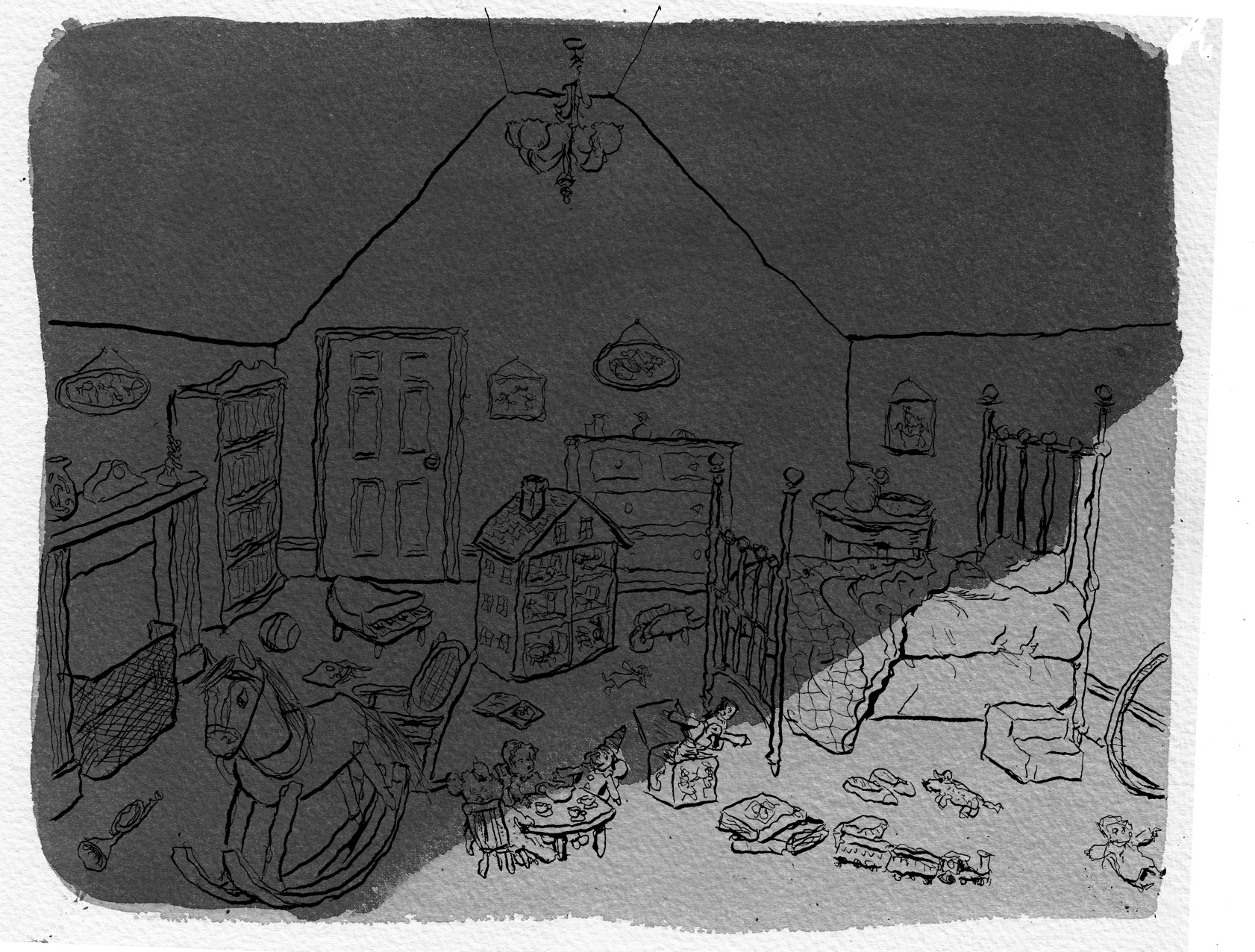
Another layer of ink washes, for specific shadows:

Added digitally:
And finally, a separate layer for the wallpaper pattern: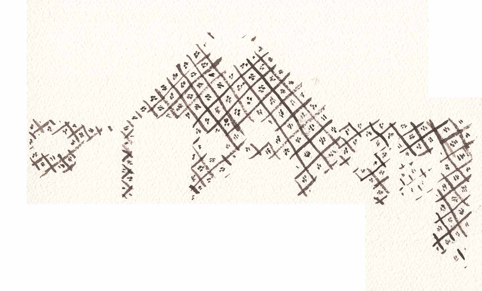
Here is the line art combined in Photoshop with the three layers of inkwash:
This method gives me a lot of flexibility. Â Too much flexibility, in fact, as I can try so many combinations. Â Here, for instance, is the scan with the first layer of inkwash applied to the page (that is, the fifth image from the top for this date’s entry), combined with just the darkened ceiling from that separate layer of inkwash, four images up from here.
 If you’re confused, you see why I may be overdoing the “flexibility.” Â But I push on… Â Stay tuned.
February 3: Page 1, finally.
The exciting moment. Â Pre-season is over. Â Now, it counts. Pencil to paper, then ink… the final page.
Oh, I lied. Â First there was a false start: I penciled, but realized I hadn’t gotten the composition exactly right. Â Not a dramatic-enough angle.

Rather than erase, Â I started over. Â Got the composition right. Â Here is an in-progress shot with just the line art. Â Again, penciled by right hand, inked with left:
And the finished page:
I was painstaking with applying the ink washes, using several “coats, ” like glazing in painting, letting each coat dry, then applying another, to get the tonalities where I wanted them.
February 2: ink sketch for page 1
I did one final pencil sketch, then another version in ink and inkwash… since that’s the media I’ll be using for this chapter, and I want to get used to it:

I penciled this with my right hand, and inked with my left. I kind of like the wiggly lines my left hand makes. Â Overall I’m happy with the quality of the drawing, but I screwed up the composition… didn’t get enough of a dramatic angle.
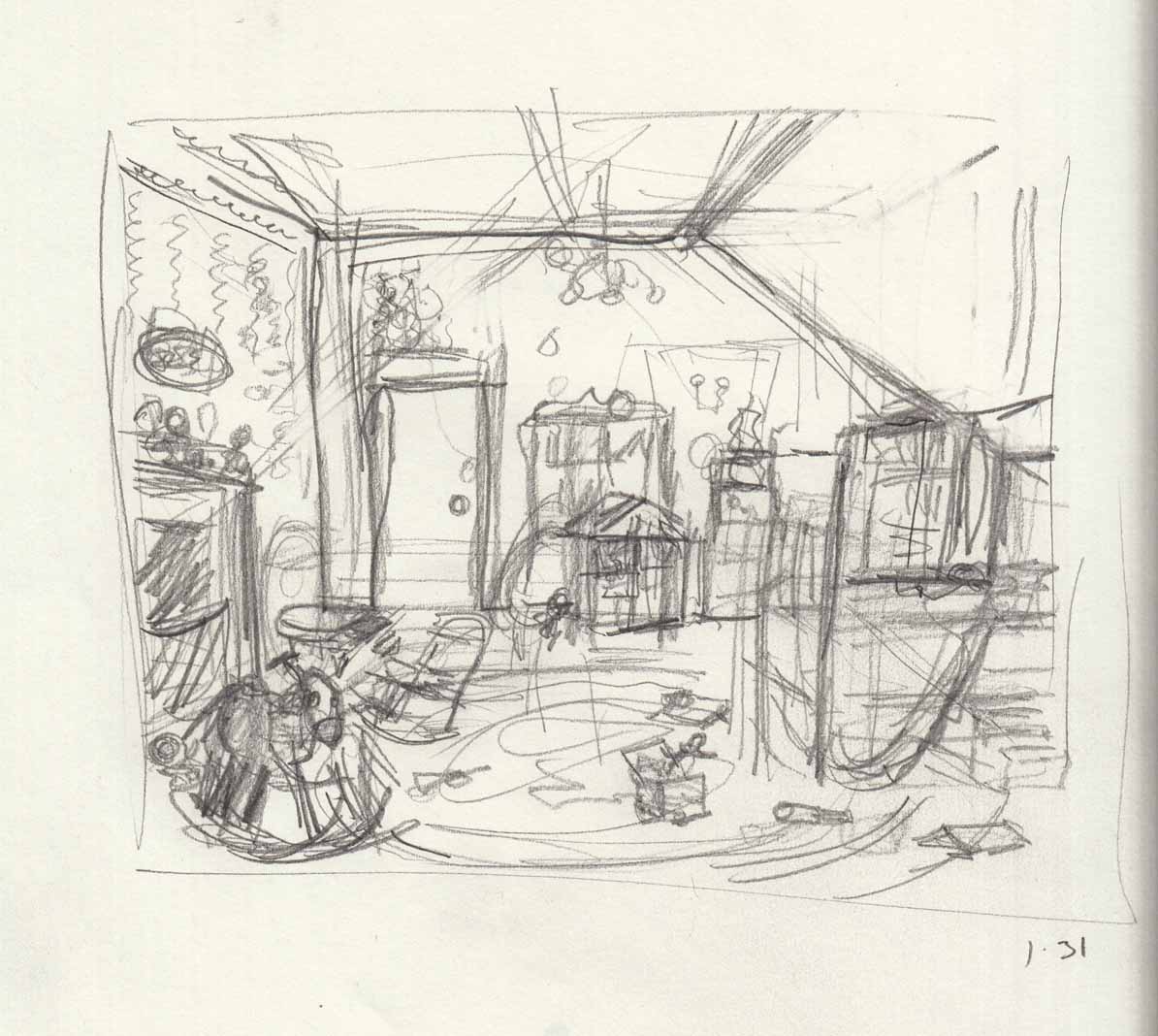
January 31-Feb 1: page sketches
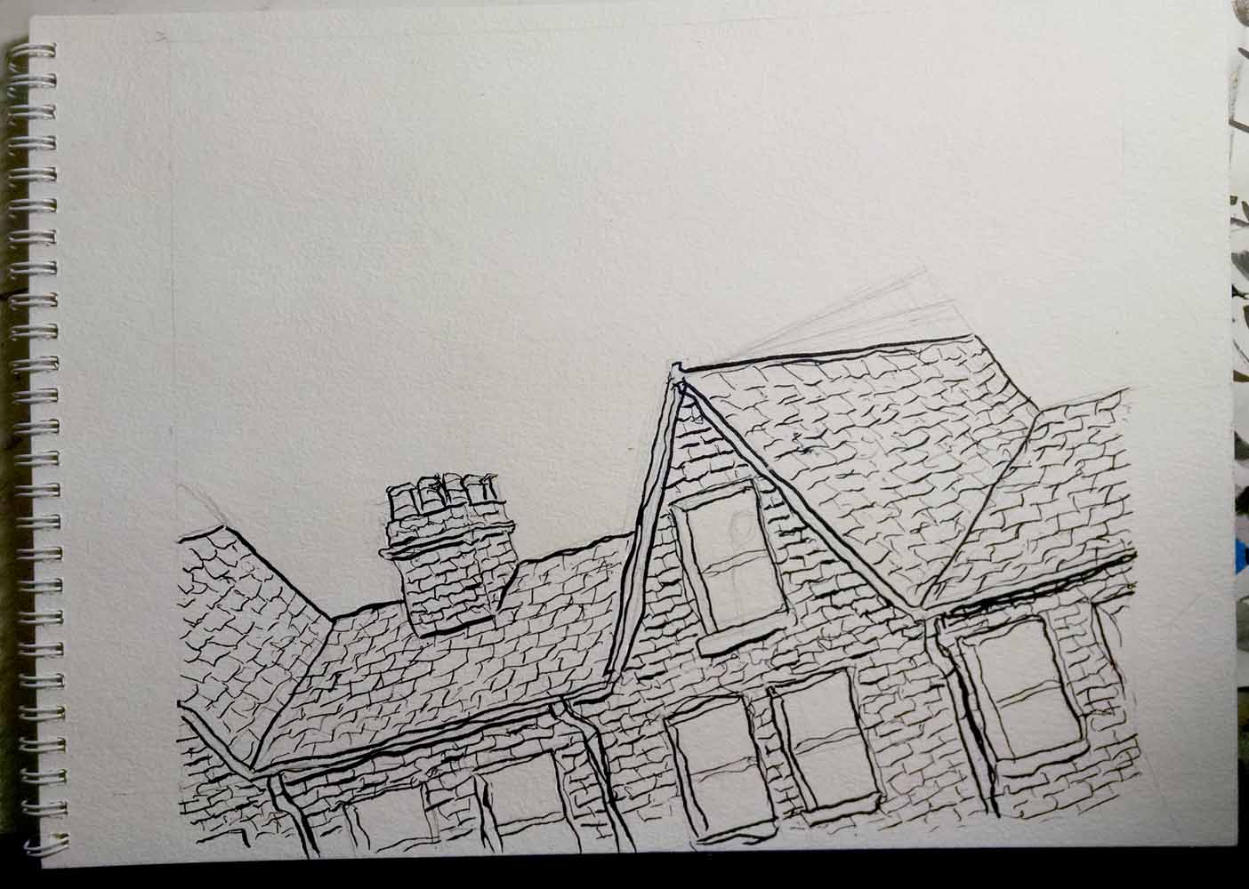
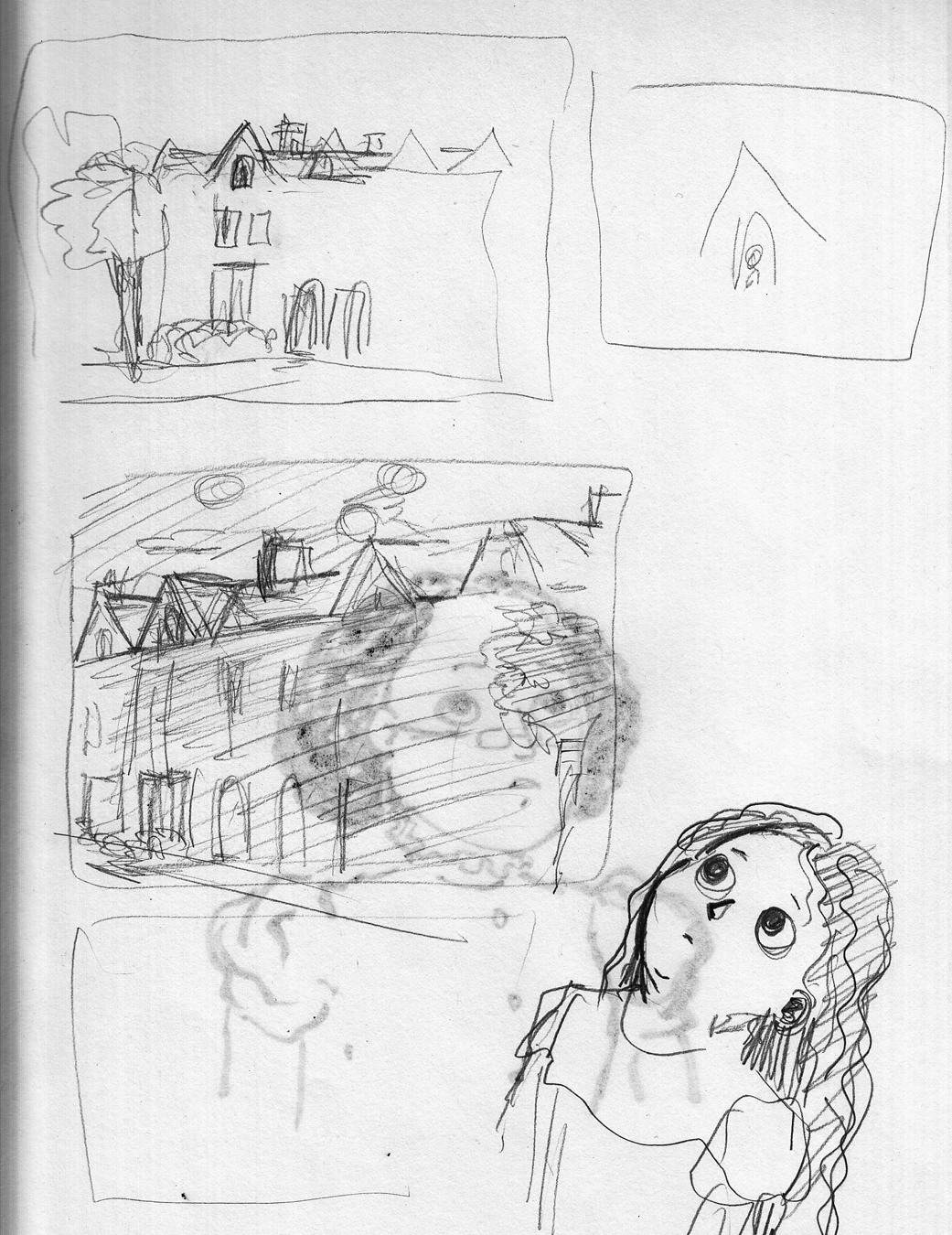
I started doing more refined pencil sketches for the first two pages of the chapter. Â Page 1 is the “establishing shot” of the building in which the scene takes place:Â 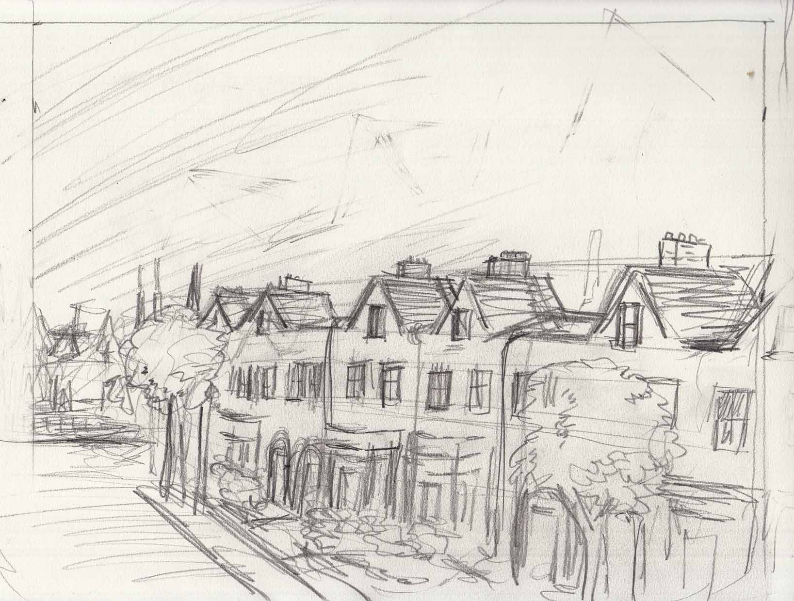
What bothers me about this is that it’s too similiar to the first page of the previous chapter, another look down a block of rowhouses. Â I tried to vary the architecture, but still.
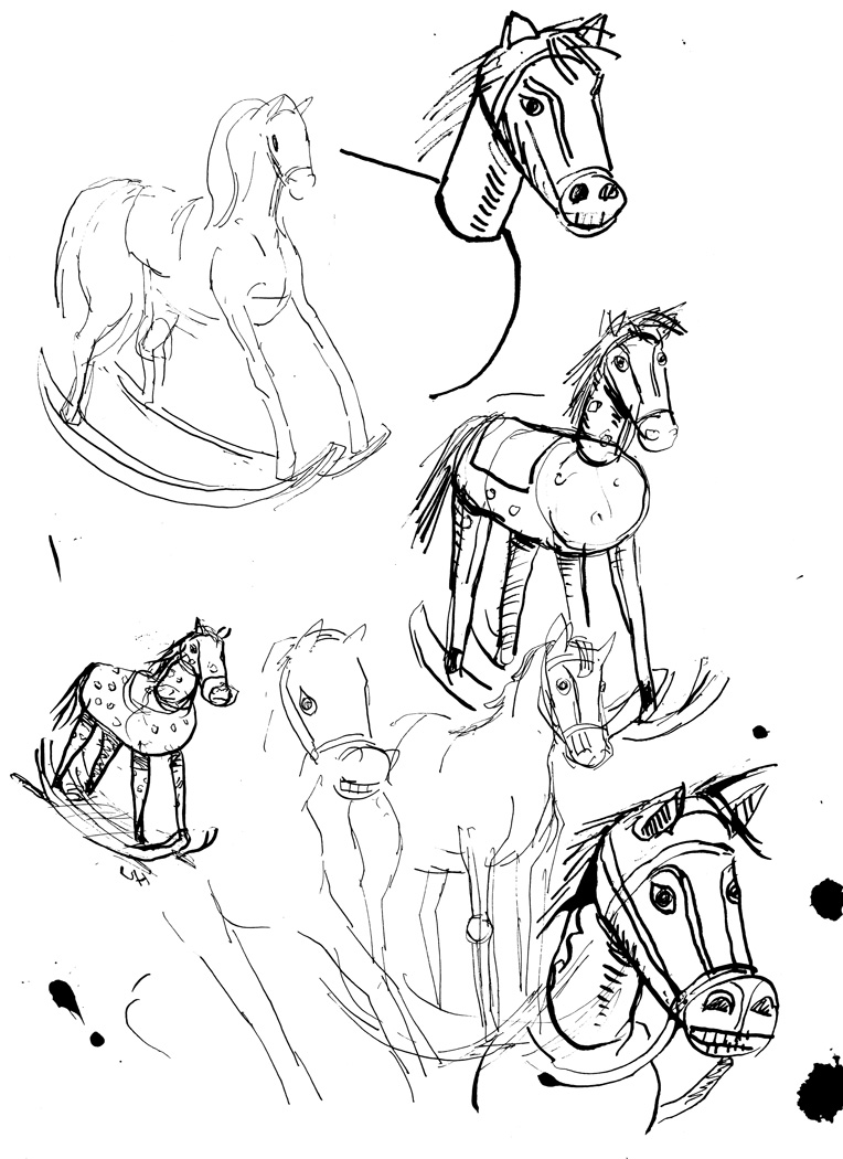
Re-thumbnailed the page, changing the angle and making it closer to the window of the girl’s room (plus a few more rocking-horse doodles):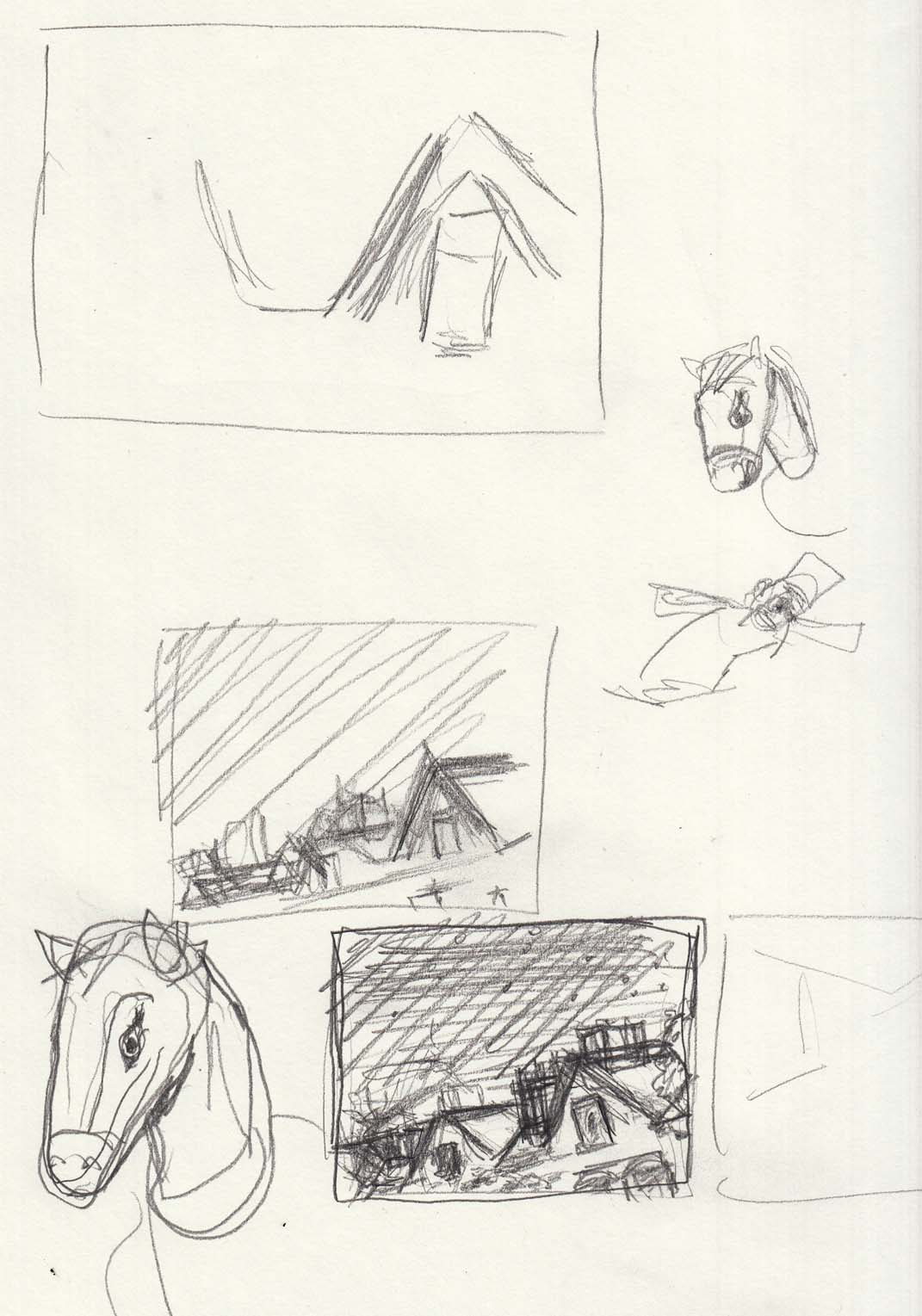
Okay, that looks better. Then, on to page 2, A thumbnail:
And a full-sized rough sketch:

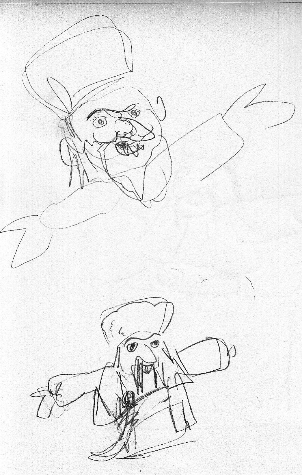
January 30-31: Â Jacks-in-the-box
Another toy to be featured in the first pages of the chapter (as we “move in” on details of the bedroom). Â Here’s some reference: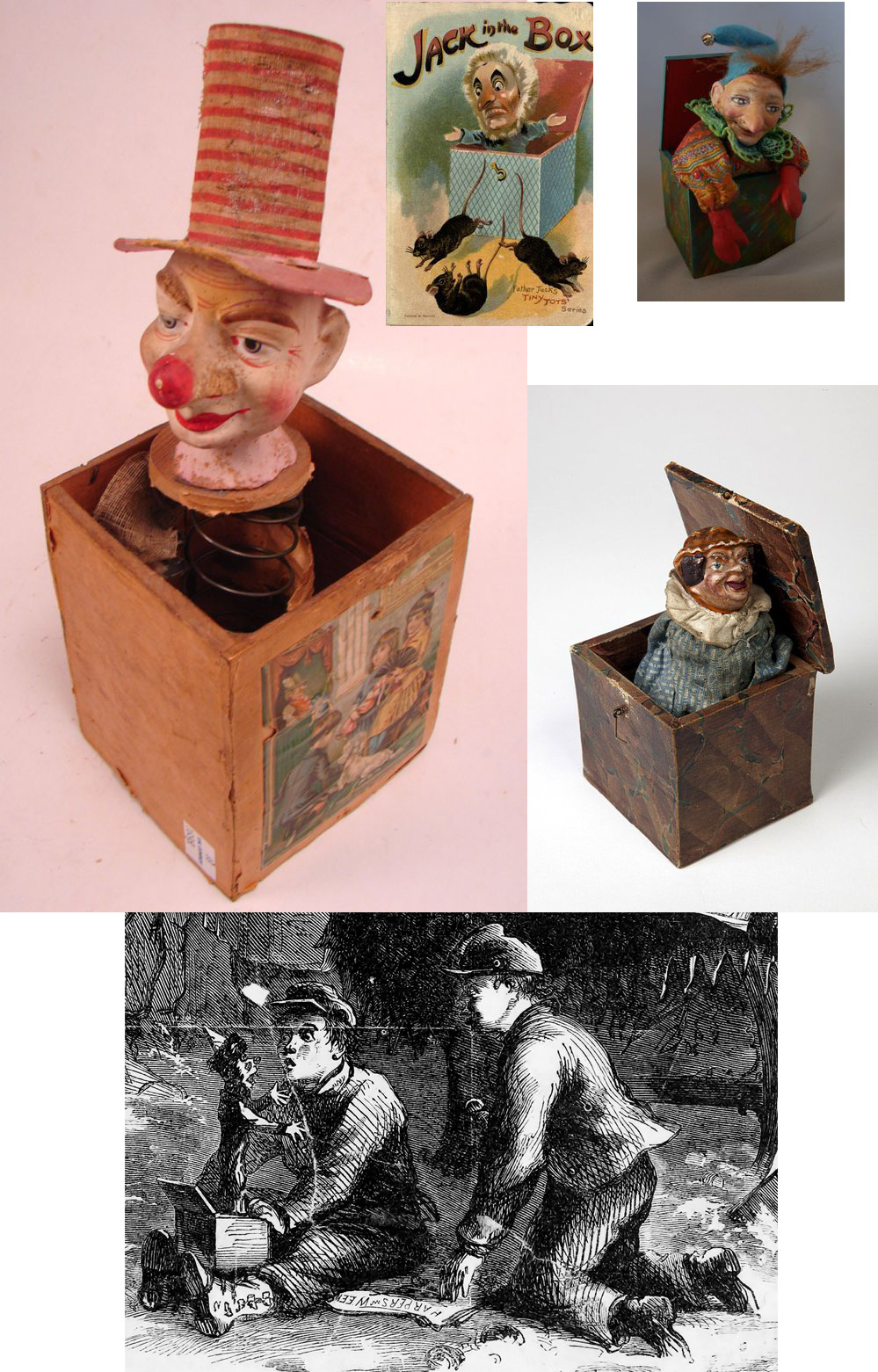
Some scribbly sketches:
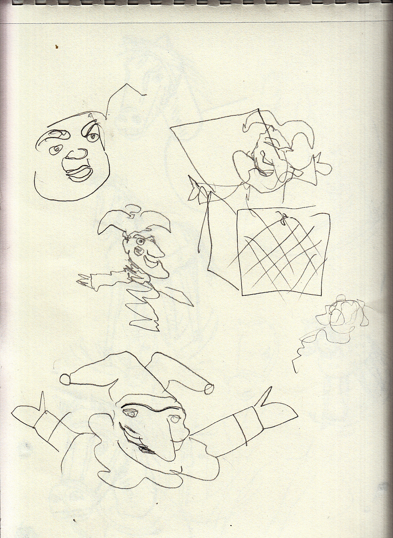
Thinking that I want to do something different: still with a classic Jack-in-the-Box feel, but with a little variation. Â It popped into my head to do a Cossack Jack-in-the-Box:
![]()
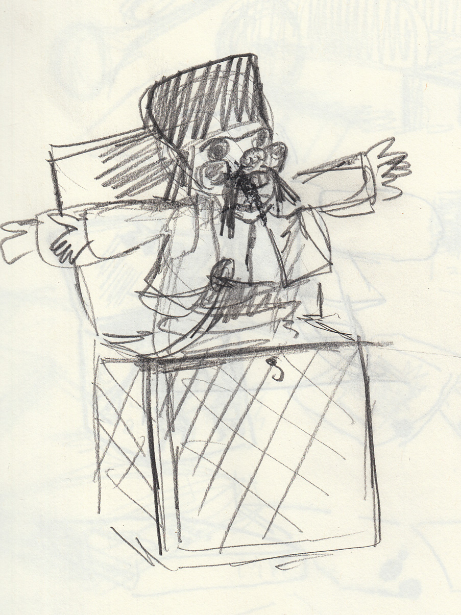

Again, I don’t need to nail it down at this point, just get a basic idea of what it would look like, and go back to it fresh when I reach that page. Â (afterwards I googled “Cossack Jack in the box” and there aren’t any images of one, so maybe I’m being original!)
January 27-28, 2017: Toy-time
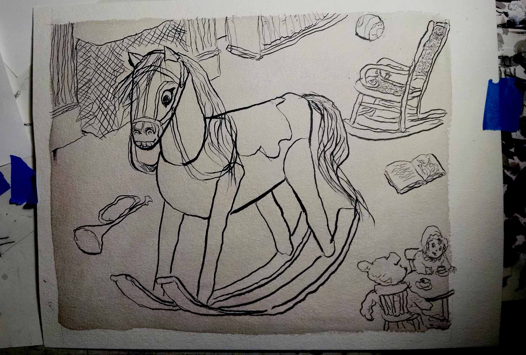
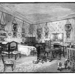
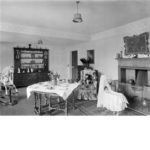
Studies for the rocking horse in the bedroom scene. Here are some of my reference photos (there are lots more, I’m kind of obsessive about gathering reference):
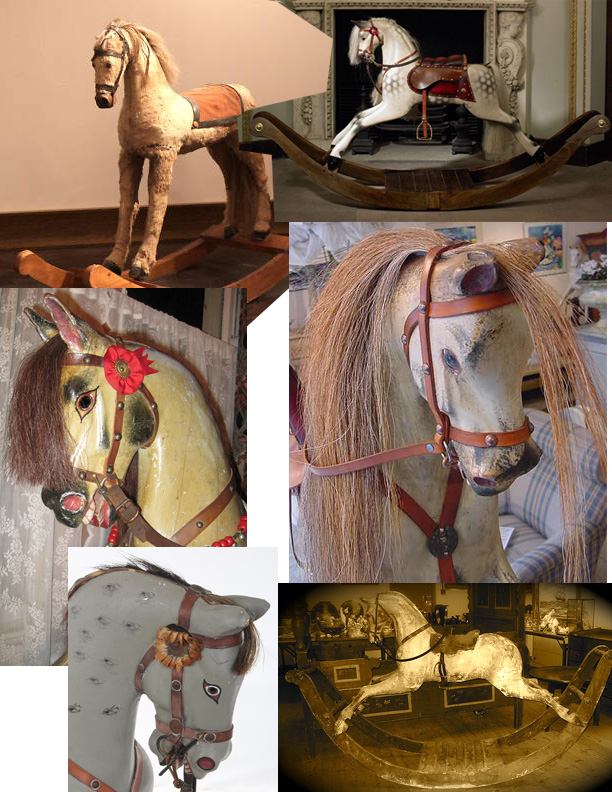
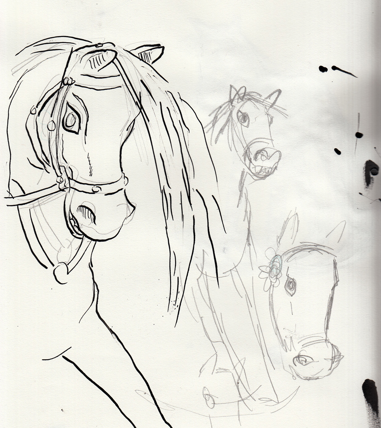
The thing is, a lot of those Victorian rocking horses are very naturalistic — but if I draw a naturalistic rocking horse, it won’t look any different than if I was just drawing a horse. Â So I will go for a more stylized design:
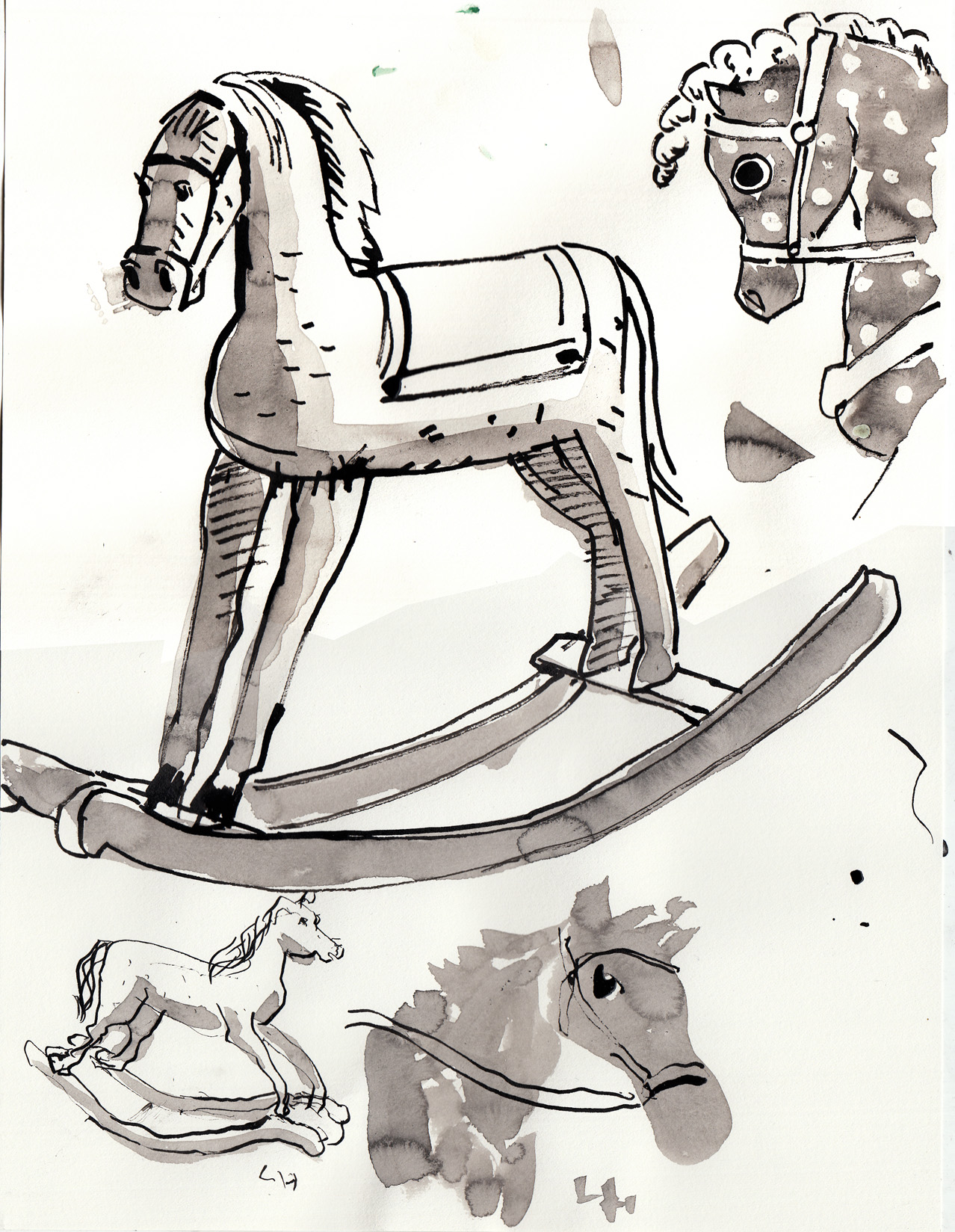
I like this last one (inked with left hand). Â I’ll stop now, so I don’t get stale on rocking horses before it’s time to draw the actual page.
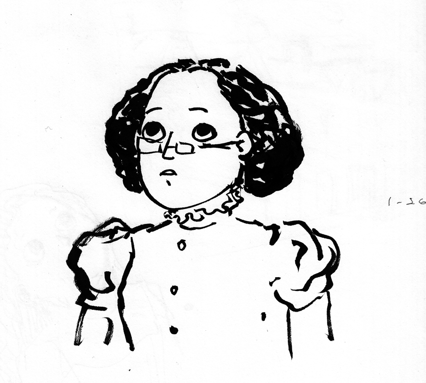
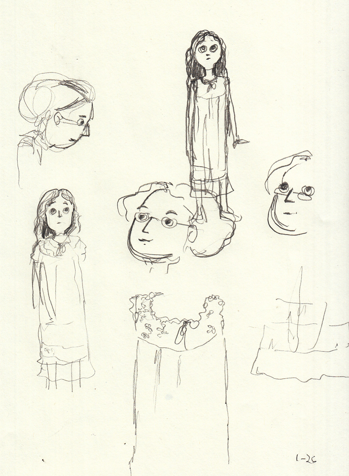
January 26, 2017: sketches, ink wash
Now that the sequence is thumbnailed, I went to work on more refined sketches of the characters. Â Since I plan to draw this chapter using ink and wash, I started working with that medium.
 ‘(Note: the above is just a doodle of the character when she’s older, though the hair is wrong, not a sketch for ch. 2)
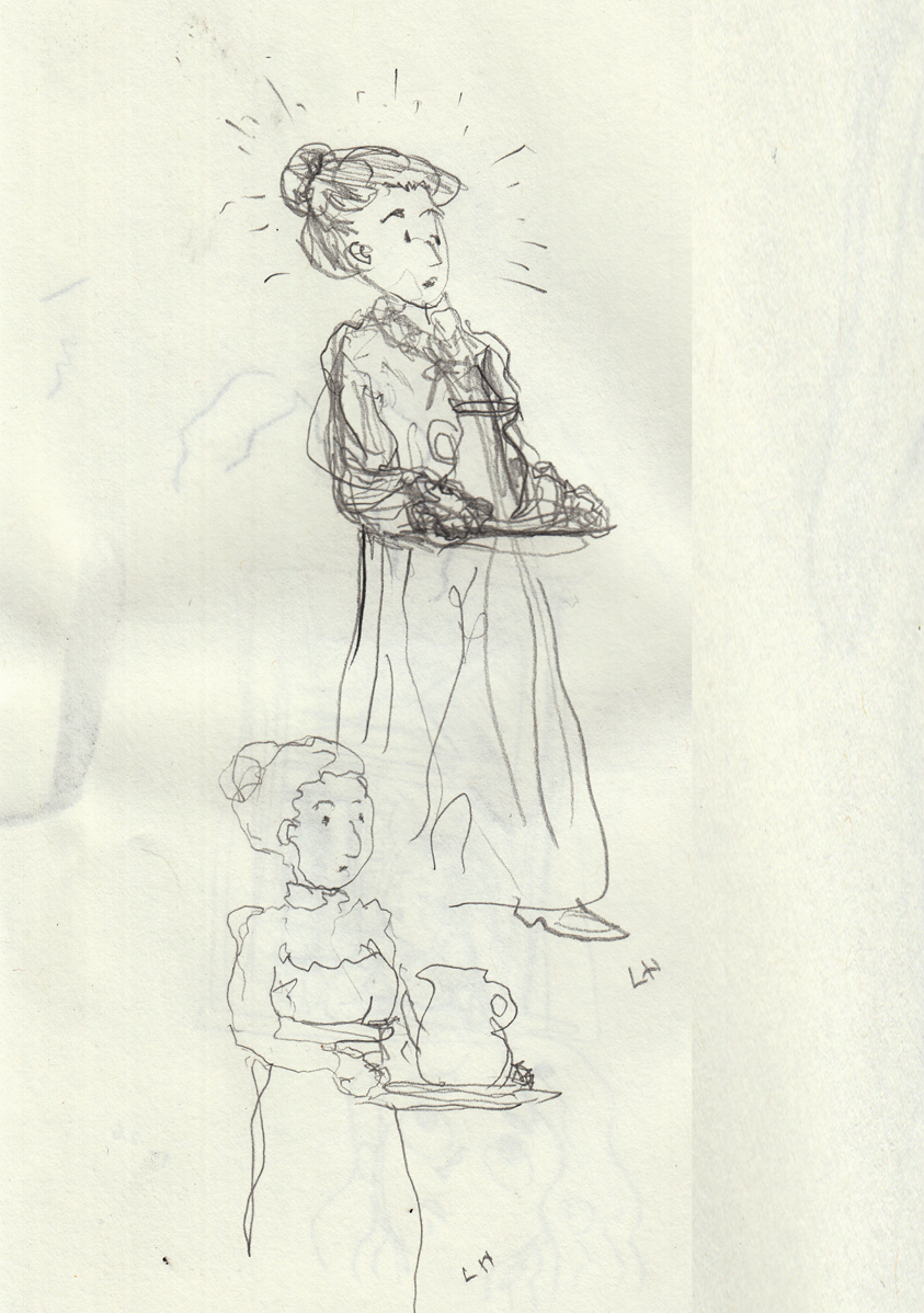
Drawn with left hand; the reaction of the mother on entering on the final page of the chapter.  This was going to be a maid, but I decided to make it her mother, again to play down the idea that she’s wealthy.  There’s no reason she shouldn’t be a wealthy character, but there’s no reason she should either.  So even though it might be more fun to draw a big mansion (and easier to draw a maid’s uniform than figure out what a Victorian-era mother would be wearing in the early morning), I don’t want this story to be about the fantasy of wealth. So mom gets the part.
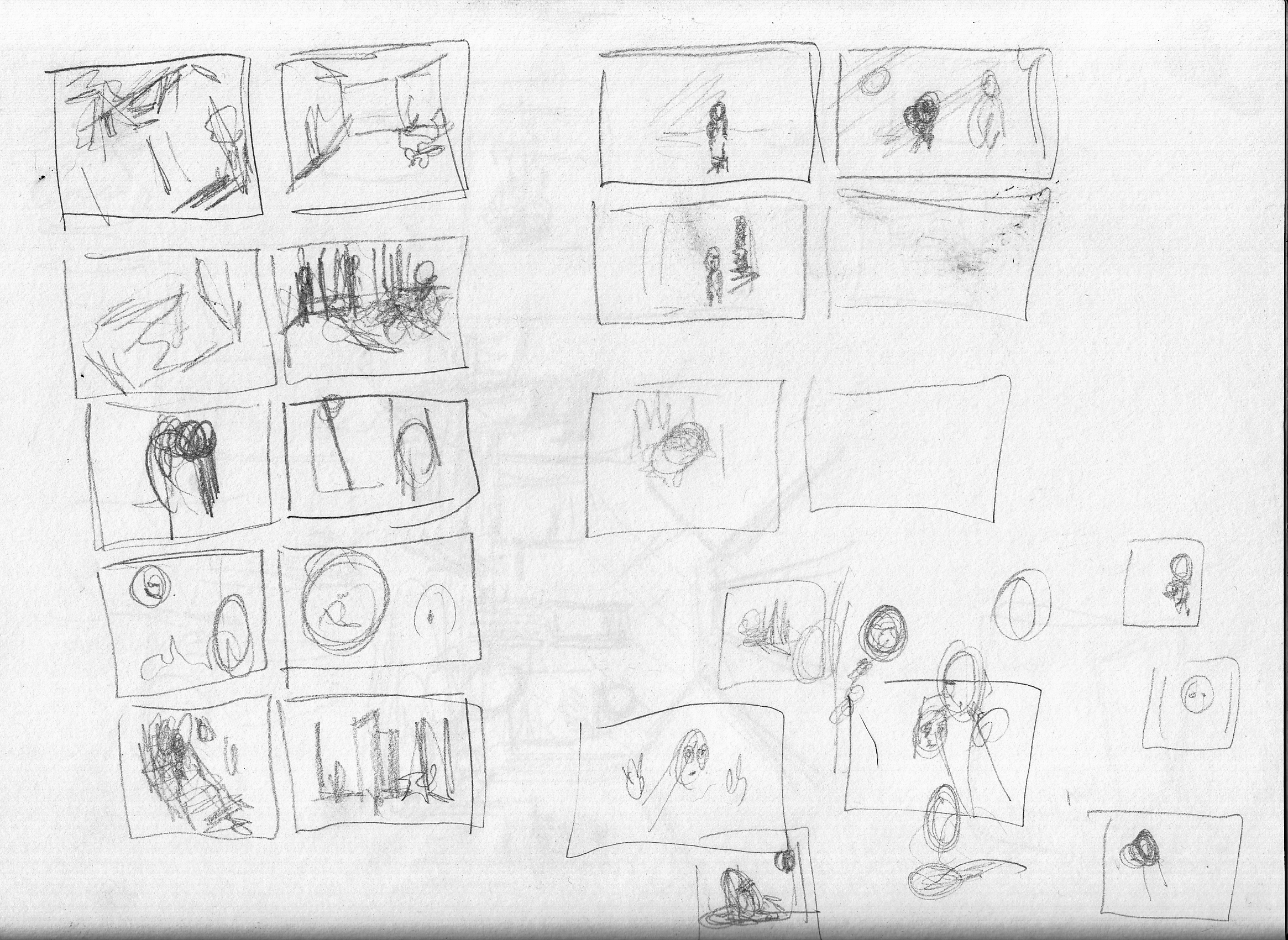
January 25, 2017: more detailed thumbnails; architectural decision sketches
I drew larger thumbnails, so that I could see more detail and get a better idea of the flow from image to image:
One question I’m having is the depiction of the house. Â I started drawing a rather large Victorian stand-alone house. I wanted to differentiate this location from the row-houses in chapter one. Â But I don’t really like the way that defines the character as wealthy. Â I’d rather have her be middle-class, which would suggest that she and her family live in a more modest row house (since they’re urban). So I sketched a block of row houses with hopefully enough architectural differences from the opening scene to make clear we’re not in the same exact location:
Sorry about the bleed-through from another sketch (which I drew with brush pen, the following day).
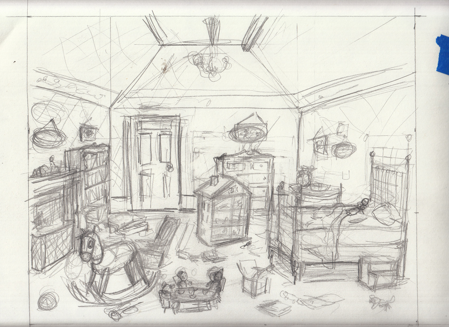
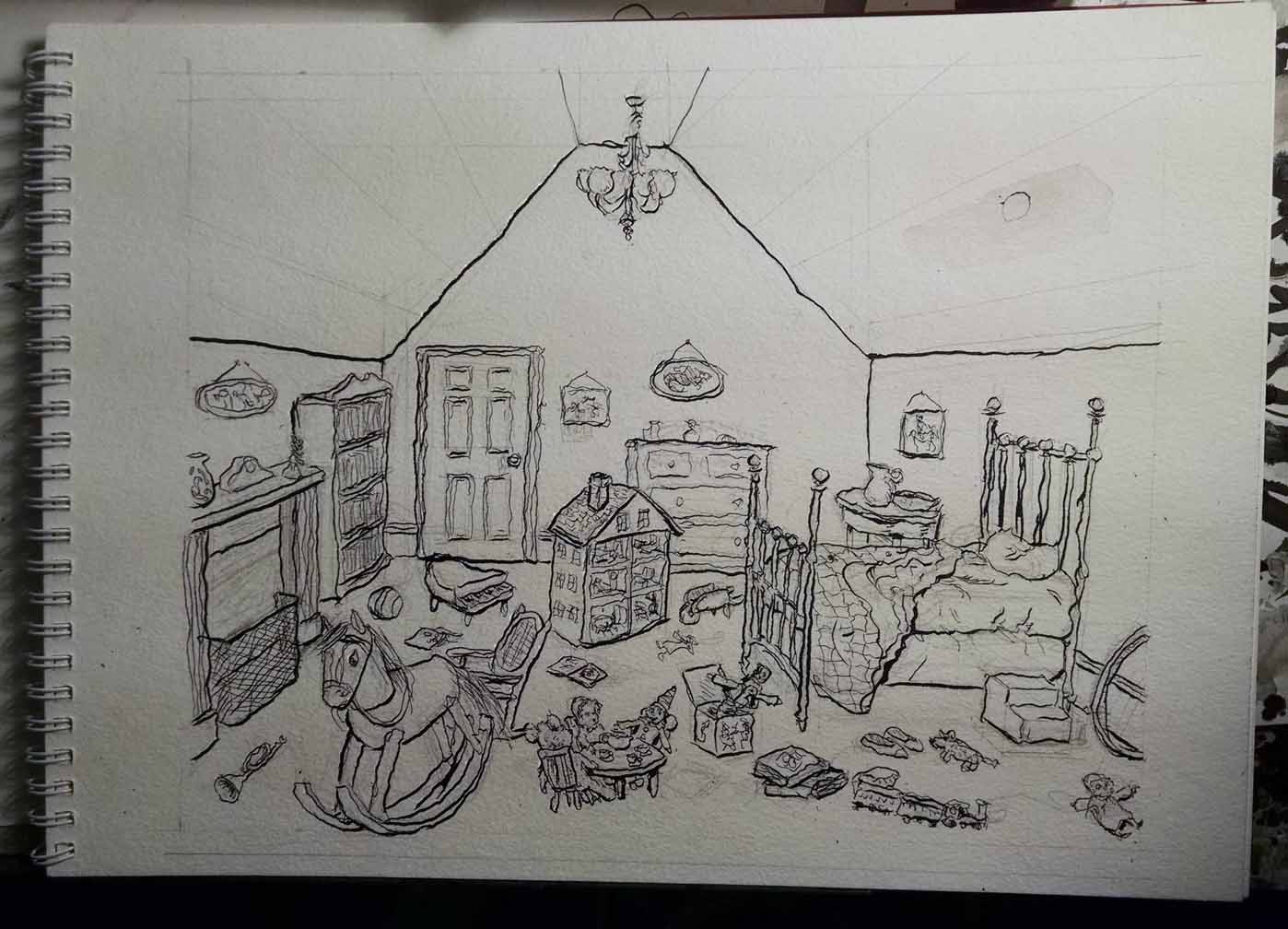
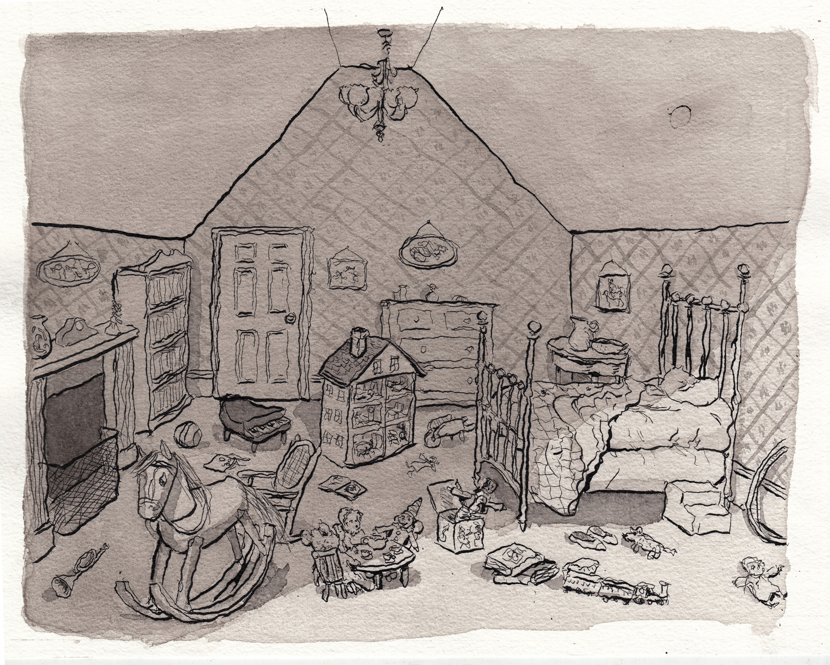
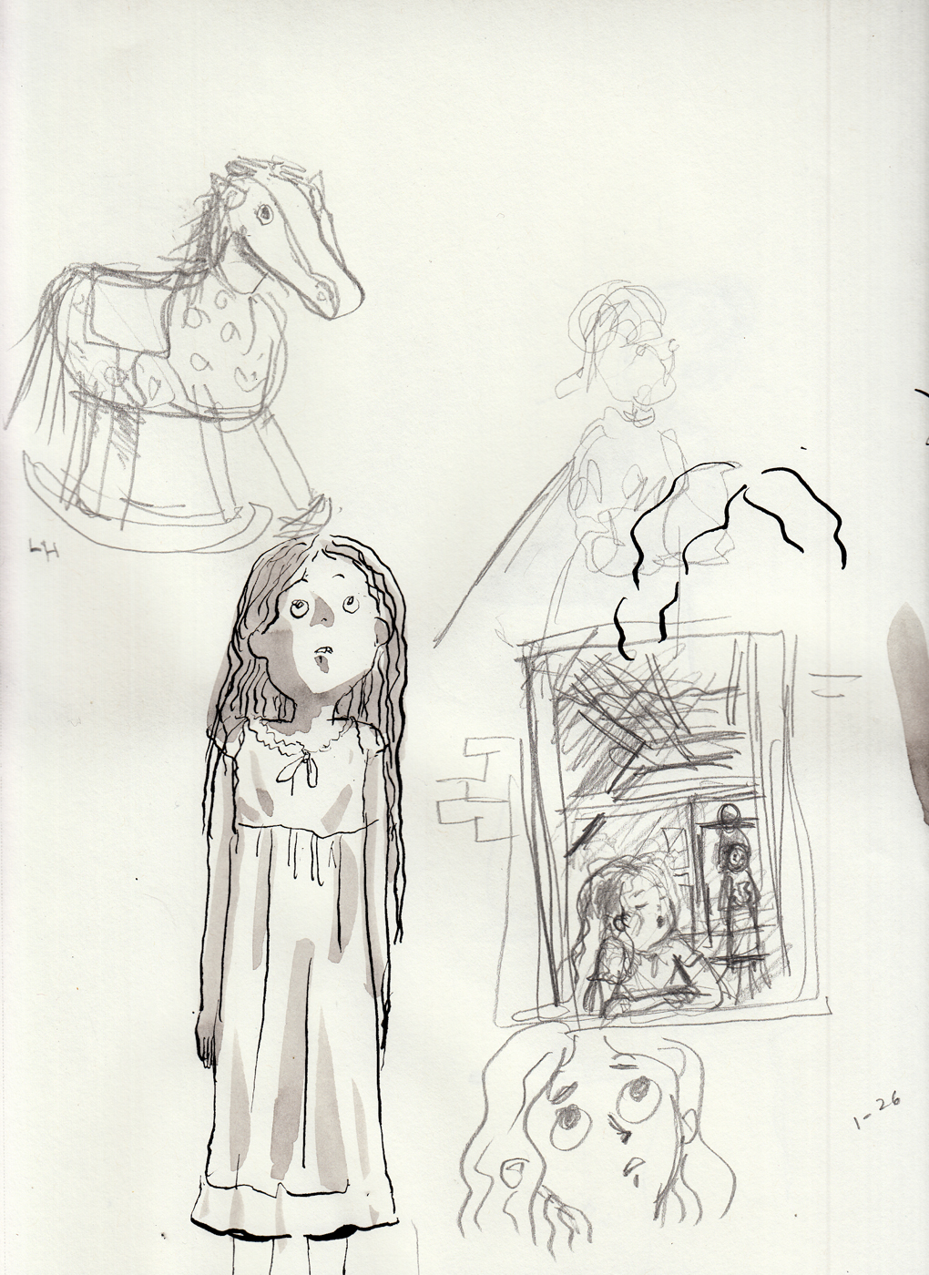
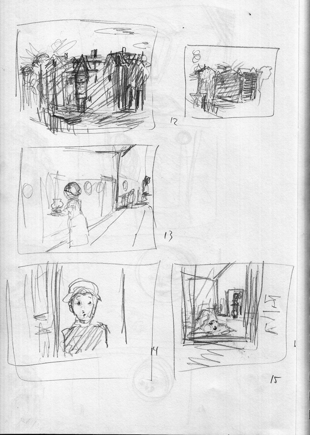
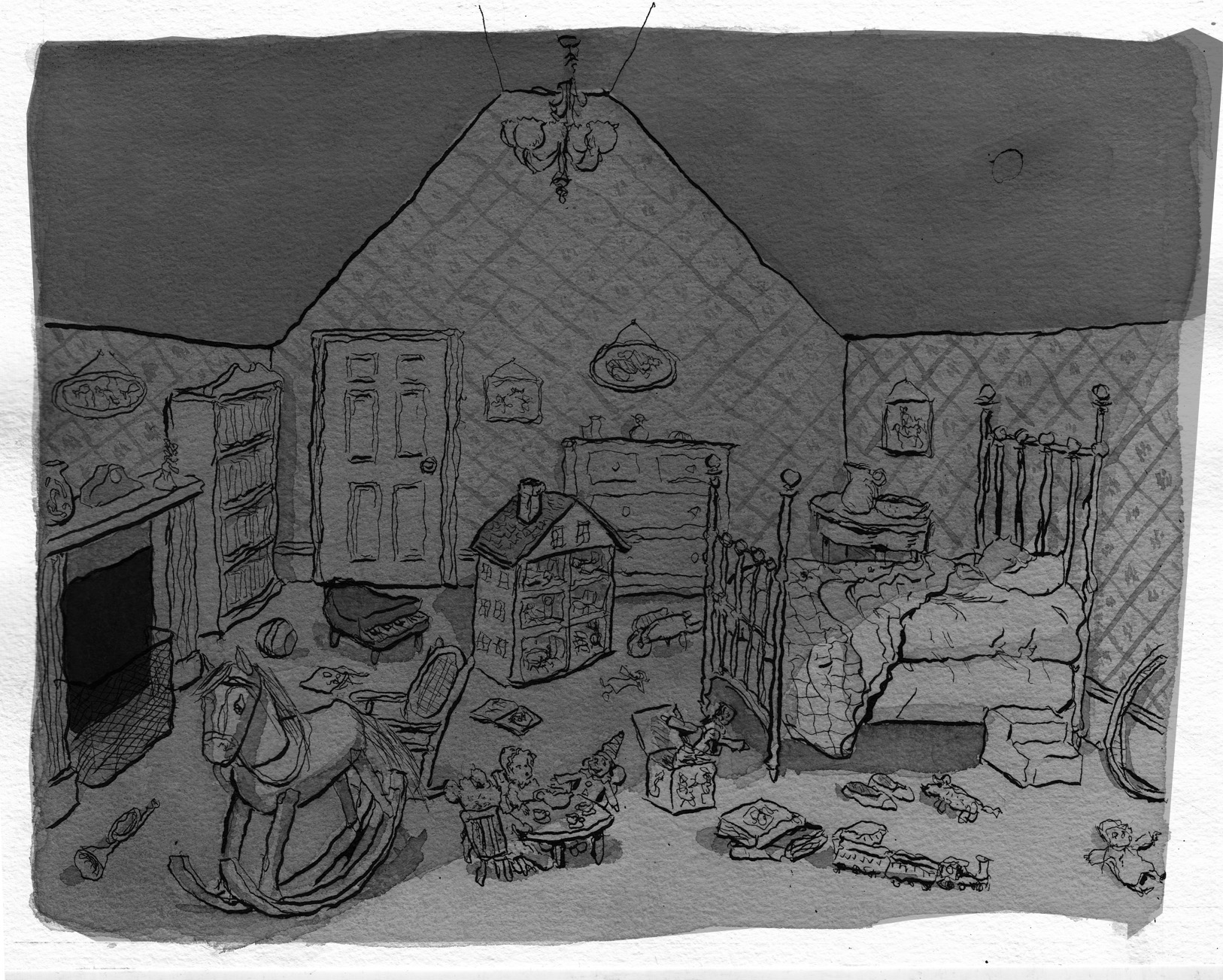
January 24, 2017: Rough thumbnails, reference material and sketch for bedroom interior.
Thumbnails:
Scribbly, yes, but I understand them. Â At this point, I am laying the chapter out at 15 pages. Â For comparison, here’s the thumbnails for this sequence from way back when i first “wrote” the story, a couple of years ago (the character was a boy, then):

Back to the present-day, and here’s some sketching of the location (interior) for this scene, the girl’s bedroom: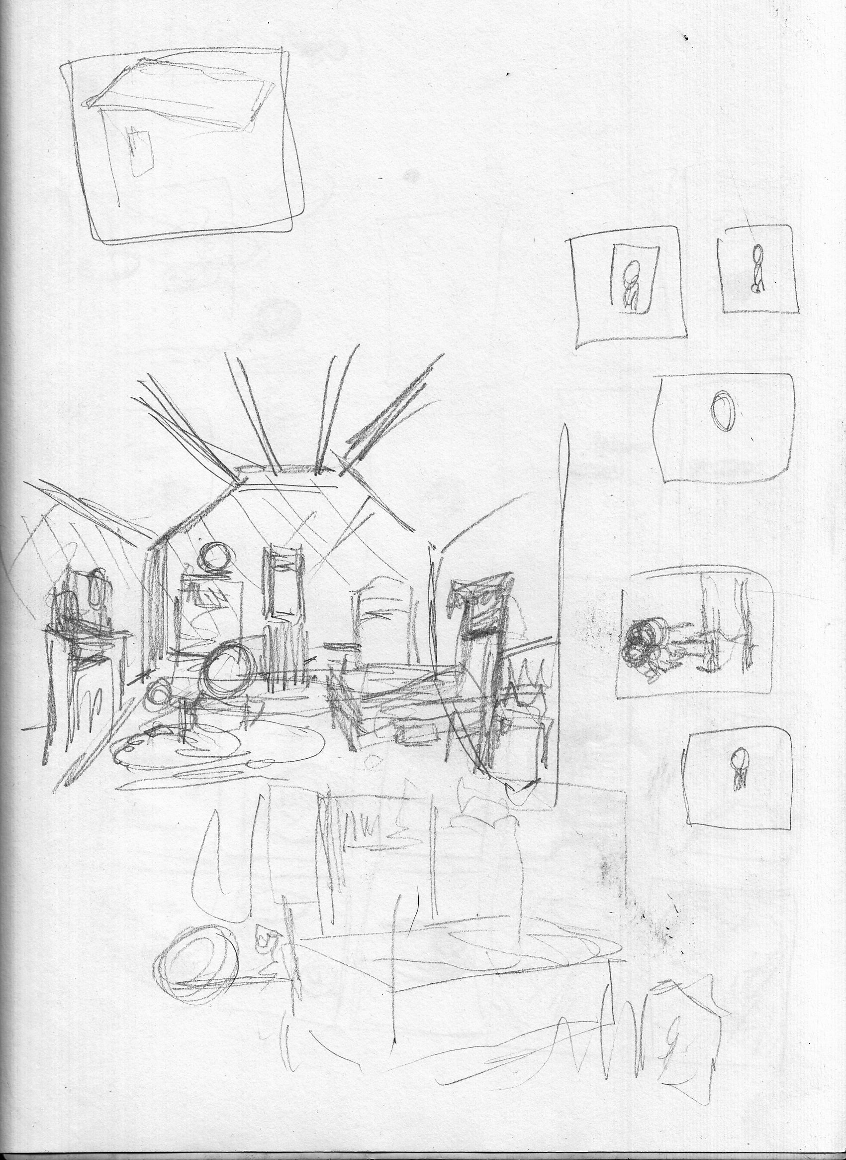
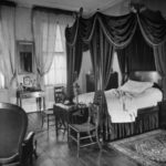
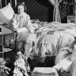
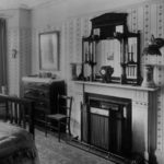
Here is some of the reference images I downloaded for this setting:
Undated (2016)
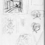
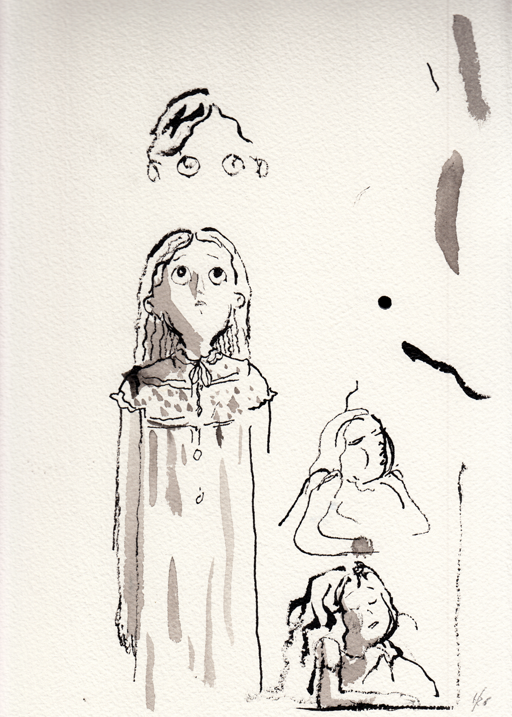
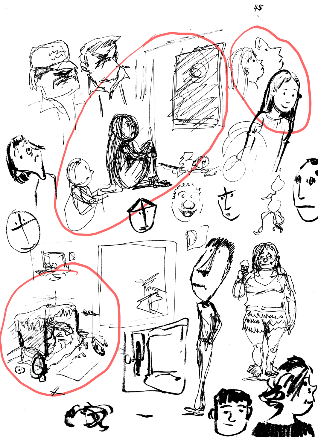
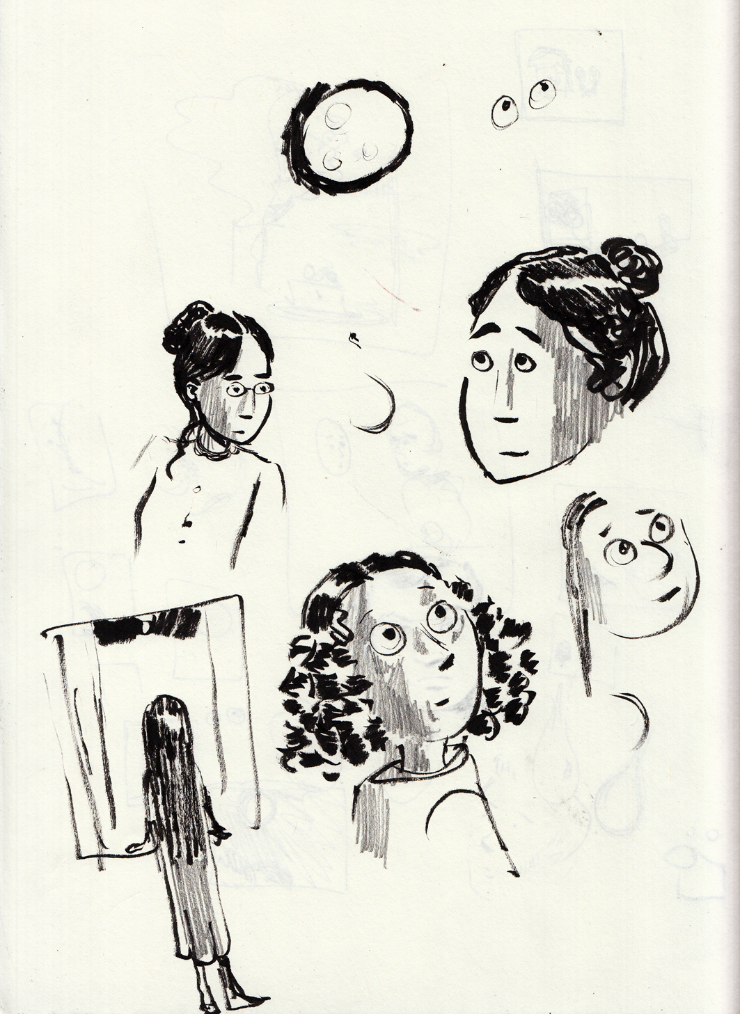
Here’s a  couple pages of doodles from some time back, not sure when.  On the top page, I’ve circled the ones that relate to Lunatic.
I found the bottom page in a pile of papers, I’d forgotten about those drawings. Â It was kind of an important find, because in the intervening months, without realizing it, I’d changed the character’s hair from dark to blonde. Â And I think I’m changing it back to dark thanks to finding those sketches.