Time for coloring, or in this case, gray-toning.
I’m trying not to go too crazy with subtle shading, since I don’t trust the final printing process to pick it all up. Also, the idea for “Outbound” was to have all tones in halftone screen form instead of flat tones (that “rule” has since been relaxed, but I want to be consistent in my “New Kid” material), but my approach is to work in tones first, and then convert to, or replace with, screens.
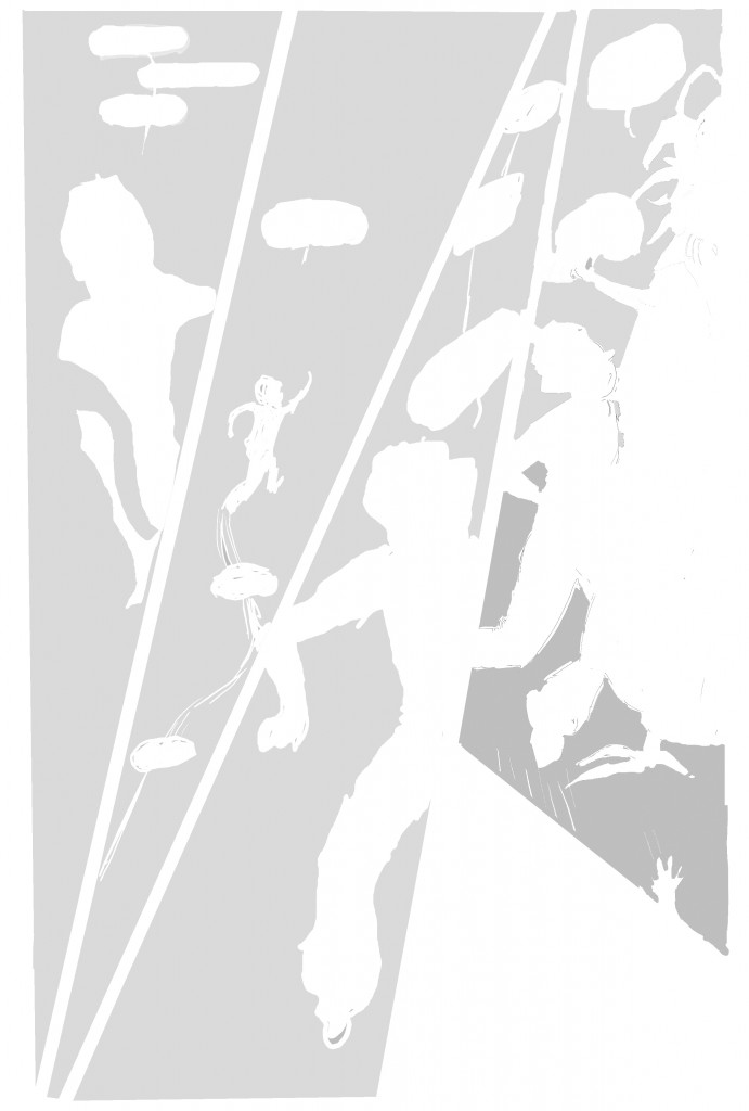
I have a lot of figures in these panels, and I want my main character to stand out, so I decide to put a light tone over the entire background. First I create a new layer, and give it the attribute of “multiply,” ie. transparent. I then select each panel (I like to use the “polygonal lasso” tool for this) and then fill, using the paint can, with a 15% gray. Next, I just go through and erase the areas I don’t want under the gray (Jamie’s figure, word balloons):
I decided the final “thud” panel worked better without the gray background, and I added a little darker gray in the lower half of panel 4, for variety (and to add a slight spatial or shaded dimension to it, I guess).
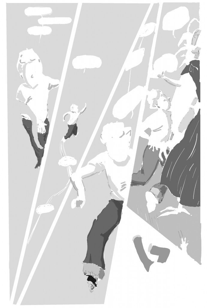
Next create yet another layer, and go in with a darker gray and do some coloring on Jamie’s pants and the creature’s cloak, then some shading in Jamie’s figure (making him a little more 3-dimensional to help stand out from the surrounding crowd):
(By the way, I keep the line art layer visible during all this, of course, so I can see the lines I’m coloring-in or erasing within!)(though it looks cool without the lines, hm!)
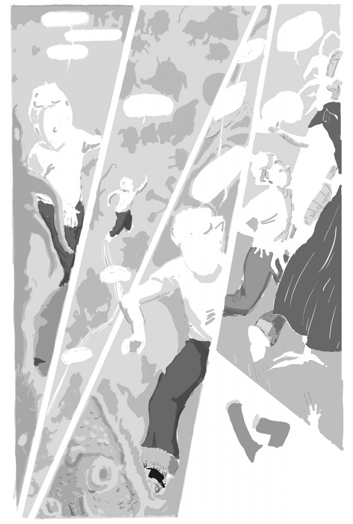
Finally, I don’t want the background figures to be too unnoticeable, so I add another layer of tone to darken them, and some shading on the figures in the foreground: (I’m simplifying actually the layers a bit for the sake of this presentation; in fact, I tend to create new layers for individual figures or groups of small figures, so that if I mess up or change my mind I can easily discard discrete sections of tone.)
This could be the end of the process, but in this case, as I mentioned, I want the page to have screen-tones instead of flat grays, and so…
(Concluded in Part 4….)

One reply on “The Process Behind the Page, Pt. 3 – Tones!”
[…] a Page Pt. 2: Pencils and inks (digital inks, that is)Some FavoritesThe Process Behind a Page, Pt. 1The Process Behind the Page, Pt. 3 – Tones!RSS « Process, process, process and MORE […]