…feeling like a cross between Harvey Pekar and Larry David here.
Lives in: Cambridge, Mass.
Does: comics.
Used to live in: Topanga Canyon, California
But grew up in: Cambridge, mostly
Used to do (maybe still?): Screenwriter, journalist, teaches some too
…feeling like a cross between Harvey Pekar and Larry David here.
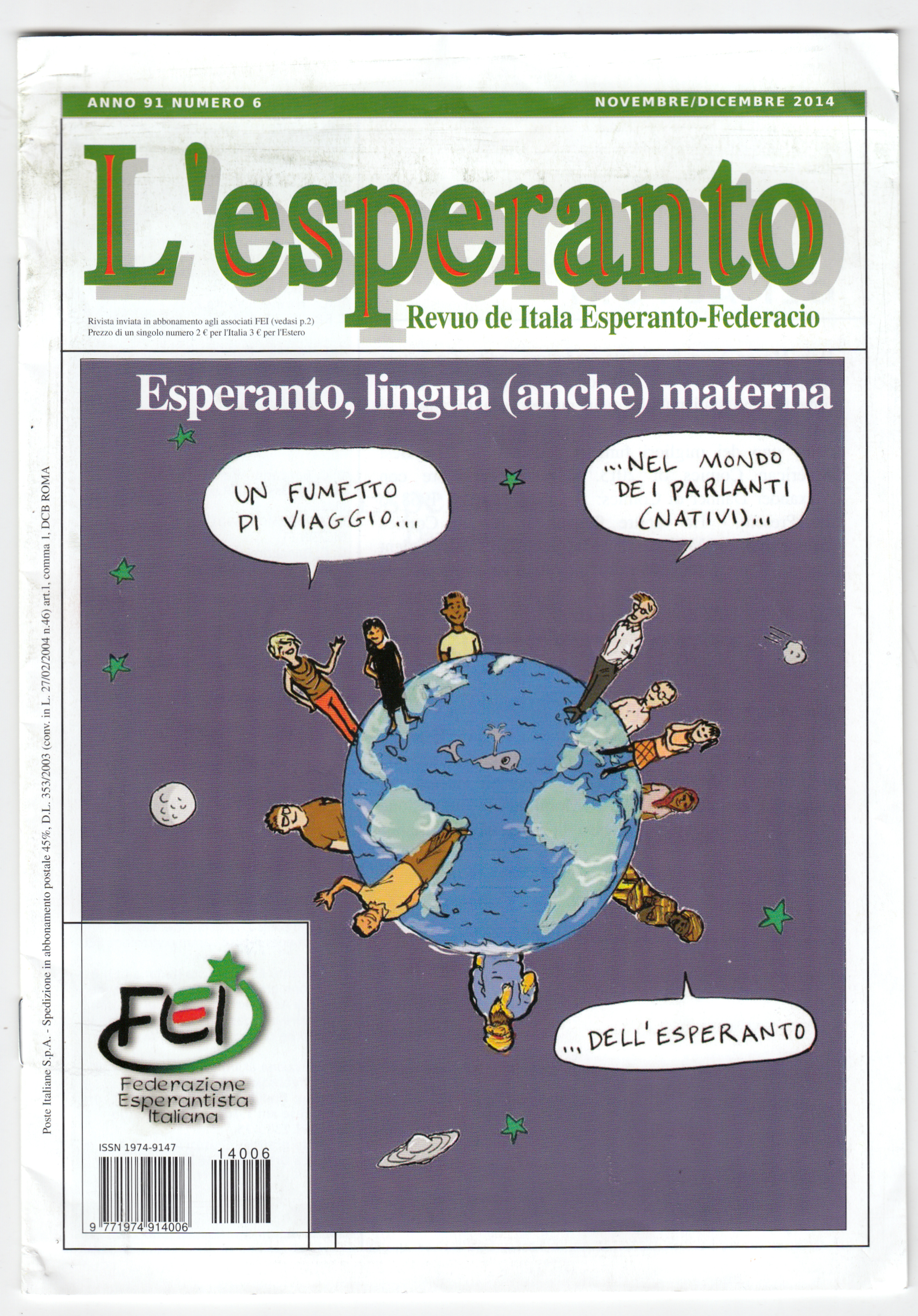
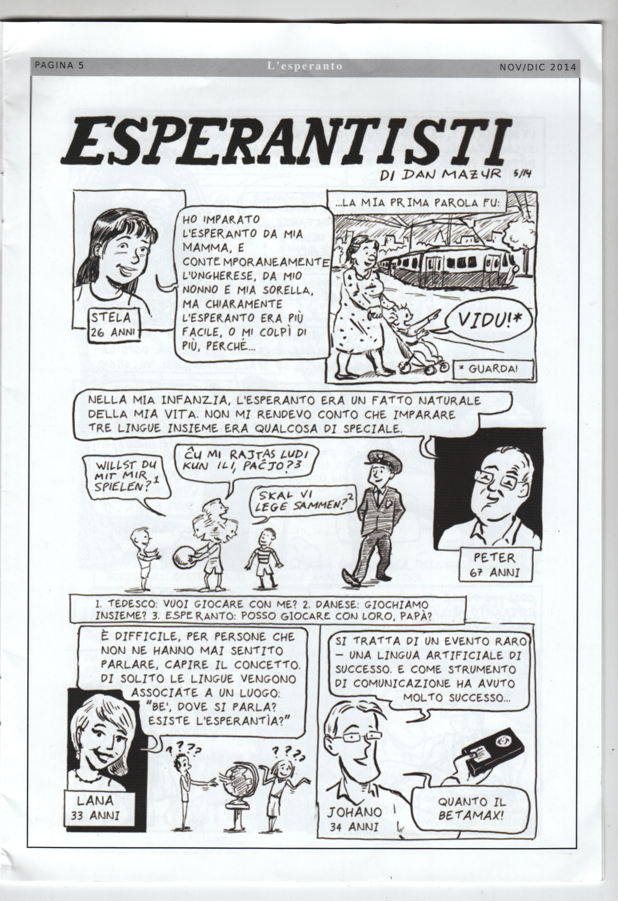
The current issue of L’esperanto, the journal of the Italian Esperanto Federation, is devoted to the comic “The Esperantists” that I did for the SubCultures anthology. Â It’s accompanied by an essay (which I can’t read because it’s in Italian), by Federico Gobbo, who also translated the comic. Â I am thrilled about this!
Too often people ask me, “what have you been reading lately?” and I don’t even remember. So here’s a way to keep track of/share at least some what I’m reading, especially the good stuff. I’m going to see if I can do it on a monthly basis:
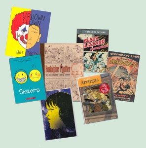
Not the sort of reading month I had planned — little progress in my huge pile of minis and graphic novels I’ve acquired over the last… oh, year, year and a half. Alexander Danner and I were asked to contribute a chapter on “The International Graphic Novel,” for a collection, so I re-read some stuff for that — which is great. Hard to find time to re-read things, but it’s always worthwhile. But I did squeeze in some “first reads” as well…. (read more)
Two new reviews of the book have appeared this week: one by Pascal Lefevre in the online journal Image and Narrative, and one in theaustralian.com by Cefn Ridout.
These are both well written and perceptive pieces, and follow the general pattern of most of the book’s reviews, in terms of both positives and negatives:
Gratifyingly, the critics express admiration for the scope of the task and our success at achieving it. Lefevre says,
“Even with these limitations [that is, narrowing the “global” scope down to Europe, Japan and North America, for the most part], it remains an impressive achievement to tackle the three major comics-producing cultures, North America, Francophone Europe and Japan. Not only the most popular or acclaimed titles of the three regions are succinctly presented, but also lesser-known but historically important works. So, I guess that every reader from every part of the world will learn about several new interesting titles or artists.”
And Ridout: “Where the authors undeniably succeed is in distilling their extensive research into a single volume that places the development of comics in five continents across five decades into a wider cultural context, revealing fascinating parallels, divergences and cross-pollination between the disparate histories.”
Both Lefevre and Ridout also mention specific points they agreed with.
Lefevre liked that “the authors rightly state that demographics played an important role:
the postwar baby boom created a mass of children’s comics readers in the 1950s and one they became teenagers and young adults, in the 1960s, they were accustomed to reading graphic narratives and they were ready for graphic narratives with more adult aspirations.”
Ridout mentions a few “enjoyable discoveries” of previously unknown work, such as Pazienza, Oshima, Neaud. That, for me, is what it’s all about!
On the negative side, there’s been pretty much unanimous critical agreement, of course, that the ambitions of the project necessitate some omissions, and each critic will point out those that they feel are the most egregious. In almost all cases, these complaints are perfectly valid. For Lefevre, it’s the thin coverage of newspaper strips, and also the relatively small number of source citations.
Ridout points out that our acknowleged focus on artistic rather than commerical importance “creates a somewhat skewed, auteurist history that overlooks writer Stan Lee’s equally pivotal role alongside artist Jack Kirby in attracting college-aged readers to Marvel Comics in the 60s and the impact of mainstream publishers embracing non-anglophone artists and writers since the 70s.” Fair enough.
Ridout, with a sensitive ear for tone, also catches the uncharacteristically “sombre” mood of the final chapter, in which Alexander and I succumbed, perhaps, to a little bit of a “good old days” quality in musing on the decline of the fictional graphic novel in recent years. That’s a criticism that hits home, since I don’t think either of us really feels, or wishes to convey, a negative judgment on contemporary comics!
DECEMBERÂ 2014
I Â didn’t read a whole lot of comics this month, compared to previous months. Especially not a lot of minicomics. I think the only minis I cleared from my huge “to-read” pile were:
 |
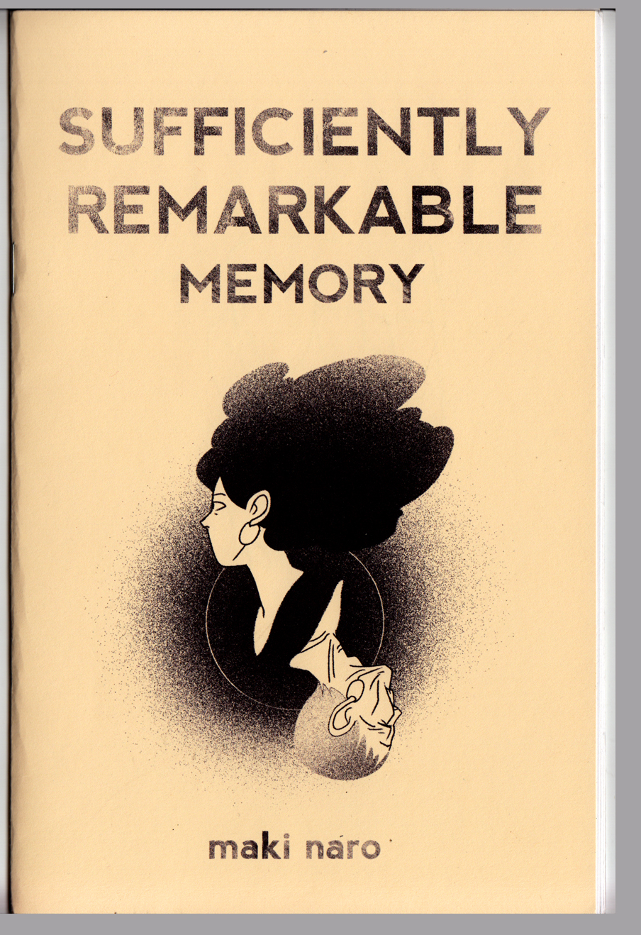 |
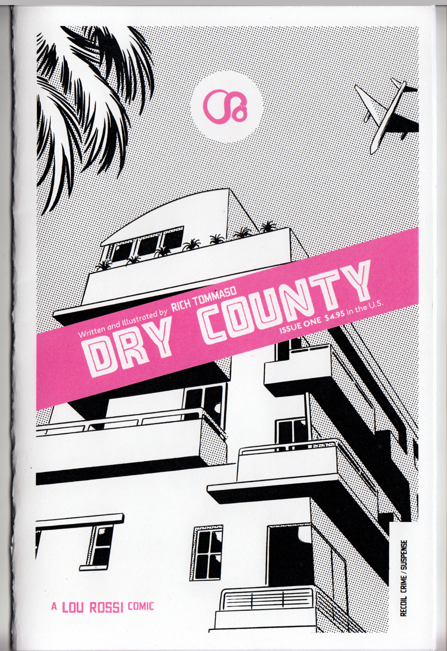
| Dry County by Rich Tommaso. I’ve always liked Tommaso, who works in the alt-comics tradition of Dan Clowes, Charles Burns, David Mazzuchelli et al.; his work has a similiar style and themes to those guys but has never hit it big with a graphic novel (yet). This one is a Florida-set noir-ish mini about a down-at-the-mouth cartoonist (what a surprise) and a femme fatale with some fucked-up baggage (it’s chapter one, I think the series runs on Act-i-vate, but I’d rather find the next mini). (update: I ordered it from him online at http://recoilcomics.bigcartel.com/) | Sufficiently Remarkable: Memory by Maki Naro. A mini I got at MICE 2014. Another one that comes out of a webcomic, it’s a touching little comics poem about the protagonist’s grandfather’s failing memory. |
I spent some time this month catching up on a few of the GNs that got a lot of attention this year, including a couple that made a lot of the “Best of the year” lists:
 |
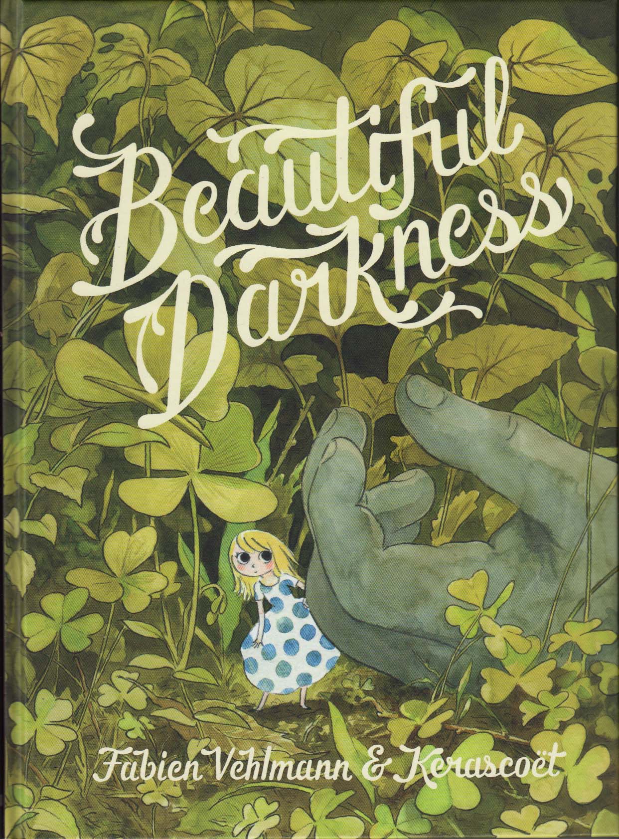 |
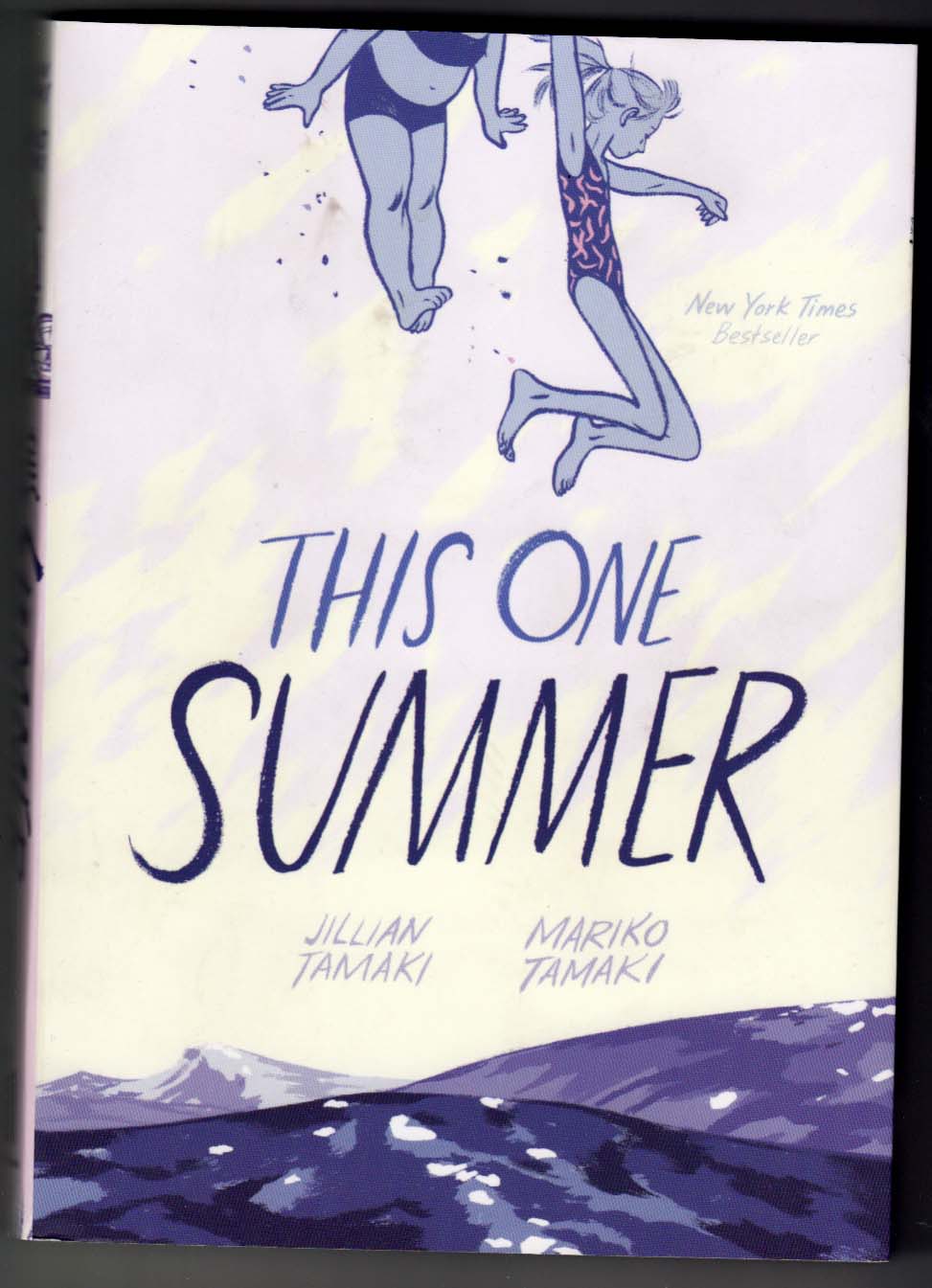
| That One Summer by Jillian Tamaki and Mariko Tamaki. This made nearly all the top-ten comics and graphic novel lists I saw. I agree with the hype. It’s beautifully drawn: the dry-brush strokes she uses to draw hair, and the fluid curving brush lines that describe cheeks and jaw-lines linger in my mind. The story involves a series of relationships as seen through the eyes of a tween-age protagonist, and the themes of adults (or teens) grappling with responsibility/parenthood/sex is developed with subtlety and nuance; it doesn’t feel like “YA.” | Beautiful Darkness by Fabien Vehlmann & Kerascoët. Another one that showed up on all the end of the year lists, I’m not quite as on board with the hype here. The book is gorgeous, drawn in watercolors; as pages, this is fantastic comics-making. And though the premise of the story is intriguing and original, I found it repetitive and ultimately mean-spirited and a little pointless, indulging in morbidity and cruelty without much nuance (note: I read it in the English translation). But I’ll open up the book with pleasure to look at any random page. |
 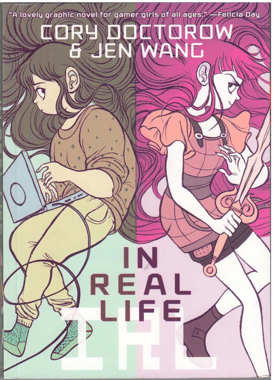 |
IRL (In Real Life) by Jen Wang and Cory Doctorow. One ends up reading a lot of YA material when you’re into comics these days, because there’s so much of it, and that’s where the paying work for good artists is, I guess. IRL makes a good compare/contrast with That One Summer; the art is equally wonderful (and similiar in style; the coloring is fun too), but this is YA that feels very much like YA. It’s a positive message for kids, but simplistic as well. So simplistic, in fact, that I wonder if its positivity is really meaningful at all, since it never questions the assumption that relating to other players/avatars in online gaming is as or more important as relating to people IRL. |
Then, two great kids’ adventures in space comics, made on two different continents, 75 years apart, but seem to me to have a certain kinship:
 |
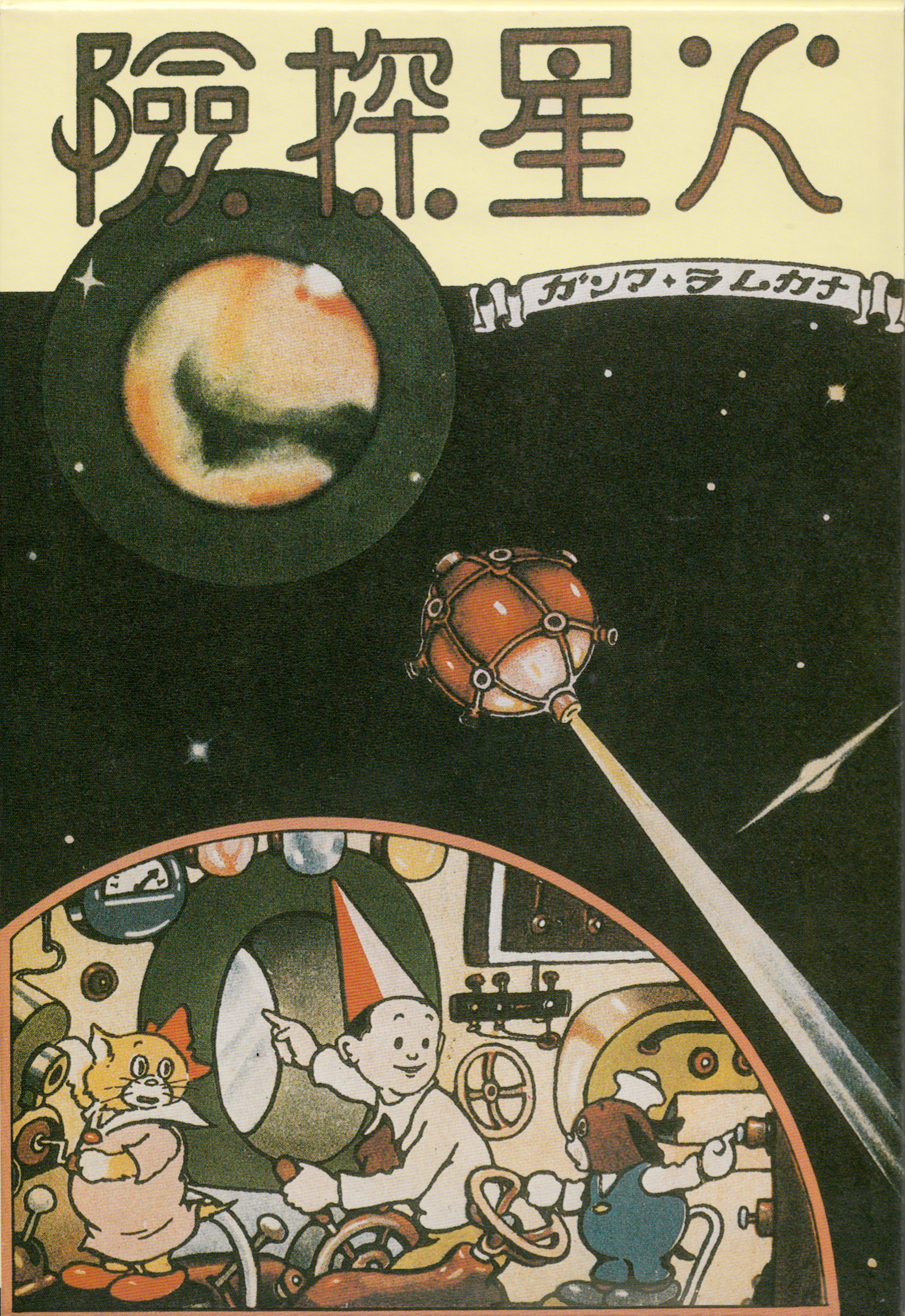 |
|
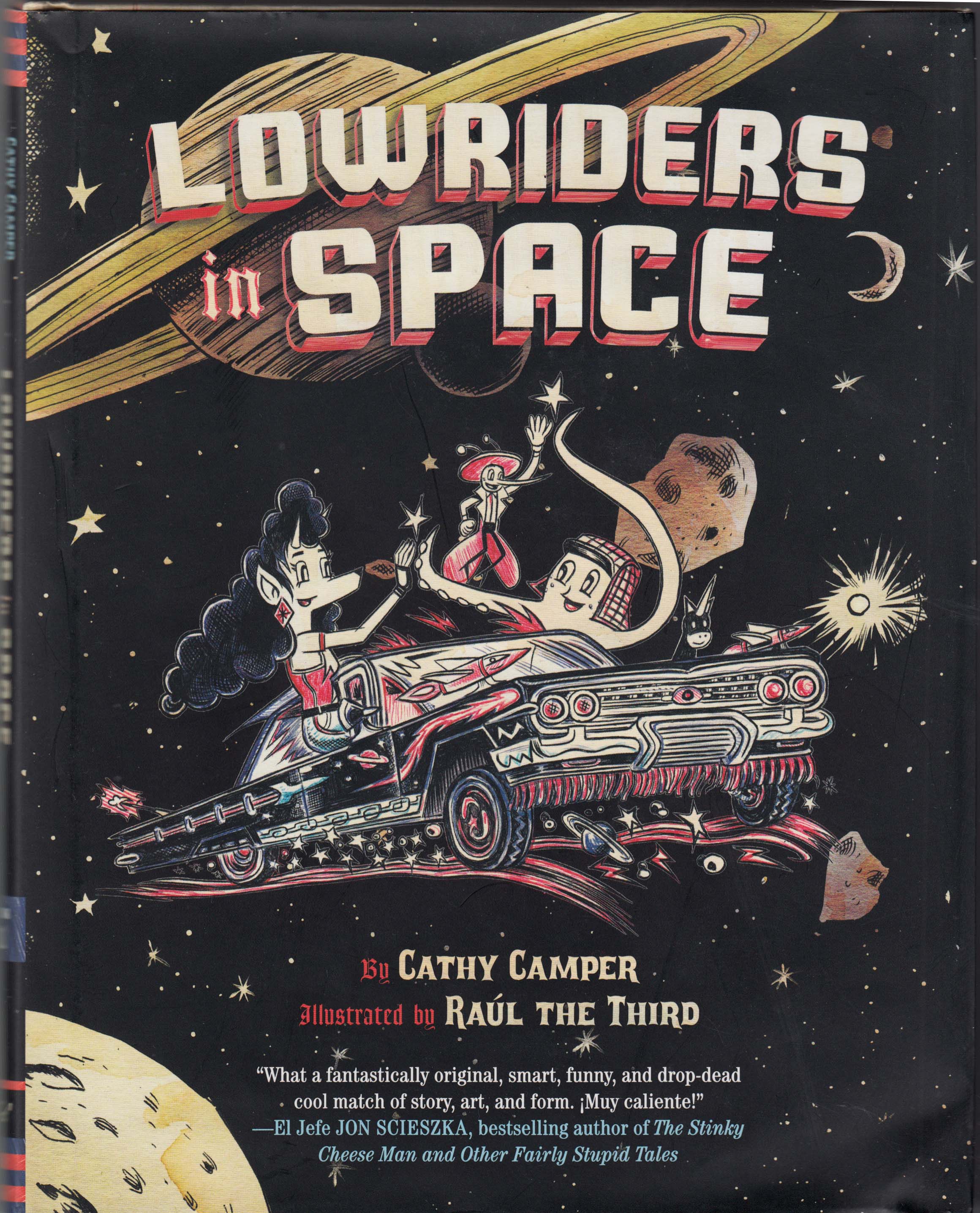
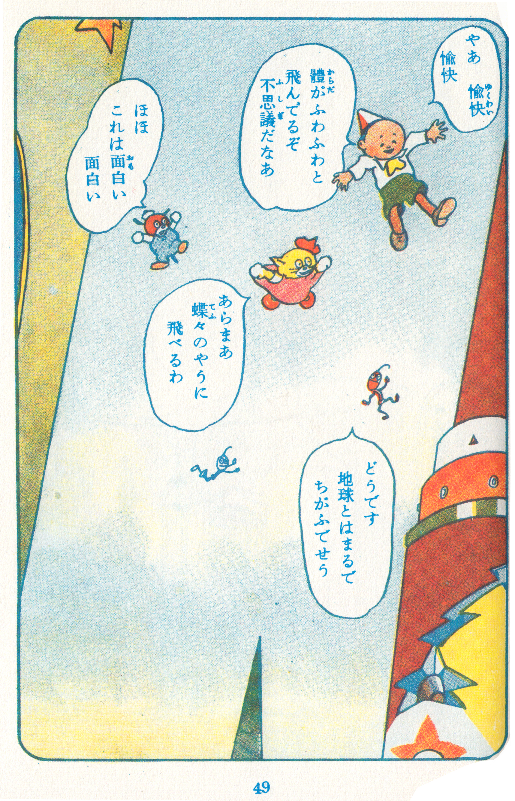
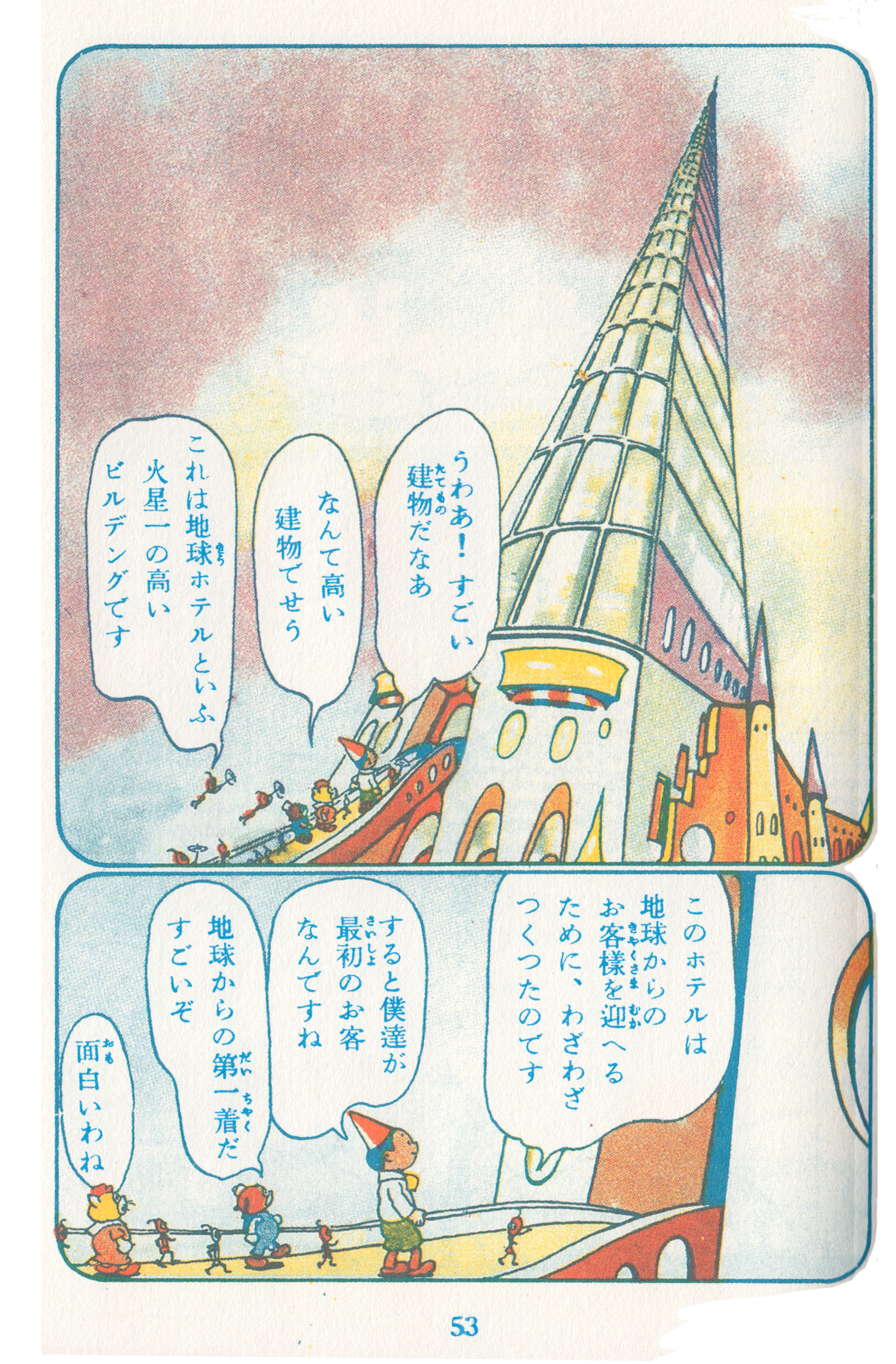
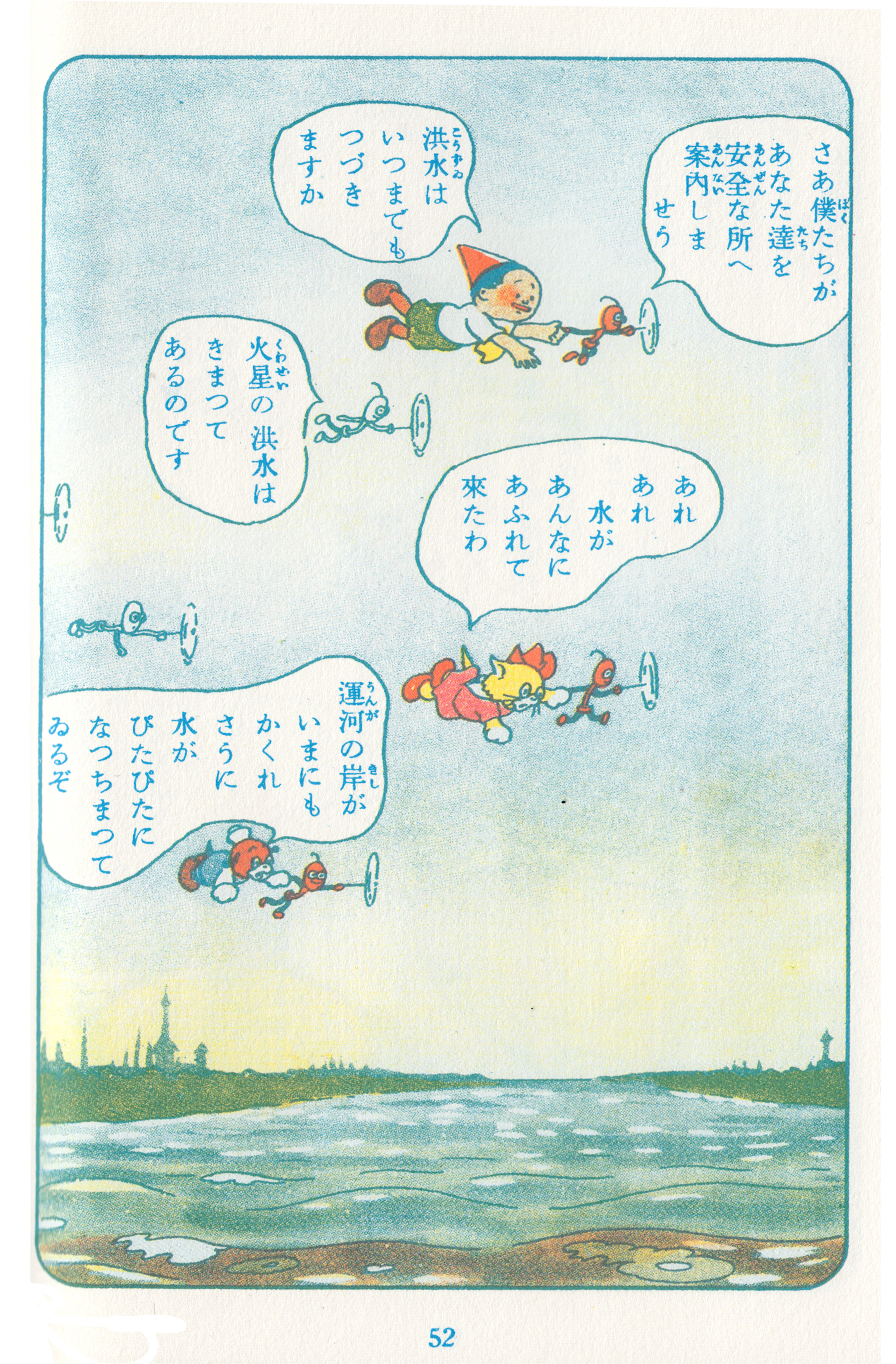
| Low Riders in Space, by Cathy Camper and Raúl the Third (Somerville-via-El-Paso’s own Raúl Gonzalez). This has to be one of my most-anticipated comics ever, and I wasn’t disappointed. A crazy, goofy kids’ adventure, funnily written by Cathy Camper, with the added appeal of joyous multiculturalism (including lots of Spanish expressions and an appreciation for low rider culture). But what makes this book sooo great is Raúl’s art; there’s really nothing like it in comics, like a combination of Fleischer cartoons, Big Daddy Roth, grafitti art and psychadelic notebook doodles, with a beautiful/cheap aesthetic (all drawn with Bic ballpoint pens), on paper that looks like it’s been soaked in coffee. The characters are lively, cute, weird and rubbery, but at the same time he has a perfect sense of form and composition, color and movement that make every page a delight. | And if re-reading counts… (which it does, because I say so)…Kasei Tanken (Voyage to Mars), art by Noboru Oshiro, written by Taro Asahi. Beautiful 1940 manga, which I read in the facsimile reprint. A scientist’s son and his talking dog and cat have adventures on Mars (actually, it’s all a dream). I can’t read the Japanese, but it doesn’t really matter – I follow along with a synopsis, and mainly just read the pictures. There’s a very long sequence where the trio eats some tomatoes that make them sick, and then spend a long time in a Martian hospital. | |
| Here are some great pages from Low Riders in Space (click to enlarge): | ||
 |
 |
 |
| …and from Kasei Tanken: | ||
 |
 |
 |
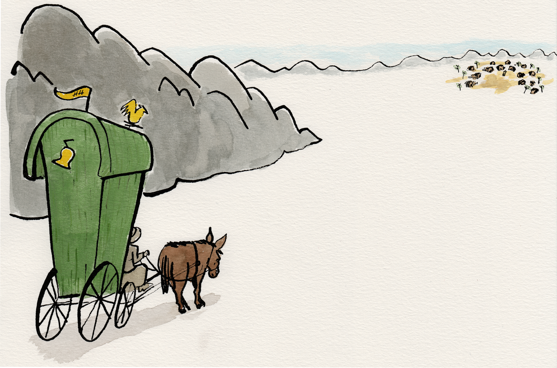
| Finally, there was Bidouille & Violette by Bernard Hislaire… | ||
 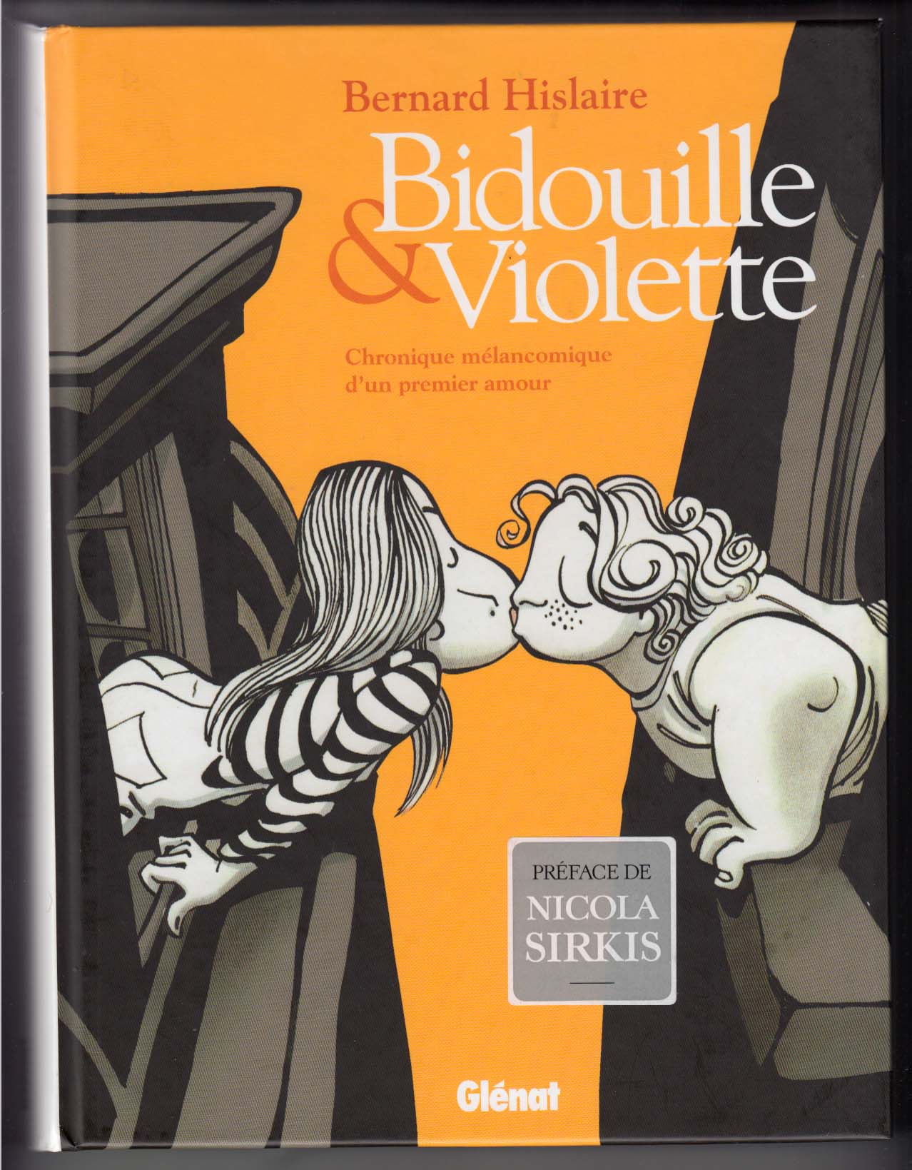 |
A complete collection of a relatively minor series that ran in the journal Spirou between 1978 and 1985. Though the strip appeared only sporadically during its brief life-span, it seems to have made an impact on readers of the time, in part for being the first strip in the venerable, juvenile Spirou, that broke from traditional genres of action and humor, and focused instead on a relationship: a “melancholy chronicle of first love,” as the sub-title describes it. |
It doesn’t come up in any of the histories of Franco-Belgian comics that I’ve read, but I saw this page online while browsing original art sites. 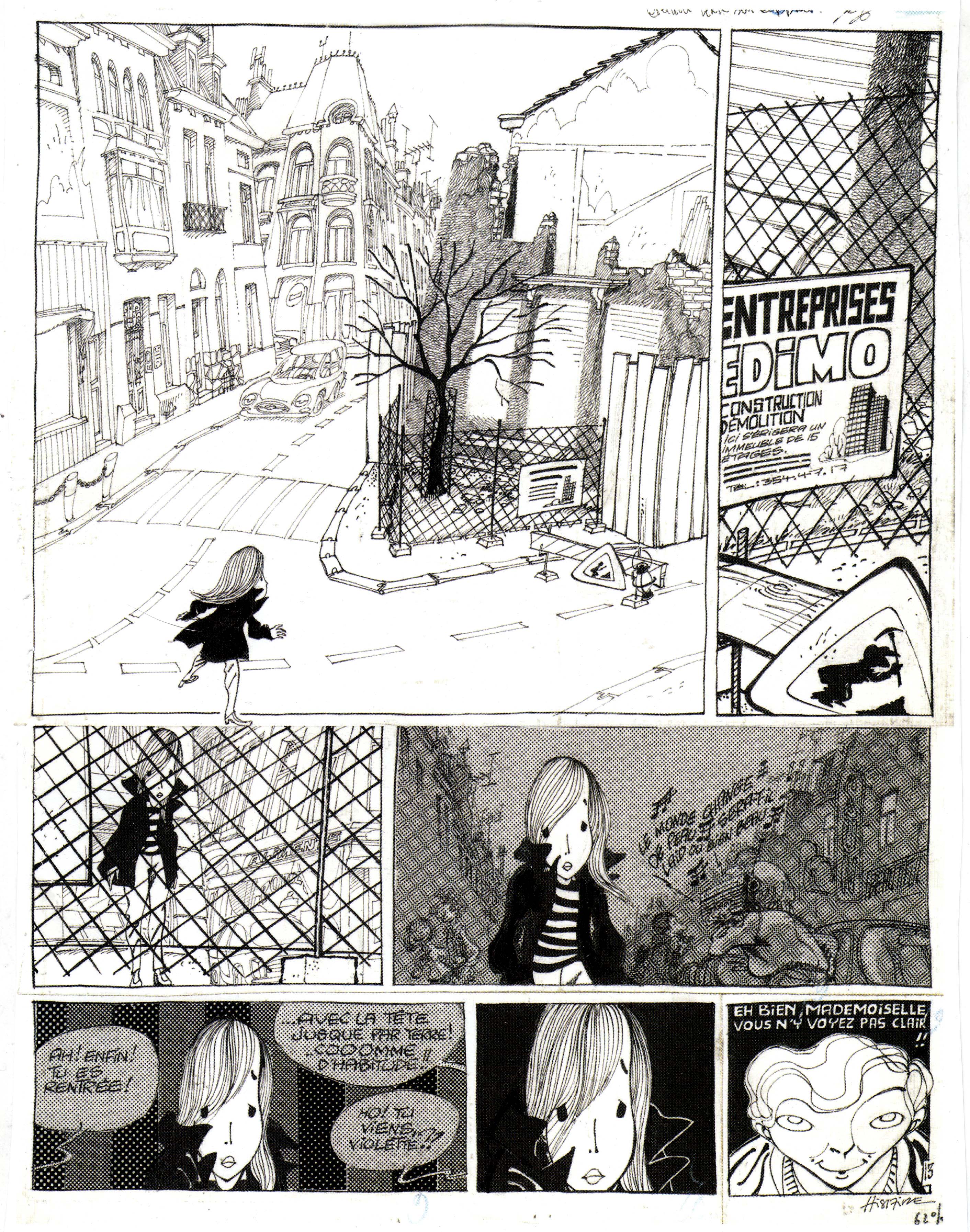 I was intrigued by the unusual line-work and atmosphere, the drama created by the page, the way he draws the hair and the weird eyes. Â The page stuck in my mind, and after some months of vacillating, I sprang for the collection from Amazon France.
The love is between two shy teenagers in a provincial French-or-Belgian city (the fictional town of Mayon, so that the inhabitants can be referred to as Mayonnaise, *chuckle*), their innocent youthful passions somewhat inexplicably foiled by un-supportive parents. At first, I found the comic a little too twee, but by the end of the book, which comprises material that made up four albums, I felt positively about it; it’s rather uneven, perhaps reflecting the youth of its artist-writer Hislaire (just 21 years old when the series began). The early chapters do verge on twee-ness, as we meet the tender young proagonists and follow their halting progress toward young love. There’s a lot of graphic energy and inventiveness, though: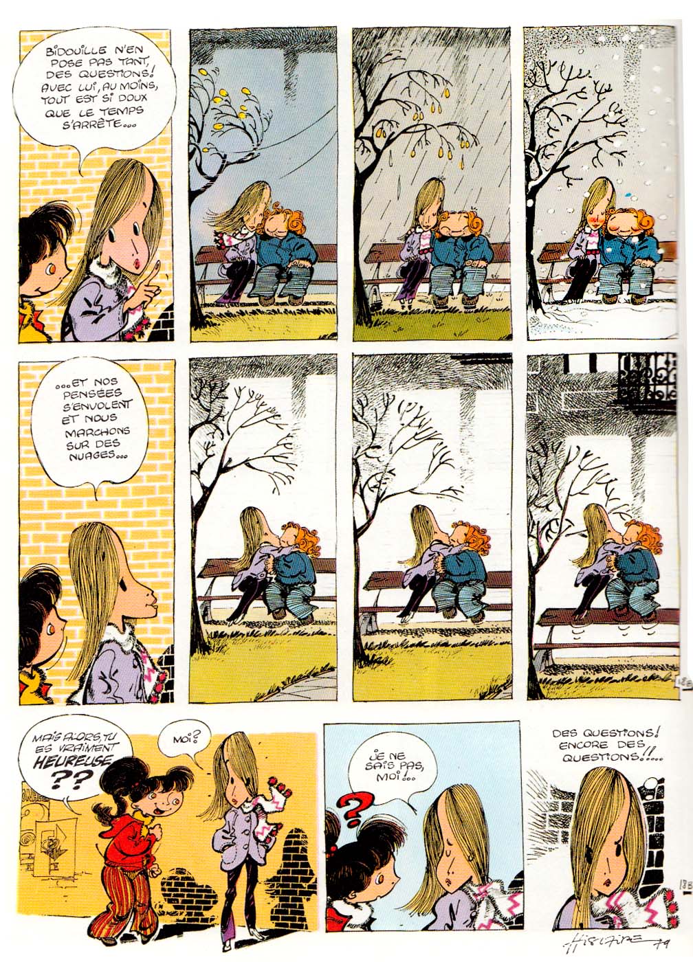
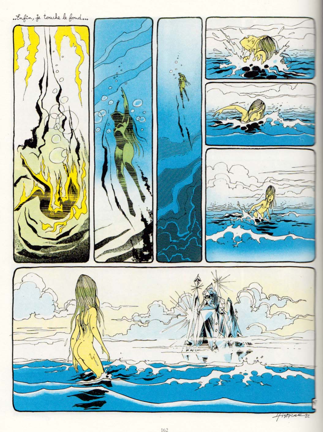
Then there are some episodes of misunderstandings and jealousy, from which we veer into a psychedelic dream sequence that takes up nearly a full album…
 …followed by a slightly absurbist episode of B & V going on an urban “mountain climbing” adventure over the roofs of the town. Â
…followed by a slightly absurbist episode of B & V going on an urban “mountain climbing” adventure over the roofs of the town.  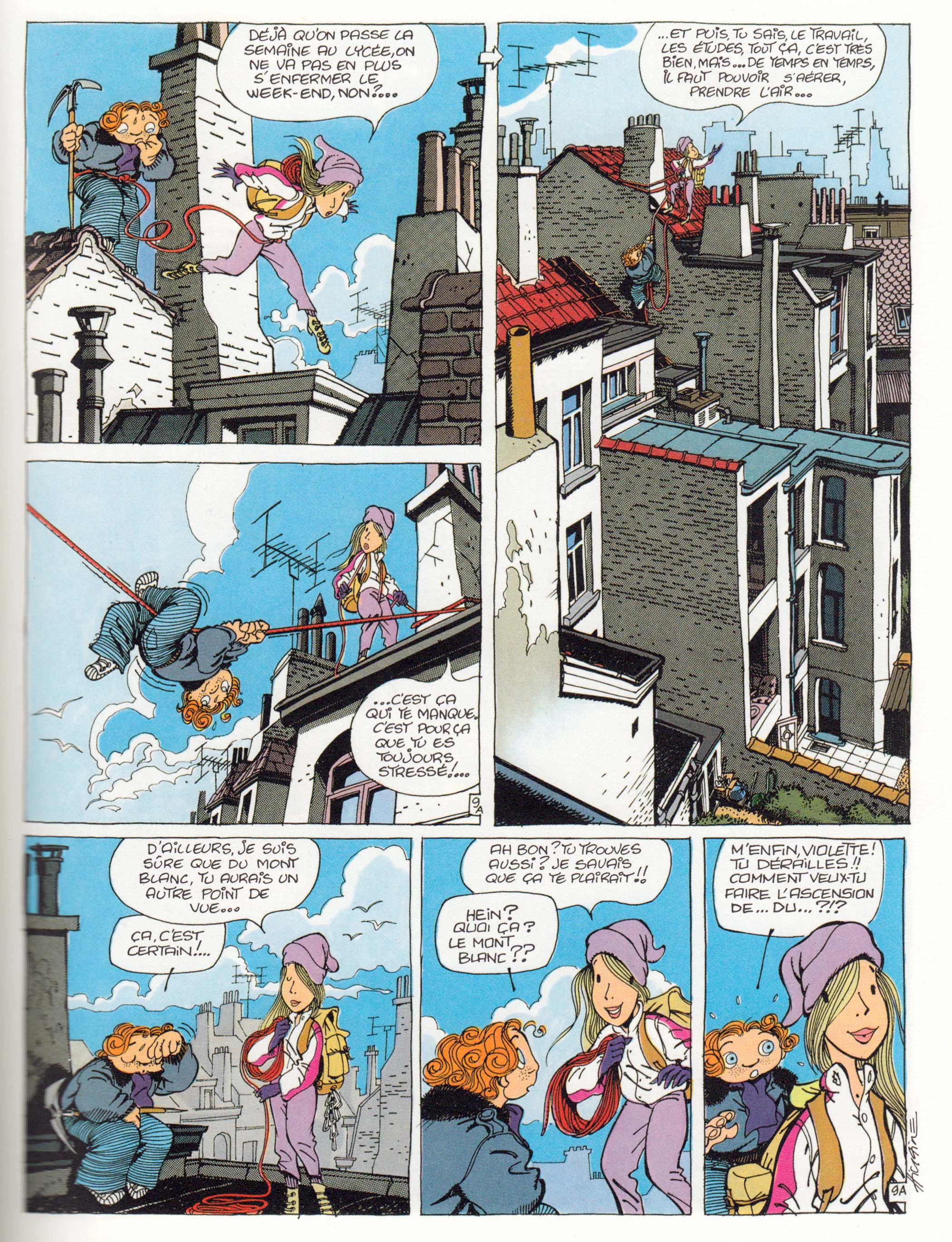 Finally the story resolved by invoking Romeo and Juliet for a surprisingly dark conclusion.
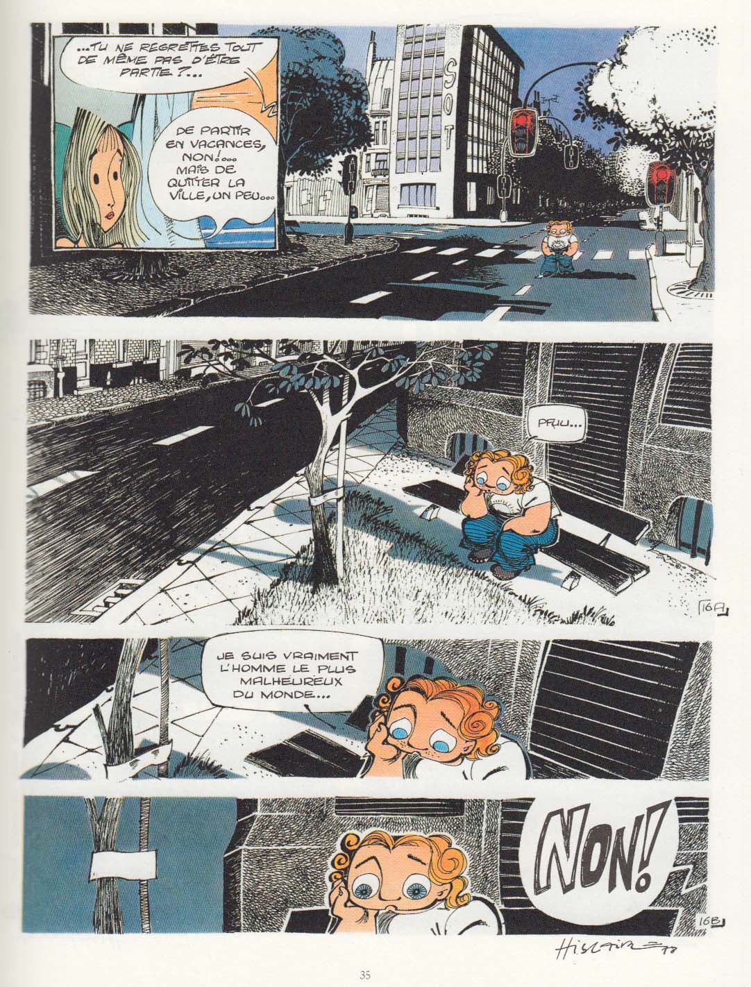
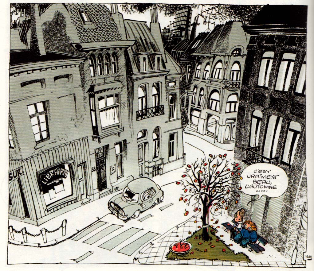
Despite this somewhat flailing approach to story, there’s a sincerity and intensity of feeling that I bet accounts for the fond memories it inspires in those who read it as adolescents. Throughout it all, I remained fascinated by Hislaire’s style, which falls into neither of the two dominant Franco-Belgian “schools”: the precise, Hergean ligne claire style, or the rounded Andre Franquin-ish look that generally charactertized Spirou. Hislaire favors eccentric shapes for his characters’ heads and figures, a wide variety of types of line and texture marks, all contributing to the loose, askew world he creates. 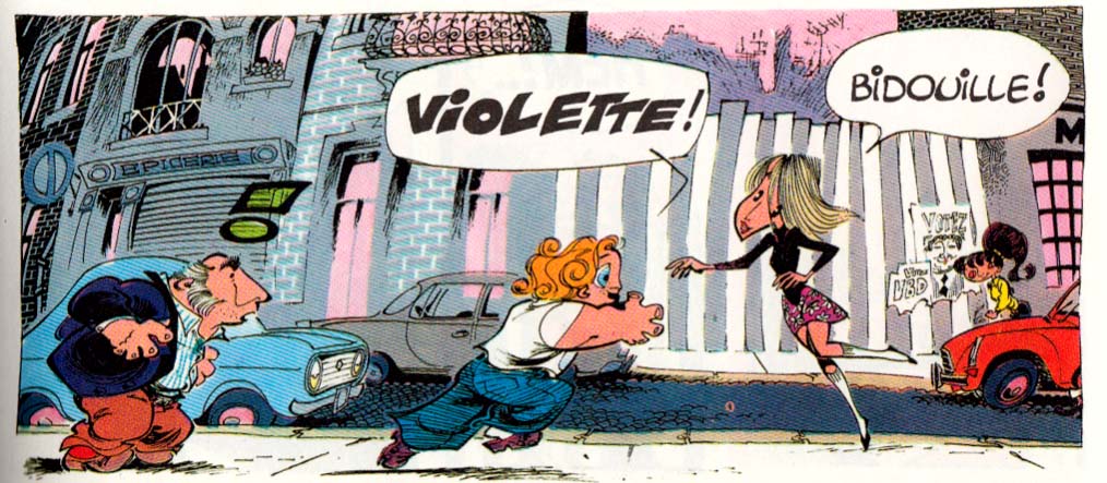  His style (or his graphisme, as the French would say) reminds me a little bit of Fred, the artist of Philemon, though they work in very different modes, of course.(1)
Hislaire especially excels at drawing the settings his characters inhabit and move through, using them to create mood, especially the cityscapes.
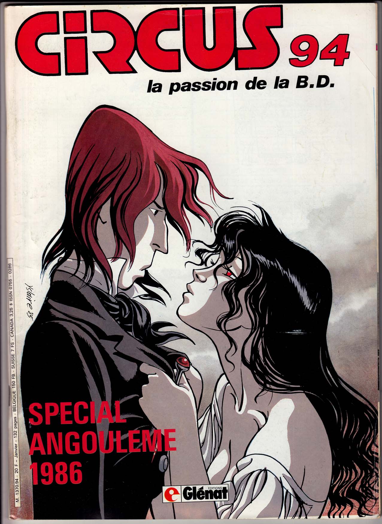
 After Bidouille & Violette, Hislaire launched the series that really made him a bande dessinee star: Sambre, which ran in the new journal, Circus. Very very different from B&V, a more serious and adult romantic adventure, set against the French revolution of 1848, and drawn in a completely different, more “realistic” style. To punctuate this dramatic shift in style and tone, Hislaire even changed the spelling of his name to Yslaire. I haven’t read Sambre; I’d always lumped it in with what I consider a mediocre slate of historical comics in Circus, but, as with Bidouille & Violette, there’s something about the look of it that’s always intrigued me; I think I’ll give it a shot sometime soon.
(1)NOTE: I should point out that two of Fred’s fantastic Philemon adventures were finally released in English this past year by Toon books – with no fanfare whatsoever. I haven’t seen the English versions, but these are really wonderful imaginative French classics, for all ages.
An update for my “recommended reading.” Â What I read and liked last month.

La revue dessinée is a quarterly French journal of comics “investigations, reportage and documentaries†(enquêtes, reportages et documentaires); in other words, comics journalism. I subscribed to this magazine earlier this year, in time for the two most recent issues, numbers 4 and 5. This is an ambitious and jam-packed periodical (both issues contain 226 pages, at a trim size of 7.25 x 9.5 inches). The material covers a broad range, from politics, economics and social issues to popular culture and arts, along with humorous personal essays and features.
The quality of the art  is very high, and the stories are, for the most part, informative and entertaining.  The big challenge in making this kind of informational comics work best is, for me, avoiding the formula of “caption-illustration, caption-illustration,” an approach which doesn’t really make the best use of the comics medium’s sequential story-telling and word-image interplay. Inevitably, some of the stories in La revue dessinée fall into this pattern (it’s very difficult to avoid in non-fiction comics, I know from experience), but some succeed quite well, and the different strategies for using comics for journalistic purposes are interesting to explore. Here’s a brief recap of the most recent issue:

First of all, each issue is very nicely designed and produced; an attractive object, starting with the covers, for which they seem to hire “bigger name” artists than most of the (excellent) ones for the interior content.  Number 5’s cover (see above; it’s actually a wraparound, but too hard for me to try and reproduce that here) is a strong image by Nicolas De Crécy  (Celestial Bibendum, Foligatto).  The cover for #04, by Stanislas (The Adventures of Hergé), was even more eye-catching.  Previous cover artists have included Gipi and Mattotti (the cover artists also do the inside-front cover and a frontispiece).
The first story in #05, “Yes Scotland,” by Olivier Hensgen and Daniel Casanave, shows the risks of practicing journalism in the time-consuming medium of comics: a background piece on the referendum on Scottish independence, which arrived in my mailbox shortly after the vote had taken place (I guess the French subscribers probably got theirs in time). Still learned a lot, mostly about the leader of the independence movement, Alex Salmond.
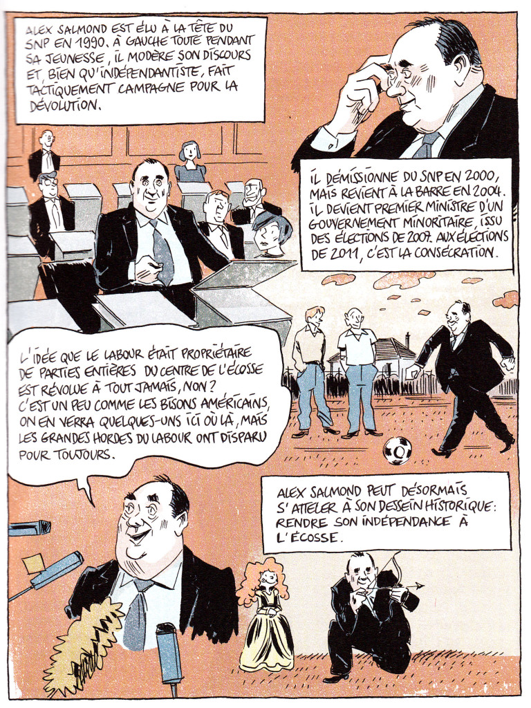
Well-drawn and well-written, this 29-page story still mostly fails my test for being a really satisfying use of the medium: you could learn pretty much everything from reading the text, the images are merely supporting illustrations.  Nothing wrong with illustrations, mind you, but I’m looking for a more interesting use of comics.  One major exception to this criticism, is when the “action” of the story shifts to the oil-boom Northern town of Aberdeen, and the creators devote a largely wordless double-page spread to a visual approach, through the countryside to the city.  I’m not sure the reason behind this choice, but it’s a nice touch.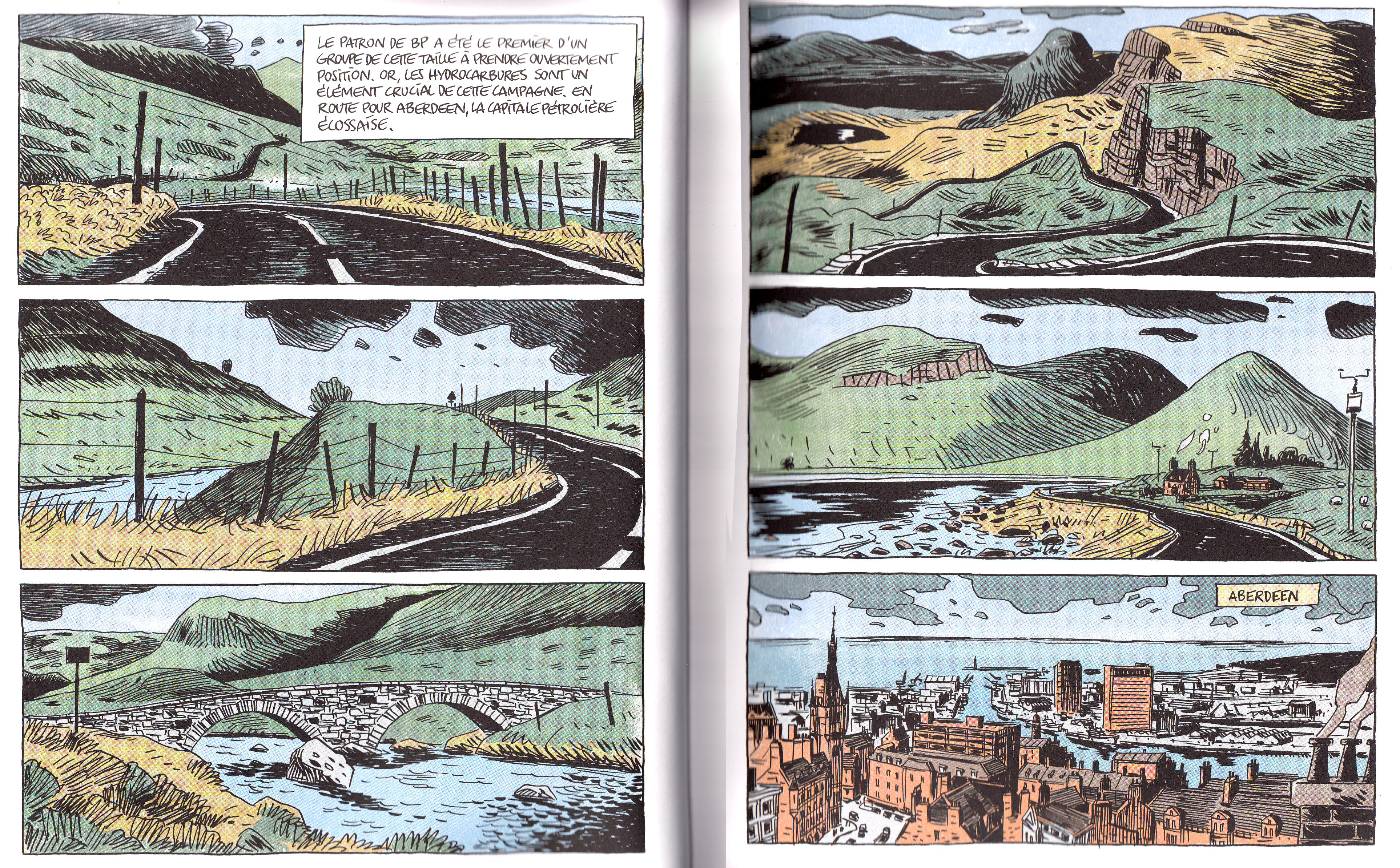
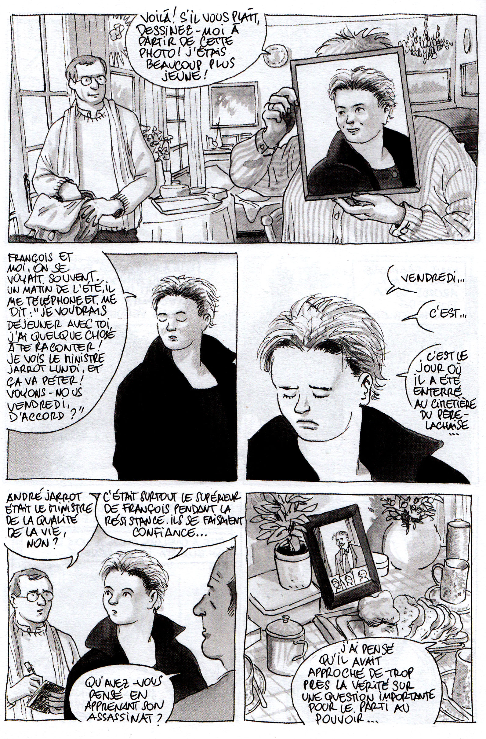
The second major story in this issue is the cover feature “Death of a Judge,” by journalist Benoît Collombet and artists Étienne Davodeau. The longest piece in the book, at 59 pages, I found this the most successful as well.  The subject is the assassination of a crusading judge in Lyons, in 1975, against a backdrop of political violence and corruption. The creators use their ample page count to develop characters and atmosphere, telling the story with a flashback structure that follows the writer and artist as they travel from place to place interviewing various witnesses to the nearly 40-year old events.
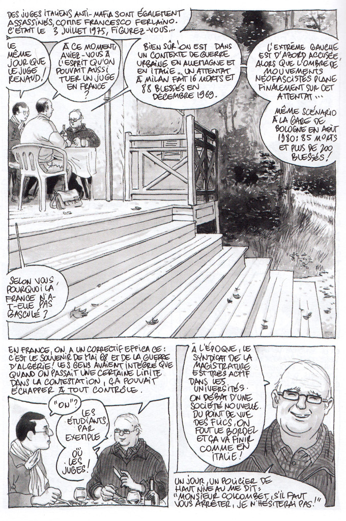
Davodeau’s ink-wash art is exquisite, and he beautifully creates the spaces inhabited by the interview subjects, as well as gestures and expressions; the differing social positions and personalities of the interview subjects become a part of the story.  Details like the artist’s accommodation of a character who doesn’t want to be drawn, but requests that Davodeau depict her as a young woman (the age that she was in 1975), show a playful use of the form (in the first panel of her interview she’s shown holding up an old photo of herself in front of her face; after that, she’s drawn as she appeared in the photo).  Overall this story is a great use of comics as a journalistic medium.
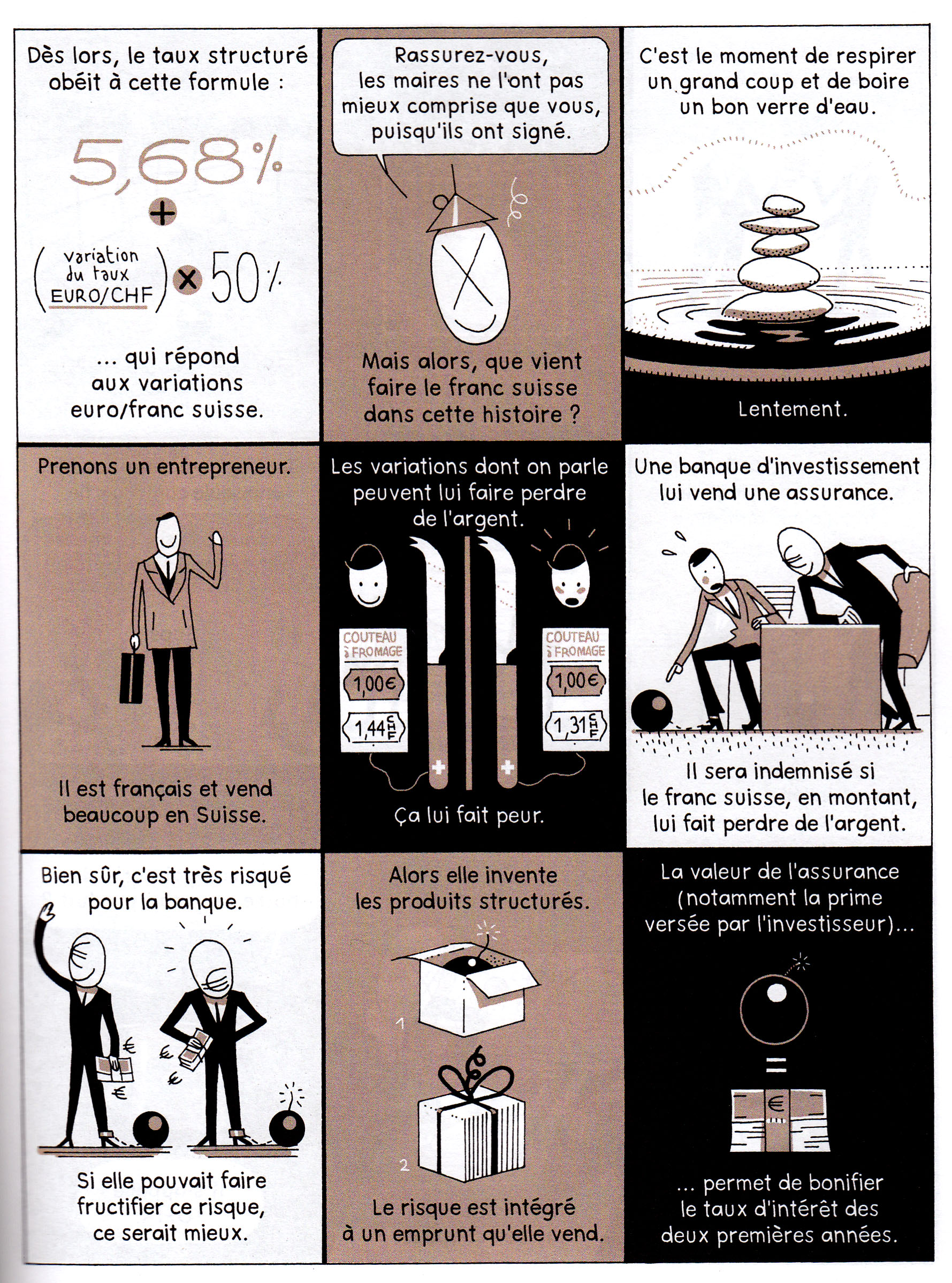
The third major piece in the book, at 40 pages long,  is “Emprunts Toxiques” (Toxic Loans), by Catherine Le Gall and Benjamin Adam, which deals with the causes and results of the 2008 financial crisis in France. Here the big challenge, especially in the first section of the story, is to explain the complicated (sometimes absurdly so) financial instruments and arrangements that led to the crisis. Although this falls to some degree into the “caption/illustration” format, I thought it was done effectively; the creators make extensive use of pictographic metaphors, which are actually quite helpful in making sense of the tortured financial logic (especially for a non-fluent French reader). It was interesting to learn that, unlike the mortgage-based derivatives that are blamed for doing in our economy, the toxic loans that pushed French municipalities and banks to the brink of doom were based on arbitrage between the Euro and the Swiss Franc.  I don’t know why they created derivatives like those, but apparently they did, with disastrous results.
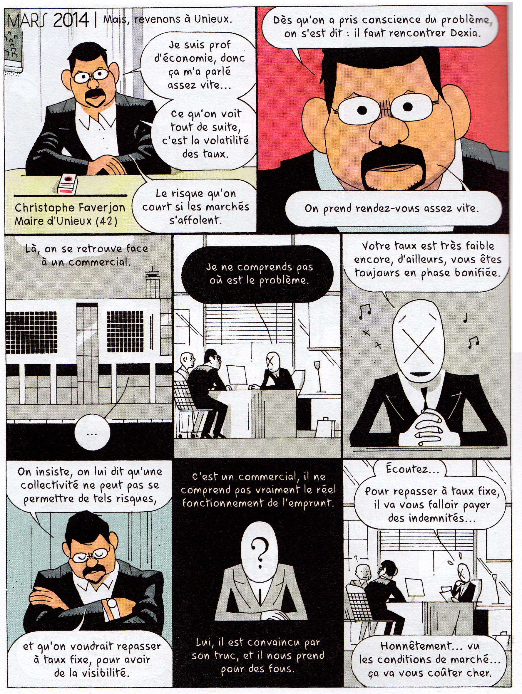
The second part of the story becomes more narrative and character-based, following the efforts of a provincial Mayor to stand up to more powerful political and financial interests to defend his city from ruin.  This dramatic story is well told, and again it’s interesting to see the difference between the crisis’ aftermath in France and the U.S. – banding together, French municipal leaders seem to have had some success using legal means to resist paying the sky-high interest rates that resulted from the banks’ sneaky and short-sighted practices.
Besides these three long pieces (accounting for more than half the page count of the book), there are numerous shorter features., including:
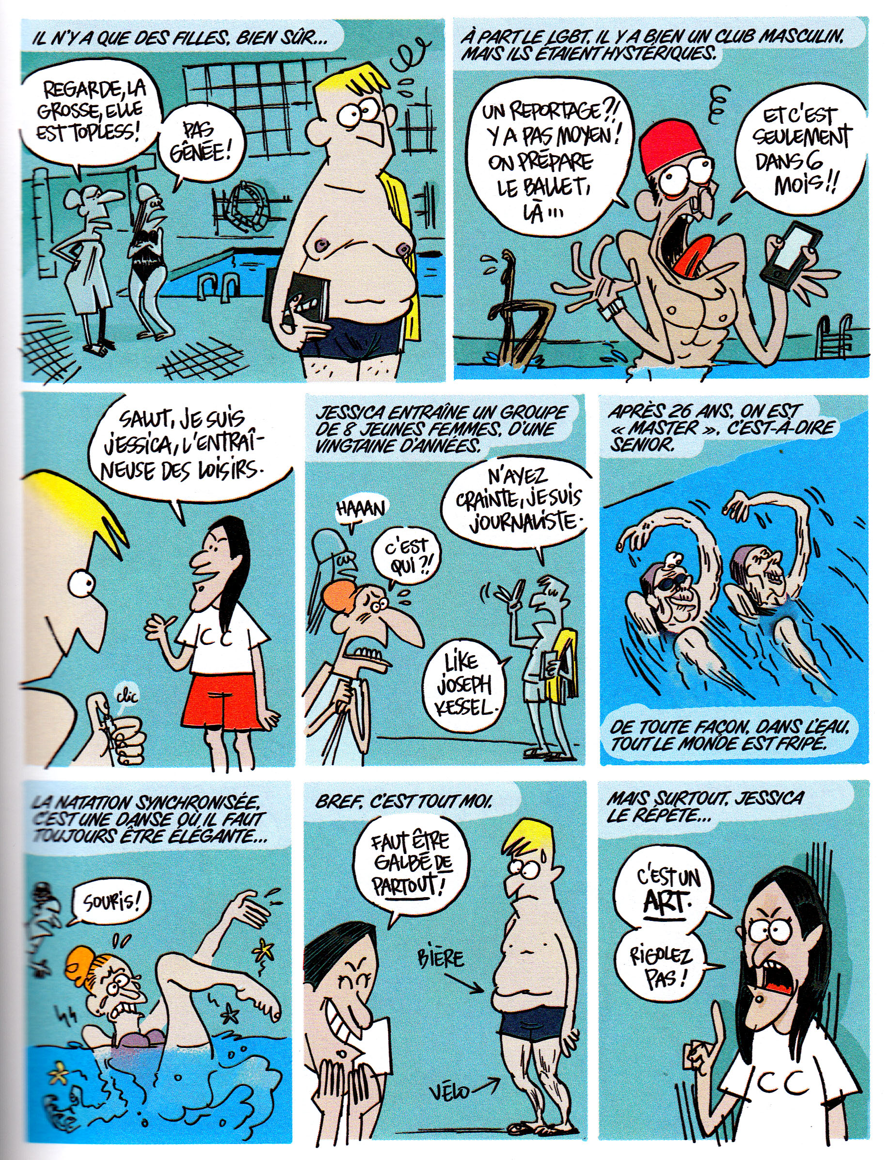
— A sports feature, “Mi-temps” (“Halftime”) by Thibaut Soucié, in which the out-of-shape cartoonist-reporter takes a synchronized swimming class.
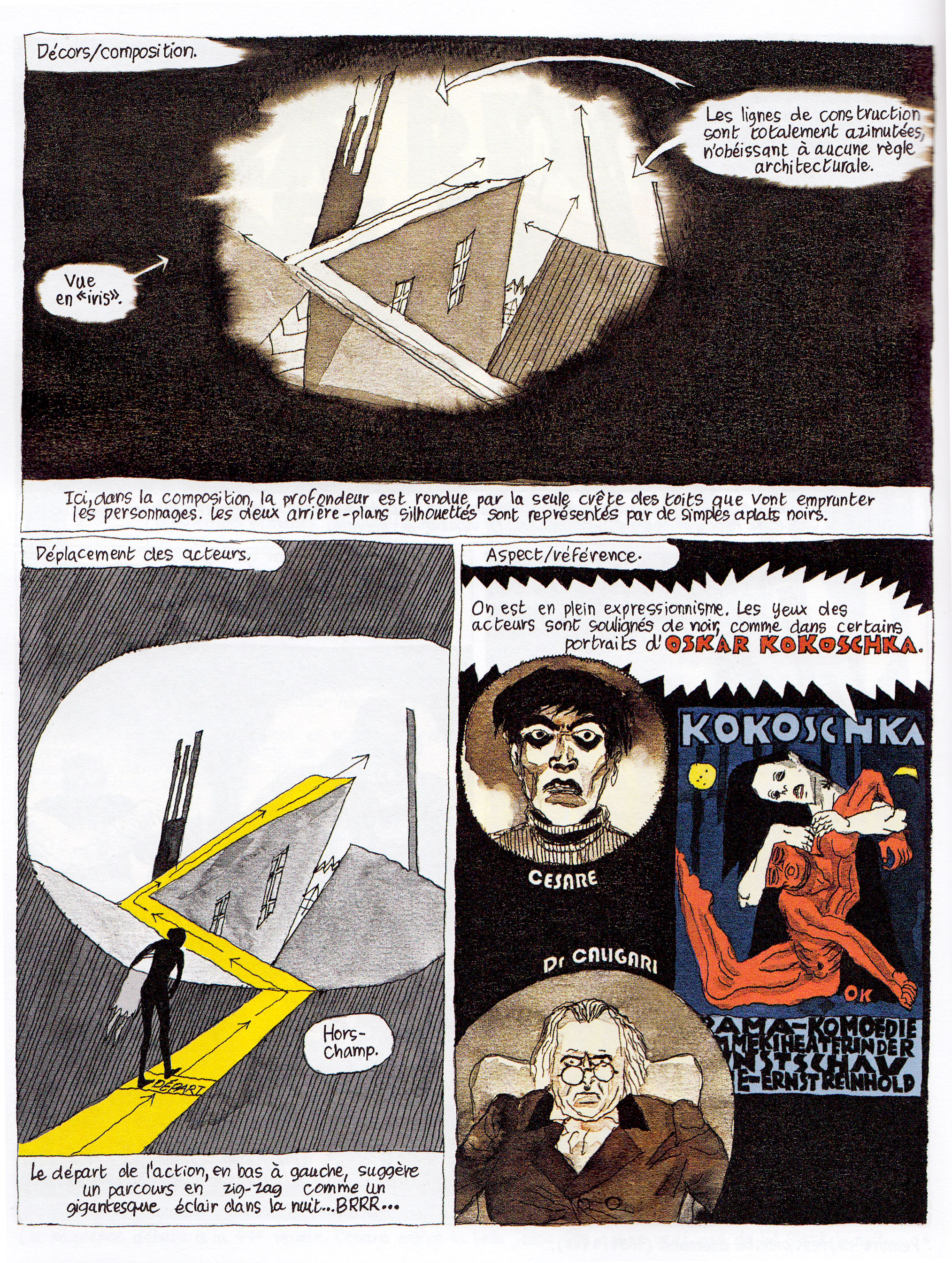
— A film comics-essay, La revue des cines, by Christophe Gaultier analyzing the set design and shot composition of The Cabinet of Dr. Caligari.
— Passion Byte, by Hervé Bourhis, a history of the personal computer, which is basically illustrated chronological fun facts.
|
|
|
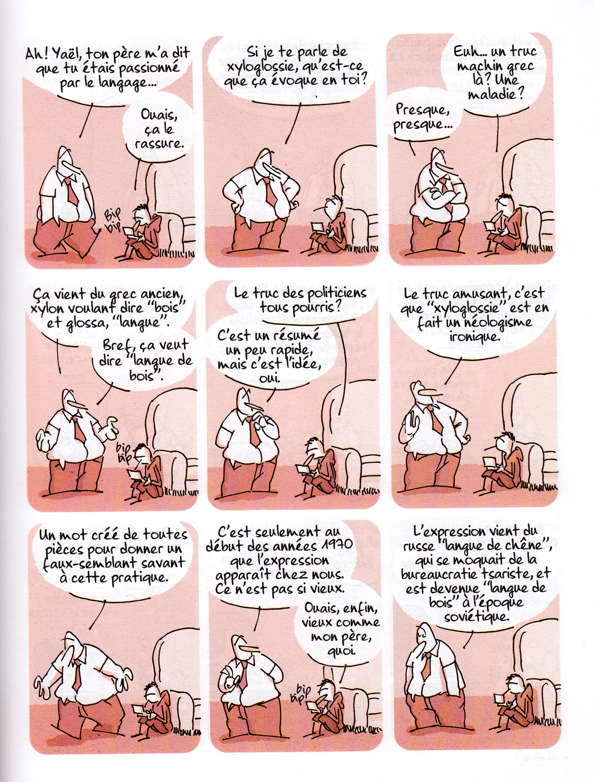
— A recurring humorous strip on language, La chronique langagière by James, this time about beaurocracy-speak (last issue’s was about crossword puzzle fanatics).
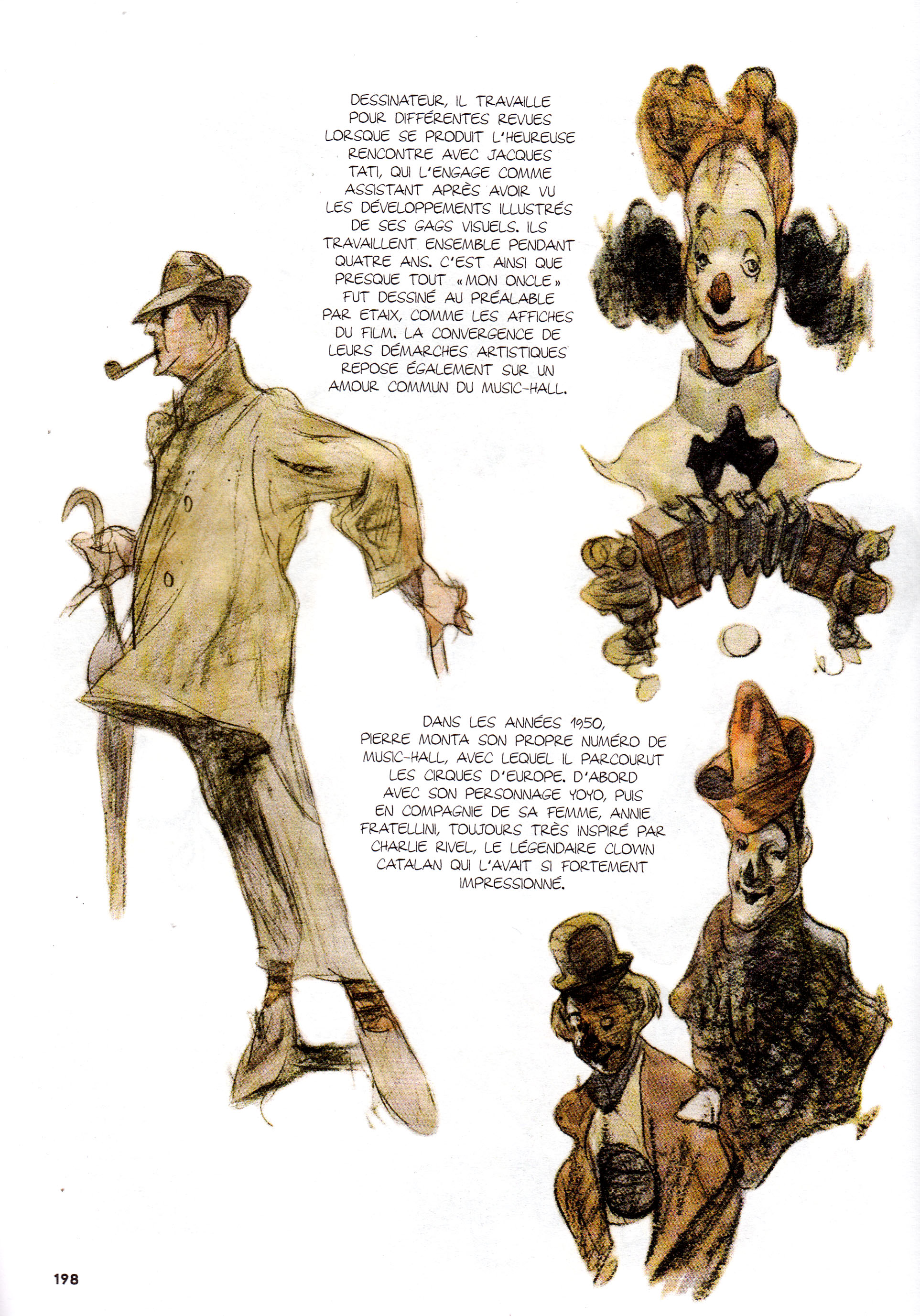
— An essay by/ interview with French clown Pierre Etaix (who worked with Jacques Tati), by Argnetinian cartoonist Carlos Nine.  This isn’t presented in comics form, but is copiously illustrated by Nine.
|
|
|
…and more!
We have some pretty good comics journalism here in the States (see the digital magazine Symbolia, for instance), but we still have to envy the French for figuring out how to produce such a classy journal as this. If you read French, and comics journalism interests you, I recommend a subscription.  If you don’t read French and comics journalism interests you, I recommend taking some French classes and getting a subscription.
I’m looking forward to taking part in this panel at Emerson tomorrow (it’s open to the public):
November 18, 2014 6:00pm to 7:30pmÂ
Little Building (80 Boylston Street), Charles Beard RoomÂ
Join a panel discussion with professional comic-book and graphic-novel creators.
In this session, writer Alexander Danner, co-author of Comics: a Global History, 1968 to the Present; Muppets Show comics artist Shelli Paroline; and independent cartoonist/author/publisher Dan Mazur will explore the differences between today’s comic books and graphic novels, look into the inspiration that drives comics creators and graphic novelists, and talk about the Boston-area comics/graphic novel community.
The Department of Professional Studies presents Graphic Novel Industry Nights as part of the Graphic Novel Certificate Program. Learn more about the Graphic Novel Certificate and graphic novel courses »
Sponsored by Professional Studies. This event is open to the public.
For more information, please contact: Trent Bagley 617-824-8280.
 Too many times people ask me, “what have you been reading lately?” and I don’t even remember. So here’s a way to keep track of/share at least some of what I’m into these days. I’m going to see if I can do it on a monthly basis, starting with
OCTOBER 2014
Still working my way through the piles from SPX, MICE and Locust Moon Fest, among other reading sources. In fact a couple of these items  I’ve just caught up with after last year’s MICE!  Read more…
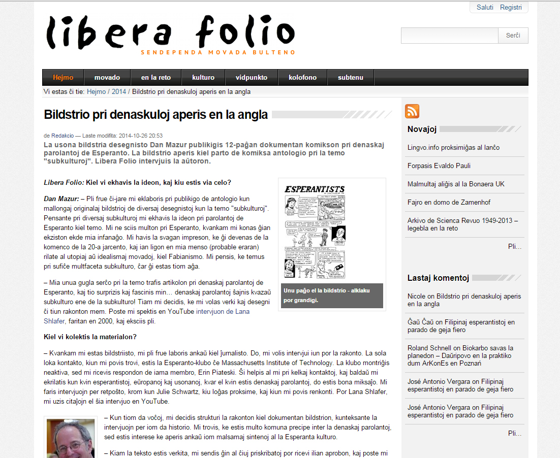
Kalle Kniivilä of the Esperanto website Libera Folio, interviewed me about my Esperanto story in SubCultures (if you don’t read Esperanto, try Google translate).  Oh, and: no, I don’t speak Esperanto myself… the interview was originally conducted in English!