Comics I Made, Comics I'm Working On, Comics I Like, etc.
Author:Dan
Lives in: Cambridge, Mass.
Does: comics.
Used to live in: Topanga Canyon, California
But grew up in: Cambridge, mostly
Used to do (maybe still?): Screenwriter, journalist, teaches some too
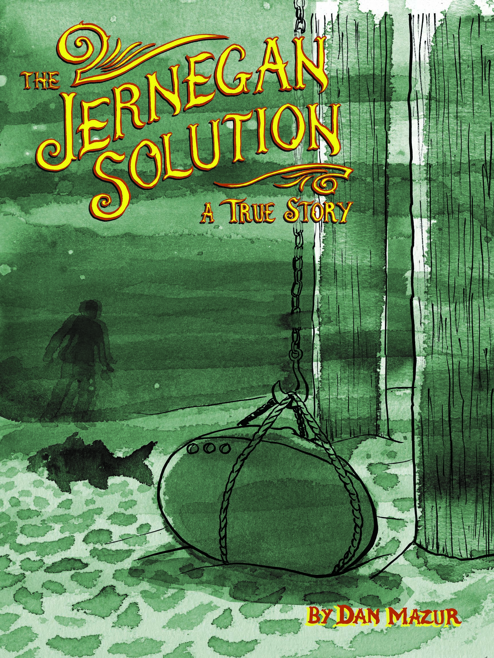
Whitey at Optical Sloth nimbly dances around the looming spoilers in The Jernegan Solution, concluding that:
This is a thoroughly engaging comic that details a bit of American history that I was completely unaware of, and what better reason is there for a historical comic than that?
Really? I read just four short comics in the entire month of May? Pitiful. Embarassing. Well, maybe posting this disgracefully short list will be a lesson to me — and I’ll do better in June!
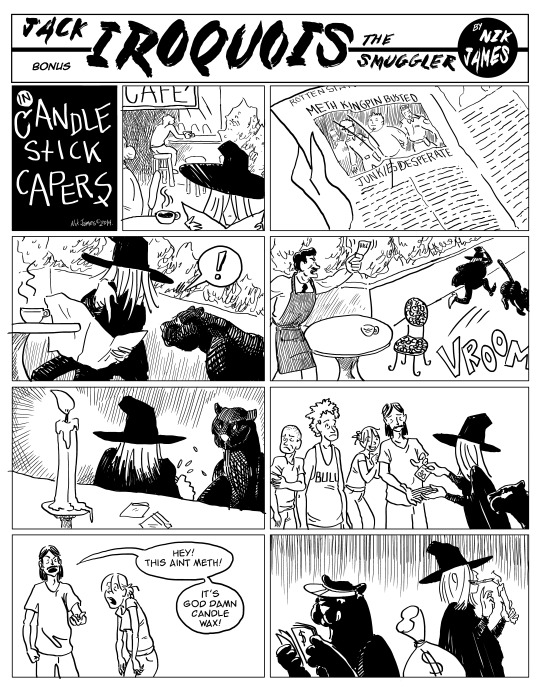
Transfatal Express by Nik James.  Even in the universe of alt-indie comics, this is a very eccentric book.  It’s done as a series of 1930s style “Sundays,” full pages, telling a pulpy tale of gangsters and molls, cursed jewels, hard-boiled cops, and … whatever.  What makes this so cool and weird is the way James stays true to the spirit of his main model (Roy Crane, as he helpfully points out in a clever “wanted poster” extra), while not slavishly copying a graphic style… the black and white art evokes Crane and other 30s strip artists — but also Ditko — and the “hero” of the comic, Jack Iroquois the smuggler, looks more like he wandered in out of a Leiji Matsumoto western.  Anyway, the whole thing is strange, fun and beautiful to look at.
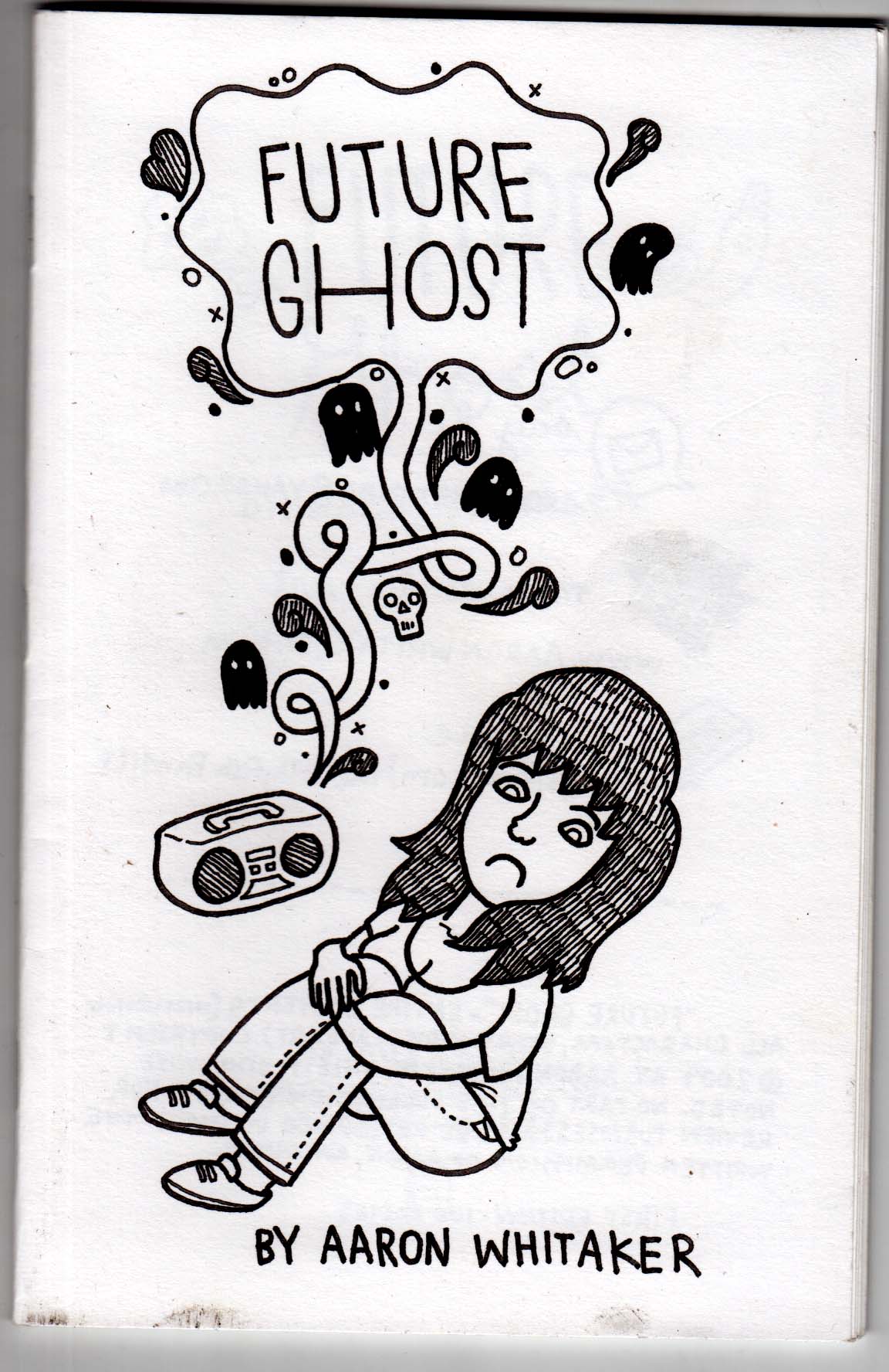
Future Ghost by Aaron Whitaker.  A 36 page mini from 2009; I don’t know how it ended up in my pile, being out of print, but glad it did.  A sad and funny story, very cleverly structured, about a young woman who house-sits a home with a ghostly presence. The way this comic works is very “medium-specific,” in its handling of time, of an invisible, inauduble character, and simultaneous dialogue.  Read it (if you can find a copy — its sold out, but i’ll lend you mine if you promise to give it back) and try to imagine it in cinematic or prose terms — wouldn’t work anywhere near the same.  The artist had some thoughts on this matter as well.
Hotblood! by Toril Orlesky. A pick-up from MICE 2014 (yes, that’s how behind I am in my reading), and a nice surprise. A western set in a slightly alternate reality in which centaurs and humans live side-by-side. This is a print version of a webcomic, and not being much in that world I don’t know how widely read it is. But as a book it’s quite good. The drawing has a loose rendering style but solid underpinnings, and Orlesky’s feel for the genre, characters and dialogue seems strong as well. She also lays out a well-conceived fantasy world, describing the culture and geographic distribution of the centaur minority.
Diamond Shifting by Murray Huber III. A short first chapter of a science fiction story. Disaffected youth of the future, hanging around in the ruins of a 20th century city for laughs, then heading back to the gleaming towers far above. I really like the super-fine line drawing and unusual color sense; no clue where the story is headed, but it has a nice sci-fi slice-of-life feel. Acquired at MECAF 2015, where it made its debut.
I’ve been too busy to update this… but it’s never too late, right?  February and early March were really slow for reading — I didn’t crack the mini-pile much, but made it through three GN’s:
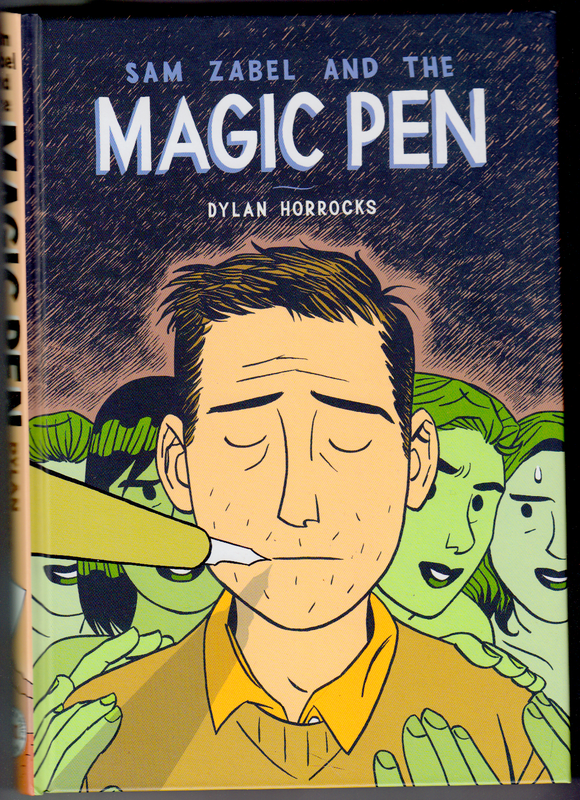
Sam Zabel and the Magic Pen by Dylan Horrocks.  I love the way Horrocks draws, and the colors make it even nicer. I really like seeing him apply his clean, indie style to fantasy and superhero imagery. Somewhat disappointed in the book overall, though.  Like most of Horrocks’ previous work, this is a comic about comics, but where Hicksville and Atlas are weird and inspired, Sam Zabel plays more off of stereotypes without ever really transcending them.  It’s fun enough, but rather thin. Horrocks seems most concerned with correcting mainstream comics’ tendency to feed male sex-and-power fantasies, a worthy goal,  but it results here in a cautious, eager-for-approval tone that has little depth.
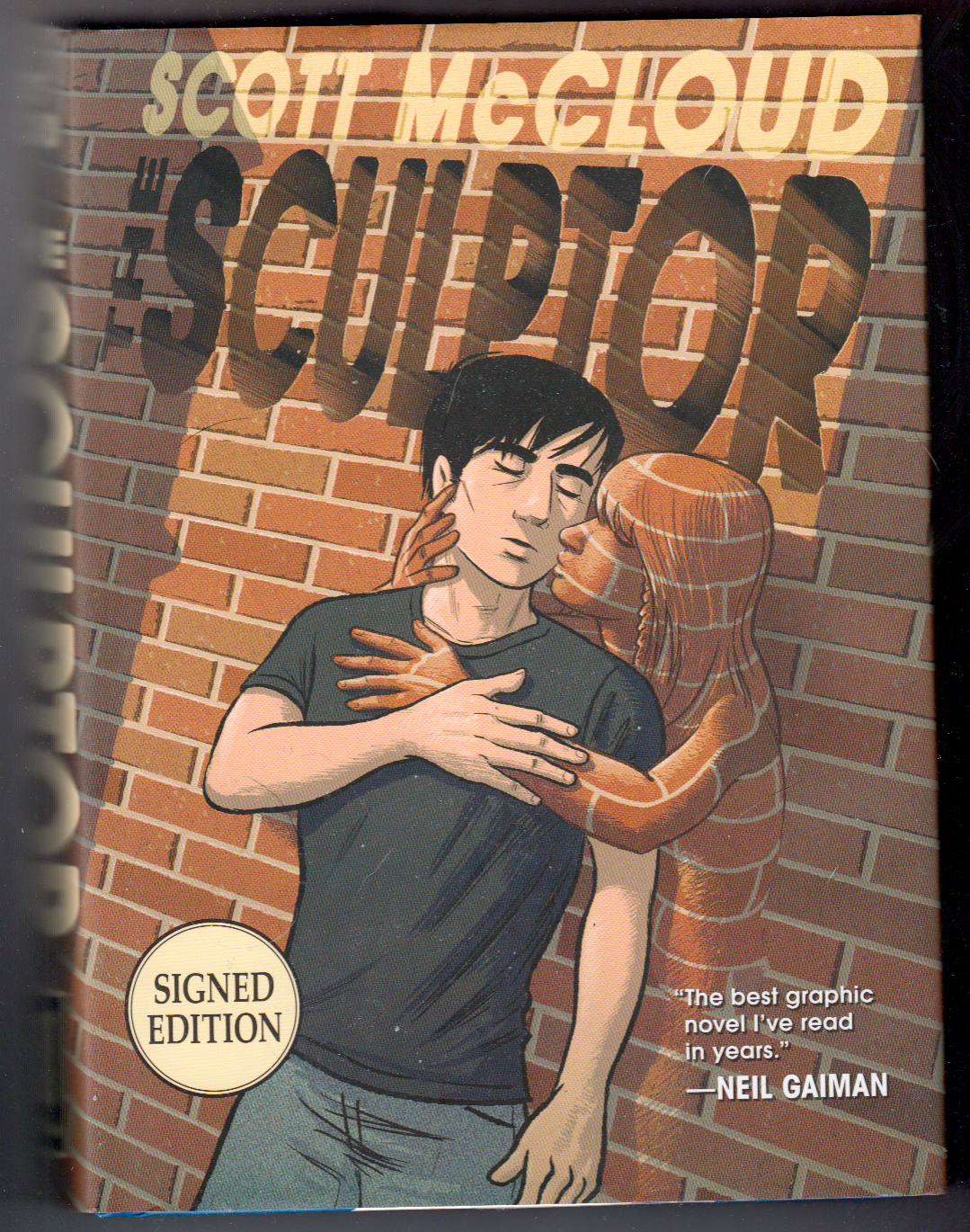
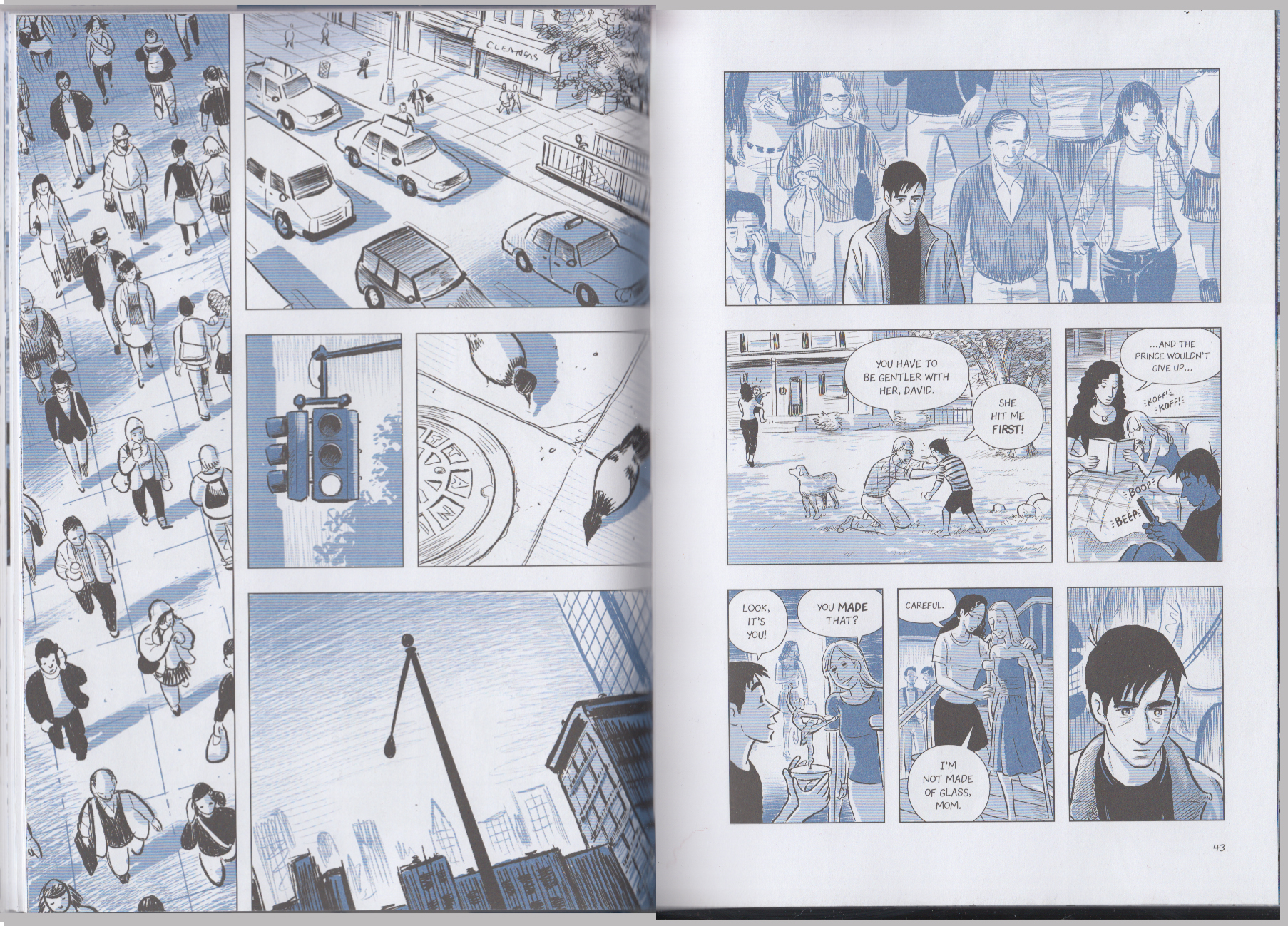
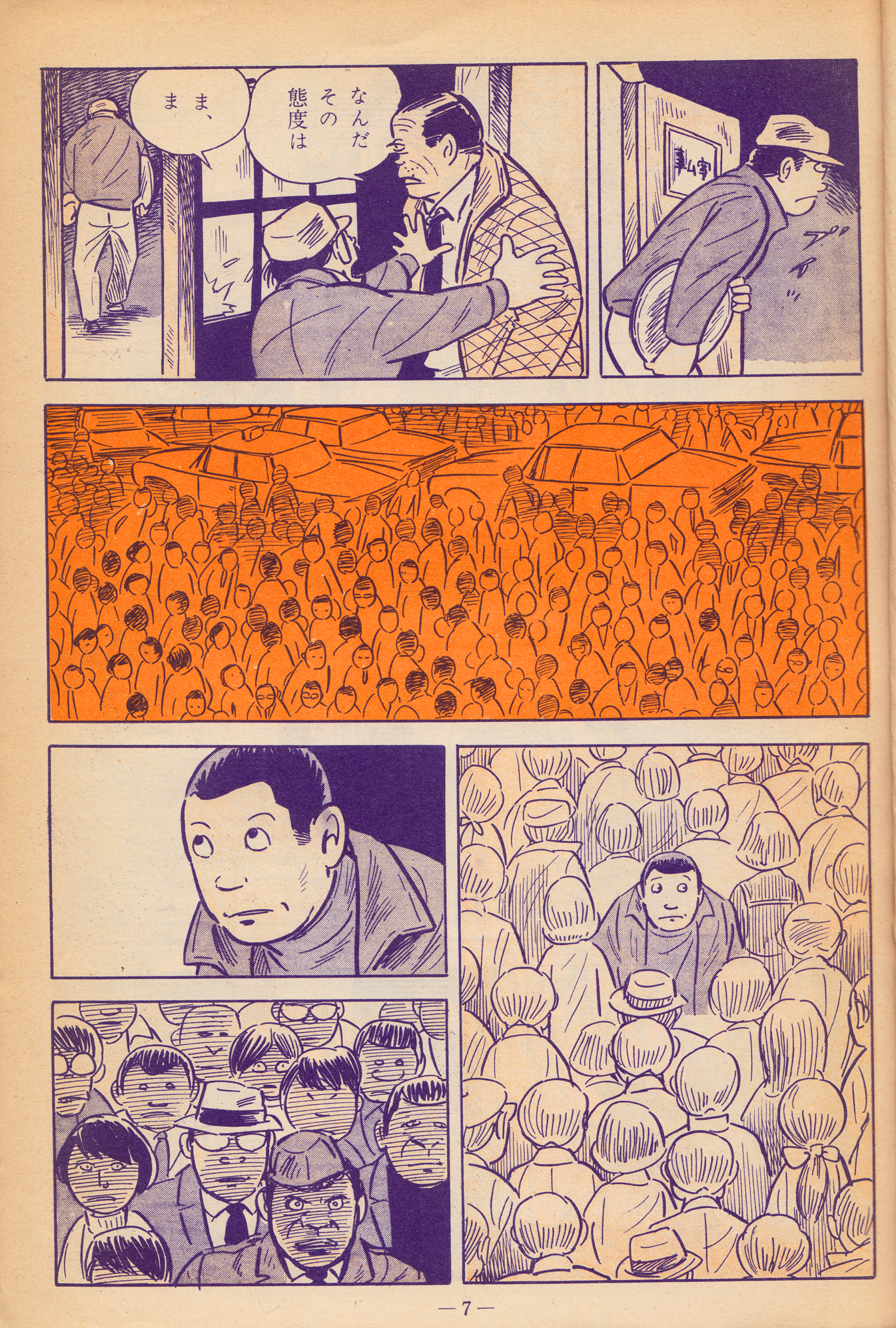
The Sculptor by Scott McCloud. I was struck by how much manga influence there is in McCloud’s work now.  I especially noticed a similiarty to Tatsumi as in the examples below (though the vertical panels and heavy use of “aspect to aspect” paneling, as McCloud calls it, aren’t Tatsumi features).  As for the story and characters in this 500 page tome, the less said the better.
The Sculptor
Tatsumi Yoshiharo from “Who Are you”
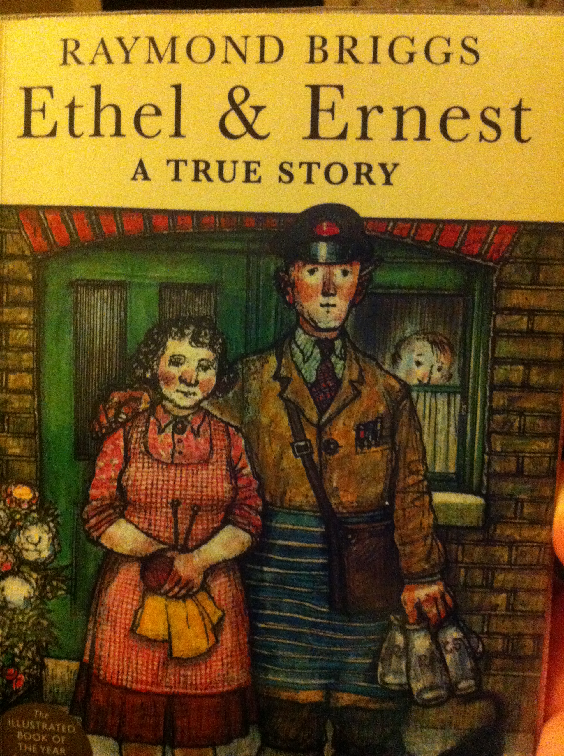
Ethel and Ernest by Raymond Briggs.  I haven’t read as much Briggs as I ought (he hasn’t done that many comics), other than The Snowman.  This graphic novel about his parents’ 50-year marriage is just lovely, focusing on the small, almost private world of their relationship and life together, as British 20th century history unfolds around them.  The watercolor art evokes children’s book illustration (which is what Briggs has mostly done).  As unpretentious, subtle and natural as those last two books are… not.
And just a couple of small-press gems:
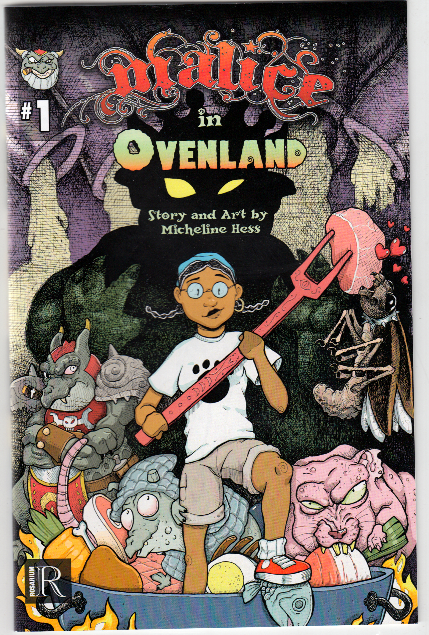
Malice in Ovenland #1 by Micheline Hess.  The first issue of a fun all-ages comic. Doing her kitchen chores, a girl falls into a creepy, smelly, greasy, magical world inside the filthy oven.  Hess’ drawing is colorful, simple and fun —  but not too simple: her pen-and-ink hatching helps create a fun/gross atmosphere for her fantasy world.  Recommended for kids — looking forward to the next issue.  From Rosarium Publishing.
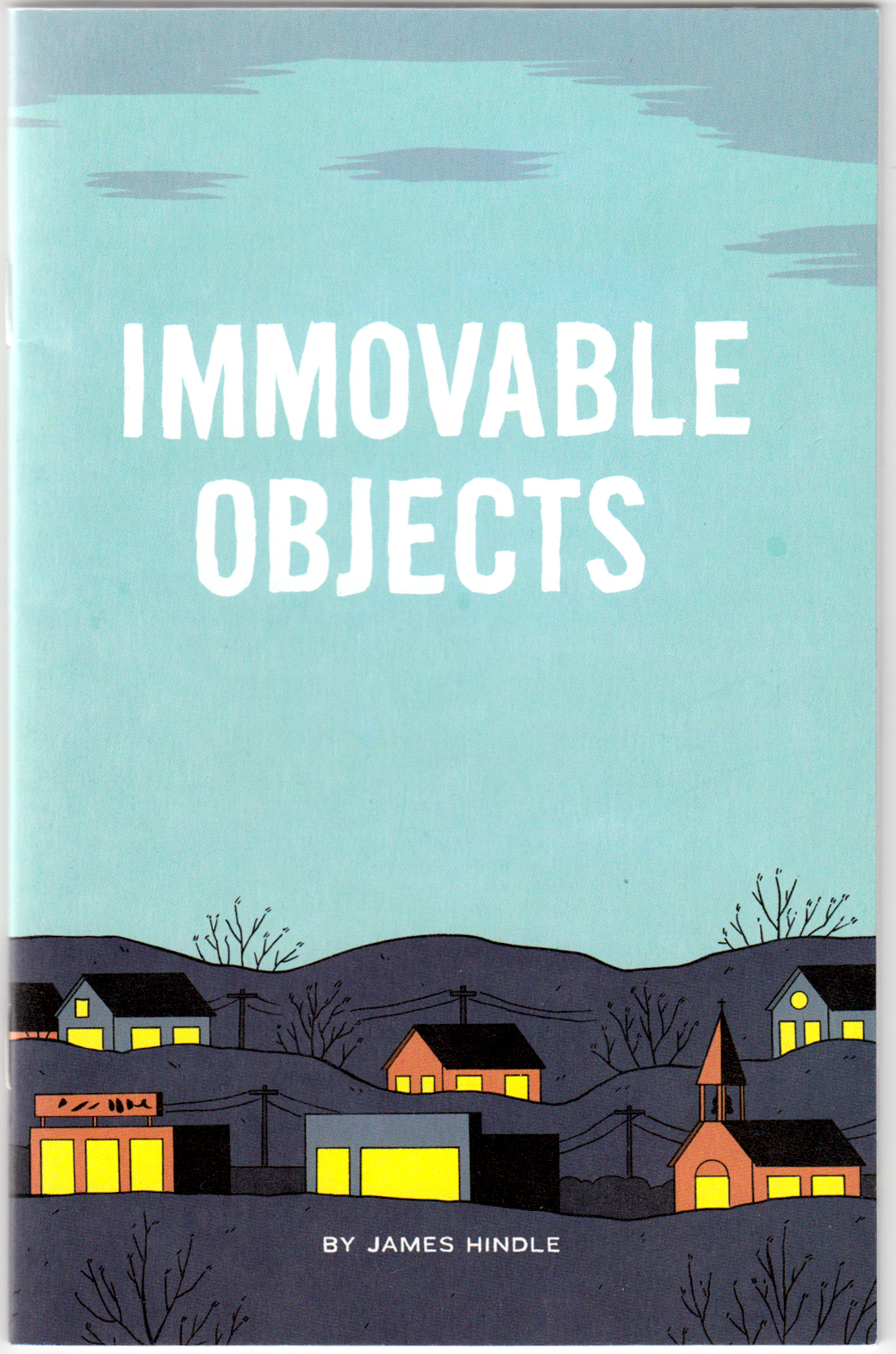
Immovable Objects by James Hindle. A nicely done minicomic, from 2012.  In the “sad, frustrated guy” genre of indie comics, looking like a minimalist Dan Clowes/Chris Ware/Adrian Tomine kinda thing… maybe that genre is a little overdone by now, but this one was worth the read: formally interesting and a nice text/image interplay.  The flatness of the visuals corresponds to the flatness of the protagonist’s affect.
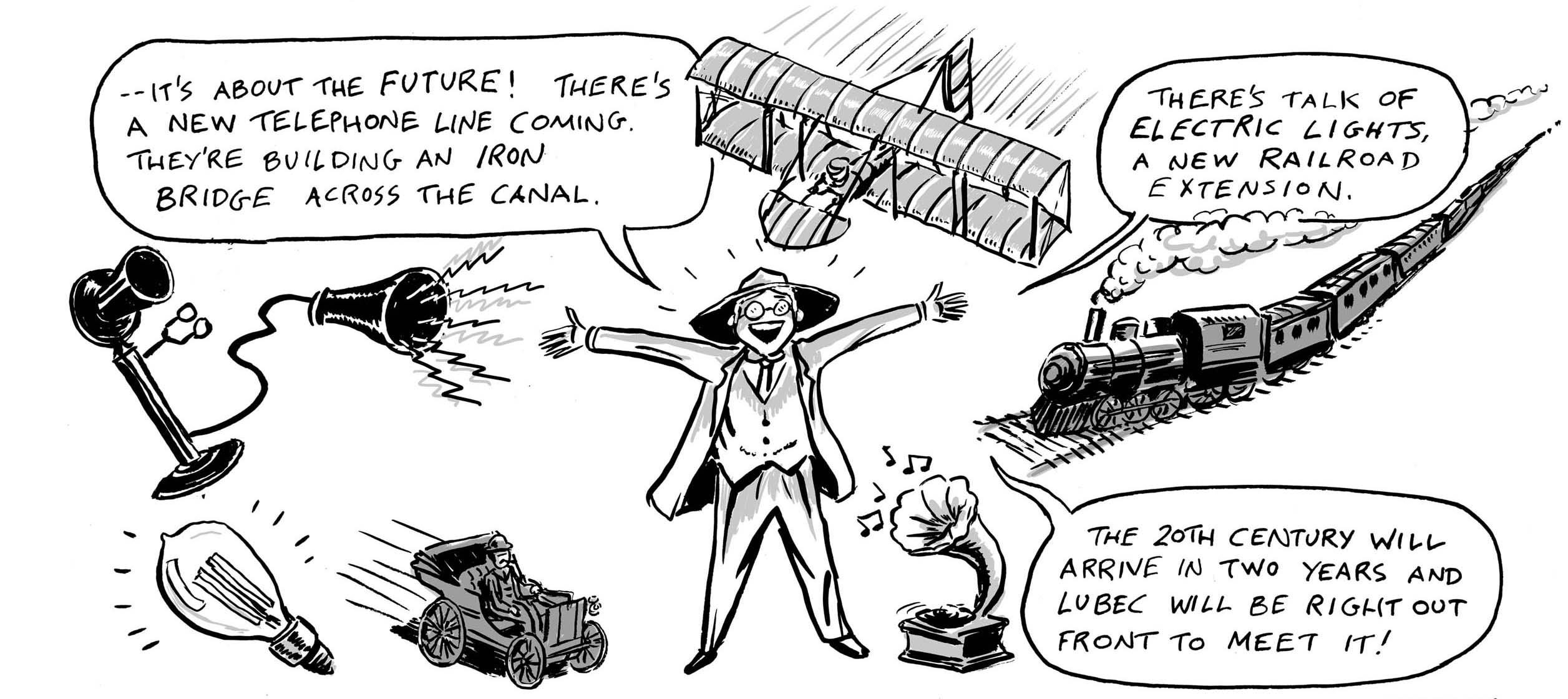
My current comic, “The Jernegan Solution” is a true historical story set in 1898 in Lubec, Maine, the eastern-most town in the United States. I’ve only been able to visit Lubec once, so I have otherwise worked from historical photos for location reference, as well as for period props. Some examples are below. The comic will be ready for MECAF in Portland, on May 17th.
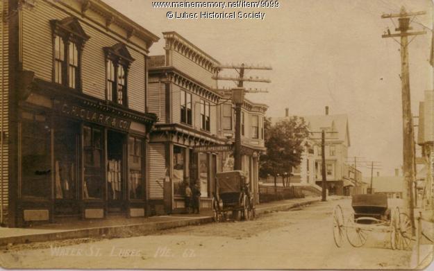
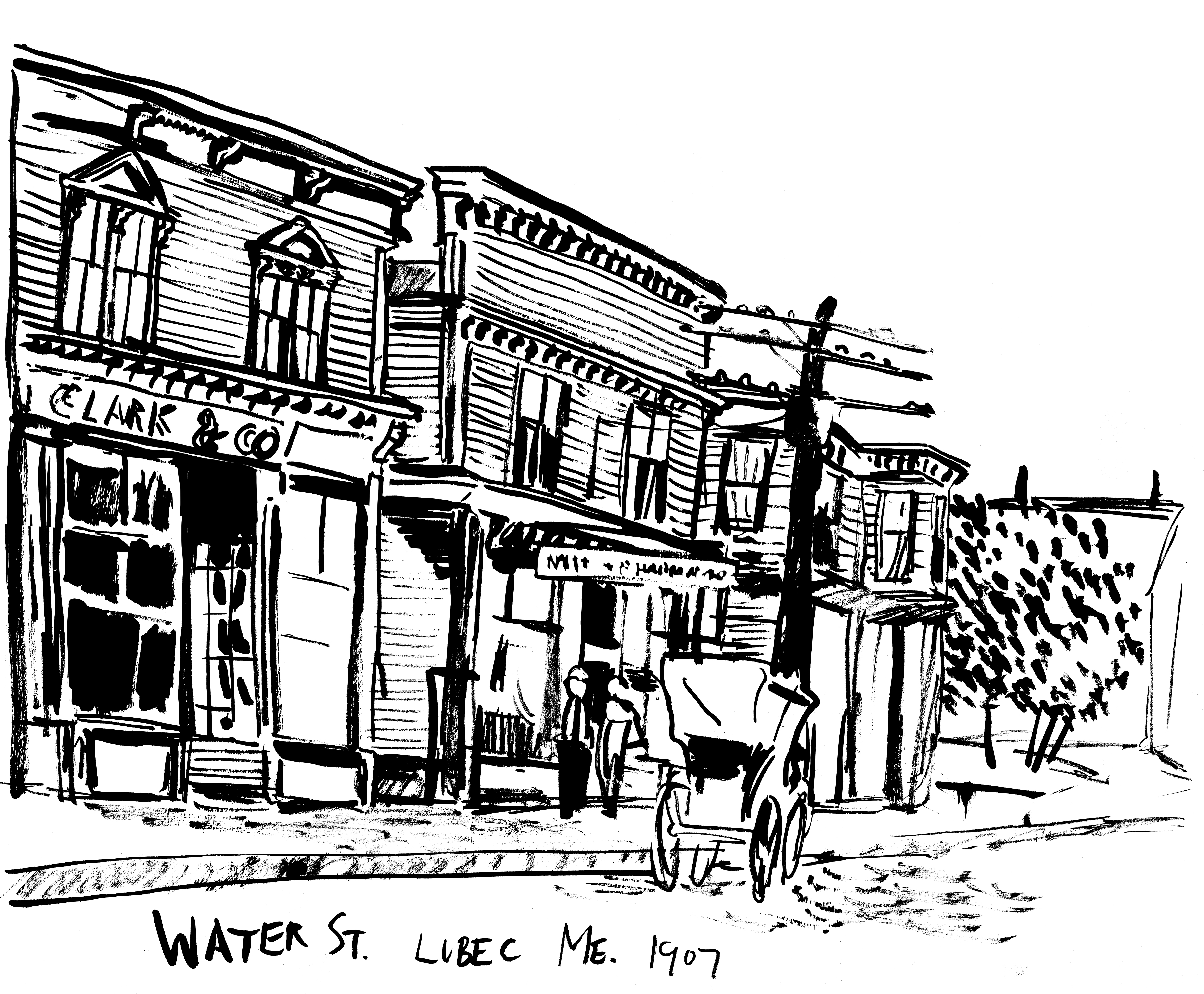
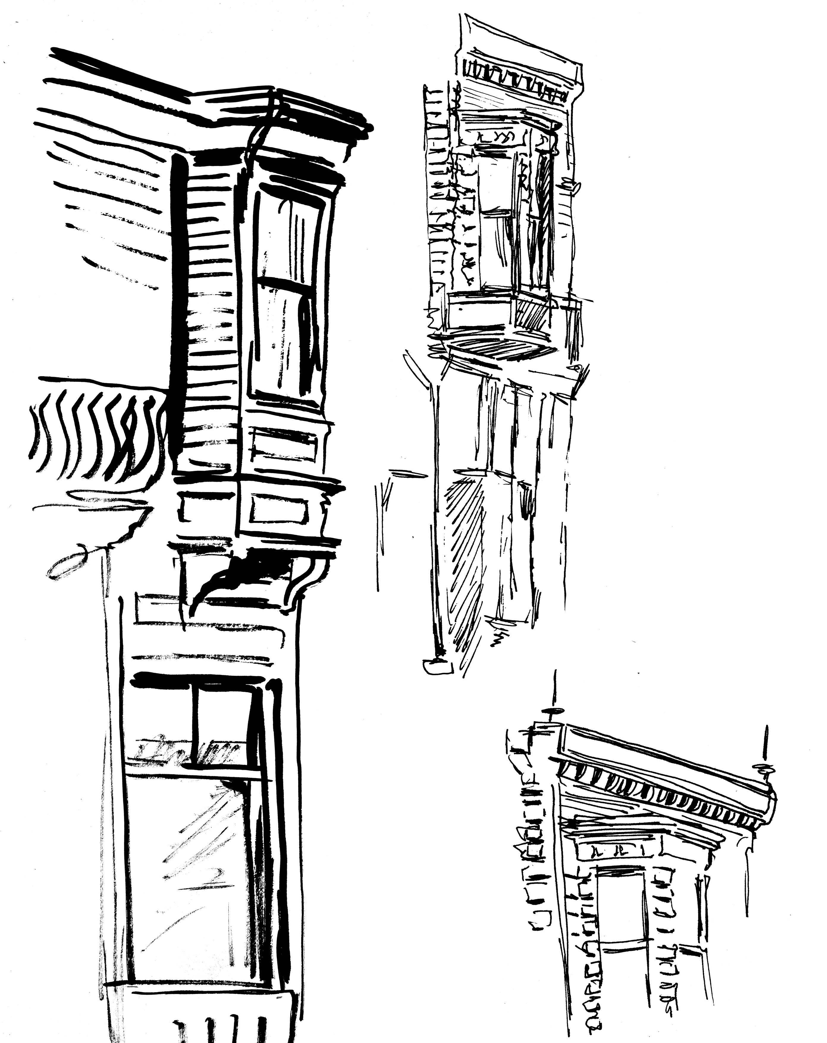
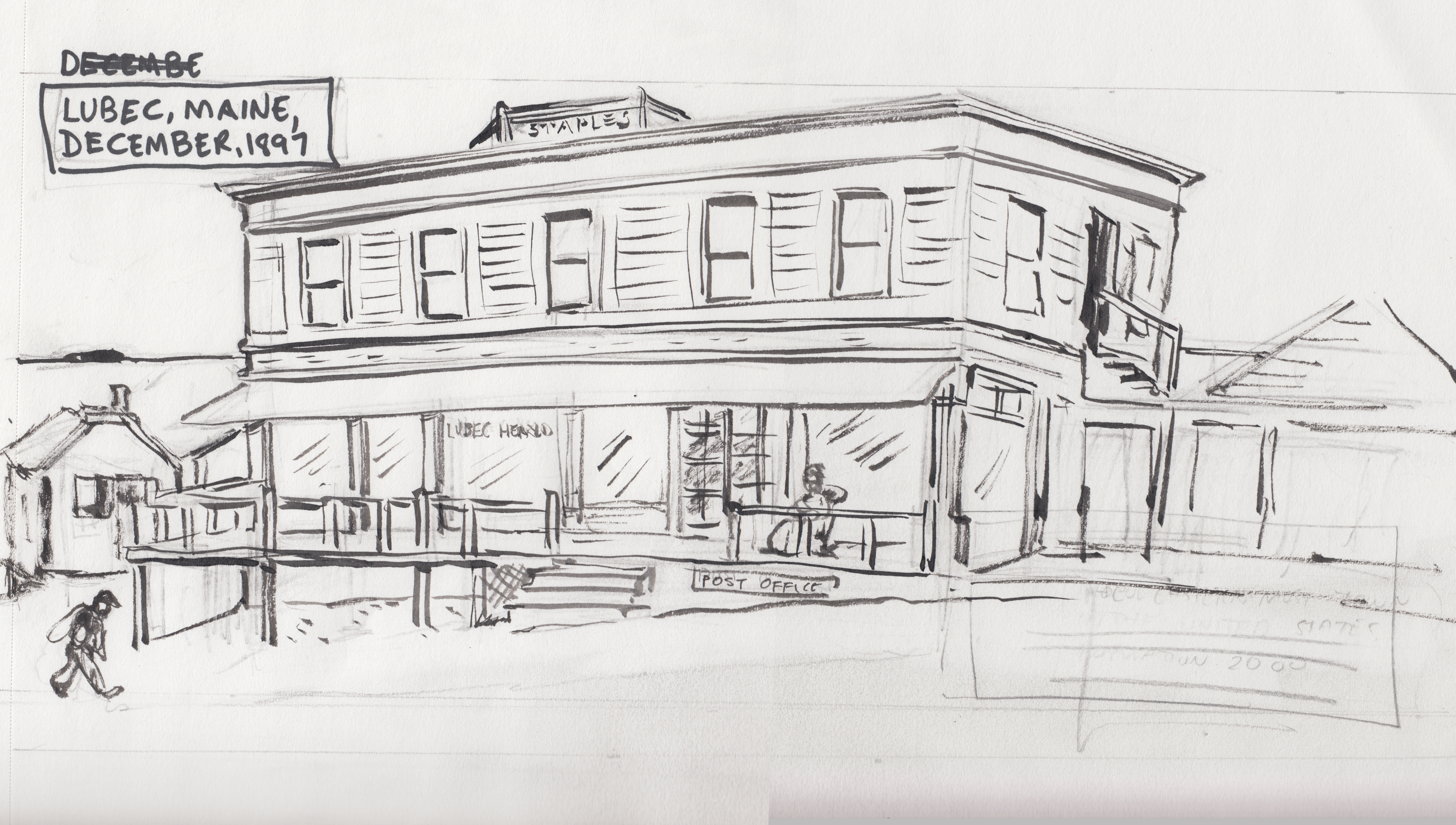
WATER STREET, LUBEC
The main commercial street of the town:
My sketch of it, and some architectural details:
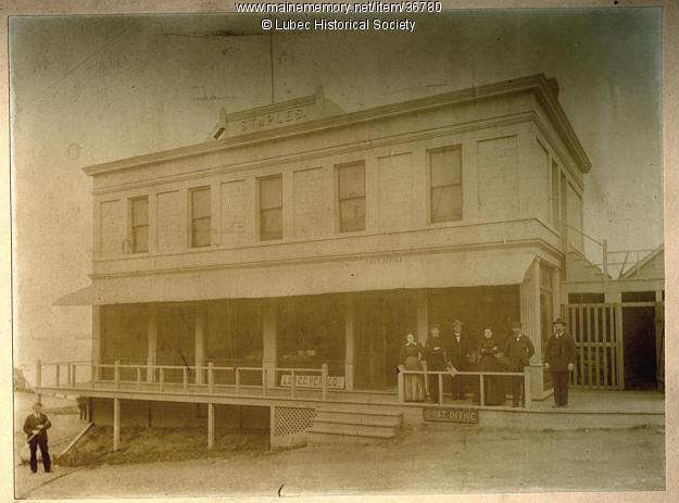
THE STAPLES BUILDING
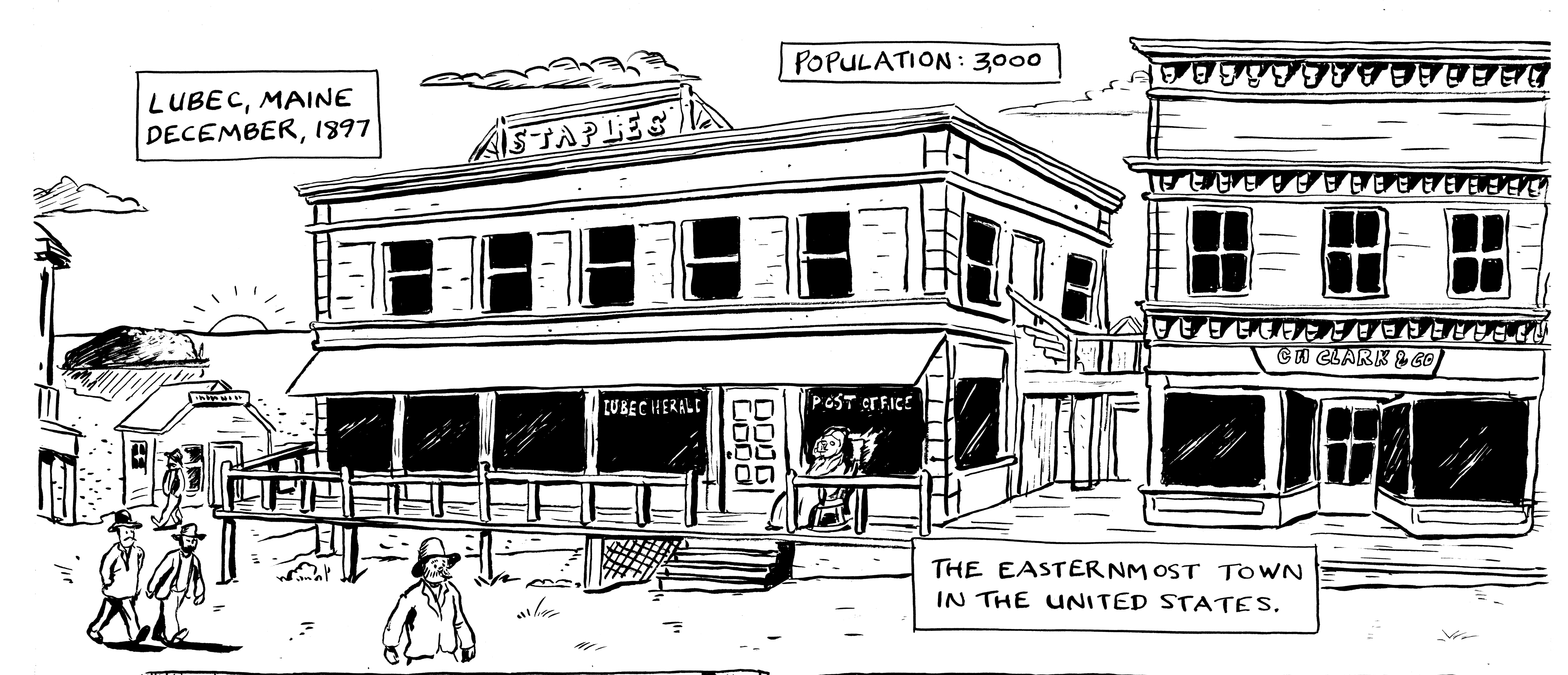
AÂ new office building at the time, home of the Lubec Herald newspaper office, where my journalist character works. It was located on Water Street.
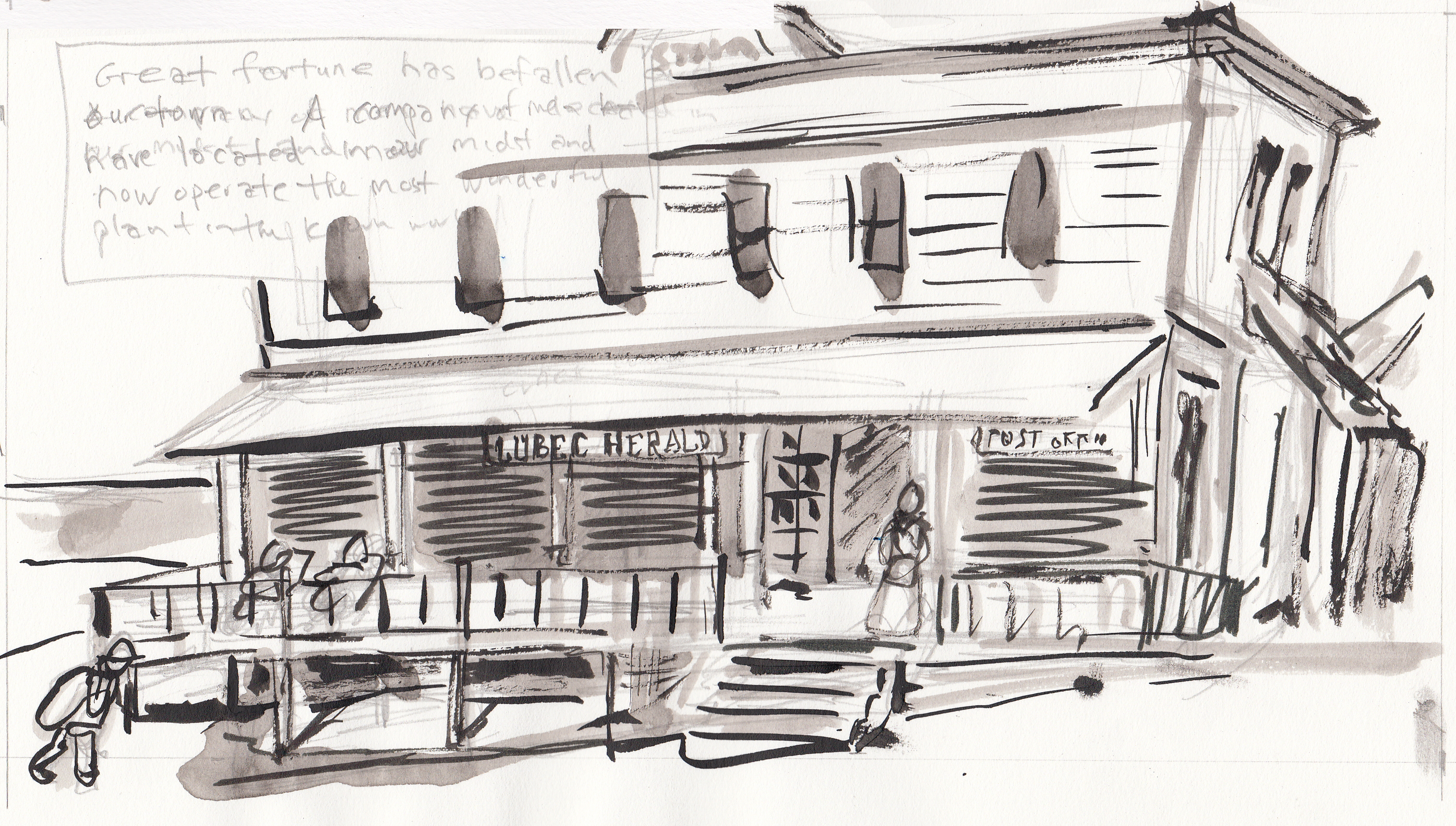
The first “adjustment” I made from the photo was to have painted “Lubec Herald” letters on the window, instead of the sign leaning against the baseboard. Â I assume that sign was later put over the door, anyway :
Here’s how it looks in the final inks. I also added in another, more “picturesque” building to the right, based on one of the buildings in the other Water Street pictures (I think that the Staples Building was at the end of Water Street, not in the middle of the commercial district).
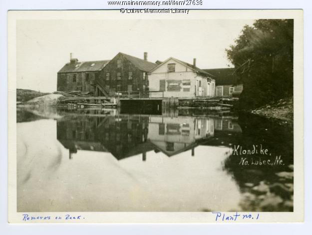
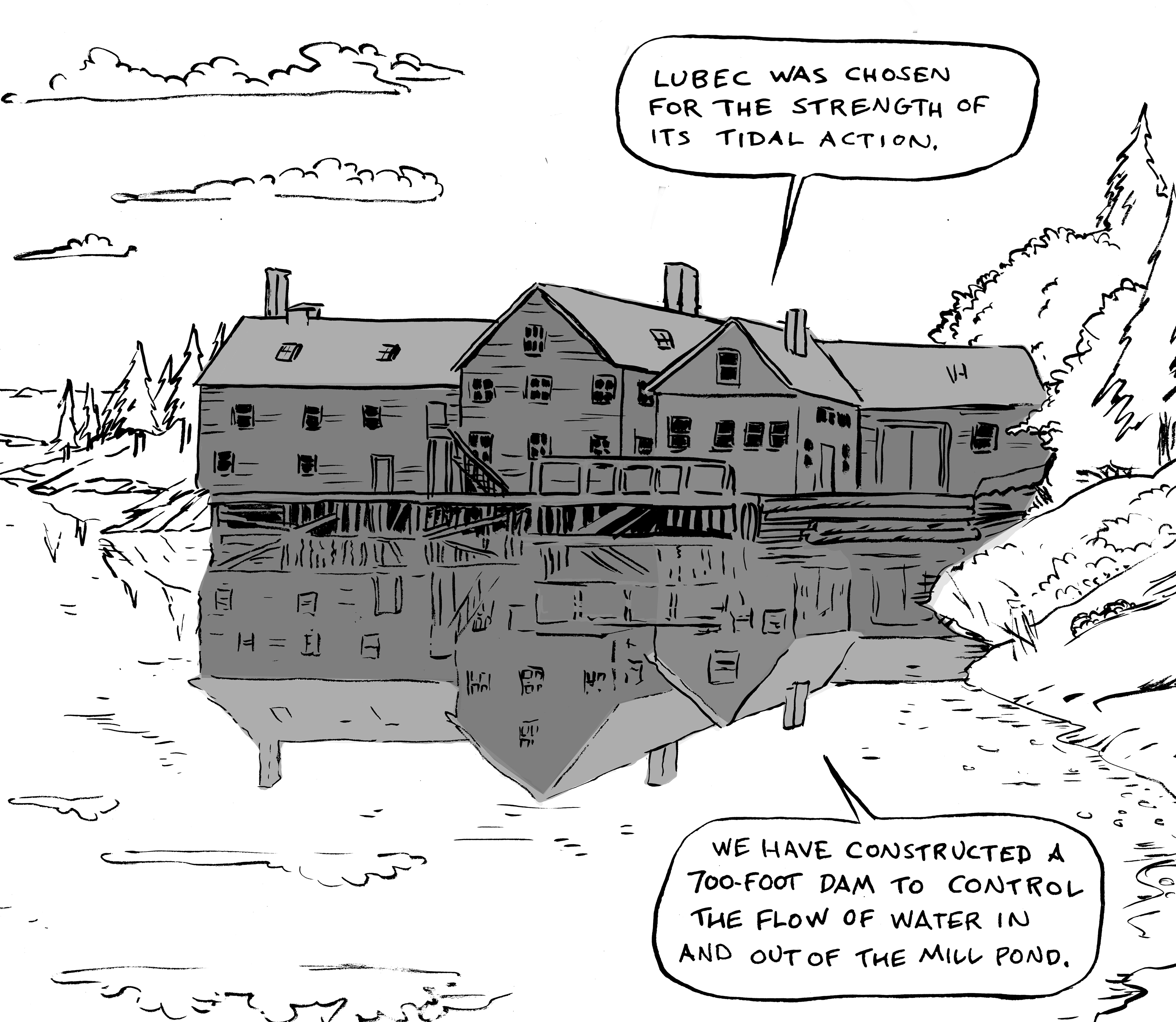
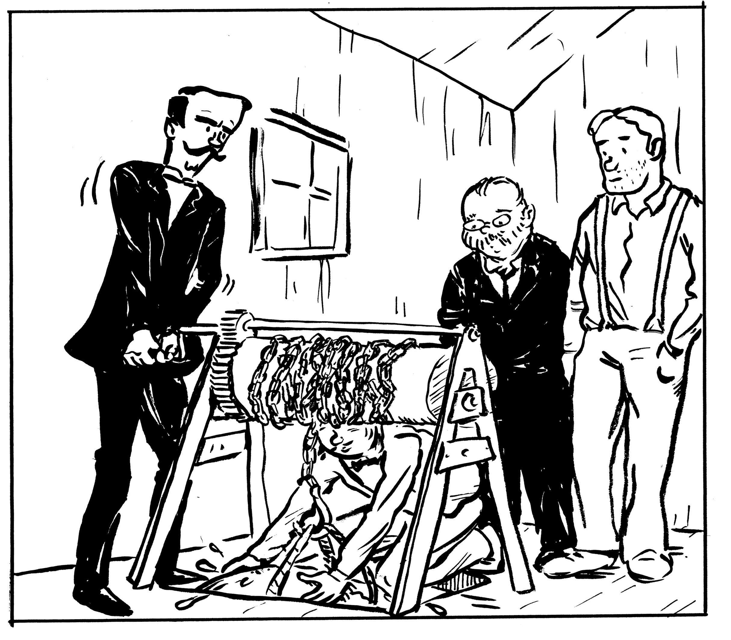
THE COMSTOCK MILL/”THE KLONDIKE PLANT”
An old grist mill, which was purchased and transformed into… well, you’ll have to read the comic to find out!
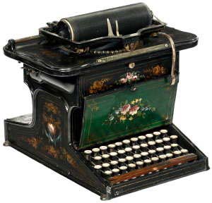
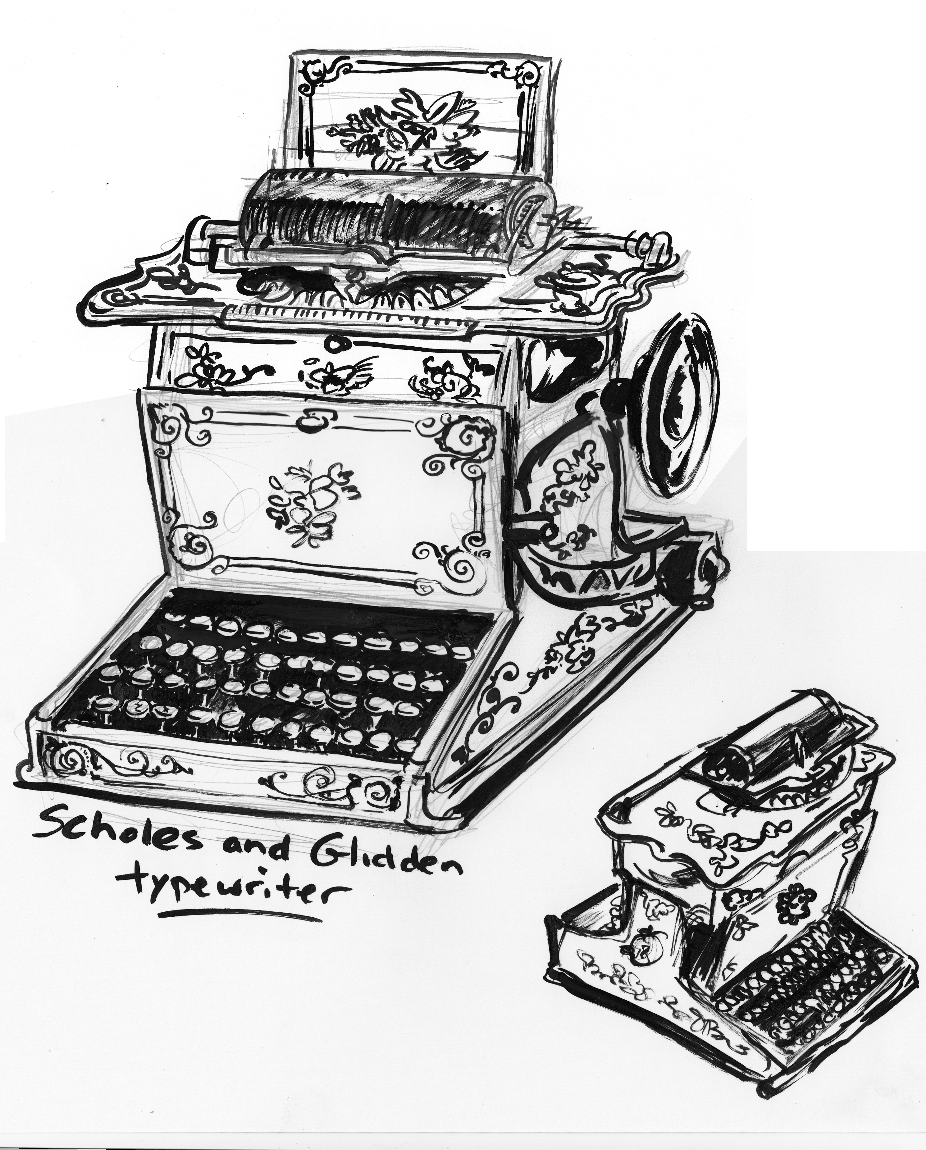
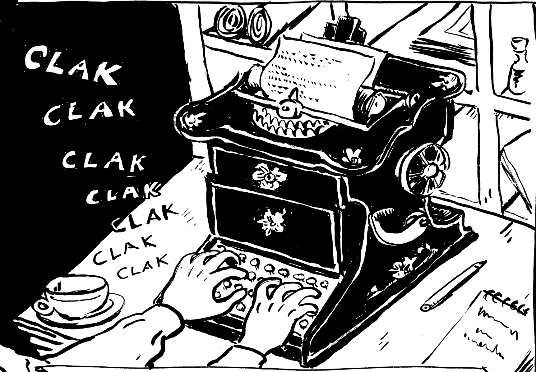
SCHOLES AND GLIDDEN TYPEWRITER
A key prop (journalist character). Â This machine was available at the time. Â Would a small-town newspaperman have been likely to have used one? Â I don’t know for sure. But I couldn’t resist using this beautiful typewriter, with the amazing painted decoration. Â I wish my PC looked like this.
In the end, though, I felt I had to simplify the decorations somewhat, to be readable at the size of the image:
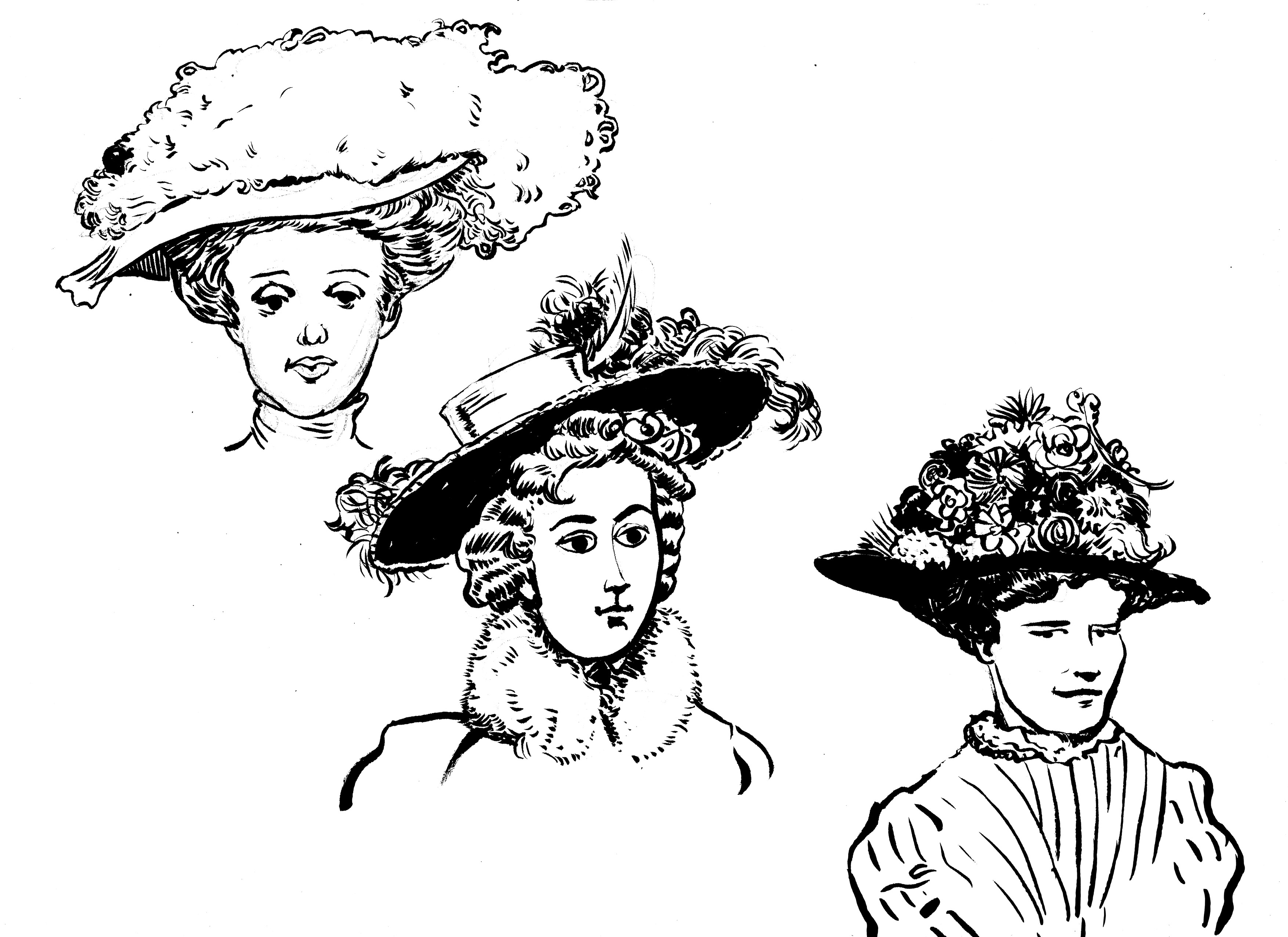
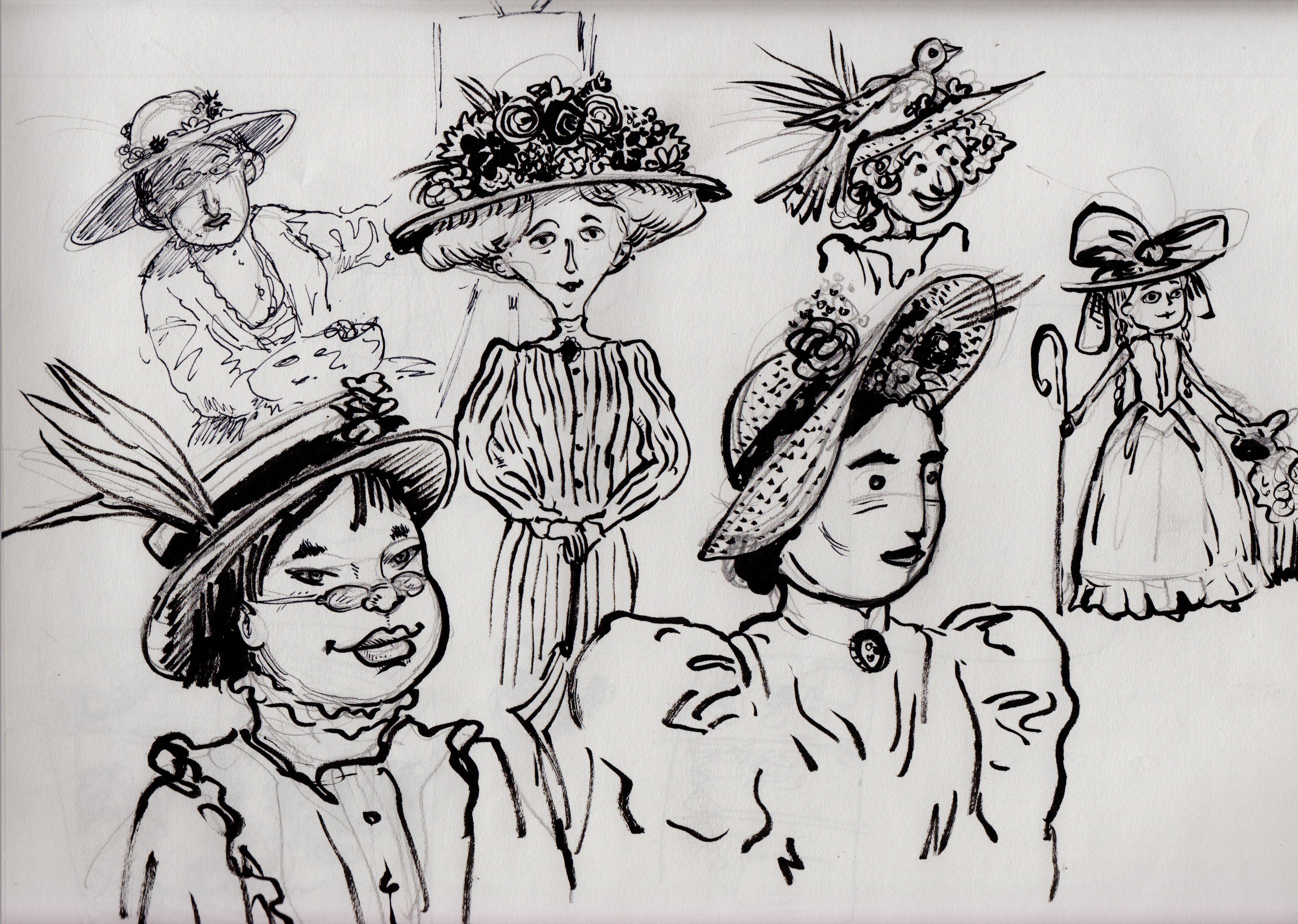
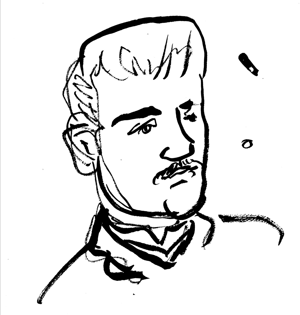
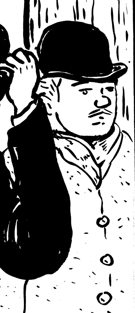
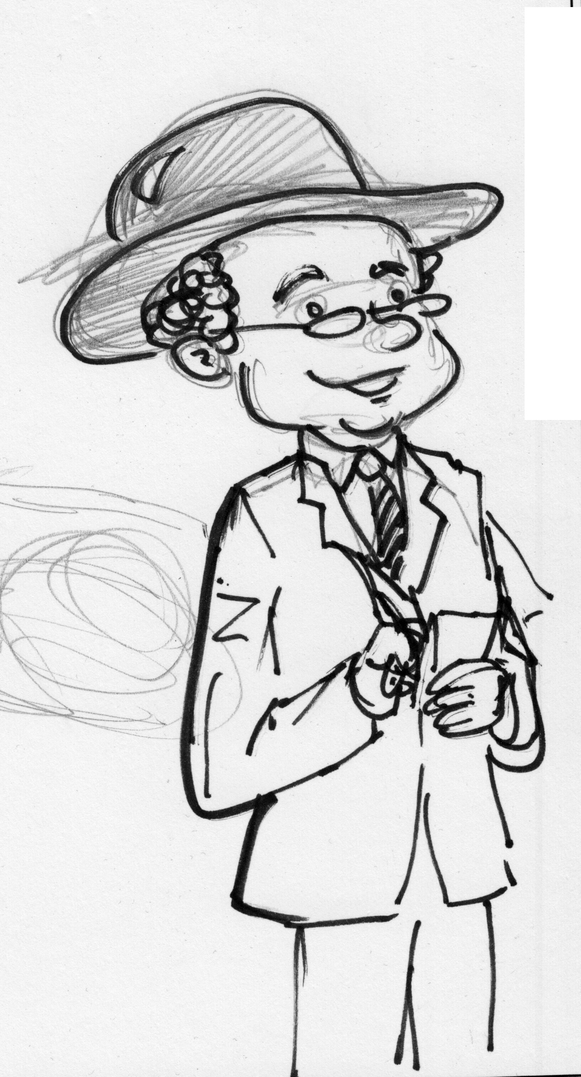
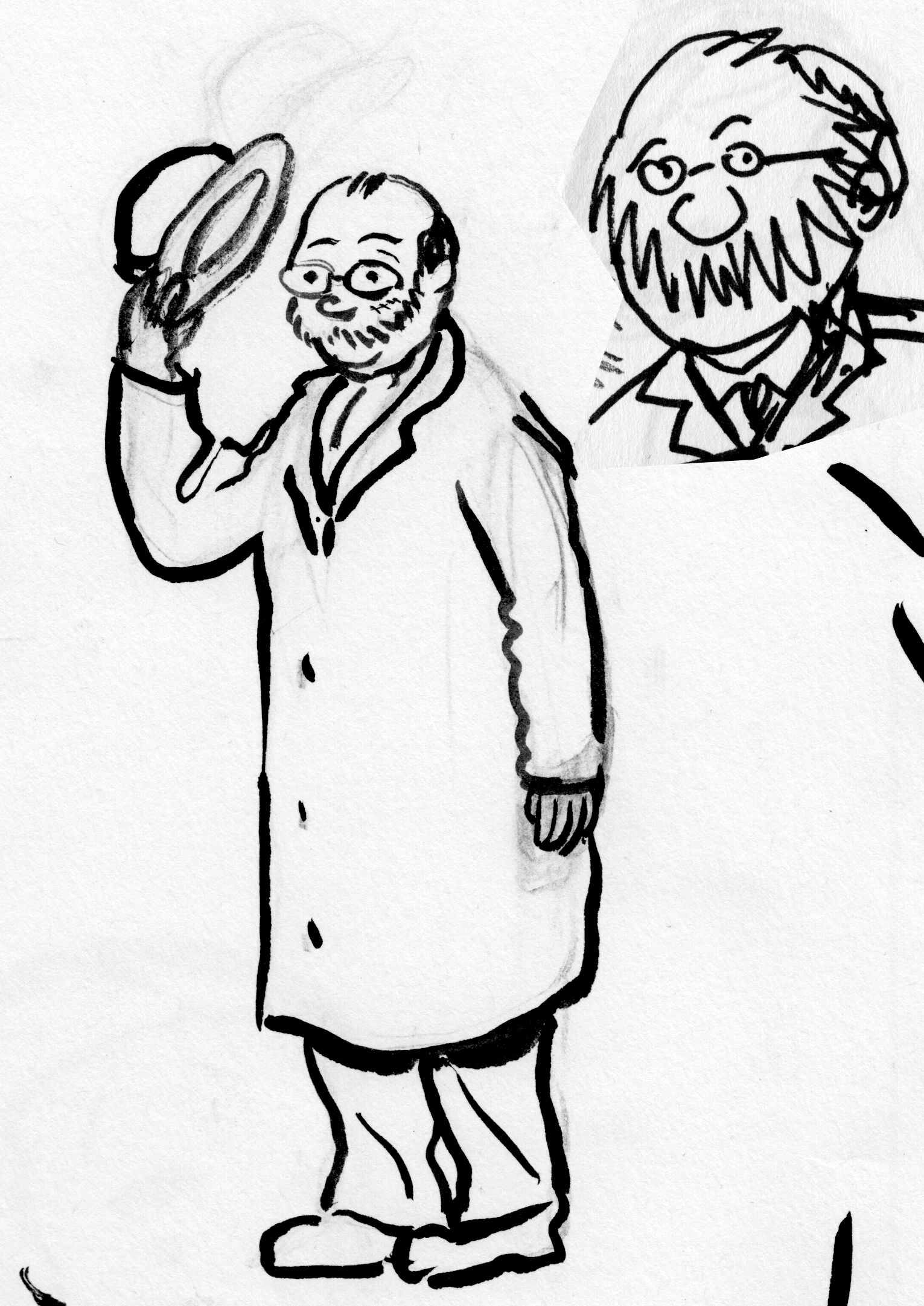
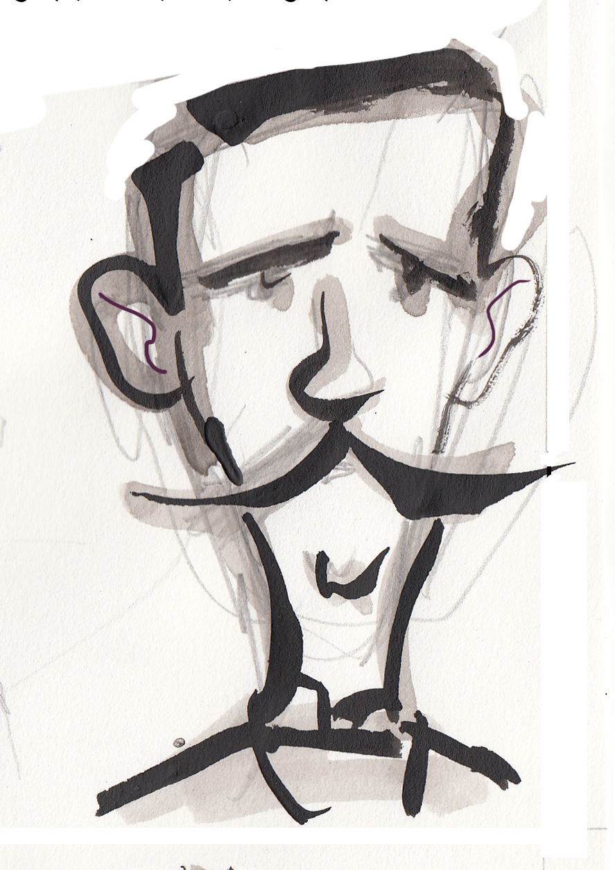
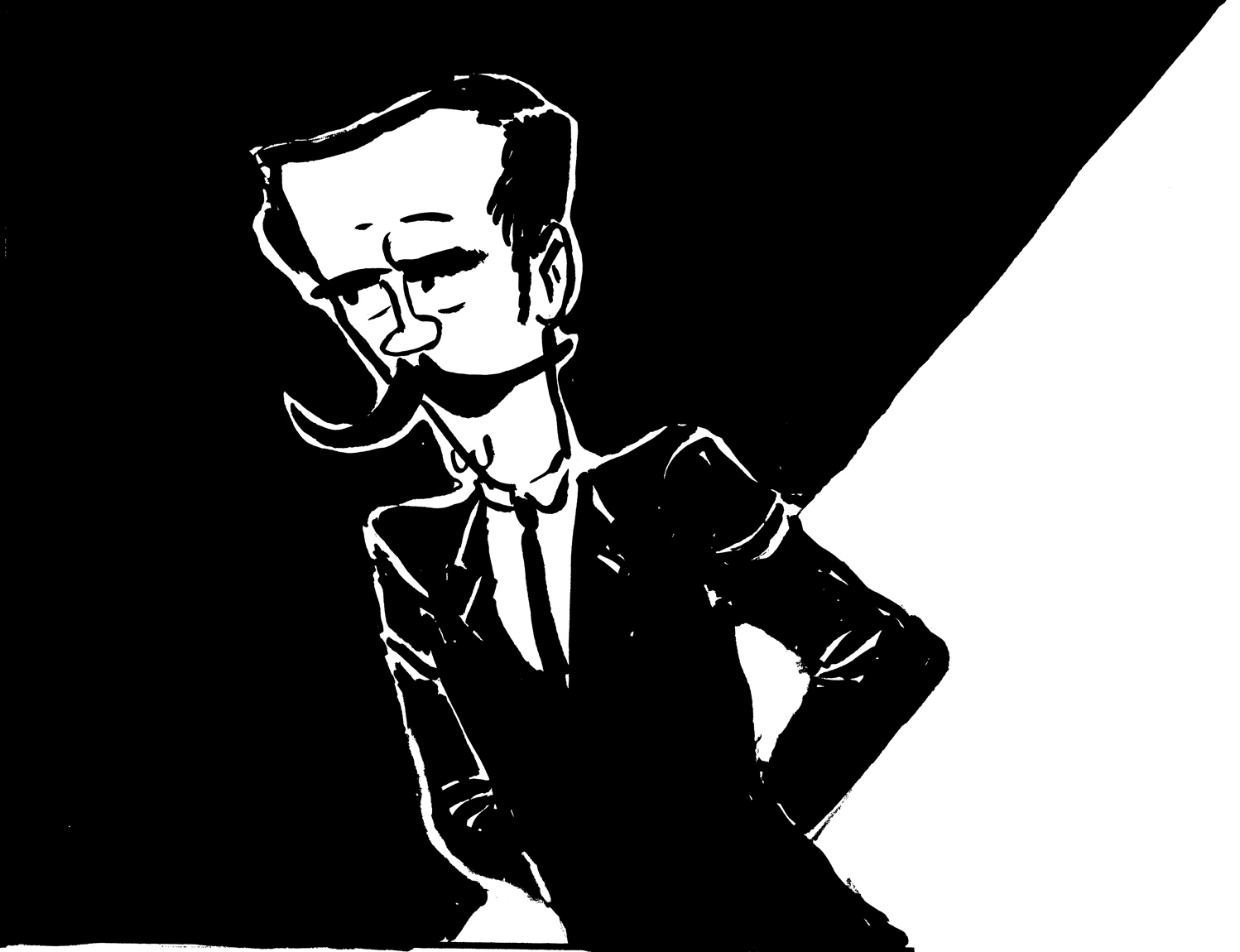
This is the only photo I could find of Charles Fisher, another principle character in the story. I liked the vain, dandy-ish look of it, which subtly fits with the character’s role in the story. Like his partne, Prescott Jernegan, he remains pretty mysterious in the historical record, and in the comic as well: he doesn’t actually say a word in the story, though he plays an important part. Here are some sketches I did. Some are stand-alone character doodles, others are taken from the rough versions of the pages, in which I was also developing the look of the characters.  In both this case and that of Jernegan, while I start from the photograph, I know that my visual development of the character is going through the prism of his role in the story, so that representing that personality in the drawing takes precedence over capturing a likeness — especially with such limited reference material.  In my drawings of Fisher, I went for a sort of “hooded” quality to the eyes, and a funny thing in the mouth — some combination of self-satisfaction and petulance that might be mistaken for humility.  I think this depiction combines what I think I see in the photo, with a pure imagining of the character based on what we know of his actions.
Â
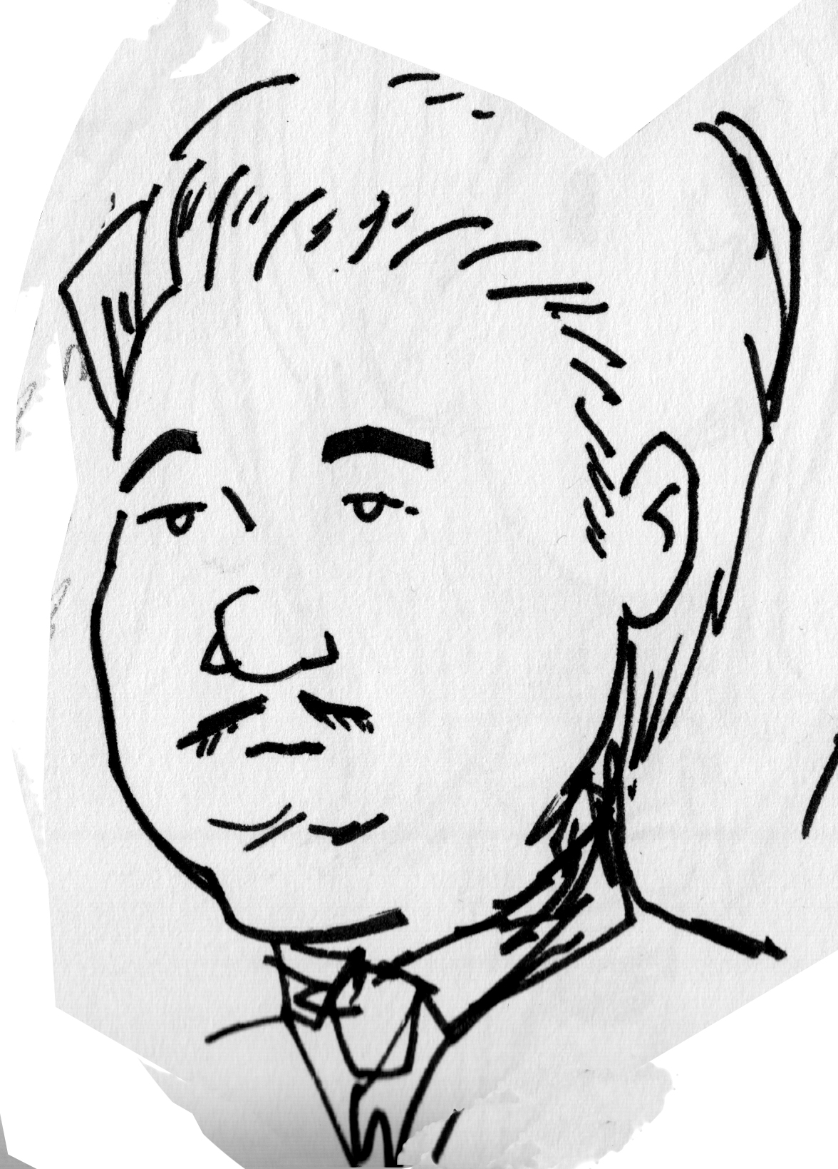
Some images of Fisher from the finished inks:
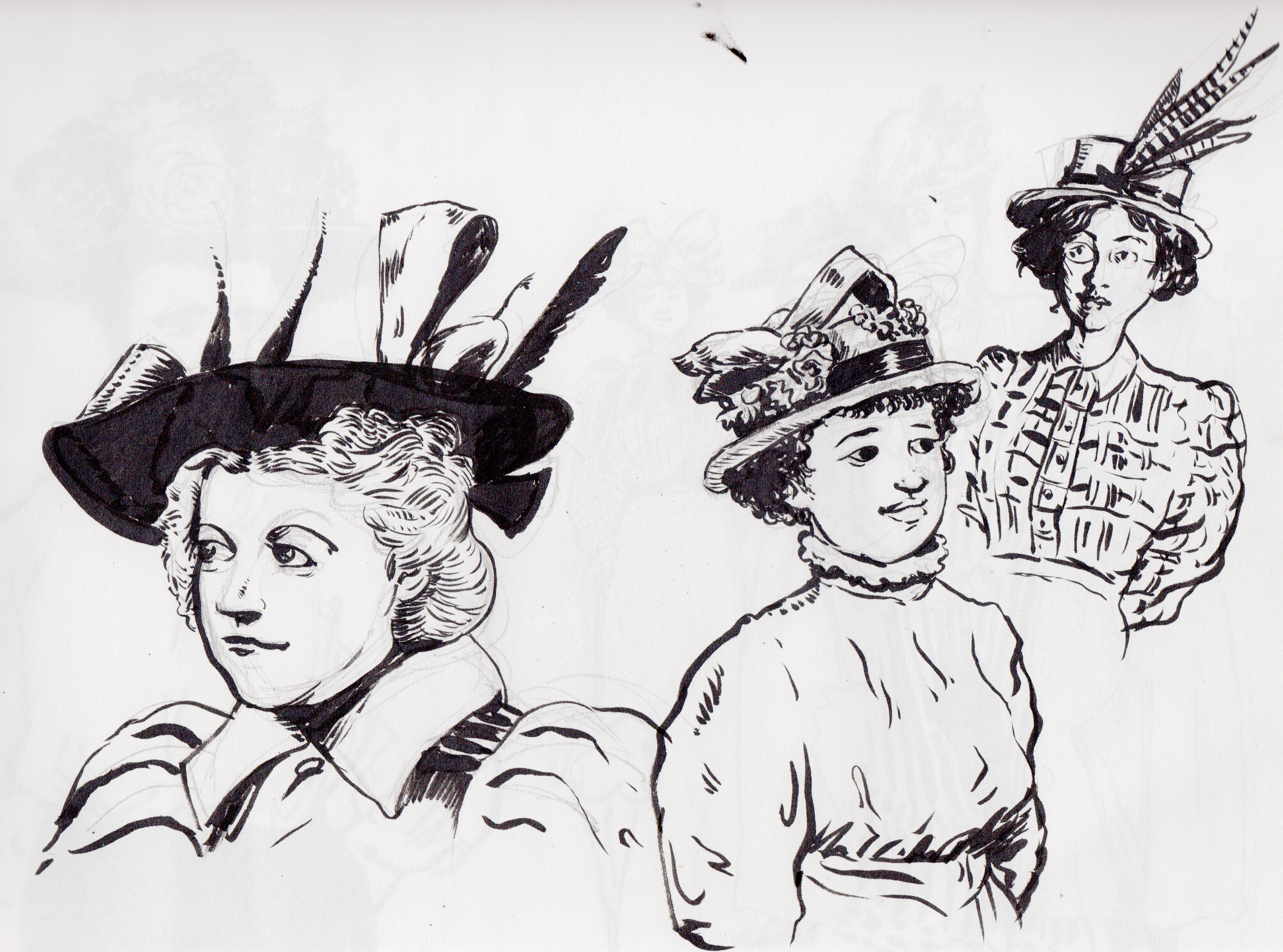
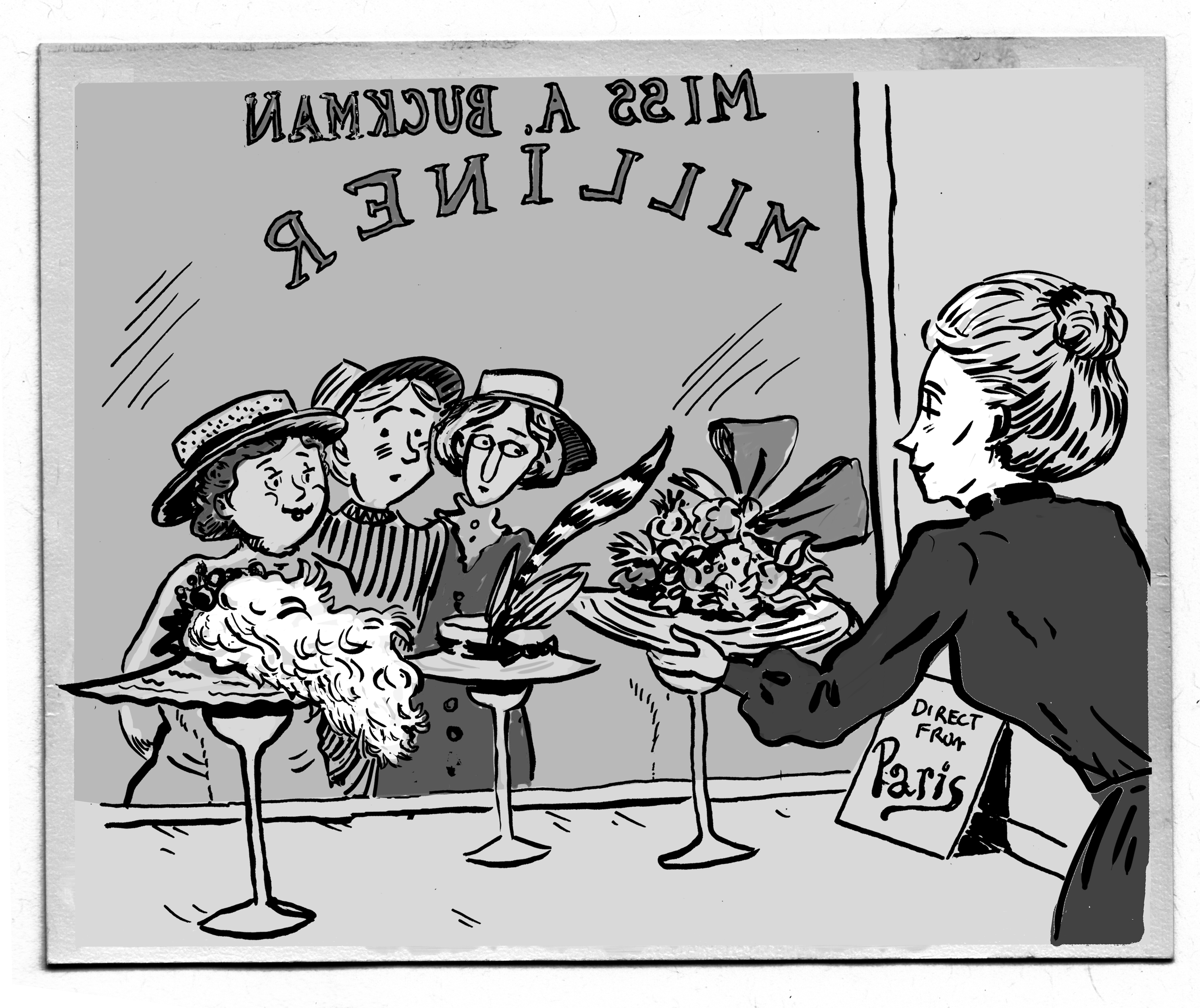
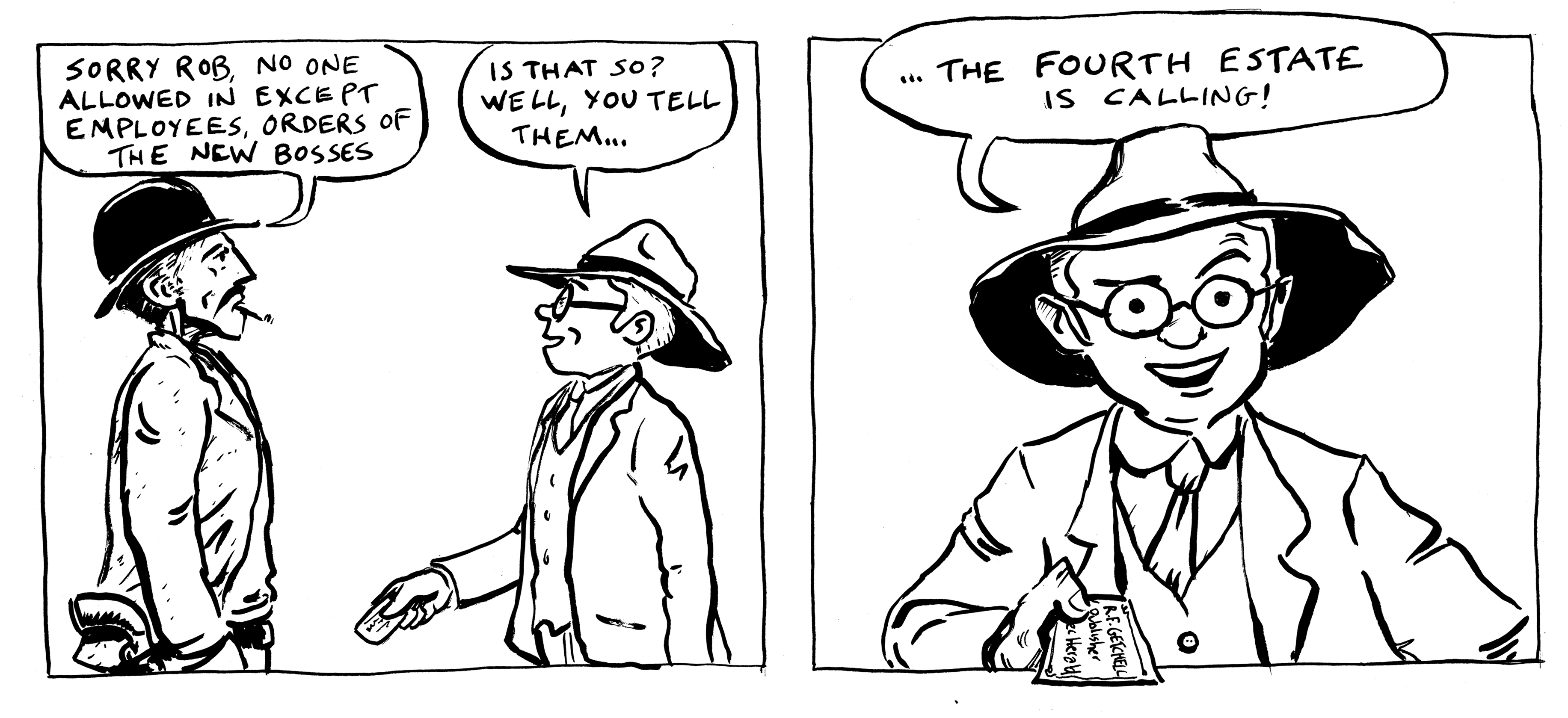
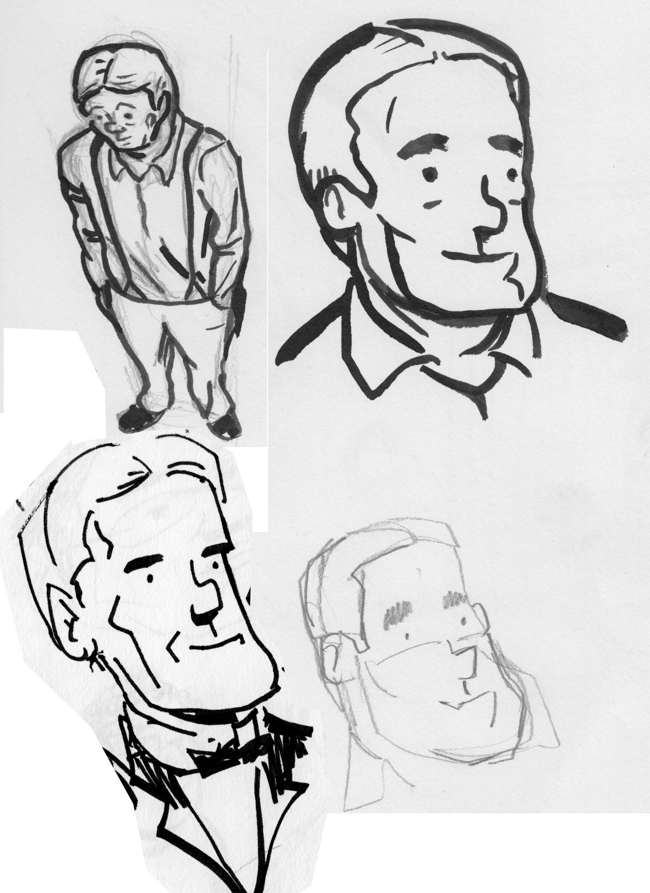
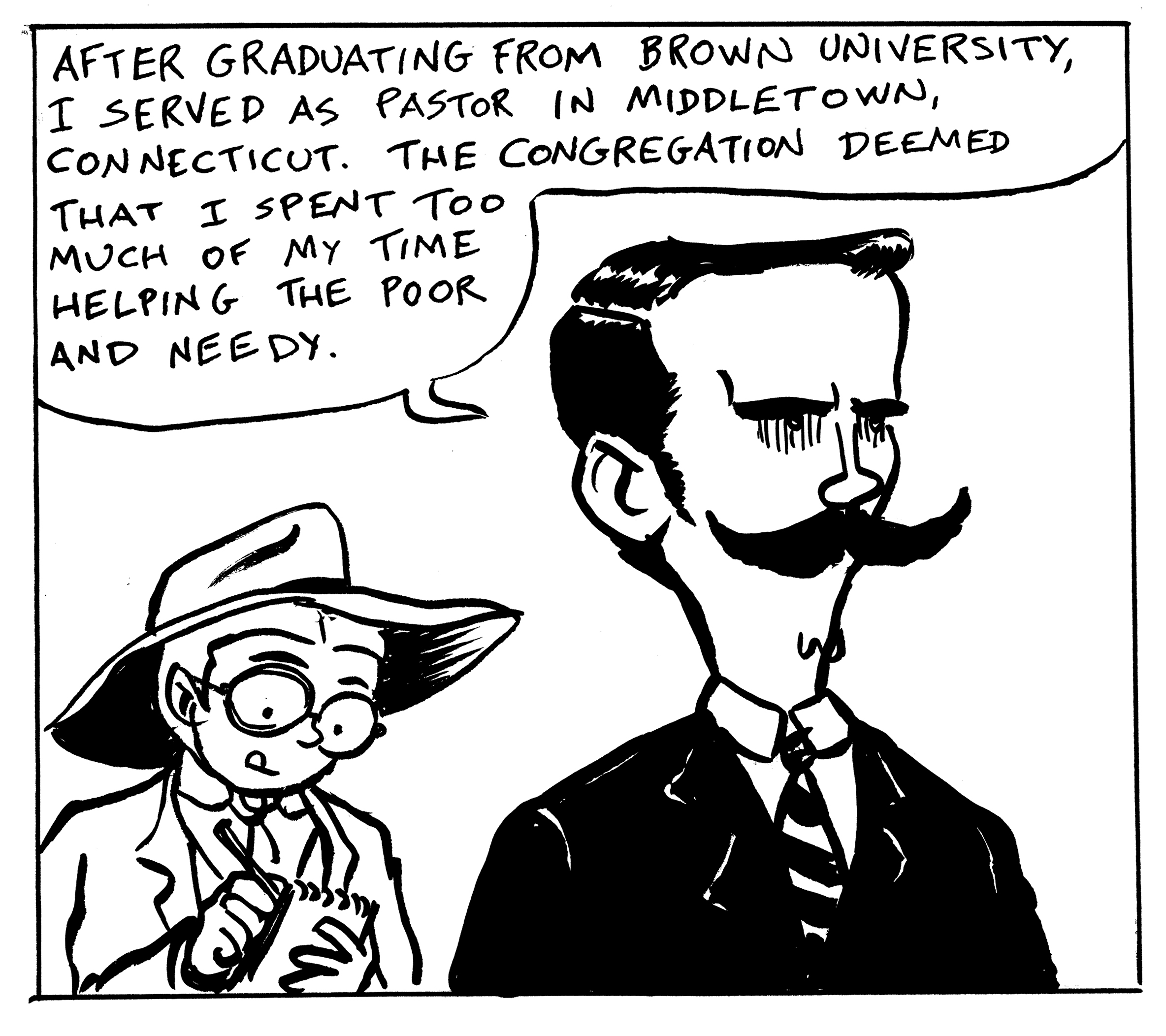
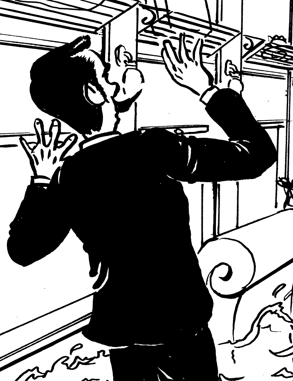
The third major character in the story is almost entirely fictionalized, the journalist Rob Getchell. The Lubec Herald in 1897-1898, from which we have most of what we know of the Jernegan story, was owned by “R. G. & F. L. Getchell Editors and Propietors.” I decided to combine them into one, and call him Rob. Â I know absolutely nothing about the real Getchells, beyond what can be gleaned from the tone of the writing in the old papers; from this I imagine a young, enthusiastic reporter, full of optimism about the modern era and its potentialities.
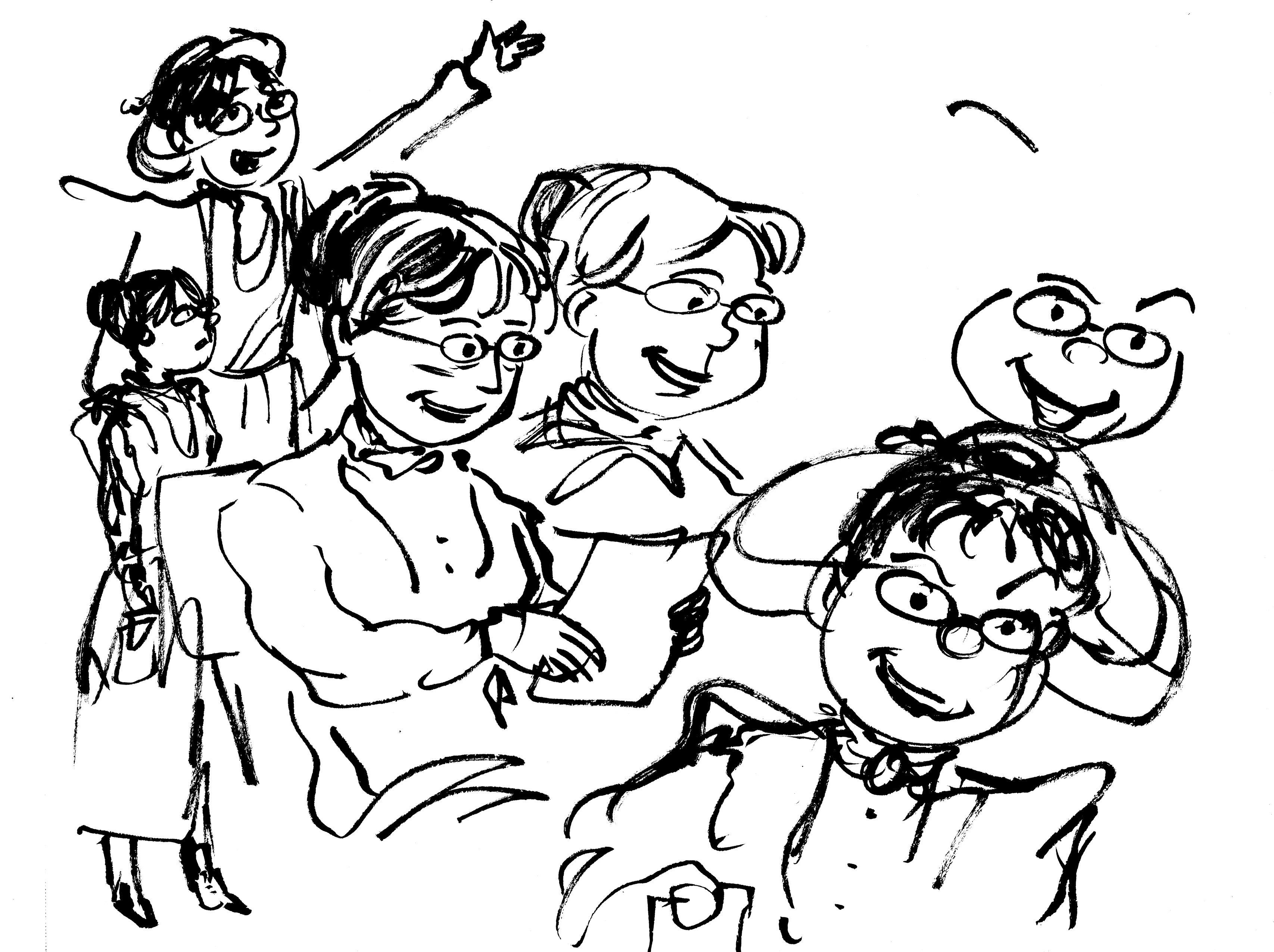
Getchell is the “stand-in” for the reader, the point-of-view character.  As such, I pushed the character in a simpler, more cartoony direction:
Then pulled back on the goofiness a bit:
At one point, since this story is low on female characters, I considered changing Getchell’s gender. There were female reporters in those days, though it was rare.
I decided not to in the end; the character turns out to be sort of a dupe, and it didn’t feel right to create a “glass-ceiling” shattering character then make a fool of her.
Here are some panels of Getchell from the final inks.
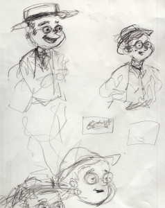
In terms of costume, since Getchell is a young man of the coming generation (in 1898), I thought the Panama Hat, a relatively new fashion, and round, tortoise shell glasses would be a good fit.
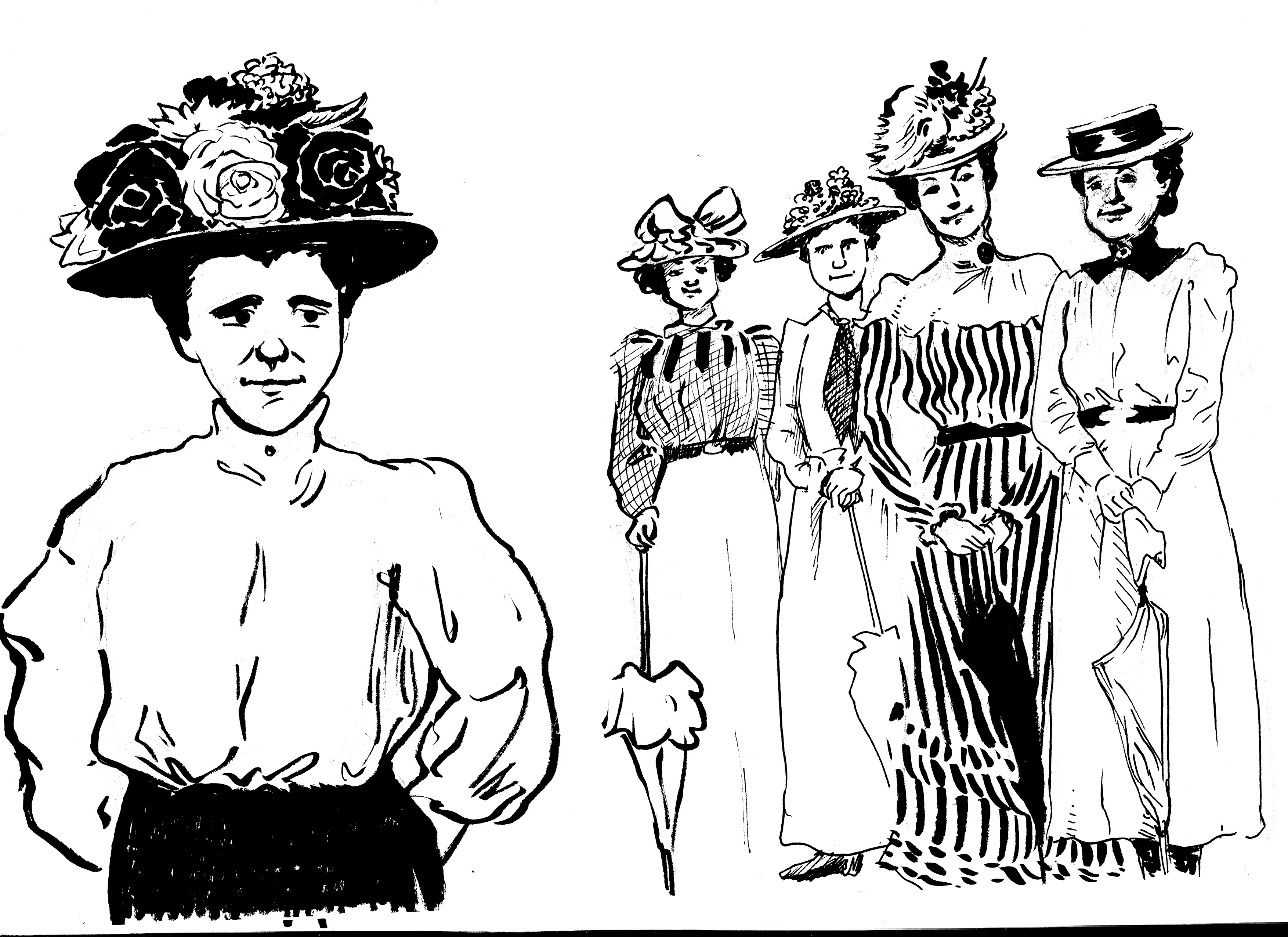
Here are some more character studies/sketches, developing some of the supporting characters:
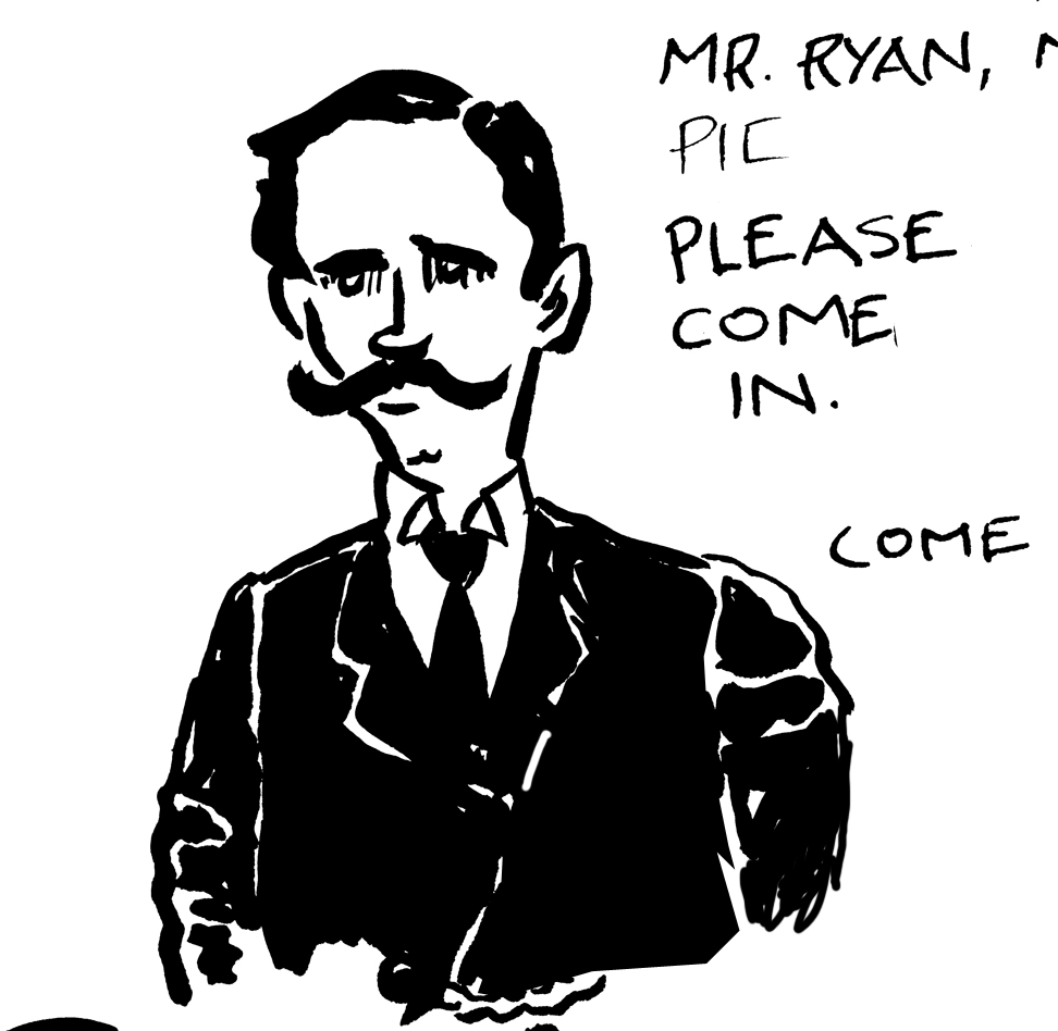
Arthur Ryan, a jeweler from Middletwon, CT., one of the first investors in the Jernegan scheme, and an officer in the company. No photo reference, so I just imagined…
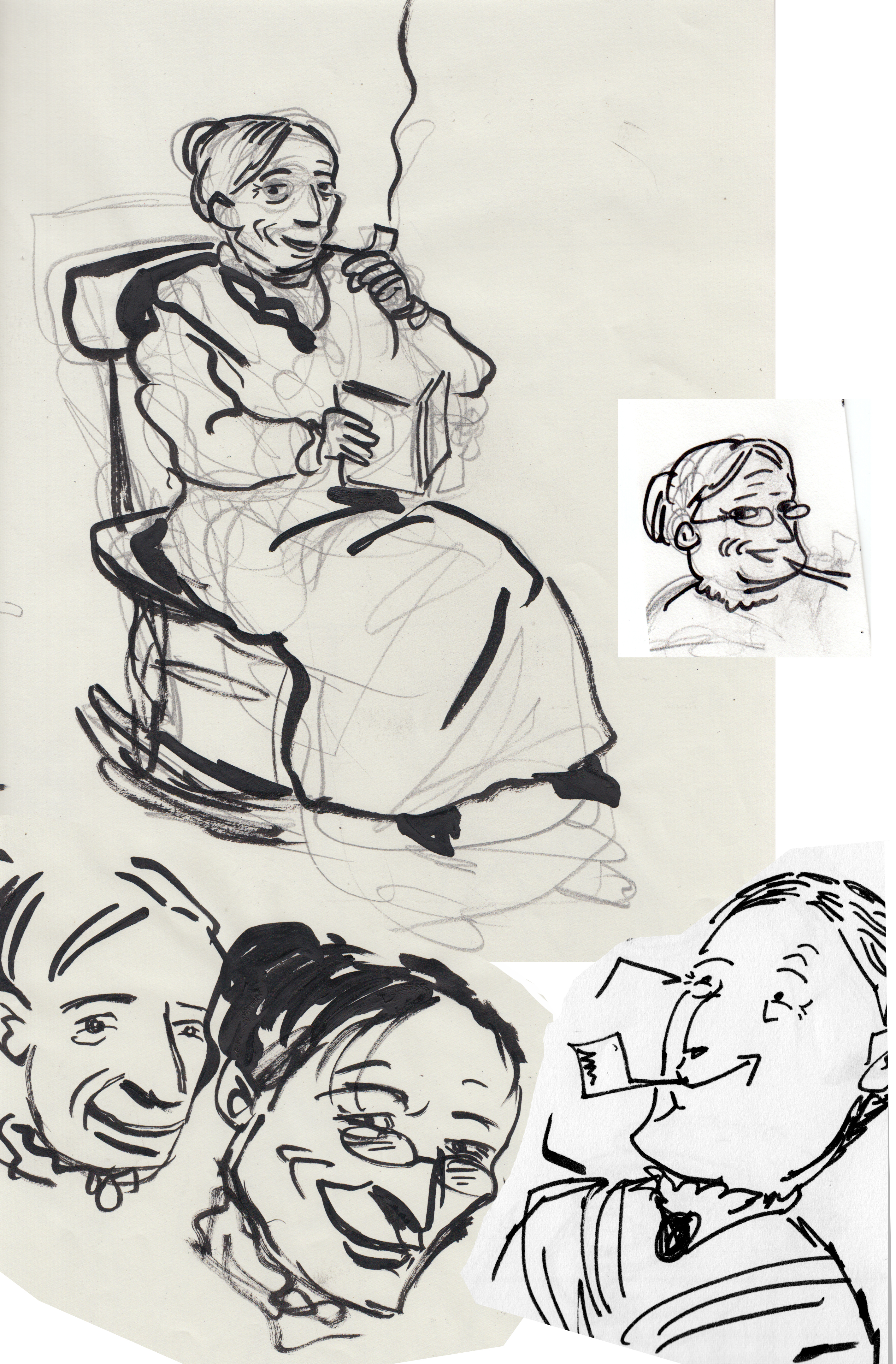
Pierson, the other early investor in Jernegan’s company; a florist from Middletown. no photos that I could find, but he’s described as a likeable, sociable and energetic fellow; and a “big swede.”Mary, an old woman who sits on the porch of the newspaper office, handing out gossip and wise advice. Totally made-up character.
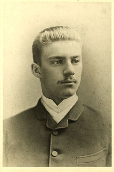
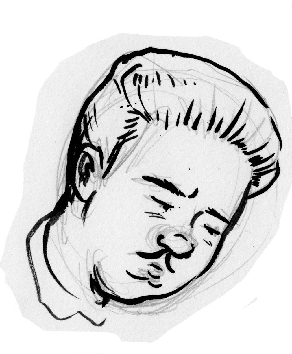
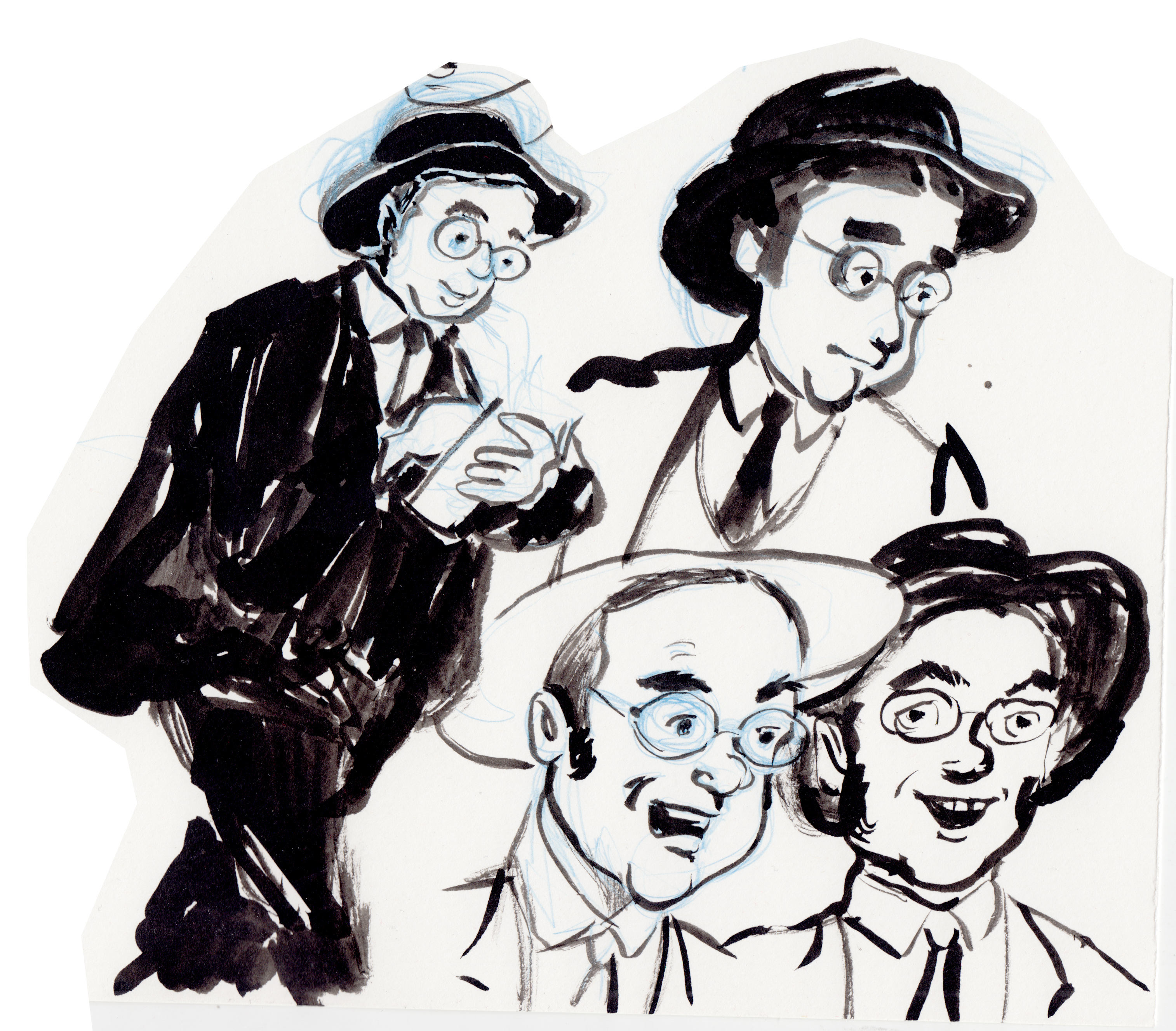
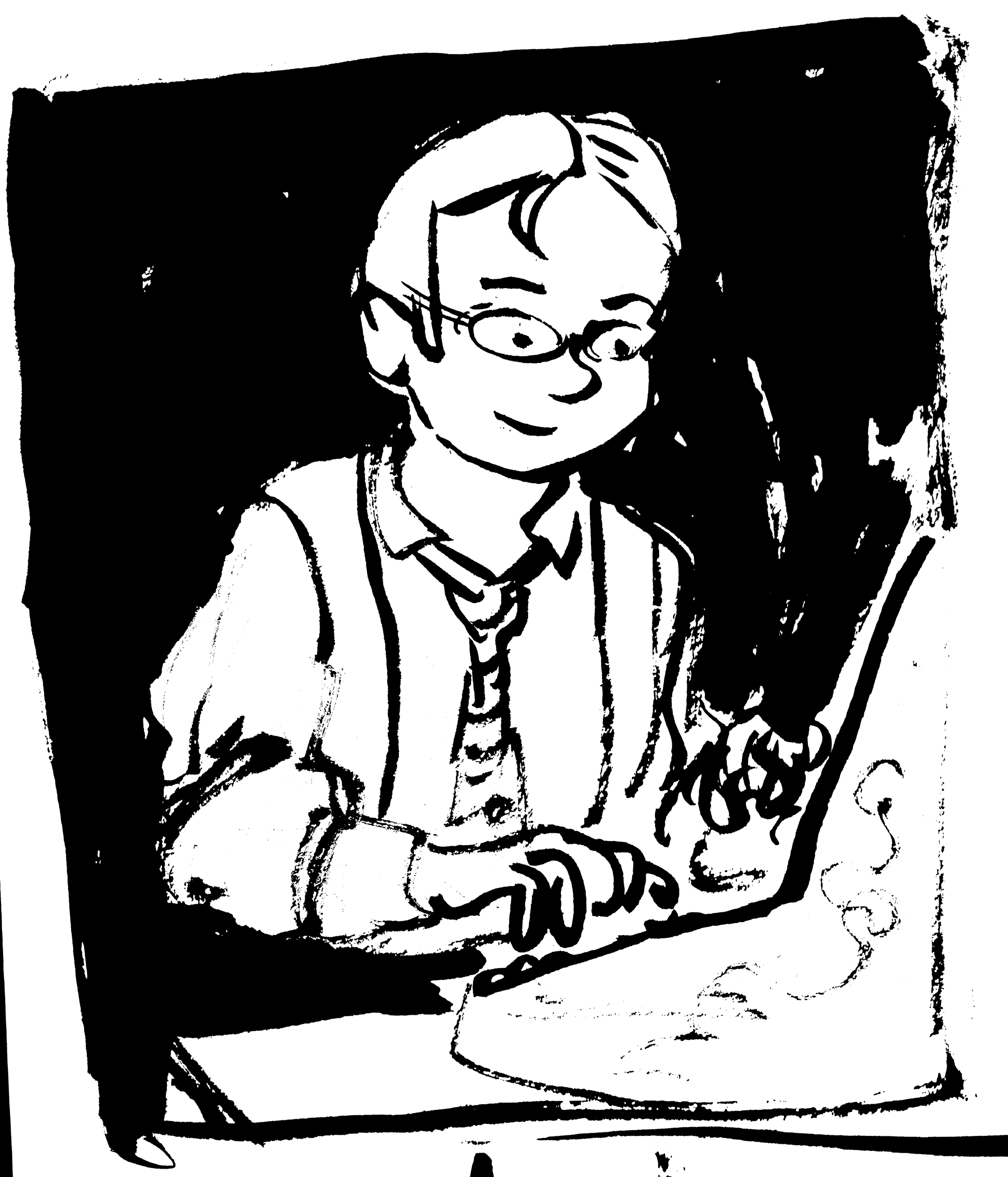
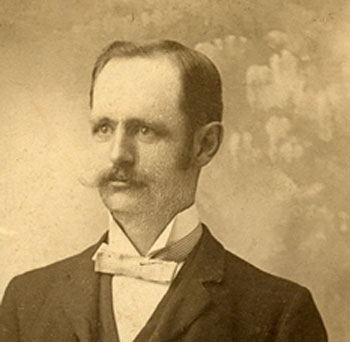
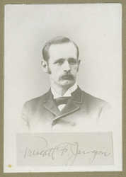
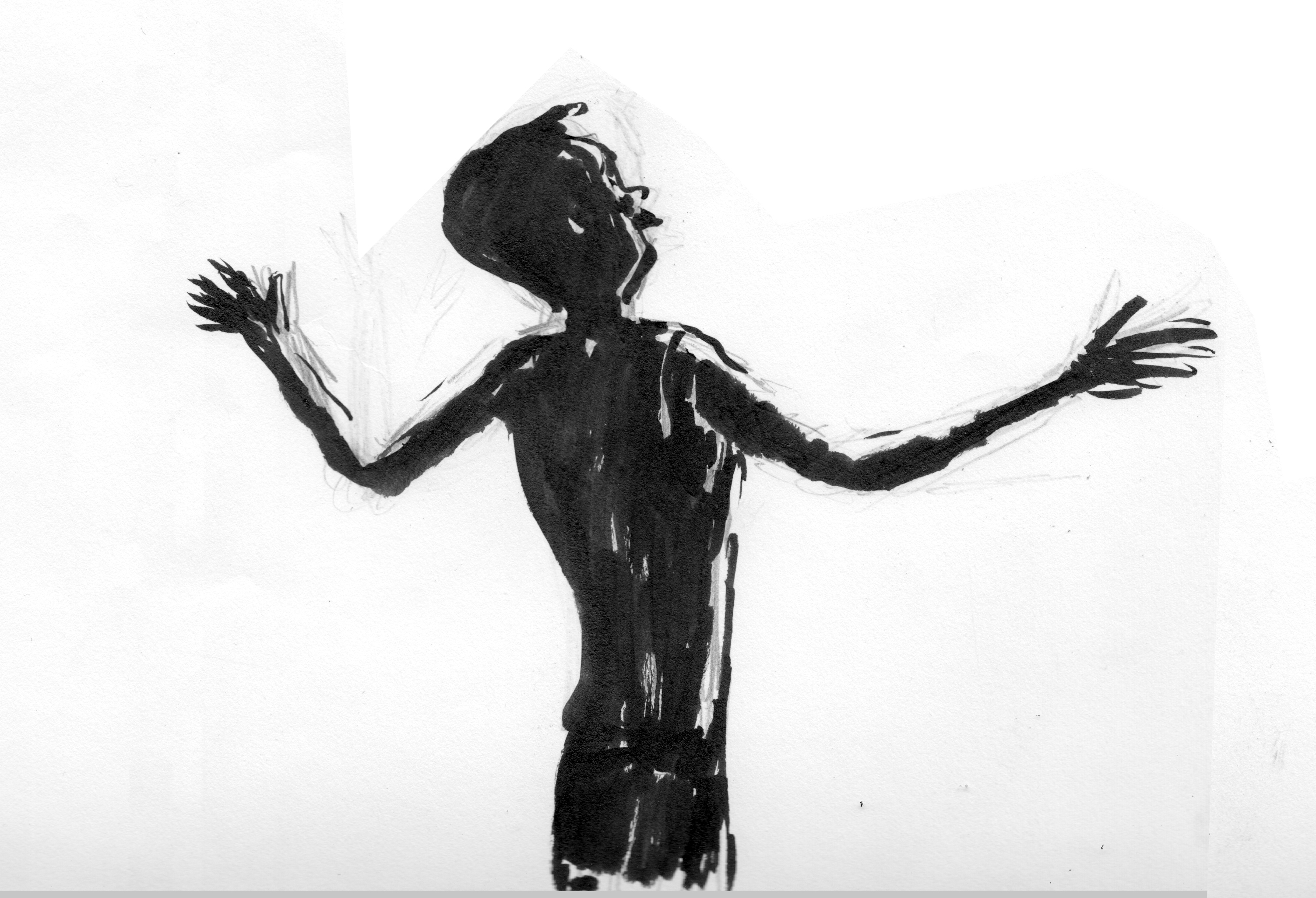
My principle characters in this comic are based on real historical figures. As far as I know there are only two photographs of my lead personage, Reverend Prescott Jernegan.  Starting from the photos, this is the look of the character evolved:
Photograph of Prescott Jernegan
Photograph of Prescott Jernegan
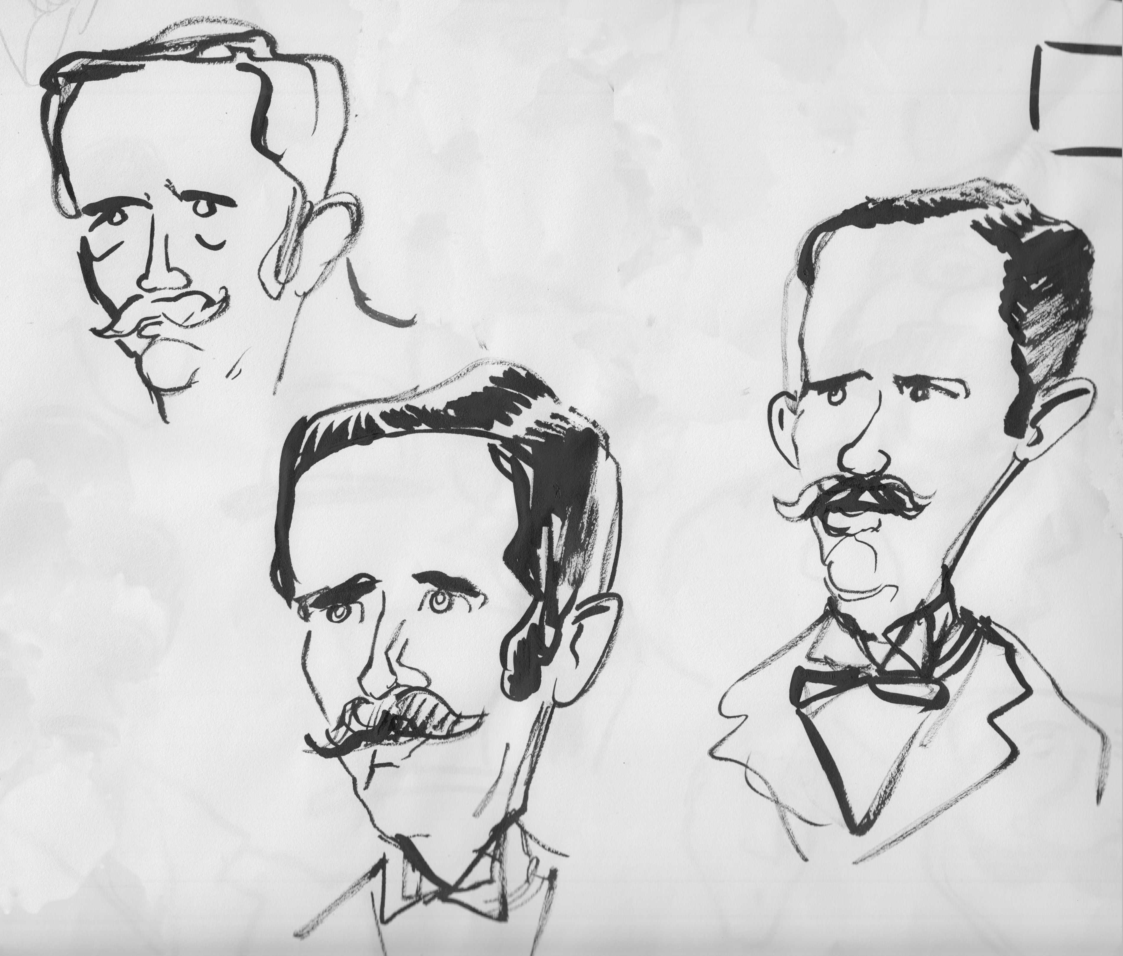
I especially like the one on the left, capturing the visionary quality I wanted for the character. Â Some early sketches:
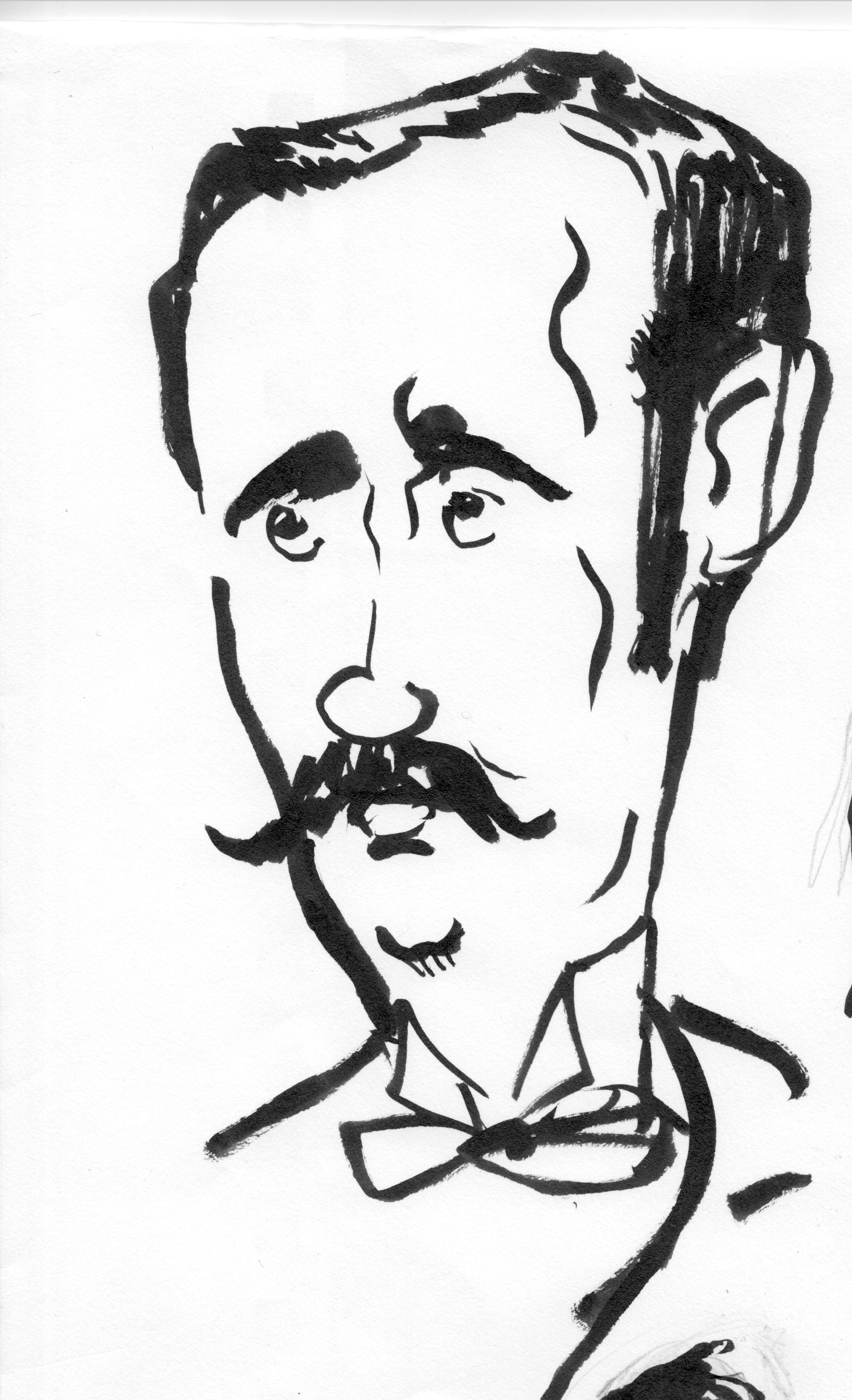
Gradually I moved toward a more stylized version of the character, and I wanted to give him a mysterious, impenetrable quality, and make his body angular and elongated:
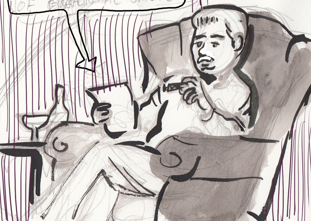
A sketch of Jernegan in the throes of ecstatic vision.
Here are some panels featuring the character from the final inked version of the comic: