Comics a Global History: Post-war Belgian bande dessinée 2: Spirou


Upcoming in June from publisher Thames and Hudson, “Comics: a Global History, 1968-present,” written by Alexander Danner and me.  Here are some excerpts, and additional material including some great comics images  that we couldn’t fit in the book.  


As the title suggests, the book covers the period from, roughly, 1968 until 2010. The introduction, though, provides some background on the development of comics around the world (focusing mainly on Europe, Japan and the U.S.) during the post-war era through the mid-60s.  Text in italics is directly from the book.

Continuing with the post-war Franco-Belgian comics, and focusing on the two cornerstone comics periodicals of the era, we move from Le Journal de Tintin to:

Franquin - Spirou 488 - 21-8-47 cover

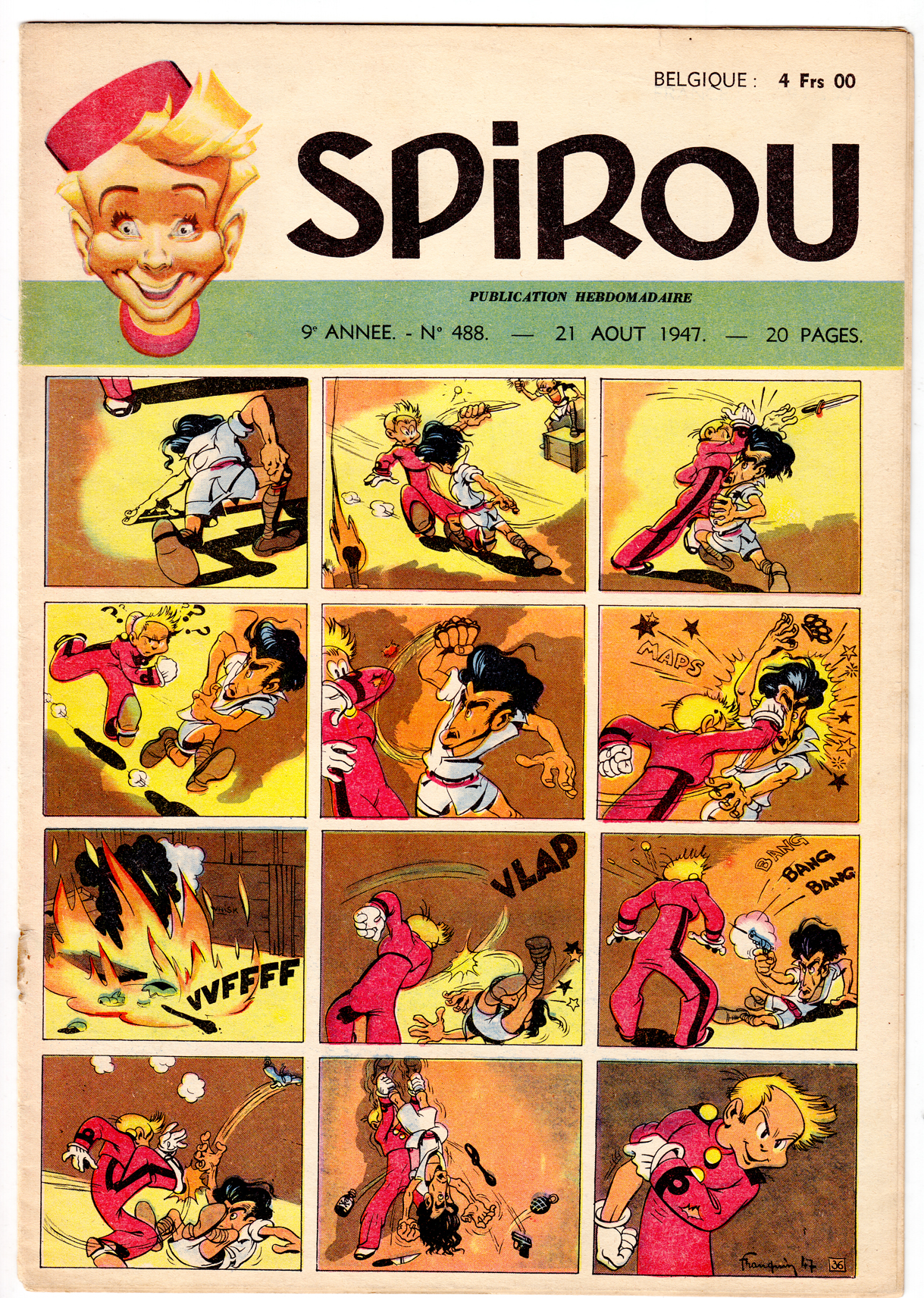
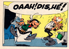
 Spirou cover/strip from 1948, by André Franquin


Spirou #748 by Franquin, 1952

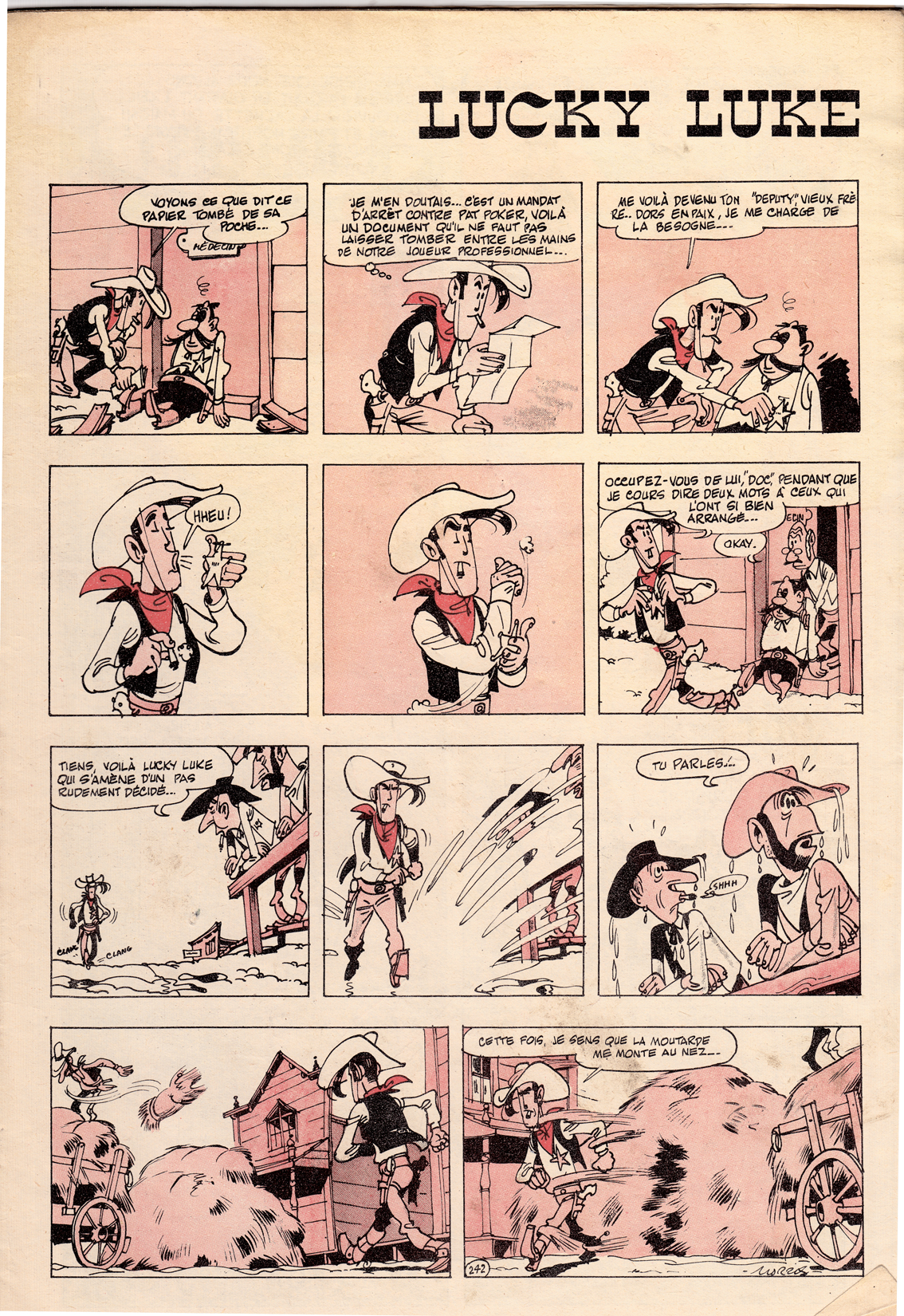
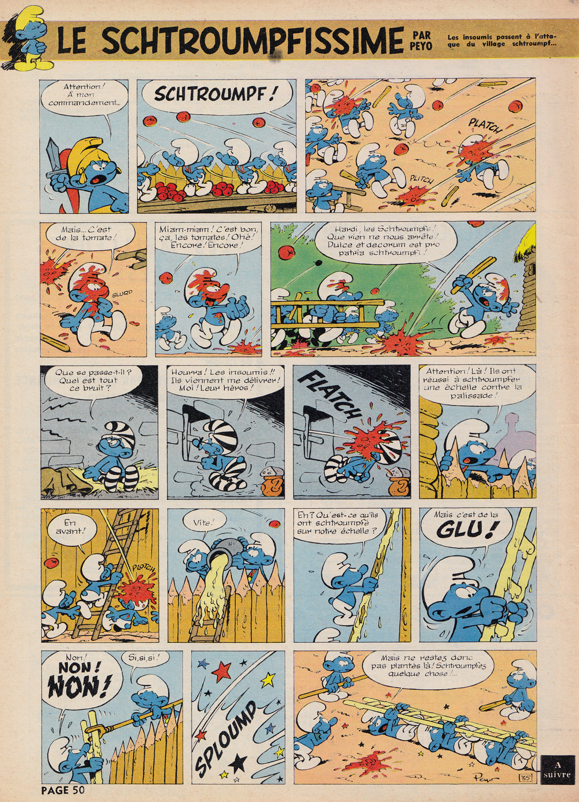
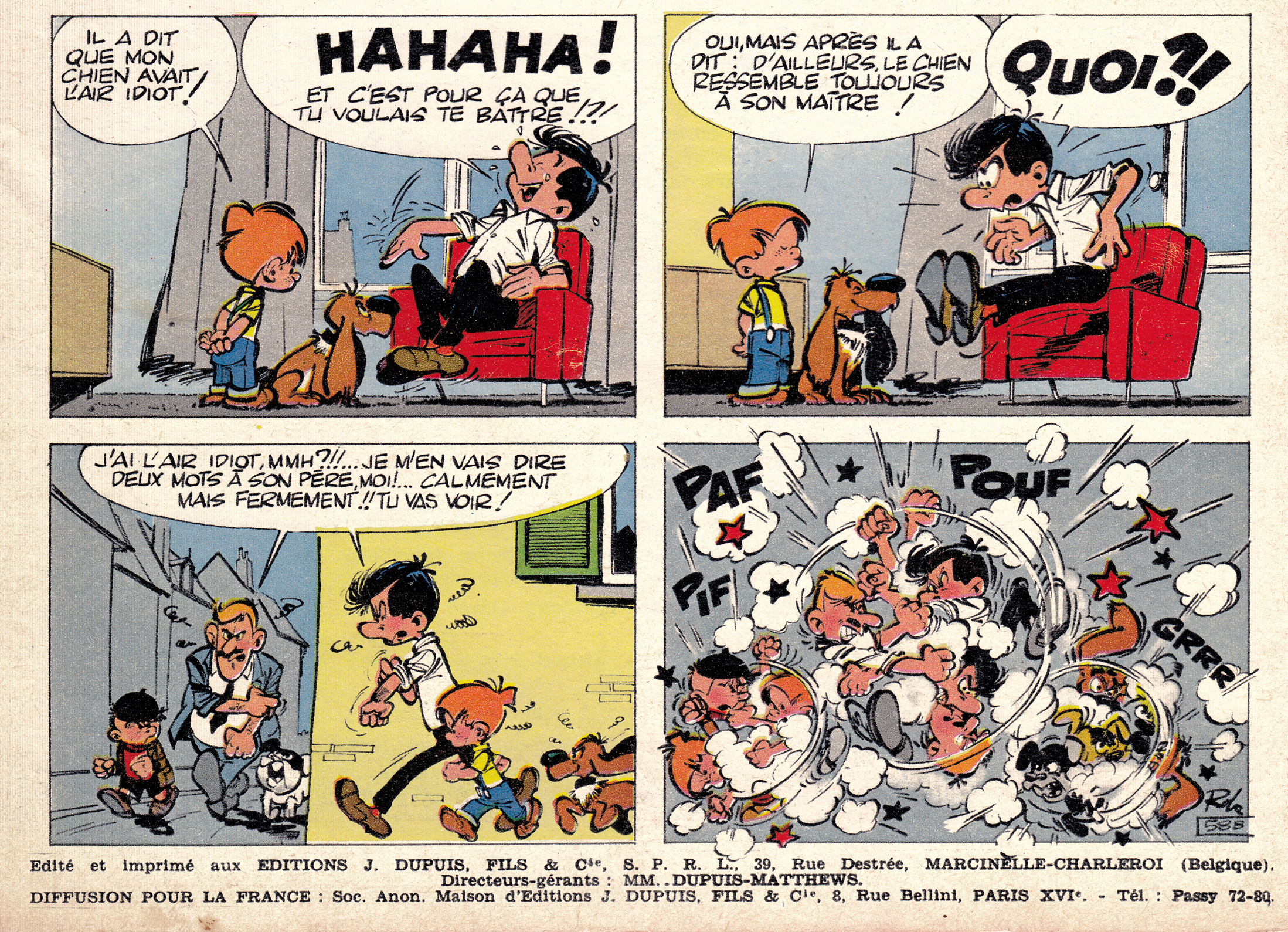
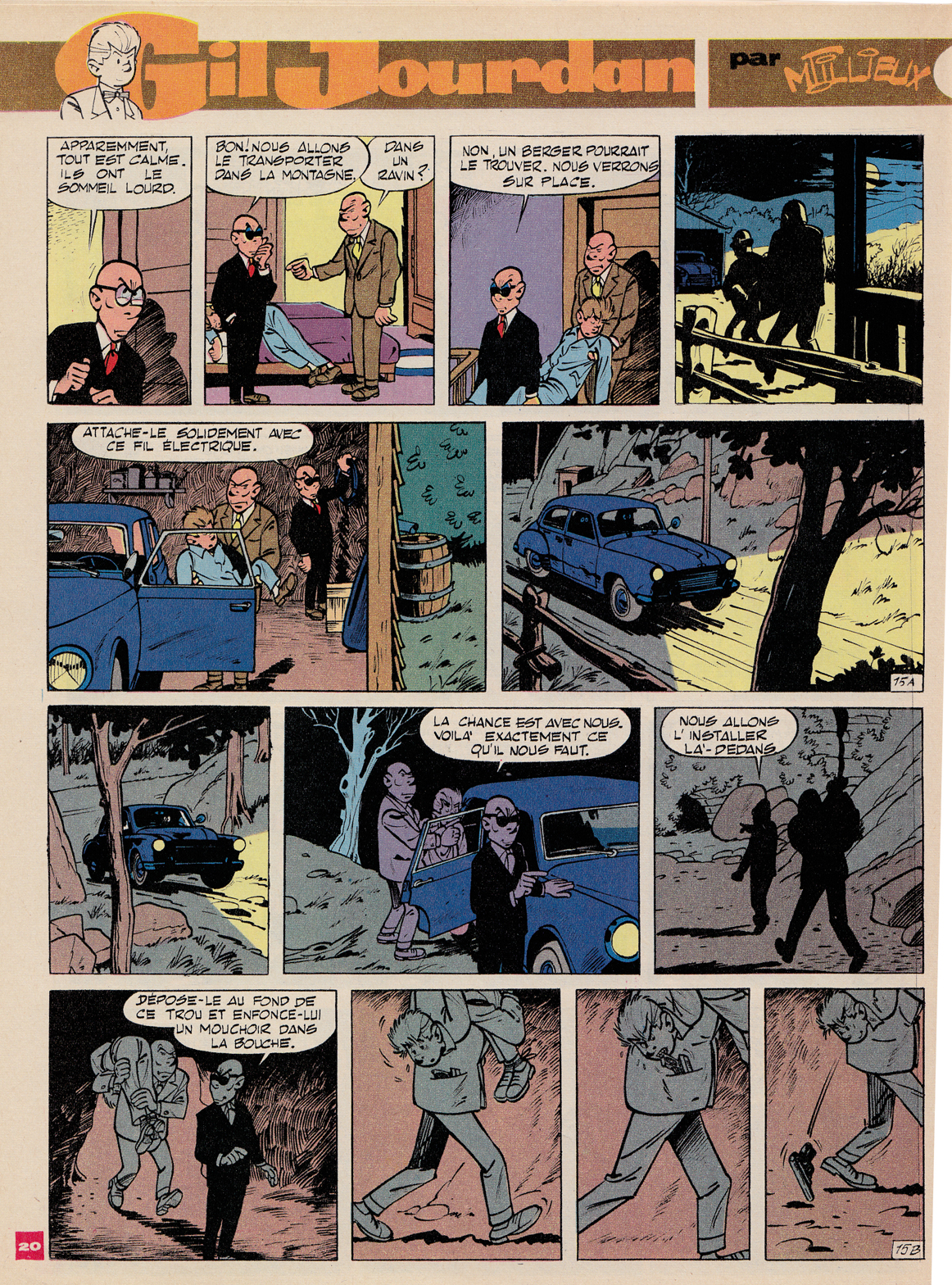
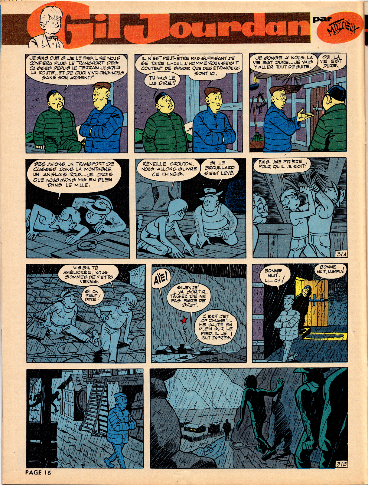
Spirou, first published in 1938, was home to the style known as the École de Charleroi, or École de Marcinelle [for the Brussels neighborhood where Spirou was located], later referred to as the “Atom Style.” In contrast to the precise, cool and orderly approach of the Hergéan Bruxelles style, the Charleroi was more exaggerated and elastic, with a more varied and dynamic quality of line. It was perfected by a strong team of artists, including André Franquin, who took over the title character Spirou and created his beloved sidekick the Marsupilami. Others included Morris (Maurice De Bevere) with Lucky Luke, Peyo (Pierre Culliford) with Les Schtroumpfs (aka   Smurfs), Maurice Tillieux with Gil Jourdan, and Roba, with Boule et Bill.

An early (1952) Lucky Luke script by Morris.
Peyo - Les Schtroumpfes, Spirou #1409, 1965
Peyo – Les Schtroumpfes, Spirou #1409, 1965


Roba - Boule et Bill - Spirou 1226 - 1961 detail
Roba – Boule et Bill – Spirou 1226 (1961) detail


André Franquin

Franquin  - Gaston lagaffe - Spirou 1480 Aug 66 DETAIL LR

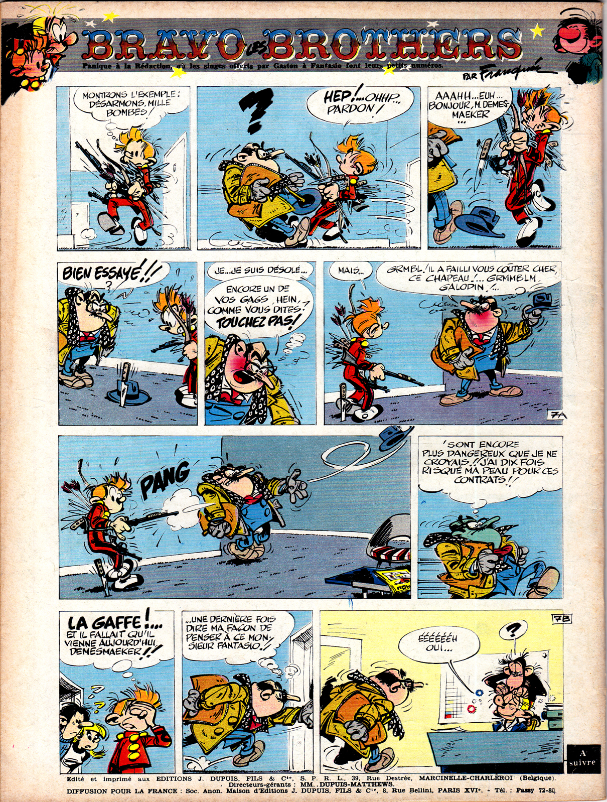
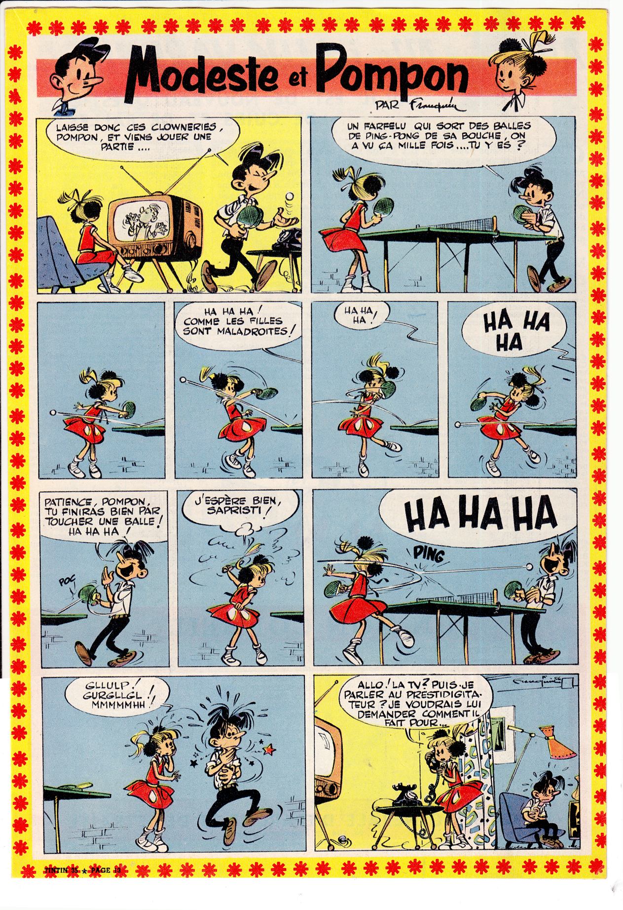
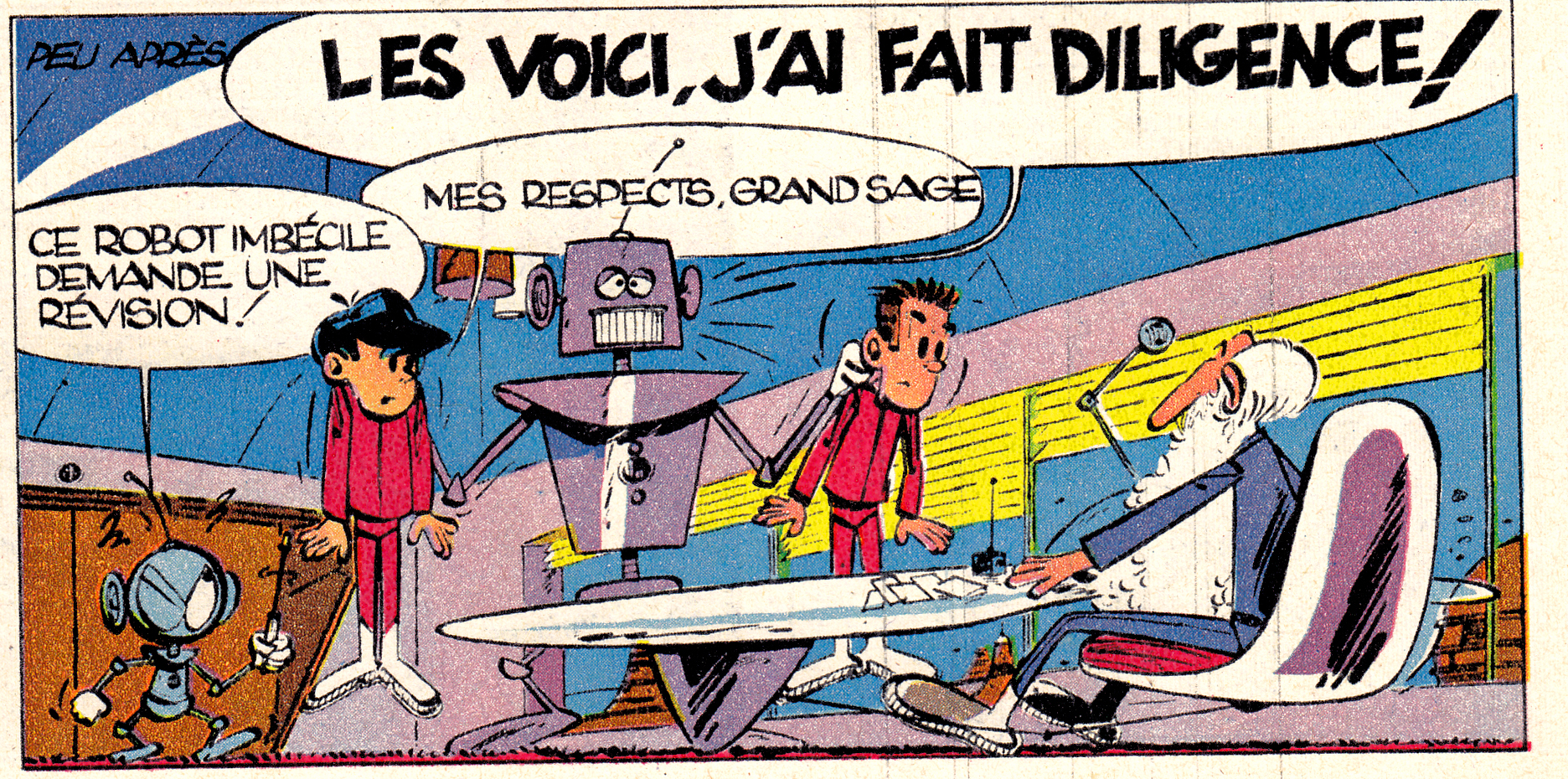
Franquin ranks with Hergé as the most revered bande dessinée artists of the postwar decades. In the late 40s, Franquin took over the title character of Spirou, and soon created the bellboy’s crazy animal sidekick, the Marsupilami.

Franquin's creation Marsupilami, the unspecified-species sidekick of Spirou is one of the most popular characters in Franco-Belgian comics

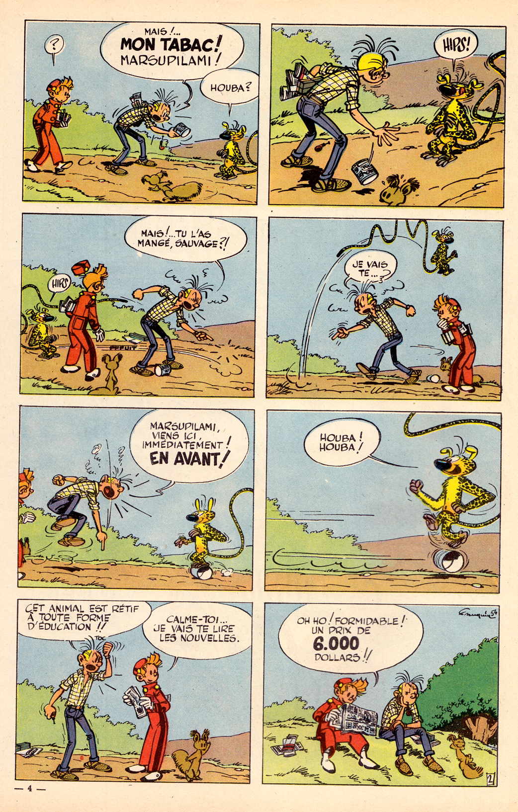
Franquin’s creation Marsupilami, the unspecified-species sidekick of Spirou is one of the most popular characters in Franco-Belgian comics

While there’s much in common between L’Ecoles Bruxelles and Marcinelle (particularly on the level of composition and layout), in Franquin’s work the differences become apparent. Instead of the cool clarity of the ligne claire style, we have here a more energetic approach to line and shading, a rounded cartooning style that owes more to the Disney model, but also a more nervous, even violent “graphism” as the French call it (a great word that means more than simply “graphic style,” I think, implying greater depths of content and meaning in the way an artist composes and draws).

Franquin Jideheim Gaston  spirou 1563 1968 DETAIL 4
Franquin and Jidehem, Gaston LaGaffe, 1968

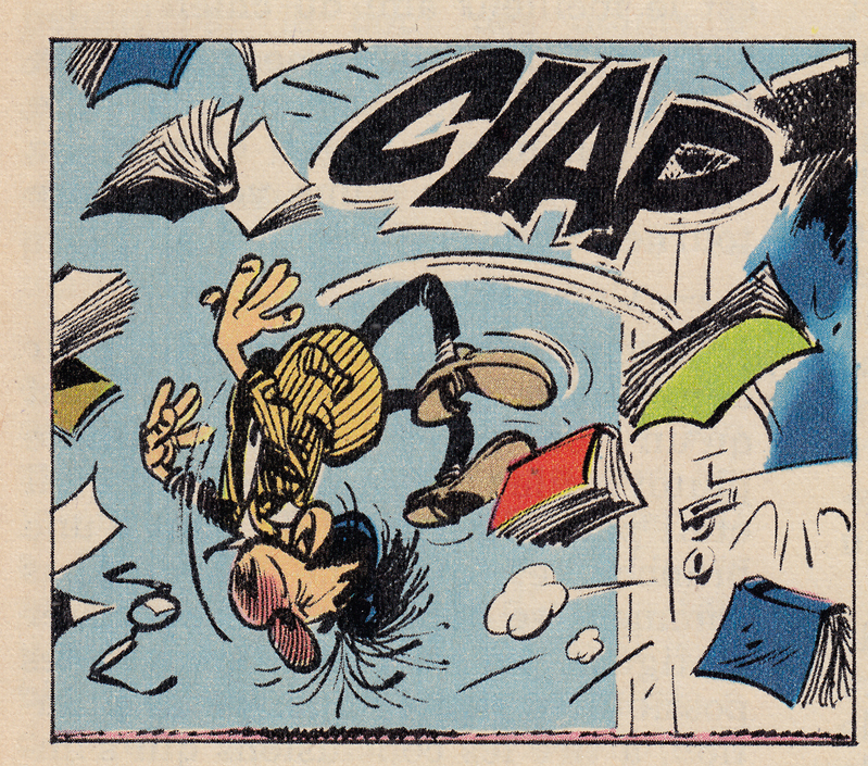
The style bespeaks an undercurrent of anxiety and chaos, as oppose to the comforting stability of the ligne claire, and this is seen also in Franquin’s approach to character.  In the late 50s he created Gaston Lagaffe, a bumbling, lazy office worker, in the words of Matthew Screech, “the first morally ambiguous bande dessinée hero.” (from Screech’s, “Masters of the Ninth Art,” which has the best writing on Franquin in English that I’ve come across, along with great chapters on Hergé, Moebius, Tardi, Goscinny & Uderzo and other topics.)
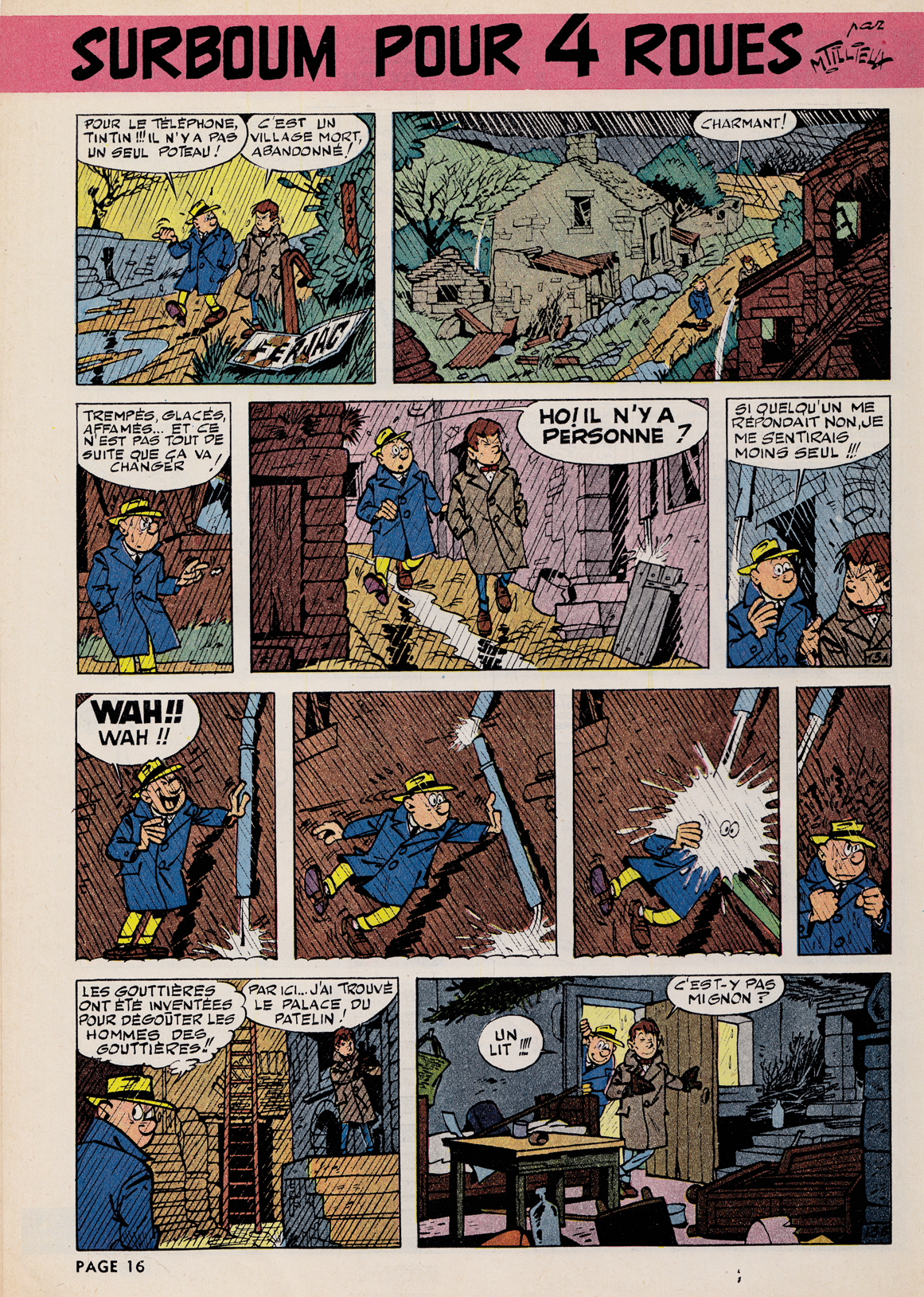
Franquin - The Bravo Brothers, 1965
Franquin – The Bravo Brothers, 1965


Franquin - Modeste et Pompom, a strip he did during a brief stint working for Le Journal De Tintin
Franquin – Modeste et Pompom, the only strip he did  for Le Journal De Tintin (from 1955-58)


Maurice Tillieux

 In his private-eye series Gil Jourdan, Tillieux combined the elegance of the ligne claire with the expressive elasticity of L’ecole de Marcinelle, moving easily from comedy to action and drama, with a great sense of atmosphere.  You can see the influence of Tillieux’s  suave but comical style  on Yves Chaland,  one of the best artists in the revival of the Tintin / Spirou styles in the 198os (more on that in later posts).

Tillieux - Gil Jourdan - Spirou 1228 1961
Tillieux – Gil Jourdan – Spirou 1228 1961
Tillieux - Gil Jourdan - le grand souffle - spirou 1560 1968
Tillieux – Gil Jourdan – le grand souffle – spirou 1560 1968
Tillieux - Gil Jourdan - Spirou 1480  1966
Tillieux – Gil Jourdan – Spirou 1480 1966
Tillieux - Gil Jourdan - Spirou 1231 1961
Tillieux – Gil Jourdan – Spirou 1231 1961

The Atom Style

In my opinion, while the Journal de Tintin / ligne claire style reached its peak in the early-mid ’50s., the archetypal Spirou look emerged slightly later, as the cartoonists working in the Charleroi/Marcinelle style fully embraced the aesthetic of 1950s-early 60s Atom-age design.  Joost Swart (another key artist in the 1980s stylistic revival, who also coined the term ligne claire),  later referred to the Spirou sensibility as the “Atom Style,” with reference to this cartoony modernism.

Franquin - Modeste et Pmpon - TINTIN35 DETAIL
Franquin – Modeste et Pompon – DETAIL
Franquin - SPIROU 907 9-55 - cover La Super Quick
Franquin – SPIROU 907 1955
Mallet - Pegg - Spirou 1231 1961
Pat Mallett – “Pegg” – Spirou #1231, 1961


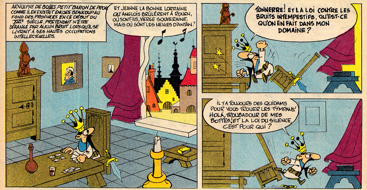
Even a middle-ages-set gag strip can have that “Atom style” look:

Noel Bissot - LesHallucinationsDuBaron - Spirou 1440 - 18 Nov 1965 DETAIL
Noel Bissot – Les Hallucinations Du Baron – Spirou #1440, 1965 (detail)

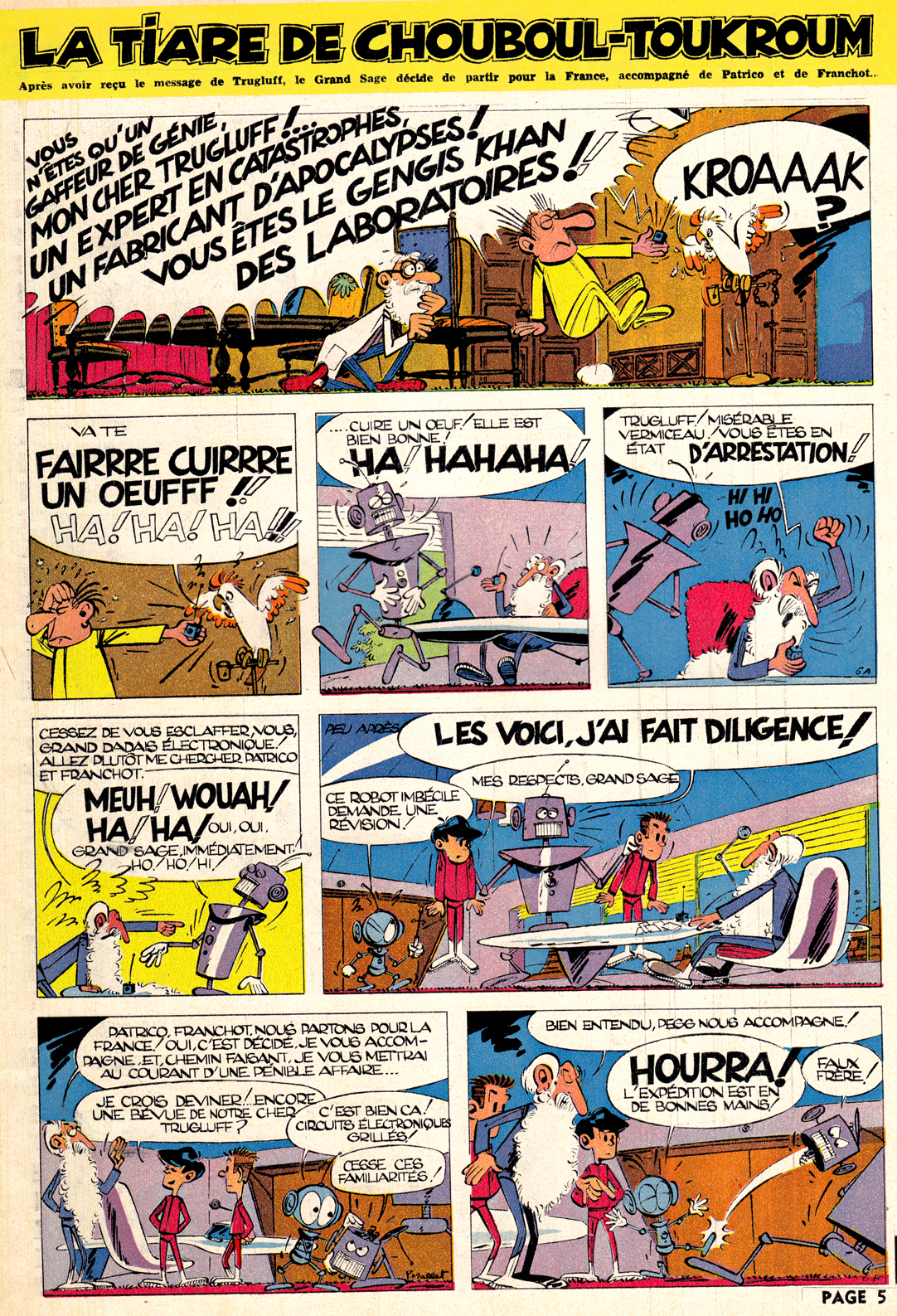
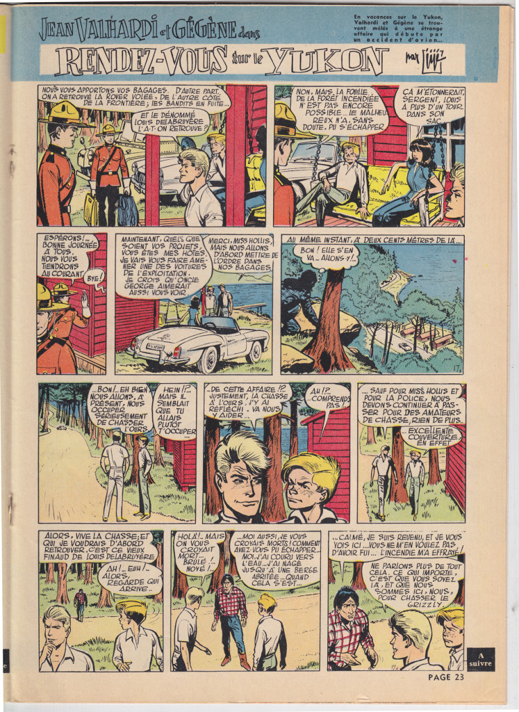
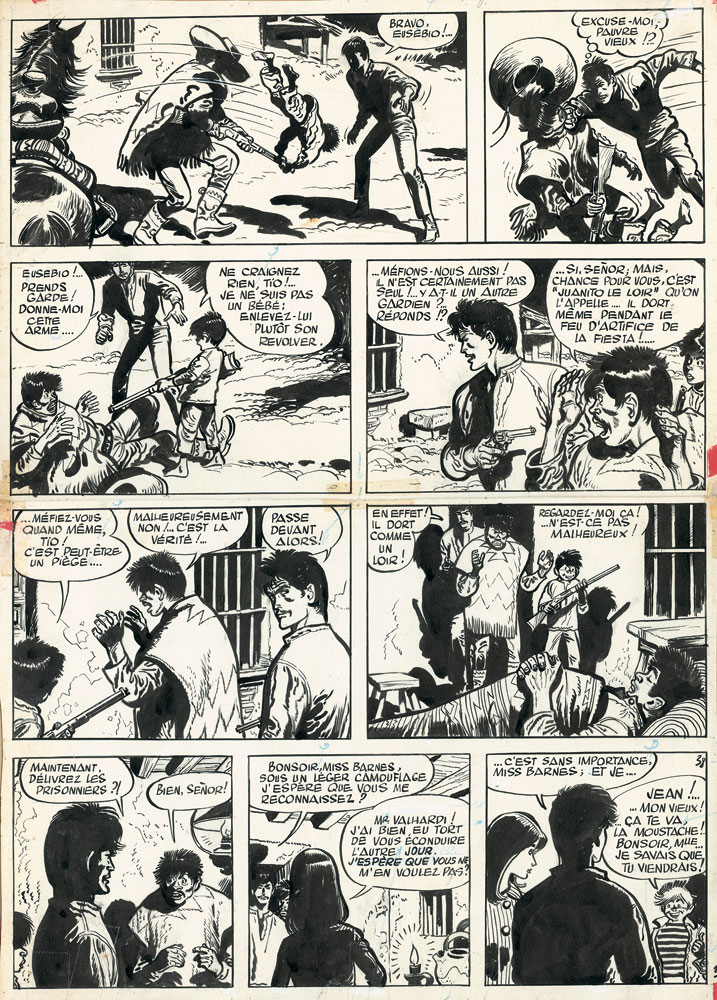
Not all the content of Spirou was comical.  There was also a large component of muscular action comics, the best featuring the heavy-lined exaggerated styles of Eddie Pappe and Jiji. Two examples, 20 years apart, of the two artists work on the long-running strip Jean Valhardi:Paape - Jean Valhardi - Spirou No436 -- 22  Aout 1946

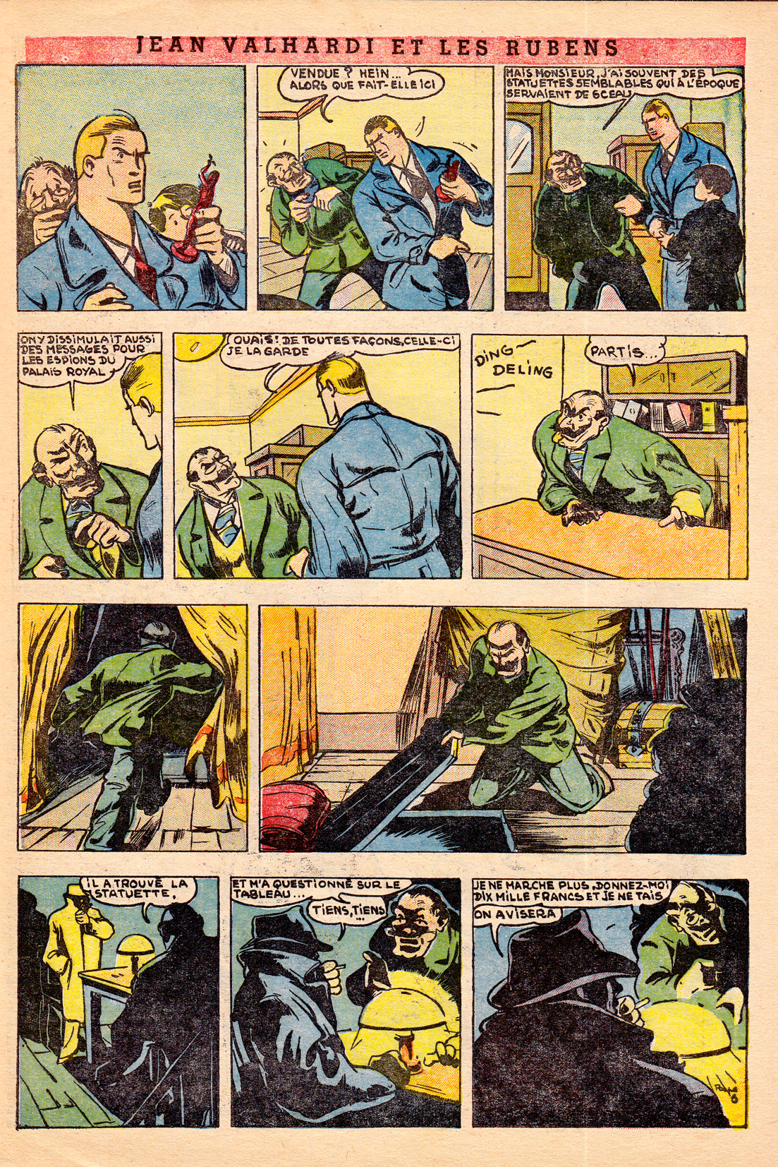
Eddie Paape – Jean Valhardi – Spirou 436, 1946
Jije - Jean Valhardi - Spirou 1226 - 1961
Jije – Jaen Valhardi – 1961 Jiji (Joseph Gillain), joined Spirou in the late 1930s and drew the title strip before handing it over to Franquin. Working for the journal through the 1970s, he was a mentor and stylistic influence on artists as diverse as Franquin, Jean Giraud (Moebius) and Yves Chaland.


Jije - Jean Valhardi - L'affair Barnes, 1957.  Scan of original art, source: Galerie Laqua
Jije – Jean Valhardi – L’affair Barnes, 1957. Scan of original art, source: Galerie Laqua


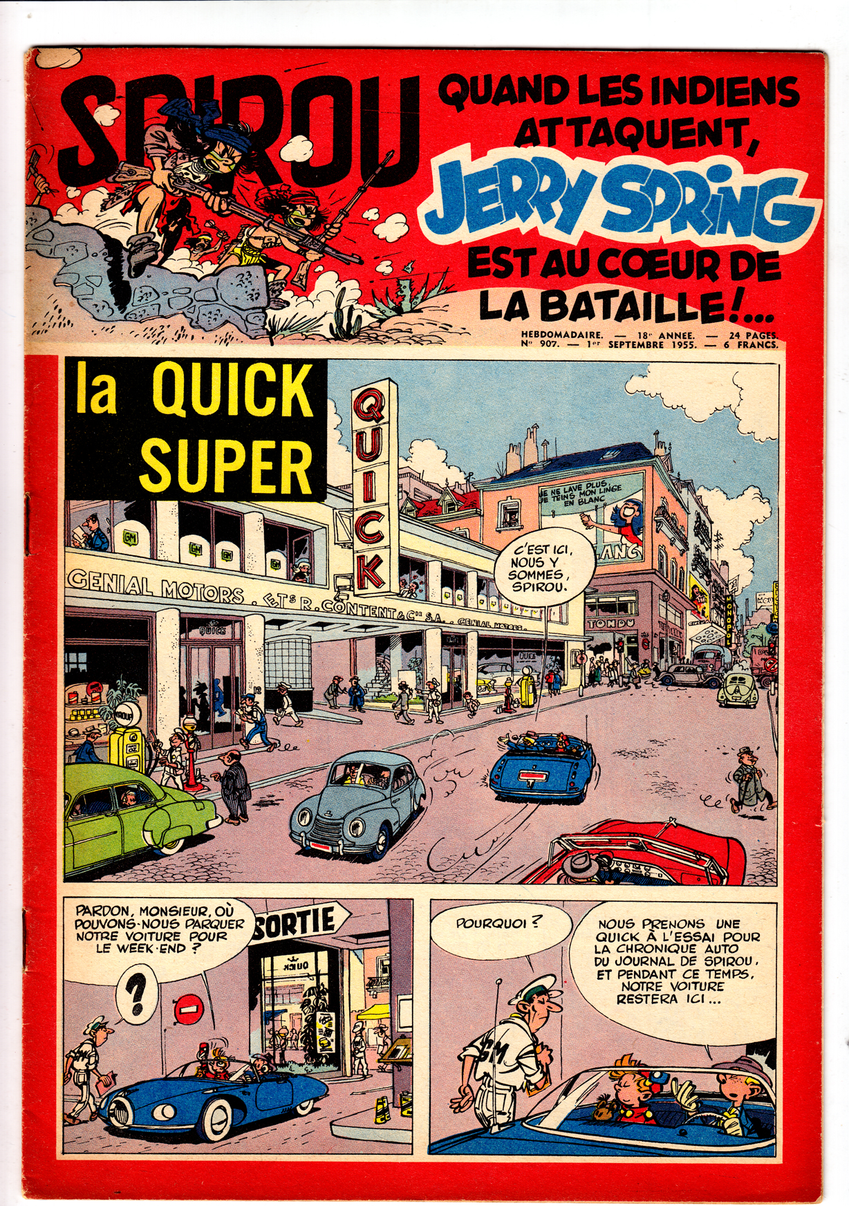
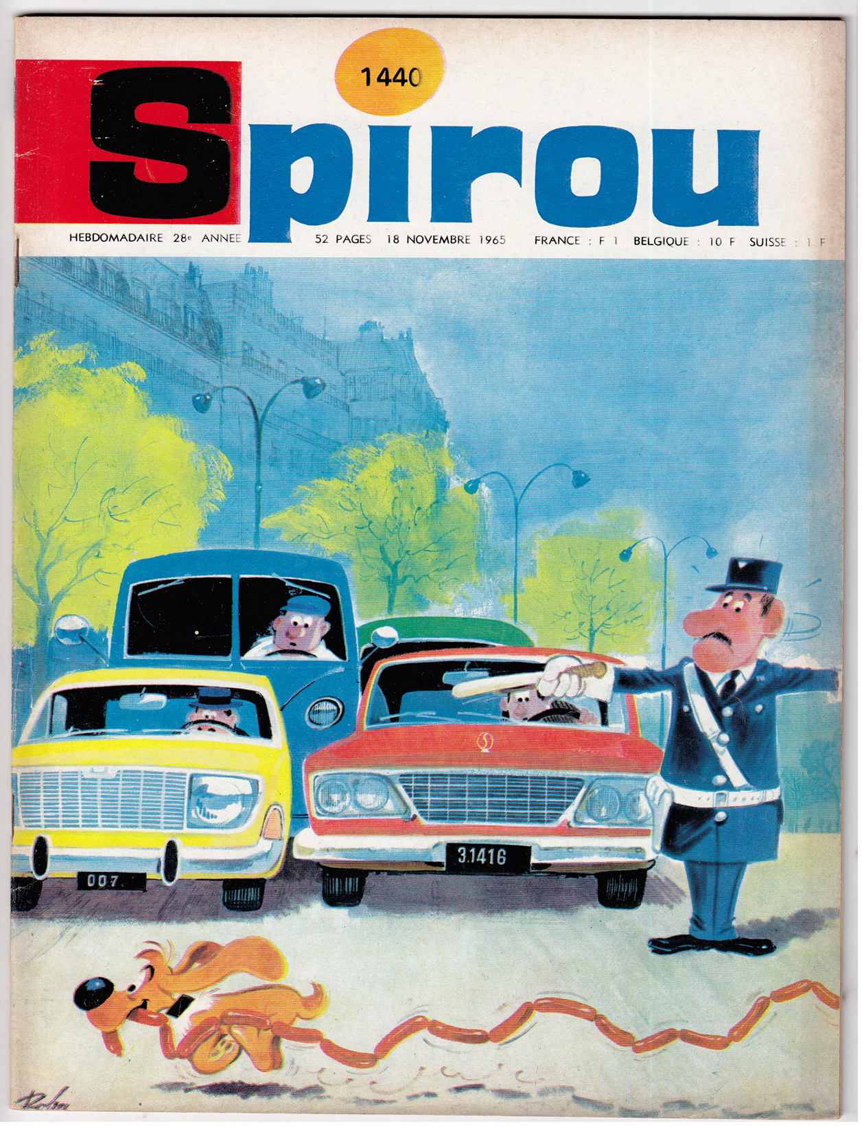
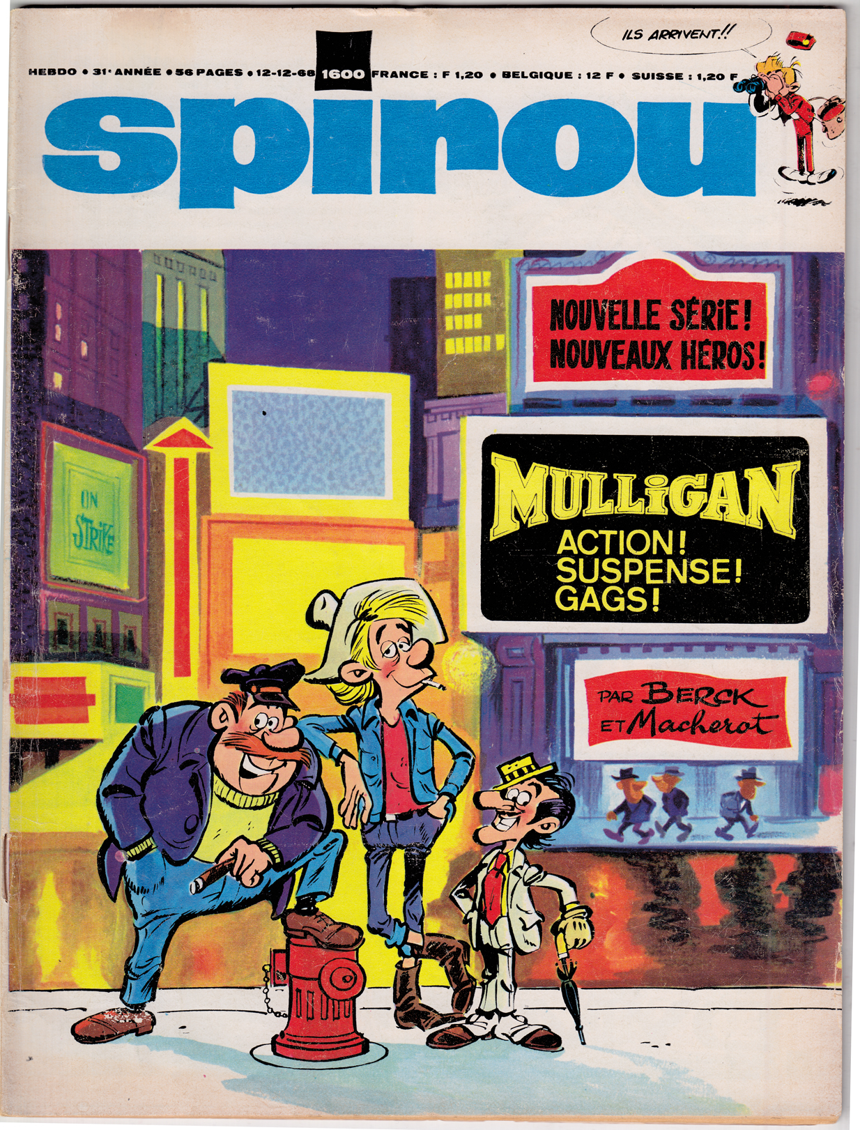
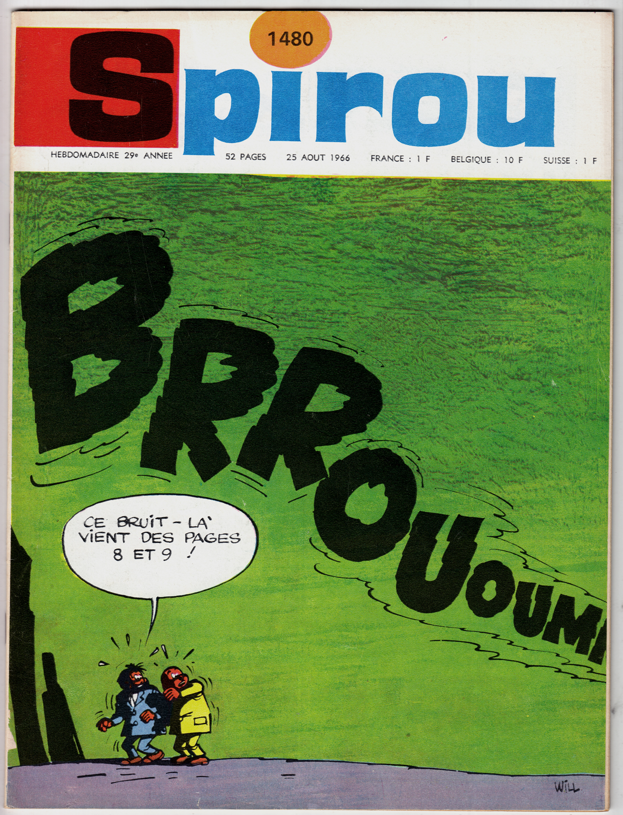
As for covers, since the Spirou approach was generally to run a comic page on the cover, they weren’t as dazzling as in Le Journal de Tintin.  By the late 60s, though, Spirou shifted to a more conventional approach to cover, with some wonderful results:

Roba - SPIROU 144 - 18 Nov 1965
Roba – Spirou 144, 1965
Berck  - couverture - Spirou 1600   1968
Berck – Spirou #1600, 1968
WILL Spirou 1480 1966 cover
Will – Spirou 1480, 1966. The word balloon reads “That noise – t’s coming from pages 8 and 9!” Do I detect an echo of MAD #1?

mad-magazine-1-kurtzman (1)

Comics A Global History: Post-war Belgian bande dessin̩e РLe Journal de Tintin

Upcoming in June from publisher Thames and Hudson, “Comics: a Global History, 1968-present,” written by Alexander Danner and me.  I want to post some snippets from the book, including some great comics images (from foreign lands and bygone days) that we couldn’t quite fit in the book.  

As the title suggests, the book covers the period from, roughly, 1968 until 2010. The introduction, though, provides some background on the development of comics around the world (focusing mainly on Europe, Japan and the U.S.) during the post-war era through the mid-60s.  Text in italics is directly from the book.

Postwar European  Comics

Edgar P. Jacobs, from Blake et Mortimer, “Le Marque Jaune.’


French-language comics created in Belgium rose to international prominence in the postwar years. While most major European countries had their own comic book industries, their comics were generally popular only within their own borders and tended to be derivative of pre-war American newspaper strips. In Belgium, however, bandes dessinées quickly developed a decidedly modern flavor that made them popular throughout the continent.  The most popular Belgian comics periodicals, Tintin and Spirou, represent two influential stylistic branches.  

Herg̩ РTintin in Tibet

Tintin, founded in 1946, was named for the popular reporter hero created in 1929 by Hergé, who was the magazine’s first artistic director. Tintin’s pages showcased the École de Bruxelles, a style later dubbed the ligne claire (“clear line”) style. Pioneered by Hergé, the style was practiced by other artists, such as Edgar P. Jacobs (Blake et Mortimer), Willy Vandersteen  (Suske en Wiske) and Bob De Moor.

Fred Funcken – Le Trone de Gilgit, 1953. Colonialist themes were very prominent in the Francophone comics of the period.

Le Journal de Tintin demonstrated the high level of artistry and imagination comics creators could bring to the form, in the decades when it was primarily a commercial children’s medium. Following the example of Tintin creator Hergé, artists such as Bob De Moor offered European readers the bright, clean, modern style known as l’Ecole de Bruxelles, later dubbed the ligne claire or “clear line” style. Graphically, the hallmarks of the ligne claire are the use of an even, unvarying line to define contours, flat color and avoidance of cross-hatching or other graphic forms of shading. In storytelling as well as graphcs, an inviting clarity and legibility were emphasized. 

The Ecole d’Herge’s emphasis on lisibilité – legibility – can be seen in an ideological light.  The entire graphic approach: unvarying line, the lack of dramatic lighting effects, consistency of background and foreground; as well as the approach to layout, using only “medium shots” and regular grids, with no close-ups or unusual angles, suggest an objectivity and stability to the universe being depicted.  In a period where France and Belgium were still  Colonial powers, the clearly-defined graphic and narrative quality of the ligne clair was a support for the rationalist, hierarchical world view that benefitted the existing power structure, helping to mold the journal’s youthful readership into good citizens.  As the great French comics critic Bruno Lecigne says, “Toute l’œuvre d’Hergé témoigne d’une doctrine d l’art classique;” (Hergé’s entire Å“uvre demonstrates a doctrine of classical art. “) the ligne claire was the High Classicism of European comics art.

Jacques Martin – Alix, L’ile Maudit – 1951.


 This classicism also expressed itself in a sort of playfully reassuring cartoon modernism, brimming with optimism about technology and progress.

Bob De Moor, 1955

What I love most about the ’40s and ’50s Tintin are the covers.  Can you  imagine being a French or Belgian kid, running to the newsstand kiosque every week for one of these jewels of color and drama?

Willy Vandersteen

Jacques Laudy is a neglected artist from this period.  He did some breathtaking covers:


More Laudy, from his fanciful, Orientalist series Hassan et Kadour:


Bob De Moor’s style was the closest of all the Journal de Tintin artists to that of Herge.


For French comics critic Lecigne, this stylistic simulacrum is what reveals the essence of the Hergean ligne claire:

“In Barelli [De Moor’s best known series], it’s the fascinating appearance, the opaque surface of the style d’Hergé that’s on display.  Hypnotized, I read Barelli without deciphering the text, unable to follow the plot, fascinated by the dramaturgy, the gestures.  What I have before me is Hergé emptied of substance, depth and mythology; the signifier without the signified…  reading Bob De Moor is an experience that permits me to perceive a language solely from the point of view of the signifier, syllables repeated until meaning disappears, whose existence becomes purely, concretely sonorous.” (Lecigne, Les Heritiers d’Hergé, p 39, translated by me)


Edgar P JacobsBlake et Mortimer rivaled Hergé’s Tintin in populariy; Jacobs represented the opposite pole of the Ecole de Bruxelles: moodier and more gothic than Herge, the series was an espionage thriller that also blended science fiction and horror.  His detailed, atmospheric London was an influence on young fan Jacques Tardi.


More great TINTIN covers:

Tibet
Reding
Reding
Panis
Follet
Cheneval
Bob De Moor


<!– extreme_danmazur_c09994d5dcea40e288ef6e0f0b6e9ce8 –>

Studies and doodles

  • I’m working so slowly these days, what with this, that and the other, that I thought I should post some some character doodles, studies, whatever, rather than wait the forever until I have a new story to post. The racetrack one is actually a study for a “Golden Age” story I’m working on with Troy Minkowsky (and a couple of the heads in the bottom one, too). The rest, pretty much just doodles:
  • Study for people waiting on line at racetrack betting window (1940s):
  • And some more:
  • Sarah Palin Vindicated by Alex Toth!!

    A few days ago, a package arrived at my door: it was my ebay-purchased, beat-up-but-readable copy of Dell Comics’ 1957 “Paul Revere’s Ride,” with art by Alex Toth (which is why I bought it). Today I read it. Good stuff: Toth took a lot more care with this than with the 1960 Four Color adaptation of “The Real McCoys,” which I acquired in the same fashion. So anyway, there I was happily reading away — not paying too much attention to the writing, but it didn’t require much — and Paul was happily riding away, when this happens:

    Do you see what he just did, in that last panel?? He warned the British. During the Ride. Warned them that they’re not going to be able to make it to Concord to seize the rebels’ cache of weapons — take our guns away!! (I paid enough attention to the story to understand that much!)

    Then, a couple of pages later…

    …in the last two panels: he does it again!

    Now, it’s not that I’m a fan of Sarah Palin, but let’s be fair: she didn’t mess up on Paul Revere… she just learned her history from a comic book drawn by Alex Toth! So regardless of political ideology, we in the comic book world should come to her defense, right?

    Okay, well I didn’t give the full title of the comic, which is “Walt Disney’s Paul Revere’s Ride with Johnny Tremain.” So perhaps the fact that this is Disney’s version of history, and includes the fictional character of Johnny Tremain, has to be taken into account here. Probably Sarah actually got her history lesson from watching Uncle Walt’s Wonderful World of Himself, in which case I’m not sure we need to rise to her defense. Never mind.