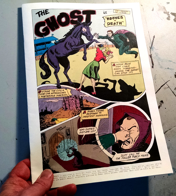
The proof has arrived! Â The book will available at MoCCA, table B129!
For the back cover of this faux-Golden Age comic, I cooked up this faux-Golden Age ad. This is a combination of digital collage and original art:
If you’re old enough to remember the American Seed Company ads, this will all mean more to you, of course.
Here are some of the real ads that inspired me (and from which I pilfered elements):
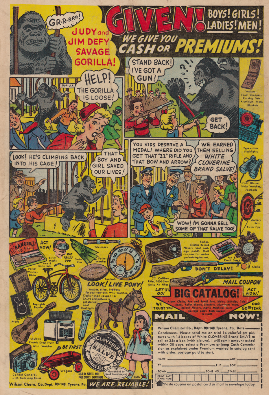
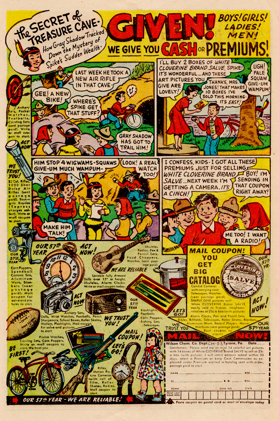
And then especially these Cloverine Salve ads, which featured little comic strips like the one I drew for mine (you can click on these to make them more readable):
Some showed how valuable the prizes could really be.  You might even use them to stop a rampaging gorilla:
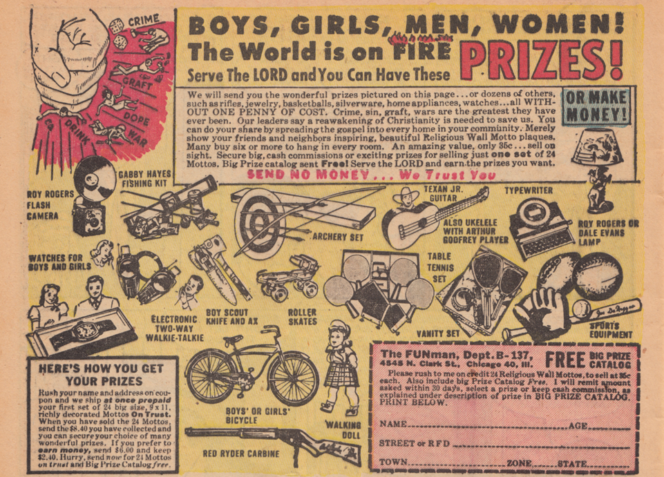
The ads could get pretty bizarre. Â This one has a strangely apocalyptic tone: the “FUNman” lets the kiddies know that the World is on Fire!
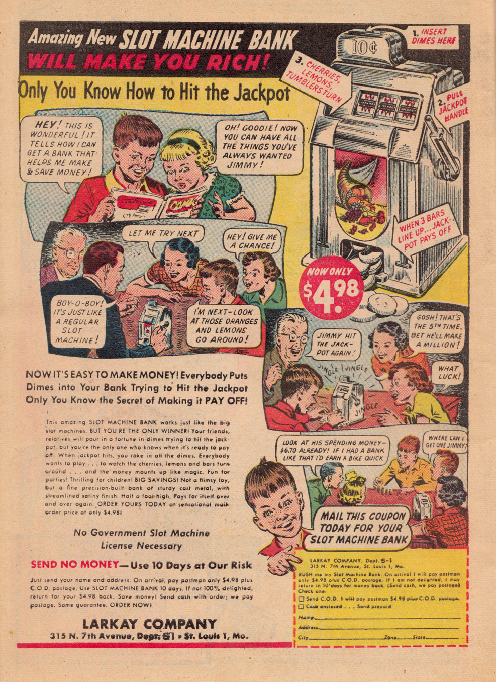
Here is a get-rich-quick scheme for the young folks, basically encouraging Jimmy to become a small-time crooked casino operator:
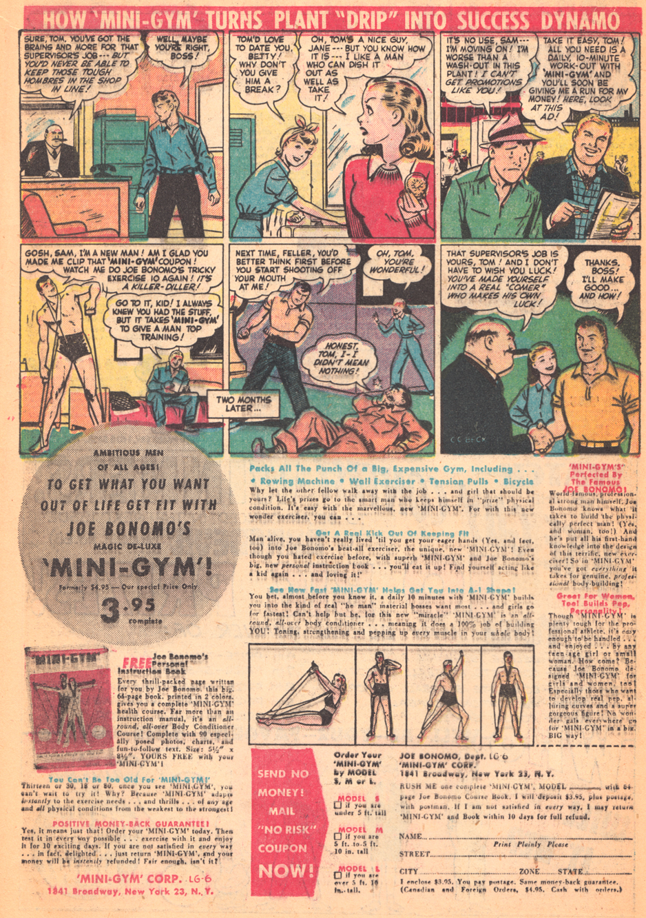
One of my favorites is this Charles Atlas-type pitch, with art by Captain Marvel artist, C.C. Beck, which suggests an unusual use for your new he-man body: advancing at work by punching out your fellow workers!
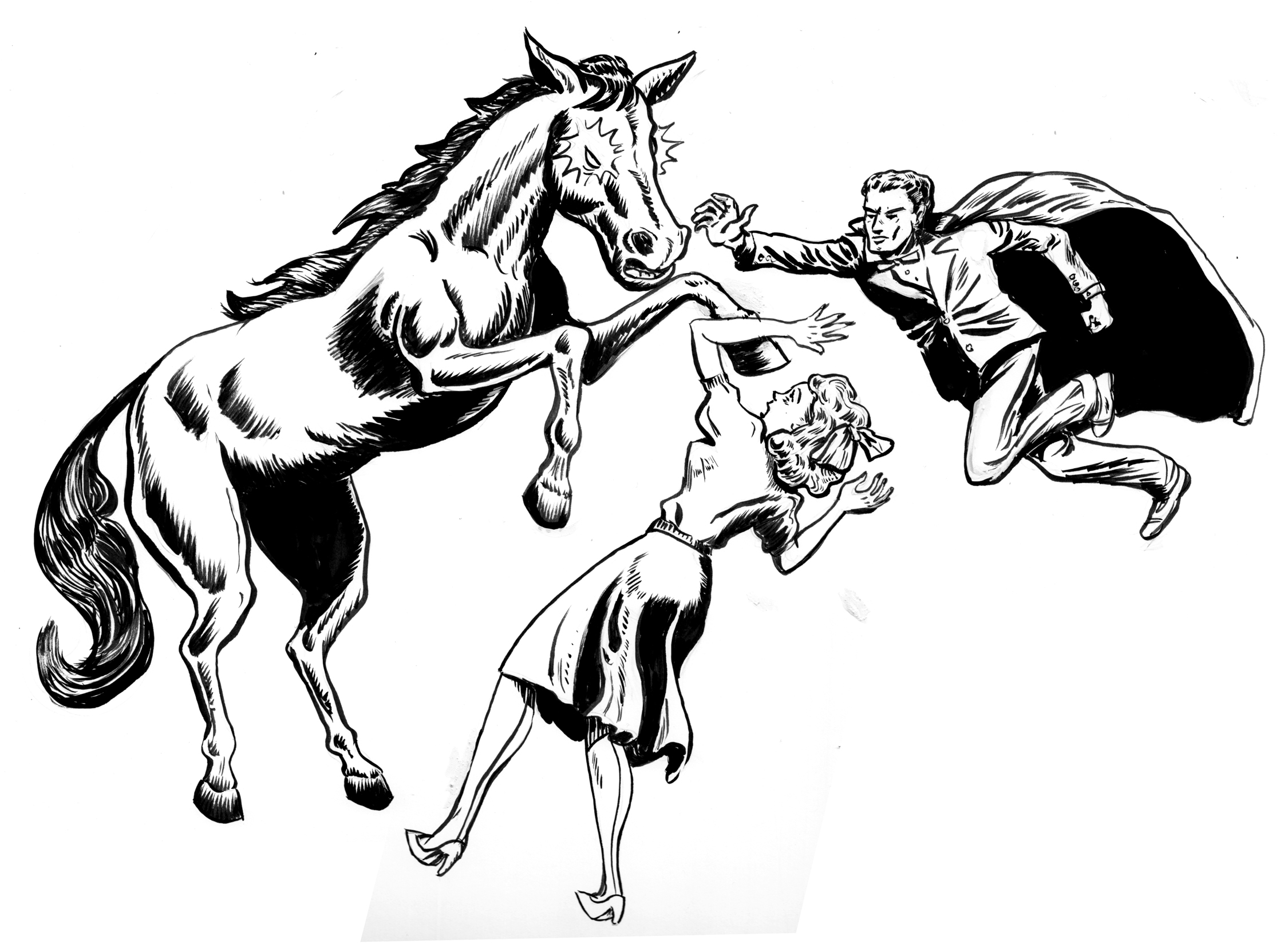
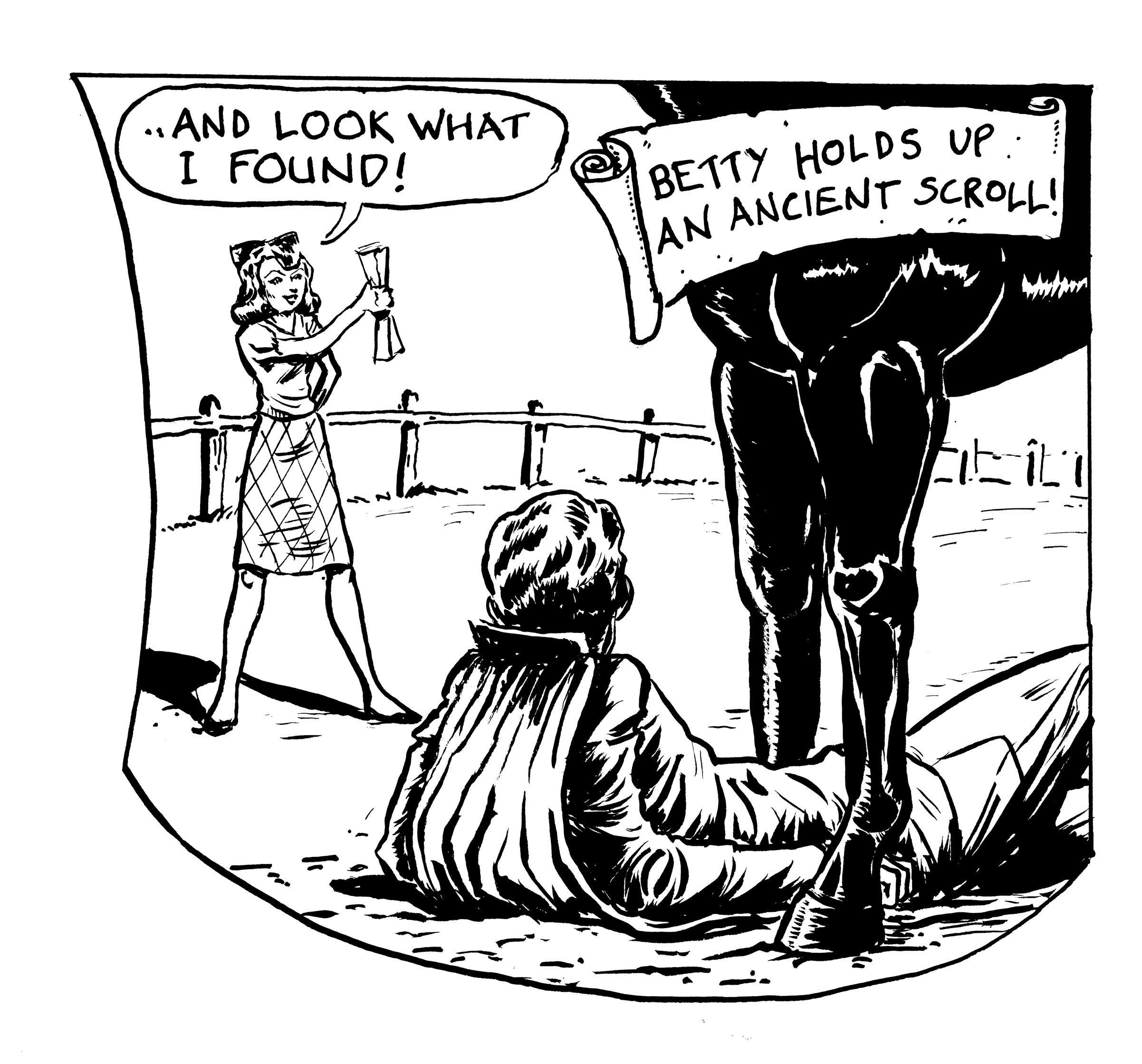
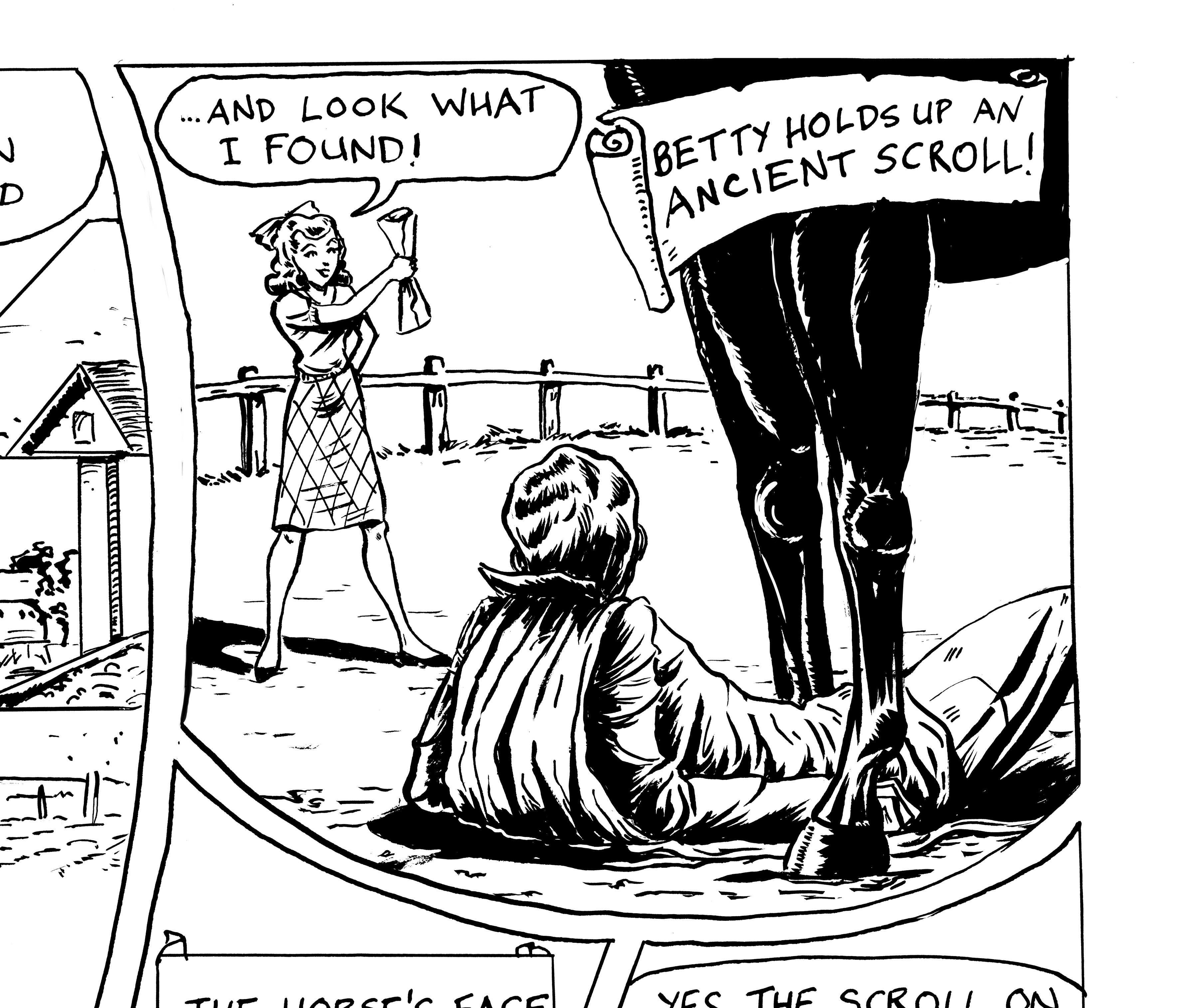
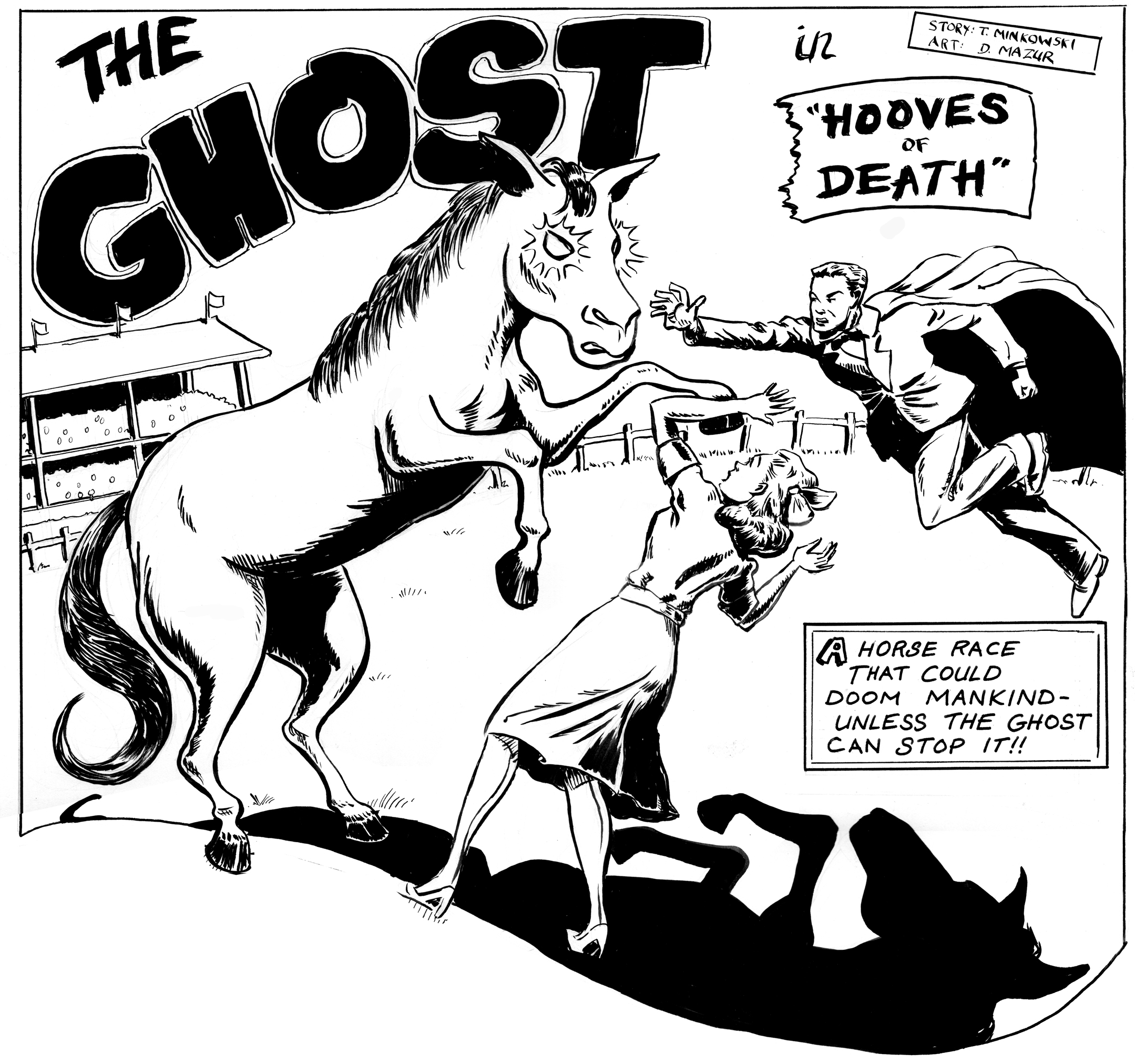
Finished drawing the last page of this story, but I had some UN-finished business as well: I had grown disatisfied with the splash panel I drew… oh, nearly six years ago now:
Problems: the horse is too pudgy, and looks more like a stuffed donkey to me. Â Also not happy with the way I drew the skirt. Â I’ve done a lot more drawing of horses and clothing in the past couple months, so I thought it was worth updating. And take another crack at the Ghost flying in, why not?
I used a lightbox, so I could just re-draw the figures, and have them in correct positions to insert digitally into the page, without having to re-letter, etc. Other than perhaps the tail, I think everything is better:
Or, if you prefer to compare via an animated gif:
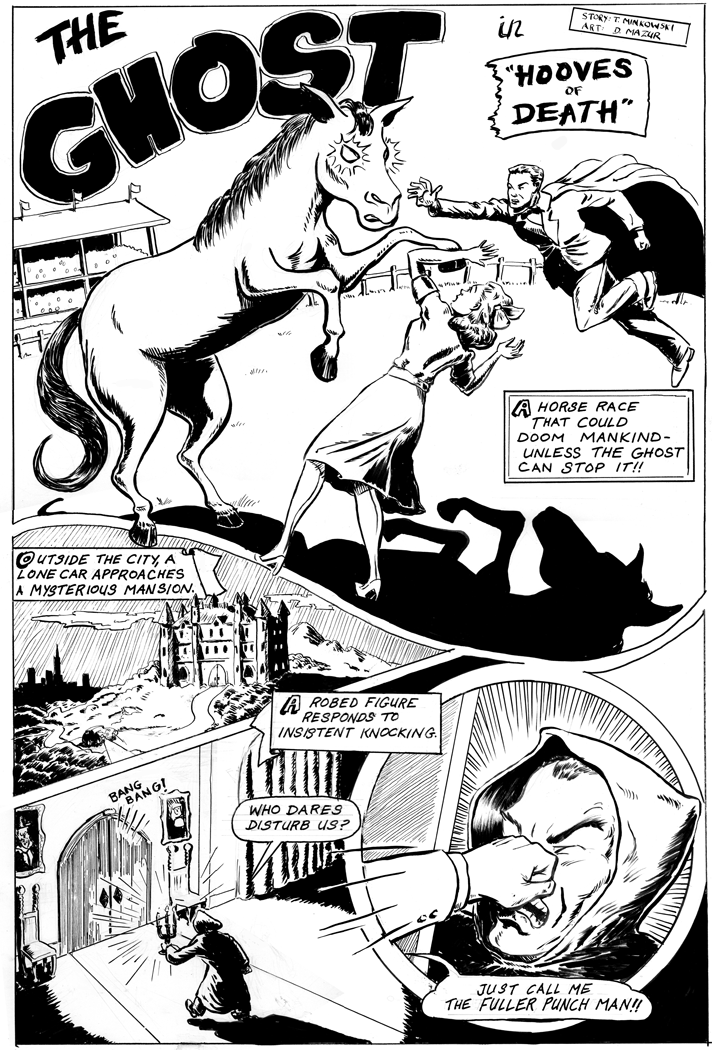
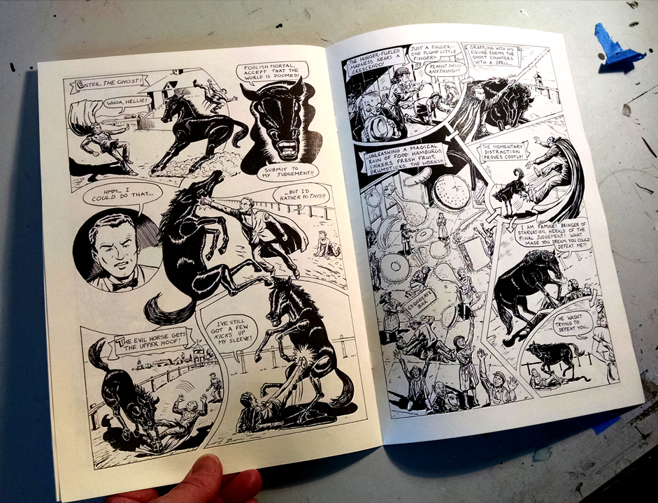
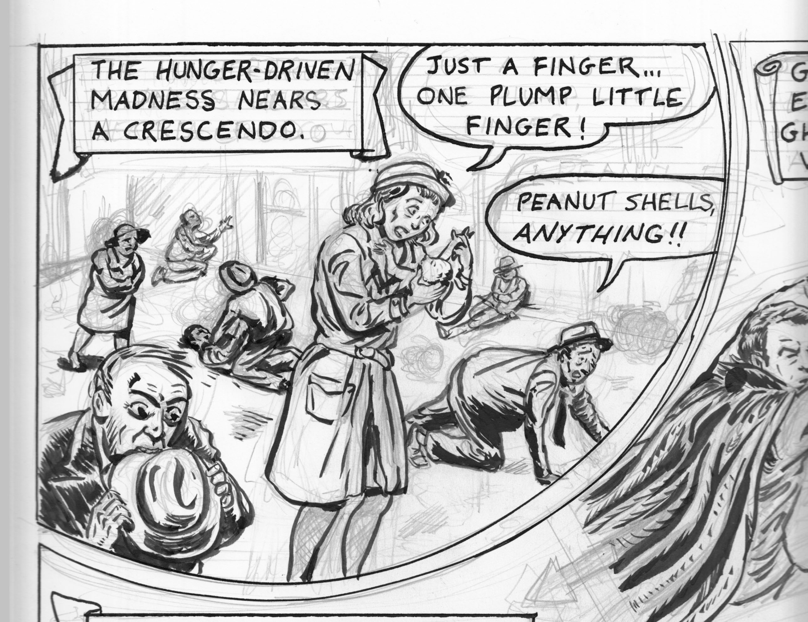
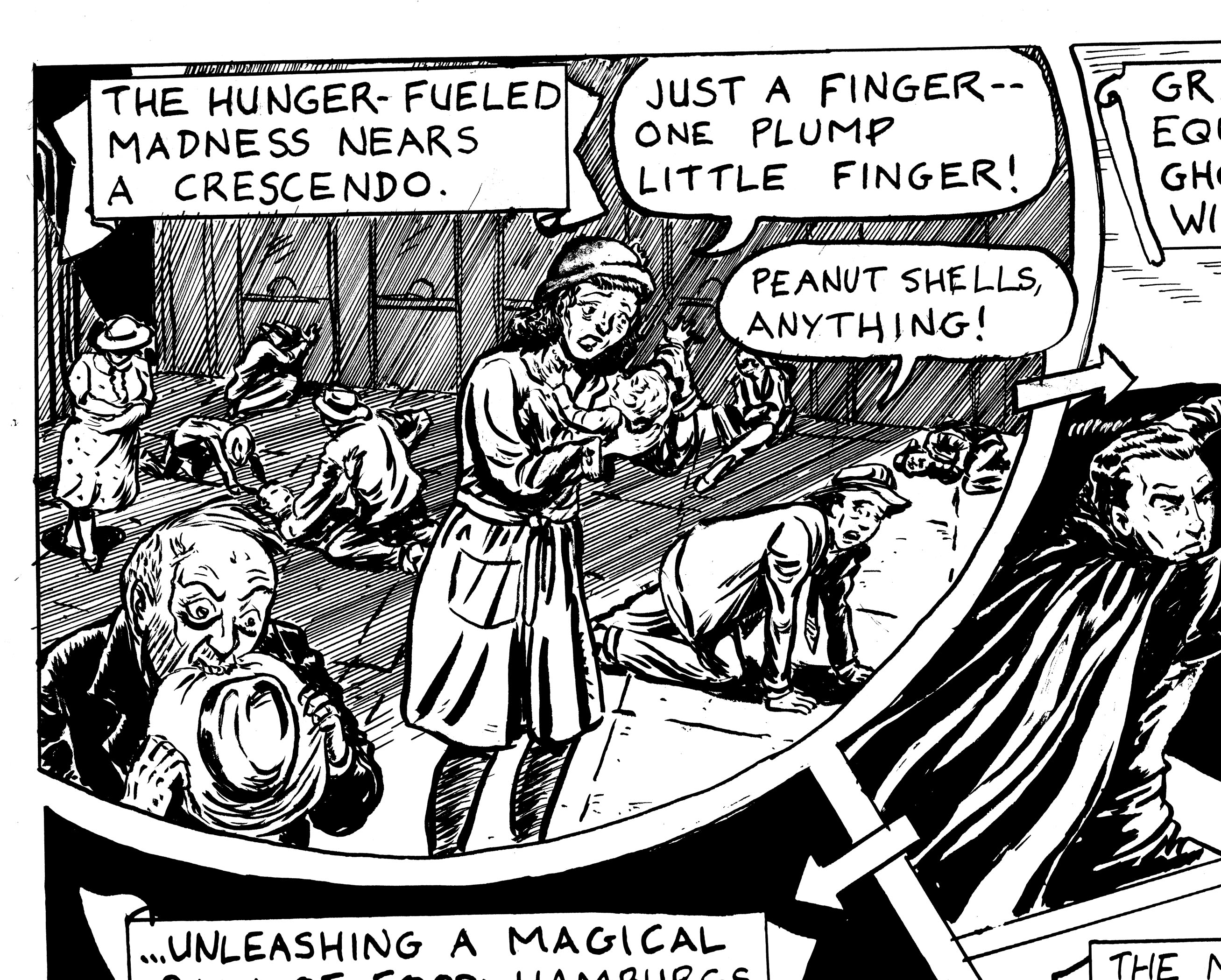
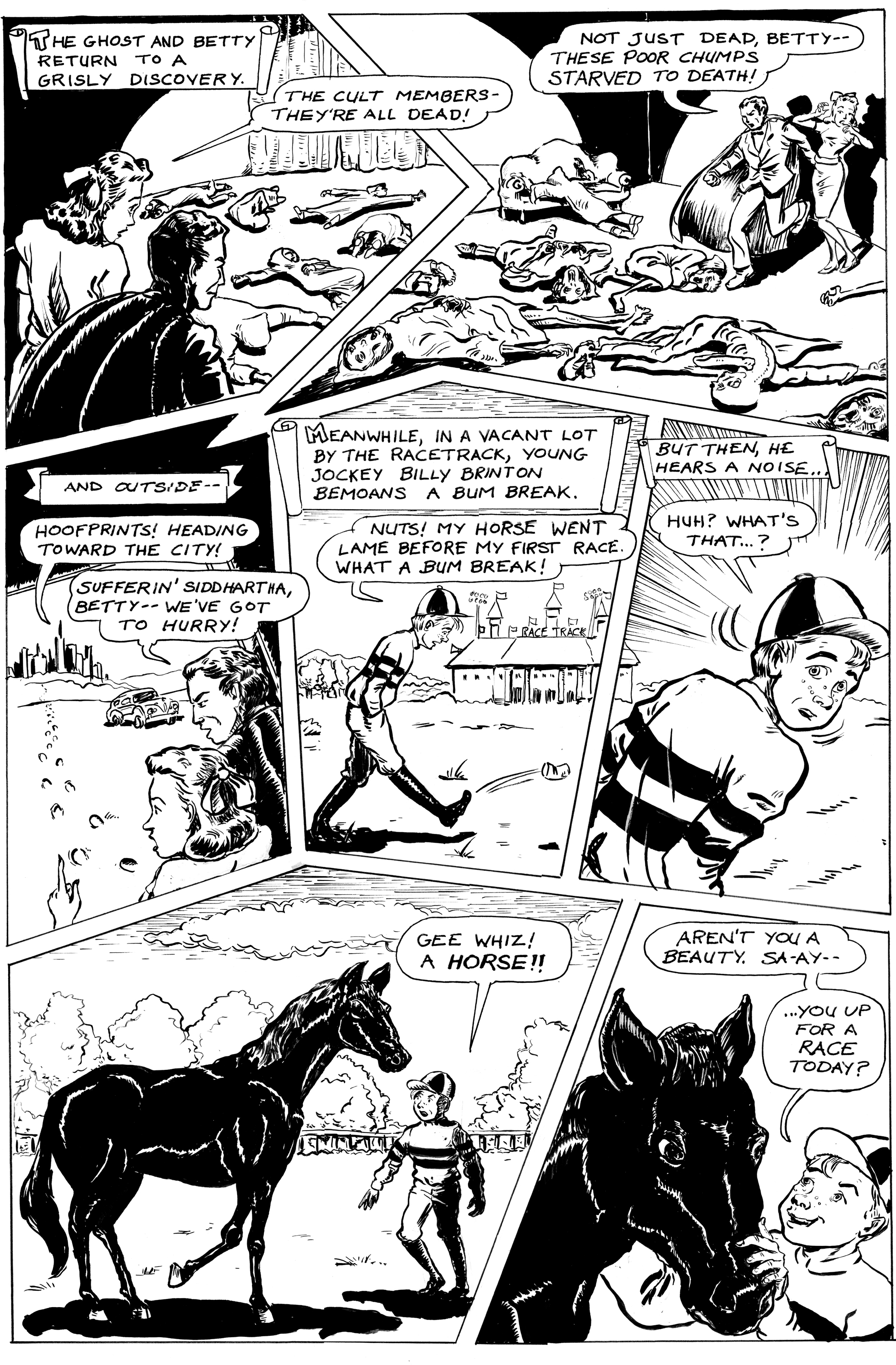
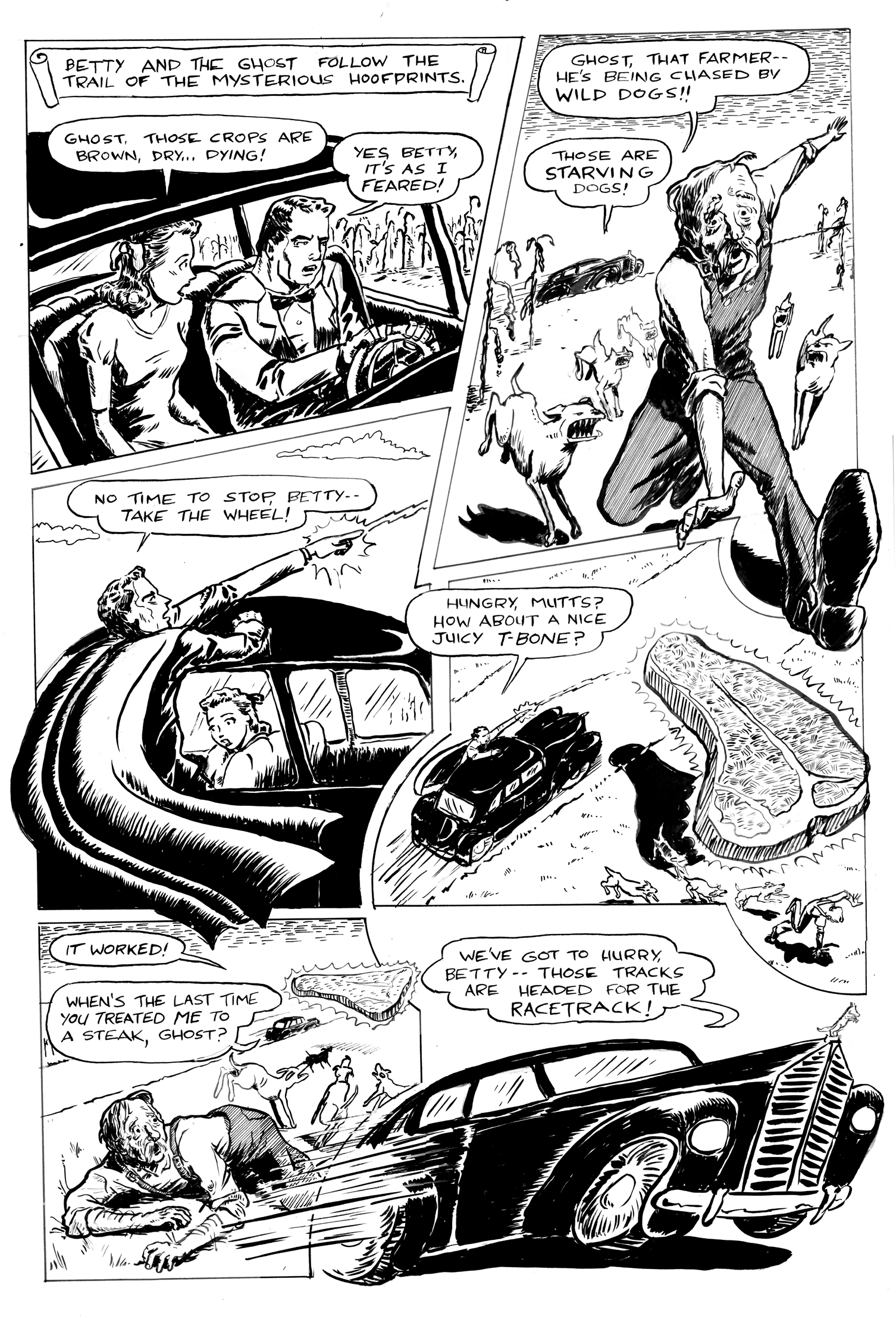
Another bout of obsessive panel re-drawing…. Â Today, it is the second panel of page ten (next-to-last page of the story!) of “Hooves of Death,” the faux-Golden Age story I’m drawing from a script by Troy Minkowsky….
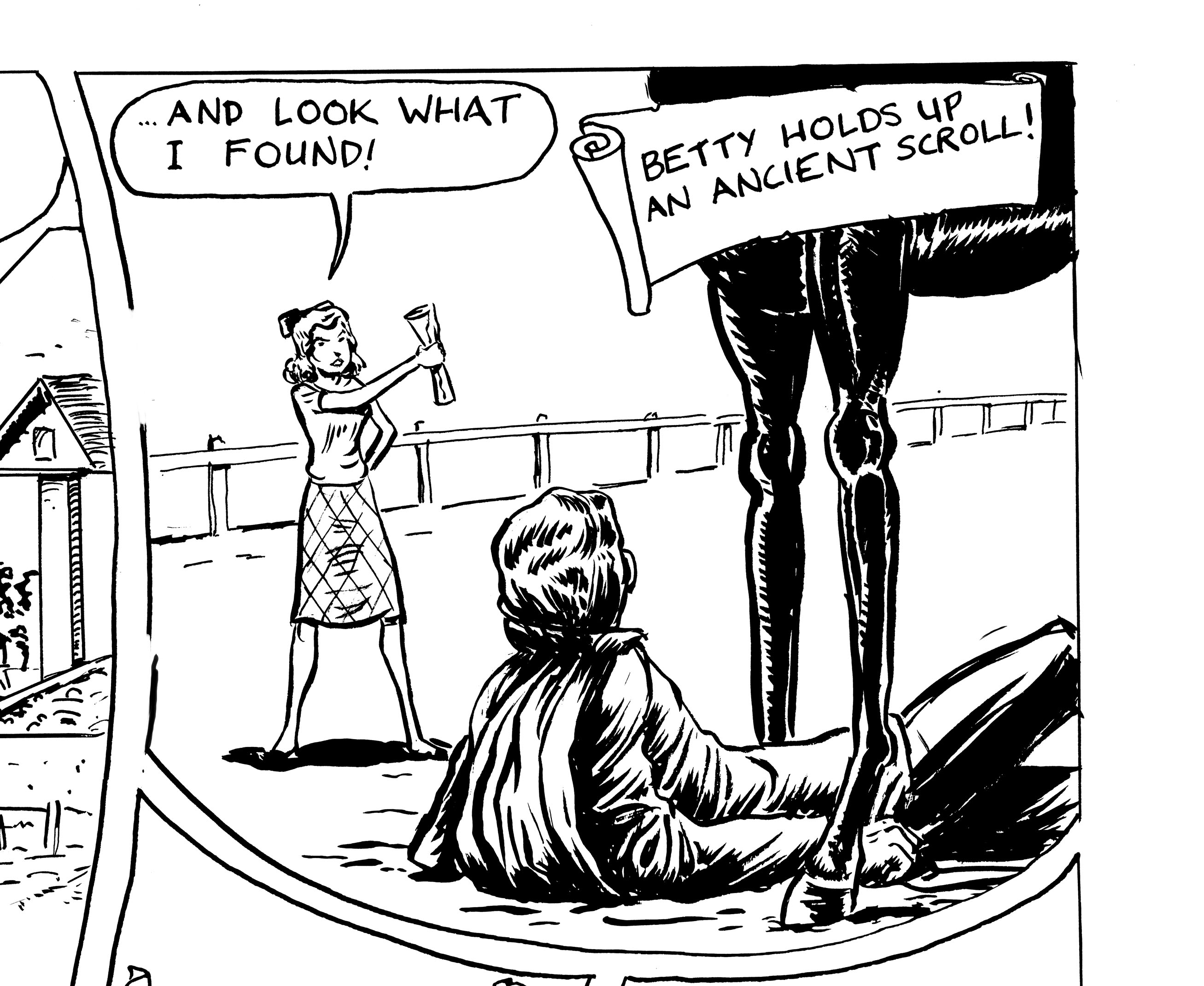
When I finished the page, I realized that I had messed up the perspective in this panel. Â Either Betty is about twenty-four inches tall, or the horse is gigantic. Â I could have probably figured out the perspective if I’d taken the time… but it’s the next to last page of the story, and I’m getting rushed and lazy! Â I tried to convince myself to just leave it as it is and move on. Â I took the page to the Boston Comics Roundtable meeting, though, and got some good feedback (as usual). Â As well as the scale problem, it was pointed out that the horse’s legs are funny — more like table legs.
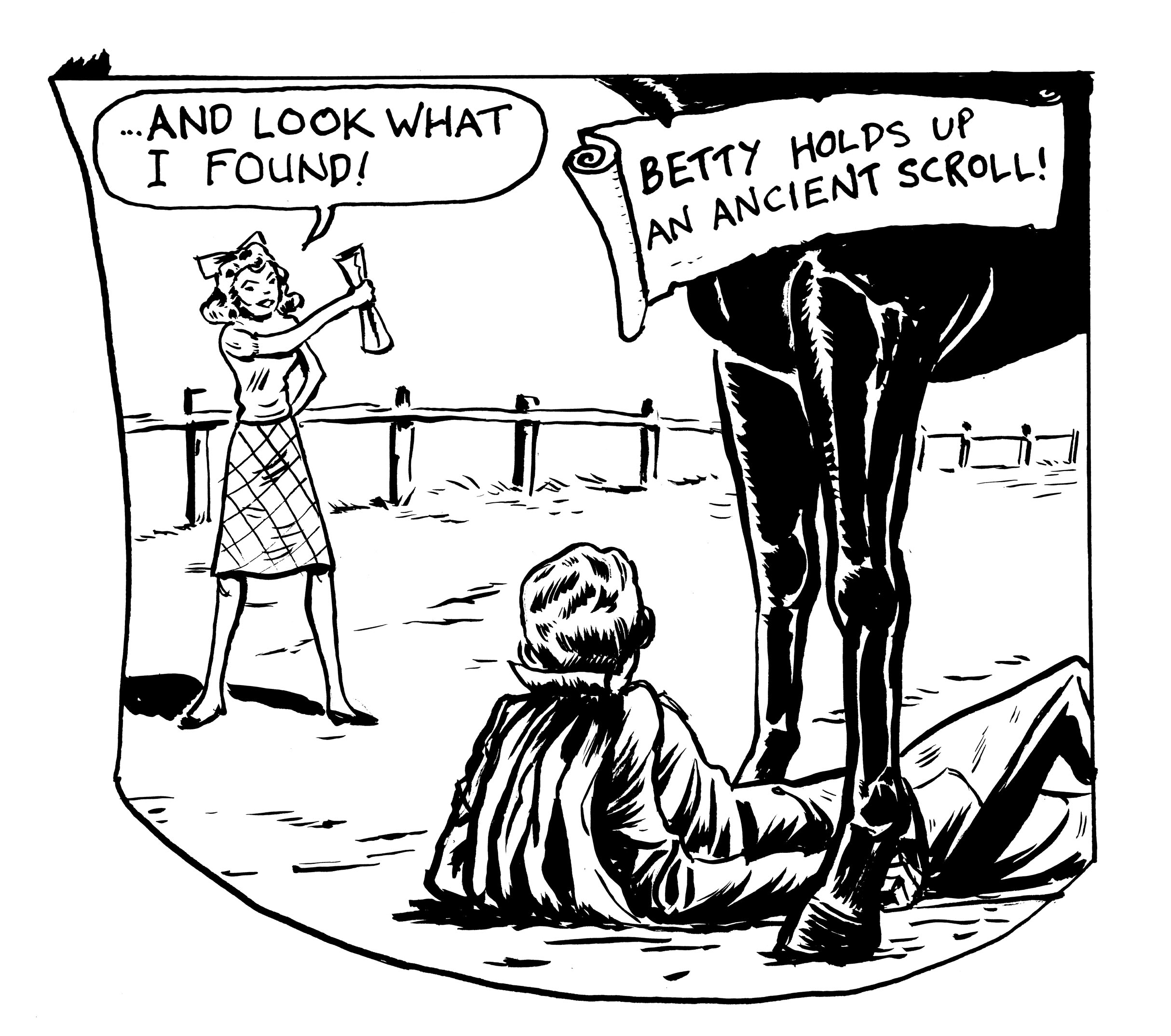
Well, it’s not like I haven’t studied horse anatomy a bit in the course of this project, but since I’m getting rushed and lazy (see above), I thought I could wing it, and not actually look at horse reference this one time. Â The result: it looks like the Ghost has had a bit too much to drink and finds himself under the dining room table, which for some reason is on a racetrack.
Again, I tried to convince myself I could live with this… but… my consience nagged at me, and it was draw-it-over time.
What followed was a strange blend of diligence and laziness. Â I just started re-drawing, perfectly willing to draw the whole panel over and over, but still refusing to do any diagrammatic “figuring out” of the perspective (though I did look at horse-leg reference), going with trial-and-error instead. I just felt like doing it the stupid way (or the intuitive way, to be kinder), that’s all I can say. Â I got Betty better-sized, but then the relative sizes of the Ghost and the horse’s legs would seem wrong, so I tried it again… and again…
Did I stop when I got it right? Â Or did I just run out of gas? Â You be the judge….
I think the Ghost looks too small relative to the horse.
Now I think the Ghost looks too BIG relative to horse, and the horse’s legs are too squat.
A little better. I think my favorite drawing of Betty so far, and the relative sizes of the figures seem okay… though the horse’s right leg looks not quite right… but there’s the bell, class is over!
The first panel from page 9 of Hooves of Death.  I drew this three times.  I’m getting into a pattern of allowing myself one re-drawn panel per page.
Maybe the first version shouldn’t “count,” because I just abandoned the entire pass at the page, for reasons not particularly to do with this panel. So I never really finished inking it:
So this was my first “final,” finished version:
I felt that this panel was the weakest on the page for a couple of reasons.  I had totally overdone the shading with all those lines… muddied up the panel and the page. It doesn’t look too bad out of context, but when reduced, it really just turns into a gray mess (I’m drawing this story Golden Age-style, “twice-up.”  In other words, it will be reduced by 50% when printed.
Also, the pose of the central figure was not satisfactory. Â So…
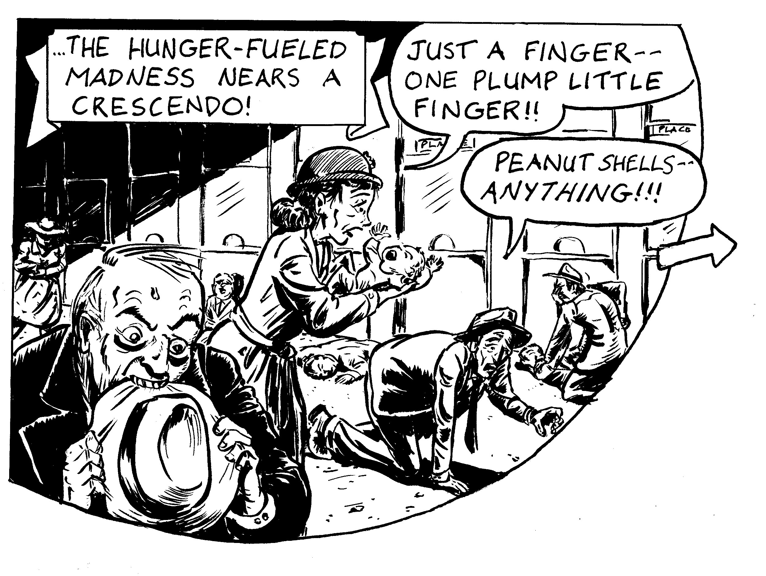
Altogether cleaner with simple black and white shading, and by moving the woman to a side view I could call better attention to the baby in her arms.  I made the guy eating his hat larger, and placed the crawling better so I didn’t have to crop him.  I  had to lose some of the background figures… but a stronger read, I HOPE, especially when it’s reduced.
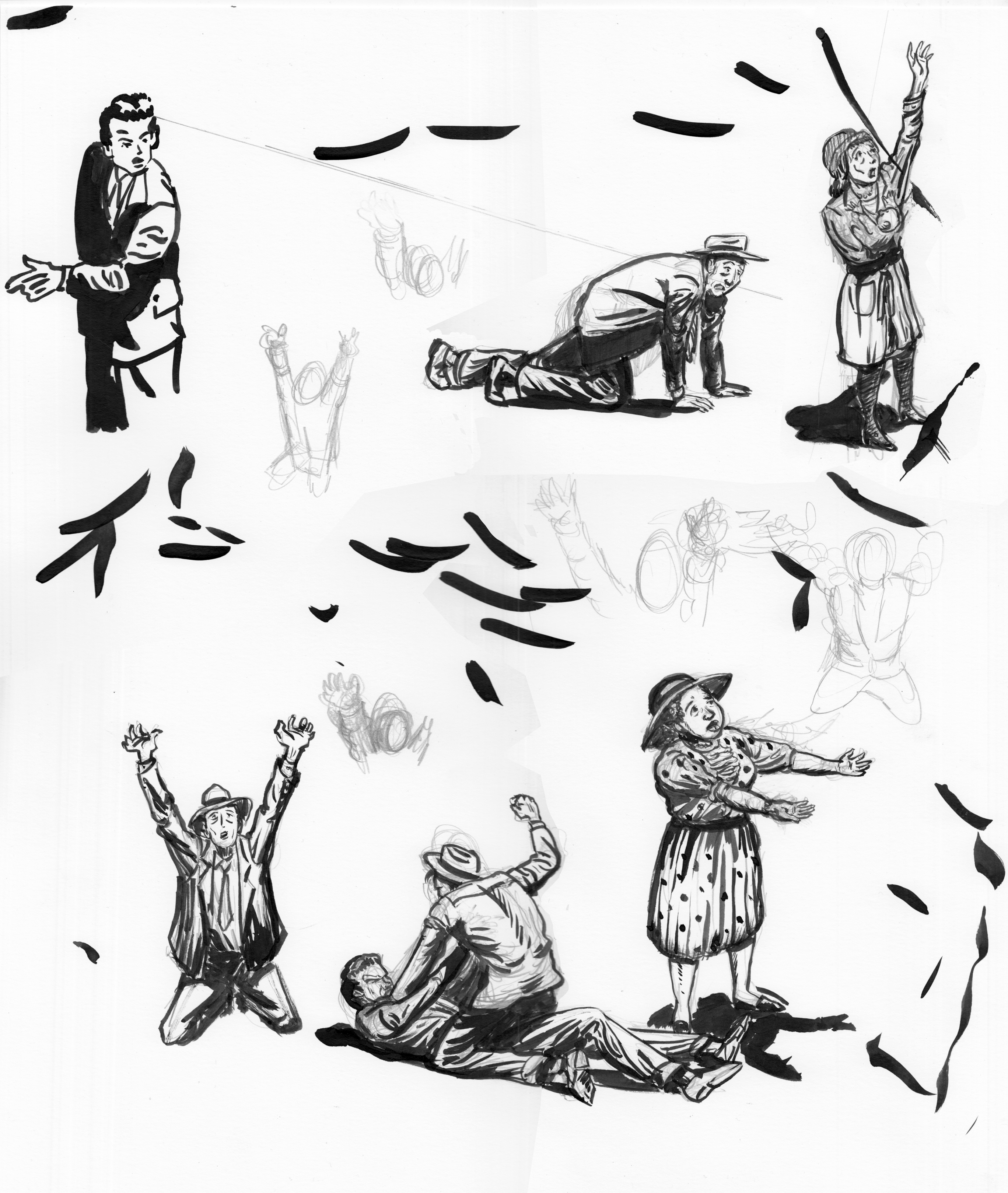
Studies from Golden Age comics, and sketches for figures on page 9 of “Hooves of Death,” comic I’m drawing from a script by Troy Minkowsky. Â 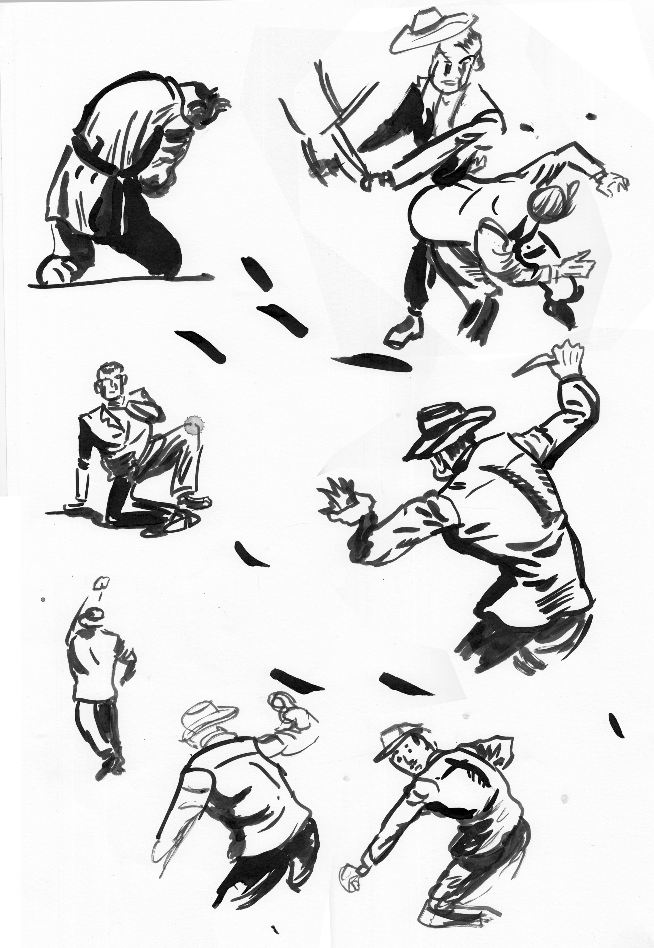
I just drew the same panel — page 8, panel 5 — four times. Â 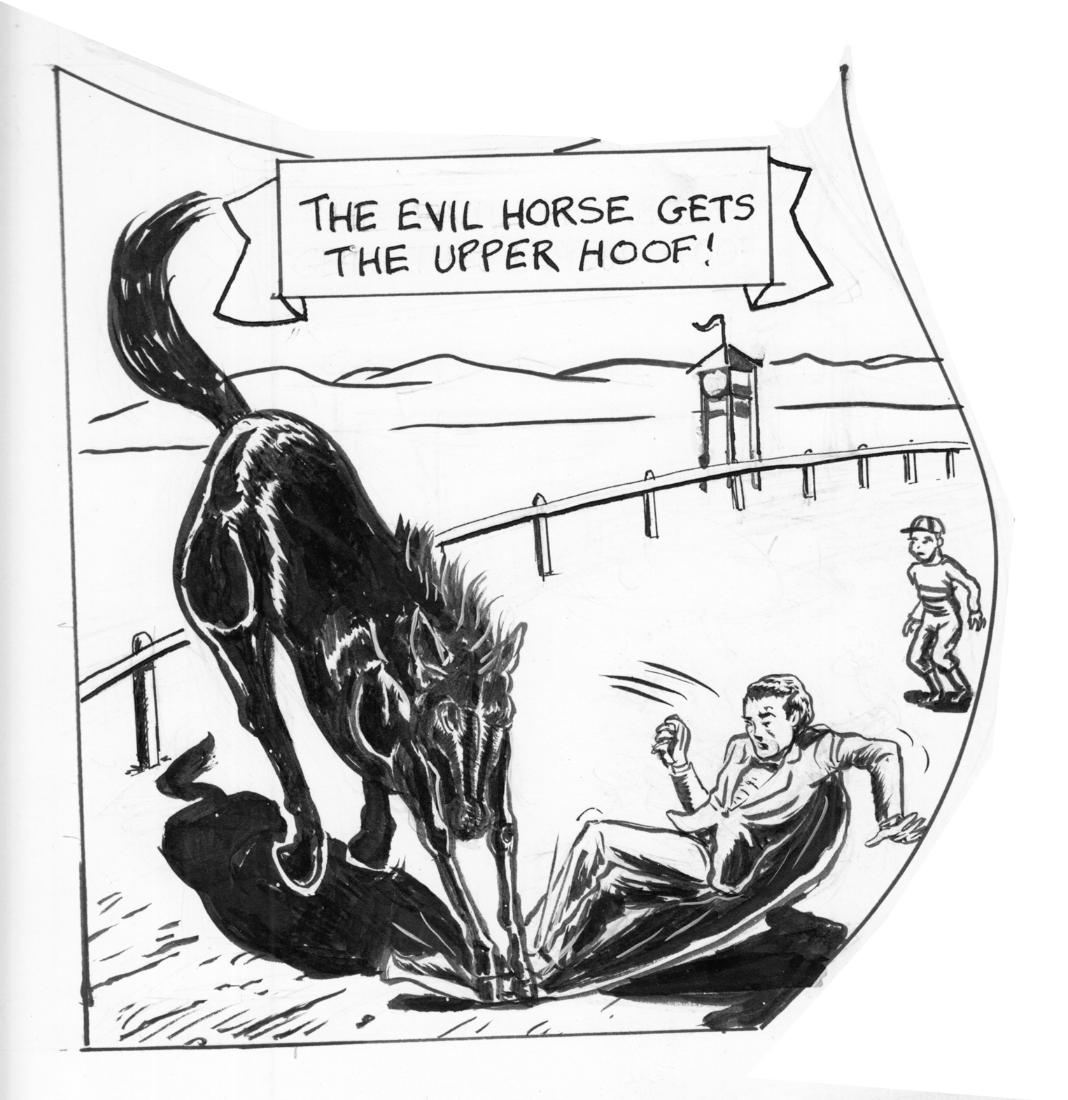 Version 1, in the original page. Â I got feedback that it looked like the horse was crushing his feet, and I didn’t like the falling figure much, and I thought I could do better on the horse.
Version 1, in the original page.  I got feedback that it looked like the horse was crushing his feet, and I didn’t like the falling figure much, and I thought I could do better on the horse. 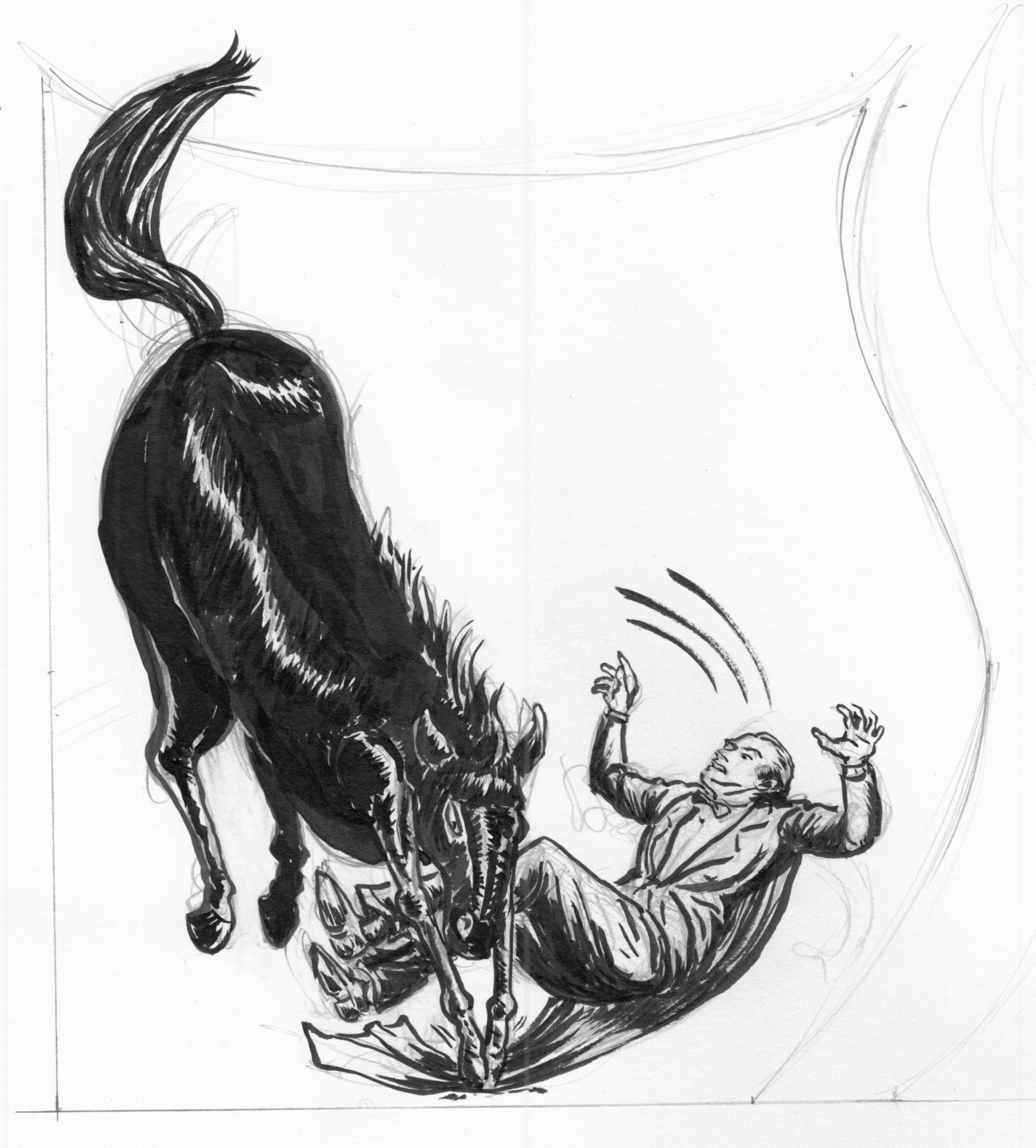 Version 2 (aborted). I can’t remember what I didn’t like about this one, actually.  Maybe the fact that the horse looks like a large sausage,  not enough detail in the reflections off the fur.  Oh also I think the guy is too big relative to the horse?
 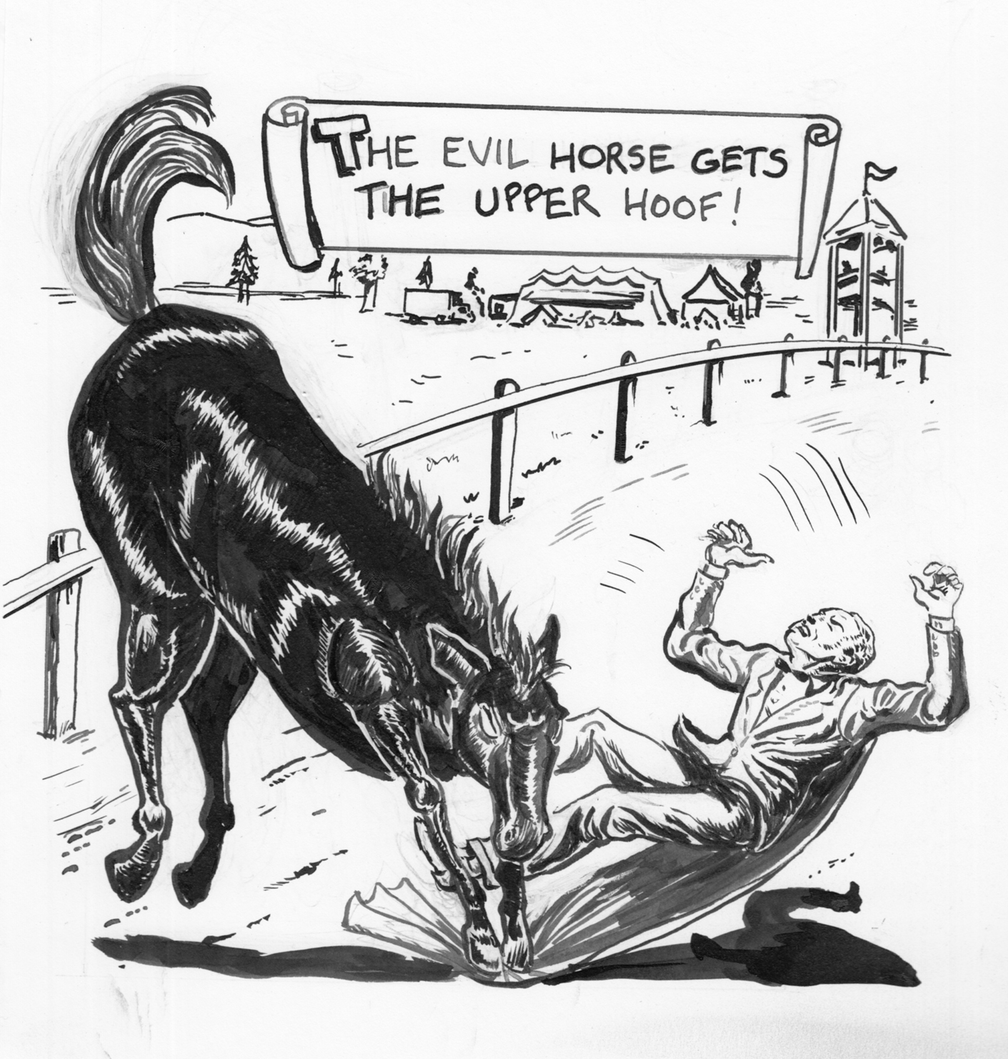 Version 3… Everything better, except the way I changed the position of the horse (in order to make it bigger), making the panel less dynamic. Now the horse looks stiff and even more sausage-y.  Also, still relative size problems.  Either a very large man or a pony, not a horse.
Version 3… Everything better, except the way I changed the position of the horse (in order to make it bigger), making the panel less dynamic. Now the horse looks stiff and even more sausage-y. Â Also, still relative size problems. Â Either a very large man or a pony, not a horse.
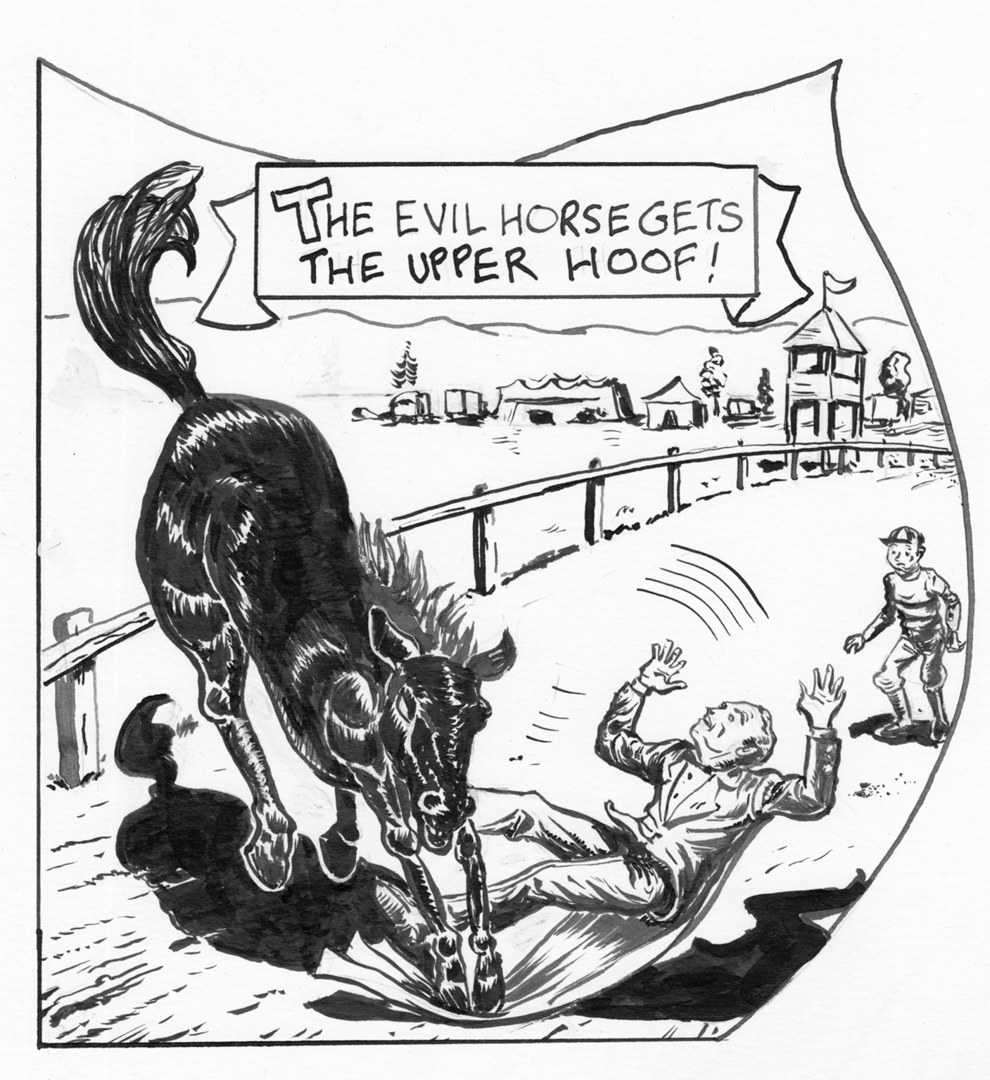 OK.  The figure was probably better in 2 and 3, but overall the best, I think. Composition works… I think my best horse, and put more care into the background details as well. Oh, well, time to move on…  wait, actually… I think there should be heavier shadows on the guy’s right leg…
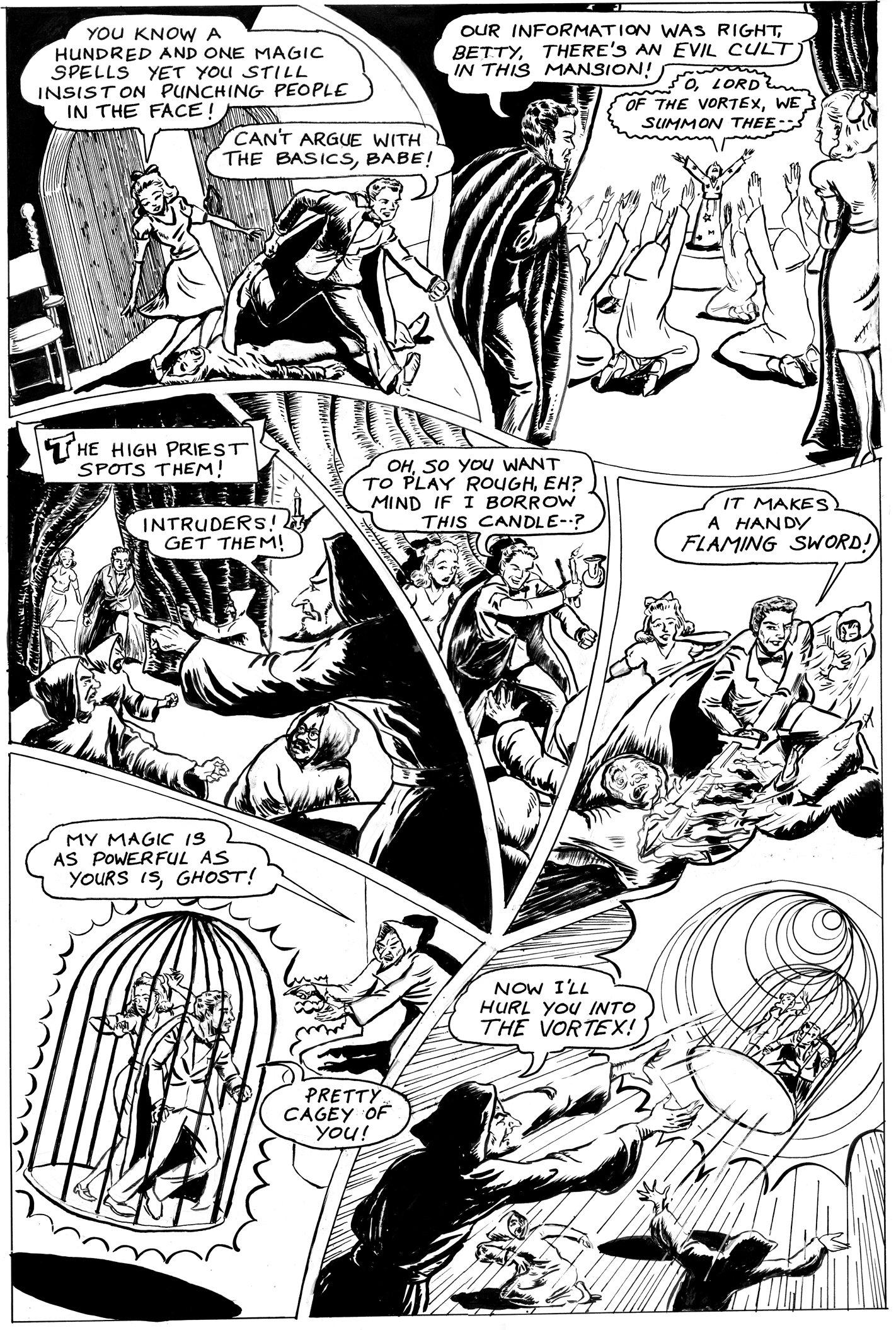
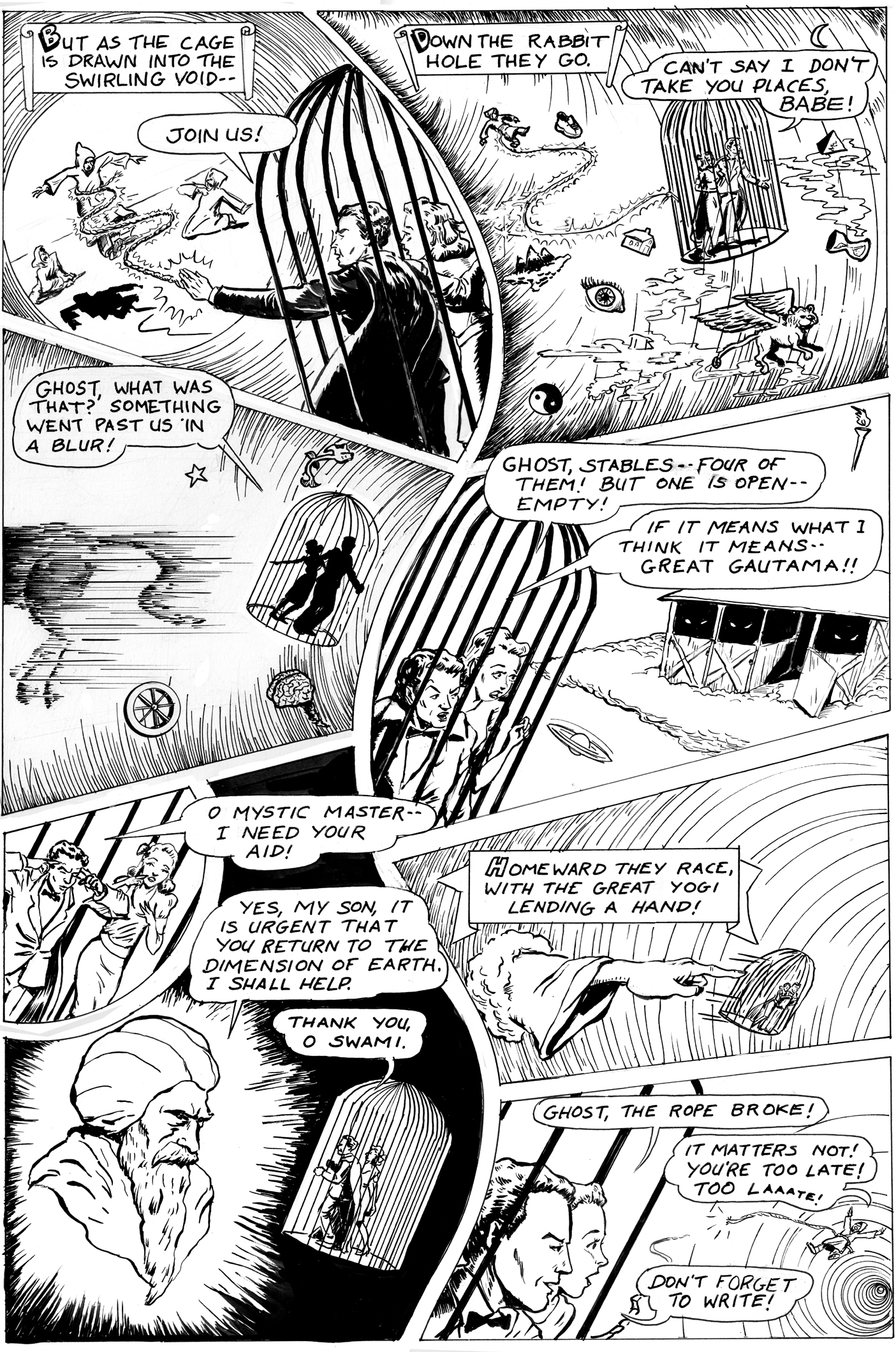
Five years ago, there was this project going to happen… an anthology of stories based on Golden Age heroes in the public domain. Â Troy Minkowsky wrote a crazy script about an obscure Nedor character called “The Ghost,” and I started drawing it. Â Then the book project fell apart**, and I got busy on other things and left it half-drawn. Â Well, the time has come to finish it, and I’m at work. Â Here are the five pages I drew back in ’10. Â The new ones coming soon….
(**CORRECTION!  My mistake, the book WAS published… Dime Box Comics from Fat Cat Funnies.  So we’re just running about 5 years late on the deadline.  I’m sure they’ll still be able to squeeze us in.)

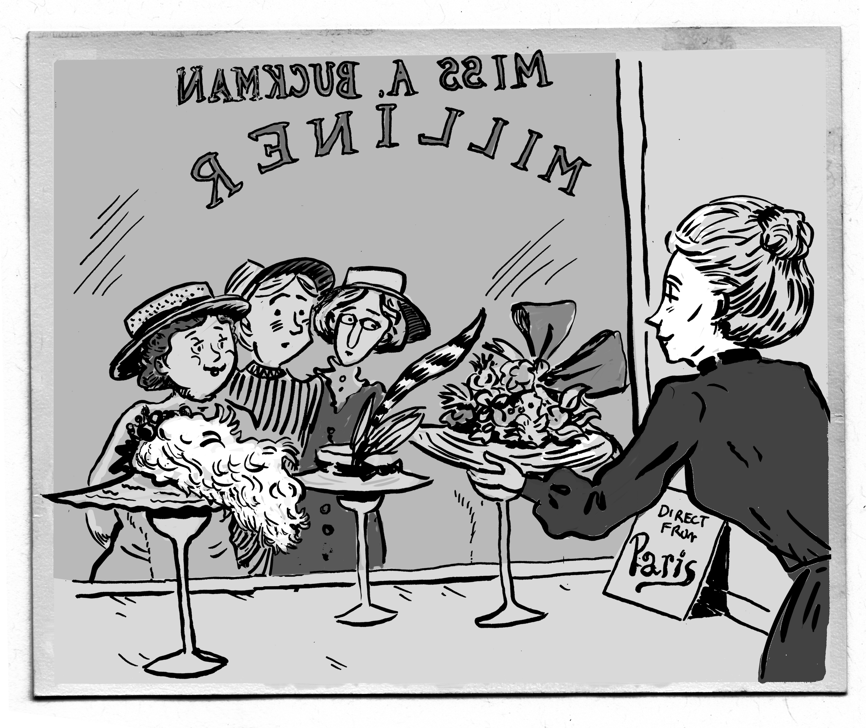
There really aren’t many ladies’ hats in my new comic…
![]() …but I did a lot of studies of them anyway.
…but I did a lot of studies of them anyway.
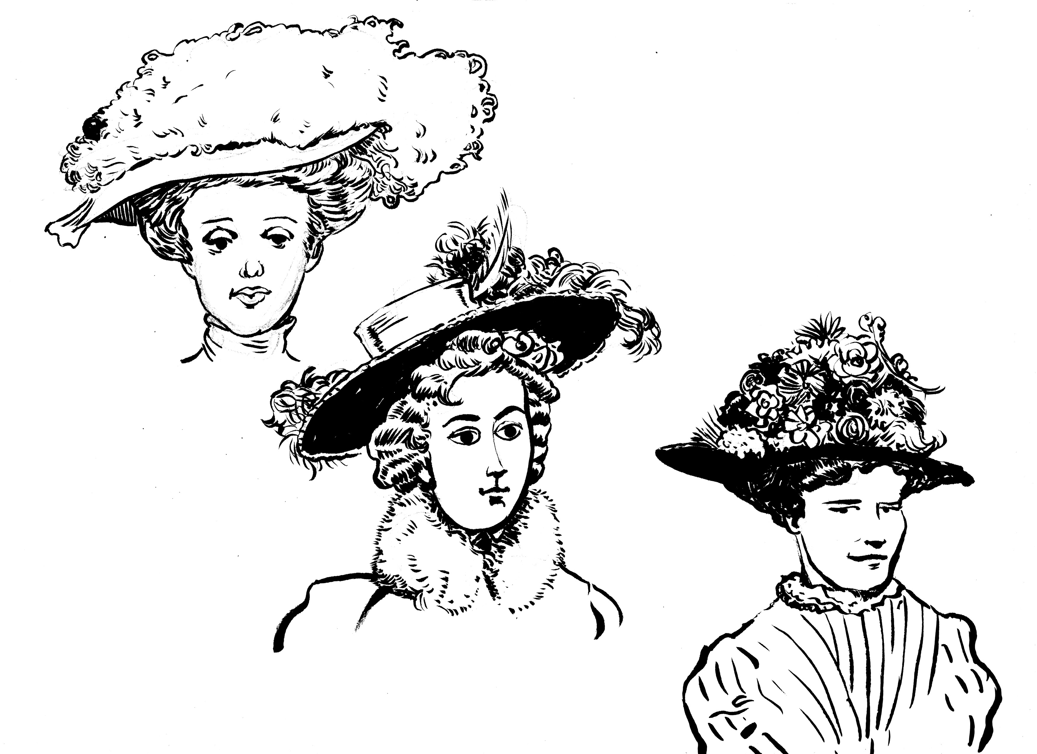
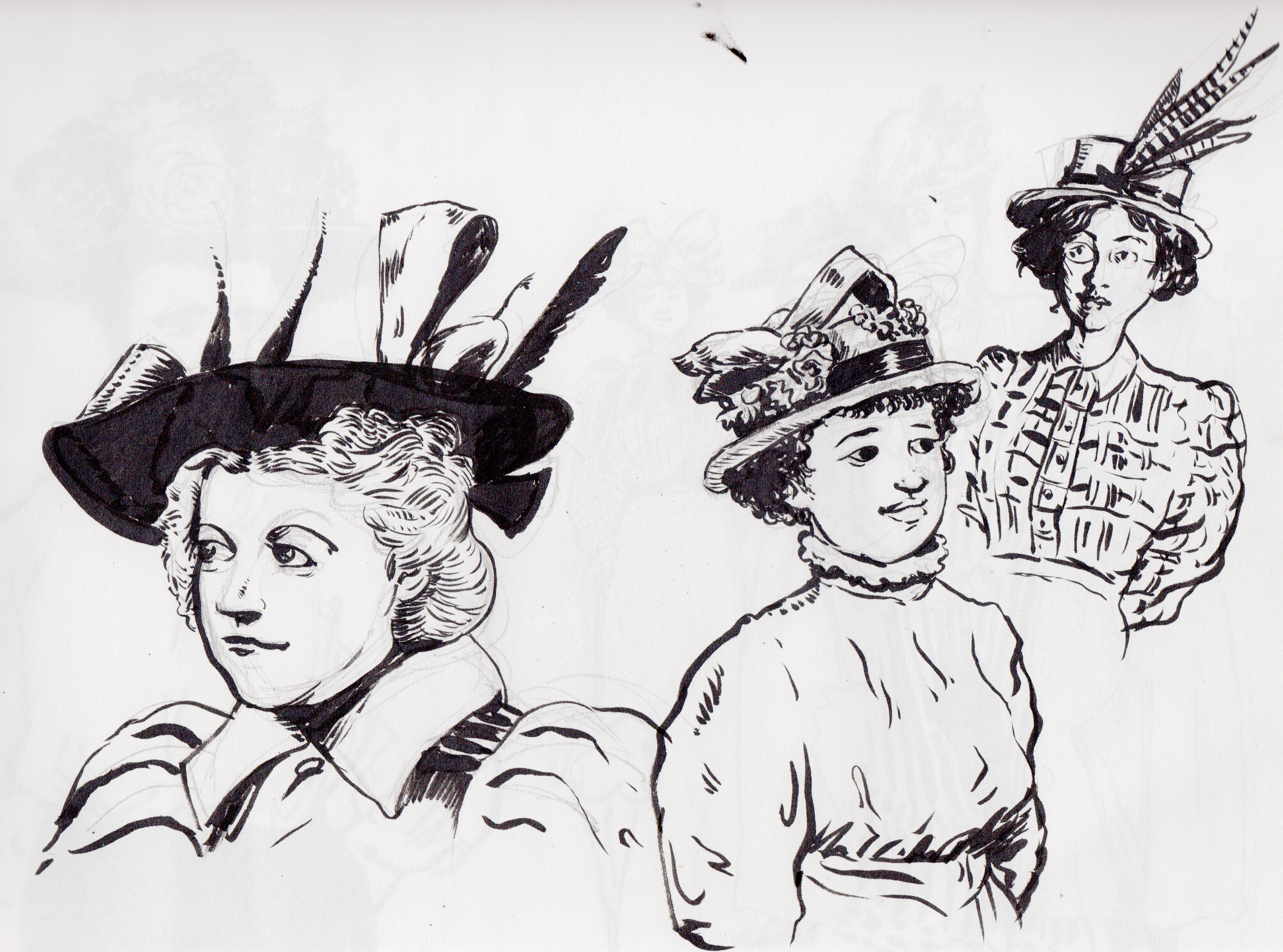
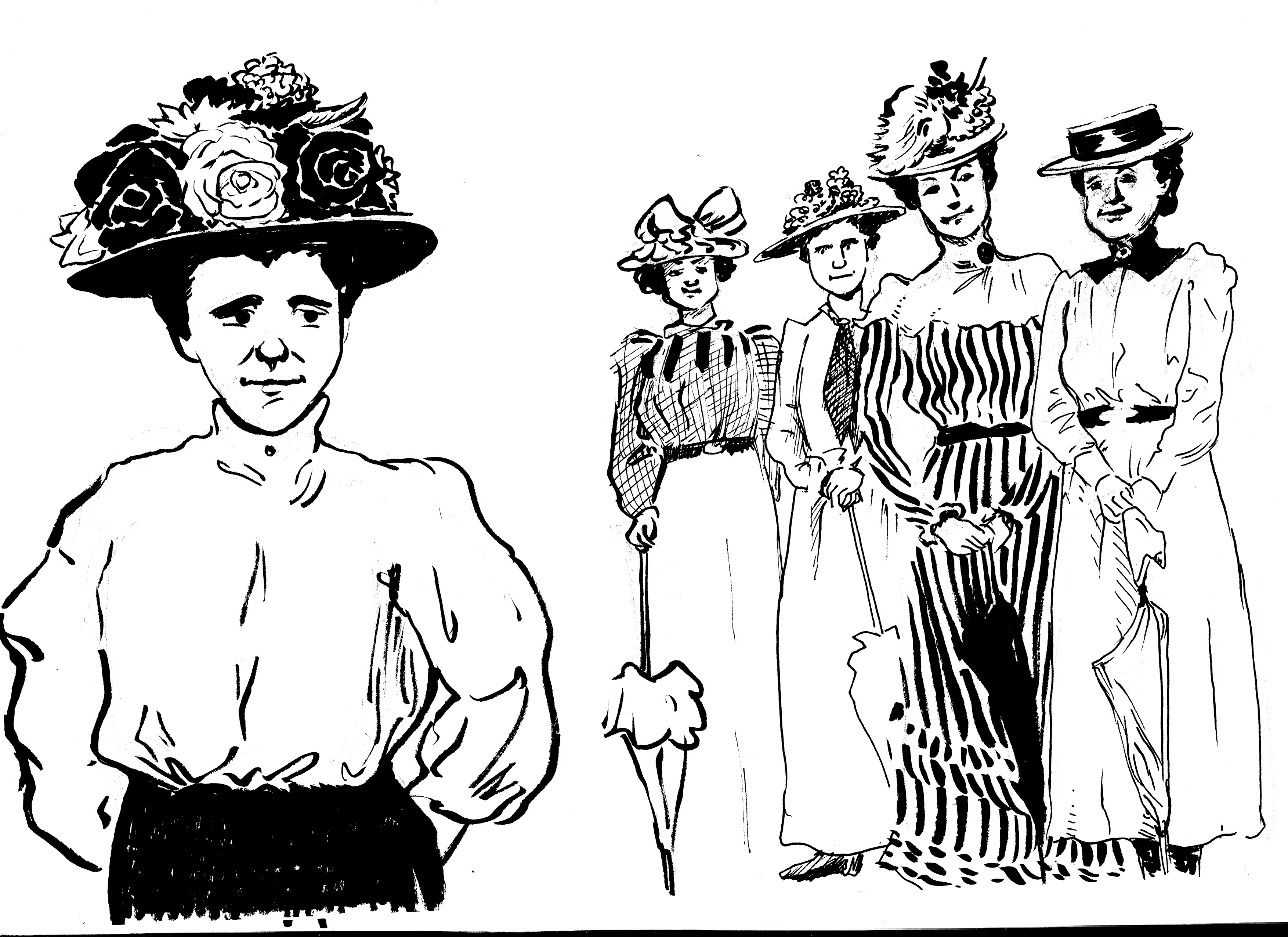
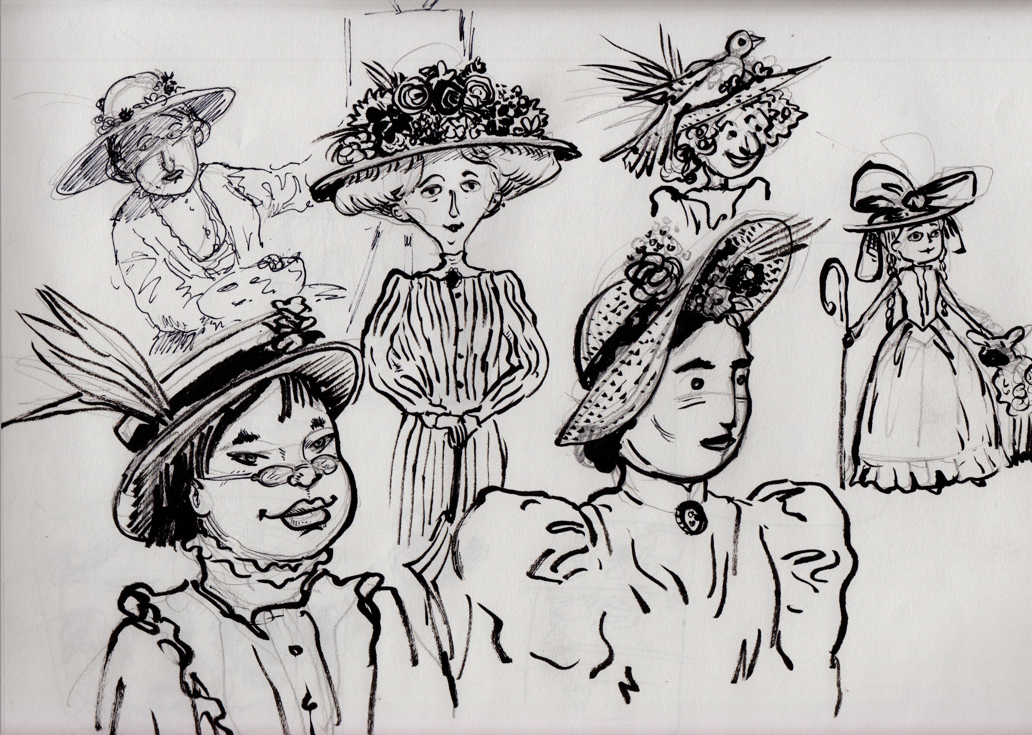
…all of that really just for this one panel:
Working hard to get this comic ready for MECAF.
![]() My current comic, “The Jernegan Solution” is a true historical story set in 1898 in Lubec, Maine, the eastern-most town in the United States. I’ve only been able to visit Lubec once, so I have otherwise worked from historical photos for location reference, as well as for period props. Some examples are below. The comic will be ready for MECAF in Portland, on May 17th.
My current comic, “The Jernegan Solution” is a true historical story set in 1898 in Lubec, Maine, the eastern-most town in the United States. I’ve only been able to visit Lubec once, so I have otherwise worked from historical photos for location reference, as well as for period props. Some examples are below. The comic will be ready for MECAF in Portland, on May 17th.
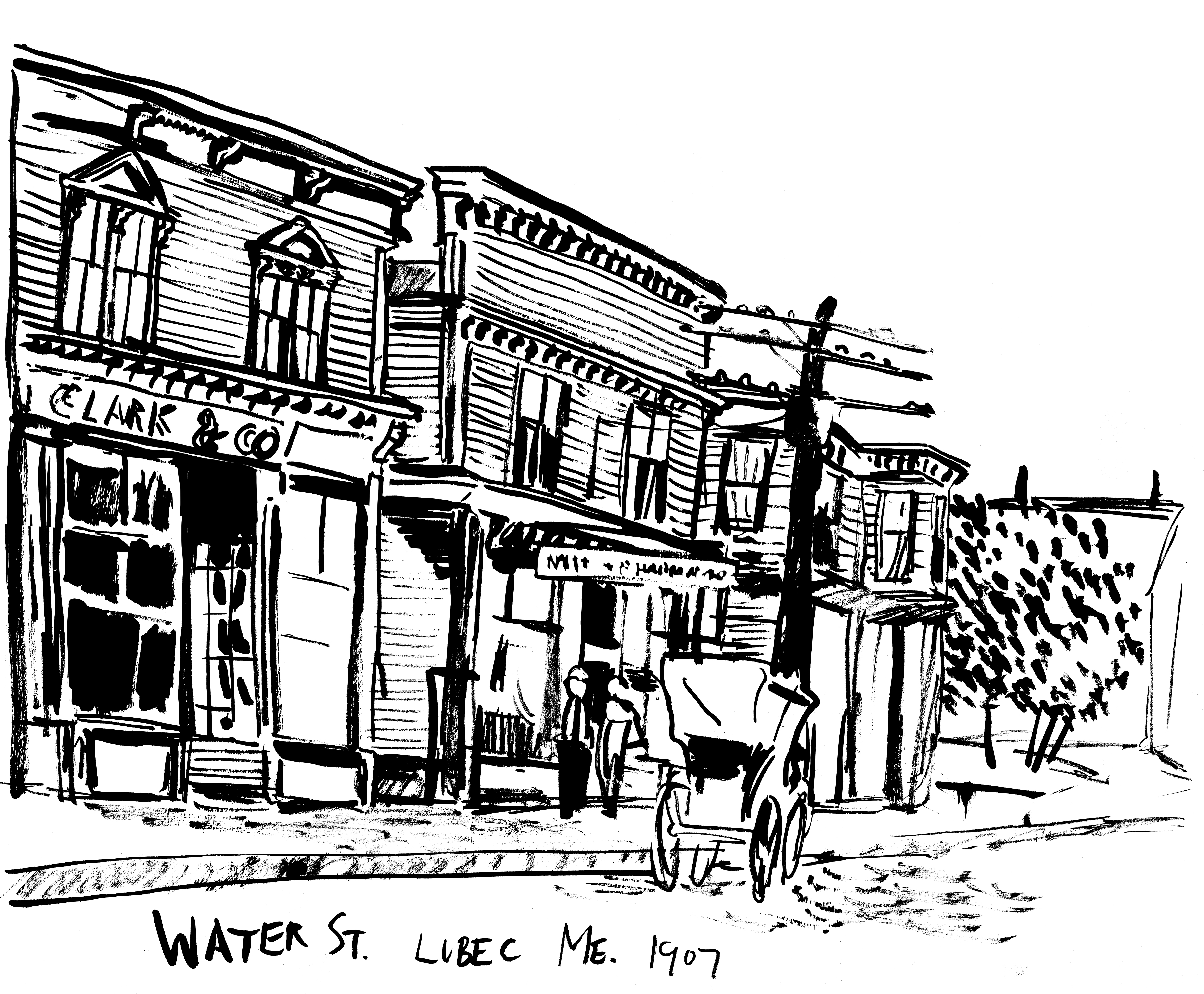
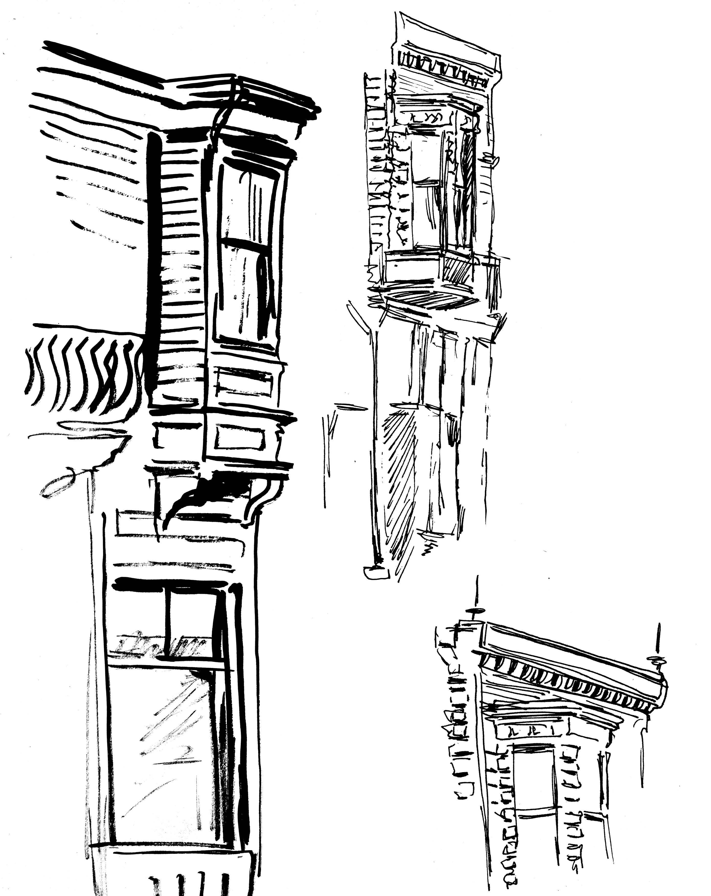
WATER STREET, LUBEC
The main commercial street of the town:
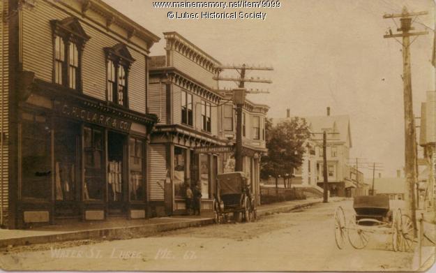
My sketch of it, and some architectural details:
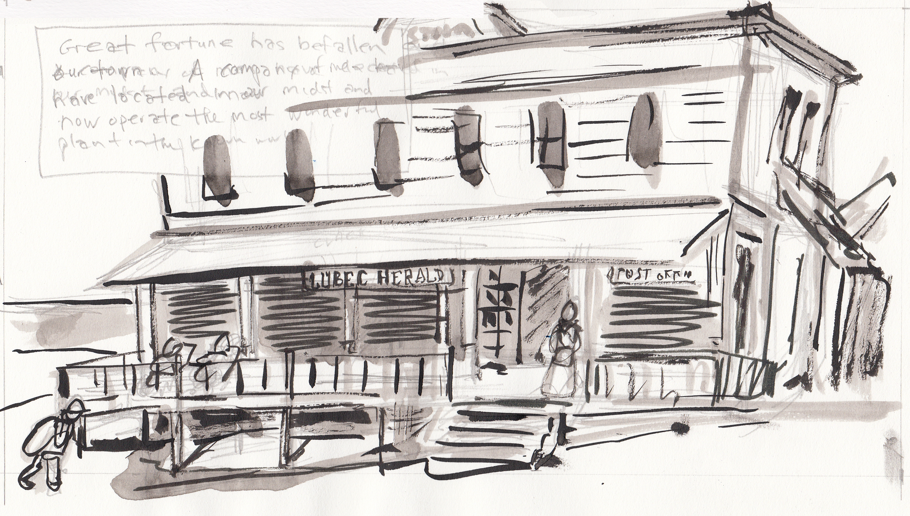
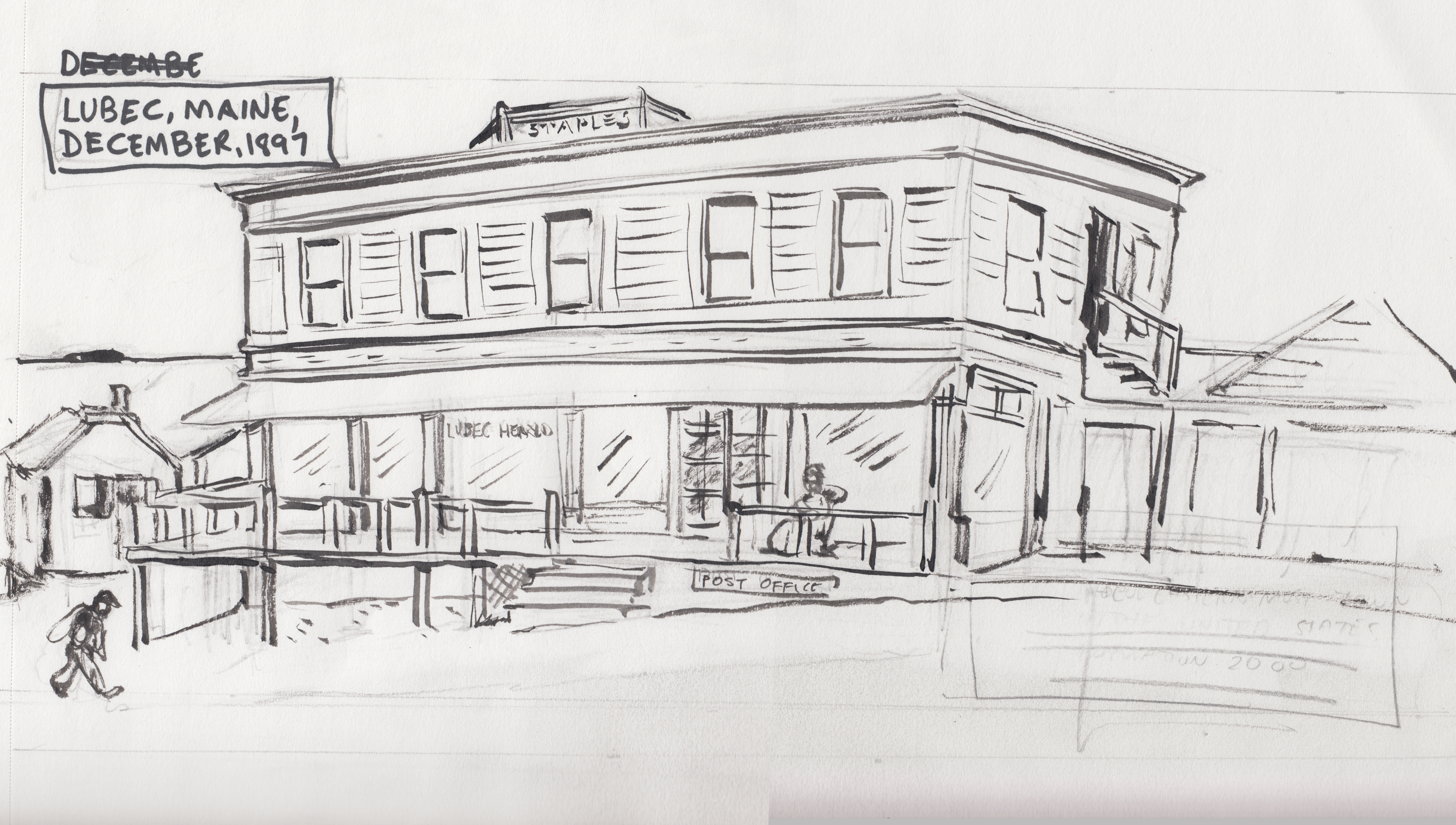
THE STAPLES BUILDING
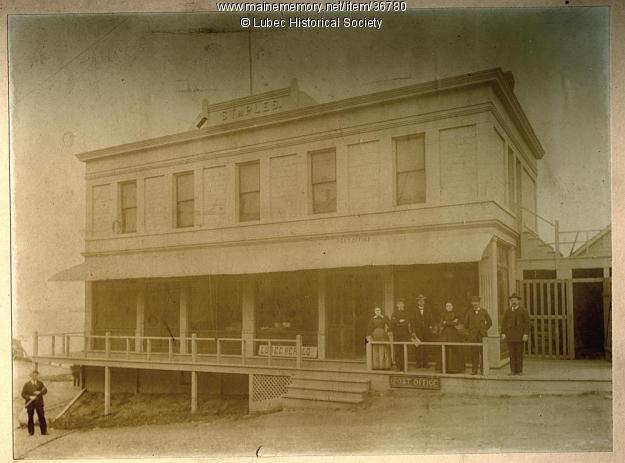
AÂ new office building at the time, home of the Lubec Herald newspaper office, where my journalist character works. It was located on Water Street.
The first “adjustment” I made from the photo was to have painted “Lubec Herald” letters on the window, instead of the sign leaning against the baseboard. Â I assume that sign was later put over the door, anyway :
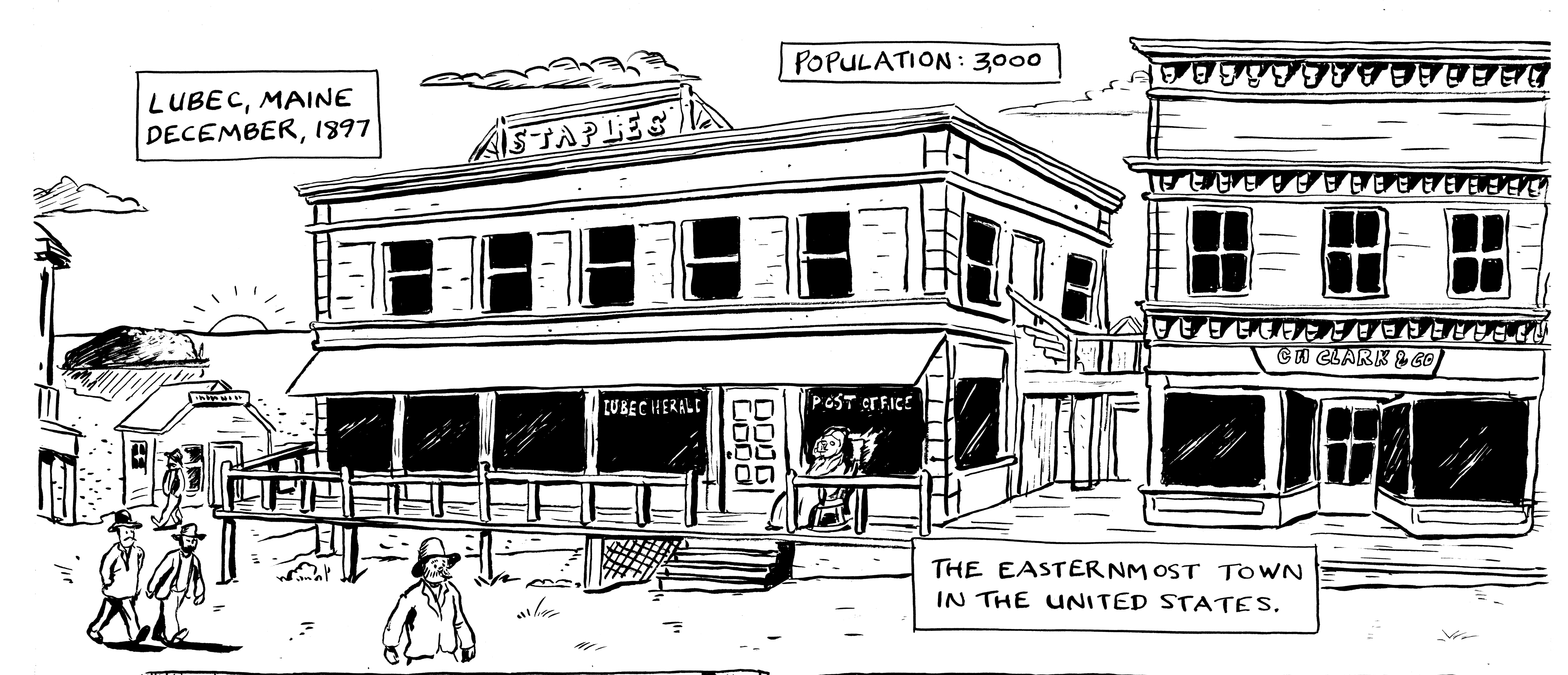
Here’s how it looks in the final inks. I also added in another, more “picturesque” building to the right, based on one of the buildings in the other Water Street pictures (I think that the Staples Building was at the end of Water Street, not in the middle of the commercial district).
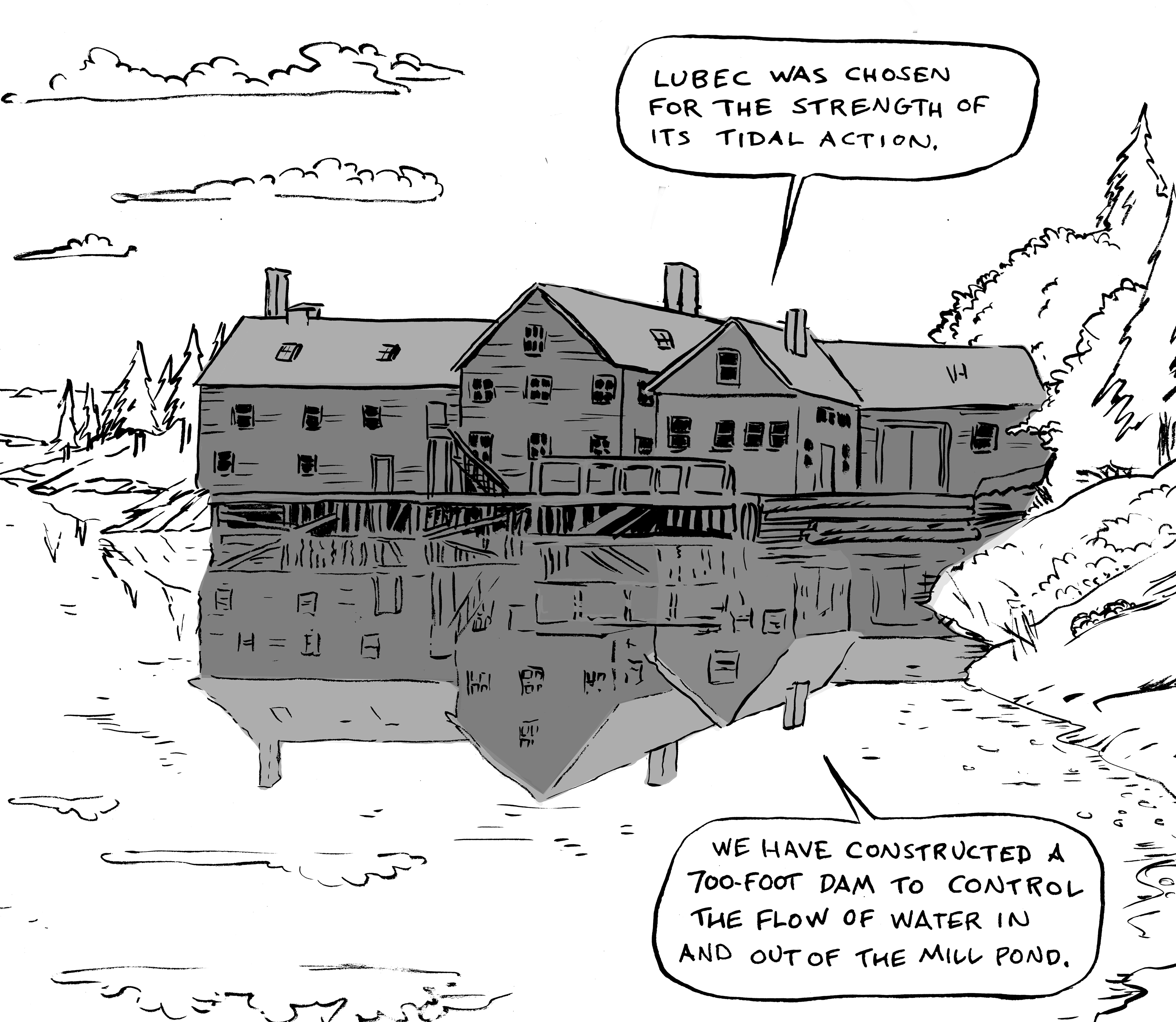
THE COMSTOCK MILL/”THE KLONDIKE PLANT”
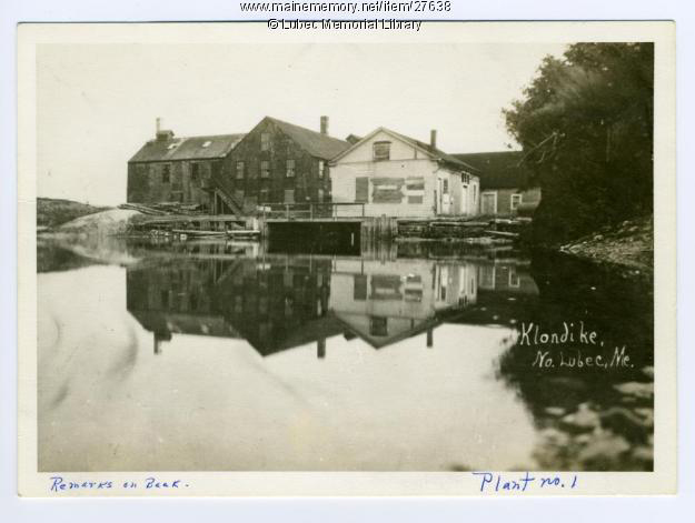
An old grist mill, which was purchased and transformed into… well, you’ll have to read the comic to find out!
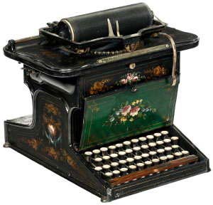
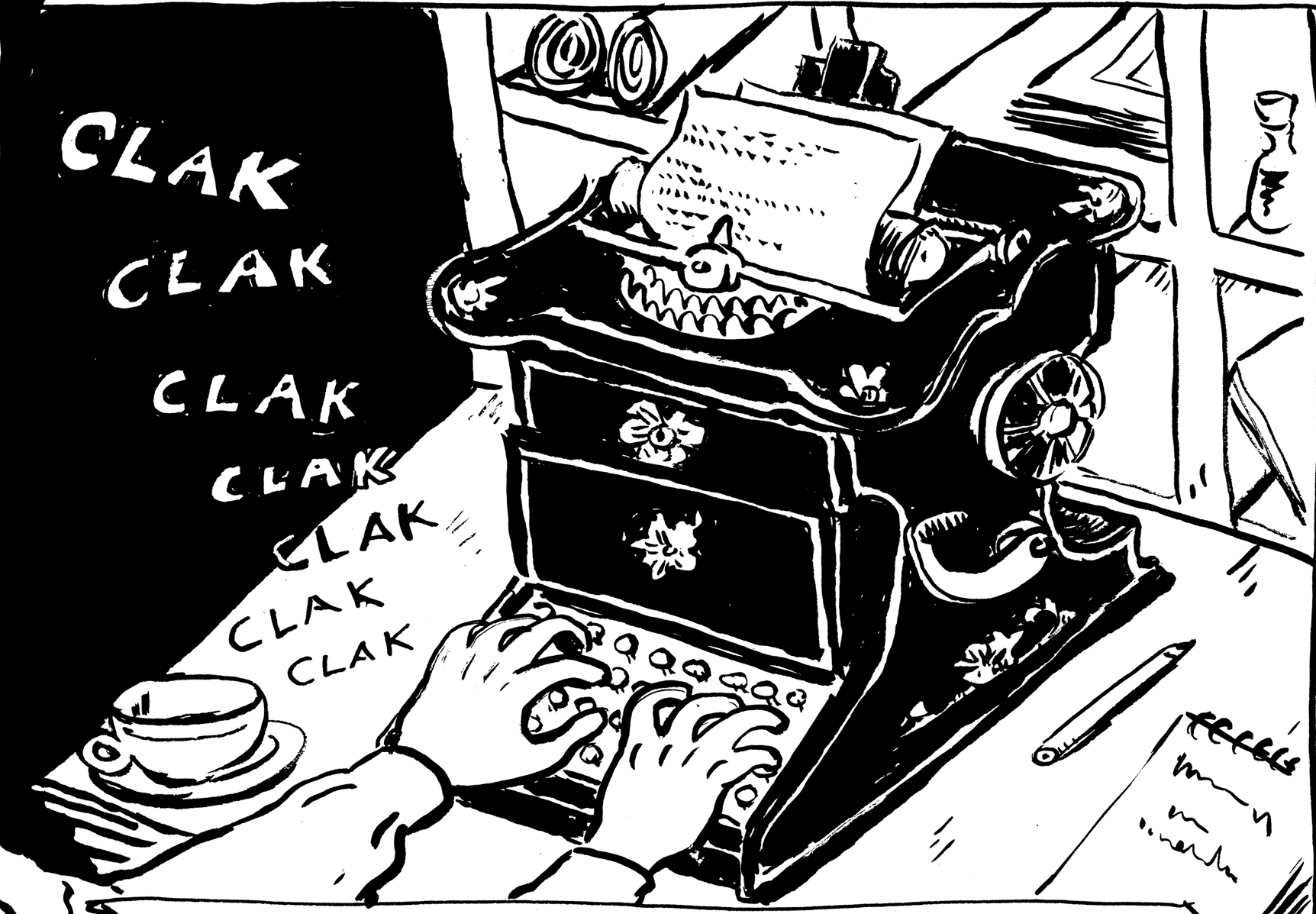
SCHOLES AND GLIDDEN TYPEWRITER
A key prop (journalist character). Â This machine was available at the time. Â Would a small-town newspaperman have been likely to have used one? Â I don’t know for sure. But I couldn’t resist using this beautiful typewriter, with the amazing painted decoration. Â I wish my PC looked like this.
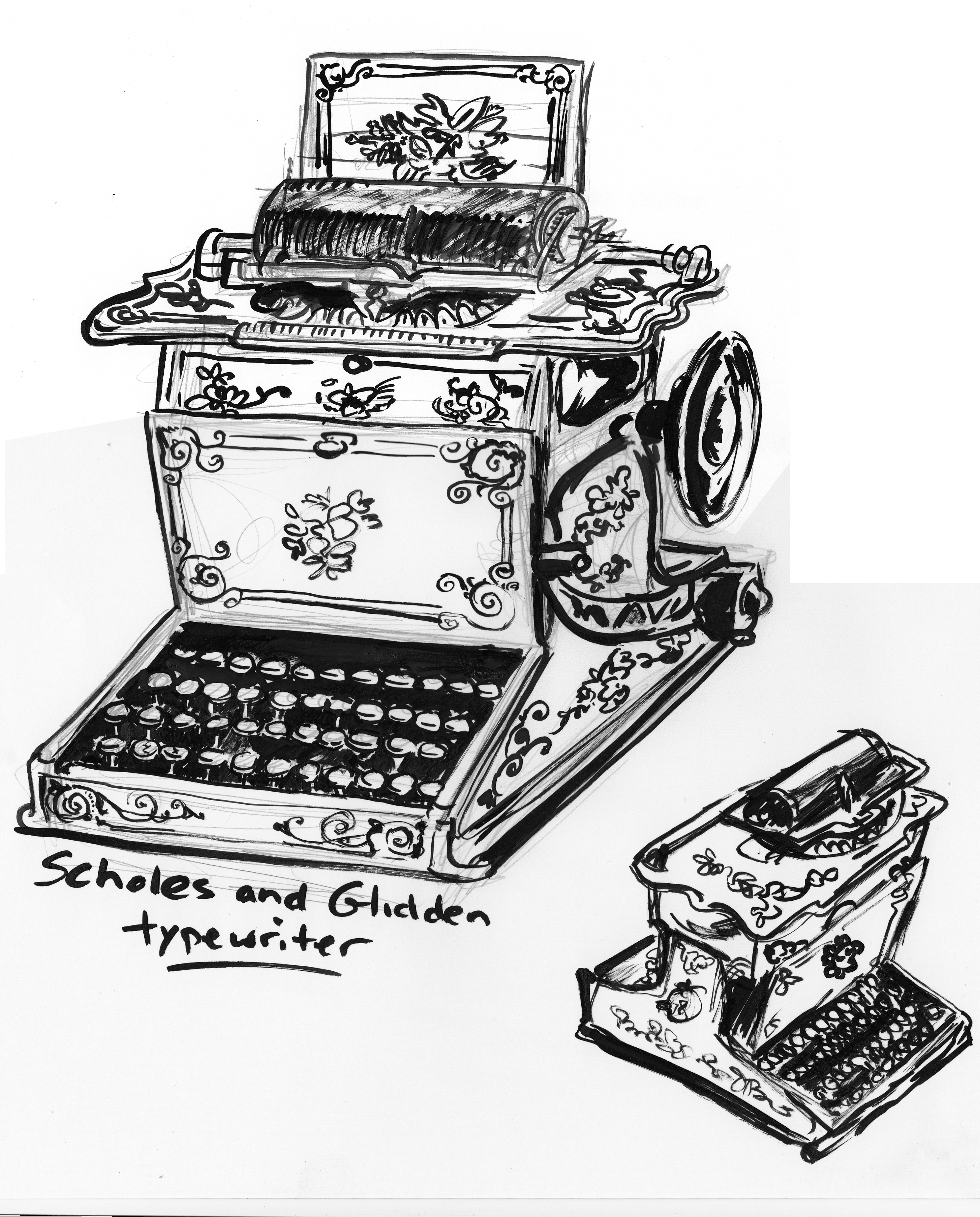
In the end, though, I felt I had to simplify the decorations somewhat, to be readable at the size of the image: